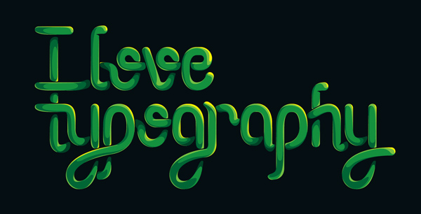
In the second part of this tutorial series, we’re going to bring this treatment to life with some color. Stick around to learn about casting shadows and highlights through abstract color shapes.
Step 49
Before you proceed with this part, I suggest you back up the original file from part 1. Adjustments to a stroked path are much easier than tampering with a double sided, expanded arch. First of all, expand the paths altogether (Object > Expand).
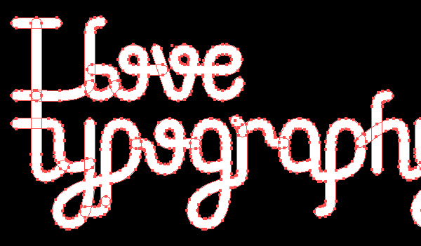
Step 50
Before we begin to add color, we need to add shadows. Since we’re going for a high contrast look, all we need to do is black out the darkest areas. We begin by creating gaps between all the letters. Create a stroke using the settings shown below.
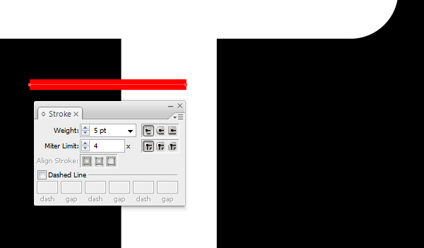
Step 51
Expand the stroked path (Object > Expand). Then Use the Pathfinder to trim off the highlighted section. Be sure to make a back up of the shape. We’ll be using it a lot.
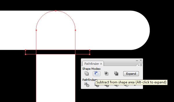
Step 52
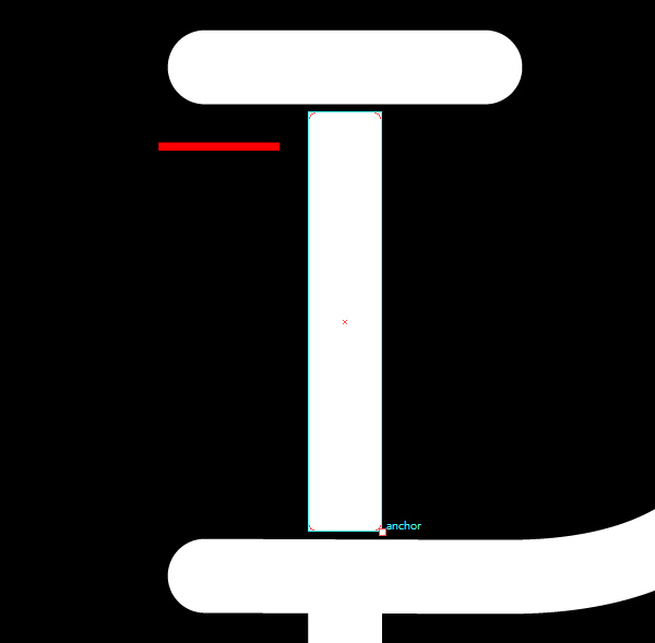
Once you’ve done the same for the bottom, grab the Rounded Rectangle Tool and create a rectangle from corner to corner. Use a 5 px radius for the corners. To bring up the settings, just click anywhere in the canvas without dragging.
Step 53
Repeat this process and apply it to any straight parts of the letters where using the tool is possible.

Step 54
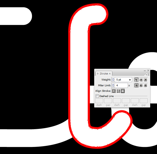
For other parts, we’ll have to create the gap in a different way. To start, make a duplicate of the letter you want to add a gap to, in this case the letter “l.” Remove the fill and add a 5 pt stroke. Align the stroke to the exterior of the shape from the Stroke Panel.
Step 55
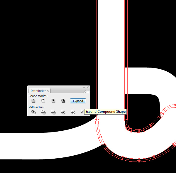
Expand the stroke (Object > Expand), and make sure to have it on top of the layer you want trimmed.
Step 56
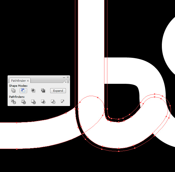
Select it and the object behind it that you want to trim, and use the Pathfinder to delete those portions. Don’t forget to Expand the final object.
Step 57
You now need to round off the corners of the newly created gaps. Select the Pen Tool and place to anchor points as to prepare a radius similar to the rectangles we created earlier.
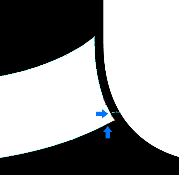
Step 58
With the Pen Tool, click on the corner anchor to delete it. Then drag the two anchor points to adjust the anchor. Hold Option before dragging so you don’t modify the other sides of the anchors.
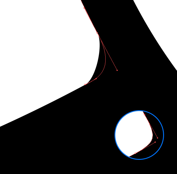
Step 59
Repeat this process throughout the letters until you have a similar result.
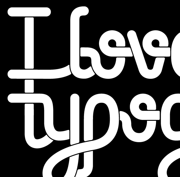
Step 60
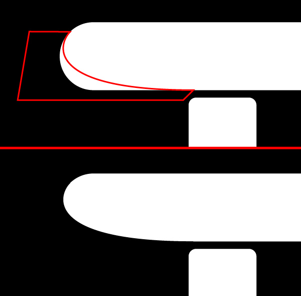
It’s time to continue the process of adding shadows. From here on, all geometric construction or inspiration ceases. You need to imagine how the shadows are cast on the letters. As a visual aid, it’s a good idea to place an ellipse somewhere on the canvas and let it be your “light source.” This will help you establish where highlights and shadows belong. Start the first shadow by hiding a bit of the lower extremity of the letter “i.”
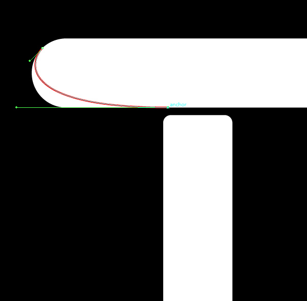
Step 61
Turn the path into a complete shape. Then use the Pathfinder to trim the original shape, so the portion disappears altogether.
Step 62
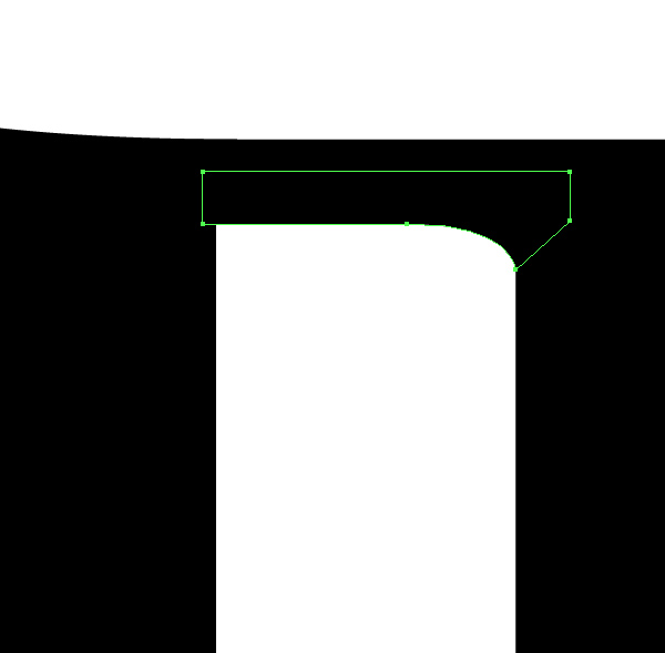
Beneath the bracket on the “i,” make a larger than usual gap. Imagining that the top bracket is on top of the center column of the capital “i,” we’d be getting a stronger shadows just below it, since the light source is somewhere in the top-right corner.
Step 63
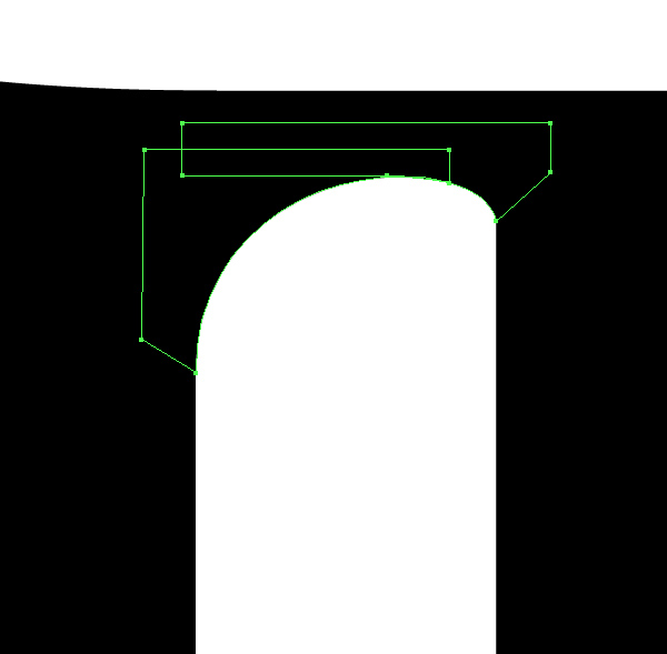
Naturally, the left side will be even darker, so go ahead and add a much larger radius.
Step 64
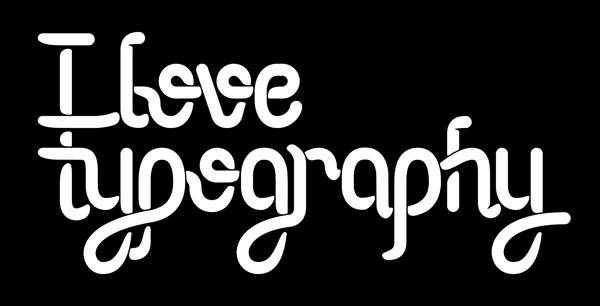
Repeat this process throughout the lettering. Remember to not only mind your light source, but also loops and brackets that can obstruct light.
Step 65
Select all these objects that consist in shadows and use the Pathfinder to merge them together (first button), then Expand them.
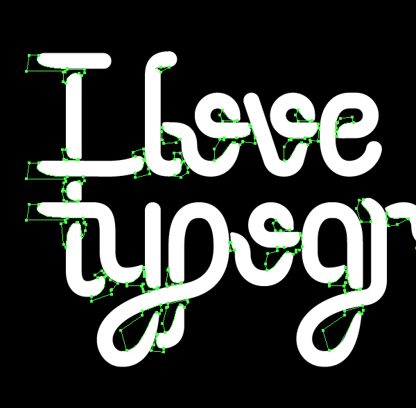
Step 66
Go Merge the letters altogether, and trim them using the shadows object.
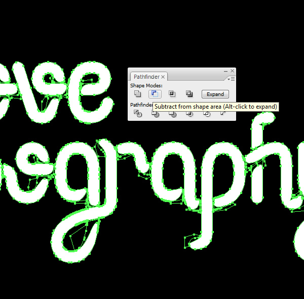
Step 67
You should now have a similar result. From now on, we start to add color.
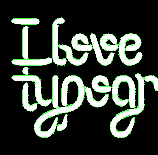
Step 68
An easy way to start is to add the base color, which in this case is #13913f. I’m using Pantone colors, but it’s best to just use colors you like, and then find Pantone or CMYK alternates near the final stages.
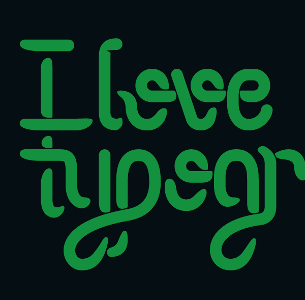
Step 69
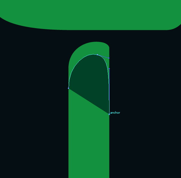
While applying the same technique as with the dark shadow, start to trace a shadow using this color: #014127.
Step 70
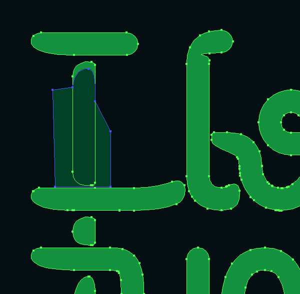
In this case, you want to trace in such a way to cover all the object, except the portion you want as a shadow.
71
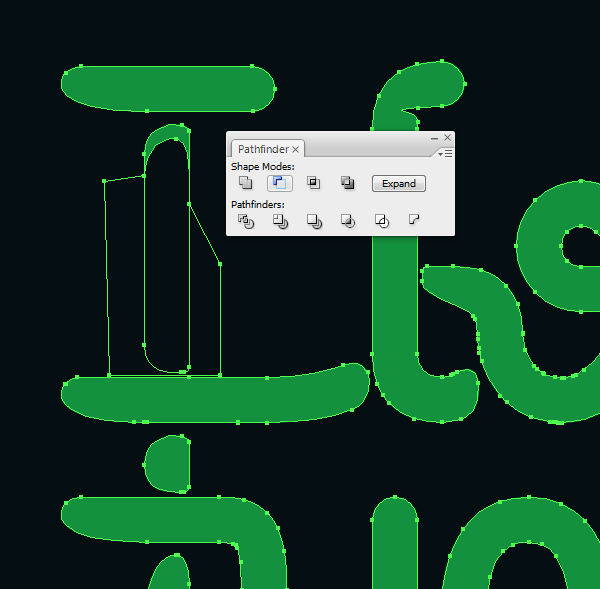
Make sure you’ve copied and backed up the original shape, but use the Pathfinder to trim off just enough to leave yourself a shadow.
Step 72
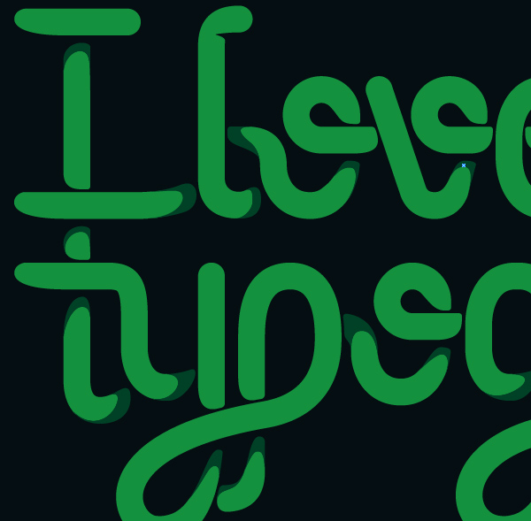
You can now adjust the anchors to get a similar result. Remember to apply the same principles as with the black shadow, just on a larger scale.

Step 73
Apply this type of shade in very dark regions, but don’t go overboard. Leave enough room for other shade values.
Step 74
It’s time to move on to the next color, which will consist in a first level of highlights. Use this color: #75bf42.

Step 75
Just as before, trace everything except the portion you actually want as a highlight.

Step 76
Then trim off everything with the Pathfinder.

Step 77
Use a fair amount of highlights across the whole project. just to make things a bit more dynamic, try not to be too symmetrical. For instance, I’ve left the sides with smaller sized highlights than the center.
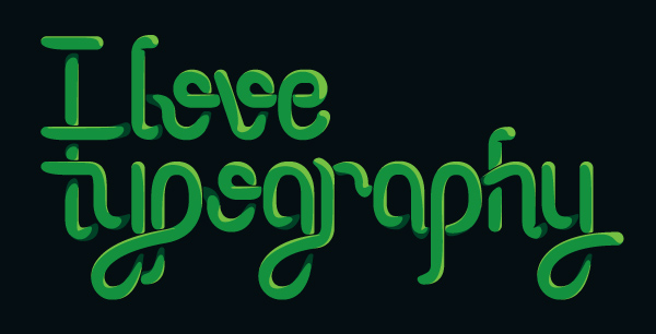
Step 78
As part of the same highlights, create very thin versions on the opposite sides. These are harder to notice, but important, so I’ve changed their color to red just here.
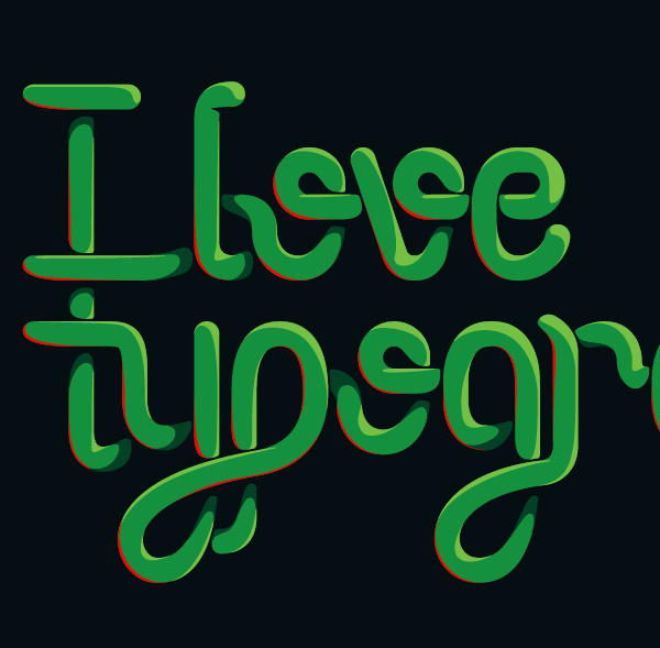
Step 79
Create these on the same layer as the previous highlights.
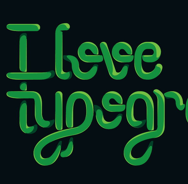
Step 80
The next part consists in adding glares. Use a bright yellow for these: #fef200.
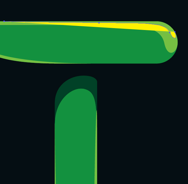
Step 81
Same as the other layers, use the Pathfinder to trim the object. Still, remember that this should cover very limited portions and only on portions directly visible by the source of light.

Step 82
Same as the other layers, use the Pathfinder to trim the object. Still, remember that this should cover very limited portions and only on portions directly visible by the source of light.
Step 83
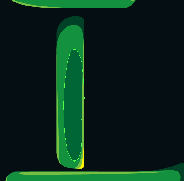
Once you trimmed off the excess, you should be left with a size larger than the original object.
Final Image
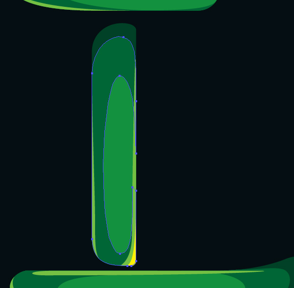
And we’re finally there! Depending on what you’re planning on using this typographic treatment, remember to calibrate your colors for Pantone or CMYK if it’s for anything print related, as I have.
