About BRAVE Quality paired with support to die for
Beautifully dark, minimal and 100% responsive, the goal with BRAVE remains
the same as it was with our previous WordPress mobile and tablet themes: keep
it simple.
You’ll be hard pressed to find a single unnecessary pixel that would get between
your visitor and your content. In fact, we aimed for your content to effortlessly
be a big part of the actual design; as soon as you visit the demo site, you’ll no
doubt immediately notice the focus on bold headlines and other well-placed
content items.
Do read through this entire page and visit the demo site to become familiar
with all the theme has to offer, but for now here’s a short list of more notable
features.
- works alongside your desktop site
- ready for localization
- ‘install as web app’ on iOS
- beautifully unique menu, comment/contact forms
- touch/swipe gallery
- multiple color schemes
- a variety of extremely customizable shortcodes
- comprehensive documentation
- ..scroll down to find out much more!
Stellar support But don’t take OUR word for it
As usual, you have our promise of excellent support which we’re massively
proud of. Below are some kind words from those who’ve purchased our themes:
- “impressively quick support
 … 5 stars”
 - “Your support is really top notch.”
- “… fantastic support … You have solved my mobile headache.”
- “… customer service provided goes above and beyond … An excellent experience from start to finish.”
- “Best support I’ve ever seen! .. Five stars is not enough!”
- “… extreme fast response!!!”
- “This is by far the best support I’ve gotten on TF.”
- “Wow, thanks for the prompt response.”
- ”…quick to respond and very helpful.”
- ”..documentation [has] been a great help..”
- “Thank you very much for the super-quick support.”
- “Awesome support!”
- “Thanks for such a speedy response! You rock man!”
Thoroughly tested: iOS, Android, Windows Phone, and desktop
browsers
BRAVE is thoroughly tested across several browsers and devices, and to that end
works beautifully across smartphones, tablets as well as desktop, allowing your
visitors to easily access your site from whatever device they happen to be using
at the moment.
BRAVE works alongside your existing desktop theme
BRAVE works alongside your existing desktop theme and can easily be shown to
your mobile and/or tablet visitors only. To get a first hand look at the theme,
use
you device to scan the QR code below and visit the live demo site:

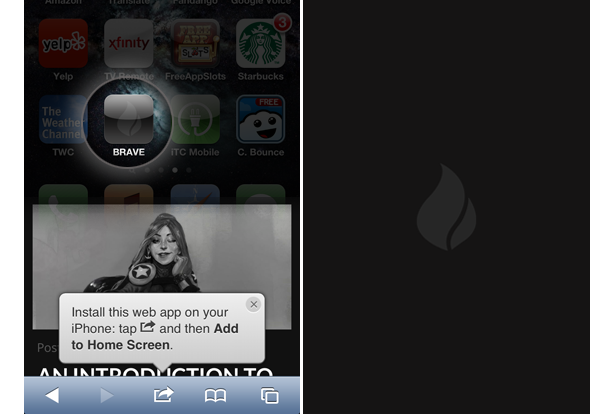
Install as a web app (use your own splash screens and icons)
As a part of the theme’s default functionality, BRAVE can be installed on your
iOS device as a web app. Upon arriving on your site, a handy prompt alerts your
visitor
to add the site to their Home Screen, meaning your site will be just a single
tap away.
You can also add your own custom icons and splash screens that the web app will
make use of, as illustrated by the included default images below:

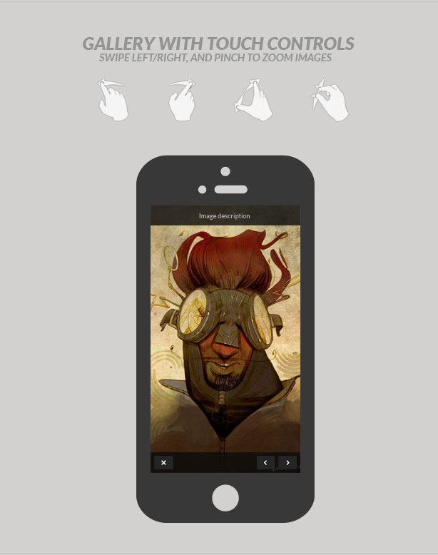
Touch-enabled gallery Swipe, pinch and zoom
BRAVE comes with a customized version of PhotoSwipe, the popular touch-enabled
gallery system, which integrates absolutely seamlessly with WordPress. Let your
visitors
swipe, pinch and zoom their way through your images!

Theme features: The all-mighty feature list
And of course we couldn’t do without a collection of the theme’s features in neat list format:
- works alongside your existing desktop theme
- ready for translation/localization (.mo, .po files included)
- ‘install as web app‘ functionality on iOS (with install prompt, splash screens + icons!)
- easily create a phone call button and/or menu item
- tested on several browsers across multiple operating systems and devices (Chrome, Firefox, Internet Explorer, Safari, Opera, iOS, Android, Windows Phone)
- a fully responsive liquid design that works beautifully on tablets, smartphones and even scales all the way up to desktop (everything from forms and fields to menus and embedded content is automatically resized to ensure your site looks its best on whatever device and resolution it’s being viewed on)
- fully supports retina screens
- beautiful and subtle use of CSS3 and jQuery animations
- includes themes for two different slider plugins
- 6 color schemes
- touch-enabled gallery (customized PhotoSwipe)
- multiple page templates allowing for formatting of content (no title, centered title, back button, and combinations thereof)
- supports 10 post formats, complete with the option of background images (Standard, Aside, Link, Gallery, Status, Quote, Image, Video, Audio, Chat)
- a very unique, subtly animated jQuery comment form
- jQuery contact form with validation
- a ton of extremely customizable shortcodes (alerts, dividers, buttons etc)..
..plus video shortcodes for YouTube, Vimeo, USTREAM, DailyMotion, Blip.tv..
.. and shortcodes for easily placing content in columns (text, images, as well as video) - custom background tool enabled; change the theme’s background color/image in seconds (a dozen background images included)
- extensive documentation
- PSD files included

