 Bye bye 69 symbol! Valley media darling/scapegoat Color has updated its iPhone App to 1.0.2 to address certain um, user interface issues. Color’s launch caused a big splash in the Valley a couple weeks ago, due to what some people viewed as an unfairly allotted and foolish $41 million in funding as well as problems with the usability of the actual app — Namely that it didn’t work if other people weren’t nearby.
Color co-founder Peter Pham tells me the latest update was “crowd-sourced” as in Color listened to user feedback. Already it looks like the largest user complaints have been addressed, at least cursorily.
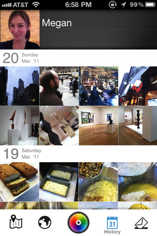
The homepage icons now have text descriptions and are more intuitive to use, like a Map for “Nearby,” a Globe for “Feed,” a Calendar for “History” and a Letter for “News” (the fade text descriptions also really help).
The bizarre revolving 69 button has been split into two buttons, the Map and Globe. The Heart button, which allowed users to share photos via Facebook and Twitter, has now been replaced by a more reasonable Paper Airplane button. A Home button also brings users back to their homepage, like it should.
Color 1.0.2 also makes it a lot easier to delete a photo, block a user or see more or less of a person (+,-) and view user profiles. In addition you can now choose a Color profile image from your iPhone photo library, which means no more dark, less than ideal profile images. The phone also now comes localized in French, Japanese and Chinese.
Color is like Rebecca Black’s Friday video: People hate on it in public but keep going back to it privately. And while this is an improvement over what existed before, Pham tells me there’s an even larger (“pretty major“) re-vamp to come. “This is just the beginning,” he said.
The Android app is coming tomorrow.