Joomla Racing Component With Betting Options For Jomsocial

I need a joomla component / modules with mainly the following features …

– create, edit, view: profiles for different “horses” (basics datas, photos, points, tables and statistics (race position, times, results, how many betts on this horse)) etc.)
– create, edit, view: races (basic datas, horses, betting datas etc., results (after race))
– create, edit, view: sponsors/owners (basic datas, photos, videos etc.)
– betting module for jomsocial community. users can bet some kind of credits on upcoming races. Results are automatically evaluated into credits. view tables and statistics for the bets of a user. some kind of ranking.
– racetable (link to racepage, horsepage)
– top-list horses (link to horses)
– top-list user-bets (link to users)

More details or Questions? Please ask.

thx.

Craigslist – Auto/car/truck – For Sale Ads

I am doing this a second time because I was not satisfied with the
first effort to post my Craigslist for sale ads..
IMPORTANT!! If the programmer (poster) is outside the U.S.
Craigslist will not publish the ads from a “NON UNITED STATES” IP
ADDRESS. It is very important that whoever bids on this project is
able to work with the “Craigslist System” and can be CREATIVE with
security measures and successfully post ads.
I would like someone to post 25 Ads. All of the information for each
ad is currently listed on a website, so the information and pictures
are available to the programmer.
Please be clear that I am looking to outsource this work overseas
and I will not be paying high prices for this work. It is very easy
to do if someone has the system in place.
Please be thorough in your response and we will work well together.
Here is a link for a sample ad which was copy and pasted from the website.

http://miami.craigslist.org/brw/ctd/1827926945.html

Thank You,

Steve.

Rewriting – 100 Articles

I am looking for a creative writer to re-write 100 articles in “getting your ex back” niche. It would be nice to find a long term writer.

I will provide you with articles… each of them will be optimized for one keyword. It is very simple and I will explain you exactly how to do it.

The word count of rewritten articles will be between 300 ~ 325 ( not including the title ). The articles will be submitted to the Ezine Articles so they must be 100% original and error free… their editors are very sensitive about both of these issues.

It is a relatively easy project for a “natural” writer with a bit of creative mind. An excellent proficiency in English is an ABSOLUTE MUST to qualify for this project… I am tired of dealing with “struggling” writers.

The articles must be well written and interesting to read.

The rate is $1.00 per article. Please bid only if this rate is O.K. with you and if you can provide at least 5 quality articles per day.

The SAMPLE ARTICLE is below. If you have any questions… please ask.

Thank you.
Andre

5 Signs That Your Ex Boyfriend Still Loves You!

Sometimes, after a breakup you can still be madly in love with your ex boyfriend, and desperately want to get him back. It’s natural and understandable. Keep in mind that your ex might be feeling confused and unsure. Look out for these sure signs that your ex boyfriend still loves you if you want to get him back:

1. The first sign that your ex boyfriend still loves you is that he’ll want to remain friends. He obviously still wants you in his life one way or the other. Try not to see this as a bad sign. You can always nurture the friendship and continue to be someone important and reliable in his life.

2. Another good sign is his reaching out and regularly keeping in touch with you via phone, email or text message. It could just be a quick hello, but that’s indicative enough that he doesn’t want to break all ties, that you mean something to him.

3. In case he mentions that he misses you, that’s a sure sign that your ex boyfriend still loves you! He’s probably missing the romance between the two of you and may be considering a way to makeup with you.

4. If he asks you whether you’ve started liking someone, that’s a complete giveaway! He wants to know where he stands, so be upfront. Don’t play games by trying to make him jealous. That can backfire real bad, so avoid it.

5. Another sign that your ex boyfriend still loves you is his behavior towards you. If the two of you go out for a coffee and he seems a little nervous, this could mean that he’s trying not to show his true feelings. Make him relax and feel comfortable. One of you has to eventually come out with the truth about your feelings towards each other.

Modify Osdate Open Source Scri

Hi guys. I need someone to add functions to osDate an open source dating script that will be running on XAMMP server from my house.

I would like to add

A function for women only that will mark a male profile they have previously contacted as undesirable with space for 25 words or so of comment. This function must only be visible to female profiles and clickable only if there was previous contact. The next female to see the profile will see the mark and be able to read the note, then she can choose to contact this person or not.

Integrate a 1 to 1 video chat and an instant messenger i.e , the profile has a choice on how to chat.

An option to upload a short 1 or 2 minute personal video to add to their profile with a pop out window for the video to be viewed.

Integrate 2 areas where a profile can choose to have their Facebook news feed, a twitter feed. i.e , if they option click to add any or all these functions it will open on their home page (search page). This function will only be on their search(home) page

Quick Tip: How to Recreate Tails of Drum Samples

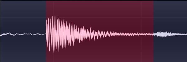
Chopping drum hits out of loops is a great way to gather one-shot drum samples, but since they’re in a loop, the tail or decay of the drum is often interrupted by another hit. To make our abbreviated samples sound more natural, we’ll try to recreate the lost tail of the drum in Edison, but any audio editor will do.


Step 1

Load a loop into Edison and delete everything except the drum you intend to extract. In Edison, Ctrl+Del will ‘trim’ the audio, deleting everything except the current selection. Aim for a nice, clean hit without any strange background noises. A decent decay before the next hit will help immensely. Try to trim the sample so that it starts exactly at the beginning of the drum’s transient and ends before any other sound pops up. Make sure the sample begins and ends on zero-crossing points.

Download audio file (1.mp3)


Step 2

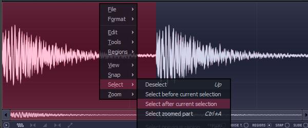
When it’s looking good, select all with Ctrl+A and copy and paste the audio with Ctrl+C and Ctrl+V. Now you’ll have two copies of the drum hit. Right-click anywhere on the waveform and choose ‘Select after current selection’ from the ‘Select’ menu, or just use the mouse to select the second copy of the drum.


Step 3

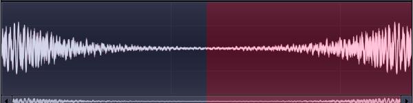
Press Alt+Left Arrow to reverse the selection. You probably see where this is heading already. If you chose a nice part of a loop to extract from, the drum sound probably has a bit of a tail, just not a very long one. By duplicating the whole hit, we can extend the small tail we already have and fade the sound out before the reversed initial transient is audible. Look carefully at where the two halves meet, if the wave suddenly starts going the wrong way, reverse the polarity of the second half with the option under the ‘Tools’ menu.

Download audio file (3.mp3)


Step 4

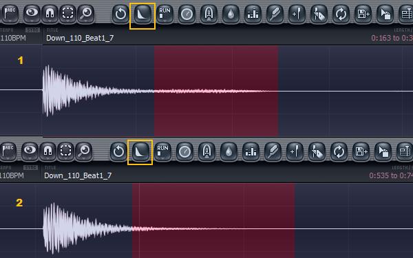
The easiest way to fade out our new fake tail is Edison’s ‘Fade out’ button. If you can’t see it, make the Edison window wider until it pops into view. You’ll probably need to fade the audio out twice or so, once with the reversed transient selected and another time with more of the fake tail selected, to even it all out. You’ll have to experiment a bit to get it just right.

Download audio file (4.mp3)


Step 5

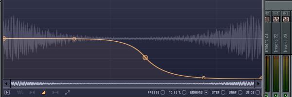
If you don’t like messing around with fade buttons, you can also just draw in an amp envelope yourself. In the bottom left of Edison, click the little triangle and start making curves. You’ll want the ‘fake tail’ portion of the sound to fade out naturally, but the reversed transient to be completely silent. Press Ctrl+E when you’re happy with it to apply the envelope.

Download audio file (5.mp3)


Step 6

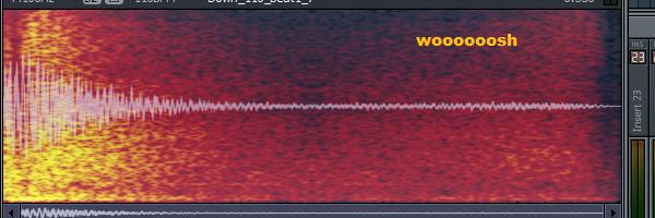
You might find the higher frequencies of your drum sound ‘wooshing’ back even after you’ve faded it out. To fix this, we’ll use Edison’s handy ‘Undo mix (envelope)’ feature. This lets you control the mix level between the audio as it is presently and how it was at an earler time in the undo history. We’ll equalize the whole sound to get rid of the unwanted high frequencies and then undo the equalization by a varying amount over time with an envelope. Basically, the envelope controls the wet/dry level of the equalizer so that we can leave the beginning of the sound alone but gradually reduce the level of the offending frequencies.

Download audio file (6.mp3)


Step 7

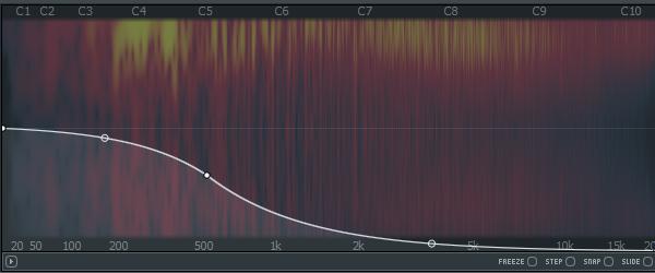
To start, press Ctrl+Q to bring up Edison’s equalizer. Gently roll off a lot of the highs, probably a little more than you might think is necessary. You might also want to reduce the level of some lower frequencies, especially with a bass drum that has a long, ringing decay. If it seems good, press accept.

Download audio file (7.mp3)


Step 8

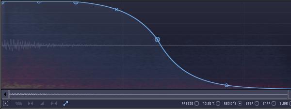
Click the two squares connected with a diagonal line at the bottom left of Edison to bring up the all-purpose envelope. Draw in a curve that leaves the nice parts alone while cutting out the wooshing sound. You won’t be able to preview the effect it has, so make a good guess. Don’t spend too long tweaking the envelope, each edit will add a new event to the undo history and we don’t want to lose our equalization undo point.


Step 9

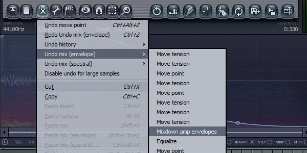
Click the scissors to bring up the tools menu and go into the ‘Undo mix (envelope)’ section. Click the undo point that is directly above the equalizer undo, because we want to revert to before the EQ. If it doesn’t sound right, hit Ctrl+Z, tweak the envelope a bit and try again.

Download audio file (9.mp3)

Now save your nice drum sample and use it someday when you need a really nice drum sample.

Here’s an example of two beats, one with all the sounds chopped straight off a loop and the second with some of the tails recreated. It might not be the biggest difference in the world, but when believeability is crucial, it might make you feel better.

Download audio file (Example.mp3)


Know Your Icons Part 1 – A Brief History of Computer Icons


As with great works of art, you must look into the past to appreciate the future. With roots as far back as the 1970′s, the humble icon has come a long way. Following is a collection of icons though history. Although there have been many other operating systems in the time between 1981 – 2010, I’ve hand picked the ones of the most significance to modern icon design. These designs show just a small fraction of the icons in the many and varied User Interfaces throughout the years. To learn more about the history of User Interface Design you can find a comprehensive article on the subject on Wikipedia.


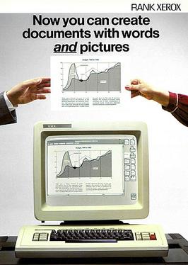
1981 Xerox 8010 Star — The First Consumer GUI Computer

In 1973 the Xerox Alto was the world’s first GUI (Graphical User Interface) based computing system. Designed around an "office" metaphor (also a first), the Alto was built as a research computer and therefore wasn’t available for commercial release. With 2,000 machines worldwide, the Xerox Alto was so significant, it was a source of inspiration for the Apple Lisa (1983). In 1981 the Xerox Star was released, incorporating many of the design features of the Alto. The Xerox icons demonstrate a consideration for human interaction. As you can see, Calculator, Document, Folder and Trash haven’t changed in almost 30 years.
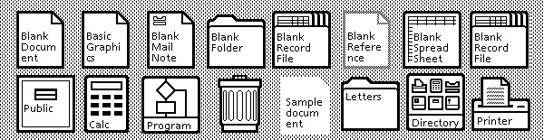
1981 – Xerox 8010 Star

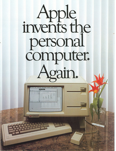
1983 Apple Lisa — Popularized the GUI

Development of the Apple Lisa started in 1978 and was heavily influenced by the earlier Xerox computers. Hoping to carve a niche in the personal computing market, Apple adopted the office metaphor to make navigation easier for new users. Lisa was an advanced GUI for the time as it had movable "Desk Accessories" (early Widgets), drop-down menus and folder based directories. You can see the icons are not much different from the Xerox, except for the size and single pixel outlines, and the use of the computer as the preferences icon (it’s now common to use cogs).

1983 – Lisa Office System 1

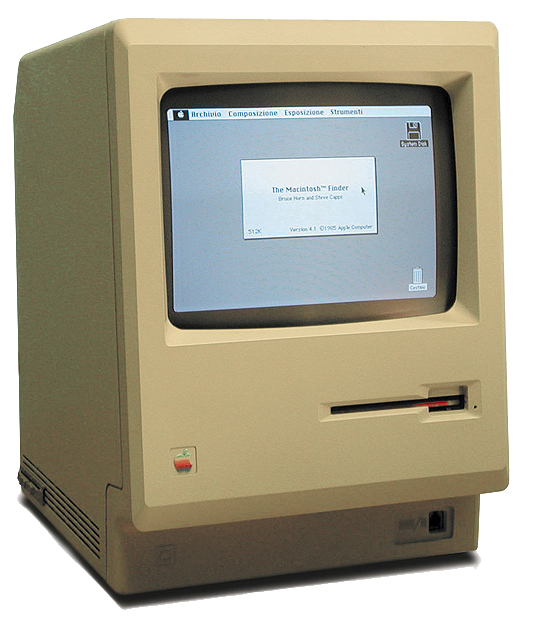
1984 Apple Macintosh 1.0 — Artist Designed Icons

A year after Lisa the Apple Macintosh 1.0 was released. We now see drag and drop file copying, movable windows and fancy new icons! The Macintosh icons were designed by the now legendary Susan Kare. Susan Kare has to be the all time master of Icon design and was responsible for many icons including the MacPaint interface (fig 2). Kare’s philosophy on icon design is simple, "I believe that good icons are more akin to road signs rather than illustrations, and ideally should present an idea in a clear, concise, and memorable way. I try to optimize for clarity and simplicity even as palette and resolution options have increased." This philosophy is at the core of Apple’s early commercial success.
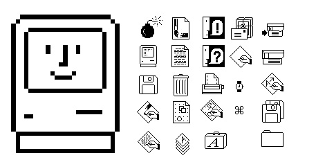
1984 – Macintosh System 1.0 (fig 1)
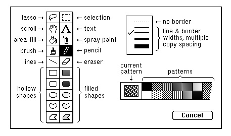
1984 – Macintosh System 1.0 (fig 2)

1985 Atari TOS — Isometric Icons

It’s important to note — for those a bit younger than us old sentimental computer users — that the GUI was not only for the Apple systems. The Atari ST had an OS called TOS which had a minimal interface also using the desk metaphor, which by then had become a computer standard. It’s interesting to see that the TOS has Isometric Disk icons (file drawers).

1985 – Atari TOS Version 1.0

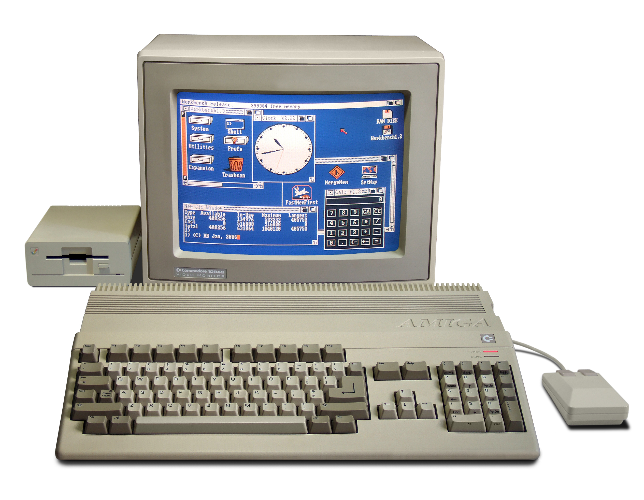
1985 Amiga Workbench — Four Color Icons

The Amiga Workbench was made for the Amiga 500 personal computer. Despite the crudely designed icons, Workbench was actually ahead of its time. Including features such as customizable mouse cursors, four color graphics and multi-state icons. You can see the two states of the "Workbench" icon in the example below. The Amiga broke with the desktop convention and chose to use a workbench with drawers instead of files.

1985 – Amiga Workbench 1.0

1985 Windows 1.0x — Microsoft’s First GUI OS

In 1985 Microsoft finally released its first GUI. The icons are just as crude as the Amiga but don’t include color. It’s interesting to see that the first icons for Windows Paint employ different symbols to MacPaint, in particular the Spray Painter.
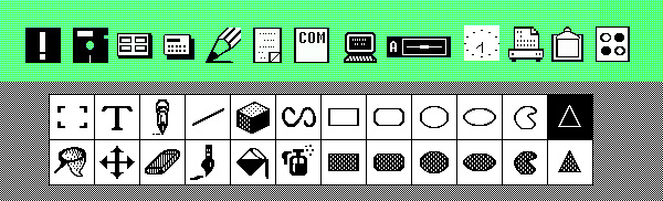
1985 – Windows 1.0x

1986 GEOS for Commodore 64 — The Alternative OS

I’ve included GEOS for the Commodore 64 as, at the time, it was the second most popular GUI behind Macintosh 1.0 (based on units shipped). The icons have more character than Windows OS and share the Mac philosophy of clearly expressed metaphors.

1986 – Commodore C64 GEOS

1991 Macintosh System 7 — First Mac OS with Colors

With System 7 we saw the introduction of color to the icons. You may notice that the icons are now slightly raised to appear "clickable".
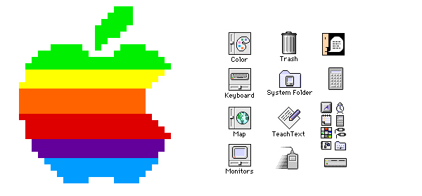
1991 – Macintosh System 7

1992 Windows 3.1 — New Designer Icons!

In Windows 3.0 (1990) Microsoft employed Susan Kare (who first made icons for the Macintosh 1.0) who greatly improved the designs. In 3.1 Kare further refines the colors and designs for the icons. Windows 3.1 was the first Windows platform with pre-installed True Type Fonts.
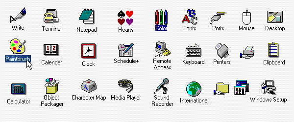
1990 – Windows 3

1995 Windows 95 — The Start Button

Windows 95 introduces more colors to the icons and a few more isometric designs. The Windows 95 design is a complete re-build and includes elements that are still part of Windows designs to this day. The elements include, the taskbar, the menu and Microsoft’s famous Start Button.
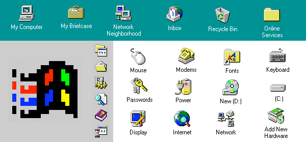
1995 – Windows 95

1997 Macintosh OS 8 — Brighter Icons for Mac

In Mac OS 8 the icons are now beginning to look brighter and rendered to show a strong light source. Macintosh also starts to implement an isometric style with a strong "drop shadow".

1997 – Macintosh OS 8

2001 Mac OS X v10.0 — Jelly Mac

Mac OS X was released around the time I was studying for my degree in Multimedia. Lovingly called the "Jelly Mac" by most of the students. We couldn’t help but notice the ultra shiny and plastic-jelly like finish of the icons. The icons in OS X are also a huge leap forward in design from the previous OS 9, which was released just two years earlier (OS 9 looks almost the same as OS 8 above.) Presumably, due to the Dock, the icons are rendered either from a straight forward point of view or slightly above. Designed around the new Aqua theme, icons show complex reflections, highlights and textures. Without the Aqua theme, I doubt that icon design would be as desirable as it is today.
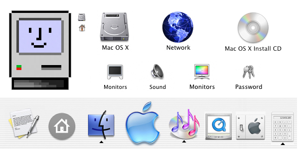
2001 – Mac OS X v10.0

2001 Windows XP — Bright Soft Icons

In 2001 Microsoft introduced, yet another, completely new OS system. Adopting a saturated color palette, the icons are rendered with a soft illustrative look that uses a single light source and a semi transparent drop shadow. They continue to use the isometric style.
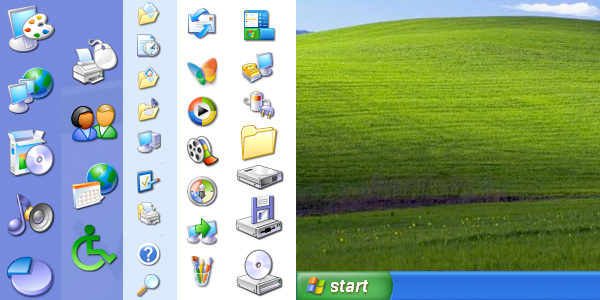
2001 – Windows XP

2007 Mac OS X Leopard — Reflective Dock

Mac ditches the stripes and adopts a 3D reflective doc for the icons to "sit on". The use of chrome, glass and reflections is as popular as ever. The icons don’t change much from v10.0.
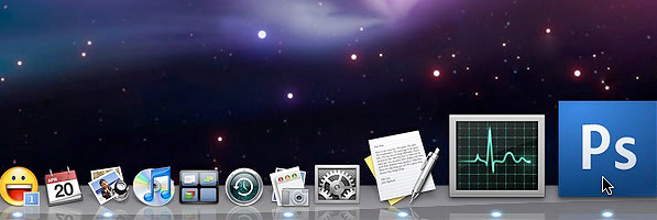
2007 – Mac OS X Leopard

2009 Windows 7 — Soft and Reflective

The Windows 7 icons are completely different from Windows XP and similar to Windows Vista. The major difference between Vista and 7 is the direction the icons are facing. I haven’t been able to find any official documentation on the change, but I’m not the only one who’s asking the question. The icons in Windows 7 are also softer and more glassy than previous ones.
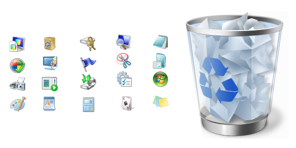
2009 – Windows 7

Resources & Further Reading

More to Come Soon

In the next installment (Know Your Icons Part 2 – Modern Icon Design) we will be delving further into the world of icons and exploring what icons mean to us today.


Need 1500 votes on a website / poll (with different IPs) by prshp

I need 1500 votes on a website before August 27. I will provide the direct link to vote, no searching necessary. Only one vote is possible per one IP adress, so you may have to use proxies etc Each vote has to be confirmed by entering a valid email adress… (Budget: $30-250, Jobs: Advertising, Data Entry, Internet Marketing, Social Networking)


DHTML, AJAX, JQuery – Graphics & Text Sizing & Positioning by schuurman

This is a small project to demonstrate your DHTML skills. We will select probably two user interface developers. Additional project work may be available for you. Our web app is a presentation slide designer… (Budget: $30-250, Jobs: AJAX, CSS, HTML, jQuery / Prototype, XML)