10 Crazy Must-See Camera Tripods and Mounts
How to Set Up and Shoot an Enchanted Photoshoot in the Woods
Can You Hack Your Own Site? A Look at Some Essential Security Considerations
Getting Started with CouchDB
20 Outstanding GraphicRiver Flyers and Posters
Putting together a party or an event can be stressful enough without having to worry about the invitations or promotional material. Recently, GraphicRiver has been collecting a ton of really cool flyer/leaflet templates that are ready for print. We wanted to highlight some the variety of templates that are available for your next business or personal shindig.
1.Legacy Poster/Flyer Template

Legacy Poster/Flyer Template
This sexy event poster comes packed with 7 different styles to try out. There are many layers to move around/change blend mode etc. to create unique looks.
2.Full Page Magazine Ad or Flyer Templates

Full Page Magazine Ad or Flyer Templates
This high resolution magazine or flyer ad is ready for print and includes all the bleed, cut and text safe guides you’ll need.
3.Flashy Nightclub / Event Poster-Flyer

Flashy Nightclub / Event Poster-Flyer
If you like the night life as much as you like to boogie, you’ll love this retro nightclub event poster/flyer. Includes several variations.
4.myFlyer – Party Celebration Flyer
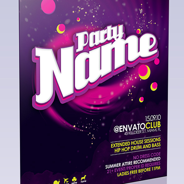
myFlyer – Party Celebration Flyer
This colorful party flyer really pops off the page. Also, there’s no rasterized layers to worry about; all the text is fully editable!
5.Get Minimal – Flyer 02

Get Minimal – Flyer 02
If you love the classic style of strong typography mixed with minimalist design, you’re going to love this flyer. Feel free to change colors, positions and typefaces.
6.Club Flyer Template

Club Flyer Template
Grab their attention with this flyer/poster for your next club event. The photoshop document is well organised and super easy to edit.
7.Business Flyer Template With 4 Color Schemes

Business Flyer Template With 4 Color Schemes
When the party is over, it’s time to get back to business. This attractive business flyer comes with 4 different color schemes.
8.Business Sale Postcard Mailer

Business Sale Postcard Mailer
Mailouts can get pretty expensive, so don’t waste your money on a blah looking one. This 8.5 x 5.5 postcard template is ready to send!
9.Indie Flyer

Indie Flyer
Be sure to wear your flannel for this Alternative inspired party flyer. Suitable for a festival, concerts, special evening in a club, concerts or parties.
10.Wavy Style Flyer Template

Wavy Style Flyer Template
This clean and professional flyer template is perfect for a business flyer or mailout. Print bleed lines included.
11.Music Festival Poster & Flyer
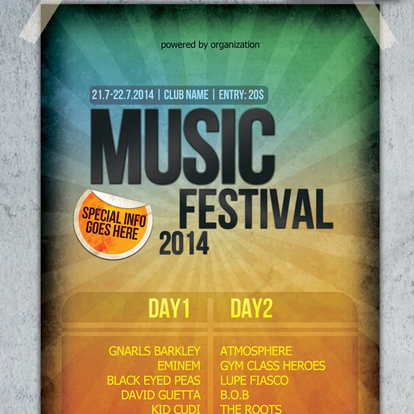
Music Festival Poster & Flyer
A touch of grunge and eye-catching colors will make this poster/flyer stand out. Also included is a smaller version for mailouts.
12.Green Valley Poster Template
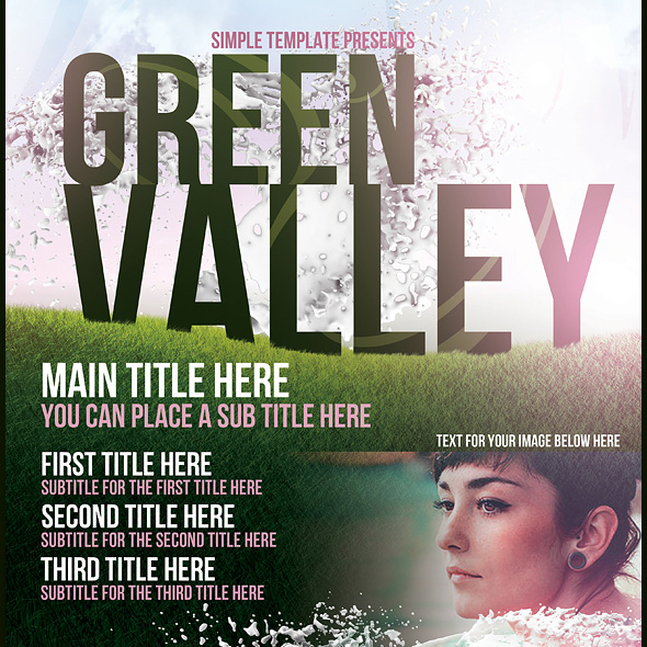
Green Valley Poster Template
Got a summer blockbuster in the works? This poster template would go well with your next indie movie screening or off-broadway play.
13.Contemporary Flyer Template
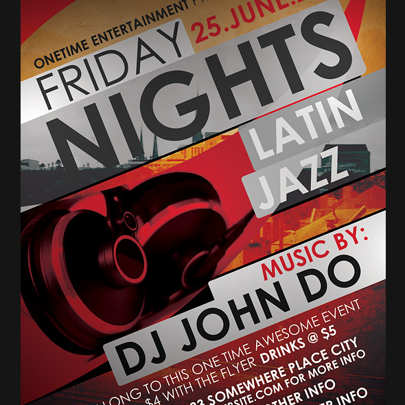
Contemporary Flyer Template
Bold typography and images make this flyer jump out at you. Comes with several different styles and sizes.
14.Typographic Poster Template
Typographic Poster Template
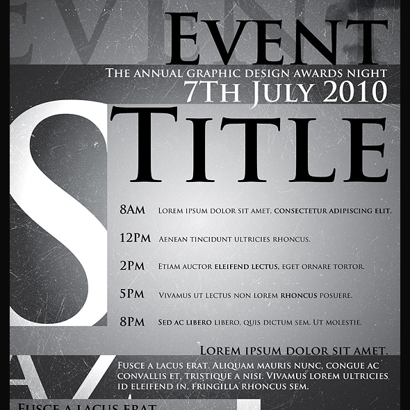
Who says text-only can’t be beautiful? This poster template combines texture, light and typography to deliver a high quality product.
15.Business Flyer Template

Business Flyer Template
This flyer template is perfect for a business that wants a clean, modern look. 3 color schemes are included.
16.Clean Simple A3 Poster and A6 Flyer

Clean Simple A3 Poster and A6 Flyer
If you’re looking for a flyer or mailout with tons of breathing room, this is your template. Every layer is vector based, no pixel layers, patterns, or smart layers so it is completely editable and scalable.
17.Sensation Flyer
Sensation Flyer
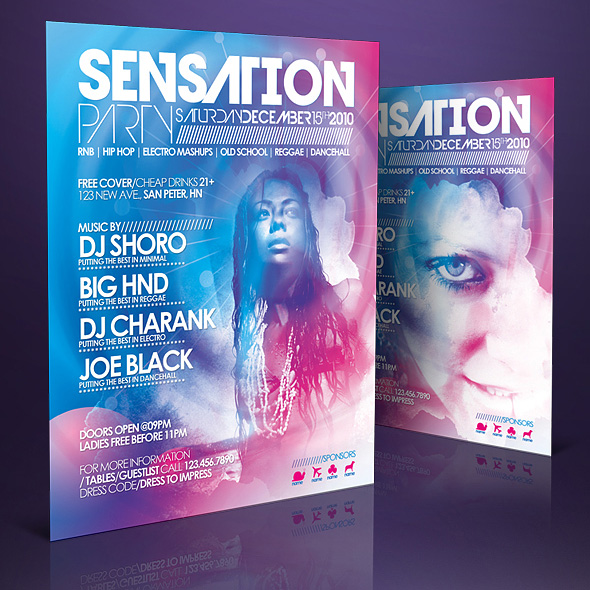
As sexy as it is sensational, this flyer template really grabs you. Ultra easy to modify, change colors, dimensions and place your own photos.
18.Elegant Product Flyer

Elegant Product Flyer
If you’re looking to announce your newest product, you can’t go wrong with this clean, elegant flyer template. Super simple to change text and images of your own.
19.Poster Template

Poster Template
Stars, grunge, bold typography – what’s not to love? This poster template is quick to adapt and edit.
20.Outline – Business Flyers

Outline – Business Flyers
Keep things professional with this cool business flyer template. Three different versions are included along with video instructions on how to edit and use the files.
Sell Your Own Design Templates?
GraphicRiver has been growing very fast and top authors there earn thousands of dollars a month these days. If you’ve got the skills, you should consider uploading your files for sale! Anyone can join and become an author, and with a bit of work you’ll get to enjoy a nice, steady income stream.
Learn more about selling on GraphicRiver
Win a Free HP EliteBook 8740w Laptop
A couple months back I had the opportunity to review an HP EliteBook 8740w Workstation laptop for HP. HP sent me this computer for free and asked me to unbox it, use it, and then give my honest opinion of it in a review. If you follow my personal account on Twitter, you may have seen some of my tweets about it. I put my computer through the ringer. Played a lot of video games and really pushed this laptop to its limits. I had a lot of fun doing this and overall, really liked this machine, even though it was a PC and not a Mac. With that said, after I finished reviewing the machine, HP agreed to give another one of these machines away to one lucky reader of my website.
Instead of giving this machine away on my Colorburned site, I decided to instead, give it away here on Psdtuts. I decided to do this, mostly because Psdtuts is a much bigger site than my Colorburned site and I wanted to give as many people the opportunity to win a new computer as possible.
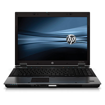
Before I tell you how you can win this computer. First, you should probably know a little about it. The computer that you may win is exactly like the one that I reviewed. It’s a beast! It has an Intel Core i7-740QM (1.73ghz, 6mb L3 Cache) processor, 8gb DDR3-1333 memory, 17 inch WUXGA (1920×1200) LED-backlight DREAMCOLOR display, an NVIDIA Quadro 5000m with dedicated 2gb DDR5 workstation-class GPU, 500gb 7200RPM HD, Full-sized backlit keyboard, 230w external power adapter, it also includes a fingerprint scanner, ambient light sensor, dual microphones, a three button trackpad mouse as well as a three button point stick mouse, touch-sensitive media keys, a 2.0mp integrated webcam, and a LightScribe DVD +- RW burner. It’s also got a Bluetooth module and an Intel Centrino Ultimate N Wireless Adapter.
So HP isn’t messing around here. It’s their top of the top of the line laptop. If you were to buy this computer on your own, you’d spend about $5,000 USD.
Now that you know a little about this machine, it’s time to tell you how it can become yours. First of all, we can only ship this machine within the U.S. If you don’t live in the U.S., sorry  . For those of you who do, to win, all you have to do is answer the following question correctly and submit it using this form.
What video game did I play while I reviewed this machine?
Submit your answer here by Friday, March 11, 2011 at 11:59 PM EST. I will select the winner at random from those of you who answer correctly. You can find the answer in a number of ways. Read my review, Google it, or take a look through my Tweets. It doesn’t matter how you find the answer; only that you submit the correct one. You may only enter once. Entering more than once will disqualify your entry. Also make sure that you leave a valid email and shipping address. Otherwise, I can’t send you the machine. Good luck everyone!
Create a Sleek and Clean MP3 Player Interface
In this tutorial, we will design a sleek and clean MP3 player interface. The process involves a lot of manual drawing and lots of layer styles. Let’s get started!
Tutorial Assets
The following assets were used during the production of this tutorial.
- Font Digital-7 from Chess-7
- Font LCD Phone from Raúl Andrés Pérez Canseco (Grafito Design)
Step 1: Background
Let’s start by creating a background for our mp3 player. Draw a radial gradient from white to gray.

Step 2
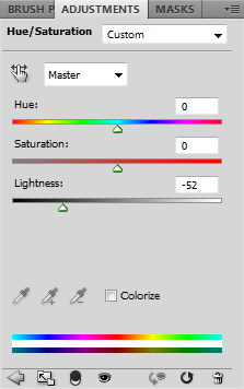
Darken the gradient by adding Adjustment Layer Hue/Saturation. Reduce the Lightness setting.

Step 3
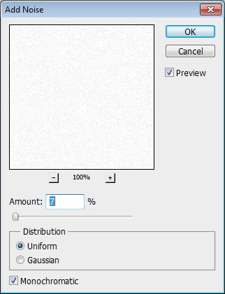
Create a new layer and fill it with white. Make sure you have white and black as foreground and background by pressing D. Click Filter > Noise > Add Noise. Set Distribution to Uniform and select Monochromatic.

Step 4
Change the blending mode of the layer to Multiply.

Step 5
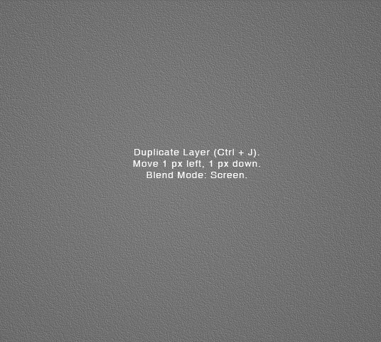
Duplicate layer by pressing Command/Ctrl + J. Move layer 1 px left and 1 px down by activating tool move then press left arrow then down arrow. Change blend mode to Screen.
Step 6
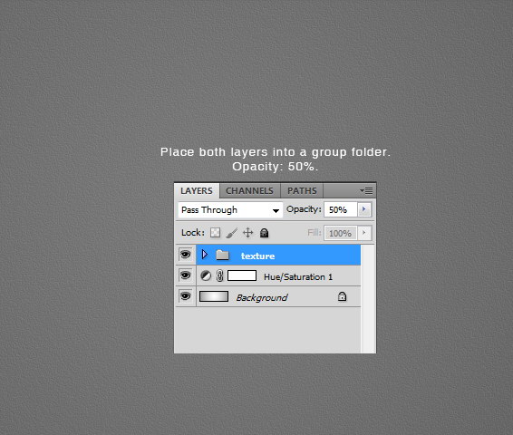
Put both noise layers into a group folder and reduce its Opacity to 50%.
Step 7: MP3 Basic Shape
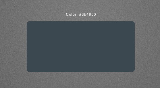
Create a rounded rectangle on the canvas. Use #3b484f as its color. Add following layer styles.
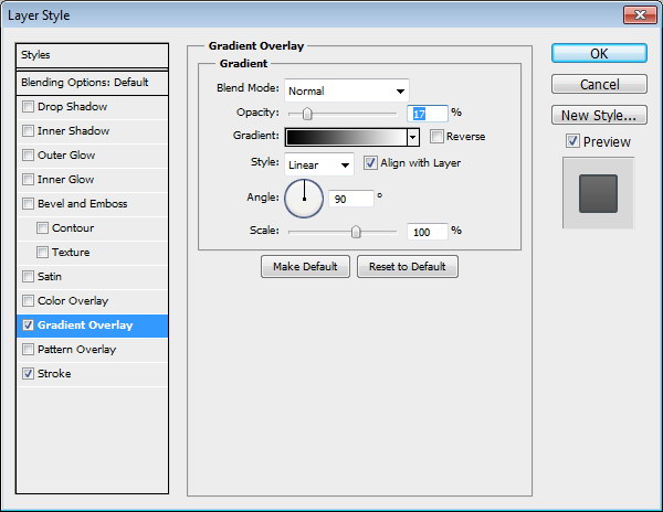
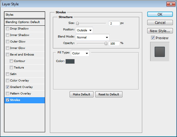
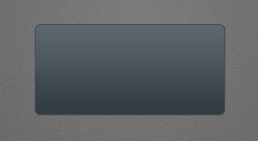
Step 8: Screen
Draw a smaller rounded rectangle. Add following layer styles.
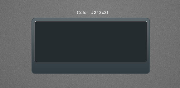
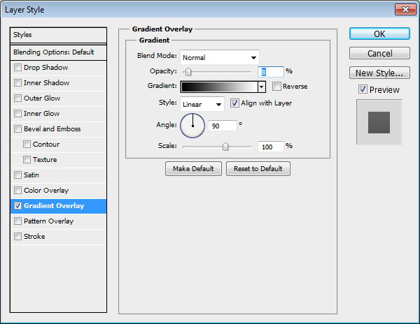
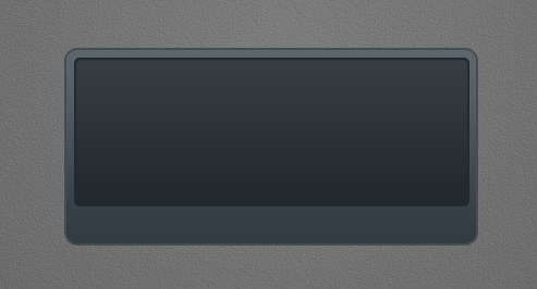
Step 9: Album Info
Add a small rounded rectangle. We’ll use it as a container for album cover. Add following layer styles.
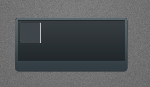
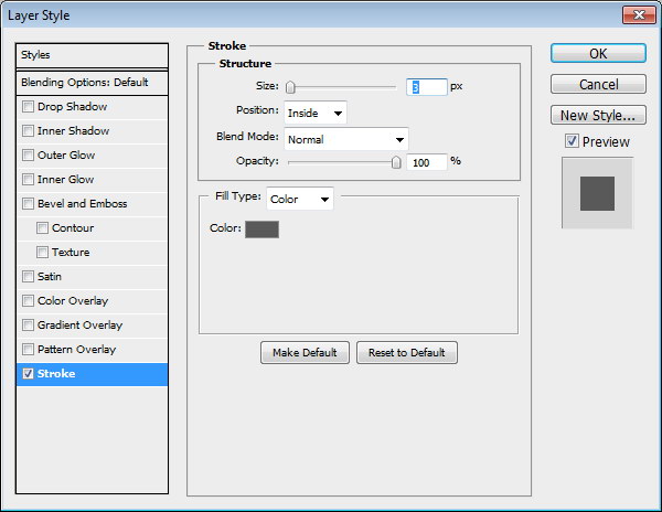
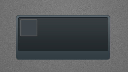
Step 10
Paste a picture on top of the rounded rectangle. Hit Command/Ctrl + Alt + G to convert it to clipping mask and put it inside the rounded rectangle.
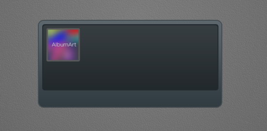
Step 11:
Add artist info, album’s name, and its year underneath the album cover.
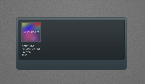
Step 12
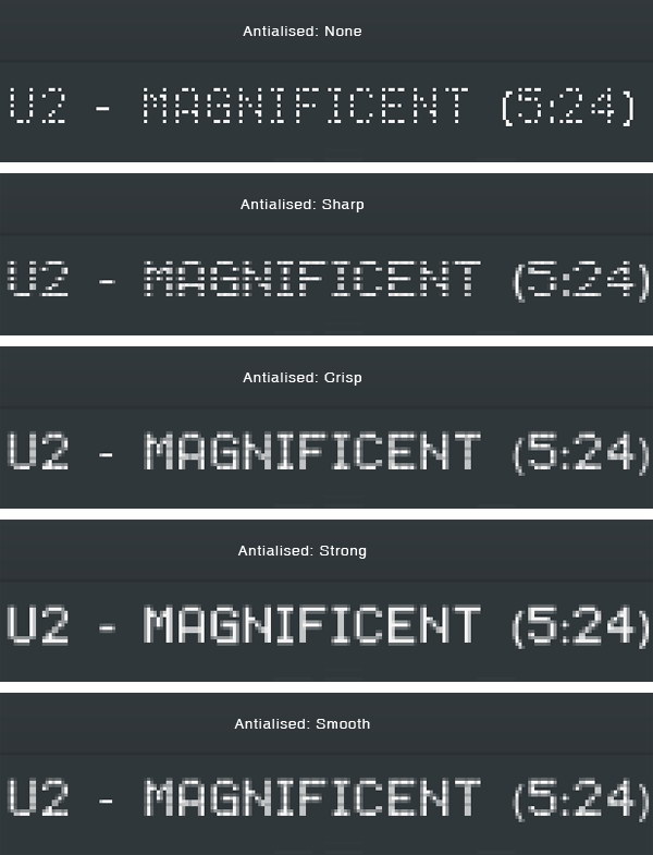
From the option bar, you need to select the best Anti-aliasing methods to prevent blurry appearance. I can’t say which one is better because it’s different for each font type and size. You need to experiment with each setting. As you can see below, in this case None works best.
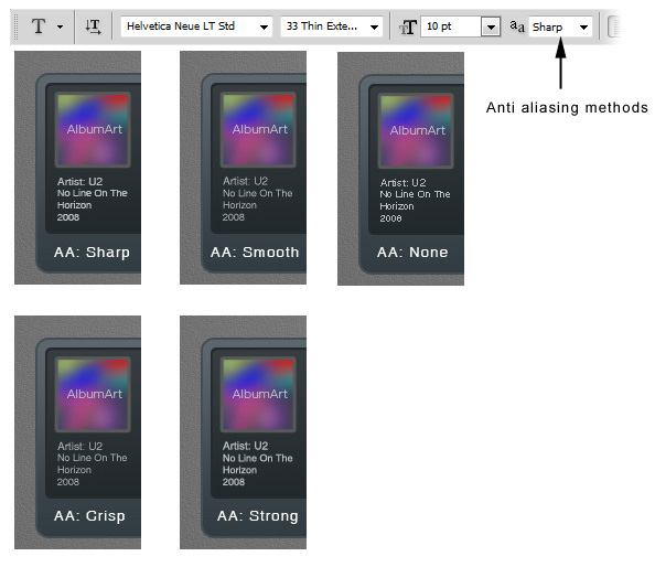
Step 13: Equalizer
Draw a rounded rectangle. Add following layer styles.
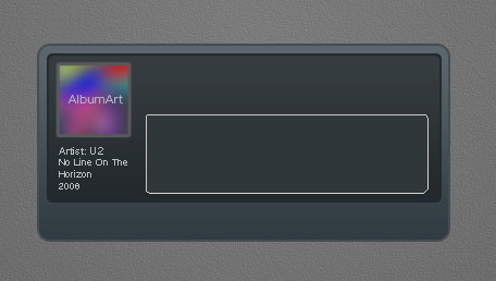
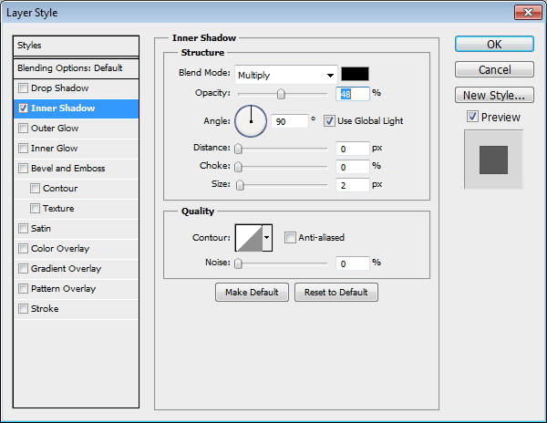
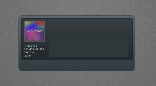
Step 14
Create new layer. Paint white using using a soft brush (Hardness: 0%) with low Opacity (10-15%). This will add a subtle light source under the equalizer.
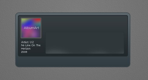
Step 15
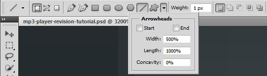
Select line tool and set its weight to 1 px.
Step 16
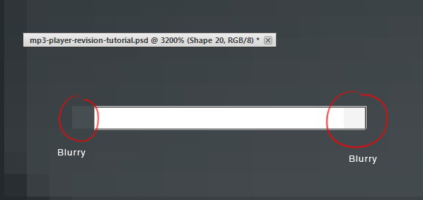
Draw a white line inside the equalizer. Activate zoom tool and click few times to zoom in to maximum view. We need to make sure that the line is not blurry. As you can see below, there is blurry spot on both ends of the line.
Step 17
There are two ways to fix this blurriness. First we need to round up the size. Second is fixing its placement.
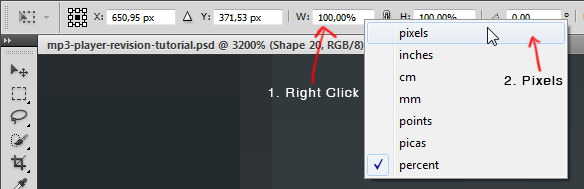
Hit Command/Ctrl + T to transform the line. Right click Width (W) box and select pixels. Do the same to Height (H) box.
Step 18
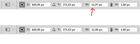
We need to round up the size. In this case we will need to change 11,97 px to 12 px.
Step 19
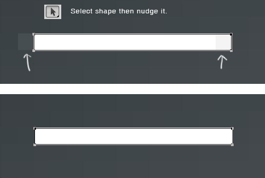
Next, let’s fix its position. Select line shape with tool Path. Hit arrow key to fix its position. Do this until we have no blurry spot.
Step 20
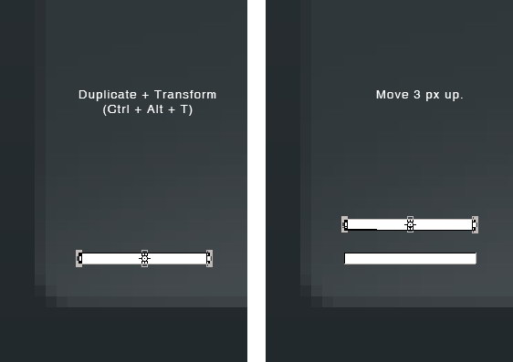
Duplicate and transform the line by pressing Command/Ctrl + Alt + T. Move it upward 3 px..
Step 21
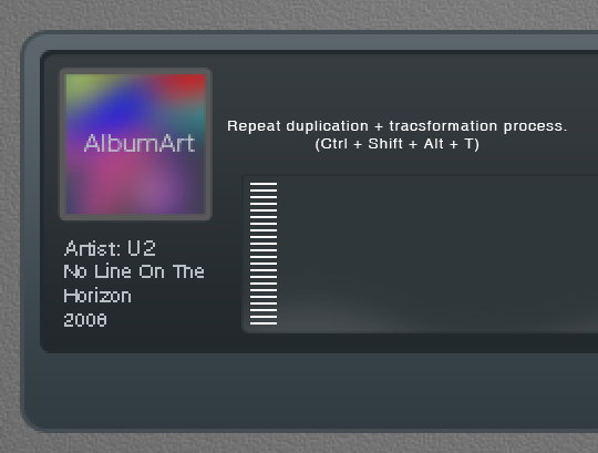
Repeat the duplication and transformation process by pressing Command/Ctrl + Shift + Alt + T.
Step 22
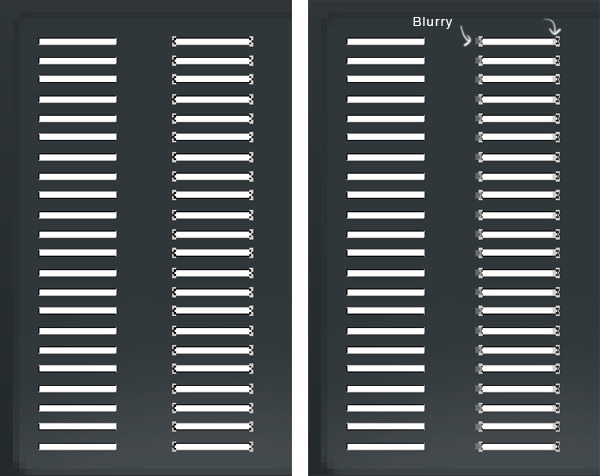
Select all lines, duplicate it and place it to the right. Remember to keep it sharp. Make sure the position is perfect to avoid blurry spot.
Step 23
Repeat this process until we have some columns of 1 px height lines.
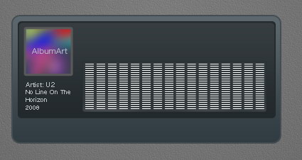
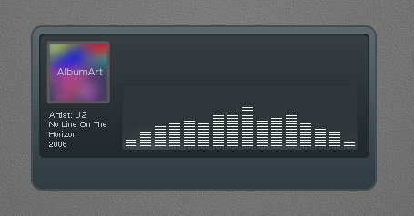
Step 24
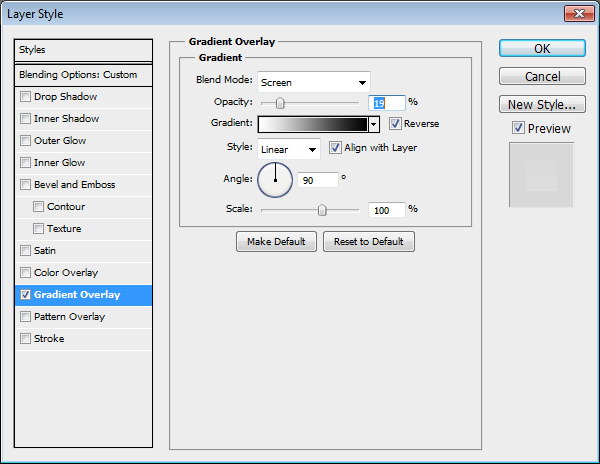
Delete some of the lines until we get a natural shape of equalizer. Add following layer styles. Set Fill to 0%.
Step 25: Song Info
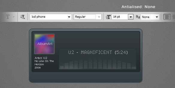
Add artist name, song title, and total track time on top of the equalizer. I’m using font type LCD Phone here. The Anti-aliased Method used here is None.
Step 26
Below, you can see the result with each Anti-aliased method.
Step 27
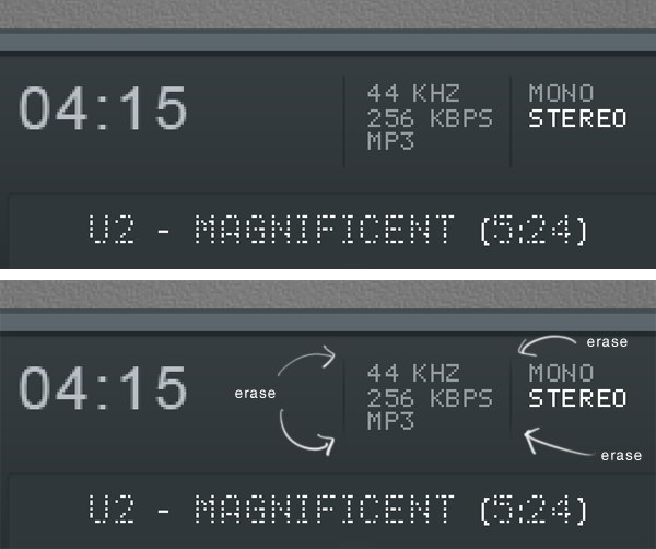
Add more text for more info on top of the LCD. Use Pencil tool to draw a small black 1 px line separating each text. Erase both ends of these lines.
Step 28
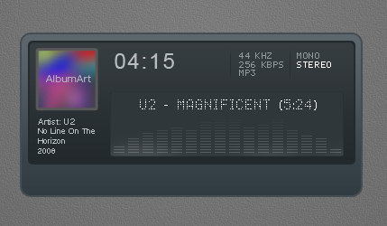
Hit Command/Ctrl + 1. Let’s step back and see the result we have so far in 100% view. This is important to make there’s no blurry spots in our design.
Step 29: Main Buttons
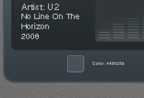
Draw a small rounded rectangle for the button.
Step 30
Again, we need to check its size and position to avoid blurry spots. Hit Command/Ctrl + T and make sure to round up its size.
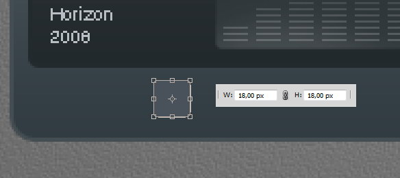
Step 31
Make sure to check its position, we don’t want to see blurry edges.
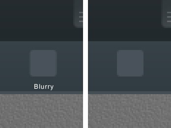
Step 32
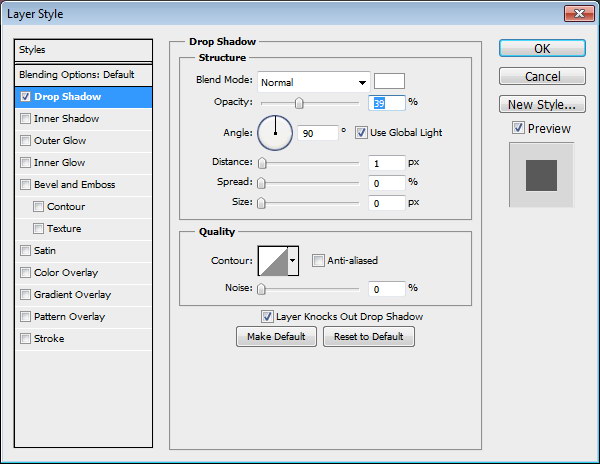
Add following layer styles.
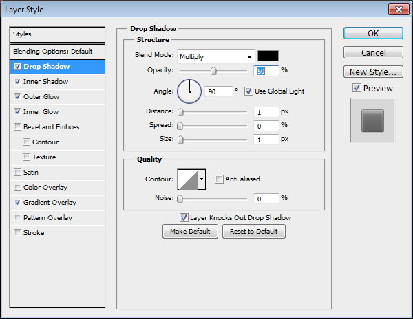
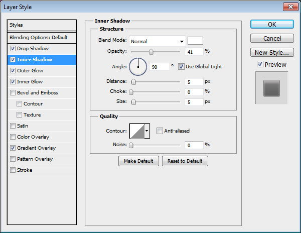
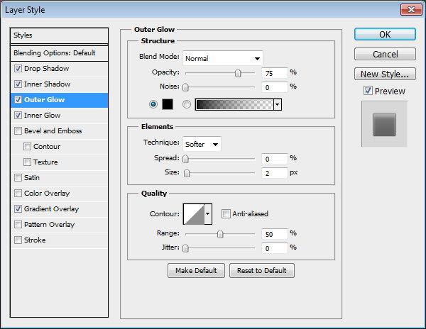
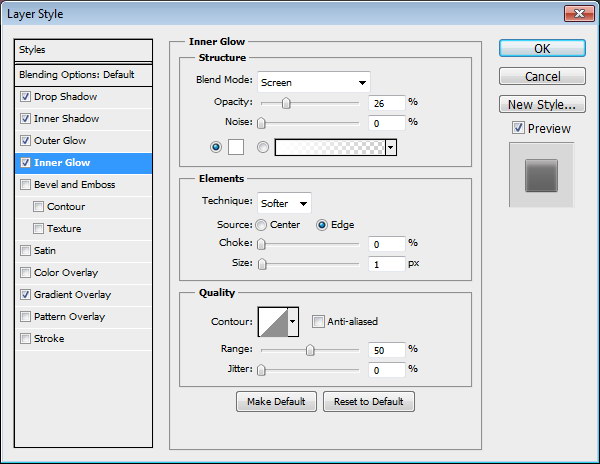
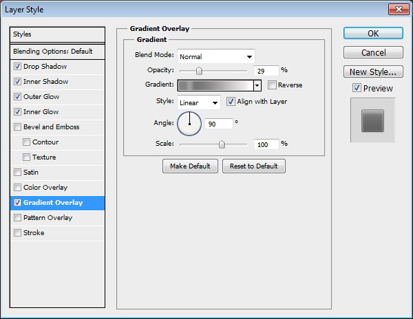
Step 33
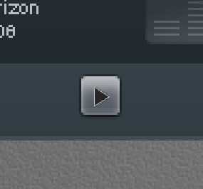
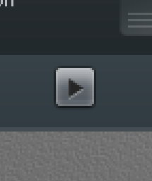
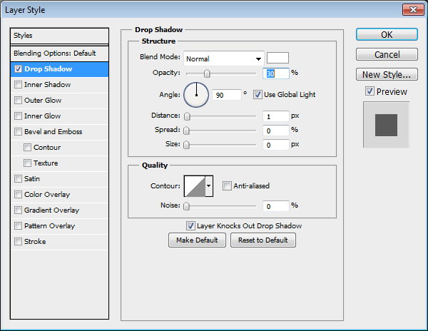
Draw a black triangle on top of the button. Add Drop Shadow with following settings.
Step 34
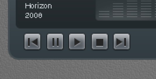
Repeat the process to create more buttons.
Step 35
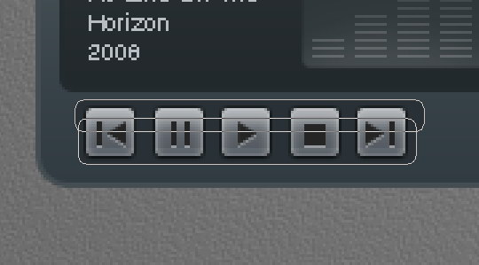
Create button background made from two overlapping rounded rectangle. Add following layer styles.
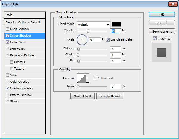
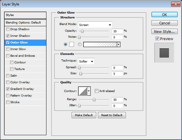
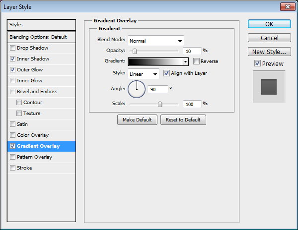
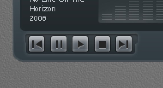
Step 36
Let’s step back again and take a look at the design in 100% view. We need to make sure that there is no blurry spots.
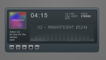
Step 37: Total Time Track
Create a long rounded rectangle. Add this following layer styles.
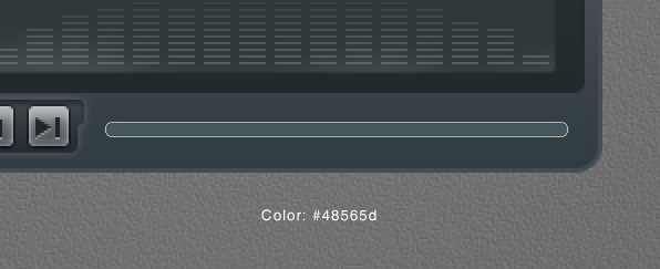
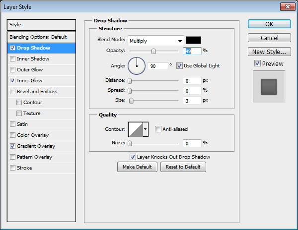
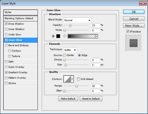
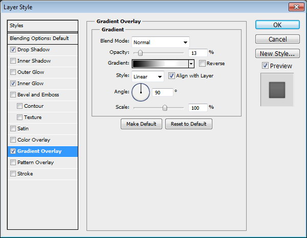
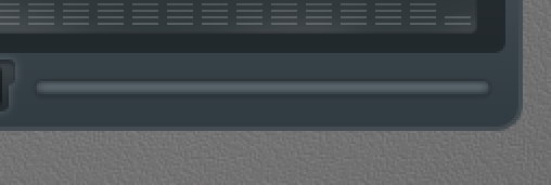
Step 38
Duplicate layer shape we have just created and add these layer styles.
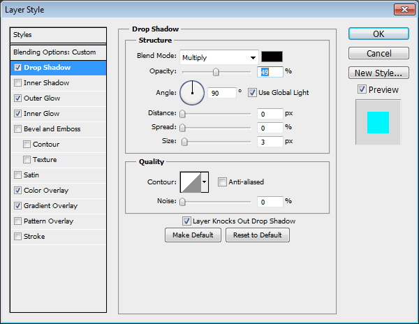
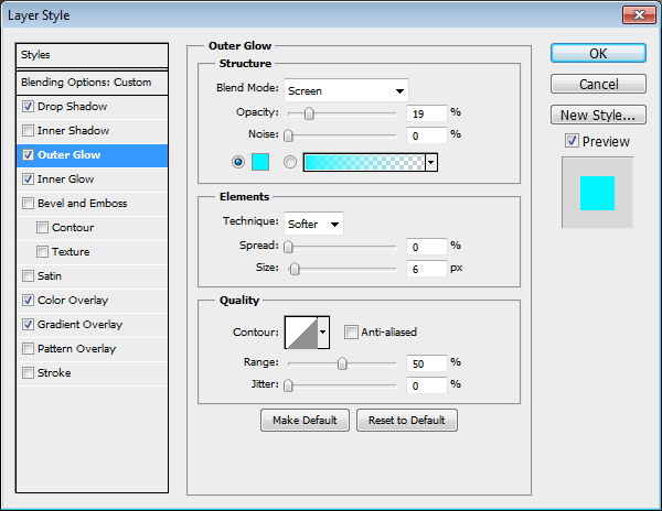
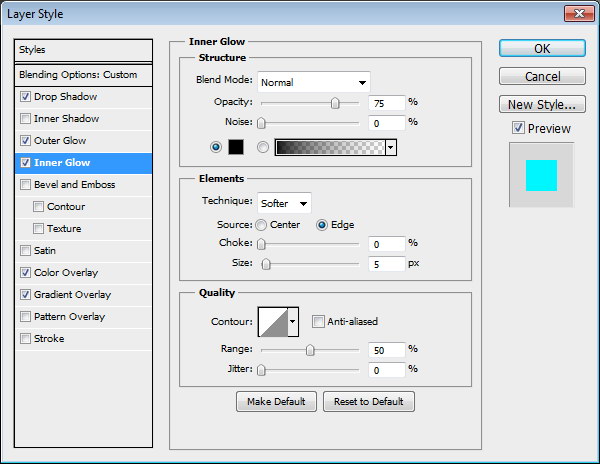
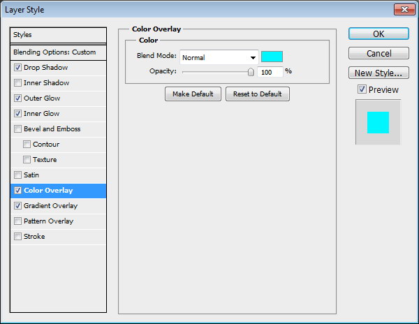
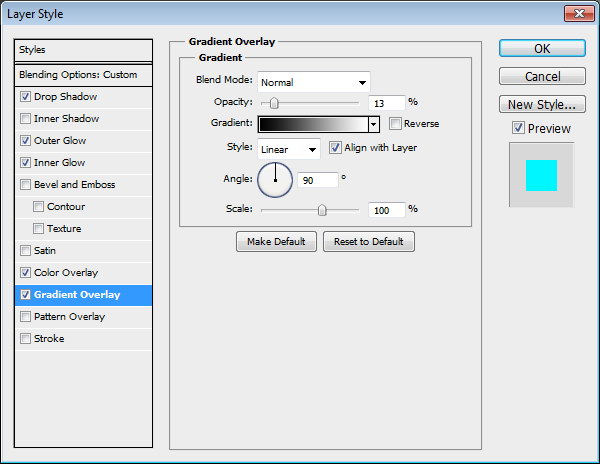
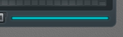
Step 39
Add layer mask. Select half of the shape and fill it with black.
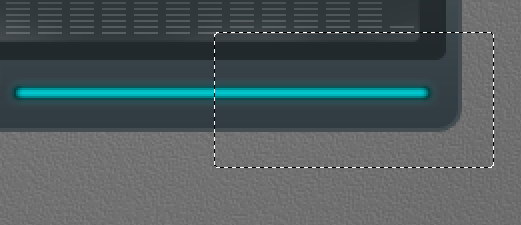
Step 39
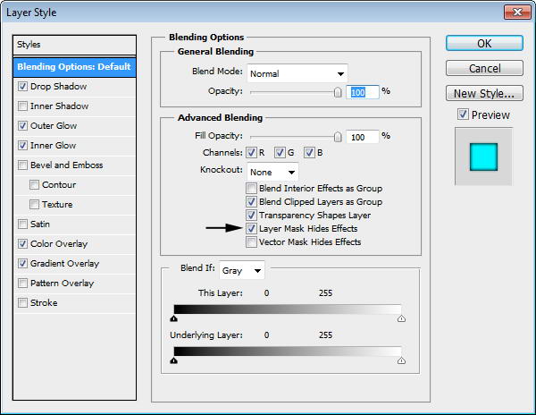
Currently, layer styles are applied to the layer mask and they are adding a rounded shape on right end of the shape. To remove this, activate Layer Mask Hides Effects from layer style dialog box.

Step 40
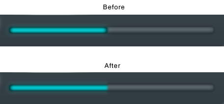
You can see the difference below. The effect from layer style is now hidden by the layer mask.
Step 41
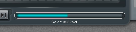
Create bigger rounded rectangle behind the time indicator for its background. Add this layer style.
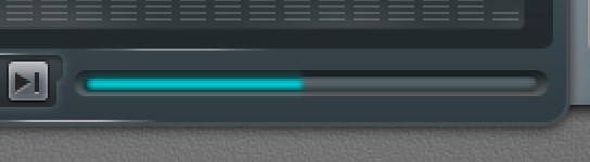
Step 42
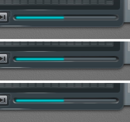
Create new layer on top of the time indicator background. Paint some highlight and shadow. You can see the progress I made below.
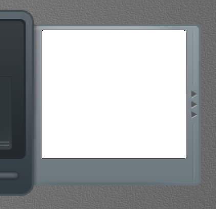
Step 43: Right Window – Playlist
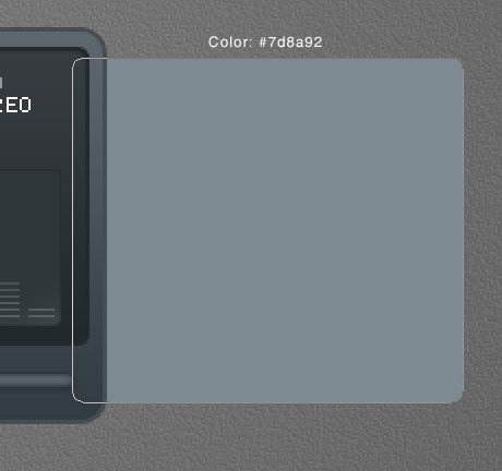
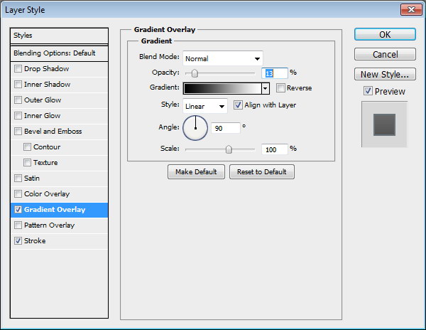
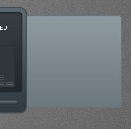
Create a rounded rectangle and place it on right side behind the main shape. Add following layer styles.

Step 44
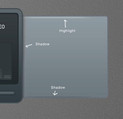
Create new layer on top of the rounded rectangle shape. Paint some highlight and shadows.
Step 45
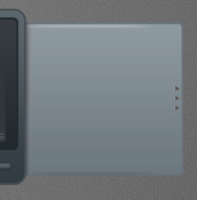
Create some triangles and place them on right side of the shape. Add following layer style.
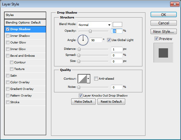
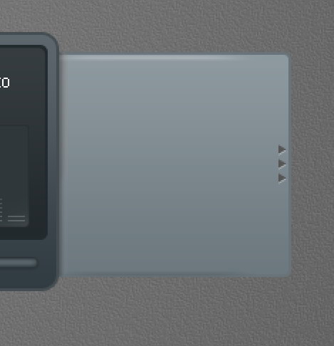
Step 46
Use pencil tool to draw two 1 px line, black and white. Set its opacity to 10%.
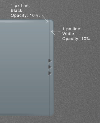
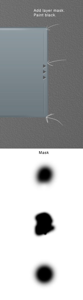
Step 47
Add layer mask and paint some parts of the line with black. Below you can see the mask used here.
Step 48
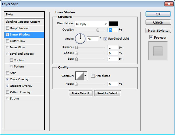
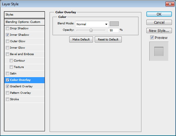
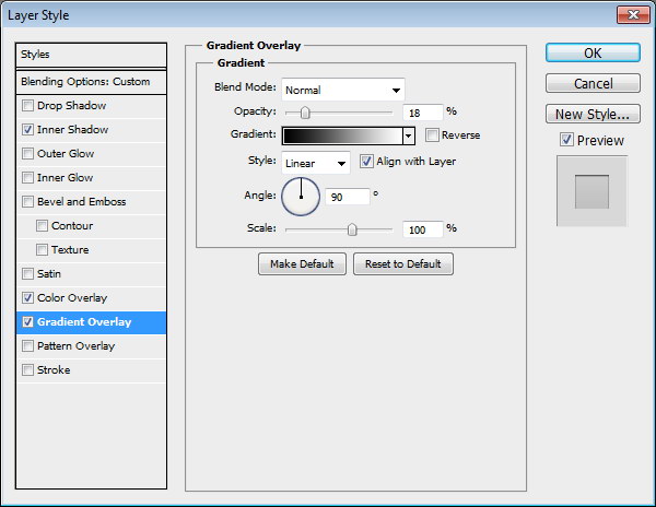
Draw a rounded rectangle and add following layer styles. Set Fill layer to 0%.
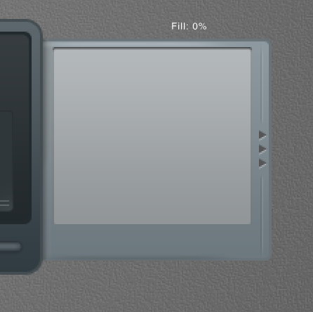
Step 49
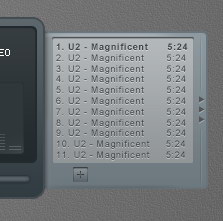
Add song titles. Set one of the songs to bold to indicate it as an active song.
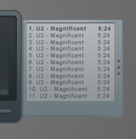
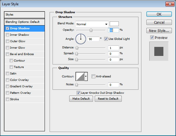
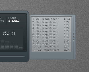
Step 50
Add Drop Shadow to give it inset effect.
Step 51
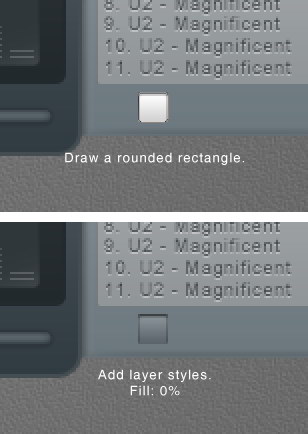
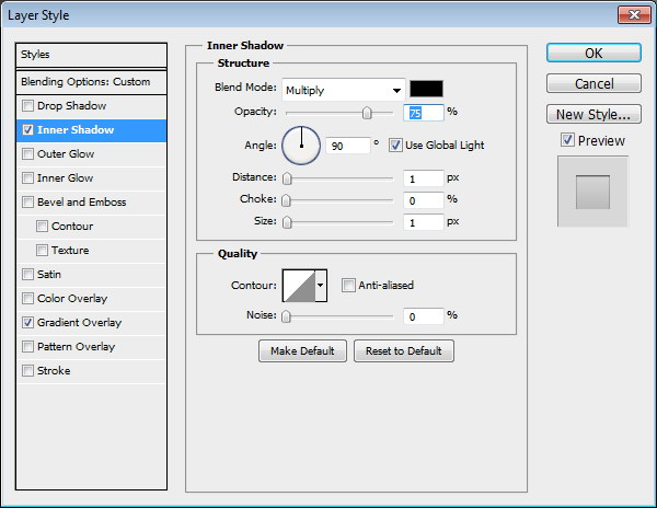
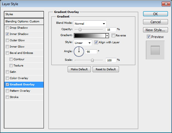
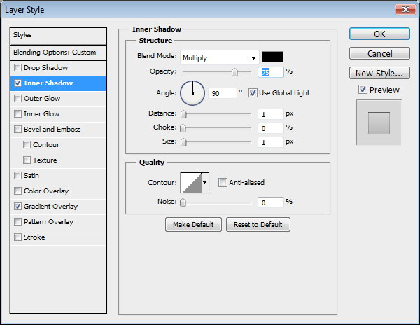
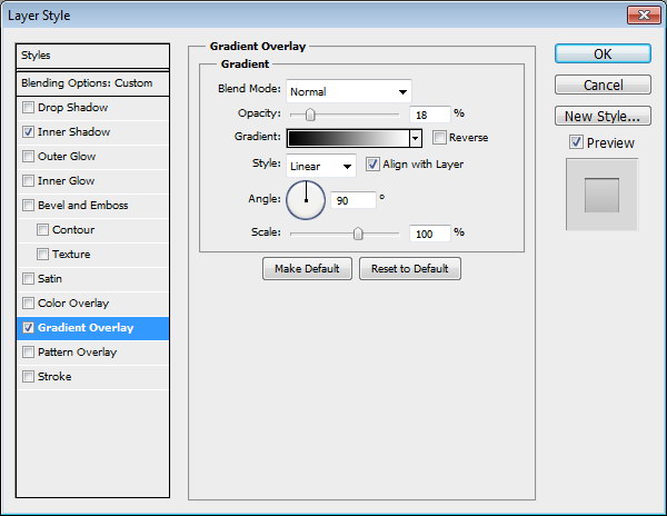
Draw a rounded rectangle. Add following layer styles and set its Fill layer to 0%.
Step 52
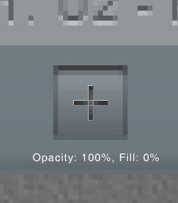
Create a plus sign made from two overlapping line shape. Set Fill to 0% and add these layer styles.
Step 53
Repeat the process to create other buttons.
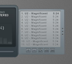
Step 54: Left Window – Player Settings
Duplicate playlist basic shape. Hit Command/Ctrl + T, right click and choose Flip Horizontal. Move it to left side.
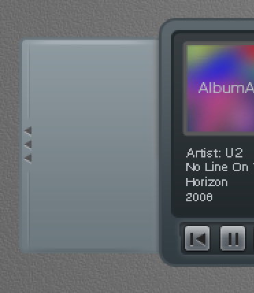
Step 55
Draw a thin rounded rectangle and add these layer styles.
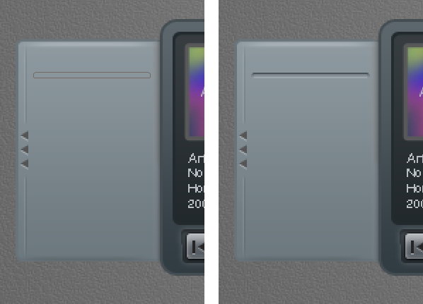
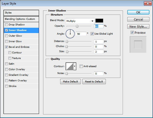
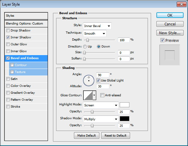
Step 56
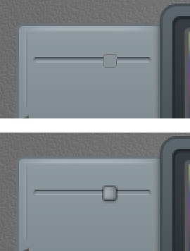
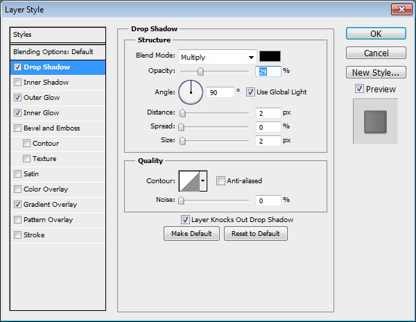
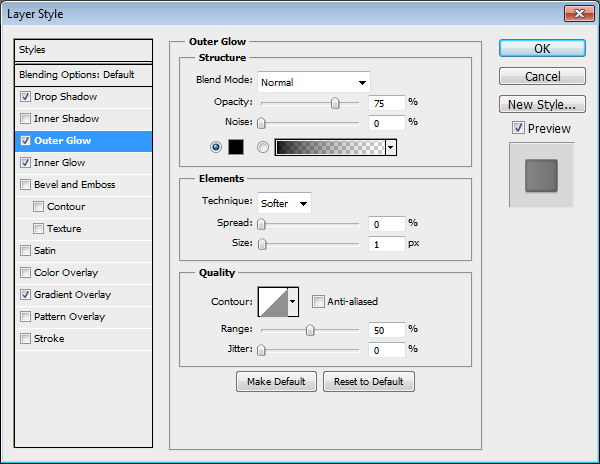
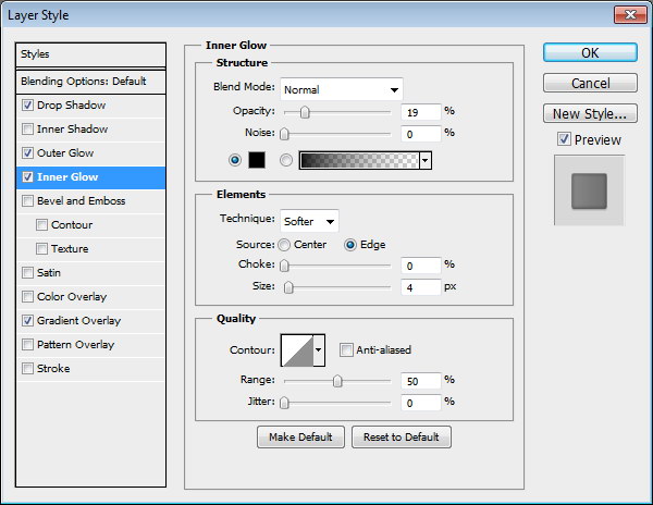
Create a small rounded rectangle for the slider. Add following layer styles.
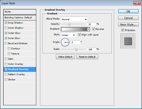
Step 57
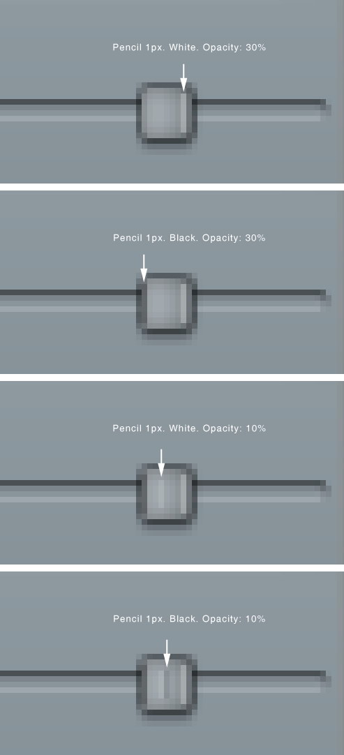
These layer styles is still not enough to get a convincing 3D appearance. Using pencil tool, we need to add some 1 px line detail on the slider. See picture below for reference.
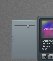
Step 58
Let’s step back and see the result in 100% view.
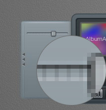
Step 59
Paint some black stripes behind the slider.
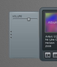
Step 60
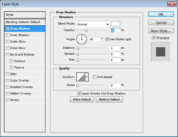
Let’s add label "VOLUME" for the slider. The font used is Digital-7. Add Drop Shadow.
Step 61
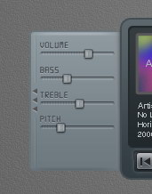
Create another slider by duplicating previous slider and change its label.
Step 62
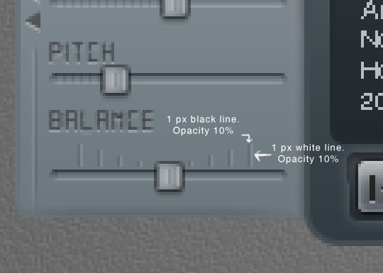
Now let’s focus on creating balance slider since this is a bit different. Add more space between the slider and its label. Delete stripes behind the slider. Use pencil to draw alternating 1 px black and white line. Set the layer’s Opacity to 10%.
Step 63
Add plus (+) and minus (-) character on both ends and add Drop Shadow.

Step 64
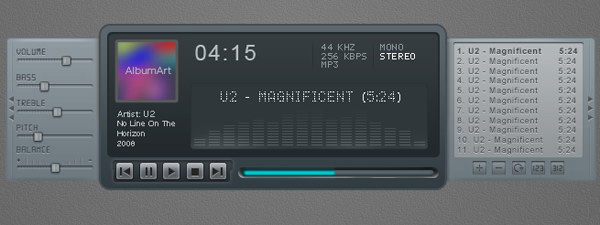
Hit Command/Ctrl + 1 to see the result at 100% view.
Step 65: Highlight
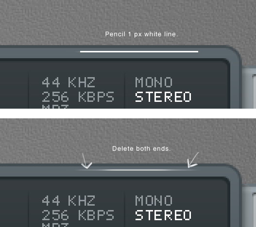
Our design is simply too clean and unnatural. To fix this let’s add some highlights. Draw a white 1 px line using pencil tool. Delete both ends.
Step 66
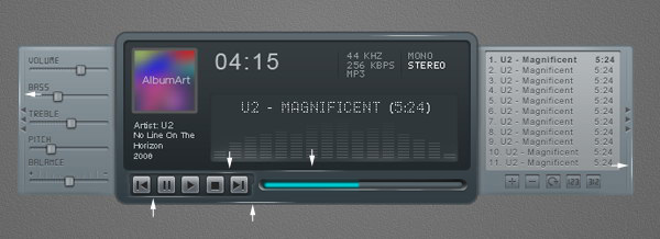
Repeat this process to create another highlights.
Step 67: Shadow
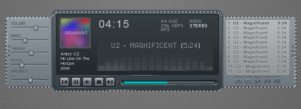
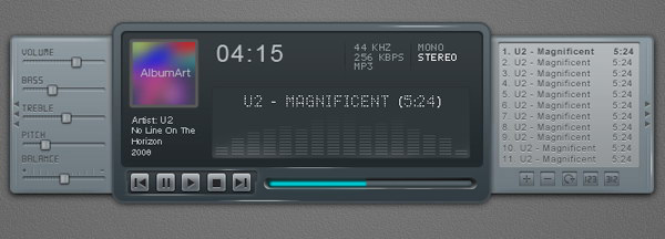
Hold Command/Ctrl and click basic shape, playlist shape, and player settings shape to create a new selection based on the mp3 player’s shape. Press down arrow a few times to nudge the selection down.
Step 68
Create new layer underneath all other layers. Fill selection with black. Presst Command/Ctrl +Shift + I to deselect. Soften the shadow by adding Gaussian Blur filter.
Step 69: Reflection
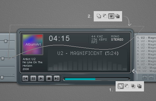
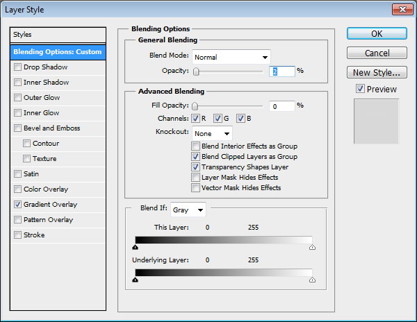
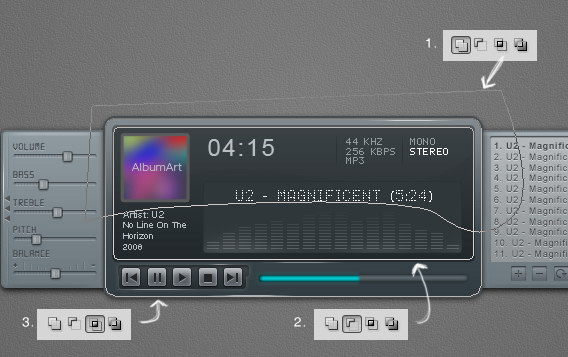
Let’s add reflection onto the surface of the mp3 player. Copy screen path (1). Click Adjustment Layer icon and select Solid Color. You can use any color here. Create another path covering top part of the screen and set it to Intersect (2). Change Opacity to 2% and Fill to 0%.
Step 70
Now we’ll create another reflection on outter side of the main window. Create new path covering top part of the main window (1). Click Adjustment Layer icon and select Solid Color. Subtract it with screen shape path (2). Intersect it with main window shape path (3).
Step 71
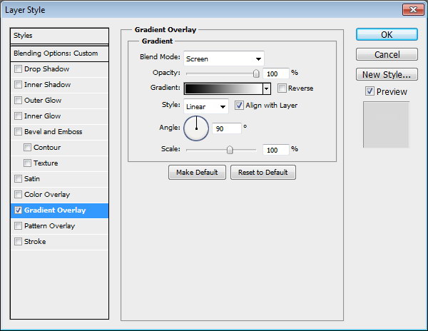
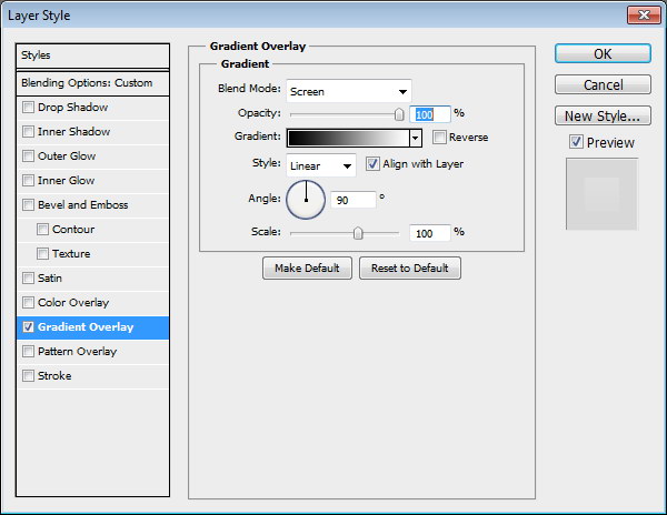
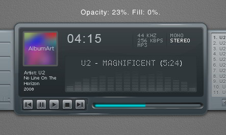
Set Opacity to 23% and Fill to 0%. Add following layer styles.
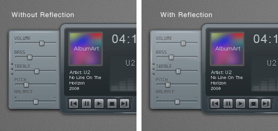
Step 72
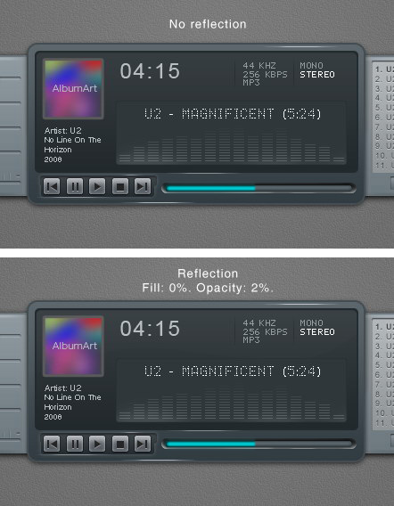
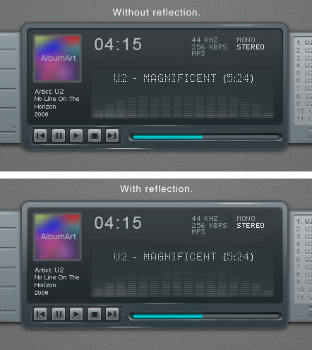
Below, you can see the difference with and without reflection.
Step 73
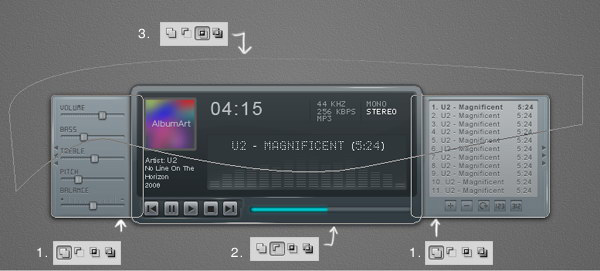
Next we will add reflection on left and right window. Copy left and right window path, set their mode to Add (1). Click Adjustment layer icon and select Solid Color. Subtract path with the main window path (2). Create new path covering top part of the interface and set it to Intersect (3).
Step 74
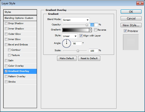
Set Opacity to 10% and Fill 0%.
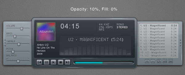
Step 75
Below, you can the difference with and without reflection. Very subtle but it gives more depth onto the shape.
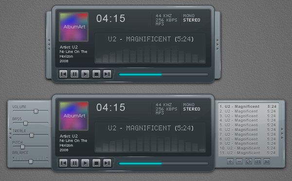
Step 76: Interface with Closed Playlist and Settings
Put all shapes and layer that create the mp3 player into a group folder. Duplicate the group and move the left and right window until they are closed.
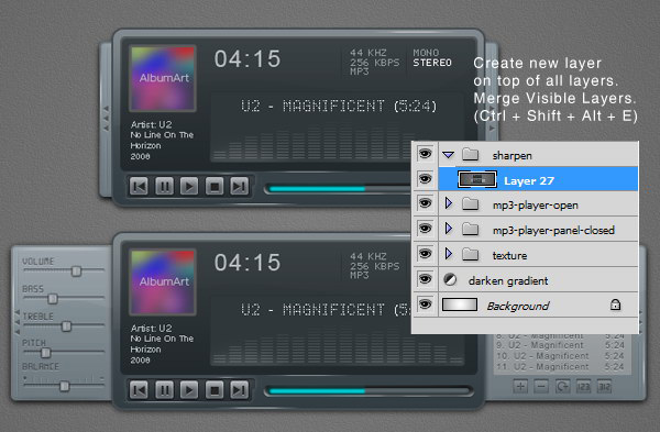
Step 77: Sharpening
We have tried to sharpen every pixel on the interface, we still need to sharpen it again. Create new layer on top of all layer. Hit Command/Ctrl + Shift + Alt + E to merge all visible layers. Now, we have exact duplicate of the image in one single layer.
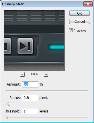
Step 78
Click Filter > Sharpen > Unsharp Mask. This filter will sharpen all the pixels on the layer.
Final Image

Create a Download Folder Icon in Photoshop
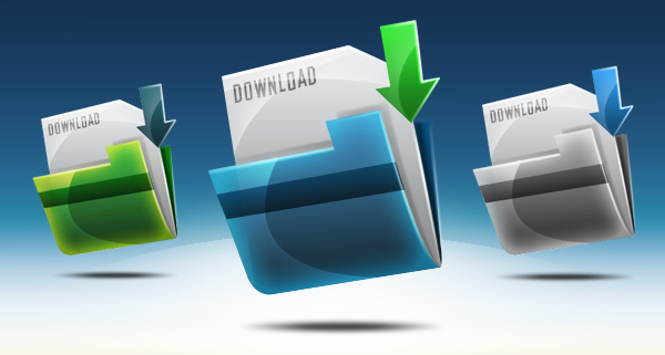
Icons are an important part of most interactive and web design. While icons are small, they can often be challenging to create. In today’s tutorial we will demonstrate how to create a download folder icon using different shapes and reflections in Photoshop. Let’s get started!
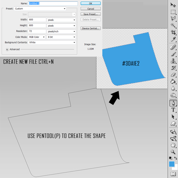
Step 1 – New File/Pen Tool Technique
Open Photoshop and set up a new document (Command/Ctrl + N). Use the following settings:
- Resolution: 72dpi
- Color Mode RGB color
- Dimensions: 600×600 px
Create the following shape using the Pen tool (P).
Step 2 – Creating Shapes Using Pen Tool
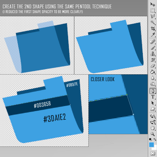
Draw the back part of the folder using the Pen Tool using the same drawing technique. Then draw the stripe as shown.
Step 3 – Finishing the Shapes
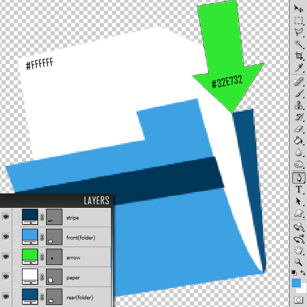
Once you have finished drawing your folder, go ahead and add the paper and arrow as shown. You should now have the following 5 layers. Each shape will be in its own layer. Be sure to give each layer a unique name.
Step 4 – Adding Colour Effects
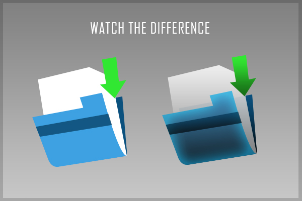
Add the following layer styles to the front part of the folder. Lower opacity to 90%.
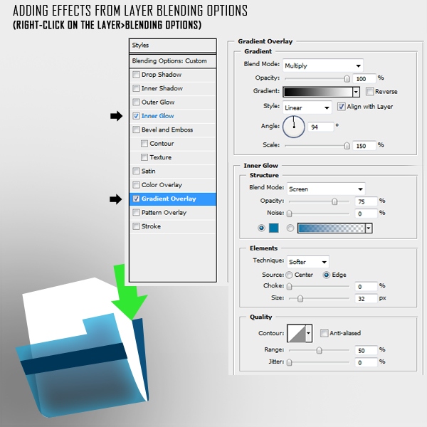
Add the following layer styles to the Paper. Lower the opacity of the layer to around 90-95%.
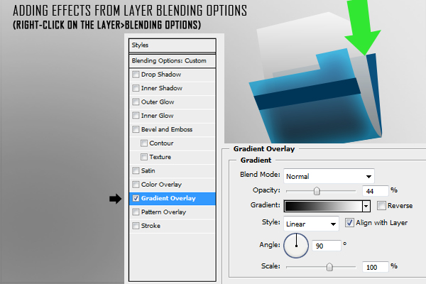
Add the following layer styles to the Stripe.
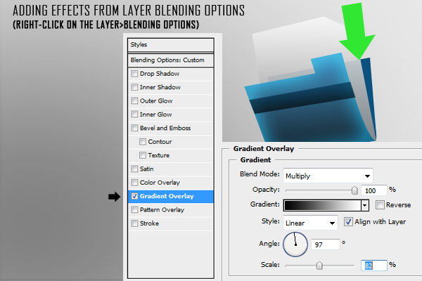
Add the following layer styles to the rear part of the folder.
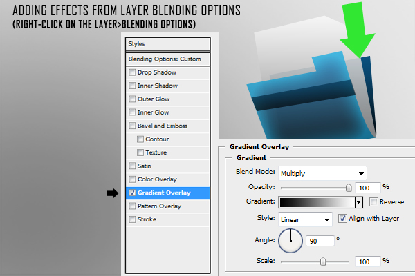
Add the following layer styles to the arrow.
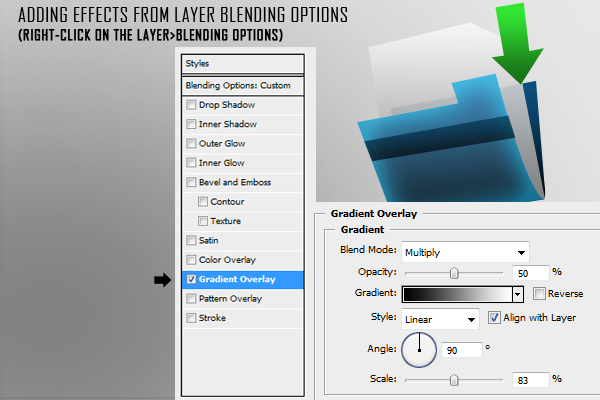
Your icon should now look like this.
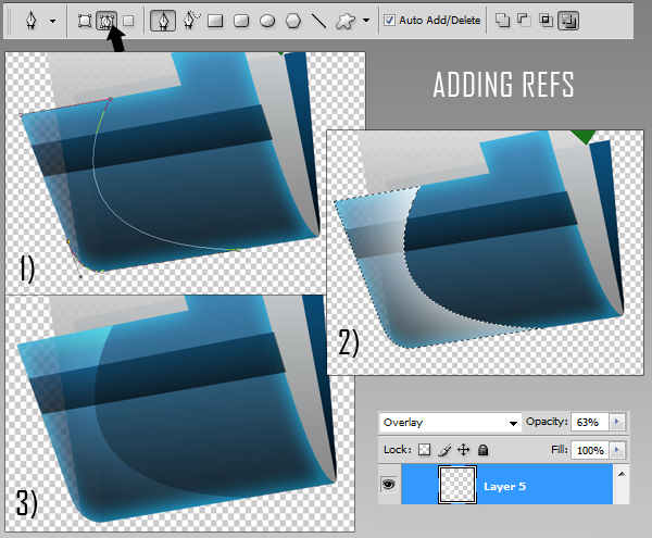
Step 5 – Adding Reflections
Add a new group named "refs." Use the pen tool to draw reflections as shown. Make sure you draw your shapes as paths instead of shape layers (see arrow). After you have closed the path, right-click on the workspace and choose "make selection" (feather 0). Pick up a big brush (master diameter around 470, hardness 0) and brush round the right part of the selection as I did creating a white reflection. Change the blending mode to Overlay and reduce the opacity to 63%.
Step 6 – Margins
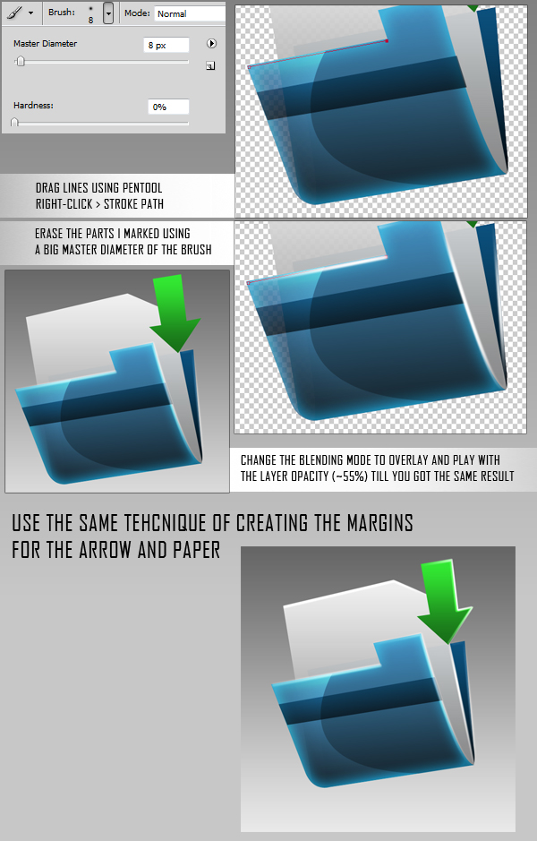
Create a new group named "margins," create a new layer in it (Command/Ctrl + Shift + N). Adding highlights on the margins emphasizes the effect of the 3d icon. Use the pen tool to create the stroke lines around the corners and all the margins of the folder, paper and arrow. Then, right-click on the workspace and choose stroke path – brush. The brush settings must be changed to 8 px master diameter, hardness 0.
Step 7 – Shadows
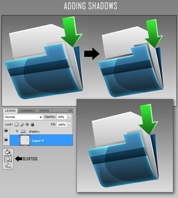
Create a new layer (Command/Ctrl + Shift + N) for shadows and place it into a new group (Command/Ctrl + G). Make selection as you did in step 5 for creating reflections. Fill the selections with black and then blur the margins using the blur tool. If the shadows look too strong, it means that you must lower the opacity of the layer to 40%.
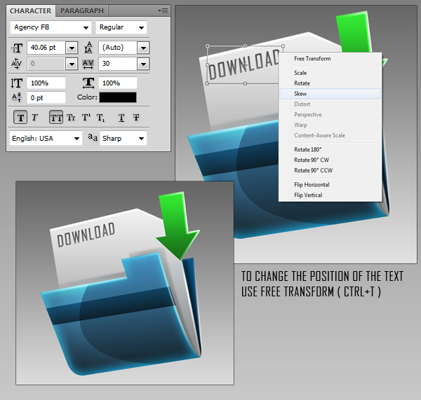
Step 8 – Adding Text
Add text using whichever font you like. In this case, I chose "Agency FB." Font size: 40, Layer Opacity: 75%.
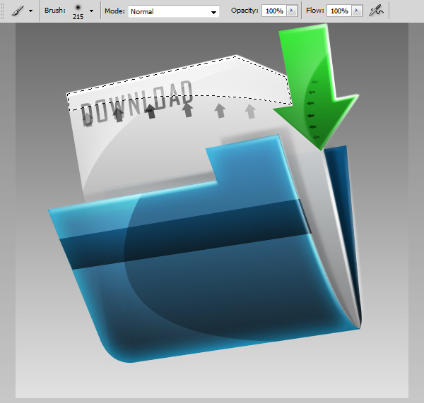
Step 9 – Add the Final Reflections and Shadows
Add some more reflections to the paper using the same techniques we demonstrated in Step 5.
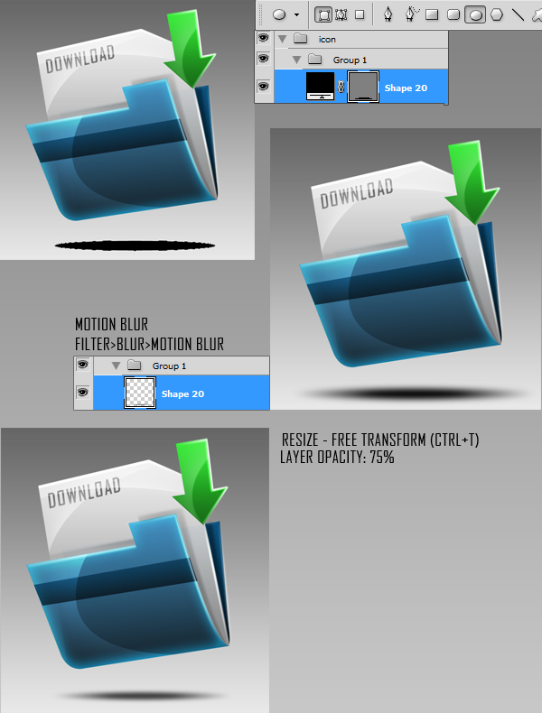
Add a shadow using the ellipse tool (E). Draw an ellipse as shown and add a slight motion blur. Reduce the opacity to your liking.
Final Preview
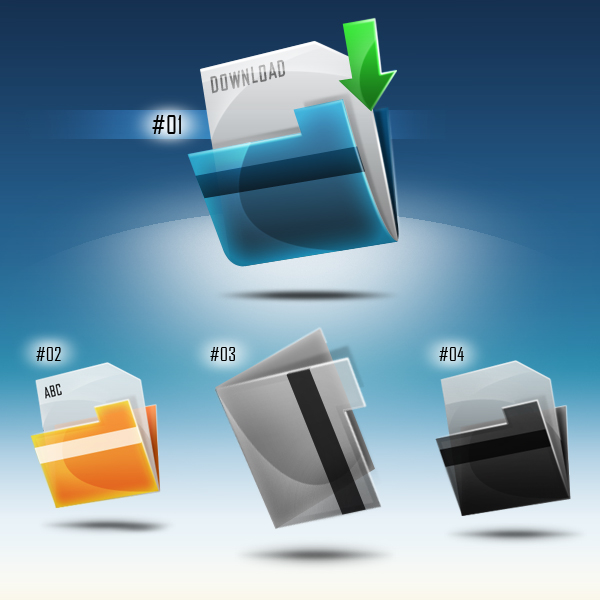
I hope you enjoyed this tutorial. I added some additional icons that I created using the same techniques below.
Create a Glowing, Sci-Fi, Line Art Collage – Psd Premium Tutorial
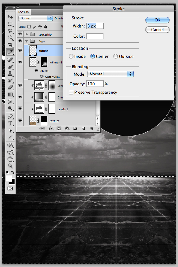
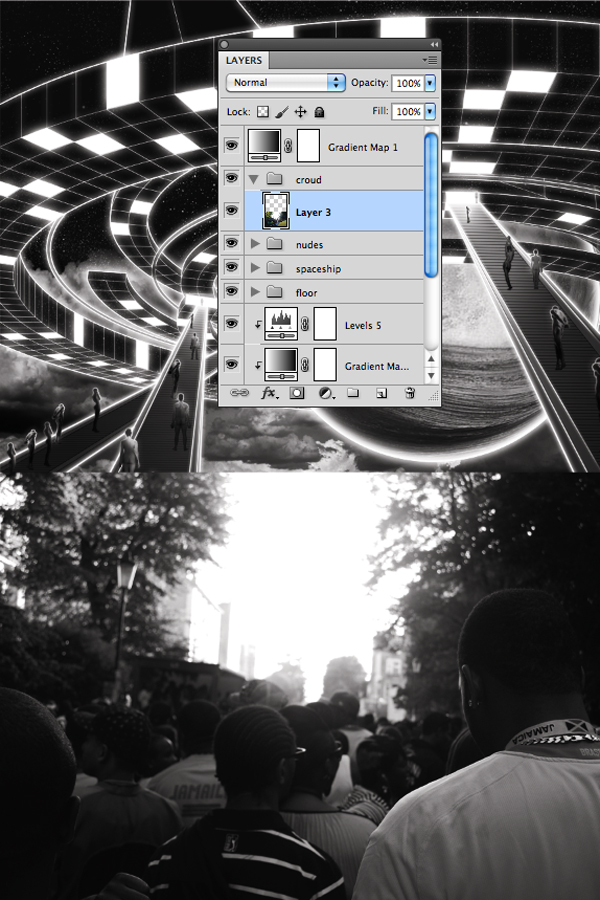
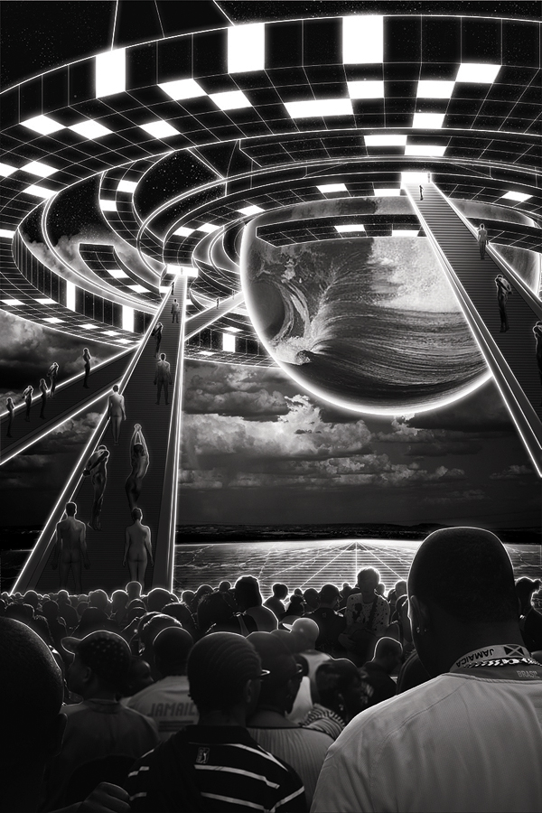
When you’re creating a composition, often you will need to combine stock images with vector line art. In this Psd Premium tutorial, author Kervin Brisseaux will juxtapose various resources using straightforward techniques and subtle photo manipulation to create a dense sci-fi image. If you are looking to take your illustration skills to the next level then Log in or Join Now to get started!
Professional and Detailed Instructions Inside
Premium members can Log in and Download! Otherwise, Join Now! Below are some sample images from this tutorial.


Psd Premium Membership
As you know, we run a premium membership system here that costs $9 a month (or $22 for 3 months!) which gives members access to the Source files for tutorials as well as periodic extra tutorials, like this one! You’ll also get access to Net Premium and Vector Premium, too. If you’re a Premium member, you can Log in and Download the Tutorial. If you’re not a member, you can of course Join Today!
The Answer to All Your Problems: Masking – Basix
Are you new to Photoshop? Have you been trying to teach yourself the basics of Photoshop but have found the amount of educational material available on the net a bit overwhelming? As the world’s #1 Photoshop site, we’ve published a lot of tutorials. So many, in fact, that we understand how overwhelming our site may be to those of you who may be brand new to Photoshop. This tutorial is part of a 25-part video series demonstrating everything you will need to know to start working in Photoshop.
Photoshop Basix, by Adobe Certified Expert and Instructor, Martin Perhiniak includes 25 short video tutorials, around 5 – 10 minutes in length that will teach you all the fundamentals of working with Photoshop. Today’s tutorial, Part 12: The Answer to All Your Problems: Masking will explain how to save selections as layer masks and refine them using the brush tool. Let’s get started!
Best of Tuts+ in February 2011
Didn’t catch your usual Tuts+ reading during February? Here’s a catch-up on the best we have to offer!
Cgtuts+ CG and 3D Tutorials
-
The Soviet Machine’ – Day 1
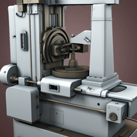
February saw the release of “The Soviet Machine”, a brand new multi-part tutorial series from new Cgtuts+ author Martin Kostov. The ‘Soviet Machine’ is a high poly modeling tutorial for 3d Studio Max. Throughout this amazing series, Martin will show you how to create accurate, highly detailed objects using only a few reference images. This is a great and easy to follow tutorial for both beginner and intermediate 3ds Max users alike. We know you’re going to love it!
-

Tattered Cloth In Cinema4D – Day 1
February also saw the release of an in-depth two part tutorial by new Cgtuts+ author Tony Rivera. Throughout the tutorial Tony shares some of his techniques for creating tattered cloth in Maxon’s Cinema4D. You will learn how to create this effect by making a flag simulation using the power of C4D’s Spline and Boole tools. This is a great starting point for any artist interesting in exploring the possibilities of cloth simulation inside Cinema4D!
-
Tree Bark Textures – CG Premium Content Pack
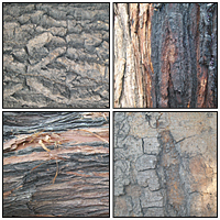
In February Cgtuts+ was pleased to release two amazing texture packs from regular author and contributor Chandan Kumar. Chandan put together a huge collection of 118 awesome, high resolution tree bark textures for our Premium subscribers. These unique textures are presented at full size and in high resolution, sure to meet all of your texturing needs!
Aetuts+ After Effects News and Tutorials
-
Dave Scotland’s 5 Handy Workflow Tips
Today I really wanted to share some workflow tricks that I use on a daily basis in a production environment. Many of you might be familiar with these techniques, but there will be a lot of people that will definitely benefit from these tips. With the exception of the Reel Smart Motion Blur plug-in, all of these processes are built into After Effects. Whether youre a newcomer to After Effects or a seasoned veteran, you will definitely get something out of these great timesavers…
-

Burst Through the Earths Surface In Style
This tutorial has three main parts. It covers the panorama background plate for the scene. It does NOT cover the rotoscoping of the actor (grrrr). Then, the jump is animated with Action Essentials II dirt footage composited in. Finally, the “camera move” effect is demonstrated from an intriguing zoom to epic wide angle!! Get your Jump on!
-

What The Heck Is A Hex Value Anyway?
In today’s Quick Tip, I briefly explain the history of and logic behind a color’s hex value. Enjoy!
Psdtuts+ Adobe Photoshop Tutorials
-
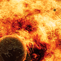
The Cosmos: Create a Red Giant Star in Photoshop
When a star like our own reaches the end of its life, it begins to run out of hydrogen fuel in its core. Like a car running out of gas, it will begin to sputter, swelling to a size that could encompass every planet in our solar system out to Mars. When this happens, the sun will swallow the Earth and will spell certain doom for all life on our planet. Today’s tutorial is part of a 4-part series depicting the journey of the inhabitance of a dying world that must travel into the unknown to find a new world to call home. In this series, we will explore the cosmos from the perspective of this fictional civilization making their way through the universe and will demonstrate the techniques that you can use in Photoshop to depict your own cosmic scenery. In addition to written content, this tutorial also includes about an hour of video instruction to help you along the way. So what are you waiting for? Let’s get started!
-

Create a Fictional Arctic Snow Frog in Photoshop
Photoshop is a great tool to create scenarios that can’t or don’t exist in real life. In today’s tutorial, we will combine several stock images and effects to create a fictional arctic snow frog in Photoshop. As you can see, some of his unfortunate friends are frozen into the ice behind him and his meal is frozen just out of reach. Let’s get started!
-

Does Photoshop Really Cost Too Much?
Let’s be honest, Photoshop isn’t cheap. Most of us have probably complained about the cost of Photoshop, and Adobe products in general at some point in our careers. The fact is that none of us could do our job without it. It’s an advanced application meant for professional users. It is used by people in all walks of life, from photographers to web designers; but is it worth the $699 price tag? In this article, we will take a balanced look at whether or not Photoshop costs too much, not enough, or if it is priced just right.
Webdesigntuts+ Web Design Tutorials
-

Pitfalls to Avoid for New Web Designers
New web designers often find themselves in a common scenario: fresh out of college or just barely starting your career… but unlike other careers where there are defined training programs to show you the ropes, you end up wandering around the internet, hoping to pick up enough experience to land a job. Today, I am going to discuss a few areas where rookie web designers can drop the frustration and begin making high quality web sites faster.
-

Design a Beautifully Detailed Web Button
Today we’re going back to basics with a simple, elegant, and professional button tutorial from Liam McCabe. Liam creates all sorts of great web elements, so he’s going to be a great guide through the process. If you’ve been looking for a way to spice up your designs with a uniquely styled button or UI element, look no further…
-

Dissecting Web Design: The “App” Site
Web apps, Android apps, iPhone and iPad apps and now, with the release of Mac apps, the world appears to be going app crazy! It seems that there is an app to cater for almost every situation… but in a digital marketplace, how do these apps promote themselves? With web design of course!
Mobiletuts+ iOS, Android & Sencha Tutorials
-

Developing RESTful iOS Apps with RestKit
RestKit is a powerful library that simplifies interacting with web services for iOS applications. In this article, written by RestKit creator and Two Toasters CTO Blake Watters, we will take a quick tour of RestKit’s feature set, get familiar with the core concepts presented by the library, and then explore some code samples to get a feel for what working with RestKit is really like.
-
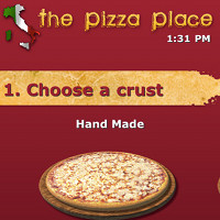
Build a Titanium Mobile Pizza Ordering App: Crust Selection
In this multi-part tutorial series, I’ll be teaching you how to build a Titanium Mobile app from start to finish. Specifically, you’ll learn how to build a Pizza Shop app that will allow customers to order a custom pizza on the go. In this tutorial, I will demonstrate how to setup the project and create a “Crust Selection” screen.
-

Android Tablet Virtual Device Configurations
Back in mid-2010 you learned about common Android Virtual Device (AVD) configurations. We’re now in tablet-crazed early-2011. In this quick tutorial, you’ll extend your knowledge of AVDs by learning how to create configurations for two of the most popular Android tablets.
Vectortuts+ Adobe Illustrator Tutorials
-

Illustrator CS5 Variable Width Stroke Tool: Perfect for Making Tribal Designs!
Adobe Illustrator CS5 features a slew of fantastic new tools and functionality, but the one that jumped out at me and really grabbed my attention was the Variable Width Stroke Tool. The concept was great. And when I actually put it to use – the experience was even greater than my expectations. In part one of this two part series we’ll be creating a tribal design and improving our Illustrator work flow along the way.
-

Learning at the Speed of Technology
If you’ve been using design software for as long as I have, you will no doubt have more than a few obsolete skills up your sleeve. Those of you who have mastered the notoriously difficult QuarkXPress will know what I mean. Dropping to a 25% market share, behind InDesign, many Quark users found themselves having to learn a new piece of software just to stay relevant in the workforce. With the current speed of software updates, how can you be sure that your skills will stay relevant in the future?
-

Create a Retro Style, Airline Destination, Travel Poster – Vector Premium Tutorial
Today, we have another Vector Premium tutorial exclusively available to Premium members. If you want to learn how to create a poster design, in the style of 1950′s air travel tourism. We’ll take a look at the typographic qualities and composition of late 50′s posters, then utilize modern digital rendering techniques to create an illustrated Australia tourism ad campaign.
Phototuts+ Photography and Post-Processing Tutorials
-

Shooting an Amazing Product Photo That Tells a Story
In the United States, around $400 billion is spent on advertising each year. That’s “billion” with a “b.” A slice of that goes to producing photos for those advertisements. Commercial photographers can make a career out of shooting objects for advertisements, and in this tutorial, I’ll walk you through the process. I’ll explain how to decide about props, setting, lighting and toning. Mastering the “product shot” could lead to your next six-figure income (or maybe just some great eBay auctions) – either way it will be fun.
-
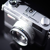
Film Is Alive and Well: Tips, Cameras, and Beginners Advice
When I first got into photography almost 20 years ago, film was the de facto standard and, obviously, the only standard. For over a hundred years film was the only option. The greatest names in photography all shot film; I’m sure you’ve heard of Ansel Adams.
-

Seriously Cool Self-Portraits (And Tips to Shoot Your Own!)
The self-portrait has been a popular form of expression ever since man first saw his own reflection. Much like Narcissus, it’s often the case that we need not look beyond the tip of our own nose for a muse worth studying.
Activetuts+ Flash, Flex and ActionScript Tutorials
-

Quick Tip: Displaying a 3D Model With Papervision3D
In this Quick Tip we’ll take a look at how to embed and display a 3D model in Flash, using Papervision3D.
-

Meet the New Activetuts+ Staff Writers!
A couple of weeks ago we advertised for a new Staff Writer at Activetuts+. The response was phenomenal! We had a pile of submissions to wade through and the quality of all applicants was of such a calibre that we chose to take on four new staff writers! There’s a good chance you’ll recognise these guys, come and meet them..
-

Creating a Virtual Joystick for Touch Devices
A lot of Tablet Computers and Touch Screen devices have emerged, and it’s time to create games that have virtual joystick support on the screen for easier gameplay. Read on and discover how you can create a virtual joystick for your games on touch enabled devices..
Audiotuts+ Music Theory, Production, Mixing Tutorials and More
-

D Mixing Part 5: Creative Routing
Sorry for the long delay in continuing this series. I just moved across the country which took a bit more time and effort than I had originally hoped. In getting back on track with this tutorial, we are going to begin to look at some interesting ways of setting up our mix routing to maximize our mix-down flexibility; allowing us to shape our sounds into something with a more personal and artistic feel. As with any artistic endeavor, many of the settings and choice of effects shown here are going to be largely subjective, but much of the routing and underlying principals will help give you a solid jumping off point in making your mixes and sounds more diverse, interesting and personal.
-

Quick Tip: Epic Drum Sequencing with QL Stormdrum – Part 1
Probably most of you have played computer games or have watched movies, where the music is made with large percussion hits and really low ethnic drums. I remember watching the Warcraft 3 introduction video, where the attack of the orcs was accompanied by smashing drums. I always wanted to capture that sound and in this quick tip I’ll try to explain you some of the techniques I’ve come across in my experience.
-

Foolproof Ways to Make Your Home Studio Sound Better
It’s easy to make music at your home today. However, you can’t put up low budget monitors and a microphone and call yourself a studio. There is a difference between a nice home recording studio -” even if it’s just one spare room -” and a low-cost corner in your bedroom, especially if you want to make money with it. We all start somewhere, even if it is in the corner of our bedroom but what separates the men from the boys is being able to take it to the next level. What follows are some of the foolproof ideas to make your home recording studio sound better.
Nettuts+ Web Development Tutorials and more
-

Why You’re a Bad PHP Programmer
We all have our bad habits. In this article, we’ll go over a list of bad practices that are worth examining, reevaluating, and correcting immediately.
-

Lessons Learned After Running a Massively Popular Blog
For the last three years, I’ve had the pleasure of managing Nettuts+ – a site with 80,000 subscribers, and over 3 million page views each month. In that course of time, I’ve learned a great deal about, not only what it takes to build an active community, but also the economics of running a sustainable and profitable blog. I’d like to share some of these lessons with you today.
-
Canvas From Scratch: Introducing Canvas
This is the first article in a series that will bring you up to speed with HTML5 canvas, the plugin-less drawing functionality built into modern browsers. In this introductory article, I’ll show you how to access the canvas element, draw shapes, change colours, and erase things. It’s a whistle-stop tour of the basics of this amazing new Web technology.
21 Amazing Basketball-Related Designs
Basketball is a great medium for artists to find their favorite all-star and create an awesome design around them. In this article we focus on just that, some of the best NBA-related artwork found on the net. We feature some amazing fan art as well as some interesting professional takes on NBA teams and super heroes, an odd combination leads to some astounding art. This is all featured in this post so if you are even a mild fan of basketball it is still worth checking out.
If you are a basketball fan you’ve probably witnessed some nail-biting games, monster dunks, upsets, and other exciting events. From a designer’s prospective basketball is a great medium for artwork. Companies like Nike, Reebok, Adidas, ESPN are always looking for artists to create new ads for their products. That is where this roundup comes in. Today, I have compiled some awesome graphics from a few different basketball sources. For instance we have an interesting collaboration between ESPN the magazine and Marvel Comics in where the artists from marvel made a superhero-themed comic for every NBA team. We also have some fan made covers for the video game NBA Elite 11. There is a lot of well designed basketball material in this post, so if you are a fan take a look and maybe you’ll get inspired to create something for your favorite player.
Lebron James & Kobe Bryant by Justin Maller
In our first design Justin Maller takes Kobe Bryant’s nickname “The Black Mamba” and brings it out visually with some cool snake images mixed with 3D components. The colors match perfectly and the concept really works with the player and the Nike Concept.
The second design featured fellow NBA All-star Lebron James in a magazine spread for client Acclaim. In this design Justin simply mixed some amazing looking 3D renders with an image of James, the renders really bring out the intensity of the image itself coupled with the strength and intensity of James as a player.


Various NBA Players for Nike by Pete Harrison
Next up we are featuring a set of designs from Pete Harrison, which were commissioned by Nike. In these designs Pete adds some accompanying graphics to in motion shots of players like Kevin Durant, David Lee, Lebron James and more. The in motion shots coupled with the explosive designs added to these posters really give off a feel equivalent to watching one of these players just land a monster dunk. The fireworks and steam seen on the Lebron design are small additions that really take the designs to another level. Overall these are some quality basketball related designs.


Kobe Bryant Digital Painting by Caio Cacau
This awesome digital painting features Kobe Bryant mid-dunk. Any well-executed design of a basketball player who is in the act of dunking or shooting will look awesome because we all know what Kobe does when he gets up in the air like that. So this is the perfect motion to freeze in time and paint. The execution of this painting is also top notch and the details like jersey wrinkling and sweat just take it up another level.

Fan Made NBA Elite 11 Covers
This next set of designs feature some fan made covers of video game NBA Elite 11, although the game never got released this fan took the original cover with NBA star Kevin Durant and
mimicked the distinct style to feature some of the other notables who could have gotten this honor. Below are just a few of the nicest ones out of the set.


ESPN The Magazine & Marvel NBA Edition
If you are a fan of the NBA and Comics as well then you are going to love this latest collaboration between ESPN the magazine and the artists at Marvel comics. For every NBA team the amazing artists at Marvel created a super hero alternative, and on top of that drew and colored it to turn it into an official comic book. Every NBA team has its own story, whether it’s injuries or your star player leaving for another team; just like in the super hero world. So the artists decided to look for similarities between the Marvel world and the NBA, then they incorporated those superheros and NBA stars into one cover. The result of that idea was 30 awesome covers, you can see a few of my favorites below and check the rest out at ESPN’s website.
Some notables include Kevin Durant of the Thunder mixed in with Thor the God of Thunder. There are too many awesome covers to pick from so check them out yourself.


How to Make a Textured 3D Spray Can
In today’s tutorial we will demonstrate how to combine Illustrator and Photoshop to create a 3D, textured spray can. This tutorial requires some basic understanding of Illustrator and Photoshop as well as the pen tool. Let’s get started!
Step 1
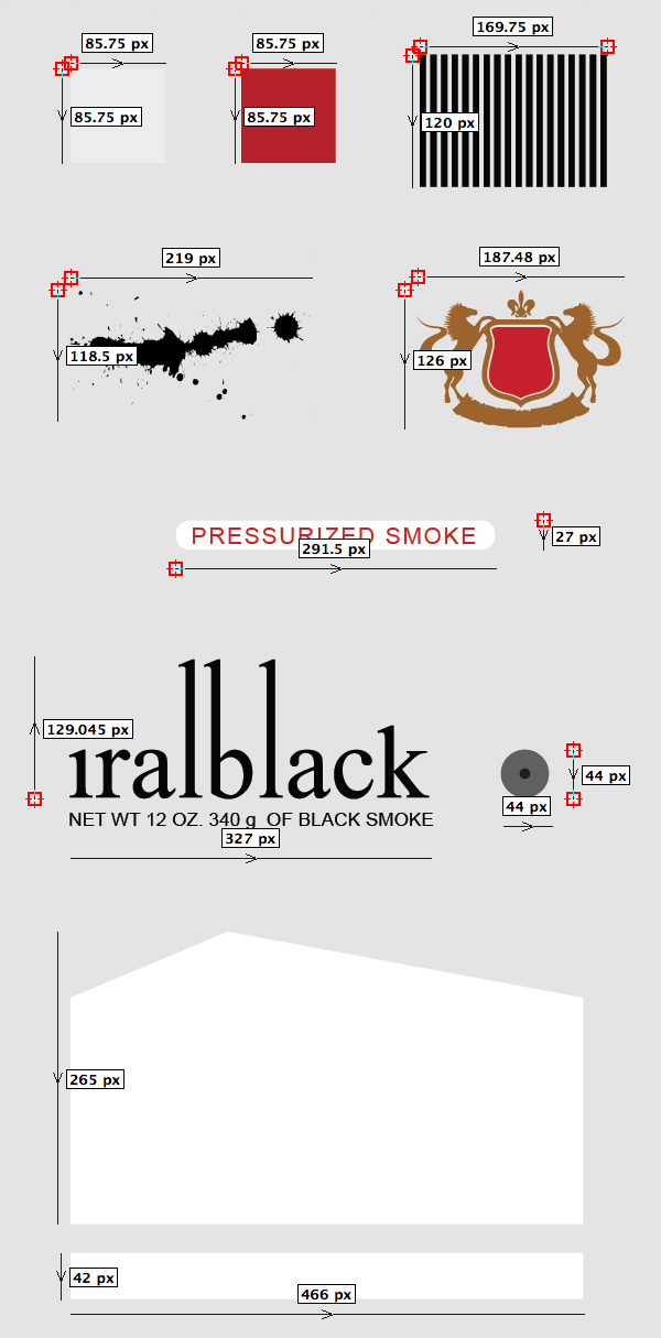
Open Adobe Illustrator. Create a new document. The first step is to create all the materials and elements that will appear on the can. Most of them are basic shapes and text. I created the spatter and the shield for this tutorial. You can use them or you can find free similar vector elements over the Internet.
Note that I included measurements for you to have an idea of the size and proportion, but you don’t have to be exact. You can always resize things later if you need to.
Step 2
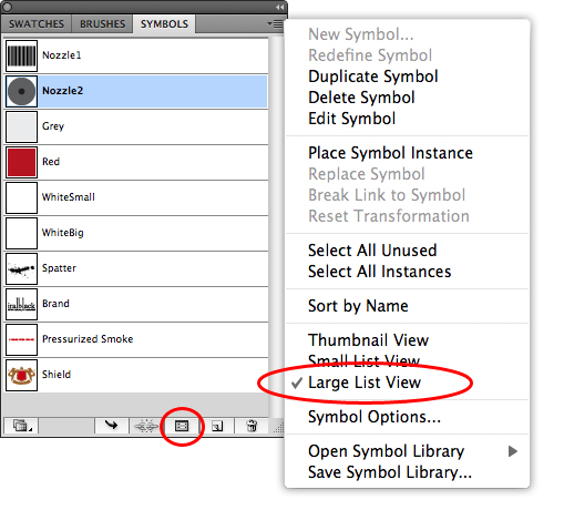
In the menu, go to Windows / Symbols to open the Symbols Window. Drag each of the elements you just created to the Symbols Window to convert them to symbols.
In the Symbols Window open the menu from the top right corner and select "Large List View.
Select the Symbol Options button at the bottom of the window and rename each of the Symbols as seen in the following image. Finally you can delete them from the stage.
Step 3
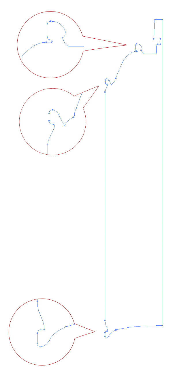
With the Pen Tool (P) create a shape like in the image below. Try to respect the amount of anchor points.
Step 4
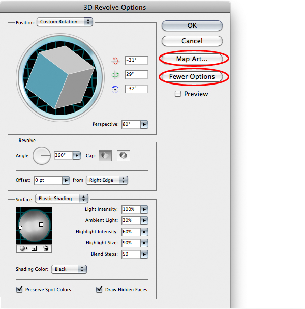
Go to the menu and click Effect > 3d > Revolve. Enter the values of the following image.
Step 5
On the 3D Revolve Options Window click the Map Art button. Check Shade Artwork and check Invisible Geometry. For now we will only use the Red and Grey boxes that we converted to symbols. Use the arrow buttons to navigate through each surface. Following the Image in Step 6, apply the corresponding material, selecting it from the Symbol list menu.
Note that the wireframe turns red on the surface that is selected. If the material/symbol is too small for the surface, click the Scale to Fit button. Finally click OK on the Map Art Window and on the 3D Revolve Options Window.
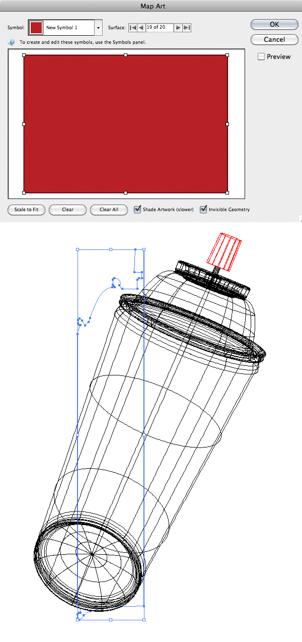
Step 6
You should have something like this.

Step 7
Now open the Layers Window if it is not already open. Rename the <Path> to MAIN.

Step 8
Select your main shape; duplicate it by dragging it to the Create New Layer button at the bottom of the Layers Window. Rename the new MAIN path to WHITE BIG.

Step 9
Hide the MAIN path. Select the WHITE BIG path. Open the Appearance Window and select the 3D Revolve (Mapped) Link. Click on the Map Art button.

Step 10
First remove all the Symbols from all the surfaces. If you created exactly the same amount of anchor points you have to select Surface 5. If not, don’t worry, just find the surface that matches the one in the following image and position the White Big symbol as seen in the following image.

Step 11
Now we will repeat steps from 7 to 10 several times to position all the different elements. You may be asking: What is the advantage of placing the elements in several overlapping paths over making only one symbol with everything inside?
- You can copy each individual element to Photoshop as individual layers.
- This allows for a more efficient use of computer resources because you can hide all unused elements if you need to.
Duplicate the WHITE BIG path by dragging it to the Create New Layer button at the bottom of the Layers Window. Rename the new WHITE BIG path to WHITE SMALL.
Select the WHITE SMALL path. Open the Appearance Window and select the 3D Revolve (Mapped) Link. Click on the Map Art button. Remove all the symbols from all the surfaces. Find the surface that matches the one of the following image and position the White Small symbol as seen in the following image. Finally click OK on the Map Art Window and on the 3D Revolve Options Window.

Step 12
Duplicate the WHITE SMALL path by dragging it to the Create New Layer button at the bottom of the Layers Window. Rename the new WHITE SMALL path to SHIELD.
Select the SHIELD path. Open the Appearance Window and select the 3D Revolve (Mapped) Link. Click on the Map Art button. Remove all the symbols from all the surfaces.
Find the surface that matches the one of the following image and position the Shield symbol as seen in the following image. Finally click OK on the Map Art Window and on the 3D Revolve Options Window.

Step 13
Duplicate the SHIELD path by dragging it to the Create New Layer button at the bottom of the Layers Window. Rename the new SHIELD path to PRESSURIZED.
Select the PRESSURIZED path. Open the Appearance Window and select the 3D Revolve (Mapped) Link. Click on the Map Art button. Remove all the symbols from all the surfaces.
Find the surface that matches the one in the following image and position the Pressurized Smoke symbol as seen in the following image. Finally click OK on the Map Art window and on the 3D Revolve Options Window.
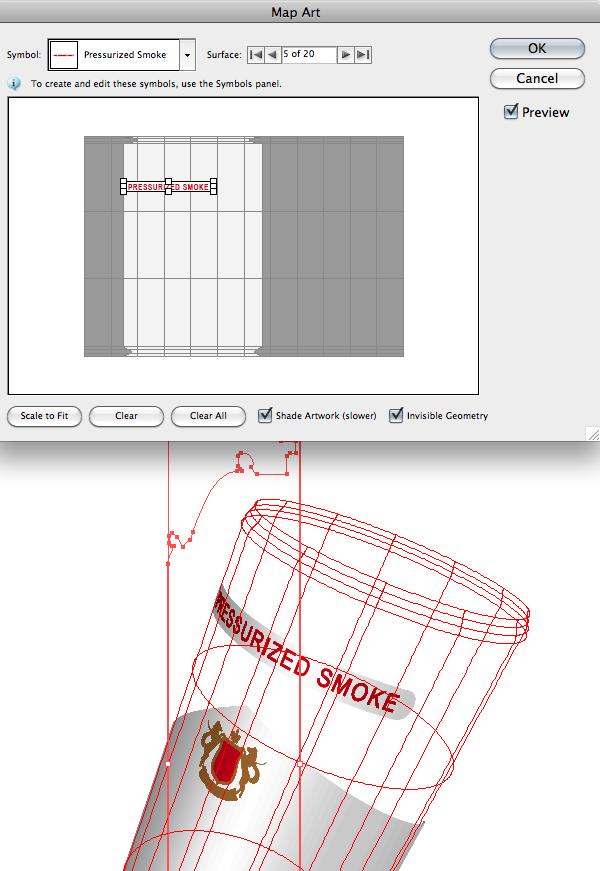
Step 14
Duplicate the PRESSURIZED path by dragging it to the Create New Layer button at the bottom of the Layers Window. Rename the new PRESSURIZED path to BRAND.
Select the BRAND path. Open the Appearance Window and select the 3D Revolve (Mapped) Link. Click on the Map Art button. Remove all the symbols from all the surfaces.
Find the surface that matches the one of the following image and position the Brand symbol as seen in the following image. Finally click OK on the Map Art Window and on the 3D Revolve Options Window.

Step 15
Duplicate the BRAND path by dragging it to the Create New Layer button at the bottom of the Layers Window. Rename the new BRAND path to NOZZLE1.
Select the NOZZLE1 path. Open the Appearance Window and select the 3D Revolve (Mapped) Link. Click on the Map Art button. Remove all the symbols from all the surfaces.
Find the surface that matches the one of the following image and position the Nozzle1 symbol as seen in the following image. Finally click OK on the Map Art window and on the 3D Revolve Options Window.

Step 16
Duplicate the NOZZLE1 path by dragging it to the Create New Layer button at the bottom of the Layers Window. Rename the new NOZZLE1 path to NOZZLE2.
Select the NOZZLE2 path. Open the Appearance Window and select the 3D Revolve (Mapped) Link. Click on the Map Art button. Remove all the symbols from all the surfaces.
Find the surface that matches the one in the following image and position the Nozzle2 symbol as seen there. Finally click OK on the Map Art Window and on the 3D Revolve Options Window.

Step 17
Duplicate the NOZZLE2 path by dragging it to the Create New Layer button at the bottom of the Layers Window. Rename the new NOZZLE2 path to SPATTER.
Select the SPATTER path. Open the Appearance Window and select the 3D Revolve (Mapped) Link. Click on the Map Art button. Remove all the symbols from all the surfaces.
This time I am going to apply the Spatter symbol to 3 of the surfaces; in this example, it will be surfaces 10, 11 and 12. Take the following image as a guide to identify the surfaces in your case. Finally click OK on the Map Art window and on the 3D Revolve Options Window.
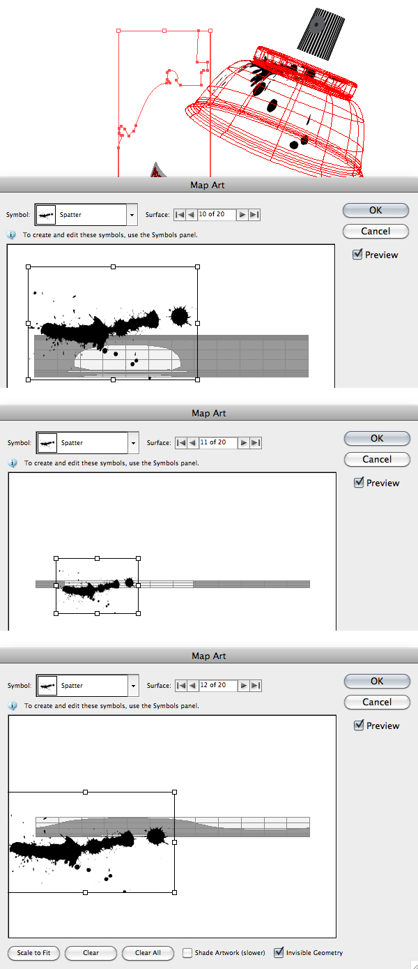
Step 18
Reveal all paths, and by now you should have something similar to what is seen in the image bellow.
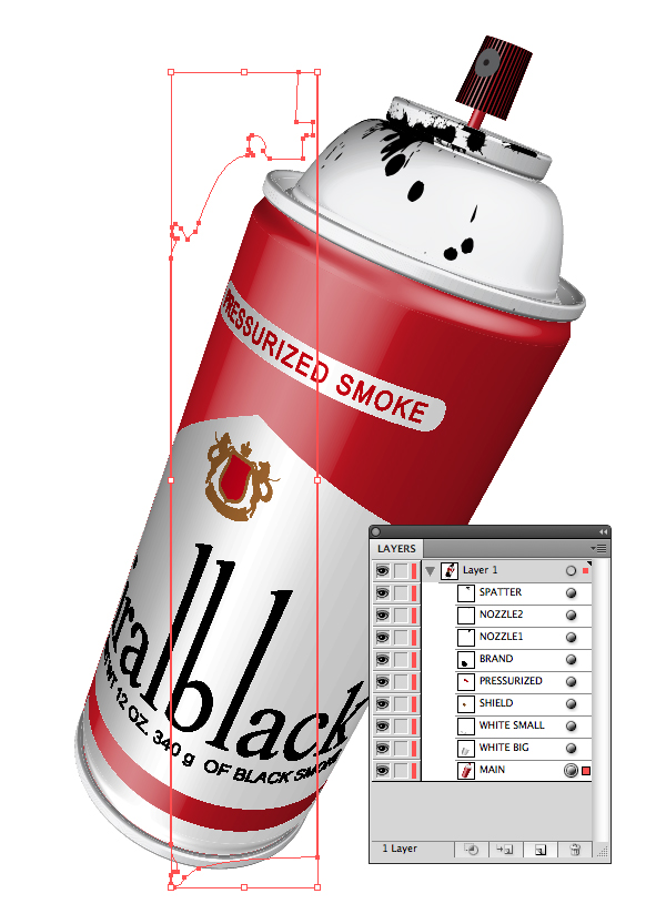
Step 19
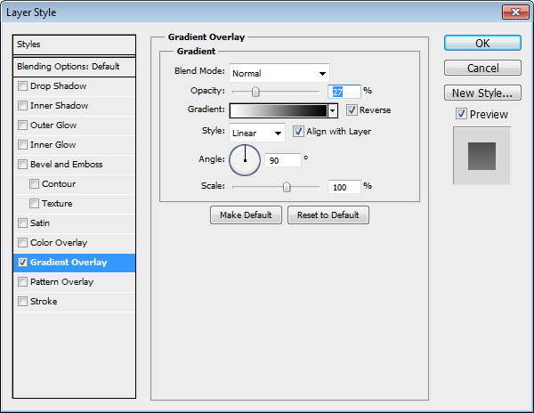
Now open Adobe photoshop and let’s make a new 600 px x 1000 px file. If your "background" layer is white press Command/Ctrl + I to invert it. The background must be black. Duplicate the background layer by dragging it to the Create a New Layer button. Rename your new layer to "MyBg". Double click your "MyBg" layer and apply the Inner Glow and Gradient Overlay Styles with the settings of the following image. Press OK

Step 20
Go to your Illustrator file and copy (Command/Ctrl + C) your MAIN shape and paste it (Command/Ctrl + V) on your Photoshop file as a Smart Object.
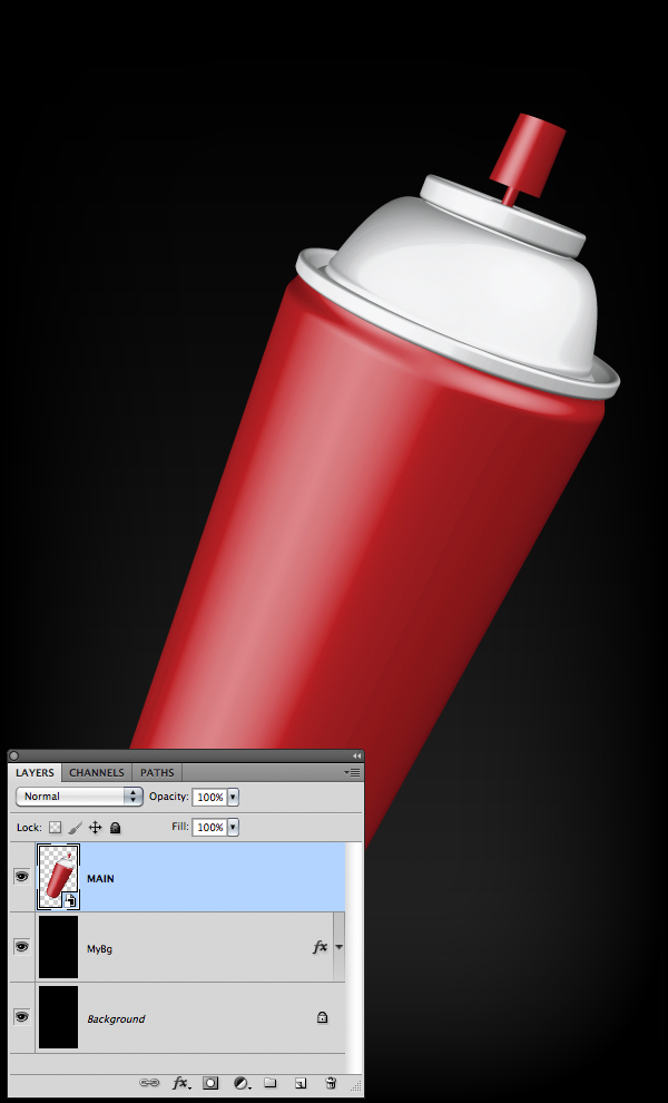
Step 21
Go to your Illustrator select WHITE BIG and WHITE SMALL shapes and copy them (Command/Ctrl + C). Paste them (Command/Ctrl + V) on your Photoshop file as a Smart Object. And rename the layer to WHITE.
Do the same for the rest of the shapes one by one. Rename all the layers as seen in the following image.

Step 22
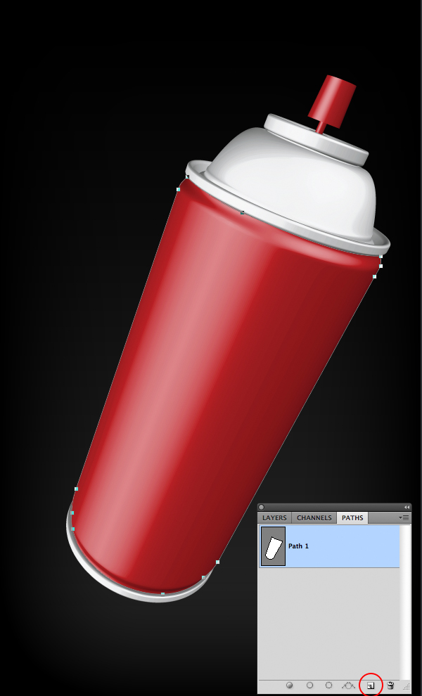
Hide all layers but MAIN. Go to the PATHS window (Window /Paths) and press the Create New Path button at the bottom of the window. Select the Pen Tool (P) and make a path surrounding the red part on the body of the spray. Press Command/Ctrl and click over the thumbnail of the path to make a selection out of the path.
Step 23
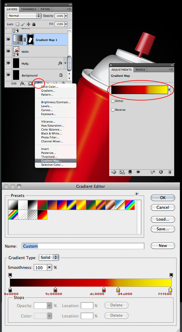
Go to the Layers Window and press the Create New Fill or Adjustment Layer button at the bottom of the Layers Window. Select Gradient Map. Double click on the icon of the gradient map to bring out the Adjustments Window. Click over the Gradient Map of the Adjustments Window and edit the gradient as seen in the following image. Press OK
Step 24
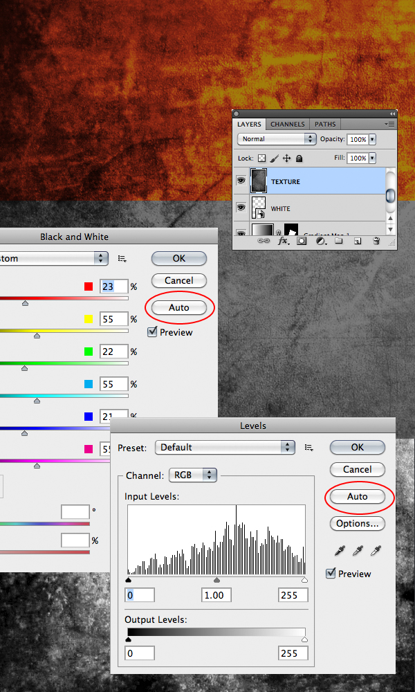
Now you need a grunge texture, you can use the one I provided with this tutorial. Open it and paste it on your file, over the WHITE layer. Rename the layer of the texture to TEXTURE. In the menu, go to Image > Adjustments > Black and White. Press the Auto button and press OK. In the menu, go to Image > Adjustments > Levels. Press the Auto button and press OK.
Step 25
With the WHITE layer selected, click the Add Layer Mask button at the bottom of the Layers Window. Go to the Channels window and press Command/Ctrl + Click over the thumbnail of any of the channels Red, Green or Blue to make a selection out of it. Go back to the Layers Window and hide the TEXTURE layer. Select the Layer Mask thumbnail of the WHITE layer. Press Command/Ctrl + H to hide the selection. Paint the parts of the WHITE layer where you want the scratches to appear color black. You can paint with color white to hide the scratches.
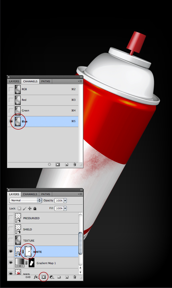
Step 26
Press Command/Ctrl + H again to reveal the selection. Now let’s save the selection because we will use it later. In the menu go to Select / Save Selection and enter "SELECTION" on the Name field. That will create a new channel named SELECTION. Press Command/Ctrl + D to remove the selection.
Now that we have saved our selection we can go and delete the TEXTURE layer selecting it and pressing the Delete key or dragging it to the little trash can at the bottom of the Layers Window.
By now you should have something like this on your Layers and Channels window.
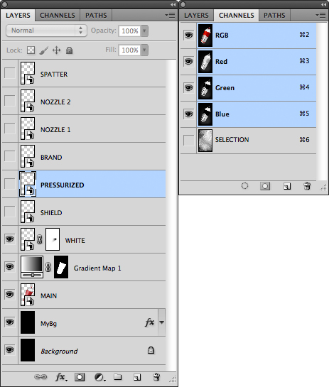
Step 27
Let’s make some scratches to the shield. Reveal the SHIELD layer. Add a layer mask to it by clicking the Add Layer Mask button at the bottom of the Layers Window. Go to the Channels window and Command/Ctrl + Click over the thumbnail of the SELECTION channel. Press Command/Ctrl + H to hide the selection. Go to your Layers Window again and select the Layer mask of the SHIELD layer. Paint with color black over the shield to make some scratches appear. Remember, to erase scratches, just paint with white.
With a layer mask selected you can toggle from black to white and vice versa by pressing the X key.
If you finished with the scratches, remember to remove the selection. You cannot see it because we hid it, but it is there; so press Command/Ctrl + H to reveal the selection and Command/Ctrl + D to remove it.

Step 28
Repeat Step 27 for the PRESSURIZED and the BRAND layers.
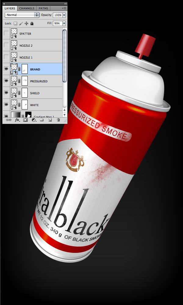
Step 29
Reveal the NOZZLE 1 Layer; turn its blending mode to Color Burn and its fill to 40%. Reveal the NOZZLE 2 Layer; turn its blending mode to Linear Burn. Reveal the SPATTER Layer; turn its blending mode to Color Burn and its fill to 90%.
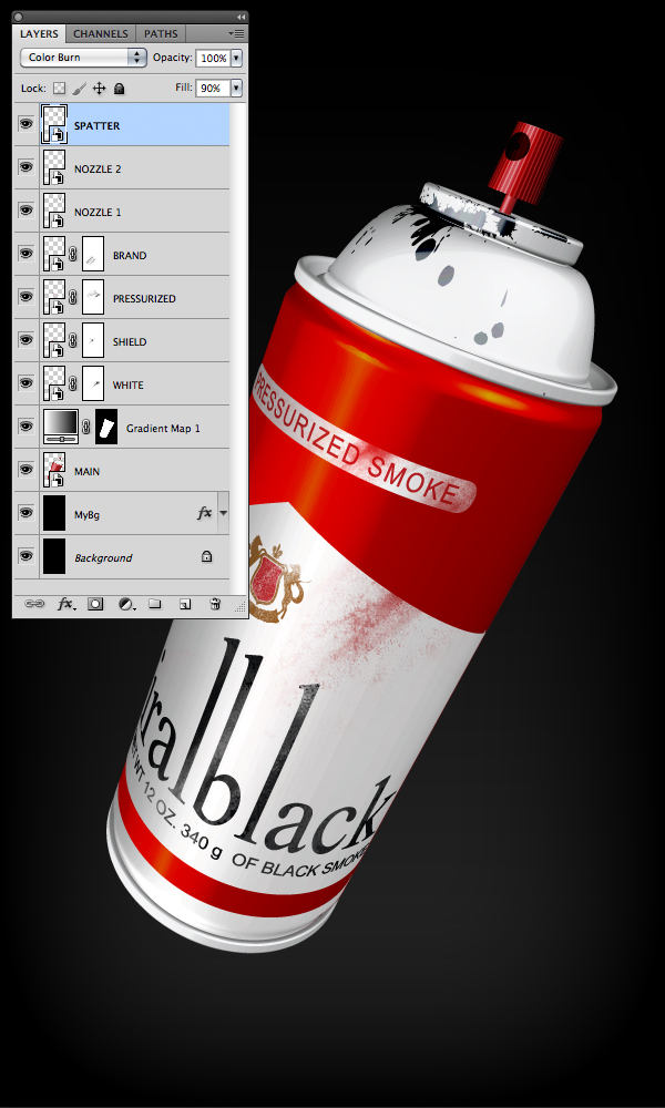
Step 30
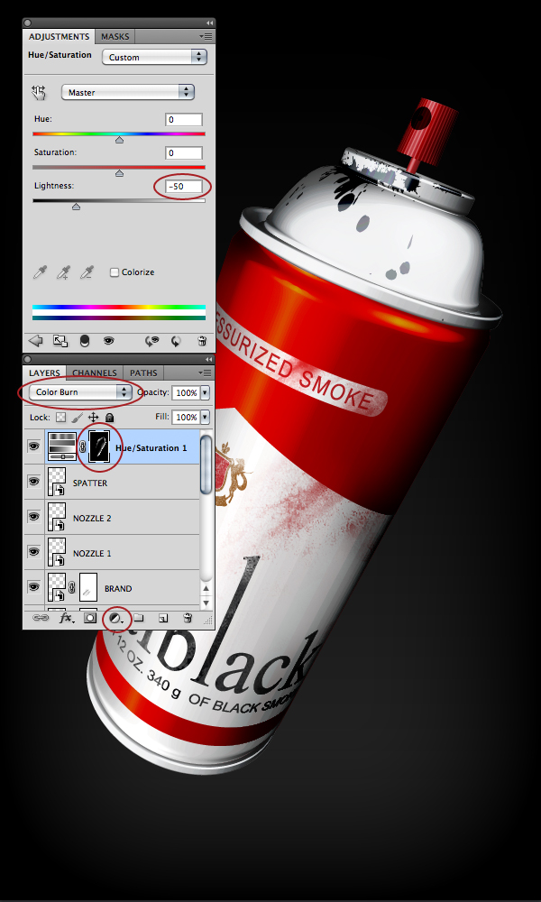
Now let’s add some more shadows to the entire spray can. In the Layers Window, select the SPATTER layer. Press the Create New Fill of Adjustments Layer button at the bottom of the Layers Window. Select "Hue/Saturation…" Select the Layer mask of the Hue/Saturation 1 layer and press Command/Ctrl + I to invert it. Change the blending mode of the Hue/Saturation 1 layer to Color Burn. Go to the Adjustments Window and turn the Lightness to -50.
Now with the layer mask of the Hue/Saturation 1 layer selected, start painting with white on the sides of the spray can to add more shadows. Remember, you can always remove what you painted, by painting with black over the layer mask.
If you finished adding shadows to the spray can, you will notice that the background also darkened. We will remove that now.
Go to your MAIN layer and Command/Ctrl + Click on its thumbnail. This will make a selection of the spray can. Press Command/Ctrl + shift + I to invert the selection, because we want a selection of the background, not the spray can. Select the layer mask of the Hue/Saturation 1 layer, make sure that in your Tools window the background color is black, and press the Delete key.
Step 31
Now let’s add some more Texture to the entire spray can to make it look dirtier. Go to the Channels window and select your SELECTION channel. Press Command/Ctrl + A to select all. Press Command/Ctrl + C to Copy.
Go to the Layers Window and with the Hue/Saturation 1 layer selected press Command/Ctrl + V to paste your selection channel as a layer. Rename the layer to TEXTURE. Press Command/Ctrl + Click on the layer mask of the Hue/Saturation 1 layer to make a selection out of it.
Select the TEXTURE Layer and press the Add Layer Mask button at the bottom of the Layers Window. Change the layers blend mode to Multiply and the fill to 50%.

Step 32
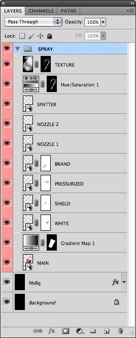
Now we have finished with the spray can, so we can make a group with all its elements. Select TEXTURE layer, and with the Shift key pressed, select the MAIN layer. Press Command/Ctrl + G to group all of the spray can layers and rename the group to SPRAY. Your Layers Window should look like the following image.
Step 33
Let’s create the Smoke. Create a new layer over the SPRAY group and name it SMOKE. In the menu, go to Filter > Render > Clouds.
Press the Add Layer Mask button at the bottom of the Layers Window. Press Command/Ctrl + I to invert it. With the Layer mask of the SMOKE Layer selected, paint with white to reveal the smoke.
We will turn the smoke a little green. Press the Create New Layer or Adjustment layer button. That creates a new layer named Hue / Saturation 2. Select the Hue / Saturation 2 Layer and in the Adjustments Window enter the values of the image bellow. Note that the Colorize option is checked. With the Layer mask of the Hue / Saturation 2 layer selected, press Command/Ctrl + I to invert the mask. Paint with white to reveal the green color.

Step 34
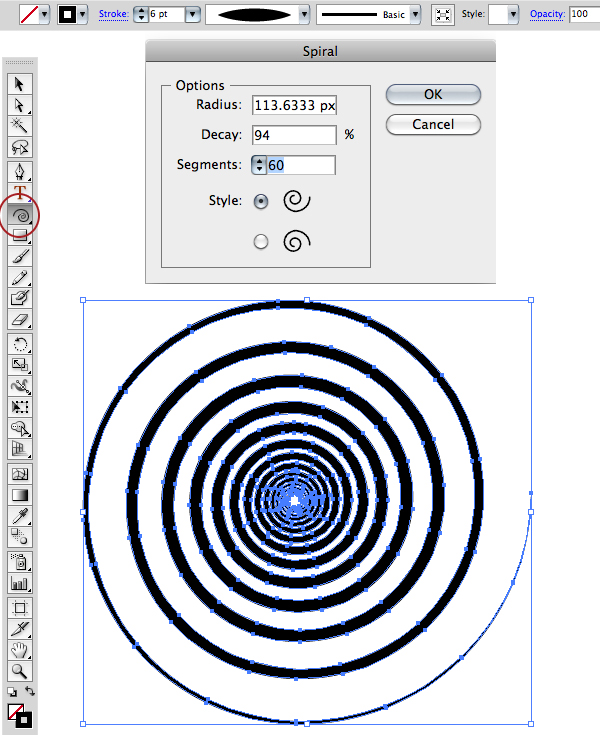
Go to Illustrator and create a spiral with the settings of the following image. To pop up the spiral window click on your document with the Spiral tool selected. Go to the menu, press Object > Expand Appearance. Press Command/Ctrl + C to copy the spiral.
Step 35
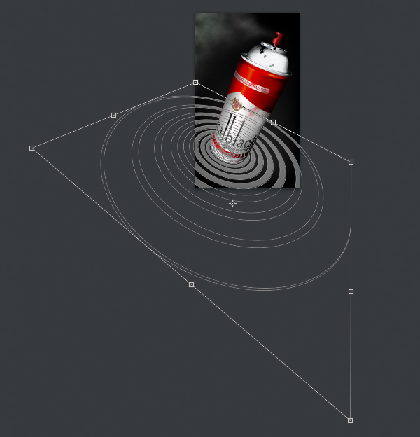
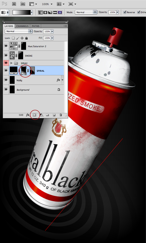
Go to back to Photoshop and press Command/Ctrl + V to paste the spiral over the MyBg layer. Rename the layer to SPIRAL. Press Command/Ctrl + T and the Transform Handles will appear; then press Command/Ctrl and drag the handles to distort the spiral as seen in the following image. Press Enter/Return when done.
Step 36
Press the Create Layer Mask button at the bottom of the Layers Window. Press the G key to select the Gradient tool and make sure you have a black and white gradient. With the layer mask of the spiral layer selected, drag diagonally to hide the backside of the spiral in the distance.
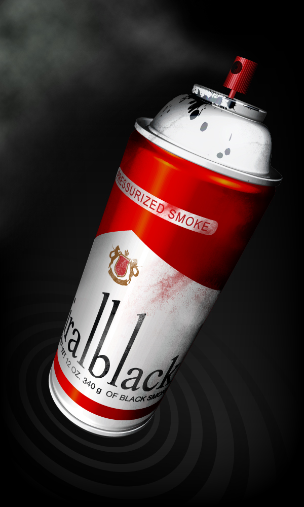
Final Image
Best of the Web – February 2011
As you know, each month, we round up some of the best Photoshop-related content from around the web. This month, there were some excellent Photoshop tutorials and articles to choose from so please take a moment to review our favorites from February 2011.
Photoshop Tutorials
-

Photoshop Tutorial: Create an Abstract Figure From Circles
Often, beautiful artwork can be based from the simplest of geometric shapes. In this tutorial from Digital Arts, author Mart Biemans demonstrates how to create a stunning composition using basic circles and effects.
-

Milk Monster and Chocolate Splash
There are a lot of tutorials that demonstrate how to use splashes in your work to create a cool effect. This tutorial from Alfoart however, stands out. It shows how to manipulate a splash to create your own milk monster.
-

How To Paint Mustache (Video)
Just about ever guy has wondered what they would look like with a mustache. Some have tried, others have lied about trying. This tutorial from Cute Little Factory will demonstrate how to paint a cartoon-style mustache on a character. Really fun!
-

Incredible Horror Photo Manipulation Photoshop Tutorial
Horror is an incredibly popular genre of art. In this tutorial from Creative Fan, they will demonstrate how to turn a bright, sunny stock photograph into a scary scene straight out of a horror film.
-

Create an Intricate Mythological Statue Photo Manipulation Photoshop Tutorial
Turning a photograph of a person into a statue is one of those projects that seems easier than it actually is. This tutorial from Creative Fan will demonstrate how to turn a photograph into a mythological statue.
-

Create a Realistic Vintage Ticket Stub in Photoshop
Making something look vintage, old, or worn in Photoshop can be tough if you don’t know where to start. This tutorial from Design Instruct will demonstrate how to create a vintage and realistic looking ticket stub in Photoshop.
-

Burnstudio: Create An Amazing Personal Website From Scratch Using Photoshop
Photoshop is the industry-standard app for creating web designs. This tutorial from 1st Web Designer will demonstrate how to create a personal website from scratch using our favorite design application.
-

Look Under The Hood: Photoshop Color Settings
Understanding Photoshop’s color settings is an important part of creating fantastic designs. This tutorial from 1st Web Designer explains these settings in detail and is an excellent resource for those of you who need to brush up on your knowledge.
Articles and Inspiration
-

In Defense of Advertising
Ads may be annoying at times but let’s face it, they aren’t all that bad. In fact, ads are often celebrated for their creativity and the success of the products that they promote. This article from Design Shack defends advertising and explains why we should appreciate it more.
-

Eye-Catching & Clever Print Ads
Speaking of ads, this showcase of clever print ads from Noupe displays some excellent examples of eye-catching print ads for your inspiration.
-

Simplify and Improve Your Designs with the Bonsai Tree Method
Sometimes the best design inspiration comes from outside the field of design. This article from Spyre Studios explains how you can improve your designs with the bonsai tree method.
-

Business Design Advice to Keep You Sane and Prosper
Let’s face it, design can make a person crazy if you let it get the best of you. This article from The Design Cubicle shares some lessons and thoughts on the business of design.
-

Ethics in the Design Field
Every profession has its own set of ethical guidelines most of its members adhere to. And while the design industry’s code of ethics might not be as crucial as, say, the medical industry, there are still some important ethical considerations every design professional should think about. This article from Web Designer Depot explains some of the most prominent ethical considerations that designers must deal with.
-

How Old-Fashioned Marketing Can Supercharge Your Design Business
Studying history is often the best way to understand the present and future. While new technologies have developed in recent years, it doesn’t mean that the old way of doing things is complete obsolete. This article from Web Designer Depot explains how you can supercharge your design business with some old-fashioned marketing techniques.
-

Video: How to Run Your Design Business W/Emily Cohen
Running a design business is more than just about making great designs. It’s also about organization, book keeping, writing proposals, budgets, and much more. This speech given by Emily Cohen at a Creative Mornings event in New York City gives some great advice about how you can run your own business.
-

Digital Artwork Inspired by Geometry
Great designs are often the result of the combination of simple shapes and effects. This article from Noupe showcases some excellent examples of artwork inspired by geometry.