Creating convincing buildings that appear like text in a cityscape can be a challenging task. In today’s tutorial we will learn how to create building-shaped typography in Photoshop using photos that you have taken yourself. Let’s get started!
Tutorial Assets
You may download the photos that were used in this tutorial for free from the link above.
Before You Begin
It is most fun to use your own photos for this tutorial. Feel free to use the ones provided, but you will feel much more satisfied when you use your own. If you decide you use your own, there are some things that you have to take into account. The first is to go to (one of the) highest building in a city with high rising buildings (more than 10 floors). Any capital in the world will do, except Amsterdam and Ouagadougou. Higher buildings are more spectacular. Take shots of complete buildings, of parts of buildings, take shots of streets, parks, pedestrians, cars, satellite dishes, antennas, rubbish baskets, take shots of everything you see. Zoom in to roofs and take shots of the small constructions on top, of laundry lines. You will be surprised how different things are on each roof. Use a reasonable zoom lens for some of the shots. When you start creating the image, you will get all kinds of ideas on small details and how to use them. Don’t be stingy with using your camera memory when you are on the roof; take loads of pictures.
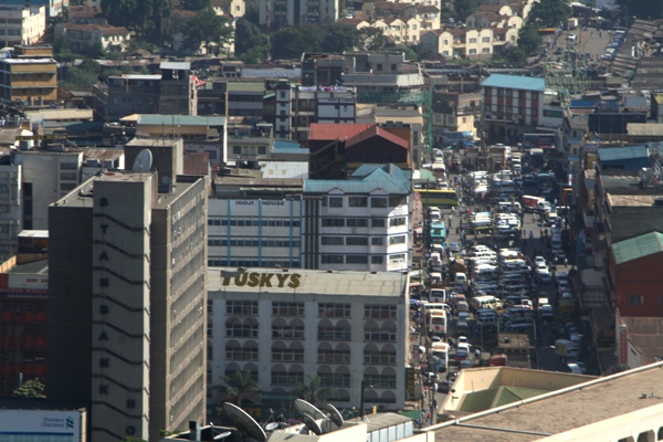
Step 1- Nairobi Skyline
Create a white background image of 6000 x 6000. Save it as nairobifull.psd. Open Nairobi_skyline.jpg, copy it to Nairobifull, rename it to Nairobi background and drag this image as in the photo with the move tool (V). Make the horizon horizontal (turn it -2degrees or so) and drag it to the top of the working space, leaving the sky out of the image. Hit return (confirm).
Step 2 – Putting it in Perspective
Horizontal text is boring. So we want to put things in perspective. We are still in move tool mode, press Command/Ctrl, click the left corner of nairobi background and drag the photo down on the left side (see image) correct the horizon again so that it is above/out of the image, maybe you need to drag the left point somewhat further to the left, to correct the vertical direction of buildings. It is important that all building are vertical. Make sure there is space for the text below.
Step 3 – Level it Out
Go to image > adjustments > Levels, put the middle arrow to 75. If you use your own photos, you may want to wait with this till last. The colorization has to be in line with the front buildings.
Step 4 – Vanishing Points
Now it is time to put the direction of the letters/buildings in perspective: vanishing points. Create a new layer. Call it vanishing points. Draw a vertical line (use Shift and the pencil tool). Duplicate the layer. Select the move tool and rotate the line 90 degrees. Merge the layers. Duplicate the layers. Rotate one layer 45 degrees, merge. Do this another two to three times, (22.5 degrees, 11.25 degrees, I guess you grab the idea). You now have a wheel like the picture below. Duplicate it, put it in one layer group (layer > new > group from layers (both vanishing points layers selected). Put this layer group to 50-60% transparency. I got the idea of the vanishing points from a previous tutorial on this site by Narendra Keshkar who created a great banana ship tutorial that was published in September 2010. Without it, this image would have been impossible. Have a look if you want.
Step 5 – Vanishing Points in the Image
Use the move tool to enlarge the vanishing points layers 5 times or so. They have to be really much bigger than the canvas. Now starts one of the most important parts of the tutorial: put it in perspective. The lines of the vanishing points have to follow the perspective lines of the buildings. Move one vanishing point layer till it is done. It is easy to follow a floor in front of a vanishing point line. It has to be the same for the top floor as well as for the lower floor. When this is done correctly you can start with the next step: the text.
Step 6 – The Text
Select the text tool. Write SAFARI (or any other text) and enlarge the text so that it covers pretty much the white part of the canvas. Choose a simple font. Buildings made with Gothic or handwriting fonts are a bit more complicated than Arial if you know what I mean. Then right click the layer and rasterize the layer. Use the Command/Command/Ctrl + move tool to put things in perspective. Make sure the text follows the vanishing point lines nicely into the two directions, as seen in the photo below. Try to find a color that is very visible as font color; it will help with staying visible. Black is hard to see sometimes.
Step 7 – Organizing Group Layers
Duplicate the layer SAFARI, erase AFARI, so only the S survives. Select the layer and make a new layer group S building (layer > new > group from layers). This group is for the S building. Put all things for the building in that building. Use a similar way of organization for all the other buildings. Within the layer group, use other layer groups for walls, fences, roof shades and other things if need be. The tutorial may not mention all the layers used in the tutorial, but there is a lot of organization in such a file. It is important you can trace back a little thing within over 300 layers. Premium members can see the psd file with all the layer, layer groups and layer groups of layer groups.
Step 8 – Perspective to Square
Open the file Nyayo house.jpg and copy it into your Nairobifull in the S-building group as a new layer. Call the layer Nyayo house. There is a kind of diagonal way the floors move because of the perspective the photo is taken. This has to be corrected. Command/Ctrl and the move tool are of help. Pick the little right middle selection square and pull it a bit up, till the floors are horizontal. Confirm the distortion. Then use the rectangular marquee selection tool, select a part as large as possible, this will be the area you are going to use for creating the building. Inverse the selection and hit delete. During the selection, try to be careful with where you cut. Cutting through glass is not good since this will make the building look as if it is incomplete. Cut it in such a way that putting the same selection next to each other seems to make it seamless.
Step 9 – Wrap the First Wall
Copy the layer Nyayo house. Move the copied layer below the purple S. while in the move mode click on one of the corners. The wrap function appears. Click on it. This allows you to distort the layer the way you want. You want the layer to look like it is following the curve of the S. So make the edges higher, push the middle lower so that you get the impression the wall of the building is round. You should also try to make the middle windows wider and especially the ones on the right edge smaller so that you get the idea that they are really facing away.
Step 10 Wave the Second Wall
Continue with the next wall. Copy the original Nyayo house layer again, and wrap it in the middle of the S. Make sure it is below the first layer. This time it is like a wave. The process of wrapping needs quite some attention. You can accept the wrap and do it again to get a better result. Make sure the floors are in line with the edge of the roof.
Step 11- The Last Curve
The inside of the S top is also not complete yet. Duplicate your Nyayo house layer again, and cut the left half away so that the only part left that will be visible later. You only need three windows wide for this part. This way you have more control over the wrap.
Step 12 – Finalizing the S Walls
The last wall is the simplest. No wrap after duplication, use Command/Ctrl and draw the layer in perspective Make sure you have two windows on the edge. Select the rest and delete it. Now you should have an S standing out as a kind of building. Make the last Nyayo house invisible. You can delete it, but it makes life easier if it is invisible because you never know if you may become unhappy with one of the previous layers and you want to start from scratch. Now select all the nyayo house layers make a new group from layers and call it nyayo house walls.
Step 13 – Sourcing the Roof
Roofs are not smooth and purple. Time for texture and a better color. Open roof 1 and select a part of the roof with the polygonal lasso tool (L), copy it and put it in the Nairobifull file Under the S building. Rename the layer Roof
Step 14 – Put the Texture in Perspective
Stretch the layer so that it would be big enough to cover the entire purple S. Also put it in perspective. The roof textures has some lines, the lines should also more or less follow the vanishing point lines. You can use the same method as in step 8 followed by the same way as the text was put in the boxes, step 6. After that you may want to adjust the color a bit. Go to Image > adjustments > hue and saturation. I removed the green a bit, made it lighter and desaturate the color somewhat. The idea is to have a realistic color with the right brightness. Copy the layer once and make it the original invisible. We will use it again with building F.
Step 15 – Finalize the Roof
Move the roof layer on top of the purple layer. Command/Ctrl + click on the purple S layer (probably called safari copy). This selects all pixels in that layer. While the layer roof selected, inverse and delete. Now you have a roof on your building.
Step 16 – Safety First
It starts to look a bit like a building isn’t it? Time for details. We do not want our friends fall off the roof so a small wall at the edge needs to be made. Go to the roof photo again, cut out something out of the wall. Use the polygonal lasso tool like step 13. Copy it to Nairobifull > S-building group and rename it edge. Make it square like step 8.
Step 17 – Placing the Edges
Make a new layer group from edge and call it ‘edge of S’ or something like that. Move the edge layer to the group and copy it and start to make a fence or wall on the edge of the S. Use the wrap mode as explained in step 9. Copy the original edge layer again and continue to repeat with this till you have walls around the whole S that are visible from within the roof (see the image of step 18).
Step 18 – The Outside Edges
Now it is time to do the rest of the edges. The idea is that the edge of the inside has a different color than the outside. The inside should be yellow like parts of the rest of the building. So select the original edge again, open image > adjustments > hue and saturation and tick colorize, hue 45, saturation 33, lightness + 30. It should make the edge more or less yellow like the rest of the building. Now continue making edges like in step 17. Make the original edge and the original yellow edge invisible.
Step 19 – Shading
Now we have a kind of building, but it still looks like a computer 3D generated thing. Partly because the shades are missing. First think of how the shades should be. Look at the background image and look at the shadows. Where is the sun situated?
Make a new layer, call it shades S. Select the brush tool. Seize 1400, opacity 15, hardness 0%. Now we have to be careful with what we paint. The brush is too big for every detail and the a smaller brush is not an option because of the hardness. So we have to select wall by wall. Open the group Nyayo walls.
When you click Command/Ctrl and the icon of a layer, you select objects that are present in that layer.
When you hold Command/Ctrl + alt and you select another layer, the objects that are in the other layer are removed from the selection. This way you can quickly and precisely select and deselect what you want to paint (shade) at a go.
Select the wall as seen in the image below (Command/Ctrl and select the layer called nyayo house copy and Command/Ctrl + Alt on the roof icon, in case there is overlap Command/Ctrl + Alt will remove the layer you click on. Command/Ctrl + Shift will add a new layer). Paint once over the area right of the middle, a bit more on the middle and several times on the left. The result should be a nice shade on the left side. Paint vertically. If you are not happy with it, you can always throw the layer and start a fresh. Now repeat this step for each nyayo house wall. Once you are done with the walls, you have to do the edges.
Step 20 The A-Building
You know the drill: copy the SAFARI layer you made with step 6. Erase S and FARI. Select the layer and make a new group from layers. Make sure the group called S (which should be all the layers that are making the S building) is collapsed. Now select the groups S and A. Make a new groups from layers called Safaritext.
From now on, create each new letter in a new layer group. As said before, you may find that the hardest part of this work is the organization. Proper organization saves time. Make sure layers have either a sensible name or they are in a group that has a sensible name (preferably both). It is a waste of time if you have to go through more than a hundred layers to fine a stupid lose window or satellite dish which is not correctly placed. Use layer groups, sub groups and sub sub groups and go on if need be.
Step 21 – The Building’s Main Wall
Open Building A.jpg and select the front of the building with the polygonal lasso tool. Copy it and paste it in Nairobifull. Use the same techniques as in step 6 to make it square.
Step 22 – Adding Floors
Now we are facing a slight problem. We were able to select about 6 stories of building in the previous step. And if you check the white building behind the place for F, you can count 10 stories. So we have to add some stories to our version. Copy the layer and move the top layer a bit in such a way that it looks like you have ten stories. Merge the layers. Call the m A-wall and make a new layer group A-Wall. This is the time to change hue/saturation if you want.
Step 23 Placing the wall
Now we duplicate A-Wall, and paste it alongside the A, the same way we did it with the S but for now we do not suffer from the curve, so now wrapping, just Command/Ctrl + click a corner in move mode and make it go nicely. Make sure there is a small perspective in the layer, since the stories near the top of the A are of course closer to each other than the bottom.
Step 24 Two Front Walls
As you can see in the final image, the legs of the A have one floor less than the rest of the building. I did this because no building is the same, some are boring like a block (the I in safari is a good example) and some are more interesting. It makes the image alive. But if you use your won text; be careful not to exaggerate the things. It has to stay readable.
So the first thing to do is to see how the lower story works. The wall placed in the previous sample has to be cut out a bit. It starts at the beginning of the leg. One story. Select the place with the polygonal lasso tool, and select what needs to be cut out. Go to layer > layer mask > hide selection. This way you delete the piece but you can paint it back if needed. I used layer mask for all the walls of the A building since it allows me to fine tune everything.
Now select A wall again, duplicate it and this time paste it on the base of the A as if A is a triangle, this wall is the base of the triangle. Remove the top story and remove the stories between the legs with the help of the layer mask (red indicated). You can do this by new layer mask, reveal all and then select the red area with the polygonal lasso tool. Then use black with paint bucket tool while the mask is selected. If you want to fine tune it later: it is a layer mask, paint white what you want to see, paint black what you want to hide.
Step 25 The Third Front Wall
We need the second base of the A, the wall that comes at the center and has one extra floor compared to the legs. Duplicate A wall again, make the red disappear with the layer mask.
Step 26 – The Last Wall
The wall that comes within the hole in A and is part of the right leg is the last wall that needs to be made. It basically uses the same steps as before. The red part is the part that needs to be removed.
Step 27 – Roof Sourcing
Now it is time for the roof. Open Roof2.jpg and select the roof. Past it in Nairobifull and make it square. Duplicate the layer and put the layers next to each other, stretch them a bit so that they are a big square.
Step 28 Top and Lower Roofs
Put the roof in perspective. Use the grid cells as a guide. Crtl and click on the purple A (SAFARI) layer, go to layer > new layer mask > reveal selection. Note that this makes the roof for the top part of the building ok, however the two legs of the A are out of perspective. Remove the two lower parts (black brush on the layer mask), select the area that should have a roof (polygonal lasso) and use the paint bucket tool to fill it up with white (visible).
Step 29 – Shade
Time for shading again. Do the same as in step 19. Black brush opacity about 15, Seize 1400 and hardness 0%. This time there is no half shade at the left wall. Only the base of the small triangle has a border of shade and not shade. Don’t forget to make the purple A invisible, it looks quite ugly if you forget it as you can see below
Step 30 – Fencing Off
Paint/draw a fence. Many ways to do it. If you have your own photos you may be able to cut one out. For this tutorial do the following: draw two horizontal lines in a brown color, used innershadow, layer draw some vertical lines, also innershadow. Black spots on the bottom and merged the two layers. Actually I think the inner glow and the spots are over the top since the fences are hardly visible. Call the layer fenceA and start copying and than in a new moving the fences all around your building edges. When finished select all fence layers and group them. After that, make sure you group all A related layers in the A layer. Building A is done.
Step 31
Now you are going to get a repetition of previous things. Duplicate the SAFARI layer again, make sure that the F is the only one left. And make a new group of layers called F.
Step 32 – The F side Wall
Open building F.jpg. repeat step 8 and 23. This will be the wall alongside F. Open roof 2 and cut out this part of the wall that can function as a vertical other wall, the bottom of F (I love the part where some tiles seem to have fallen from the wall, will make our result more realistic). Repeat step 8 again open hue and saturation. Put hue + 16, saturation -66 and lightness -10. Repeat step 23 with the wall.
Step 33 – The F Roof
Remember at step 14 we left a copy of the roof invisible. Grab it and use it to finish the roof of the first part of the F building. Make sure you change the color a little bit with hue and saturation (changing the hue is enough).
Step 34 – The Two Towers
Create two new layer groups within the F layer group, call one top tower left, the other top tower right. Make sure they are above the roof layer. Start creating the walls and roof of the towers the same way as the previous part of the building. However when you create the layers indicated in red, you have to move them out of the top tower group and move them to below the roof layer.
Step 35 Finalizing F
After finalizing the towers the building is as good as done. Just create some walls to prevent your virtual friends from falling, like the S building (now only no wrap is required) and put shades again. The only new shade is the one from the right tower on the roof. Use polygon lasso tool to select the area of shade. Use the black paint bucket tool to fill the area and change the opacity of the layer to 45%. F is done.
Step 36 – A2
3 down, 3 to go. The further away and the smaller the buildings, the fewer details are necessary. This is partly because the buildings are smaller, partly because they are less eye catching but also because more complex accessories or extra shapes make the letters less visible. Therefore a simplified A could also do the trick. Just two legs, without the horizontal connection down. For the coming step open townhall.jpg and building A2. Use step 8 to make everything nicely square. From there, try to create the main wall as you see it in the image below, so cut out several floors of building A2, duplicate them and put one floor of the white floor of the town hall in between. Merge the layers. Duplicate it and you can have two walls for your second A building.
Step 37 – A2 Finalizing
After you placed the walls, you can use the roof from building S or F. Just use hue and saturation to change the color a bit if you like. Open times tower.jpg. Use the polygonal lasso tool again to select a piece of the building. Use brightness + 70, contrast + 60 to make the tiles a bit more visible. Now you have a nice wall for the bottom of the legs of the A. Duplicate the layer, then paste it with the move tool nicely on the bottom. Add an edge the same way as the F building, shadow as well. A2 is finished.
Step 38 – R MainWall
R is a bit of a more complex building. There are some round parts, the two legs. Following the purple letter may be a bit tricky. The two legs do not have to come together with a curve. You can make it come together like the previous A, in a corner. Than the R does not have to be round, you can make it with corners.
Before we get to this, lets first make the main wall. Open Rbuilding.jpg use the polygonal lasso to cut out the square as good as possible and paste it into Nairobifull. As with the A building, also this building has an element of another building in it. So open Rtopridge.jpg. On the left you see a white building with thin vertical windows. Cut one floor out and merge it with the other piece you cut out of Rbuilding.jpg. Merge the layers and use hue/saturation to give it a bit of color while you have the colorize box checked. Duplicate the layer 6 times.
Step 39 – The Lower Roof
Time for the roof. Since this building is a bit playful, it would also be nice to add an extra floor to the top of the R part. So the legs are a bit lower. Get the roof F or S again, duplicate it and colorize it like the previous step. When this is done, start thinking how the roof is going to follow the purple R. Make your life easier by avoiding round corners. Use layer mask with cutting the things out. With layer mask you can always correct what went wrong. Put also the first wall against the roof. After that use 3 of the duplications for the other walls.
Step 40 – The Higher Roof
Make the top roof of the R building, one extra floor. Use the wall layers that have not been used yet for the two walls you need for the top floor. Than fence the roof, like you did with building A. Create Shades.
Step 41 – I Building
Let us see the work in perspective now. Make the SAFARI layer visible again. You can see that F looks a bit funny but if one would look straight up it should be ok. That is the idea behind this work. The I would also be acceptable if we used the original I of the Safari layer, however it would disappear behind the R (because of the extra floor). To solve this, we simply make the building higher.
Open building A2 again. This time we select the part that makes the staircase (the part on the left that is glass only). Select it, make it square and multiply the layer a few times and put it next to each other. Merge the layer. Now we have a glass like wall. Fix the front wall, fix the roof and don’t forget the shade. Now you have your safari ready. And there are still quite a lot of things that need to be done.
Step 42 – The Street Cut Out
It is to fill up the space in front of the buildings. And in front of almost any building there is a street. When going through the photos, there doesn’t seem to be any reasonable street photo because all photo’s where the street goes in a diagonal direction, buildings or trees were in the way. So we need a photo where the street is more visible (vertical) and make it more diagonal. Open street.jpg and cut out part of the street as indicated below.
Step 43 – The Street in Perspective
Paste the text in Nairobifull (call it street) and go to edit > transform > flip horizontal. After that use the Command/Ctrl and move tool to put more perspective in it. Accept the transform. Make sure the street is not completely against the buildings. Duplicate the street layer. Move the new layer up-right and make it a bit smaller so that it looks as if the street continues till it is out of the photo.
Step 44 – The Last Building
Before we really fill up the rest of the picture, it is time for the last main building. This is quite an important element in the photo. This building has a diagonal roof, but it can really be anything. Details will be very important if you decide that the roof should be flat.
Open townhall.jpg. Cut out a white floor with 2 grey stories below. Copy them into Nairobifull.jpg and put them in perspective.
Step 45 Creating the Delta
Create a new layer, call it delta. Select a triangle above the left wall as seen below. Fill it with white. Now this is of course too white. Select the round brush, put opacity to 15% or so, seize 800 and move it once over the entire triangle and now start brushing with the edges to the top, so that you get a kind of shade. Open the citycouncilogo.jpg. Go to select > color range. Click on any white part in the photo. Inverse selection. Copy and paste it in Nairobifull. The logo is already a bit in perspective, but you may want to make it more in perspective through Command/Ctrl and move tool.
Step 46 – The Roof
Go back to townhall.jpg and cut out the orange roof. Duplicate the layer. Fix the roof on the building we are working on. After that, put some shades on the front wall Also the left top side roof should have a little bit of shade.
Step 47 – The Park
The last major element: the park/market. Open Park.jpg. Use the quick selection tool to select the park itself. The reason for the quick selection tool is that the edge (top part next to the street) is rough, and trees should be the edge. Paste it into Nairobifull and move/transform it in such a way the trees fall a bit over the road and the park looks placed just next to the road, coming from underneath the front building.
Step 48 – Cut the Trees
Read step 49 before you really start with this one.
Now it is time to eliminate all the white. Go back to Park.jpg. Cut out a green piece (quick selection will do). Copy-paste it into Nairobifull. Move it to a white space between the road and the buildings. Duplicate the layer, turn it randomly, move it to some other place. Duplicate again, make it bigger or smaller, or squeeze it, whatever, move it to another white space, repeat a few times. Go back to park.jpg. Select another tree or bush, do the same. Continue till all the white places are filled up. 30 to 50 layers will do. Don’t forget to put all the layers in one layer group.
Step 49 – Pedestrians
There are two places where filling everything with green would be too much. So some pedestrians are welcome here. Cut them out of the park picture (or another one) and paste them there. Make sure the trees are overlapping the edges of the cuts, so they fill in naturally.
Step 50 – Making the Green Green
You will see the trees you cut from the park can have quite a different color, the aim is to make the differences a bit smaller. Duplicate the layer with the trees and merge the layer. Put the opacity to 50%. Open hue/saturation. Have colorize checked. Hue 95%, saturation 26%, lightness -20. Now we are done! Let’s zoom out and look at the result.
Step 51
If I look at the result everything looks clean. Too clean. Have a look at the pictures we worked on before, the originals. The big difference is that those buildings are messy. Satellite dishes, small constructions, rubbish, graffiti, whatever makes it……human! So the next step is to create some small top buildings. Open roofbuilding.jpg. You see a kind of small building Cut out the roof and the front. Paste it into Nariobifull.
Step 52 – Roof Structure
Change the shape of the roof and the front building as done before (Command/Ctrl + move tool). Select the part of the wall without window, copy it into a new layer and paste it as the left wall. Now make a new layer under the three layers, call it shade. Use polygonal lasso to draw the shade as you think should be done. Fill it with black. Change the opacity of the layer to 60%. Shade is ready. Select all four layers and group it in a layer group called roofthing (or find a more original name).
Step 53 – More Roof Structures
Copy the roofthing layer a few times, and spread them on the S-building. The buildings in front should be a bit bigger than the ones further away. If you use the move tool while the group is selected, the group behaves like one layer. Make another copy of your roof building, move it to F. If you want you can change the shape a bit. Make it a bit longer, also create windows on the left side. By now it must be very clear how to do that. Then open roof1.jpg again. Select the roof thing on the left side, flip it horizontal, create shade, make a group and paste it a few times on the A2 building. Open Roof-R.jpg. Cut out the structure that is highest and paste it on top of the R-building. Flip horizontal to make the shade match. Draw a shade under it. You may what to make it a bit lighter and increase the contrast. Select both the shade and the roof thing itself and put it in one group called R-roofthing or something like that.
Step 54 – More Awesome Roof Structures
Copy the R-roofthing layer and move the copy to A. Make it higher, squeeze it a bit so that the perspective is a bit better. Also do the same thing to the shade. Make the color a bit different (hue/saturation), play with the lightness so that it is convincing that it could be there.
Open building A2 again. You find some funny looking things on the roof there. Perfect to put on the A building. Cut them out, paste them on the A building, change the perspective a bit. Now the small rooftop buildings are more or less finished. However if you want more, please continue, the more the better.
Step 55 – Dishes and Antennas
What are we still missing? Satellite dishes! They make or break the image, for real! Open Satelite dishes.jpg. The dish you see is not a very modern one (build in the seventies) but it will do. Cut it out, paste it in Nairobifull.jpg. Copy it at least 10 times. You can change the shape and seize every time. In some cases make it darker. Make a new layer under it, call it shade. Use a brush with 15% opacity and hardness 0%.
Another thing that is typical is the amount of antennas. Grab building A2.jpg again and get a nice rusty pole. Copy and resize it about 30 times and put it in an equal amount of places. Almost done.
Step 56 – Signing Off
What is a city without graffiti? I think those do not exist. Many of the guys put their names at as many places as possible, and this is your town, so you can put your name everywhere. Go to Dafont.com and search for a nice graffiti font (don’t forget to give credit if the author asks for it). Put it where you want and maybe you need to distort it a bit (Command/Ctrl + move tool). You can use outerglow black to make lines thicker if needed. If you want to squeeze it, you need to rasterize it first. Put the opacity of each text to 60% in the shade and 75% in the sun. Congrats; your image is ready.
Conclusion
The photos I used were made with my first (and current) SLR camera, a Canon 350d with about 5 megapixels. Not a great camera, the lens I used was a Tamron 38-300. Some pictures with details are not too great because of keeping the lens steady/large exposure time. It was a sunny day in Nairobi so I still got a reasonable amount of light in the lens. Despite the fact that the photos were not excellent, the result can be quite ok.
Is my final image perfect? I don’t think so. Not all the shades are perfect, I may have put some fences together wrongly; forgot some shades etc. However the objective is to make something that looks realistic. I wanted to fool my friends. I don’t want to (I actually mean I can not) fool an experienced photo shopper. The result was somewhat in between, as you may see from the reactions on the photo on my flickr page.
Realism is best realized by paying a lot of attention to the first buildings, S and A. F is also important but not so much. The front building should also look ok. Realism is details. Satellite dishes, laundry lines, dirt, graffiti, you name it. Pay attention to this and it really pays off. I also created a story with the image which you can find on my flickr page. That can also help.
It is funny how a logo can make people believe they know the building but the real building looks completely different. People usually do not look up while walking in a familiar place. Do you know how your favorite fashion store looks above the first floor? What if you saw a photo and someone photoshopped something different on top? Would you notice?
You can really create your own reality with this work.
What should you write in a city? Your own name? EAT ME in the Big Apple? PETER in St Petersburg? While I was making the tutorial, I thought: why did Khadaffi and Saddam Hussein not create their names of building in their cities. These buildings are definitely harder to pull down than their statues.
If you decide to follow the tutorial, it would be nice if you could post a link to your final result, especially if you use your own photos. A really final thought: I always see a tutorial as a recipe in a cooking book: use it for inspiration and some tips, but do not forget to put a personal touch in it. Have fun!