Dialvetica: Fast and Simple Communication

I’ve talked a little bit about how single-function apps help me manage the different aspects of my life, and how utilities can be extremely beneficial and excel at one key aspect. Dialvetica is one of those apps.

What can Dialvetica do for you? Well, that depends on what you want it to do. The possibilities aren’t quite endless, but this utility is one of the favorite apps that I’ve added to my iPhone. Why? Read on and find out.

Introduction

Dialvetica is made by Mysterious Trousers, a group that also publishes two other apps: Calvetica, the recently redesigned calendar that makes adding entries a snap, and Event Calendar, a simple calendar app that reminds me of the original Calvetica and Agenda, another simple calendaring app.

The premise behind Mysterious Trousers’ apps is simple: do one thing well and look good while you’re doing it. As you may have gathered by the name and icon, Dialvetica’s design takes inspiration from the clean Swiss typeface, Helvetica. We’ll discuss the app’s purpose and take a deeper look at the interface below.

Contacts on Steroids

The easiest way to describe Dialvetica is as a speed-dial/contacts app on steroids. Dialvetica makes it insanely easy to call, text or email anyone in your contacts list with just a few taps of the custom keyboard. Names are organized by how often you contact the person using the app, but scrolling through is made simple and intuitive.

The running Favorites list that the app opens with is easily my favorite feature. Because I use Dialvetica so often, it knows who needs to show up above everyone else in my contacts list, allowing me to skip the alphabetical sorting of Apple’s own Contacts app and get to the people that I would actually like to communicate with quickly.

The favorites list, and a look at Dialvetica's custom keyboard.

The favorites list, and a look at Dialvetica's custom keyboard.

Dialvetica also has the ability to sort your contacts by company. While this may not be helpful for most people, I imagine that those who have lots of work numbers stored in their iPhone that aren’t called particularly frequently will appear the more powerful search.

Because the Favorites list gets updated each time you use the app, contacts can sometimes jump around unexpectedly. This can cause an issue if you talk to one person more often (for whatever reason) than usual in a week, but would prefer that they slink back to the bottom of the list once you’re done. Just from an observational standpoint, I noticed that the app will sometimes order my contacts in haphazard ways, moving them up and down the list almost arbitrarily.

Don’t mistake that as a heavy criticism; for the most part, the app does an excellent job of ordering the people in your life (and phone).

Interface

It seems odd to harp on an interface for an app that’s designed to be as fast as possible, but there are some excellent things that I feel should be touched upon (as well as a few gripes that need to be aired).

First is the custom keyboard. Instead of using the default iOS keyboard, Dialvetica has a custom flavor that not only serves the benefit of showing more contacts on the screen, but also behaves in a way that makes finding your other contacts a snap.

Say I want to call someone and they don’t show up in the Favorites view. While I could scroll through all of my contacts, it’s easier to just start tapping on letters. Whenever you touch a letter you’ll notice that the key stays lit and works in conjunction with your following inputs. This is because Dialvetica doesn’t search by full name or by consecutive lettering; instead, it searches names based on how often you contact someone and the individual letters that appear.

Dialvetica searches for individual letters, in any order.

Dialvetica searches for individual letters, in any order.

If I wanted to call Jacob Smith for example, I could type in J, A; O, I; or C, S and Dialvetica would be able to find him. This is handy for those times where you have that friend with an ‘X’ in his or her name, or when you’d like to tap the closest letters possible. At first this is jarring, but eventually it becomes second nature.

Now, besides the excellently-designed custom keyboard, Dialvetica falls flat. The spacing, font-rendering, and color chosen all remind me very heavily of Android. This may not be a bad thing to some people, but to most I believe that “looks like Android” is synonymous with “looks pretty terrible.” If the app weren’t as functional as it is I wouldn’t use it; thankfully, I’m not left looking at the interface for too long.

Saving Space on your Home Screen

For me, a lot of the benefit from Dialvetica is a combination of what it does and how little space it takes up. As I’ve mentioned before, the app is extremely fast, meaning that it doesn’t have a very heavy feel to it. It’s designed to make your life easier, and definitely hits the mark in the speed department.

Where Dialvetica really cemented itself into my workflow is with the space that it freed up on my home screen. I used to leave the Phone and Messaging apps on the Dock of my iPhone within easy reach in case I wanted to send someone a message or contact them in another way. With Dialvetica I’m able to move those two apps to the second screen, shoved into a folder that is only accessed through Dialvetica or notifications.

Is that one extra space worth it to everyone? Maybe, maybe not. I do know that it’s helped me get my Home Screen the way that I want it, and despite my misgivings for the interface the icon really is much nicer than those striped-green default icons that Apple ships.

Customization

Most of the customization for the app comes through use, changing your contacts into a personally-organized list for fast communication. It is also possible, though, to change the way that the app functions through the Settings app/screen on your iPhone.

The default keyboard really doesn't help the app in any way, besides offering familiarity.

The default keyboard really doesn't help the app in any way, besides offering familiarity.

First, if you find the custom keyboard to be too jarring or cumbersome, you can opt to use the default iOS keyboard. I personally feel that the keyboard is part of the utility in the app, but this comes down to personal preference.

Second, and most importantly, you can change the app’s default behavior when you tap someone’s name. I have a tap set to call the person, as I find that being able to hit one button when I need to call somebody (I rarely call people, so when I do I want it to be as fast as possible) a tremendous help. This can be changed, though, by setting the default behavior to either Text or Email. Dialvetica fits your workflow, not the other way around.

Dialvetica's latest update added many more options for reaching and searching your contacts.

Dialvetica's latest update added many more options for reaching and searching your contacts.

Beyond that, the latest addition added some much-wanted functionality, including support for Google Voice and the ability to import data from an older version, clear calls history, or change default behavior.

Conclusion

So, would I say that Dialvetica is worth the low cost of entry? Absolutely. Not only is it a fast, well-designed (functionally) utility that does everything that it promises, but it also has just enough customization and feels personal enough that I can’t imagine going back to using Apple’s default Contacts app.

If you’d like to save some throughout the day as you call, text, or email someone, Dialvetica is the best place to get started.

Flight Card: Your Boarding Pass, Reinvented

No doubt that any of you who have ever had the fortune of travelling by plane have had the confusing experience of locating information on the boarding pass. These things, it seems, were designed by a “small, blind, parakeet” (from Tyler’s post) and finding what you want can be a mission in its self.

Well the guys from Sylion took it upon themselves to solve this issue and quite simply reinvent the boarding pass. Head on past the break to meet Flight Card, and see how their stunning design has influenced the way we fly — forever.

Getting Started

The opening screen you are faced with is your Flight list which shows you your itinerary of Flights. Tapping on the plus button in the top right corner will bring up the Search Flight option to either find your flight by the Flight number, or the route.

Flight list and Searching for your flight

Flight list and Searching for your flight

Once you’ve found your flight and checked that it is correct, you can add it to your Flight List and you get beautiful view of your boarding pass. On here you see all the information you need for your flight at a glance such as the Terminal and Gate of depature as well as the arrival, rather than being forced to scour that ugly piece of white paper, then find the big ticker board and browse through about 50 flights to see yours.

Simply pressing Add will place it in your Flight List

Simply pressing Add will place it in your Flight List

Design

As you can probably tell by now, this app is no ugly tool. Designed by the awesome Jonatan Castro, this is a real piece of beauty — simple and sublte. Not only is it designed to give you all the information you need at a glance, but it is colour co-ordinated depending on the state of your flight, such as Scheduled or Cancelled. This makes finding out about your flight details not only pleasurable, but essentially effortless.

Beautiful, elegant designs of Flight Card

Beautiful, elegant designs of Flight Card

Functionality

In case you got the wrong impression, this is purely for personal use (currently at least) and is not a complete replacement for your boarding pass. You can’t hand your iPhone over at the gate and expect to be allowed on the flight. However, that’s not the point. This app is aimed at you, and it does a pretty damn good job of it.

The whole process is very easy, from finding your flight to checking your information (tapping on either the Time or the terminal/gate on the screen will alter between your departure and arrival information) and even to sharing your boarding pass via email or SMS. The sharing aspect is actually really useful, allowing you to quickly send a text your mate waiting for you or an email to your driver — a nice touch.

Search, Track, Share. Simple.

Search, Track, Share. Simple.

In terms of the backend, Flight Card is powered by FlightStats which is a very powerful service which delivers over 90,000 flights per day on more than 1500 airlines from over 16,000 airports. Essentially, you are going to struggle to find a flight that’s not covered by the service. This is an essential part of the app because if it was hit and miss whether your flight was there, it would render this app almost useless. It would be no good if it only worked part time.

The app is not only useful for those travelling, but can be extremely handy for those wondering where you are or if you have people meeting you upon arrival. With instant updates of delays or cancellations it can be an essential app for anyone even indirectly involved with your flight (I actually had a flight redirected the other day, which was highly irritating, and it would have been made much easier if the person meeting me new had this app and thus would have known of my hour-long delay).

Downsides?

One downside I hear people complaining about is the price — $4.99. You may be thinking that it’s a lot of money for an iPhone app, especially when compared to some of the games you can get for that price, however there is justification. Firstly, this is a very powerful tool that could save you time and significantly more money, but also the service they use (Flightstats) costs money as well which adds to the production costs. I believe its a very reasonable price considering its value.

Conclusion

This app is a very well finished with great design and functionality. If you fly frequently, heck even if you don’t, I would strongly recommend this app to anyone who wants to make the flying experience easier. Flight tracking has never been easier and it’s a sign that our lives can, and will, be made easier by technology.

Runnin’ Things

The first thing you’ll notice about Vivo’s Barefoot Ultra running shoes is the perforated upper. It’s made of molded ethylene vinyl acetate (EVA), a soft and flexible material that’s resistant to both the abuses of running and potential damage from the elements.

But the shoes really stand out thanks to their resemblance to one of the last decade’s greatest eyesores: Crocs. Unlike Crocs, however, these can be worn in public without embarrassment or shame.

The Vivo Barefoot Ultras are true minimalist running shoes. They aim to give you an experience that’s as close as possible to running in bare feet. There are other shoes feeding this craze, like Vibram’s famous FiveFingers toe-shoes and Merrell’s Barefoot runners. As any fan of barefoot running knows, some of the design choices made by these shoe manufacturers are dubious, as they apply radical technologies and materials in their attempt to lighten the load or arrive at their minimalist goals.

But Vivo’s Croc-like vibe has a great advantage — the hexagonal, honeycomb-shaped perforations allow the shoe to drain instantly in wet conditions, making them practically amphibious.

The sole has the same honeycomb design, but in the form of nubs that provide traction. Keeping with the theme, the interior liner snaps into the heel with a honeycomb-shaped tab.

The shoes can be worn three ways: The upper and plug-in tongue can be worn with socks like a traditional running shoe, the removable liner can be used in place of socks for a “barefoot” run, or the cage-like upper can be worn on its own.

The last scenario is most useful on the beach — when I competed in the Big Kahuna triathlon in Santa Cruz, California, I debated leaving the uppers at the swim finish so I could use them to run to the transition area a quarter of a mile away.

No matter which configuration you choose, they’re astonishingly light. With the upper and liner assembled, the shoe weighs only four and a half ounces (the uppers alone weigh about three ounces) in a women’s size 8.5.

The 6mm sole provides zero drop, meaning you’ll experience that heavy feeling of landing flat-footed while you’re adjusting from regular running shoes or a transitional pair. The sock liner — a combination of nylon, airprene and neoprene — is about 2mm thick. Combined with the EVA cage, this provides a more comfortable sole than other minimal shoes, where every pebble is felt in a The Princess and the Pea sort of way. The Vivos have what could be described as a slightly springy feel, which I happened to like, but I realize the purists of the barefoot running community may not appreciate it.

I have narrow feet, and the upper has a rather wide cut, so adding the liners gave a nice, snug feeling to the fit. But the liner also caused my feet to get unpleasantly hot while running. One of the big reasons they typically make wetsuits out of neoprene is because it retains body heat in cold salt water. As to whether you’d prefer the extra insulation or not, that’s a matter of individual preference. And luckily, the shoe is configurable enough that you can swap out the liner for something better suited to your running conditions. But if you like the liners, you may want to stock up on your anti-fungal cream.

Both the men’s and women’s versions of the Vivo Barefoot Ultras come in five different color choices. Alas, mine are white, so they have been retired until next Memorial Day.

WIRED Amphibious, lightweight and comfortable. Vegan. Configurable design matches multiple running styles. 6mm-thick, zero-drop sole gives a barefoot feel with a slight spring to each step. Great for the beach. Adjustable locking cord system replaces traditional laces (for the better). The company says its polymer-heavy shoes are produced sustainably and ethically, from locally sourced materials.

TIRED Liners trap heat in and don’t breathe well. Like other barely-there shoes, sizing is fickle. They look like Crocs — there’s no nice way to say this.

Photo by Sara Peschel/Wired

Bright Bike, Big City

I arrived for my first visit to San Francisco with the idea of getting myself a bike to explore the city. Voilà — one chat with the product reviews editor later, and my butt’s planted on the mighty comfy Urbana.

I live in Shanghai, where cycling is a way of life, and I’m Italian, so cycling is in my blood. My background is mostly in mountain biking, so I’m used to fat tires and fat frames. But not, I’ll admit, on a commuter bike.

The Urbana is as beefy and sturdy as a football player. It’s got a step-through frame and lacks a horizontal top tube, à la “a girl’s bike” — friendlier to the women of yesteryear who rode bikes in their long and ample skirts. The lack of rigidity that comes with this age-old design is mitigated here. The big tubes and quality welds keep the ride steady and comfortable. At the bottom of the “U” shape are two reinforcement plates. They’re welded to the sides of the tubes where they act to reduce stress on the frame and stiffen things up around the bottom bracket.

The Urbana is spec’d for year-round versatility: disc brakes, fender eyelets, custom-made fat tires, a rear rack for panniers or cargo baskets, and a low-maintenance and clean Gates belt drive attached to a Shimano Nexus 8-speed internally geared hub. Even with all the hardware, it doesn’t lose that je ne sais quoi, that (dare I say European?) grace that makes it look OK even when the rider is a gentle, middle-aged worker bee.

To put it another way, even with the beefiness, the Urbana is not the most masculine bike around. But even if the design doesn’t scream “kick ass,” the ride quality is still excellent. The low-pressure, 2.6-inch semi-slick Sidewalk “Nid de poule” tires digest knee-deep potholes, torn-up bike lanes, construction zones and curbs without worry. They also have some extra reinforcement, with an anti-flat layer under the tread and two layers of rubber around the sidewalls. These are custom tires, and every Urbana ships with them.

Something about the bike compels people to ask, “And how much would this cost?” The usual answer, upon hearing that it sports a hefty $1,800 price tag, is: “Woah! That thing?” We’re conditioned to think of fancy racing bikes costing that much, but not commuters. Still, it’s unfair to dismiss the Urbana on pricing. It’s not a toy; it’s a quality ride, and quality isn’t cheap.

As the doorman in my building said: “It doesn’t look fast.” And it doesn’t, I’ll give him that. Much like a longboard or a low rider, it’s built for comfort, cruising and coasting, not for moving you between here and there as fast as possible.

The vertical riding position (especially for yours truly, whose small frame had me positioning the seat post only a tiny bit out of the seat tube) doesn’t help in the speed department. You catch wind like a spinnaker. But the weight of the frame and the mass of the wheels affords one very pleasant consequence: lots of momentum.

Another feature that’s positively surprising for this bike is the silence of its ride. Nothing rattles or crunches. The addition of the carbon belt drive in lieu of a chain contributes to the machine’s stealthiness. Our tester didn’t have the newer Gates CenterTrack system, but Urbana offers that as an option.

Something to note about the drivetrain: The rear dropout system is removable and different modules can be swapped in, so you can fit it with a single-speed freewheel, a cassette and derailleur, other internal gear hubs (even a NuVinci), or other belt drives without altering the frame. If your dropout of choice gets chewed up, you can plop in a new one without altering the frame.

I rode the bike to work every day for about two and a half weeks, and I was very pleased with the sturdiness and comfort. But I had to pull it up a short flight of stairs every day, and given the bulk and weight, that was something I definitely didn’t look forward to.

Sure, it took a bit of swearing to get the Urbana moving when the light turned green at intersections, but once I reached cruising speed, “fuel consumption” felt comparatively lessened. The disc brakes were super-responsive, and the 8-speed hub made the infamously hilly San Francisco if not pleasant, at least negotiable.

According to the company’s website, to build an Urbana, you “take a little bit of Amsterdam and add some North Shore.” That’s pretty accurate. It’s a great utility bike and it’s laid back. But considering the look of the thing, I’d add a pinch of “Los Angeles soccer mom” to the mix.

WIRED Comfortable, sturdy ride. Commuter-friendly trim. There’s one frame size, but with enough adjustability to fit most riders. RNR rack holds 120 pounds and handles a variety of bags. Choose one of 12 colors, from stately black to bright orange and acid green.

TIRED Heavy (just under 40 pounds). Pricey ($1,800 as tested). Goofy looking. Extra-wide, 2.6-inch tires offer too much rolling resistance and don’t always fit into bike racks. No built-in lights; you have to provide your own.

Website And Php Development

We are looking to have a website created that will serve appointment based businesses such as doctors. A general overview of the site is as follows;
The business will visit our site, view our front page, decided he wants to register after registration they can then login which will take them to an area with a monthly calendar in which each day on that calendar is selectable when a day is clicked they will be taken to a daily calendar based on their hours of operation broke down to 15 min intervals. Each hour of their operating hours should be able to be broke down according to how they select in the profile when one of the intervals is selected they should be prompted to either select a client or type a new clients info in Such as name, cell number, email address, cell carrier, and a tick box for email and or sms alert.
Then according to selected time intervals in their profile the site will send a text message to their client reminding them of their appointment, which would obviously run on a cron.
Now for the details;
1. Registration Page
a. Company Name – also used for username
b. Password
c. Contact Info
d. Package/Pricing Choice
e. Business Details – Hours of operation etc.
f. Payment for package they choose.
g. Promotion Code
2. Business Backend
a. Opens to monthly calendar
i. Needs to be able to advance to future months/years etc.
ii. Needs to be searchable per that businesses account to quickly find their client so they can change or cancel appointments
iii. When a date is clicked on opens to a daily calendar within the business hours of operation.
iv. Daily calendar should be editable in time intervals (15 mins, 30 mins, 1 hour etc.)
v. When business clicks a time in daily calendar they will be able to start typing a name and have others pop up like an auto complete or type a new client and their info.
vi. Business should be able to click email and or sms as an alert.
vii. When selecting a carrier for the time being will sms by sending an email for instance cellnumber AT vtext.com for Verizon and the same for other carriers.
viii. Would prefer for the email/sms to come from the business name or at least the businessname AT ourdomain.com
b. Profile Area
i. Change Contact Details

ii. Change Password
iii. Change Business Details
iv. Set Intervals when to send email/sms such as 2 hours before appointment up to 48 hours.
v. View our predefined outgoing message and or change it to their personalized message.
vi. A button to cancel their account, and end paypal subscription billing.
3. Admin Area
a. Payments
i. We would need to implement paypal payments, and paypals credit card system into the code for completing payments.
b. Packages/Pricing
i. We need to be able to create, delete, edit packages, such as how many emails, and or sms they are allowed per month from the package.
c. Promotions
i. We would like to be able to create promos to allow for half of months, double your email/sms etc.
d. Our Clients and Management
i. We should be able to create, edit, delete, as well as suspend our clients.
ii. Send our clients who sign up with us individual emails as well as bulk emails to them all.
iii. Send the clients monthly stats as to how many alerts were sent (email should be editable to make a nice template email)
4. Website Design
a. We would like to have the site designed as well with a nice simplistic web 2.0 type look maybe some ajax to make everything flow nicely especially in the calendar.
b. Colors would be medical like colors to make the user feel safe. Something really easy on the eyes, that flows great and feels good. Maybe darker blues greens white etc mock ups are great.
c. Pci-compliant
d. Examples of some layouts I like;
i. http://wearepandr.com/
ii. http://www.fork-cms.com/
iii. https://www.cloudflare.com/
Future work will most certainly come to the person we choose for the job for implementing more into the code.

How To Create And Rig A Realistic Puppet Day 15

This entry is part 14 of 14 in the series Rig A Realistic Puppet

Making clothes react convincingly doesn’t have to be an impossible mission of frame by frame keying. Using simple expressions and the puppet tool you can make clothes react automatically to your characters movements.


Tutorial

Download Tutorial .mov

File size: 152.2 MB


{excerpt}
Read More

Quick Tip: Designing a Halloween Invitation with InDesign


It’s Halloween next week and if you are having a party you might need some last minute invites. Today’s tut contains the knowledge of how to design an invitation quickly. We are going to make the most of free online resources, including vectors and fonts.

Continue reading “Quick Tip: Designing a Halloween Invitation with InDesign”

13 Illustrator Tutorials for Creating Successful Print Self Promotions


We’re all looking to creatively reach out to potential clients and secure new work, grab interesting projects, and expand our network of professional contacts. Designing self promo print materials are a proven way to get attention. The more creative your graphic design self promotion is, the better you will stand out from the crowd, get noticed by art directors, and increase your odds of landing that gig you’re aiming for. Following are an assortment of print tutorials that use Adobe Illustrator and creative ingenuity to push an artist’s visual style to the front of the pack. Learn how to create a self promotional print campaign that leaves a lasting impression.

Continue reading “13 Illustrator Tutorials for Creating Successful Print Self Promotions”

Compression Tricks Of The Pros – Part 3

In this week’s Audio Premium content, Bobby Owsinski continues his excellent series on compression. In Part 3, he’ll look at using a compressor on guitars, keyboards and vocals..

To learn more about what you get as part of Audio Premium, read this. To take a peek inside this tutorial, hit the jump!

The basic principles of compression are pretty much the same for any instrument, but of course there are nuances for each, which is what we’ll soon cover. That said, here’s a brief review:

  • Acoustic instruments are usually more dynamic than electric instruments, and therefore need to be controlled more.
  • If you set the attack and release times of the compressor so it breathes with the track, the less likely you’ll hear it working in the track.
  • The more wild the peaks, the higher the compression ratio should be set. The fewer the peaks, the lower the ratio.
  • The more compression you use, the more likely that you’ll hear it, and the more likely it will color the sound.
  • A compressor turns into a limiter if the ratio is set to 10:1 or higher.

Table of Contents

  • The Principles Of Compression
  • Compressing Guitars
  • Compressing The Acoustic Guitar
  • Compressing Keyboards
  • Compressing Vocals
  • Compressing Loops

Existing Premium members can log-in and download. Not a Plus member? Join now.


{excerpt}
Read More

Open Mic: What Are the Best Websites for Guitarists?

Each week we open our mic to readers and lurkers alike to come out of the woodwork and tell us your thoughts and opinion, your experiences and mistakes, what you love and what you hate. We want to hear from you, and here’s your chance.

We’re getting ready to update our lists of recommended websites, and we’d love your input. This week we’ll focus on guitars. Which websites would you tell every guitar player to bookmark?


{excerpt}
Read More

How to Make Simple Events with FMOD Designer

Twice a month we revisit some of our reader favorite posts from throughout the history of Audiotuts+. This tutorial was first published in September 2008.

FMOD Ex is one of several audio middleware systems that are used in modern game development. It is integrated alongside an existing game engine technology (such as Unreal or Gamebryo) to add or extend audio playback functionality. One of the primary benefits of using a technology such as FMOD is that it shifts much of the systems design and implementation into the hands of the sound designer, rather than relegating it to a programmer, who may or may not be as well versed in audio.

Some recent game titles using the FMOD EX sound system include:

In our last tutorial, we looked at a simple means of creating raygun or laser sounds. In this tutorial, I will introduce you to the FMOD Designer tool, as well as some basic concepts used in modern game development. Thumbnail image by skipthefrogman.

NOTE: A full introduction to the use of FMOD Designer is beyond the scope of this tutorial. For our purposes, we will assume that you have at least some familiarity with the program or have read the User Guide enough to understand the basic navigation and concepts.

Tools Used

  • FMOD Designer 4.18
  • FMOD Sandbox 4.18

Step 1

The first thing I’ve done with our raygun sound is to separate the three ‘bursts’ from the original final mix. Each of these is trimmed neatly so the attack is immediate, and each file is reduced to mono. Here’s what the files sound like:

Zap 1

Zap 2

Zap 3

Game Development Tip: While there are exceptions, in most game audio situations where sounds are going to be placed in three-dimensional space, working with a mono audio file is preferred. The pan information in a stereo audio file is not necessary (and sometimes can have unpredictable results) because the location of the sound will be determined by its position in the game world, relative to the ‘listener’, which could be the player’s avatar, the camera, etc.


Step 2

Now that we have three individual variations of the raygun sound, we’re going to create a new FMOD Project and Event that will randomly play one of the three sounds.

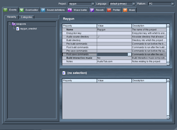
From the File menu, create a new FMOD Project. Call the project ‘Raygun’. I’ll call the Event Group ‘weapons’ and name my first event ‘raygun_oneshot’.


Step 3

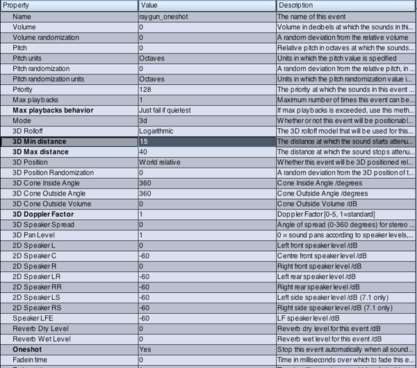
We’ll configure our Event Properties next. Most of the defaults will be adequate, but let’s make some changes that will make our raygun event more approprate for use in a game scenario.

  • Set ‘Max Playbacks’ to 3 – this will allow us to trigger up to 3 raygun sounds simultaneously before we need to steal or fail one to start a new event.
  • We’ll set ‘May Playbacks Behavior’ to ‘Just Fail If Queitest’. This behavior will tell the engine to fail the quietest raygun event if a 3 events are playing and a 4th one is triggered.
  • Mode is set to 3D – this will ensure that we can make the raygun sound emanate from a specific location in the game world. Frequently, weapon sounds may be attached to ‘muzzleflash’ type effects, such that if a weapon is fired, both a ‘flash’ from the muzzle is seen, and a corresponding sound is played.
  • 3D Rolloff is set to ‘Linear’. This is a common misunderstanding with FMOD – many users leave the rolloff to ‘Logarithmic’, which follows real-life volume curves (as the distance doubles, the volume halves). The problem with using this type of rolloff in a gameworld is that quite frequently, you want more specific control over what sounds are playing within a given viewport or game screen. If rolloff is set to ‘Logarithmic’, you may hear a weapon from a character over 500 meters away, even though the player may have no idea where the sound is coming from because they can’t see an enemy. There are a host of other reasons, but the simple solution is to set rolloff to ‘Linear’, which gives you more control over when and how and where sounds are heard throughout a given game.
  • We’ll set our 3D Min and Max distance to 15 and 40 respectively. This ensures that we’ll hear the raygun sounds at minimum volume if we are within 40 meters, and will hear them at full volume if we are within 15 meters. Outside of 40 meters, the event will be inaudible.
  • Lastly, we’ll set the Oneshot property to ‘Yes’ to ensure that when a raygun event is triggered, it automatically stops itself once the sound is finished playing.


Step 4

Next, we’ll create a wavebank in which we’ll place our raygun sounds.

  • Click on the Wave Banks tab.
  • In the Banks column, right click and select ‘Add Bank’.
  • Give the Wave Bank a descriptive name.

The properties for an FMOD Wave Bank (also known as an FSB) will vary greatly depending on a number of factors specific to your game.

As an example, however, I’ll set this wavebank to load into memory (this keeps the sounds active and availble for immediate use in game), set compression to ADPCM (offers a good balance of sound quality, compressed file size and low CPU utilization), disable Syncpoints and set Max Streams to 0, since we wont be streaming any of our raygun sounds from a disk.

Game Development Tip: Wave Banks will vary greatly depending on your target platform (Windows, Xbox 360, Wii, Playstation 3, etc.), the type of sounds in the bank, how the sounds are used in the game, and how your game engine uses audio resources. While further discussion of these topics is outside the scope of this tutorial, no doubt you’ll continue to learn about them as you work in game development.


Step 5

Now that we have a Wave Bank, we’ll add our raygun sounds to the bank.

  • Click on the Sound definitions tab.
  • Right click in the Sound definitions column to ‘Add empty sound definition…’
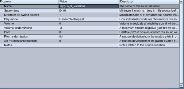
  • Call the definition “raygun_3_variations”.
  • Right click on the newly created definition and ‘Add wavetable…’
  • Shift-select the three raygun variations and click ‘Open’.
  • In the Sound definition properties, set Play mode to ‘RandomNoRepeat’. This ensures that when the event is triggered, it will randomly select one of the three raygun sounds.
  • Set Volume randomization to “-3”, which will randomize the volume by 3dB when the event is triggered.
  • Set Pitch randomization to “0.4”. This value is currently set in Octaves, but if you prefer working with other units, you can specify tones or semitones in the FMOD Event Properties view (Pitch Units and Pitch Randomization Units).

You can now audition the sound definition by clicking the ‘Play’ button atop the Sound definitions properties window.


Step 6

The final step in making our raygun event is to add the sound definition to the event.

  • Click on the Event editor tab.
  • In the grey area of layer00, right click to ‘add sound’.
  • From the dropdown list, add ‘raygun_3_variations’.
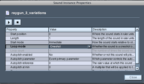
  • Right click on the newly added sound definition and select ‘Sound Instance Properties’.
  • Ensure that Loop mode is set to ‘Oneshot’.

Our raygun event is now complete, and once the project is ‘built’, it will be ready to use in an actual game!

Download the Play Pack for this tutorial (300KB)

Contents

  • FMOD Ex Source File
  • WAV Samples

If you’ve enjoyed learning a bit about game audio design, please let us know in the comments. We are considering more tutorials along these lines, but we need to know if you find them valuable. We appreciate your feedback!


{excerpt}
Read More

Winner Announced: Win a Logic Pro Tutorials Package from Logic-Courses.com

Want to learn more about Logic Pro? Logic-Courses.com offer two certified courses, one for beginner/intermediate users, and the other at a more advanced level. We’re giving you a chance to win both! To enter, just leave a comment! One random commenter will be chosen as winner. Too easy.


Winner Announced

Our winner for this competition (picked at random) is Raleigh Kleeb, who left this comment:

I only get to practice with my band for one month each year and I’d like to know all there is to know about editing music on my own so I can at least express my ideas to the other guys.

Congratulations – we’ll be in touch with you shortly.

If you didn’t win the book and are still interested, stay tuned for a post in the next day or two letting you know how to save 20% when signing up.


Logic Courses from Logic-Courses.com

Logic-Courses.com offer certified online video training courses to suit Logic users of all levels – from beginner to advanced users.

If you want to get the most out of your Logic software suite and learn all the latest tips, tricks and workflow methods then this brand new online training course provides the perfect solution for you.

Logic Courses provides both a basic/intermediate and advanced level course to support all levels of users, and the courses are delivered through a series of online video tutorials which you can access at any time, from wherever you are.

These videos will tell you more:

Beginner/intermediate course

Advanced course

How to Win

For the chance to win, you need to do two things:

  1. Firstly, comment! It would be great if you would tell us what you’d like to learn in Logic Pro. Make sure to include your correct email address with your comment so that we can contact you.
  2. Secondly, ‘like’ the sponsor’s ProducerTech Facebook page so you’ll keep up to date with their Logic Pro and Ableton Live courses (and a new Reason course coming out in a few days).

This giveaway is open worldwide, but make sure to get your comment in before midnight Sunday, October 23, 2011, AEST.


Rules and Conditions

  • To enter, leave a comment below letting us know what you would like to learn in Logic, and ‘like’ the ProducerTech Facebook page.
  • You may only enter once. Duplicate entries will be disqualified.
  • Envato staff and people who have written more than two tutorials/articles for a Tuts+ site are not eligible to enter.
  • Make sure to enter a valid email address so that we can contact you.
  • Entries will be accepted until Sunday, October 23, 2011, AEST.
  • Giveaway is open to all jurisdictions.
  • You must be of legal age in the jurisdiction that you reside to enter.
  • Giveaway is void where prohibited.

This competition is sponsored by ProducerTech and Logic-Courses.com.


{excerpt}
Read More