I tried to make a compare chart.
I’ve read the highchart document many times and searched hard, but I couldn’t find an option to create the chart I wanted.
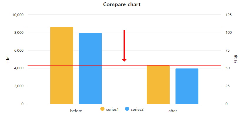
This is the original chart.
//chart1
            Highcharts.chart('chart1', {
                chart: {
                    type: 'column',
                },
                title: {
                    text: 'Compare chart',
                },
                subtitle: null,
                xAxis: {
                    categories: ['before', 'after', ],
                },
                yAxis: [{
                    title: {
                        text: 'title1'
                    },
                }, {
                    title: {
                        text: 'title2'
                    },
                    opposite: true,
                }, ],
                series: [{
                    name: 'series1',
                    color: '#f5b93d',
                    data: [8652, 4321],

                }, {
                    name: 'series2',
                    color: '#42a7f4',
                    data: [100, 50],
                    yAxis: 1,
                } ]
            });
full source : https://jsfiddle.net/publisherkim/m6g87hkf/10/
and This is what I want to make.
https://umings.github.io/images/tobe.png
I would like to indicate how much the data of series1 has been reduced to before and after in this way.
If anyone has seen a similar format chart, or knows any options, please help. Thanks.