In this Photoshop tutorial we will study the blending modes belonging to the Lighten Group. Tutorial Details Program: Adobe Photoshop CS6 (CS3+ versions will work as well) Estimated Completion Time: 50 minutes Difficulty: Intermediate Resources Arid Background Elephant Elephants Fire Burn Flames Premade Background 1463 Heart Bokeh Textures Setup working area In this article we […]
Category: PhotoShop
Photoshop tutorials
Create a Paintbrush Icon in Adobe Photoshop
In the following tutorial you will learn how to create a simple paintbrush icon in Adobe Photoshop.
Final Image
As always, this is the final image that we’ll be creating:

Tutorial Details
- Program: Adobe Photoshop CC
- Estimated Completion Time: 45 minutes
- Difficulty: Beginner-Intermediate
Step 1
Open Photoshop and hit Control + N to create a new document. Enter all the data shown in the following image and click OK. Enable the Grid (View > Show > Grid) and the Snap to Grid (View > Snap To > Grid).
For starters you will need a grid every 5px, so simply go to Edit > Preferences > Guides, Grid & Slices and focus on the Grid section. Enter 5 in the Gridline Every box and 1 in the Subdivision box. Also, set the color of the grid to #a7a7a7. Once you have set all these properties click OK. Don’t get discouraged by all that grid, it will ease your work later.
You should also open the Info panel (Window > Info) for a live preview with the size and position of your shapes.

Step 2
Set the foreground color to #f2c366, pick the Rectangle Tool and create an 80 x 40px vector shape. Make sure that it stays selected, focus on the bottom side and switch to the Direct Selection Tool. Select the left anchor point and drag it 10px to the left then select the right anchor point and drag it 10px to the right. The Snap to Grid feature will ease your work.
In the end your rectangle should turn into a simple trapezoid as shown in the second image.

Step 3
Make sure that your vector shape is still selected and go to Edit > Transform > Warp. Focus on the control panel, select Bulge from the Warp drop-down menu, check the Orientation button (indicated by the blue circle), enter "-15" in the Bend box and then hit Enter. In the end things should look like in the second image.

Step 4
Make sure that your vector shape is still selected and go again to Edit > Transform > Warp. Focus on the control panel, select Arc Lower from the Warp drop-down menu, enter "25" in the Bend box and then hit Enter.
In the end things should look like in the second image.

Step 5
Make sure that your vector shape stays selected, pick the Pen Tool, focus on the control panel and check the Subtract from Front Shape icon (indicated by the blue circle).
Move to your vector shape and draw several triangles roughly as shown in the following image. Once again, the Snap to Grid feature should ease your work.

Step 6
Focus on the Layers panel and simply double click on your vector shape to open the Layer Style window. Activate the Inner Shadow, the Inner Glow and the Gradient Overlay then enter the attributes shown in the following images. The white numbers from the Gradient Overlay image stand for Location percentage.


Step 7
Set the foreground color to black and pick the Rectangle Tool. Create two, 5 x 65px rectangles and three, 10 x 65px rectangles and place them as shown in the following image.
Focus on the Layers panel and make sure that all these black rectangles are selected. Simply right click on one of those vector shapes and go to Merge Shapes. This will turn your rectangles into a single vector shape.

Step 8
Make sure that your black vector shape is still selected and go to Edit > Transform > Perspective. Focus on the bottom side, drag the right corner 30px to the right then hit Enter. In the end things should look like in the second image.

Step 9
Make sure that your black vector shape is still selected and go to Edit > Transform > Warp. Select Bulge from the Warp drop-down menu, check the Orientation button, enter "-60" in the Bend box and then hit Enter.
In the end things should look like in the second image.

Step 10
Focus on the Layers panel, hold the Control button from your keyboard and simply click on the bottom vector shapes to load a simple selection around it as shown in the first image.
Keep focusing on the Layers panel, select your black vector shape and click on the Add layer mask button (indicated by the blue circle in the following image). In the end things should look like in the second image. You won’t need the selection anymore so simply hit Control + D to get rid of it.

Step 11
Make sure that your masked, black vector shape is still selected, focus on the Layers panel, lower its Opacity to 20% and change the Blending Mode to Overlay.

Step 12
For the following steps you will need a grid every 2px, so simply go to to Edit > Preferences > Guides, Grid & Slices and enter 2 in the Gridline Every box.
Pick the Rounded Rectangle Tool, focus on the control panel and set the Radius to 3px. Move to your canvas, create an 84 x 10px rounded rectangle and place it as shown in the first image.
Open the Layer Style window for this new vector shape and enter the attributes shown in the following images.


Step 13
Make sure that your rounded rectangle is still selected and duplicate it (Control + J). Focus on the Layers panel, simply right click on this fresh copy and go to Clear Layer Style. Make sure that the copy stays selected, lower its Fill to 0% then open the Layer Style window and enter the properties shown in the following images.


Step 14
For the following steps you will need a grid every 5px, so simply go to to Edit > Preferences > Guides, Grid & Slices and enter 5 in the Gridline Every box.
Using the Rectangle Tool, create an 80 x 20px vector shape and place it as shown in the first image. Make sure that this new rectangle stays selected and move to the Properties panel (Window > Properties). Focus on the corners section and simply enter "10px" in the top boxes as shown in the following image.
In the end your new vector shape should look like in the second image.

Step 15
Open the Layer Style window for the vector shape made in the previous step and enter the attributes shown in the following images.


Step 16
Using the Rectangle Tool, create an 20 x 40px vector shape and place it as shown in the first image. Make sure that this new rectangle stays selected and move to the Properties panel (Window > Properties). Again, focus on the corners section and simply enter "10px" in the top boxes as shown in the following image.
In the end your new vector shape should look like in the second image.

Step 17
Open the Layer Style window for the vector shape made in the previous step and enter the attributes shown in the following images.

Step 18
Hit Shift + Control + Alt + N to create a new layer, select it and send it to back (Shift + Control + [ ). Make sure that this new layer stays selected, pick the Paint Bucket Tool, set the foreground color to #edd6c8 and simply click inside your canvas.

Step 19
Focus on the Layers panel, right click on the layer made in the previous step and go to Convert to Smart Object. Make sure that this new smart object stays selected and go to Filter > Noise > Add Noise. Enter the attributes shown in the following image and click OK.

Step 20
Select all the shapes that make up your paintbrush and duplicate them (Control + J).
Make sure that only the copies are selected and turn them into a new smart object. Select it, lower its Fill to 0% then open the Layer Style window and enter the attributes shown in the following images.


Step 21
Reselect the smart object made in the previous step and duplicate it (Control + J). Focus on the Layers panel, right click on this fresh copy and simply go to Clear Layer Style.
Make sure that this new smart object stays selected, lower its Fill to 0% then open the Layer Style window and enter the attributes shown in the following images.


And We’re Done!
Here is how your final result should look.

The Best Free Photoshop Plugins for Web Designers
The work of a web designer is more of a creative process and in order to enhance that creativity web designers try to reduce the tedious technical part of their work with the help of various plugins and tools available for the software they employ. Nowadays there are many handy software extensions that can make the work of a web designer much easier and as a result more enjoyable.
Oftentimes the best and most useful tools are paid ones and not every web designer would go for it. So today we have come up with a selection of the best free Photoshop Plugins that will be helpful for both web designer pros and amateurs.
Layrs Control
CS6 CC

This Photoshop extension is basically a set of scripts that will do the routine technical work for you. With the help of Layrs Control you can easily remove all unused layer effects, delete empty layers, rasterize smart objects, and flatten layer effects styling all elements in accordance with flat design principles. As flat UI is now on the rise, you may need a separate plugin for creating flat designs and that’s Skeuomorphism.it.
Cut&Slice
CS6 CC

This is a very handy tool designed for cutting layout and exporting separate slices to different devices. For a web designer working with multiple screen sizes this is a heaven on earth. Cut&Slice allows you to export layers optimized for a particular device type. With the help of a special syntax used when naming layers, Cut&Slice can automatically perform additional actions on a layer or a group of layers, including trimming, scaling, detecting the state of buttons and distributing them on the different types of devices.
Render.ly
CC

Render.ly performs pretty much the same functions as the Cut&Slice, but has a few more useful features. It allows users to leave comments on the layout, which are then synchronized and available online. Another good thing about Render.ly is that it smart enough to export only those elements that have been changed during the session making it faster and more efficient.
CSS3Ps
CS3+
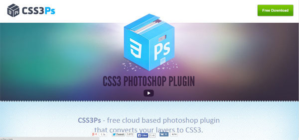
CSS3Ps is a handy tool that converts Photoshop styles and shapes to CSS3 and SCSS/SASS for Compass. It supports multiple features, including text layers, inner shadows and outer glows, which will help you with button designs, internal and external lighting, gradients, border-radius, etc.
The plugin is cloud-based, which is both good and bad. The good thing is that you won’t need to download and reinstall plugin updates to get access to newly released features and extensions. And the downside of it is that CSS3Ps requires internet connection, because the final output is generated on their server and therefore it may take up to 30 seconds.
Composer
CS5, CS6, CC
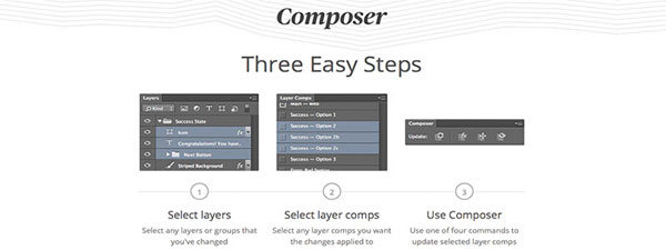
Composer is a great plugin that allows you to perform the same operation on multiple layers simultaneously. It reduces a lot of tedious work dreaded by most web designers. The range of commands is unfortunately limited to only 4 (update layer styles, positioning, visibility and all at once), but it boasts that it will cover any changes you typically make.
GuideGuide
CS5, CS6, CC
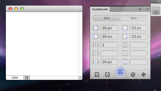
This is simply a very handy plugin for working with grids with multiple types of measurements, which allows you to save frequently used guides for further projects.
WebFont
CS5, CS6, CC

To create a really outstanding design, web designers often use non-standard fonts, but unfortunately not all of them are displayed correctly on all browsers and device types. This plugin lets you “try on” thousands of web fonts that will actually be used to go live right in the Photoshop window. The plugin gives you access to FREE web fonts from WebInk and Google web fonts.
Divine Elemente

The Divine Elemente is one of the most exciting plugins for Photoshop that has ever been released. Divine Elemente project is aimed not only at professional web designers, but also bloggers and webmasters who have basic knowledge of Photoshop. As it is stated on their website “It creates a “non-existent bridge” between Photoshop and WordPress”.
With the help of the Divine Elemente plugin anyone can create a Word Press theme, no skills of front /back- end development are required. All you need to do is to install the plugin, create the layout in accordance with an integrated blueprint and convert your Photoshop design to HTML / CSS / PHP code. Impressive, isn’t it? The only downside of Divine Elemente is that it is only available for Windows OS. But most probably an OSX version will be released in the near future, since the plugin is an absolute hit! The developers promise a lot of benefits, including: SEO friendliness, compatibility with HTML editors, XAMPP support, etc.
The plugin has a FREE unlimited trial, but a paid version is also available, featuring advantages like free updates, free premium themes, extensions, etc.
Random User Generator
CS6, CC
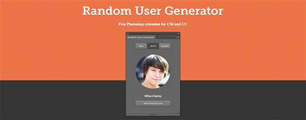
When creating web layouts you often need to also create sample users with realistic names and pictures. This is where Random User Generator will save you time and imagination. This plugin allows you to escape the long searches for avatars and with the click of a button generates a male or female character that has a random first name and last name, a random photo but altogether looks very realistic. These random personas are particularly useful when you need a placeholder in any kind of web mockups design drafts. Random User Generator plugin works with the help of RandomUser API.
BlendMeIn
CS6, CC

This plugin is probably the most sought after tool among web designers. When designing web pages becomes a part of every project you want to have a solid collection of high quality design elements always at hand and ready to use. Well, BlendMeIn is a strong attempt to solve that problem. It offers a wide variety of FREE design assets in vector format for both Photoshop and Illustrator. With the BlendMeIn plugin installed you can search for your desired element without leaving the Photoshop or Illustrator window. A must have for both pros and amateurs.
FlatIcon
CS5, CS6, CC

Flaticon is yet another free plugin that provides access to probably the largest collection (more than 38,000) of flat icons without leaving your working environment. The plugin is designed and developed by freepik.com, which is also a great source of free vector and .psd files to use in your designs.
Create a Fashion Mixed Media Portrait in Photoshop
In this tutorial I’ll show you how to create a fashion mixed media artwork. You’ll learn how to work with abstract elements, create patterns and play with shapes and colors.
Final Image

Tutorial Details
- Program: Photoshop CS3 +
- Estimated Completion Time: 2 hours
- Difficulty: Intermediate
Resources
Step 1
Create a new document and fill it with white. The ratio of the width/height is 2/3 but you can adjust it to fit your requirements.
Extract the model and place her at the center of the white canvas:

Step 2
Click the second button at the bottom of the Layers Pallete to add a mask to the model layer. Use the Lasso Tool (L) to make a selection at the bottom of the model’s coat:

Activate the Brush Tool (B) and on the layer mask, use a hard black brush to remove the selected part:

Step 3
To retouch the model’s skin, on the model layer, hit Cmd/Ctrl+Shift+N to make a new layer with Clipping Mask:

Use the Smudge Tool with Strength about 16% to soften the skin following the face details, especially the cheeks, nose sides:


Step 4
Make a new layer (Clipping Mask) and use brush with color #dba082, opacity and flow about 29-37% to brighten the shadow on the model’s right cheek (from the viewers):

Step 5
On a new layer, I used a brush with color #7b5239 with similar opacity and flow to paint on the cheeks, nose, lip corners and chin to create a smoother look for the skin and make the nose smaller and longer:

Step 6
I added an adjustment layer to reduce the model layer’s saturation. Go to Layer > New Adjustment Layer > Hue/Saturation:


Step 7
In this step we’ll make a colorful pattern to replace the white background. Make a new document and fill it with any colors you like. You can use your own size but it should be the same or larger than the size of our main one.
Activate the Pen Tool with Shape Layers options (not Paths) and draw some colorful shapes over the background. Be bold and choose the colors you wish, don’t be afraid if some of them are contrasting. Here is my choice of colors if you want a reference:

Step 8
Merge all the shape layers (Cmd/Ctrl+Option/Alt+Shift+E) and move the merged layer into the document containing the model. Place it under the model layer:

Name it “pattern” or whatever you like.
Step 9
Make a new layer above the pattern layer. Use the Ellipse Tool with color #c3c3c3 to draw a circle behind the model, then change the layer mode to Overlay 50%:


Step 10
Make a new layer above the circle layer. Change the foreground and background colors to #db829d and #2e82c3. Use the Polygonal Lasso Tool (L) to make a selection of a triangle at the right corner of the image:

Choose Filter > Render > Clouds:

Go to Filter > Sketch > Halftone Pattern:


Step 11
Make a new layer at the left side of the image and fill with color #ffa329:

Double click this layer, choose Pattern Overlay:


Step 12
Create a new layer and use the Polygonal Lasso Tool to make a selection inside the one in the previous step and fill with color #ffa329:

Apply Pattern Overlay:


Step 13
In this step we’ll make some lines to add to our picture. Open Illustrator and make a new document with white background. Set Fill to None and Stroke to 1 pt. Choose the Arc Tool and hold Tilde key (~) while dragging this tool to get a similar result to that shown below:

Step 14
Press Cmd/Ctrl+A and Cmd/Ctrl+C to copy this result then come back to Photoshop. Press Cmd/Ctrl+V to paste it into our main document. Choose Paste As Smart Object and use the Transform tool (Cmd/Ctrl+T) to rotate and scale it down:

Use a layer mask to remove unwanted lines:

Step 15
Create a circle behind the left of the model with color #191919:

I named it “circle 2″.
Step 16
Make a smaller circle inside the circle 2 and fill with black.

Double click this layer, choose Gradient Overlay:


Here is the result:

I named it “circle 3″.
Step 17
Open the star background pack. I used “starry 1″ and put it onto the two dark circles:

Change the mode to Linear Dodge 100% and use a layer mask to remove stars outside the circles:


Step 18
To enhance this effect, I used a Levels layer with Clipping Mask:


Step 19
Make a new layer, hold Cmd/Ctrl key while clicking vector mask thumbnail of circle 3 layer to load its selection (I turned off the model group to make it clearer to see):

Go to Edit > Stroke and pick white:


Step 20
Go to Filter-Blur-Gassian Blur to soften the stroke:

Use a layer mask to remove and reduce the stroke opacity to get a shiny look as shown below:

Step 21
Choose one from the sphere pack and put it inside the circle 3 after resizing:

Step 22
Open the splashes pack. I chose a green one to isolate, and placed it onto the circles:

Use a layer mask to blend the splash with the circles:

Step 23
Add a Hue/Saturation layer to the splash:


Step 24
Use Curves to darken the splash and match it with the circles:


Step 25
Cut out the flower bunch and position it at the bottom of the model. Set this layer above the model group.

Duplicate this bunch and make it larger, rotate it and place it to cover the model’s coat:

Step 26
Select the 2 flowers layers, then press Cmd/Ctrl+G to group them. Change the mode of this group from Pass Through (default group mode) to Normal 100%. Create a Curves layer within this group to change the contrast of the flowers:


Step 27
Make a new layer under the flowers group. Choose the Shape Tool with Triangle Frame and draw a shape under the model with white:


Use a layer mask to erase one side of this triangle:

Step 28
Apply a Pattern Overlay:


Step 29
Use the Rectangle Tool (U) to make several lines with white as shown below:

Step 30
Group all these lines layers. Use Cmd/Ctrl+T to rotate this group:

Add a layer mask to this group. Use a hard black brush to break the lines to get the look shown below:

Lower the opacity of this group to 80%:

Step 31
Right click the lines group, choose Duplicate Group. Right click the lower group, choose Merge Group. Use the Move Tool to drag it to the left:

Step 32
Press Cmd/Ctrl+I to invert the color of these lines from white to black then lower the opacity to 30%:


Step 33
Open the colorful pattern which was used for the background. Use the Rectangular Marquee Tool to choose a part of it then use the Move Tool to place it onto the side of the model’s glasses:


I removed unecessary parts with a layer mask:

Step 34
I used a Hue/Saturation layer to change the color of this part a little:

Step 35
I added more colorful pattern to the other side of the glasses:

Step 36
I used Color Balance for this layer:

Step 37
Make a selection of the glasses only then go to Layer-New Adjustment Layer-Curves:


Use a soft black brush with opacity about 20% to reduce the Curves effect on the center of the glasses. You can see how I did it with a layer mask and the result on the image below:

Step 38
Open the abstract shapes image. I chose the left one to put onto the model’s head:

Duplicate it twice and arrange them as shown below:

Step 39
Come back to the model layer mask. Use a black brush to remove unecessary hairs:


Step 40
Make a new layer under these shapes layers. Use a soft black brush with opacity about 30-35% to paint shadows for the shapes on the model’s forehead:

Step 41
Use another shape from the stock and place it above the model’s head:

Use a layer mask to remove the left side of it:

Step 42
Make a new layer on the top. Use a soft brush with color #f600b9 to paint on the flowers, then change the mode to Lighten 100%:


Step 43
On a new layer, use a brush with color #f759a7 to paint on the flowers again. I set the mode to Lighten 100%:


Step 44
I added a new layer and used a brush with color #f600b9 to paint on the parts of the model’s shoulder, arm, neck and face. Change the mode to Lighten 100%:


Step 45
To give a retro look to this work, I added a Curves layer at the top:


Step 46
I used another Curves layer to strengthen the effect:

On the Curves layer mask use a soft black brush with opacity about 20% to reduce the contrast on the model’s skin:


Step 47
Final step: Hit Cmd/Ctrl+Option/Alt+Shift+E to merge all visible layers. On the merged layer, go to Filter>Sharpen>Unsharp Mask:

And We’re Done!
I hope that you enjoyed the tutorial.

Using the Blending Modes in Photoshop
In this Photoshop tutorial I will introduce you to the wonderful world of blending modes.
Tutorial Details
- Program: Adobe Photoshop CS6 (CS3+ versions will work as well)
- Estimated Completion Time: 30 minutes
- Difficulty: Beginner
Resources
Intro to Blending Modes
So, what are blending modes? Well, when I first met them, they were this shady and scary part of Photoshop that seemed important somehow (because everyone was talking about it) but seemed too complex to learn. And boy was I wrong! Because blending modes are easy to learn once they’re properly explained and tremendously useful once you learn the ropes. And that’s why I am here, to make the process of learning blending modes as easy and painless as possible.
Before we delve into blending modes we have to understand another very important part of digital imaging: pixels. That’s because without pixels there would be no blending modes. How come? Let’s say that you open a photo in Photoshop. The photo is made of pixels. Pixels are little dots of different colors and they are the building bricks of the digital world. Wikipedia defines a pixel as “the smallest controllable element of a picture represented on the screen”. A regular 5×7 inch photo at 72 resolution – Web resolution – has 181440 pixels. Now imagine that each of those small pixels is formed by 3 smaller subpixels, each of them being able to display a single color: Red, Green and Blue. Each of these subpixels can have a value ranging from 0 to 255, 0 the minimum value and 255 being the maximum value. When the Green subpixel has a value of 255 it will emit green color at full intensity and when it has a value of 0 it will emit no color at all. The same goes for the Red and Blue subpixels.
Now let’s say that Green subpixel has a value of 255, Red subpixel has a value of 255 and Blue subpixel has a value of 0. What will be the color of the pixel? Let me answer that for you: the color of the pixel will be yellow. Why? Because in the additive mode (additive mode means that color is created by mixing light of two or more different colors hence the word additive) Red + Green = Yellow.
Interesting. Let’s go through a few more examples to be sure we understand this.
Let’s say that we have Blue subpixel at 255, Green subpixel at 255 and Red subpixel at 0. What will the color be? Again, I will answer that. The color will be Cyan. Hmm, it seems to be like a formula or something. Well, it is and once you memorize it, it will make things much easier in Photoshop. Here are the combinations:
Green + Blue = Cyan.
Blue + Red = Magenta.
Red + Green = Yellow.
Red + Green + Blue = White. (It makes sense because all the 3 base colors at full intensity will render a bright white light).
Lack of colors = Black. (This means that all subpixels will not emit any light – they will be at 0 intensity)
But what if we have the 3 subpixels at equal values? Let’s say that each subpixel will have a value of 30. This means that the color will be a very dark gray. If we start increasing the value of only one subpixel then the gray will start to shift towards that specific color emitted by the subpixel.
Step 1
Well, enough talk, let’s start by testing some of this knowledge. Open Photoshop and double click on the little square indicating the foreground color in order to open the Color Picker window.

Notice the 3 text boxes where you can enter a value. R, G and B. Hmm, a little cryptic. Or not. R stand for Red, G for Green and B for blue. Sounds familiar, right? Notice how in my Color Picker window R (Red) has a value of 175, G (Green) has a value of 2 and B (Blue) has a value of 0. You will see in the upper box the red color. Now if you try and enter a 175 in the Green text box you will see how the color changes to a nice muted yellow. Go ahead and experiment with different values until you have a feel for how the colors work in Photoshop.


Step 2
Ok, so now you know what pixels are. Let’s talk about another important part of Photoshop: layers. What are layers? Well, remember that I told you to open a photo? Take a look at the layers window (press F7 to open it). See where it says “Background”? That is a layer Photoshop automatically creates for every image we open. That layer is made up of pixels.

Step 3
Now let’s make another layer. Press Ctrl + Shift + Alt + N and notice in the layer window that another layer has appeared and it’s named “Layer 1”. See that the little thumbnail shows some checkers? This means that the layer is transparent (has no pixels whatsoever).

Step 4
Open the Color Picker window and choose a yellow color. Pick the Brush Tool (B) and paint a couple of lines. Congratulations, you just created some pixels!


Step 5
Now create yet another new layer by pressing Ctrl + Shift + Alt + N and paint with a green color on it. Note how the green color appears over the yellow color.


Step 6
Now try moving the layer with green painting below the layer with yellow painting (just drag the layer the “Layer 2” layer below the “Layer 1” layer with the mouse and drop). See how the layer with the yellow color (which is on top) covers the layer with the green color (which is below)? Now that’s an important thing to remember: pixels that are on the top layers cover pixels that are on the bottom layers. And when I say cover I mean that the pixels from the bottom layers are not visible at all if they are underneath the pixels from the top layers.


Step 7
But there is a way we can change this behavior. Click on “Layer 1” once – it should be the topmost layer – and change its opacity to 70%. Note that although the yellow color is still visible we can see the pixels from underneath layers through it. The lower the opacity, the more visible the pixels from underneath layers will be.


Step 8
Let’s think about this opacity thing for a bit. How does it happen? Let’s say that a yellow pixel from the topmost layer – “Layer 1” In our case – has an R value of 225, a Green value of 225 and a Blue value of 0 (remember the formulas from step 1). Now let’s say that the pixel just below the yellow pixel (situated on “Layer 2”) has an R value of 0, a Green value of 225 and a Blue value of 0. Now in a normal situation Photoshop would simply render the yellow pixel with its original color thus covering the green pixel from underneath. But since we have lowered the opacity of the yellow pixel we are telling Photoshop that this is not a normal situation anymore and he should calculate and display a combined version of the upper (yellow) and lower (green) pixel based on the Opacity slider. The resulting pixel that is displayed on the screen is called a composite pixel. The calculation it’s based on a mathematical formula that you can look up on the Internet, but that’s not our main subject so we won’t go into detail. Instead I need you to understand this:
Layers are made from pixels. If we have layers on top of each other then we will have pixels on top of each other. Photoshop needs to calculate how to display the composite pixels on the screen based on certain settings each layer (and thus all its pixels) have – like Opacity. But there are more settings each layer can have, and one of those settings is …. you guessed: blending mode.

Step 9
Now change the blending mode of the topmost layer (“Layer 1”) to Multiply and boost the Opacity back to 100%. Note how the yellow bright color has turned into a muddy one where it’s sitting over the blue, a gray one where it’s sitting over the green and it remained almost the same where it’s sitting over the white. Why? Because we just changed a layer setting and forced Photoshop to change its formula for calculating the composite pixels. If we change the blending mode of the top layer to Overlay, then Photoshop has to recalculate the composite pixels based on a new mathematical formula.


Let’s resume:
Each layer is made of pixels. Layers – and thus pixels – sit on top of each other. The pixels displayed on the screen are called the composite pixels. They are calculated based on different settings each of the layers has (amongst those settings there’s Opacity, Fill, Blending Modes, etc.) and calculated using special mathematical formulas.
Step 10
Blending modes are grouped logically into groups based on their effects:
Basic: Normal, Dissolve, Behind, Clear.
Darken: Darken, Multiply, Color Burn, Linear Burn, Darker Color.
Lighten: Lighten, Screen, Color Dodge, Linear Dodge, Lighter Color.
Contrast: Overlay, Soft Light, Hard Light, Vivid Light, Linear Light, Pin Light, Hard Mix.
Comparative: Difference, Exclusion, Subtract, Divide
Component: Hue, Saturation, Color, Luminosity.
But blending modes are not available only for layers. They are also available for certain tools and you can change the blending mode of that tool by going to the Options Bar (the most upper bar).

Step 11
Normal is the default blending mode. In this layer mode pixels on the top layers cover the pixels on the bottom layer completely (unless the top layer has a low Opacity).
Dissolve is a peculiar blending mode for which there is not much use. If you change the blending mode of “Layer 1” to Dissolve notice how nothing happens. But if you lower the Opacity, you can see pixels disappearing randomly from “Layer 1”. The lower the Opacity, the more yellow pixels disappear, leaving us with something resembling a yellow spray.
Behind is a blending mode that is available only for Brush, Gradient and Clone Stamp. If you have one of these tools selected and you change the blending mode in the Options bar to Behind then every pixel you paint with that tool will be behind the pixels that are already visible on that layer.
Clear is available for the Brush tool and can be selected in the Options bar. When selected the Brush tool acts as the Eraser tool and deletes pixels on the layer we are painting on.


Conclusion
This is a complex subject for beginners and I have tried to explain it as best as I could. If you think you missed something then read this article again or open Photoshop Help (F1) and read about blending modes there too so you can have a broader perspective.
11 Photo Effect Tutorials for Photoshop
Photoshop is the number one software to photo editing and we decided to list in this article 11 photo effect tutorials.
These tutorials were already published at Photoshop Star before and we decided to group the best ones so you can improve your photo editing skills.
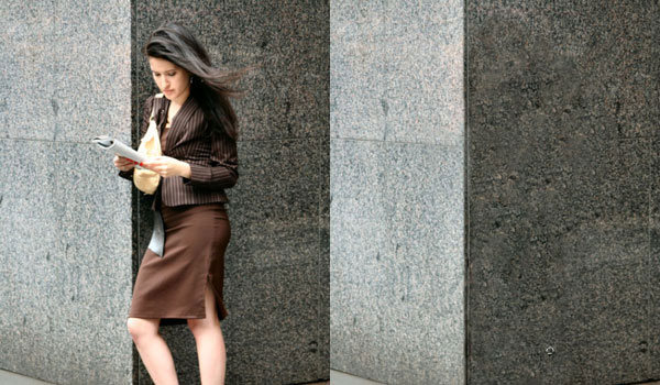
Learn How to Remove a Person from a Photo
In this Photoshop tutorial you will learn how to remove a person from a photo.
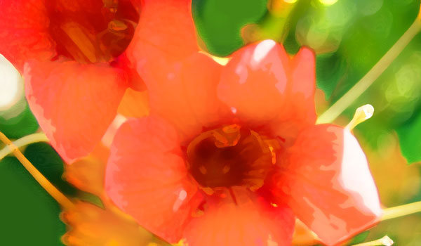
Learn How to Create Watercolor Effect
On this tutorial you will learn how to create watercolor effect on a photo.
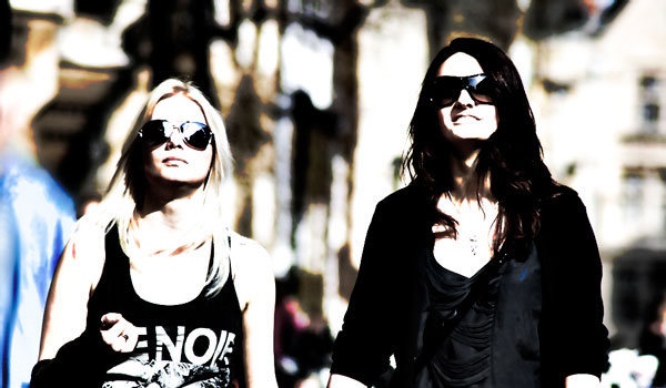
Creating Fashion Contrast Photo Effect
In this easy, step-by-step tutorial I´m going to show you how to create fashion contrast photo effect in a few minutes.
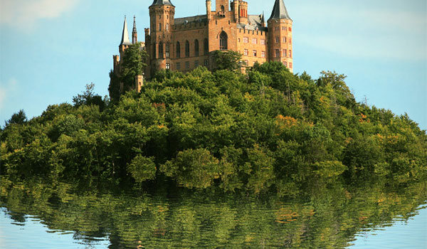
How to Create Realistic Water Reflection Effect in Photoshop
In this tutorial we will create a realistic water reflection effect and you should be able to replicate this effect on other pictures using the techniques presented here.
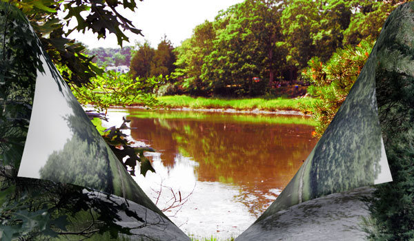
How to Create a Landscape Change Effect
Today I decided to create one unusual tutorial about landscape change effect, which you can apply for any image that you want.
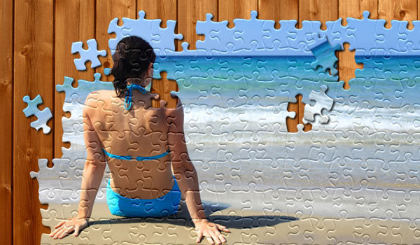
Learn How to Create Jigsaw Puzzle Effect in Photoshop
In this tutorial you will learn how to transform a regular photo into a jigsaw puzzle.
Remove a Person and Recreate a Busy Background Using the Clone Tool
In this Photoshop tutorial you will learn how to remove a person from an image and recreate the background to look very natural.
Warm Colors on the Photo
In this Photoshop tutorial we are going to add warm colors to one photo playing with color settings and layer blending modes.

How to Turn a New Photo Into an Old Photo
In this Adobe Photoshop tutorial i will show you how to turn a new photo into an old photo.
How to do Facial Retouching in Photoshop
Today i decided to create one new tutorial where you can learn how to do professional facial retouching.
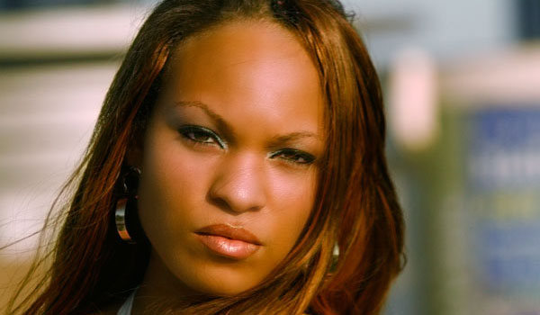
How to Add a Realistic Rainbow Effect to a Photo in Photoshop
In this tutorial we will create a realistic rainbow and add it to our photo. This is an easy Photoshop tutorial where we will create a realistic rainbow and add it to our photo.
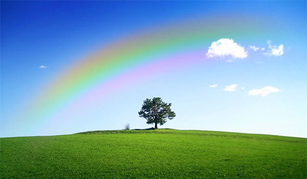
Create a Fantasy Tree Woman Scene in Photoshop
In this tutorial I’ll show you how to create a fantasy tree woman scene in Photoshop. You’ll learn a variety of manipulating techniques, such as blending, masking, using the brush tool, adjusting color as well as working with groups and more.
Final Image

Tutorial Details
- Program: Photoshop CS3 +
- Estimated Completion Time: 2.5 – 3 hours
- Difficulty: Intermediate
Resources
Step 1
Create a new document, size 1000 x 1052px and fill it with any colors you like. Open the ground stock. Use the Rectangular Marquee Tool (M) to make a selection of the ground part and drag it into our canvas. Use Cmd/Ctrl+T to resize it as shown below:


Step 2
Click the second button at the bottom of Layer Palette to add a mask to the ground layer. Take a soft black brush with opacity of about 100% and 30% to remove the hard edge of this ground. You can see the result on the layer mask and the result on the picture:


Step 3
To darken the ground, I used an adjustment layer with Clipping Mask. Go to Layer-New Adjustment Layer-Curves, then right click on the layer and select Create Clipping Mask:

I wanted to make the main light source from the right so on the Curves layer mask use a soft black brush to erase the right side to keep it a bit brighter than the rest:

Step 4
I used a Hue/Saturation layer to change the color of the ground:


Step 5
Choose a part from the sky stock and move it into the canvas. Place this layer under the ground layer and use Cmd/Ctrl+T to rotate it as shown below:


Step 6
Create a Curves layer with Clipping Mask for the sky:

On the Curves layer mask erase the left side to keep it darker than the right:

Step 7
Add a Color Balance layer to give the sky some yellow light:


Step 8
Use Hue/Saturation to reduce the sky saturation a little:


Step 9
Use Curves again to make a stronger contrast:

Apply brush masking on the Curves layer mask. We have a good contrast for the sky now:


Step 10
Open the tree root stock. Use the Polygonal Lasso Tool to take a part of the root and drag it into our picture. Use Cmd/Ctrl+T to transform it as the screenshot below shows:


Use a layer mask to remove hard edges and blend the root with the ground:

Step 11
Add a Curves layer to darken the root:

On the Curves layer mask use a brush with a very low opacity (about 10-15%) to erase the right side a bit:


Step 12
Make a Hue/Saturation layer for the root to match the root color with the ground:


Step 13
Open the tree stock. Take the trunk and place it above the root. Use the Warp Tool (Edit-Transform-Warp) to tweak it to look like a woman’s dress shape:


Use a layer mask to blend this trunk with the root:

Step 14
Make a new layer with a Clipping Mask. Activate the Clone Tool (S) and use it to fix some details on the trunk:


Step 15
Create a Curves layer to darken the trunk:

On the Curves layer mask use a brush to remove the dark on the right side (as it gets more light from the background than the left):

Step 16
Reduce the saturation of the trunk with Hue/Saturation:


Step 17
Isolate the model from the background and place her onto the trunk:

Step 18
Add a layer mask to the model layer. Use a brush to blend her dress with the trunk, also cut out her arms as shown below:


Step 19
Create a Hue/Saturation layer for the model:


Step 20
Apply Curves to brighten the right of the model:

Erase the left of the model and her arms to keep them darker than the rest:

Step 21
Add a Curves layer again to darken the left:

Apply brushing on the Curves layer mask:


Step 22
To create more light for the model, I used a new layer and a soft white brush, opacity about 25%. Paint on the right of the face and body:

Step 23
Create a new layer, fill with 50% gray and change the mode to Overlay 100%:

Take the Dodge and Burn Tools with Midtones Range, Exposure about 20-25% to create some details for the model’s dress, and darken the eyebrows a little. You can see how I applied this tool in Normal mode and the result in Overlay mode:


Step 24
Make a new layer on the top with the same settings as in previous step but without the Clipping Mask. Use Dodge and Burn to make more wrinkles for the model’s dress following the dress shape:

Step 25
As the light comes from the right and behind the model, she should have a shadow on the left and front. To do this, create a layer under the model layer. Hold Cmd/Ctrl while clicking the model layer to load its selection:

Fill this selection with black (Shift+F5) then flip it vertically (Edit-Transform-Flip Vertical). Use Cmd/Ctrl+T to transform this shadow as shown below:

Lower the opacity of this layer to 50% and use a layer mask to remove part of the arm and the rough edges.

Go to Filter-Blur-Gassian Blur to soften the shadow:

Step 26
Put branch 1 onto one of the model’s arms and use Warp Tool to bend it a little:

Duplicate this layer and flip it horizontally. Put it onto the other arm:

Step 27
Add a layer mask to these layers and use a brush to blend the branches with the arms and remove some parts of them. I’ve tried to avoid a uniform look:


Step 28
I used Dodge and Burn with the same method as in the previous steps to enhance the higher branch:

Step 29
Drag the branch from the original stock to place as the higher branch, scale it down then use a layer mask to clear some parts (use a hard brush to avoid soft unnatural edges):

Do the same with the lower branch:

Step 30
Select all branch layers then hit Cmd/Ctrl+G to group them. Change the mode of this group from Pass Through (default group mode) to Normal 100%. I named the branch layers from 1 to 4. On layer 4, go to Layer-New Adjustment Layer-Curves:

Apply a brushing job on the Curves layer mask:

Step 31
Open branches 2 stock. First use your preferred method to cut out the tree from the background:

Use the Lasso Tool to choose the selected parts shown below to put onto the model’s arms and head:

Step 32
Use a layer mask to blend the branches on the model’s arm and remove the parts over the face:

Step 33
I used a Curves layer with Clipping Mask to darken the branches at the lower position:

Step 34
Make a group for branches 2 layers and add a Hue/Saturation to the top of the layers within the group:


Step 35
Use Curves to brighten some branches:

Take a brush and paint on the branches at the lower position and on the head as they should not be too bright:

Step 36
Extract crow 1 and place him on the lower branches:

Step 37
Make a new layer under crow 1 one. Use a black brush with opacity about 50% to paint under the crow’s claws to make a shadow for him:

Step 38
Add a Hue/Saturation to crow 1 layer:

Step 39
Use Curves to darken the crow:

Step 40
Place crow 2, after cutting him out, at the top right of the branches:

Step 41
This crows looks too contrasted against the misty background so I used Curves to fix it:

Step 42
Make a new layer on the top. Change the foreground color to #1c0101 and choose a leaves brushes size 10 px. Press F5 to change the settings for this brush:


Paint leaves around sky part and model:

Step 43
Apply a Gaussian Blur of 4 px to add depth to the scene:

Step 44
Add more leaves of a bigger size and same brush color (15 px):

Step 45
I used Curves to brighten some leaves as they are in a misty scene:

Apply brush masking and here are the results on the layer mask and on the picture:


Step 46
Create a new layer on the top and use a soft white brush with opacity about 20-25% to add some light on the higher branches:

Step 47
Make a new Curves layer on the top:

Erase the right side to make the contrast of the whole scene more visible:

Step 48
Add a Gradient Map layer:

Lower the opacity of this Gradient Map layer to 20%:

Step 49
Create a new layer and change the foreground and background to #282127 and #f4e7c4. Go to Filter-Render-Clouds:

Lower the opacity to 30% and use a layer mask to remove the clouds effect on the sky, and reduce the intensity on the ground:


Step 50
Create a new layer, take the brush, color #f4e7c4, to paint on the picture to create a more misty effect for the scene. I set the mode of this layer to Hard Light 30%:


Step 51
Use the same brush to paint on the right edge of the ground which is near the horizon. Change the mode of this layer to Soft Light 100%:

Step 52
Make a Photo Filter layer:

Erase the ground on the Photo Filter layer mask:

Step 53
Continue changing color with Color Balance:


Step 54
The final adjustment layer is Vibrance:


Step 55
Final step: Press Cmd/Ctrl+Option/Alt+Shift+E to merge all visible layers. Go to Filter-Blur-Gassian Blur and set the radius to 3 px:

On the Filter layer mask use a soft black brush to remove the blur effect on the model and reduce its intensity on the ground to add depth to the scene:

And We’re Done!
I hope that you enjoyed the tutorial.

Create a Sleek Metallic 3D Text Effect in Photoshop CS6
The 3D environment in Photoshop CS6+ provides a variety of options and settings to help you create amazing 3D text effects easily. This tutorial will show you how you can play around with the different settings to create a simple, yet sophisticated, metallic text effect.
Final Image

Tutorial Details
- Program: Adobe Photoshop CS6 Extended
- Estimated Completion Time: 45 minutes
- Difficulty: Beginner
Resources
- Sail font.
- Malleable Metal Patterns by WebTreatsETC.
Step 1
Create a new 1000 × 1000 px document. Set the Foreground color to #444343 and the Background color to #1c1c1c. Pick the Gradient Tool, choose the Foreground to Background gradient fill, and click the Radial Gradient icon.
Then, click and drag from the center of the document to one of the corners to create the background gradient.

Create the text in the color #cccccc. The font used is Sail and the Size is 330 pt.

Go to 3D > New 3D Extrusion from Selected Layer. This will convert the Type layer into a 3D layer.
The cool thing about this is that the 3D text mesh will still be editable. We will get to this later in the tutorial.

Step 2
To access the 3D mesh settings and properties, you’ll need to open two panels: The 3D panel, and the Properties panel (both found under the Window menu).
The 3D panel has all the components of the 3D scene, and when you click the name of any of those, you’ll be able to access its settings in the Properties panel. So make sure to always select the name of the element you want to modify in the 3D panel before you change its settings in the Properties panel.

Select the Move Tool and check its Options bar. You’ll find a set of 3D Modes for the tool to the right of the bar. When you choose one of those, you can then click and drag to perform any changes (on the selected element in the 3D panel).

Step 3
Select the text mesh name tab in the 3D panel, then, in the Properties panel, change the Texture Mapping to Tile, and the Extrusion Depth to 500.

Click the Cap icon at the top of the Properties panel, then change the Bevel Width to 10, the Contour to Half Round, the Inflate Angle to 90, and the Strength to 2. This will help inflate the text a little bit, and create a simple stroke as well.

Click the Coordinates icon, and change the X Rotation Angle to 90. This will make the text perpendicular to the Ground Plane.

Go to 3D > Snap Object to Ground Plane, to make sure that the text isn’t inside the Ground Plane or floating over it.

Next, select the Current View tab in the 3D panel, and use the different Move Tool’s 3D Modes to move the camera so that it points to the text from above.
You can also use the 3D Axis to move the text around if needed (with the Move Tool selected). The arrows at the ends of the 3D Axis move the mesh, the part below them is used for rotation, and the cubes are used for scaling. The cube in the center is used to scale the object uniformly. All you need to do is click and drag the part you need to perform the changes.

Step 4
If, at any point, you need to change or modify the text, then you can simply click its name tab in the 3D panel, and click the Edit Source button down the Properties panel.

This will open a document that has the text layer, you can then make any changes to the text.
Here, the font Size is changed to 392.5 pt. Sometimes, when you change the text itself, or its size value, it might extend outside the document’s edges.

To fix that issue, accept the changes you made, then go to Image > Reveal All.

Once you’re done, save the document (File > Save) then close it (File > Close) to go back to the original one.

Step 5
To add more perspective to the text, select the mesh name, then click the Deform icon and change the Taper value to 80%.

Select the Front and Back Inflation Material tabs (Ctrl/Cmd + click each one), then modify their settings as shown below:
The colors used are:
- Diffuse : #391d5b
- Specular : #bbb08c
- Illumination : #080808
- Ambient : #000000

Select the Front and Back Bevel Material tabs, then modify their settings as shown below:
- Diffuse : #391d5b
- Specular : #c1c1c1
- Illumination : #080808
- Ambient : #000000

Finally, select the Extrusion material tab and change its settings as shown below as well:
- Diffuse : #1b003d
- Specular : #c1c1c1
- Illumination : #080808
- Ambient : #000000

Step 6
Click the Environment tab in the 3D panel, then click its IBL folder icon in the Properties panel and choose Load Texture.

Load the “ghghghhj.jpg” image form the “Malleable Metal Patterns” pack. Then, change the Intensity to 50%, the Ground Plane Shadows Opacity to 60%, the Reflection Opacity to 20%, and the Roughness to 2%.

You can use the Move Tool to click and drag the Environment Light’s sphere and move it around until you like how it looks.

Step 7
Click the Infinite Light 1 tab, then change its Intensity to 90% and its Shadow Softness to 60%.

You can either move this light as you like, or use the Coordinates values below.

Click the Add new Light to Scene icon down the 3D panel and choose New Infinite Light.

Change the Infinite Light 2 Intensity value to 40% and un-check its Shadow box.

Move the light or use the Coordinates values below.

Step 8
Make any other changes you want to the scene until you like the result.

When you’re done, render the scene (3D > Render). The rendering might take some time, but you can stop it anytime by pressing the Esc key.

Once the rendering is finished, click the ‘Create new fill or adjustment layer’ icon down the Layers panel, and choose Gradient Map.

Create the gradient using the colors #3e5678 to the left and #ff9a9e to the right. Change the adjustment layer’s Blend Mode to Overlay and its Opacity to 15%. This will help enhance the coloring of the final result.

And We’re Done!
Hope you enjoyed this simple 3D tutorial and found it helpful. Please feel free to leave your comments below.

How to Change Hair Color in Photoshop
In this tutorial we will change the hair color from black to magenta and we will make it look shinier and prettier. This tutorial uses some techniques that might be difficult for beginners but if you follow it patiently you should be able to complete it.
Final Image

Tutorial Details
- Program: Photoshop CC, Photoshop CS6, Photoshop CS5
- Estimated Completion Time: 45 minutes
- Difficulty: Intermediate
Resources
Step 1
Open image “Girl”.

Let’s increase the brightness of the hair a little bit. Add a new Curves Adjustment layer (Layer > New Adjustment Layer > Curves) and drag the curve up a little. Because we want this to be applied only to the hair let’s mask the effect elsewhere. Press D to set the default colors. Select the layer mask by clicking on it and press Ctrl + Backspace to fill the layer mask with black. Now with a round soft brush paint with white where the hair is. In a layer mask white reveals the layer and black conceals so by painting with white over the hair we will limit the Curves Adjustment layer effect only to it.


Step 2
Now let’s decrease the saturation. Add a Hue/Saturation Adjustment Layer by going to Layer > New Adjustment Layer > Hue/Saturation. Drag the saturation slider to the left in order to decrease the saturation. Do the same thing with the layer mask as you did at step 2 (fill the layer mask with black and paint with white over the hair).


Step 3
Create a new layer (Ctrl + Shift + Alt + N) and change it’s blending mode to Overlay. Now choose a red color (#ff0000) and with a brush at 50% Opacity paint over the hair. And voila, we changed the color of her hair. But let’s make some further adjustments.

Step 4
Add a Hue/Saturation Adjustment layer and drag the slider to the left or right until you find a color that you like. Once you’re done fill the layer mask with black and paint with white over the hair. I’ve chosen a magenta color to match with her dress.


Step 5
Create a new layer from all the visible layers (Ctrl + Shift + Alt + E). Select the Dodge Tool and lighten up some strands of hair.

Step 6
Create yet another layer and change the layer blending mode to Overlay. Choose a green/cyan color (#50a596) and with a brush at 40% Opacity paint over her hair in some areas. This step will add some color variation to the hair.

Step 7
Now let’s boost up the contrast a bit. Add a Brightness/Contrast Adjustment layer (Layer > New Adjustment Layer > Brightness/Contrast) and drag the Contrast slider to the right. We’ve changed the hair color and we added some shine to it.


Step 8
Now let’s color correct the color of the skin near the hair. Duplicate the Background layer (Ctrl + J) and drag it on top of all the layers. Add a layer mask to it and fill it with black. Now simply paint with a white brush in the layer mask to reveal the original face.

And We’re Done!

Love Is In The Air: Valentine Resources for Photoshop
Valentine’s Day is nearly upon us, and you may want to create a card, wallpaper or other project for a loved one, or even adorn your website with some seasonal images. In today’s round up we bring you a selection of free resources for Photoshop: Brushes, Patterns, Textures, .psd files and Fonts.
Valentine Resources
Brushes
Heart Brushes
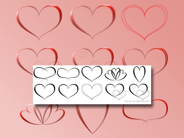
Heart Brushes
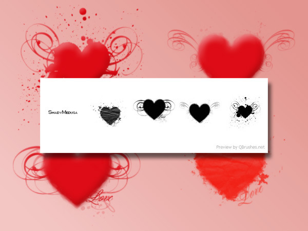
Heart Grunge
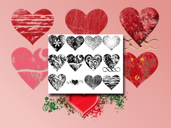
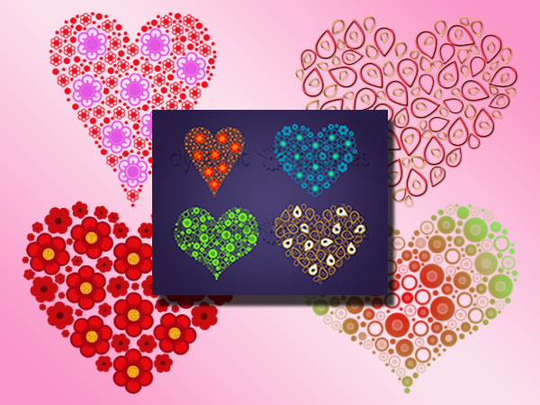
Fashioned Hearts Brushes
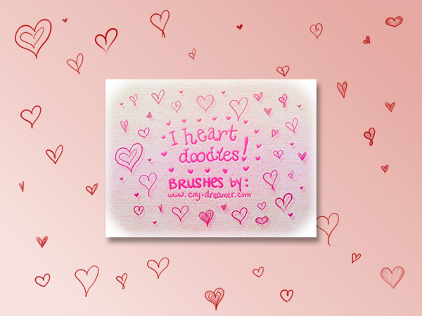
I Heart Doodles!
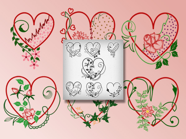
Valentine Heart Brushes
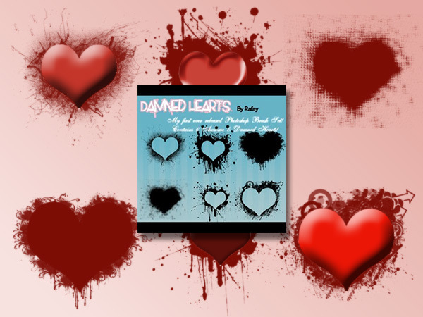
Damned Hearts
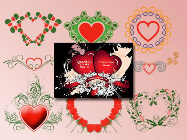
Valentine Clip Art Vol. 3
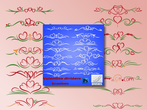
Valentine Dividers Brushes
Patterns
Quirky Seamless Hearts Patterns
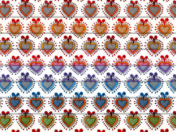
St Valentine’s Day Patterns
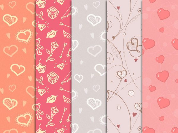
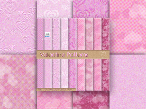
Valentine Patterns
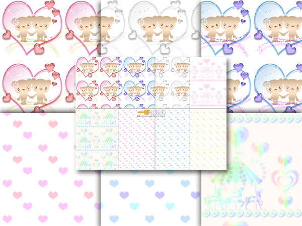
Cutie Bears
Valentine’s Day Patterns
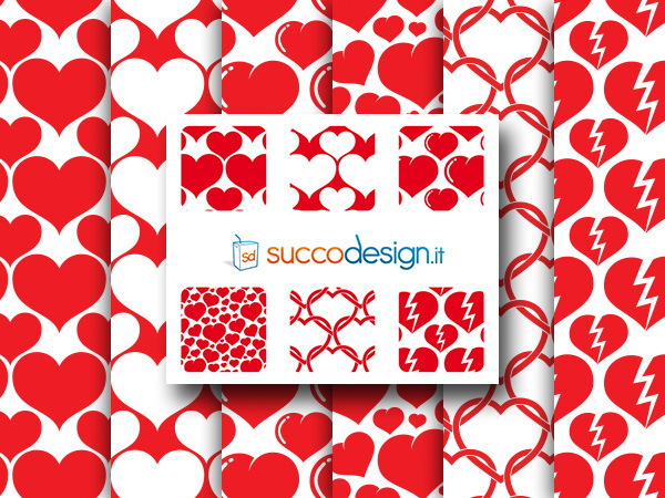
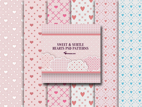
Sweet and Subtle Hearts Patterns
Textures
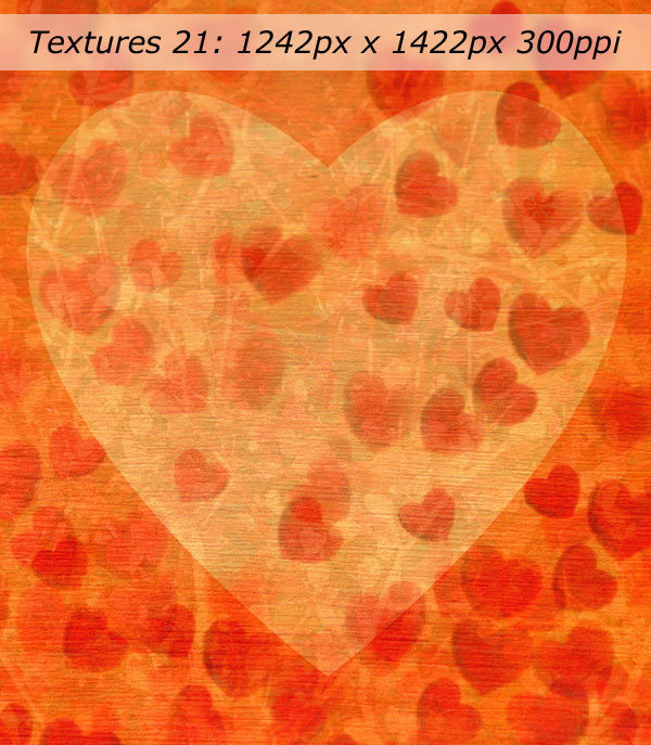
Textures 21
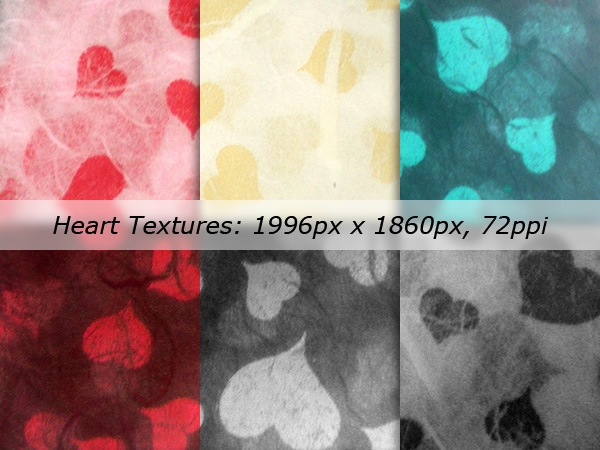
Heart Textures Pack
Grungy Coffeshop Valentine Textures
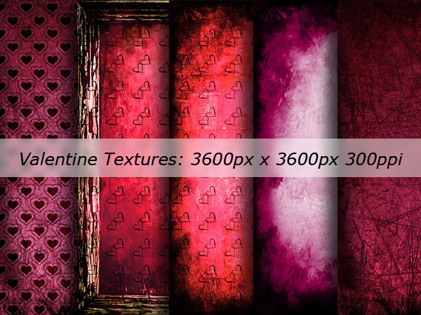
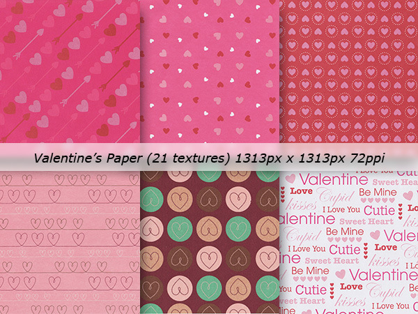
Valentine’s Paper Textures Pack
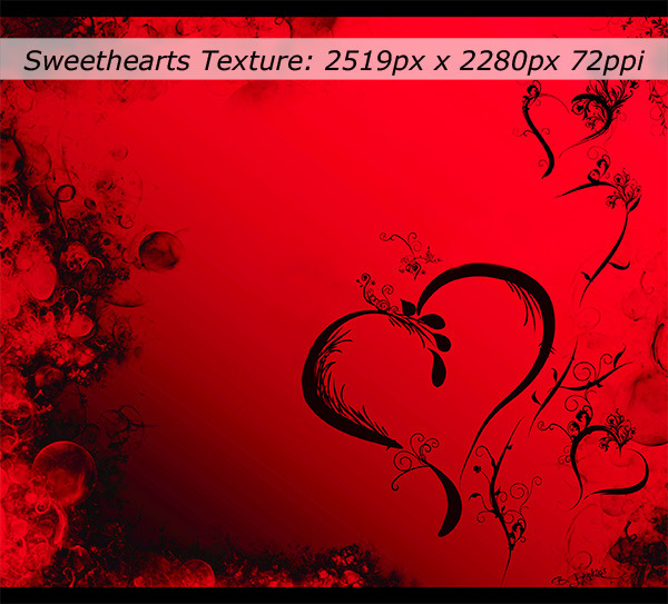
Sweethearts
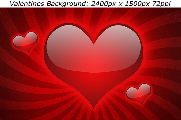
Valentines Background
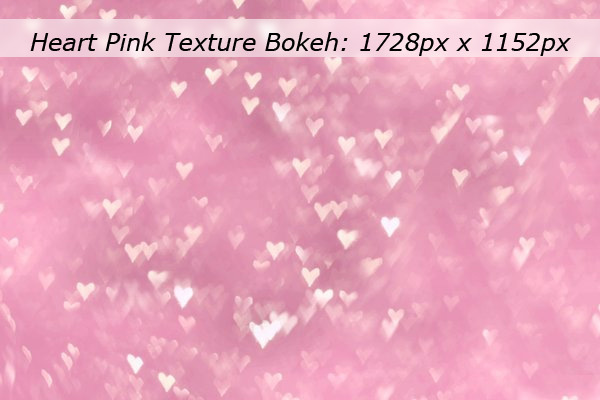
Heart Pink Texture Bokeh
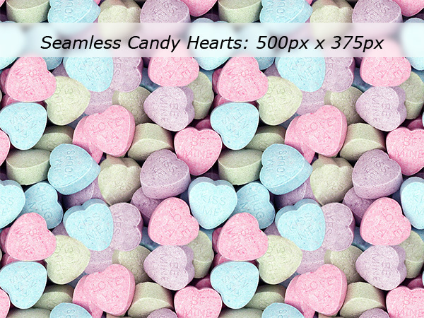
Seamless Candy Hearts
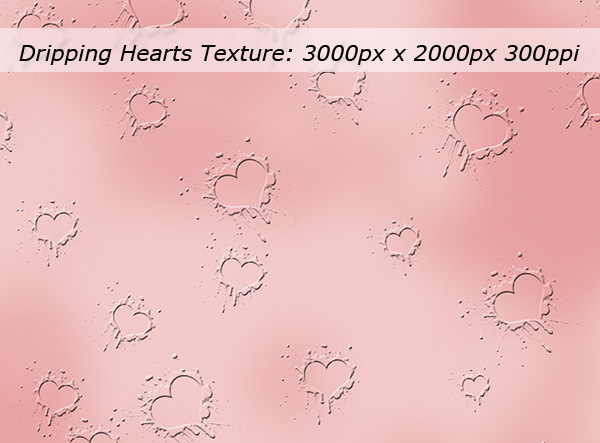
Dripping Hearts Texture
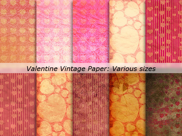
Valentine Vintage Paper
PSD Files
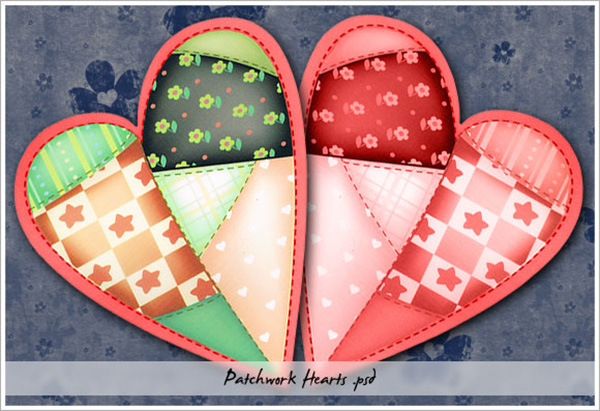
Patchwork Hearts
Hearts Take Flight
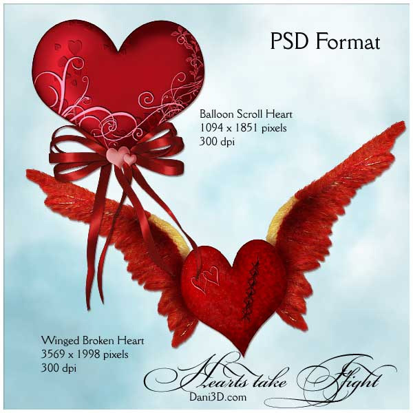
Valentine 2 PSD
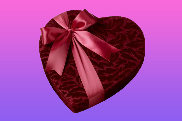
Valentine Heart Shaped Sticker

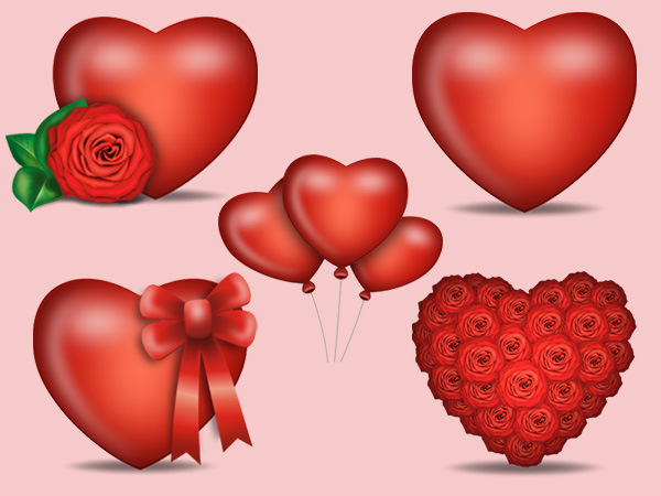
Heart Shaped Balloons

Happy Valentine’s Set 01

Heart Shapes
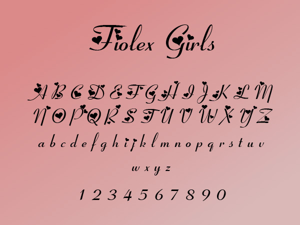
Fonts
Fiolex Girls
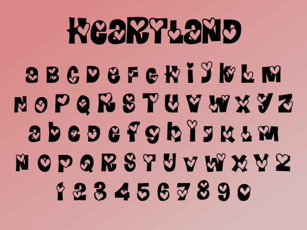
Heartland
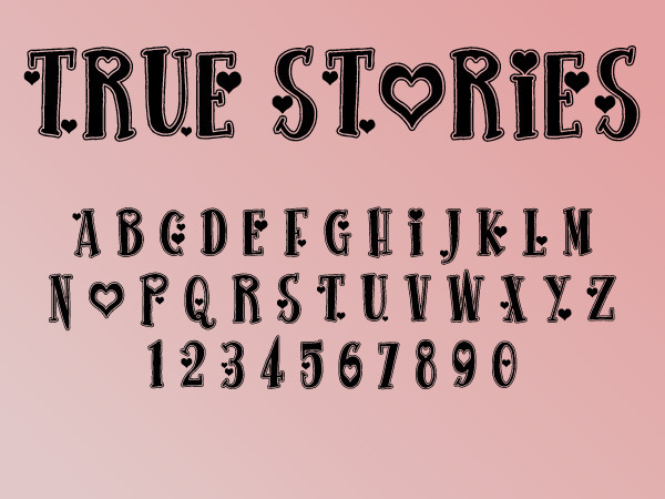
True Stories
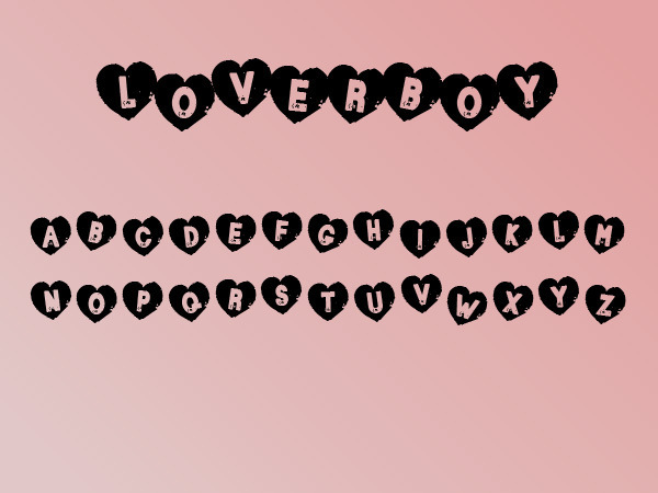
Loverboy
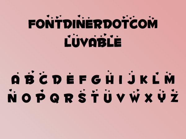
Fontdinerdotcom Luvable
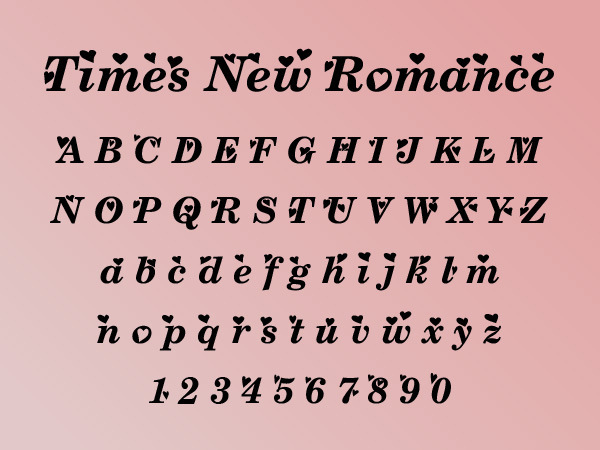
Times New Romance
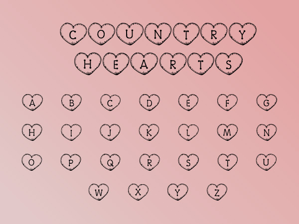
Country Hearts
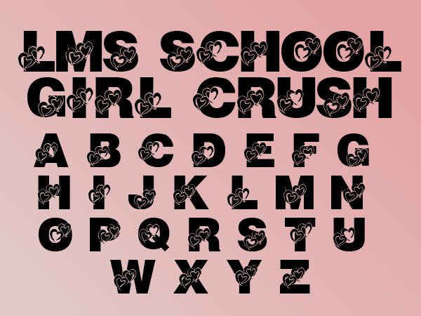
LMS School Girl Crush
Conclusion
Hopefully you will find some of these resources useful and even inspiring. Please remember to check out the license for usage on each download page. And hopefully you will be all loved up on Valentine’s day this year!
Create a Fantasy Fiery Portrait Photo-Manipulation
In this tutorial I’ll show you how to create a fantasy fiery portrait of a woman. You’ll learn how to use textures, add fire and create lighting effect.
Final Image

Resources
Step 1
Create a new document with size of 1000×1100 px and fill it with black. Press Cmd/Ctrl+Shift+N to make a new layer. Active Brush Tool (B) with color #4e1502 and size 1200 px. Paint on the center of the black canvas:

Step 2
Create a new layer, change brush color to #f6bc2f. Paint inside the dark red area and change the mode to Color Dodge 100%:


Step 3
Use same brush to paint again on a new layer, put the mode to Overlay 70%:


Step 4
Open nebula stock. Use Move Tool (V) to drag it into our canvas:

Step 5
Click the second button at the bottom of Layer Pallete to add mask to this layer. Use soft black brush with opacity about 40-45% to reduce nebula effect on some parts. You can see how I did it on layer mask and result on picture:


Step 6
Duplicate this layer and erase some parts with layer mask to get the result below:


Go to Filter-Blur-Gassian Blur and choose radius as 2 px:

Step 7
Open model stock. First I used Polygonal Lasso Tool to make a selection around model (no need to be so precise with the hair):

Double click background layer to unlock it.

Click the layer mask button to hide background part:

Step 8
Right click the mask of Layer 0, choose Refine Mask:

Use Refine Radius Tool with size about 100 px to paint around the head to reveal more hairs.

Here is my result after refining (I used a red background to make you see it more clearly):

Step 9
Place model after extracting into our main picture, on the top of layers:

Step 10
I want to reduce the lightness on the bright parts of the model so create a new layer above model one with Clipping Mask:

Use brush with color #e6e2e9 to paint on the bright hair, face and hand parts and change the mode to Multiply 100%:


Step 11
Continue reducing the light on model face, arm with a new layer (Clipping Mask) and same brush. I altered the mode to Multiply 50%:


Step 12
I want to give more details for model hair so on a new layer I used brush with color #5a595b and size about 20 px. Here is the result after drawing more hair:

Step 13
To add some red color to the model, I used an adjustment layer with Clipping Mask. Go to Layer-New Adjustment Layer-Hue/Saturation:


Step 14
I added a Color Balance layer with same purpose:


Step 15
Make a Curves layer to darken the model:

On Curves layer mask I used soft brush to remove and reduce dark intensity.


Step 16
Create a new layer and use brush with color #f66e2b to paint on the hair and hand. Change the mode to Color 100%:


Step 17
On a new layer use same brush to add more vivid red to the hair and body contour. Set the mode to Overlay 100%:


Step 18
I used brush with color #f5c25f to paint on model contour again to give some orange there. Change the mode to Hard Light 100%:


Step 19
Make a new layer and use same brush to paint on some hair ends and put the mode to Overlay 100%:


Step 20
Create a new layer, I used color #f66e2b to paint inside the eyes then put the mode to Linear Dodge mode 100%:

Step 21
Click brush menu, choose Reset Brushes to active default brush preset. Now on a new layer, change foreground to #f66e2b and click Fuzzball brush:

Lower brush size to 80 px and spot inside the eyes. I altered the mode to Linear Dodge mode 100%:

Step 22
To enhance some face details, I made a new layer, changed the mode to Overlay 100% and filled with 50% gray:

Use Dodge and Burn Tool (O) with Midtones Range, Exposure about 20-25% to brighten the eyes effect, face side and nose, darken eyebrows, nose bridge. You can see how I did it with Normal mode and result with Overlay mode:

Step 23
Make a new layer on the top, use soft brush with color #bd5733 to paint at the bottom of the image:

Step 24
To make a stronger effect there I used soft brush with color #f6bc2f and changed the mode to Overlay 100%:


Step 25
On a new layer use brush with color #f6bc2f to paint on two hands. I changed the mode to Hard Light 100%:


Step 26
Drag sparks image into our canvas and put the mode to Color Dodge 100%:


I named it “sparks 1″.
Step 27
Add layer mask to this one. Use brush to remove and reduce sparks intensity on some parts below:

Step 28
On sparks 1 layer, go to Filter-Distort-Twirl:


Apply Gassian Blur with 2 px:

Step 29
Duplicate this layer, use Cmd/Ctrl+T to rotate it to get the result below. You can use layer mask to remove any unwanted parts:

Step 30
Open fire images. I’ve chosen two these images to work with:

Use Retangular Marquee Tool (M) to make selection for a fire part on image 1:

Place it at the bottom of model body, change the mode to Screen 100%:


Step 31
To remove white edges remained after changing blending mode, double click this layer, choose Blending Options. Hold Alt/Option key while dragging black slider of This Layer until the white edges disappear:


Step 32
Take another parts of the fires and put them around model hair and body. I applied same settings of Blending Options with all of these layers and used layer mask to remove unecessary parts.


I used 14 layers for this effect.
Step 33
Make all fire layers selected then press Cmd/Ctrl+G to make group for them. Change the mode of this group from Pass Through (default group mode) to Screen 100%. On layer 14 go to Layer-New Adjustment Layer-Curves:

On Curves layer mask use brush to erase fires on the arms, hair and bottom as I don’t want them too bright:

Step 34
Final step: Press Cmd/Ctrl+Option/Alt+Shift+E to merge all visible layers. Go to Filter-Sharpen-Unsharp Mask:

And We’re Done!
I hope that you enjoyed the tutorial.

Turn a Photo into Pencil Drawing
In this tutorial we will transform a regular photo into a pencil drawing (or sketch if you want).
Final Image

Tutorial Details
- Program: Photoshop CC, Photoshop CS6, Photoshop CS5
- Estimated Completion Time: 30 minutes
- Difficulty: Beginner
Resources
Step 1
Open image “Girls”.

Desaturate the image by adding a Hue/Saturation adjustment layer (Layer > New Adjustment Layer > Hue/Saturation). Drag the slider all the way to the left.


Step 2
Now add a Curves Adjustment layer by going to (Layer > New Adjustment Layer > Curves) and drag the slider a little to the right in order to increase the contrast a little.


Step 3
Create a new layer from all the visible layers by pressing Ctrl + Shift + Alt + E.

Now apply a Find Edges filter to this layer by going to Filter > Stylize > Find Edges.

Step 4
Add a Curves adjustment layer to the layer we applied Find Edges and drag both the left and the right slider towards the center. This will make most of the ugly grays disappear and will increase the contrast.


Step 5
Create a new layer (Ctrl + Shift + Alt + N) and fill it with #eaeaea . Move this layer below the Find Edges layer. You’ll see in the next step why.

Step 6
Now lower the opacity of the Find Edges layer. 22% works for me, but you can play with the slider and see what works best for you. We can see now the use of the colored layer we created in step 5.

Step 7
Now comes the hardest part. Create a new layer. Now with a round soft brush pick a color from the background by Alt-clicking and start filling in the areas that are way to stylized (like the hair). After you’re done use a black color and scribble along the edges, maybe add some lines of your own. The idea here is to hide the fact that this was computer generated. I also added a signature for extra effect.

Step 8
Since this is supposedly paper let’s add a paper texture to it. Create a new layer from all the layers by pressing Ctrl + Shift + Alt + E. Choose Filter > Filter Gallery. From the list on the left choose Texturizer and tweak the settings to your liking. The effect is too strong so lower the Opacity to 30-40%.


Step 9
It is looking good already but let’s add another little bit for more realism. Open the image “Pencil”. Use your favourite selection tool to select the pencil. Copy the selection (Ctrl + C) and paste it into our image (Ctrl + V).

Let’s add a shadow to this pencil. Double click the layer to enter Advanced Blending mode and use the settings shown below.


Step 10
We’re almost done. Add a Curves Adjustment layer and tweak the sliders as shown below in order to boost the contrast.

And We’re Done!

That’s how you quickly turn a regular photo into a black and white pencil sketch.
Create an Easy Realistic Gold Text Effect in Photoshop
Photoshop layer styles are very versatile in nature. They are also a great time saver and offer a lot of flexibility during editing and reuse. Popular layer styles like glass, chrome and gold are very much in demand in every day Photoshop work. In this tutorial we will explore an easy, but realistic Gold Text Effect in Photoshop.
Once you are done, you can use this style in your other projects also by simply copying and pasting. So, let’s get started!
Final Image
As always, this is the final image that we’ll be creating:

Tutorial Details
- Program: Adobe Photoshop CS5
- Estimated Completion Time: 40 minutes
- Difficulty: Beginner-Intermediate
Step 1
Open a new file (File > New) in Adobe Photoshop with the following settings. Save the file as “Gold Text Effect.psd”. During work remember to frequently use File > Save (Ctrl + S) to save and update the file.

Step 2
Type the text “Gold” or anything you like with a large bold serif font. Here Adobe Caslon 205 pt bold font has been used.

Step 3
Start building the Gold text Layer style. First Gradient Overlay for basic colors.


Step 4
Then Bevel and Emboss for the 3d look.


Step 5
Now we use Satin for surface shade variation.


Step 6
Our gold style is complete. Let’s create the background. Fill the “Background” layer with a brown color (RGB 88, 59, 28). Then Double click this layer and in the following New Layer window dialogue box type “Brown bg” in the name field. Click ok to accept and close this dialogue box.

Step 7
Create a new layer on top of “Brown bg” with the name “Notepaper”. Then fill it with white color. Apply Filter > Sketch > Note Paper. This will add a paper texture to the white color of the layer.


Step 8
Change the blend mode of “Notepaper” layer to Overlay and Opacity 30%. The paper texture will blend with brown color of the layer (“Brown bg”) below it.

Step 9
Create a new white color layer with the name “Right light” on top of “Notepad”. Apply Filter > Render > Lighting Effect with the following settings.


Step 10
Change the Blend mode of this layer (“Right light”) to Soft light and opacity 60%. This layer will work as the light source from right side.

Step 11
Press “D” key to make the current foreground background colors black and white. Then below “Right light” create a new layer with the name “Left shadow”.
Select the Gradient Tool. In the Options bar (Below Menu Bar) click the gradient drop down list and select the Foreground to Transparent (First row, second from left) gradient. From the right side of the gradient Drop down list select Linear (First from left) from Gradient Types. Click and drag with the Gradient Tool to create a transparent linear gradient from the left to right edge on this layer. We’ll use this as a shadow for the left.

Step 12
Change the Blend Mode of “Left shadow” layer to Multiply and Opacity 40%.

Step 13
Create a new layer on top of “Right light” and below “Gold” layer. Name it “Gold shadow”. Then Ctrl-click on “Gold” text layer to load the text as a selection.

Step 14
Fill the selection with black and move the layer to the left by using the left arrow key from the keyboard.

Step 15
Select Multiply as the blend mode of this layer. Then Filter > Blur > Motion Blur with the value 10 pixels. Then Filter > Blur > Gaussian Blur with the value 3 pixels. This will create a realistic shadow which is affected by the light from the right side.


Step 16
Ctrl-click on “Gold” layer again to load the text as a selection. Click on the Create new fill or adjustment layer button below the Layers panel.

Step 17
Create a Hue/Saturation adjustment layer with the name “Color boost”. The “Gold” text selection will become a mask of this new Adjustment Layer. For the Hue/Saturation settings see the screenshot below.

Step 18
Create another new Curves adjustment layer with the name “Contrast” on top of the “Color boost” layer. Use the following screenshot for the Curves adjustment layer settings.


Step 19
Next create a new layer on top of the “Contrast” by Alt clicking the Add New Layer button below the Layers Panel. The New Layer dialogue box will open.

Step 20
In the Mode field select Overlay and below that check “Fill with Overlay-neutral color (50% gray)” check box to fill the layer with 50% gray color. Name the layer “Highlight soft”.

Step 21
Ctrl-click on the “Gold” layer to select it. Take the Dodge Tool and make sure that in the Options Bar range is Highlight and Exposure is 100%. Click on the light areas to create bright highlight spots. Don’t overdo this, as we will do this on another layer. Notice that the active selection prevents any paint from going within or inside the gold text. After painting, use Select > Deselect (Ctrl + D) to deselect. Then change the layer opacity to 70%.


Step 22
Follow the same procedure to create another 50% gray layer with the name “Highlight bright”. Change the Blend mode to Vivid Light this time, but with the same 70% opacity as previously. Vivid Light will create a much stronger effect. We are creating the small bright spots within the highlight areas now. But the bright spots should display some color also. Select a soft round brush and press the Alt key. The brush will temporarily change into the Eyedropper Tool. Select a light yellow color from the highlight areas of the “Gold” text. Reduce the brush size to a little smaller than the “Highlight soft” layer. Now click to create highlight spots right on top of the spots created earlier in the “Highlight soft” layer. Use the screenshot below as a reference.


Step 23
The gold we are creating here is shiny in nature. So there must be some reflected lights bouncing of the shiny surface of the gold. To show the reflected lights we need to create some bright spots on the floor (“Brown bg”) matching the top highlight spots. So create a new layer on top of “Right light” layer with the name “Surface light”. Then change the layer blend mode to Overlay.

Step 24
Load the selection of the gold text by Ctrl-clicking on the “Gold” layer. Then go to Menu > Select > Inverse to inverse the selection. This will select the area outside the gold text. Now using the same light yellow color from “Highlight bright” layer and a soft round brush paint the bright color spots in the “Surface light” layer. Match the position of the spots with the position of the “Highlight soft” and “Highlight bright” layers. Deselect when you are done.


Step 25
Change the blend mode of this layer to Overlay and opacity to 80%. The bright spots will blend with the surface below.

Step 26
Next we will add some Lens Flares on top of the bright highlight spots. We will use Filter > Render > Lens Flare for this. But if we apply Lens Flare directly on top of the “Highlight bright” layer, then later it will be impossible to edit. So for a flexible workflow, we will create a new layer with the name “Lens flares” on top of “Highlight bright” layer and fill with black. But we don’t want this black color to be visible. Also we need a very bright Lens flare effect. To achieve all of these we will use Linear Dodge (Add) blend mode for this layer. So change the blend mode of “Lens flares” layer to Linear Dodge (Add).

Step 27
Now we need to find the exact position of the lens flares. Open the Info Panel from Window > Info. Then click on the plus (+) sign besides X and Y and select pixels. The plus sign is actually a small button. Keep this window open.

Now position your cursor on top of a bright spot and check the exact x and y coordinates of your cursor position in the X and Y area of the Info panel. Write down this information on paper or in a text file.

Open Filter > Render > Lens Flare. But there is no typing field for x and y coordinates! Press the Alt key and click within the Lens Flare preview window. A small “Precise Flare Center” dialogue box will open now. Type the previous x and y information in the “Set flare center” fields and click ok to close.

Back in the main “Lens Flare” window select 105 mm Prime as the Lens Type and click ok to accept. The Lens Flare is positioned on the exact spot.

The problem with the Lens Flare filter is it creates some extra light artifacts (i.e rings, spots etc.) with the main flare. Take a soft Brush with black color and paint over these areas to hide them.

Step 28
Follow the same technique to create a few more flares. Then go to Image > Adjustment > Desaturate. This will remove the color cast which comes with the Lens Flare filter. Check the screenshot below for the position of the flares.


Step 29
Finally, change the Opacity of “Lens flares” layer to 50%.

And We’re Done!
Congratulations, the Realistic Gold Text Effect is now complete. Below is the final result.

Learn How to Add Snow to a Photo in Photoshop
In this Photoshop tutorial we will add snow to a photo. The following steps are easy to follow and you can use them on any photo.
Final Image

Tutorial Details
- Program: Adobe Photoshop CC, Photoshop CS6, Photoshop CS5
- Estimated Completion Time: 45 minutes
- Difficulty: Beginner
Resources
Step 1
Open image “Cabin”.

Step 2
Create a new layer (Ctrl + Shift + Alt + N) and fill it with white (press D for default colors and Ctrl + Backspace to fill it with the background color).


Step 3
Double click this new layer and tweak the Blend If sliders as shown below. This will cause the underlying dark pixels from the layer below to replace the white pixels while leaving the lighter pixels to be covered with pure white. It’s a neat little trick to do with Blend If sliders but they are useful for a plethora of other tasks involving masking. So if you have time, learn how to use them, it will be useful one day.


Step 4
Add a layer mask to the snow layer (Layer > Layer Mask > Reveal All). Now with a round soft brush paint with black the mountains and other areas that look washed out.


Step 5
The image already looks like it is covered with snow but there are many more improvements we could make. For example some snowflakes.
Create a new layer and fill it with black (press D and Alt + Backspace to fill the layer with the foreground color).

Now add some noise to this layer (Filter > Noise > Add Noise).


Add some blur to this noise layer (Filter > Blur > Gaussian Blur). The amount of blur will determine the size of the snowflakes so let’s start with something small, let’s say 1.2 pixels.


Now change this layer’s blending mode to Screen. This will cause the white little dots to show and hide the black pixels.


Step 6
Now our snowflakes don’t look very good. They are barely visible and there are way to many. Let’s add a Curves Adjustment layer to fix this. Create a new Curves Adjustment layer by going to Layer > New Adjustment Layer > Curves. Also, clip the Curves Adjustment layer to the snowflakes layer by Alt-clicking between the two layers.
Tweak the sliders as shown below. This will hide most of the grey pixels and make the remaining ones white.


Step 7
Ok, so we have some snowflakes. The image looks alright but we know that snowflakes that appear in a photo are not all the same size due to the distance from the camera. So let’s add some bigger snowflakes. How? Repeat steps 5 and 6 but when you add blur to the noise layer use a stronger Gaussian Blur (you can try 2.5 or 3).

Step 8
Let’s hide some of the big snowflakes. Add a layer mask to the second snowflake layer (the one with big snowflakes) by choosing Layer > Layer Mask > Reveal All. Now with a round soft brush paint with black here and there to hide most of the big snowflakes.


Step 9
Now let’s add some falling snowflakes (like falling raindrops in a photo but instead of raindrops they are snowflakes, like in a snow blizzard). Repeat steps 5 and 6 again to create some static snowflakes.

We will now add some motion to our newly created snowflakes. Select the snowflakes layer and apply a Motion Blur as shown below. This will cause the white static snowflakes to streak across the screen in the direction we choose in the Motion Blur window.


Step 10
Let’s add some snow on the roof of the cabin for increased realism. With a chalk brush (or a regular round brush) pick an almost white color (e9e8e8). Paint some snow on the roof with this color.
After you’re done choose white (pure white # ffffff) and paint over the snow you’ve already added, but don’t cover it completely, leave some grey-white areas. The reason for this is that the snow is almost never completely white, but has some gray color in it.


Step 11
We are almost done. Because it’s supposedly a winter photo let’s add a bit of blue to it to strengthen the illusion. Create a new Color Balance Adjustment layer and add a little Cyan and Blue color.

And We’re Done!

Create an Emotional Autumn Scene Photo Manipulation
In this Photoshop tutorial I’ll show you how to create an emotional autumn scene. You’ll learn how to blend all stocks together to make a cohesive scene as well as retouch the model, create rain, work with groups and more.
Final Image

Tutorial Details
- Program: Adobe Photoshop CS5 (CS3+ versions will work as well)
- Estimated Completion Time: 90 minutes
- Difficulty: Intermediate
Resources
Step 1
Create a new document at a size of 1200×1000 px and fill it with white (you can use your own size and color). Use the Move Tool (V) to drag the forest stock into your white canvas as shown below:

Step 2
I used some adjustment layers to change the color of the forest. Go to Layer>New Adjustment layer>Color Balance:


On the Color Balance layer mask, use a soft black brush with opacity from 40-90% to paint over the forest to reveal some parts of it. You can see how I did it on layer mask and the result on the picture:


Step 3
I used a Photo Filter layer to add some light yellow to the picture:

I applied brush masking on the Photo Filter layer mask on the foggy part:


Step 4
To increase the contrast of the picture, I used a Curves layer:

I used the brush to paint on the middle part of the forest:


Step 5
Open the model stock. First use your familiar method to extract the model from the background (we’ll fix the hair later). Copy the extracted model onto a new layer (I called it “layer 1″). Create a new layer between this layer and the background (the layer that contains the original photo) and fill with a warm yellow color (just use any colors you like) (layer 2).

Step 6
In this step we’ll be removing the backdrop from the umbrella of the model.

To do this, choose Select>Color Range:

We have a selection for bright parts of the picture:

Press Cmd/Ctrl+J to copy the selection onto a new layer (layer 3). On layer 1, click the second button at the bottom of the Layers Palette to add a mask to this layer.

On the mask of layer 1, hold Cmd/Ctrl while clicking layer 3 thumbnail to load its selection (bright parts):

Use a black brush with opacity about 60-70% to paint inside this selection (umbrella only) to remove the background avoiding the hair part. You should have a similar result to mine:

Step 7
Make a new layer on the top. Change brush size to 4 px and color to #221819. Press F5 to change the settings of this brush (remember these settings only work if you’re using a tablet pen):

Use this brush to draw tiny hair strands for the part near the face:

On another layer select color #3d2827 to paint the lower hairs on the model’s back:

If you don’t want to paint hair, you can use hair brushes instead.
Step 8
Turn off the background and layer 2. Make the top layer active, press Cmd/Ctrl+Option/Alt+Shift+E to merge all transparent layers (layer 1, layer 3 and hair ones).

Move the merged model into our main picture, place her on the road:
Step 9
Make a new layer under the model layer. Use a soft brush with color #dad6c6 to paint on the center section of the picture (foggy part) to create a stronger light effect for this. Change the mode to Hard Light 100% (I turned off the model layer to let you see more obviously):


Step 10
Restore visibility to the model layer. Make a new layer above the model layer and apply a Clipping Mask:

Choose the Smudge Tool with Strength about 28% to brush along the face, shoulder, arms, back avoiding the contours.

Step 11
Create a new layer (Clipping Mask) and use a brush with color #d2ad9e, opacity and flow about 40% to brighten some unwanted dark parts on the model’s arms:


Step 12
Use a Curves layer (Clipping Mask) to darken the model:

Use a soft brush on the Curves layer mask to remove the dark effect around the model’s head and body:


Step 13
Use Hue/Saturation and Photo Filter layers to reduce red and add some greenish/yellowish color to the model:


Step 14
Use Selective Color to change the color of the umbrella a little:

On the Selective Color layer mask use a brush with opacity about 30-40% to erase around the sides of the umbrella :


Step 15
To darken the dress more use a Levels layer:

On the Levels layer mask erase the model’s head, her upper body and the contour of the dress as they should not be too dark:


Step 16
Make a new layer (Clipping Mask), change the mode to Overlay 100% and fill with 50% gray:

Use the Dodge and Burn Tool (O) with Midtones Range and Exposure about 15-20% to create more details for the model’s skin, brighten eyelids and dress. You can see how I applied this tool in Normal mode and result in Overlay mode:


Step 17
To make more light for the model, create a new layer (Clipping Mask), use a brush with color #ded7cd, opacity and flow about 25% to paint along the model’s contour (which is illuminated from the background):

Step 18
Make a Gradient Map layer on the top:

Lower the opacity of this Gradient Map layer to 20%:

Step 19
Use a Color Balance layer to change the color of the whole picture:


Step 20
Add a Vibrance layer above all the layers:

On this Vibrance layer mask use a brush to erase the dress part:


Step 21
The model’s lips don’t look good so we can fix that. Make a new layer and use a brush with color #978678 to paint on this part.

Step 22
Open the leaves pack. Choose some parts and separate leaves to put around the model and on the road, use transform tools (Cmd/Ctrl+T, Skew, Warp…) and layer mask if needed to achieve a random effect. I used 35 layers for this effect. Place some bigger leaves near the foreground:

Step 23
With the bigger leaves apply a Gaussian Blur to them to create some depth for the picture. On those layers, go to Filter>Blur>Gaussian Blur and choose a radius of 3 px:


Step 24
Apply a Gaussian Blur of 0.5 px to some of the other leaves if they look too sharp (we’re in a foggy scene!).

Step 25
To make a shadow for the leaves on the model’s arm, we will use a Drop Shadow effect. Double click these layers, choose Blending Options:


Step 26
To change the color of all the leaves together, select all of these layers then hit Cmd/Ctrl+G to create a group for them. I named them from 1 to 35. Change the mode of this group from Pass Through (default group mode) to Normal 100%. On layer 35, go to Layer>New Adjustment Layer>Hue/Saturation:


Step 27
Use Curves to darken the leaves:


On the Curves layer mask use a brush to erase some leaves as they look too dark after this step:


Step 28
Right click the leaves group, choose Duplicate Group. Then right click again, choose Merge Group. Now we have a leaves selection that will be useful in next steps (remember to turn off the visibility of this layer).

Step 29
Make a new layer on the top and fill it with black (Shift+F5). Right click it and choose Convert to Smart Object. Go to Filter>Noise>Add Noise:

Filter>Blur?Motion Blur:

Filter>Blur>Gassian Blur:

Change the mode to Screen 100%:

Use a layer mask to reduce the rain intensity on some parts as shown below:


Step 30
Duplicate this layer and apply a layer mask again:


Step 31
Make a group for the rain layers and change the mode of this group to Screen 100% (it’s very important to keep the effect the same as before grouping). Use a Levels layer within this group to enhance the rain effect:


Step 32
In this step we’ll be adding a dreamy effect to the foreground. Make a new layer on the top. Change the foreground and background colors to #cfd8d1 and #3d262a. Go to Filter>Render>Clouds:

Lower the opacity to 50% and use a layer mask to remove and reduce the mist intensity as shown below:


Step 33
Make another layer on the top. Use a brush with color #cedfdb, opacity and flow 16-20% to paint on the model’s face and arm to create some light for these areas:

Step 34
Create a new layer again, load the leaves selection (leaves copy layer). Look at step 6 if you forget how to do it and use the same brush to blend the leaves (they need light from the background). You should vary the brush opacity to get a more natural result:


And We’re Done!
I hope that you enjoyed the tutorial.
