Tutorial: How To Create An iPad Split View With A Sliding Master Controller Like The Mail App

Typically with a UISplitViewController if you want to keep the entire space of the screen usable by the Detail view of your app then you will place the master (controlling) view within a UIPopOver.

The Mail app does things differently by sliding in the detail view from the left.

Keith Harrison has written an excellent tutorial on how to create a UISplitViewController modeled after the Mail app which has a master view that slides in from the left responding to toolbar presses, and to gestures.

You can find more details on Keith’s site here.  Keith has also created a followup that builds the gesture recognizers using interface builder rather than in code here.

A full example project is included.

©2011 iPhone, iOS 5, iPad SDK Development Tutorial and Programming Tips. All Rights Reserved.

.

DeliciousTwitterTechnoratiFacebookLinkedInEmail


Open Source: New Networking Framework Inspired By The Now Defunct ASIHttpRequest

ASIHttpRequest was an extremely popular framework that made basic communications, and interacting with REST based web services dead simple.

Unfortunately updates of ASIHttpRequest have been discontinued and I’ve previously mentioned the lightweight communications library AFNetworking as an alternative.

Mugunth Kumar has released a new library known as MKNetworkKit which marries the feature set of both ASIHttpRequest, and adds a few new interesting features.

Some of the features added according to the Github page are:

– Single queue for the whole app
– Auto queue sizing
– Auto caching and restoring
– Performs exactly one operation for similar requests
– Background completion
– Full ARC
– cURLable debug lines

It definitely looks like Mugunth has put in a lot of work here to make sure that the library optimizes properly for the different types of network a user is going to use.

You can find the Github page here and Mugunth has a writeup with some examples on his site that you can find here.

Mugunth Kumar has put out some excellent libraries that I have previously mentioned such as this easy store kit library, and a library that allows you to automatically save NSUserDefaults to iCloud that I mentioned just last week.

©2011 iPhone, iOS 5, iPad SDK Development Tutorial and Programming Tips. All Rights Reserved.

.

DeliciousTwitterTechnoratiFacebookLinkedInEmail


Tutorial: iPad UISplitViewController And Storyboards

The UISPlitViewController is an important component to understand if you are developing iPad apps.

Apple has provided the MultipleDetailViews example which demonstrating how to create a split view where a table view is used to control view contents.

This example as of yet has not been updated to use Storyboard’s added to Xcode with the iOS 5 SDK.

Fortunately, Todd Bates has written a short tutorial, and provided example code illustrating how to use storyboards to recreate this Apple example.

You can find the tutorial here and the sample code on Github here.

You can find Apple’s original MultipleDetailViews example here.

This tutorial was added to the Xcode storyboard tutorial page which is part of the iOS 5 sdk tutorials listing.

©2011 iPhone, iOS 5, iPad SDK Development Tutorial and Programming Tips. All Rights Reserved.

.

DeliciousTwitterTechnoratiFacebookLinkedInEmail


Low Expectations

PC industry, this is your problem:

However, as soon as you tilt this screen vertically off axis, the problems emerge. Not only do colors start to fade, but whites quickly become a urine-colored yellow. Yes, it’s disgusting any way you look at it or describe it. Those issues aside, the display and the resolution are more than adequate for an entry-level unit

and

However, we knew there would be sacrifices, and while the Series 7 might come close to closing the gap with the MacBook Pro on performance, it simply isn’t as well-built as Apple’s machine. And that can be seen most notably in the keyboard, touchpad, and the screen quality.

The keyboard, touchpad and screen are the computer, in terms of what you’re directly interacting with. So every part you’re going to interface with is notably substandard. Right.

You’d assume that the final rating would duly castigate the manufacturer, but it’s actually 7.8 (presumably out of ten), with this pull-quote:

Samsung has crafted one of the best Windows 7 laptops out there right now

You, the PC consumer, simply shouldn’t be putting up this sort of situation. Low expectations permeate the PC press, due to the type of products foisted upon the market for many years. Poorly-integrated plastic boxes (often poor copies of existing products), optimised for cheapness of manufacture and co-branding opportunities, resulting in horribly compromised products for the consumer.

There are certain companies out there who wouldn’t allow a product with even one of those flaws to ever make it to manufacturing. It’s a terrible indictment of the PC industry that even journalists often don’t expect anything better.

Addendum

Mark McFarlane on Twitter says:

While I agree PC manufacturers lack the engineering skills, this device is $500 (~30%) cheaper!

I don’t think PC manufacturers lack the engineering skills. I think that the design ethos and culture of these companies simply doesn’t encourage or reward striving for anything but a very temporary distinctiveness.

More fundamentally, I think that there’s a poison in the blood of the PC industry: the mistaken belief that lower cost can justify substandard products. For me, low cost is something you aim for once the product is right. Once it’s been designed well, and is something you can be proud of.

You have to push as hard as you can towards perfect, then begin to take whatever small steps back are necessary. Start with something great, then make it meet reality. If all you ever shoot for is “good enough”, when the world changes around you, you suddenly find that your best isn’t good enough anymore.

Simplicity

I enjoy a certain aesthetic. I like things made from brown leather and light-coloured wood, from glass and metal and brick, from wool and cotton. I like cheerful (but not loud) colours. I like plants and sunlight, and open space.

View from my office today

View from the window beside my desk, in my home office.

I enjoy things that are natural and elemental, not artificial and adorned. I dislike plastic, and heat-sealed packaging and polystyrene. Above all, I enjoy simplicity. I’m willing to pay more, and do more, to get it. I could give dozens of examples, but a few should suffice:

  • My key-fob has my car key and the two main-door keys to the house, and nothing else.
  • My wallet is a (brown leather, obviously) card case, with four cards (ATM, credit, driving license and breakdown service) and a couple of £20 notes.
  • I carry exactly two bus-fares of coins, and ruthlessly clean out small-denomination coins into a jar.
  • My iPhone is in a brown leather sleeve, and has two screens of apps. I carry only a handful of playlists of music on it.
  • I take photos on my phone, because I’m not much of a photographer (either in terms of skill or inclination), and the phone is more than good enough.
Essentials

Simple, beautiful things I keep with me.

Of course, simplicity can also be about adding things, rather than removing them. I invest in technology that lets me carry less stuff, like a Kindle. A suitcase full of novels now fits into my hand-luggage. Sometimes, simplicity means carrying more stuff when you have a means (or device) to let you do something better. I’ll gladly carry an e-reader along with my laptop if I’m going to be reading for more than half an hour.

I’ll happily buy a smaller, lighter, better-designed bag whenever I find one (like my iPad and MacBook Air satchel). My blog is static HTML, and I went through the process of migrating to it because it provides me with conceptual simplicity and reassuring portability.

More importantly, I also believe in simplifying my life, offline and online, to let me focus on doing what I want to do – whether that’s writing code, writing words, or helping other people with their work. To do that, I have to reduce the ambient noise.

I follow comparatively few people on Twitter. I subscribe to few blogs, and I mostly read them via their feeds. I don’t subscribe to email newsletters, and I don’t follow any discussion groups. I switched comments off for this blog.

I’m still paying attention; indeed, I expend significant effort to follow what my peers and the industry are saying. I participate more than many people do, and I think that’s why people in turn tend to listen to what I say. But there comes a tipping point where you can be held hostage by that participation.

A major lesson I’ve learned (which I had to teach myself) is that it’s OK to cut out negative people from your life. Everyone has a right to their opinion, but people don’t have a free pass to be heard by you, particularly if their manner of expression is consistently unpleasant or unproductive.

It took me a long time to separate the enjoyment I get by knowing that people are interested in what I write, from a sense that I had some kind of democratic responsibility to listen to any sort of feedback, even the trolling and the ad hominems and the meaningless, illogical snarks. I think it’s an issue that a lot of us struggle with, whether we’re writing, releasing software, creating designs, or something else.

The truth is, it’s OK to curate your life. You’re allowed to manage your interactions with people, online as well as offline. We make choices every day that limit our exposure to things (or people) that are frustrating, confusing or unpleasant – and you’re still allowed to do that even if you have an audience.

When you’re creating a piece of work, your audience is your readers, or your viewers, or your listeners, or your customers. You still have the right to say no. You’re free to delete an email, and to filter the sender straight to the trash. You’re free to unsubscribe from a blog. You’re free to mute, unfollow or block someone on Twitter. You’re free to not talk to someone who’s consistently, unproductively negative.

It’s just part of the search for simplicity, and focus, and elegance in life – which is something that creative people desperately need. Don’t remove yourself from contrary opinions and criticism (that’s how we grow), but be willing to take control of your environment.

Simplicity is a powerful thing, if you can find it. It can improve your creativity and focus, provide much-needed perspective, or allow you to declutter your workspace and your thoughts. It can also make you happier.

Armchair

The most important chair in my office.

It often costs more, but I’ve found it to be the most worthwhile investment you can make. There’s nothing better for your work and your life than a quiet, focused mind.

(If you enjoyed this article, I always announce new pieces on my Twitter account.)

iPhone Game Friday: New Releases

Get your thumbs and fingertips warmed up, folks, because it’s Game Friday once again! It’s never nice to end the week on a dull note, so as always we’re here to help you out with our recommendations for the coolest new titles to hit the App Store.

Jump in and have a look at this week’s lineup …

MinoMonsters

MinoMonsters

After getting its start as a Facebook game, MinoMonsters has finally made the transition to the iPhone in an extraordinarily polished and entirely revised version that brings the familiar monster training and battling to your smartphone.

As you explore the still-fledgling world in MinoMonsters, you’ll encounter adorable and charismatic Mino species that you can train and battle against your friends. Rich animations and an extraordinarily polished visual style add to the charm and personality of each of the monsters, and there’s an emphasis on treating them well by feeding them candy, outfitting them with collars, etc. The happier you keep them, the stronger they get!

Besides being a nice way to teach kids to take care of their pets, MinoMonsters offers a solid amount of straight-forward and easy to pick up gameplay that should appeal to gamers of all ages — including you nostalgic Pokémon folks out there!

Price: $0.99
Developer: MinoMonsters, Inc.
Download: App Store

Batman Arkham City Lockdown

Batman Arkham City Lockdown

Tying in to its big brother on the consoles, Arkham City Lockdown lands on the iPhone sporting an Infinity Blade style one-on-one combat system featuring the characters we all know and love from Batman lore.

The setup is understandably straight-forward, but the execution is solid and entertaining, with combat feeling responsive and characters each having their own diverse skillsets. Upgrades and gadgets allow you to augment the Batman’s abilities, and as you progress through the difficult opponents you’ll find you might need all the help you can get.

While the game lacks some of the cinematic flair of the aforementioned Infinity Blade series, Batman Arkham City Lockdown offers a respectable and engaging Batman experience right in the palm of your hand.

Price: $5.99
Developer: Warner Bros.
Download: App Store

Bejeweled

Bejeweled

In an interesting effort to consolidate and refresh its offerings, PopCap has recently released a new version of Bejeweled (and its separate free cousin Bejeweled Blitz) with impressive Retina graphics.

Bejeweled is a familiar face either way, and it remains a gaming phenomenon that’s almost unbelievably addictive. Matching gems and racking up the points has an almost infinite appeal, and the variety of game modes (many familiar to those who play the desktop version) ensure that there’s no shortage of activities to keep you busy in the game.

As you’d expect from a major publisher title, Bejeweled sports many interesting social enhancements, achievements, and — less fortunately — in-app purchases. The IAP are optional, of course, and either way do very little to detract from the appeal of this revival.

Price: $0.99
Developer: PopCap
Download: App Store

Grabatron

Grabatron

Do you ever have those days where you just feel like an evil alien? If so, then you may want to direct your attention to Grabatron, a stunning new game from Future Games of London where you terrorize humanity from the safety of your claw-wielding alien saucer.

It goes without saying that the game is incredibly fun — it channels the same kind of gleeful destruction energy that Super Mega Worm did — but what stands out is the way that the finely tuned gameplay is woven in with the smooth animations and contrasty art style. Everything feels remarkably fluid and organic, which only makes the frenzied action more immersive.

There’s a lot of content in Grabatron, so you’ll want to grab it and start exploring and destroying your way through!

Price: $0.99
Developer: Future Games of London
Download: App Store

Shine Runner

Shine Runner

If developers at Vector Unit know one thing, it’s how to make a cool aquatic racing game. Their popular Riptide GP has attracted enormous acclaim with its stunning water physics and breakneck gameplay. Building off that success comes Shine Runner, a game that takes the same foundations and runs with them in an entirely new direction.

Gone are the sporty jet-skis; now you’re racing flat bottomed boats — bayou style! While admittedly an unusual setting, the game is immensely entertaining. Instead of racing, you’ll be carting contraband through the swamps at breakneck paces. The faster you transport them to their destination, the more you profit. The physics engine now has its hands full with the fully destructible environments; feel free to smash through obstacles and be ruthless in your smuggling deeds.

Shine Runner is a great example of taking something you’re good at and exploring a similar but compellingly fresh alternative direction. Now that there are touch controls available (for those who weren’t fans of the tilt controls in Riptide), there’s nothing stopping you from trying your hand at deep south smuggling.

Price: $0.99
Developer: Vector Unit
Download: App Store

What Have You Been Playing?

We hope you find something to play with up there, and look forward to your comments — especially if you think we missed something amazing. Drop us a line, have a terrific weekend, and see you next time!

AppStorm Arrives on Google+

That’s right! AppStorm has now landed on Google+ and will be delivering you app related goodness right to your Stream! We’re excited to let you know that now, in addition to Twitter and Facebook, you can get involved with iPhone.AppStorm over at Google+! We’ll be using Google+ to let you know about the latest app news, reviews, how-tos, and roundups. Read on to find out more…

AppStorm on Google+

Through Google+, we’ll be publishing links to our new reviews, how-tos, roundups, and lots more! It’s going to be an extension of the AppStorm site and community, in the same way we treat Twitter and Facebook.

Don’t have a Google+ account? You can head over and create one here, or find out a little more about how it works.

AppStorm on Google+

Head to the overall AppStorm page for easy access to all of your favourite AppStorm sites, or click here to check out iPhone.AppStorm – add us to your circles and get involved!

Flipboard for the iPhone: A Beautiful Transition

I bought an iPad on release day, and since then I’ve seen my parents follow suit and get an iPad and an iPad 2 in the following years. Although I use my iPad every day, it’s not for writing, drawing or creating, it’s basically an e-reader. And my main app for that is Flipboard.

Had you asked me months ago if Flipboard would work on the iPhone, I would’ve told you that it was a stupid idea. Flipboard is so effective on the iPad because of the added real estate; it lets the app breathe, and the stories come to life. There’s no way it would work on the iPhone. No way.

Boy was I wrong.

The Concept

To understand why Flipboard is such a revolutionary concept, let’s take a moment to break it all down. The idea is that Flipboard is a magazine that is entirely curated by you. The table of contents is made up of subjects that you choose, and they’re updated on the spot so that you’re always in the know. And once you get into each subject, the individual posts or articles are rendered so beautifully that you wonder if there’s a designer hammering away at the speed of light to deliver your content to you personally. It’s just that pretty.

The first time you fire up Flipboard, you're greeted with a beautiful splash and login page.

The first time you fire up Flipboard, you're greeted with a beautiful splash and login page.

Each subject comes from a feed. You can include popular social networking services such as Instagram, Facebook and Twitter, but then there are other options such as a feed from a website such as All Things D or Fast Company. And if that wasn’t enough, Flipboard has their own series of channels, including FlipSports and FlipNews, so you’re pretty much covered, no matter what you’re looking for.

Going Into the Magazine

Select a subject and immediately you’re transported to a page with your content, organized blog style with the newest stuff up top. How many posts per page varies greatly depending on how Flipboard pulls it up. For example, you could have two posts top and bottom of the page, just one or sometimes even three if they’re short. Each post may have a dividing line between it, or it could just be on its own in a thought bubble. There are tons of options.

You start with a few cover images, and then each post can be displayed in multiple ways.

You start with a few cover images, and then each post can be displayed in multiple ways.

Videos even play right in the app, and you can see up to three posts per page.

Videos even play right in the app, and you can see up to three posts per page.

When it really gets pretty though is when a picture is posted. Sometimes it will come up as an image at the top of the screen, other times it’s the background for the entire page, which just looks beautiful. Don’t believe me? Well look:

See? Now don't you feel silly.

See? Now don't you feel silly.

Each image fades to black on the top and bottom, making it look like it’s a bent picture you’re holding in your hands. Of course, you can also touch the image to see it without the fade, another nice addition.

Navigating

Moving from post to post is part of the appeal of Flipboard on the iPad, because navigation is a cross between a traditional magazine and an old-school flip clock going from side to side. Flipboard on the iPhone is different though, because instead of flipping side to side, you go up and down with your thumb. The iPhone edition seems much more natural to use on the smaller screen, as flicking up and down with your thumb is just easy and quick to do with just one hand.

It's kind of hard to catch, but the folding animation reveals the page behind it.

It's kind of hard to catch, but the folding animation reveals the page behind it.

The animation used between screens is nice as well. The page folds in half and then moves up and down, depending on which way you go, and then reveals the page behind it. It’s similar to the page curl feature in iBooks, but with a bit more panache.

Beyond the Surface

Each post on a page displays either the post itself or the link from the post, be it an image or video. If you want to find out more or see the original post, just touch it and you’ll either get a pop up or you’ll go to a new screen with just the post. And if there’s a link in there somewhere, just touch that and it’ll go to an in-app browser that works very well.

Pulling up a link in a post takes you to a built-in web browser

Pulling up a link in a post takes you to a built-in web browser

Another nice thing integrated into the iPhone version is the new Cover Stories feature. On the iPad, the cover of your Flipboard is just a cool image, and that’s all you get. With the iPhone version, you see a few select posts that Flipboard picks at random and then you can just skim through them quickly. Flipboard says this is the option you’ll use when you’re in line at the grocery store, and I couldn’t agree more — it’s exactly what I did today, as a matter of fact.

What Makes It So Special?

Flipboard is probably used 80% more than any other app on my iPad, because it’s an easy way to go through all of my social networks, get my news fix, find out what’s going on in the world of sports and call it a day. It’s quick and easy, but beautiful to look at, so I just enjoy it.

Moving it to the iPhone means that you could potentially get rid of both the Facebook and Twitter apps, or just shove them into a folder somewhere. You don’t need those individual apps anymore if all you do is check the feed, you just need Flipboard. In the short time that it’s been out, it’s already replaced those two apps for me, and I can’t see going back.

Final Thoughts

The app is barely 24 hours old at this point, and as such, there are still a few little hiccups. The system was down almost immediately after I downloaded the app because of too many people signing in, and as was the case with the iPad version, occasionally it takes a bit longer than you’d like to load up a section. It’s not the end of the world, but it can be frustrating.

Otherwise, this has become my new favorite app. I mean, it was my favorite on the iPad anyways, but now for the iPhone, it’s really just … awesome.

I’ve found myself at a loss for words numerous times while reviewing this one (which is odd for me), mostly because it’s hard to quantify exactly how much Flipboard as a whole has made my life easier. But to sum it up, you know those apps that you get that just change the way you do things? Flipboard is one of those apps. And if you don’t give it a try, the only person that suffers is you.

Thanks to the iPhone.AppStorm Sponsors

Everyone here at iPhone.AppStorm would like to send out a huge thanks to this month’s iPhone.AppStorm sponsors, for all of the great work that they do. If you would like to advertise on the site, you can purchase a space through BuySellAds.

Slide Soccer — Have a ball playing soccer on your mobile device with Slide Soccer. You can play the game online with your friends, or with anyone in the world with the multiplayer option! Available for iPhone, iPod Touch and iPad.

Zack Splat — Apprentice magician Zack animated some creatures to help him out, but anything the creatures touch gets splatted. Zack doesn’t know how to stop them – help him run away and avoid getting splatted!

CreTouch — Looking for a new case for your iPhone? CreTouch has a wide variety of cases for the iPhone 4, 3GS and 4S, including perimeter cases as well as fronts and backs. These cases not only look fantastic, but also give a luxurious look to your iPhone.

iGearUSA — iGearUSA.com is a leading online retailer and manufacturer of iPhone accessories that offers a large selection of products ranging from iPhone Car Kits, Cases, Chargers & Cables, Cradles & Docks, Headphones, Headsets, Screen Protectors, Touch Pen and more. We’re based in City of Industry in beautiful southern California. We offer the latest Apple iPhone accessories with rapid fulfillment, expert support and excellent customer service.

Clear Tones — You don’t want to look like everybody else, why would your iPhone/Android phone sound like everybody else’s? Cleartones offers a set of 50 quality “hand made” minimalist ringtones for the serious user. Like yourself.

CopyTrans Tune Swift — Changing PCs or switching to Mac without losing your iTunes library? CopyTrans TuneSwift is the easiest and safest way to move iTunes data to a Mac or any PC. Backup the entire iTunes library including iPod Touch, iPad and iPhone backups. Save the latest changes of your iTunes library by using the incremental backup feature. Import the iTunes library from an external hard drive and restore it from previous backups. Anytime & anywhere your iTunes library just a flap away!

CopyTrans Manager — Sick of iTunes? Is it too complex and slow for your needs? Looking for a faster, lighter and free alternative iPod manager? CopyTrans Manager is the perfect iTunes replacement for your iPhone or iPod. Add music & videos to iPod, edit song tags and artworks, create and organize iPhone playlists, preview tracks with the integrated music player. It has never been this simple!

Hotspot Shield VPN —Hotspot Shield for iOS provides the same great features as our popular desktop version (trusted by 10 million users) plus data compression that stretches your cell phone data plan and saves you money.

Affix — ?ffix aims to be the central hub for all of your life inputs. Awesome task manager with gestures. Create templates for frequently sent emails. Post a tweet within the app.

Ideas to Apps — If you want to design your own iPhone app, this is a great place to start. It’s a step-by-step guide to designing your own app, then finding someone to develop it for you

Prioritize Differently With Any To Do

It seems like there’s a new to-do list app on the market every day, and each of them tries to innovate the way you get things done by changing different aspects of the productivity process. There are apps that try to streamline the task input process, or reinvent the way you organize your tasks into lists and folders. What is relatively uncommon, however, is putting more emphasis on the way apps are prioritized. For the most part, productivity apps handle the priority issue in one of a few ways: they allow you to flag or star a task as important, or in some cases allow you to assign a priority (1-9) to each task.

Today we’re going to take a look at Any To Do, a to-do list app that focuses on providing a non-linear approach to organizing your tasks based on importance and urgency. By plotting your tasks on an innovative matrix, you can decide on-the-fly whether to tackle your most urgent or most important tasks first. Any To Do is sleek, well-designed, and loaded with features, so hit the jump and let’s get started.

Interface

I find myself partial to dark-themed iOS apps (for example, I prefer Twitterrific over the official Twitter app), and in this sense, Any To Do delivers. The interface is a gorgeous dark-tone and silver combination, with the app’s icon-shade teal thrown in as flare here and there.

The main screen gives you an overview of outstanding tasks.

The main screen gives you an overview of outstanding tasks.

The controls make it easy to input tasks with few taps (more on that later), and minimize the need to drill in and out of excessive menus, which remains, for me, the plague of the more complex and featured iPhone applications.

Inputting And Organizing Your Tasks

What sets Any To Do aside from the plethora of organizational and to-do list apps in the App Store is the way in which it organizes your tasks. As I mentioned before, you’re likely to find relatively unhelpful numerical prioritization or simple flags and stars to be standard practice as far as marking tasks as urgent or important is concerned. With Any To Do, tasks are organized into a matrix with your “important” tasks on the Y axis and your “urgent” tasks on the X axis.

To get started, simply tap the New To-Do button at the bottom of the home screen, title the task and decide whether the task is going to be urgent, important or both (or neither).

Quick entry of tasks places them into the matrix grid in order of urgency and importance.

Quick entry of tasks places them into the matrix grid in order of urgency and importance.

Based on these qualities, Any To Do places your task into the matrix (which can be re-themed). This way, depending on when you have time to knock out your to-do’s, you can see at a glance which tasks require your attention most.

Any To Do is designed to be easy to use, so if your tasks are as simple as a title, then you’re completely set. However, if you like to provide a bit more detail to your tasks, the app accommodates more robust organizational habits as well.

For the more detail oriented, Any To Do has a beefy list of details for each task.

For the more detail oriented, Any To Do has a beefy list of details for each task.

By hiding the keyboard on the main task input screen, you can gain access to a whole list of detailed settings for each app. You can move a task to another list, set a reminder or repeat occurrences, attach a location, various types of media files and notes, and you can share your task with iCal, Twitter, Facebook or Bump, all from this single screen.

In the event that you need to revisit your completed tasks or check up on any missed reminders, both screens can be accessed from the main screen, with the buttons on either side of the New To-Do button.

Revisit completed tasks or check up on missed reminders.

Revisit completed tasks or check up on missed reminders.

Settings and Extras

Any To Do sports a pretty robust Settings pane, giving you plenty of utility and customization to make the app work best for you.

Settings and Evernote sync let you customize Any To Do just the way you want it.

Settings and Evernote sync let you customize Any To Do just the way you want it.

Of course, you can change your standard settings like the home screen icon badge, color scheme, reminders as well as your iCal, Twitter and Facebook settings, but one of the most useful features I found is the Evernote sync. By setting up Any To Do to sync with Evernote, you can ensure that your tasks are congruent between your iPhone, the iPad version of the app, as well as the web.

With the ability to share tasks via multiple outlets as well as sync tasks with an organizational system like Evernote, Any To Do shows some solid promise as a team management app. It may not be the most robust solution, but I think it makes a step toward a trend of being able to use your app of choice while still being able to coordinate team efforts among your peers.

Conclusion

Any To Do takes a unique approach to prioritizing your tasks and organizing your productivity. As its major selling point, I find that this innovative method really sets the app apart from the competition, while keeping some of the same core functionality you would expect in an iPhone to-do list app.

If you haven’t already settled in on your task management app of choice, give Any To Do a spin and let us know what you think!

The Problem With Social Networks for the iPhone

There have been a ton of new releases for the iPhone recently, and a lot of talk about the latest and greatest social networks to come down the pike. We’ve seen Stamped, Path, With, Instagram and more come down the pike, and all of them are either iPhone only, or start out that way.

Now obviously I think that the iPhone is a great platform to put your developer money, but starting a social network is a big task. And frankly, there are a lot of faults in the plan, particularly when the only platform is the iPhone. Let’s talk about it after the break.

Starting With The Obvious

Before continuing on, take a moment and think about all of the friends you have, then think about what kind of phone they have in their pocket. Chances are pretty good that you know who your iPhone friends are, because you’ve probably waited in line with them for the latest Apple product or played a game with them online. But what about the rest of them? If you can’t even recall what type of phone it is, chances are pretty good it’s either a traditional “non-smart” phone, or an Android — fact is, you can find Android on every carrier on multiple devices, and they can be pretty cheap.

So when it comes time to sign up for that latest social network, you’ve basically got to narrow down your group of friends to those who have an iPhone. In my case, that means a good 50-70 percent of my friends who I would normally have in there, just aren’t available. That’s weird. And even weirder, there are the people I know in my life who aren’t really my friends but have iPhones and know me through some other social network. Do I really want those people following me on whatever network it happens to be, particularly if it involved location sharing?

Data Entry

Today, the two big social networks are Twitter and Facebook, and that’s pretty much it. There are definitely some up and comers in there, but no one has really come close to the juggernauts of Silicon Valley. If I want to update my status on either of the two, I have lots of options. I can use an app on my Mac, use the web or my iPhone, and both of them have options for other mobile operating systems, including the iPad, Android and otherwise.

So how about the newbies? If it’s an iPhone-only application, well then the iPhone is my only option. I’m pretty handy at hammering out a text message on my iPhone, and the occasional long email here and there, but sometimes doing so on the iPhone gets tedious. I want another option; some way of doing it faster, without having to use only my thumbs.

Hardware Limitations

The iPhone 4S is a very fast phone, but last I checked, there was no Ethernet port to plug into. Wi-Fi and 3G will only get you so far, and sometimes it’s just not fast enough. How many times have you pulled up your Facebook account just to wait for that 3G connection to click? Or wait for an image to load up because you don’t have a great Wi-Fi signal? Take that same scenario and apply it to the newbies, and you’ve got a reason not to use the service. For example, I’ve been using Stamped off and on since I wrote a review on it a week or so ago, and sometimes when I go to refresh it, I get nothing. I sit and wait, watch the little circle indicating Wi-Fi activity move around, but it just takes too long to refresh, so I bail. If I can’t access it, what’s the point? Every single thing that either slows you down or stops you from using this new app is another mark against it. You might take those kind of delays from a service with a proven track record, but the standards are so high with a new one that the developer has to be flawless, otherwise it’s not worth the effort.

The Hassle

I was talking to a friend of mine the other day about social networks, and how they had slowly taken over the home screen on my iPhone. We talked for a bit about how sometimes it’s annoying to get a request to join yet another network, when we’ve already connected with that particular person on many others. Not everyone is at into it was some of us are, and that can be a problem. But as a person who does like to join the latest and greatest thing, I want all of my friends to be there with me so we can share in the fun. That’s the whole point, right? That’s why we all flocked to MySpace when it took off, and why we then turned it into a ghost town when Facebook finally became mainstream. We go where our friends go, and sometimes being the first isn’t an advantage. And without a large network, no one wants to go there.

So What Do You Do?

Well that is the question, isn’t it? Facebook would still be limited to Harvard if they hadn’t expanded it, and Twitter wasn’t anything special until a few big names took up the cause. There really is no firm way to determine who will succeed and who will fail. Who knows what the next big thing will be, and if you’re an early adopter, you’re essentially gambling that your network of choice will succeed. That’s not always the case — just ask Color.

So what’s your decision? Well in my mind, I work it out like this: I adopt the new network and give it a try. If I like it, I stick with it and hope that an Android/Blackberry/Web version of it comes out within six months so the rest of my friends can hop onboard. If not, well then I may just bail. If so, then I ride the train on until it stops.

But if the platform stays iPhone only forever, there are very few social networks that will succeed. Instagram has bucked the trend so far, but there are many others left in the wake. It’s an uphill struggle, for sure.

What do you think? Let us know in the comments below.


Best of AppStorm in November

We’ve collected the top four reviews, roundups and how-to articles from across the AppStorm network in February. Whether you’re interested in Mac, iPhone, Web, or Android apps, there’s bound to be something you didn’t spot over the course of the month. Now would be a good time to explore a part of the AppStorm Network you’ve never seen before!

Thanks for reading AppStorm, and I hope you enjoy looking over some of our favourite posts from last month!

Best of Android.AppStorm

Sync Your Life: Student Edition

Sync Your Life: Student Edition

The life of a student can be very chaotic at times. Luckily, there are some excellent apps that are perfect for keeping track of your daily life. While each app has its own benefit individually, theyíre even more powerful when used in combination with each other to achieve seamless organization of events, assignments, notes, and anything else you would like to keep track of.

To do this, I recommend centralizing your organization around a feature-packed note-taking application. In this demonstration, I will be using Springpad.

10 of the Best Photo-Sharing Apps for Android

10 of the Best Photo-Sharing Apps for Android

This round-up aims to present an overview of arguably the best photo-sharing platforms available on Android. Now, this includes apps that focus most heavily on pictures, rather than the far larger social networks such as Google+, Facebook and Twitter which serve a wider purpose. These apps are more dedicated to sharing pictures, and make it as easy as possible to do so from your mobile phone. We haven’t included purely photo-editing apps; apps like Pixlr-o-matic and BeFunky are very cool, but there is less focus on sharing and do not provide the same kind of platform to share pictures on.

Here youíll see some big names, some new names, and some names you might not have heard ofÖ until now. Read on for some truly excellent photo-sharing apps youíll want to check out!

The All-in-One Era of Android

The All-in-One Era of Android

Google and Samsung recently released their latest and greatest flagship phone, the Galaxy Nexus, running Android 4.0 (aka Ice Cream Sandwich). I watched a video review of the device and I was very impressed with Googleís latest offering because it represented some big changes to Android that are going to be fantastic.

I took to my own site and penned an article praising the new phone and OS. Being an Apple-focused site, I threw a bit of iPhone discussion in there, looking at Appleís ageing mobile interface compared to Googleís fresh, modern, almost Windows Phone-ish interface.

However, Ice Cream Sandwich is helping Google recognise some big improvements to Android that is going to edge them towards a level of customer satisfaction provided by companies like Apple and Amazon, with fully integrated devices and all-in-one solutions.

The Designerís Android Toolbox

The Designerís Android Toolbox

Weíve reached a point in the evolution of computing technology where one canít deny the impact of mobile devices ñ phones, tablets and everything else to come ñ in our personal and work lives. For designers, this domain is typically governed by Apple products, be it the Mac desktops and laptops, or the range of iOS devices like iPhones, iPads or even iPod Touches. With the huge surge in adoption of the Android platform though, a lot of designers have also come onboard and are probably wondering how they can use these devices in their work context.

Being a designer myself, I went through that struggle and scoured the Android market to find all the tools I could use and benefit from. And this roundup is a culmination of that search. Letís take a look then, shall we?

Best of iPad.AppStorm

The Early Edition 2: RSS Feeds In Your Morning Newspaper

Let’s face it. The app store is overflowing with RSS readers.

On the iPad it began with the highly publicized Flipboard and developers took off from there. While I’m quite an avid blog reader, all the reader apps can begin to blend together after awhile – to a point where I find myself not paying much attention anymore. However, there are a few, like Reeder, that find ways to stand out.

Typically what causes them to stand out is a wealth of features, a beautiful design that has visual appeal, and a twist on the basic concept of reader apps. I quickly found that The Early Edition 2 fits that mold and has quite a bit to offer.

The One and Only

Several weeks ago we run a poll that asked the very simple question; could you use the iPad as your only computer?

It made me wonder about whether I really could, what the toll on my productivity would be, and how it would change the way I did things. Could I truly ditch my MacBook and move over the the iPad permanently?

How to Turn Your iPad Into the Ultimate Writing Tool

Many consider the iPad to be a content-consumption device, with little to no possibility of creating something with the large screen and limited hardware capabilities. I’d like to say that, with all fairness, those people are out of their minds! The iPad makes it easy to do many things, and can replace laptops for a fair number of people.

Aside from the computer-illiterate, the iPad may be best for writers. How can you turn your iPad into the ultimate writing machine? Read on to find out.

Rock Out: 14 iPad Apps for Listening to & Discovering Music

If you are like me, you thrive on music to get you through the day. However, when you need new tunes most of us turn to word of mouth, and get our friends involved! But what if there was a better solution? What if your iPad could help you out! With these awesome apps we can discover, listen, and share these new tunes! In this roundup we have apps to help you discover and listen to new music!

So, if you are ready to rock out with new music, read this roundup and get inspired!

Best of Windows.AppStorm

Turn Your PC Into a Wifi Hot Spot

Turn Your PC Into a Wifi Hot Spot

Ever had to stay at a hotel that only provided a single ethernet port for connectivity? Using a USB modem to connect to the internet maybe? Wouldn’t it be great if you could share you internet connection without having to buy even more fiddly hardware?

Well, you’re in luck because that’s exactly what we’re going to take a look at today!

Tidy Up Your Computer with CleanMyPC

Tidy Up Your Computer with CleanMyPC

While there are tons of PC optimization and file sweeping applications out there on the web, few offer a complete solution that gives you hard drive clean up, registry error fixing, and other ways of speeding up your computer. While programs like CCleaner and Revo Uninstaller can tackle one or a few of these features at a time, CleanMyPC by MacPaw has them all. But does it successfully pull it off? Keep reading to find out!

Sauerbraten: A Fast Paced First-Person Shooter

Sauerbraten: A Fast Paced First-Person Shooter

Today, I would like to go off the beaten path a little and share a little-known first person shooter with you that I have been enjoying for years. Sauerbraten is an arena-based first-person-shooter with many aspects that resemble the all-time classic Quake 3.

Being highly addictive and always impressive to play, Sauerbaten is an ideal combination of fun weapons and fast gameplay. Read on for my full review.

11 Terrific Cloud Backup Solutions for Your PC

11 Terrific Cloud Backup Solutions for Your PC

Backing up files is the smartest thing a computer owner can do. Storing them in the cloud means less investment upfront and unlimited storage that can be accessed from any place. Thanks to the intense competition among the cloud backup services, you can get unlimited storage for just a few bucks.

But, it isn’t like cloud backup services are the silver bullet. Some tend to revise their pricing plans, throttle upload bandwidth and so on. Still, given that the domain is in its infancy, things should improve over time. Follow me after the fold to check out some of the coolest cloud backup solutions available.

Best of iPhone.AppStorm

Great Apps and Software From XDA-Developers

iCloud Is Broken and It Needs to Be Fixed

Many years ago, back before I was a convert to the world of Macs, I wanted to find a way to sync the contacts on my various computers, that way I always had the right phone number on hand. To do that, I used a new online service, which didn’t really work the way I expected it to. I always found myself with doubles or missing contacts, which essentially defeated the purpose.

Today we have iCloud, which is supposed to be an improvement on the problems we had with MobileMe. But with those improvements comes a problem — relying on the system. And when it doesn’t work, then there’s a problem. A big one.

Orchestra: Everybody Plays a Part

There is no shortage of to-do apps in the App Store. There are apps that will sync across platforms, apps that only reside on your phone and apps that live primarily on the web. I would say that behind games and camera applications, to-do apps are the most popular in the store.

They all offer different features, and have their own strengths and weaknesses. Today we’re going to take a look at Orchestra, the app that aims to be home for your own personal to-do list and the tasks that need to get done by, or are assigned by, the other people that you work with. It also has a companion app which we reviewed on our sister site, Web.AppStorm as well.

Meet The Developers: Emmanuel Crouvisier from Tagg

It’s funny how small this world is. Take, for example, Emmanuel Crouvisier, the owner of Emcro and developer of Tagg, a new application that allows you to easily and quickly tag the pictures taken with your iPhone using facial recognition. I worked with him a few years back when we were both at a magazine in Arizona, and then I went my way and he went his, but we kept in touch. Flash to today, and not only has he built quite a few apps for other companies, but now he’s branched out on his own and developed Tagg for the iPhone, and pushing iOS 5 to the max. With the launch of his new app, we figured it might be a good time to sit down and talk about development, what he’s doing with Tagg and the future of app development. Enjoy.

Securely Store Anything With 1Password

I’m not a big fan of applications that store passwords and information like that, and it’s for a very good reason: once you stop with the habit of remembering passwords yourself, you forget them, since you’re relying on an app to do it. Apart from that, there’s the security issue, since your passwords are being stored in a potentially insecure system.

That said, 1Password isn’t any password management software. Like its name doesn’t suggest, it can store almost any kind of information, not just passwords. This comes very handy in case you need to buy something online but don’t carry your credit card around. Plus, it boasts hardware accelerated AES encryption, so even if you lost your device, someone would have to go through a tough time to gain access to your passwords.

Best of Web.AppStorm

6 Ways to Make the Web Easier to Read

Sometimes it seems that writing is more important today than it’s ever been in history. From Facebook status updates to txt messages, we’re all writing and reading almost more than we’re talking and listening. And while the internet has hastened print media’s troubles, many of us still read tons of text online weekly.

Whether you’re reading news articles, a great longform story, or a review of a new app here at the AppStorm network, sometimes the internet just isn’t the best place for thoughtful reading. From small font sizes to cluttered layouts, the web often takes the joy out of reading. Here’s some of the best ways to make your online reading experience better no matter where you’re reading.

Offline Gmail: A Neat HTML5 WebApp

Ever since Google killed off Google Gears, users were left without any way to access their Gmail accounts without internet. Google said they were ending Gears because they wanted to focus on implementing HTML5 to get a newer, more complete, and less plugin-based system for offline email.

Even though it’s been a long time in the making, Google’s finally kept their word: the Offline Gmail app is now available for free in the Chrome Web Store. Keep reading to see our overview of this iPad-inspired offline web app for Chrome.

Otixo: Access All Your Online Files in a Single Place

If you are using the Internet, there is absolutely no chance you aren’t using cloud storage. Knowingly or unknowingly, your data is stored in a remote server waiting to be accessed from any device you choose to use. And if you are someone like me, you likely use a whole bunch of cloud services to do one thing or the other. From invoicing, email to getting things done and composing this very article, I depend on the cloud for a huge portion of my computing life.

It’s a conscious choice, and over the couple of years I have willfully reduced my dependency on local storage. Over the course of the day, I have to open and close a lot of apps to get work done. I’d would love to avoid that. Otixo is a web app that creates a centralized place to access all files stored in the cloud across all of your storage services, letting you move files seamlessly between, say, Google Docs and Dropbox. That sounds like an app that most of us could use today, with a growing number of files saved on dozens of apps across the web.

Web Apps We’re Thankful For in 2011

Happy Thanksgiving! For Americans around the globe (including your editor in Thailand), Thanksgiving a time of family and friends and football and more food. And, of course, it’s the time we’re supposed to take a few moments to think of all the things we’re thankful for. Most of us have life far easier today than the original settlers and native Americans did back in the 1600′s, but there’s still a lot to be thankful for.

Truth be told, almost every device and app we touch today would have seemed magical only a decade or two ago, and the internet itself is almost a modern miracle. Here’s some of the biggest things in the world of web apps the AppStorm team is thankful for this year.

Best of Mac.AppStorm

Return of the King: Will Quicksilver Reign Once More?

Quicksilver. For seasoned Mac users that word instantly draws up fond memories of an app that was once at the top of every list of must have utilities. The beloved launcher has been out of the game for years though, an unceremoniously abandoned project that went before its time.

It seems though that the story doesn’t end there. The open source Quicksilver project, housed at QSApp.com, is alive and kicking and recently released a major update for Lion users. Intrigued? Read on!

Upgrade Your MacBook With A Dual HD/SSD Setup

SSD’s or Solid State Drives are a popular upgrade lately due to the very significant difference they can make to even an older Mac’s performance in real world use. Unfortunately, SSD’s are also still prohibitively expensive for those of us who wish to keep large quantities of media on an internal hard drive.

There are a few workarounds for this, but most rely on an external drive or cloud storage. Alternatively, the following guide will show you how to install an SSD and make use of a larger, standard hard drive in the SuperDrive bay. As far as non-standard upgrades go, it’s not too difficult, but is perhaps not best suited for complete novices and may well void your warranty.

Stop the Presses: Sneak Preview of Alfred 1.0

Big news, our favorite launcher is finally about to hit version one! It’s hard to believe that the app has received so much attention and good press while in a fairly experimental state but the simple truth is that Mac users simply can’t get enough of Alfred’s perfect combination of depth and simplicity.

Read on as we take a renewed look at what Alfred can do along with some awesome new features you can look forward to in the 1.0 release!

30 of the Best Calendar Apps and Utilities for Mac

We’ve scoured the Mac App Store and the web in search of the very best calendar apps for OS X. Some serve as full on iCal replacements while others are must have companion apps that extend iCal far beyond what it currently offers.

We found apps that put calendars on your desktop, in your menu bar, on a screensaver and just about everything else you could want. If you’re in the market for a new calendar utility of any kind, this is the roundup for you. I’ll even help you cut through the clutter by pointing out my favorite app of all!

Share Your Ideas

Is there something in particular you’d like to see on the site next month? We’d absolutely love to hear your suggestions for articles, topics and giveaways. Just let us know in the comments. Thanks for reading AppStorm!

Audium: Move Your Music

It’s safe to say there’s no shortage of music apps in the market, and even the native client is very capable and suitable for most — so why would anyone want this app? In short, there are two reasons: beauty and simplicity.

Audium is an exceptionally elegant music player that gets rid of complex options like playlists and even individual song lists, instead focusing on the albums. Head past the break to check it out.

The Basics

The app is very straight forward; your list of albums along the bottom and your “now playing” album in the top view. You scroll through your albums smoothly and simply double-tap to start the album playing.

The basic view left; paused on the right

The basic view left; paused on the right

This app is gesture orientated. For example, to play the next song in the album you swipe to the right, and previous song you swipe to the left. Volume can be controlled by swiping up or down respectively, and a double-tap on the album artwork of the current album will pause the playback. Something that I didn’t discover immediately but is vey helpful is swiping down on the album in the bottom row will reveal the album name; this is very handy when some of your albums are missing the artwork.

Really helpful feature if you haven't got the album artwork

Really helpful feature if you haven't got the album artwork

As I’ve already explained, the app focuses on the album first, and by stripping away these often over used features like playlists and putting the album front and centre, Audium encourages the user to appreciate them as a whole and rediscover those forgotten tracks.

Design

One of this app’s main attractions is its beauty. It’s so simply designed that using is actually a pleasure and not a chore like many other apps can be. The album artwork along the bottom is displayed in an elegant and playful way that makes them look almost like coasters on a table, and the simple wooden and dark background really put the focus on the actual albums. The whole interface is beautiful, effortless and focused.

Elegant minimalism makes this app stunning to use and play with

Elegant minimalism makes this app stunning to use and play with

Functionality

Its not easy try to make an app that relies heavily on gestures, and although it can make it more intuitive, it can often lead to an unusable experience with gestures not being recognised and ultimately the user getting frustrated. I’m glad to say that’s not the case here. For the most part, the gestures are very intuitive and work well. Occasionally swiping for the next or previous song can go unrecognised, and I believe this is because if you start the swipe outside of the actual artwork it won’t recognise it — I think this could be an easy fix, so I’m not worried because its only an occasional problem.

Scrolling between albums works very well and quickly, and the animations are silky smooth. Currently albums are displayed in alphabetical order, but I’m told by the developer that the next update will bring the ability to change the sort order. Another problem that is in need of being sorted is when an album has been played through, it will restart at the beginning. However, I’m glad to hear the option to make it pick a random album once finished will be appearing in the next update as well.

If you’re like me and your iTunes collection isn’t completely full with album artwork, then this app won’t shine quite like if your library was full of colour. I resorted to using TuneUp to clean up my library and now nearly all my music has an album artwork so now it looks much better. A small bug I have found is that occasionally it will not display the artwork in the bottom row, but when double tapped and the album starts playing, then it will reveal the artwork in the main section.

Incorrectly displaying no cover art in the bottom, but in the main view it shows it

Incorrectly displaying no cover art in the bottom, but in the main view it shows it

In terms of functionality, this app is strong but with room for some improvements (but what app doesn’t?). Perhaps the ability to rewind songs might come in handy but for the most part, with the promised updates, it is very capable.

Conclusion

Overall this app is a great little package worth every penny that cuts out overused features and lets us appreciate an entire album for what its worth. Since using it I have found myself listening to entire albums much more than before and it opens up a whole new experience rather than skipping from track to track sporadically until I find a song I like. Despite its minimalism, I find Audium very functional and fun to use, and it takes little to no time to get a hang of the controls. Its (almost) everything you need to enjoy your music, without a clunky interface getting in the way.

Using XCode 4 Snippets

Recently, I came across this post and fell in love with the idea of using XCode 4 snippets. Up until I read the post, I had heard they existed, but never really tried them. After reading the post, I began using his snippets as well as started creating my own. Now, I would say that my work-flow is faster than ever.

Here is a quick demonstration of the power of snippets

Type:

ttt

It generates:

#pragma mark - UITableView Datasource
 
- (NSInteger)numberOfSectionsInTableView:(UITableView *)tableView {
    return 1;
}
 
- (NSInteger)tableView:(UITableView *)tableView numberOfRowsInSection:(NSInteger)section {
    return 10;
}
 
- (UITableViewCell *)tableView:(UITableView *)tableView cellForRowAtIndexPath:(NSIndexPath *)indexPath {
    static NSString *cellIdentifier = @"Cell";
 
    UITableViewCell *cell = [tableView dequeueReusableCellWithIdentifier:cellIdentifier];
 
    if(cell == nil) {
        cell = [[UITableViewCell alloc] initWithStyle:UITableViewCellStyleDefault reuseIdentifier:cellIdentifier];
    }
 
    cell.textLabel.text = [NSString stringWithFormat:@"Cell %d", indexPath.row];
 
    return cell;
}
 
#pragma mark - UITableView Delegate methods
 
- (void)tableView:(UITableView *)tableView didSelectRowAtIndexPath:(NSIndexPath *)indexPath {
 
}

As you can see, with 3 keystrokes, I now have a fully working table view implementation with sample data.

This article will be another introduction to XCode 4 snippets but focusing on how to set them up as well as share them with your team.

Adding A Snippet Inside Of XCode

In my opinion, this is not very obvious. The snippet library is fairly well hidden. To bring it up, first ensure that the right side bar is visible in XCode by selecting the right most option of the “view” pane in the top right corner of XCode.


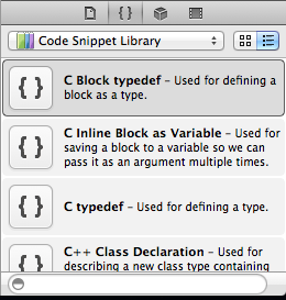
Now that the right bar is available, click on the “{}” option of the bottom most pane. This will bring up the snippet library.


Feel free to browse the snippets that XCode ships with, however most of them are not very useful. So, now this is where I feel Apple engineers were a little too clever. It took me a little while to figure out how to actually add a new snippet. You would expect some sort of + button or something. The way you add a new snippet in this case is to write out a chunk of code and drag it into the Code Snippet Library window.

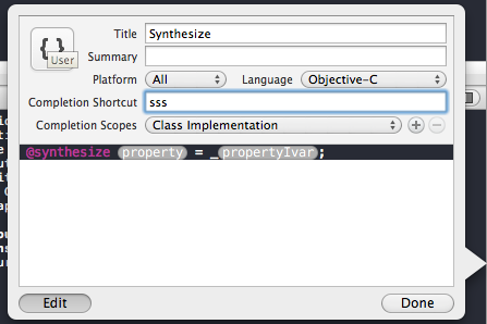
Once you drag the code into the library, it creates a default snippet called “My Code Snippet”. Which again, is just terribly non-obvious. Now, double click on “My Code Snippet”, and then click the “edit” button to modify it.


Let’s talk about each of the important fields:

  1. Title – This is just the common name you will use to refer to the snippet. It will display during autocompletion
  2. Completion Shortcut – this is the command you will use to invoke the snippet. For example, I have ttt to automatically create all of the UITableView delegate and datasource methods with sample data.
  3. Completion Scopes – This is pretty cool. You can have the same shortcut to represent differnet snippets based on the scope of the document. For example, you won’t want to invoke your @property snippets inside of your Class implementation. So, they get ignored…

Adding dynamic fields

If you notice, many of Apple’s auto generated classes or snippets (like UIAlertView), have these “code bubbles” hinting at the type of data you should put into them. They are also nice because they allow you to tab between them enabling you to implement the code quicker. To add your own simply insert this into your code:

<#Text#>

Where “Text” is whatever you want the code bubble to say.

That’s it, when you are finished click done and you should now be able to use your snippets.

Sharing Snippets

While XCode doesn’t have an export button for snippets, they are in a fairly predictable location. They are located at:

~/Library/Developer/Xcode/UserData/CodeSnippets/

That being said, you could manually share them between developers (zip them up and email) OR you could version control this folder with something like git. I really like the latter approach. Any time a developer adds a new snippet to the library, the others just have to pull, restart XCode, and voilà the snippet is there.

Conclusion

The only issue now is remembering to actually use your snippets in practice. It takes some getting used to, but I’m sure you will get it. Below, you can download a zip file containing many of the snippets that I use. Simply unzip it into the folder that I mentioned above.

Download My Snippets

Happy iCoding!

Follow me on Twitter