Audiofolio – Responsive Music Site Template (Creative)

Audiofolio is a responsive music site template.
It can be used as a music portfolio or creative personal site.
Contains all you need for a personal music site.

White\dark layout

Pages

  • about.html
  • gallery.html
  • index.html
  • music.html
  • news.html
  • shows.html
  • single.html
  • video.html

Features

  • Responsive grid
  • Easy to rearrange and modify
  • Well commented
  • Mp3, Ogg files support
  • Cross browser compatibility
  • Smooth scroll and animations
  • Powered by Twitter Bootstrap 2.3.0

Credits

Download Audiofolio – Responsive Music Site Template (Creative)

Barrci – Responsive One Page Photo & Portfolio (Portfolio)

Barrci is brand new responsive theme with modular and scroll homepage. Barrci is built for photography, portfolio websites and it is suitable for all creative people!

This theme comes with many cool features as full width slider, modular homepage sections and flexible layout and possibility to manage homepage columns, headings and color schemes.

There are also 50+ advanced shortcodes with Shortcode Generator support, 6 custom post types (slider, homepage sections, portfolio, clients, services and pricing tabs), support for post formats and much more!

Main theme features:

  • Advanced theme admin panel,
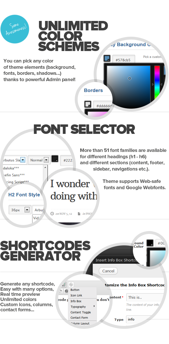
  • Unlimited color schemes,
  • Scroll Homepage,
  • Homepage without scroll effects,
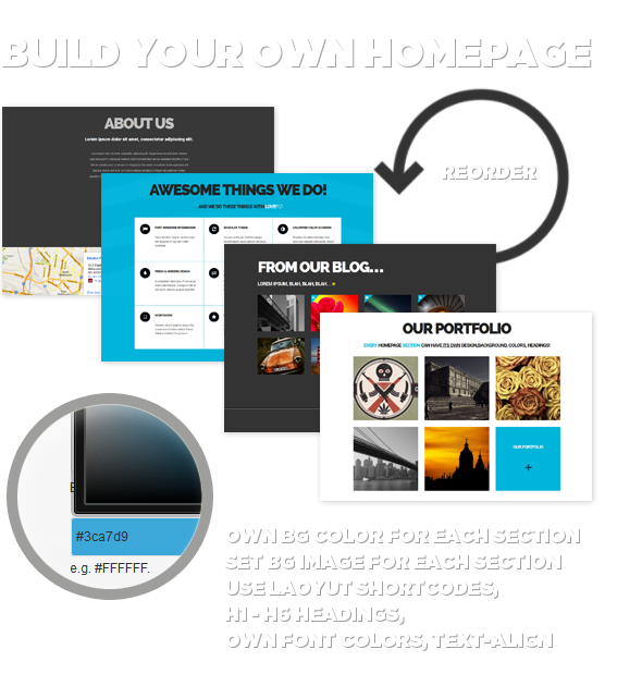
  • Modular Homepage (using Homepage sections),
  • Full width slider (possibility to add video),
  • Flexible Homepage sections – you can set for each/single section:
    • own background color or image (or both),
    • columns,
    • layout shortcodes,
    • headings,
    • texts
    • colors for headings and texts.
  • Single posts and portfolio jQuery sliders,
  • Playground template (best for layout shortcodes),
  • Blog template,
  • 3 Portfolio templates,
  • Posts formats: Standard, Audio, Video, Gallery, Quote, Link, Image,
  • 6 Custom Posts: Portfolio posts (with taxonomies), Homepage sections, Slider, Clients, Pricing tabs and Services,
  • Font selector/custom typography – 53 fonts available (hand-picked web-safe fonts and Google webfonts),
  • Font Awesome integration,
  • Custom Menu – with icons,
  • jQuery sliders – Galleries,
  • Shortcode generator (including layout shortcodes),
  • Unlimited dynamic featured sections in Sidebars and Footer,
  • Logo and favicon upload,
  • Google Analytics Input,
  • Custom Footer,
  • Sidebar tabs (latest, popular, random posts + list of tags),
  • Translation ready,
  • WordPress 3.5 + ready,
  • Smooth tabless design.

Templates:

  • 3 Portfolio templates,
  • 2 Homepage template (Scroll and without scroll),
  • 2 Blog templates,
  • Full Width template,
  • Redirect,
  • Error 404,
  • Archive templates,
  • Author template,

Other:

  • 13 Custom widgets,
  • 16 design elements to style in admin menu:
    • fonts (53 families, colors, weight, styles, sizes),
    • backgrounds,
    • texts,
    • links,
    • hovers,
    • icons,
    • borders…
  • Font Awesome integration,
  • And much more…

Download Barrci – Responsive One Page Photo & Portfolio (Portfolio)

Raiser – Premium OpenCart Theme (OpenCart)

Description

Raiser is a Premium OpenCart Theme with clean design. Suitable for any kind of store.

Features

  • Clean design
  • Clean , easy to install and customize
  • Does not require core files replacement
  • Google Web Fonts
  • Cross Browser compatible
  • SEO optimized

Compatibility

  • OpenCart 1.5.3.1
  • OpenCart 1.5.4.1
  • OpenCart 1.5.5.1

Changelog

26.02.2013
– Released

Download Raiser – Premium OpenCart Theme (OpenCart)

ReadIt (Creative)

ReadiT is a really and well structured Html website template, it is made to make your visitors focus on your content. When buying this theme, you will get a really complete template, with support for galleries, carousel, audio player, embedded audios and videos.

Template Features

  • Responsive Design – Every pages are entirely responsive, meaning that the layout adpat to the viewing environment.
  • Fullscreen Mode – You can see any page in fullscreen mode if your web browser support it.
  • 3D Homepage Slider – The homepage template features a totally responsive 3D sliced slider to leave your visitors a tremendous impression.
  • Responsive Masonry Galley with lightbox – You can create a responsive masonry gallery with a nice lightbox and slideshow feature.
  • Nice Elements – Included in the template : buttons, icons, toggles and tabs.
  • Responsive Carousel – You can add anywhere a responsive carousel to showcase realated stuff or short portfolio.
  • Fully Ajaxified Contact Form – The contact page template features a jQuery ajaxified contact form with validation and a PHP sample file to suit your needs.
  • Customized GoogleMap – The contact page template features a googlemap to show your location to clients with a marker.
  • Homepage Timeline – The homepage template features a responsive timeline to display your last posts in an elegant way.
  • Responsive embeddable stuff – You can include Vimeo, Youtube, Soundcloud… In a responsive way.
  • Socialized template – At every scales (global, author, post), the theme features a simple social integration to help you share your content.

Download ReadIt (Creative)

RealBlog – Responsive WordPress Blog Theme (Blog / Magazine)

RealBlog is a Responsive Masonry WordPress Blog Theme.

The main advantage of this theme is fully customizable theme colors, with help theme options panel!

In the theme a lot of settings, with which you can easily customize the theme, as you need, also detailed documentation and quick support!

Features

  • Fully responsive
  • Masonry layout
  • 3 home page featured
  • Unlimited theme colors
  • 7 Page Templates
  • 4 Post formats: post, image, video, audio
  • 90+ Shortcodes
  • 80+ Theme Options
  • 10 Custom Widgets
    • Banners
    • Latest Tweets
    • Popular posts
    • Recent posts
    • Recent category posts
    • Recent category posts – second variant
    • Video Widget
    • Slider
    • Flickr Photos
    • Contact Form
  • 2 Widget Areas
  • Twitter Stream
  • Flickr Photostream
  • Theme Options
    • Custom Site Background Upload
    • Custom Logo Upload
    • Custom Favicon Upload
    • Featured settings
    • Cufon Fonts
    • Social widget
    • Typography
    • Localization
    • Colors
    • SEO
  • Support Soundcloud
  • WordPress 3.5+ Ready!
    • 2 Custom Menu Locations
    • Post Thumbnails
  • Page Templates
    • Home page
    • Home page with Flex slider
    • Home page with Royal slider
    • Page full width
    • Sitemap
    • Error 404
    • Contact
  • Custom posts cycles
  • SEO
  • Extensive Documentation
  • Support 24h
  • Crossbrowser compatible

Theme Options

  • General settings
  • Futured
  • Pages
  • Single post
  • Single page
  • Ads & Social
  • Colorization
  • SEO
  • Translation

Download RealBlog – Responsive WordPress Blog Theme (Blog / Magazine)

Roki – Multi-Purpose Responsive Theme (Business)

We didn’t want for the demo to be heavy and boring, that’s why we share the first and most essential feature of the theme – the way it’s built.

WordPress is a platform, with thich we’ve been working for years and we’ve used tens of premium themes. We’ve been impressed by all of them with their incredible design. The troubles always tend to come once we deep into the administration and setup. The heavy and confusing design and functionality of the admin have always left us with bitter sweet taste.

We know that with Roki we managed to change precisely this. All the content and elements are manipulated in an extremely easy, simple and fast. We tried to cut down the time of going from one tab to another, in order to change the simplest of settings. We’ve put much thought in all the main components of work with the admin. People love WordPress because it saves time.

That’s why we gave our best – to make Roki a super easy to use theme.

  • Multi-Purpose
  • Page Builder
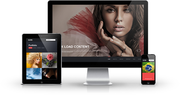
  • Responsive Design
  • Revolution Slider
  • Mobile-First
  • Liquid Layout
  • Built on Bootstrap
  • Retina Ready
  • Unlimited Color Options
  • Adaptive Images
  • Skin Manager
  • Shortcode Editor
  • Font Manager
  • Unlimited Sidebars

Page Builder

The Page Builder makes it a one-click job to configure your layout structure, and page content.

With an easy-to-use drag and drop interface you can add unlimited number of layout elements, configure their presentation – as each element comes with its specific options to play with.

Resize each element to make it display as a single to four columned element on the layout.
You can configure a more generalized look of your website from the Theme Options panel. This will affect all pages on your website. If you want dig deeper into customization – no problem. You can define the layout structure for your Portfolio and Blog pages from the Theme Options panel as well.

But if you want to be really specific – the page builder is available while editing each single page – you can create a unique look of your website and pages.

Responsive Design

Roki is an ultra responsive theme – we’ve put a lot of time and effort to make sure that regardless of their screen size each one of your visitors will be able to easily reach the information on your website.

Roki “magically” adjusts its layout and elements, depending on your visitors’ screen size – from mobile to desktop devices. Not only the layout is perfectly adjust for the appropriate environment, but the user interface makes it easy and intuitive for users with multi-touch devices to use native gestures they’ve grown so used to – swipe or touch.

Wide Layout

By changing a single option, you can totally change the look of your web site with a wide layout. If you don’t want to restrain your content and burden your users with information and various graphic details surrounding the content, you can easily setup your page, without affecting the clear and minimalistic design.

Boxed Layout

You might need your content to be centered – it’s an easy thing to set up with rocky – just modifying a single option. With the boxed layout you have an option to choose a background image, giving a new detail in freshness and clean design, suiting your business.

The powerful admin panel gives you the opportunity to tweak some fine settings, so the look of your site can reflect your corporate identity to its fullest.

For example with two simple sliding panels you can adjust the maximum width of your layout (the box) as well as the maximum width of your content, without the need to worry about the graphic elements and clean design.

Fluid Layout

Thanks to the powerful bootstrap front-end framework, roki is not simply a responsive theme, rendering natively on all devices – mobile, tablets or desktop, but features a fluid layout. You can adjust your content to always take up 100% of your visitor’s screen and each detail or box will “fluidly” adjust inside its context.

This is a solution, solving a lot of the problems with the screen of the device your users reach the information on your website.

Mobile-first Design

On a daily basis, the number of mobile devices increases, and therefore, the number of users who surf the web through them.

Your website needs to behave adequately in 100% of the times its requested – regardless of the device that renders your layout. In order to achieve maximum level of satisfaction from the usage of mobile devices, companies invest millions in developing mobile user interfaces and the majority of users get used to these interfaces in days, hence the mobile first design should be as much as possible these functionalities.

While developing Roki, we’ve invested a lot of time and effort, to get as close as possible to the intuition that users have developed from work with mobile operating systems.

Built on Bootstrap

Roki is built on Bootstrap – sleek, intuitive, and powerful front-end framework for faster and easier web development. Bootstrap is a renowned framework that features all major design elements. The whole Roki design is built on top of this framework and this gives you the possibility to use all of their elements, when publishing your posts or pages, and you will be certain that they won’t be in conflict with the initial Roki design. Bootstrap is packed with features, but more importantly – really easy to use from everyone! This gives you the power for quick and sleek design of your layouts.

Retina Ready

Roki looks as awesome on wide screens as on mobile devices. There is no need to install additional plugins to display cristal clear images on the new retina displays. All graphical elements, fonts, icons and textures that form the clean and beautiful design of Roki are optimized. Oh yes, we’ve added the feature to upload retina logo as well, so not a single component is left out, making everything look crisp and more lifelike. Text is razor sharp. Colors are vibrant. Photos and video are rich with detail.

Fontawesome Icons

Roki includes the packet of svg icons – Font Awesome – looking razor sharp on any screen and device.

Thanks to this package, we’ve made it possible to easily format the contents of your website, so that it is accessible, intuitive and understandable for all of your visitors.

At the same time, thanks to these over 200 svg icons, you keep the retina design of your theme and don’t overload your server with unnecessary images.

Unlimited Color Options

We understand the importance of your business identity. That’s why we’ve put a whole lot of time and energy, so that Roki can impose no limitations on colors of any graphical element, that build the fresh, clean and fine design of the theme.

You have the absolute freedom to choose the most-appropriate color scheme, while, regardless of your choice, the whole website will keep its characteristic clear and pure looks of the Roki template. Of course, this can be achieved in the simplest possible way – we realize how important it is for you to be able to manipulate theme options intuitively, without posing any trouble.

Roki gives you the possibility to adjust the color scheme, by modifying 4 main options, and if you feel the need for even finer touch – you have access to 2 additional options for the color palette of your main layout, and the container holding the content. Couple of selections and you have a brand new look of your website, as simple as that.

Revolution Slider

Roki includes a great premium plugin – Revolution Slider, $15 worth, and gives you the opportunity to benefit from tons of unique transition effects, an image preloader, video embedding, autoplay that stops on user interaction and lots of easy to set options to create your own effects.

With Revolution Slider you can create a responsive (mobile friendly) or full width slider with must-see-effects and meanwhile keep or build your SEO optimization (all content always readable for search engines). Thanks to ThemePunch.

Adaptive Images

Adaptive Images detects your visitor’s screen size and automatically creates, caches, and delivers device appropriate re-scaled versions of your web page’s embedded HTML images. No mark-up changes needed. It is intended for use with Responsive Designs and to be combined with Fluid Image Techniques.

Why? Because your site is being increasingly viewed on smaller, slower, low bandwidth devices. On those devices your desktop-centric images load slowly, cause UI lag, and cost you and your visitors unnecessary bandwidth and money. Adaptive Images fixes that.

Shortcode Editor

It’s a common situation to see a web page that looks simply awesome, but once we try to recreate it in our theme installation – we realize this is close to impossible.

The search through the demo content commences, support from authors etc … Even with top-notch customer support, large amount of time is lost, which costs us, and ruins the beforehand good impression of the front-end design.

With the Roki Shortcode Manager, we’ve tried to bring down to minimum the confusion and unclarity while using it. Nothing new and revolutionary, no, we simply wrapped it up in a clean, simple design, which all mobile users are used to.

Font Manager

Roki includes ultimately simple and intuitive font manager. We understand the importance of typography in your corporate identity, that’s why we did our best to give you as simple as possible way to choose the most suitable font. Getting feedback from users, we’ve narrowed down the most important parts of such a manger:

  • Simple
  • Easy-to-use
  • live preview

not a simple dropdown, where you cannot get a glimpse of what the font family looks like

Sidebar Manager

With the Layout Manager incorporated with the Page Builder you can easily change the layout structure of any single page – choose between one sidebar – left or right – two sidebars, or no sidebars at all.

You can set general layout structure from the advanced Theme Options page within the admin panel. This will affect the whole look of your site without you having to bother about per-page modifications if you don’t want to.

The advanced Page Builder gives you the power to create unlimited sidebars and assign them to any single page. Again – if you do not want to bother customizing every page – the generalized hierarchy structure of layout loading will ensure that pages inherit parent structures if none is specified.

You can easily assign the sidebars dragging them to the specific positions in the builder (left or right) – and they will appear in the Widgets Admin area. Include various widgets to that suit the needs of the particular page.

Skin Manager

Play with the styling options. Save them. This affects the current skin you’re working on only. Not happy with the results? Not a problem create a new skin and test there. Revert to the previous skin, create a new one modify again and save – the options are endless!

Download Roki – Multi-Purpose Responsive Theme (Business)
Simplog – Responsive Blog/Magazine Theme (Blog / Magazine)

Simplog is a stylish and pixel-perfect blog/magazine theme. Simple, refined design coded with the latest most effective techniques.

It has been designed with mobile-first practices, ensuring a smooth flow of the layout in mobile devices. The theme is based on a 12 column 960 grid system and built with Twitter Bootstrap framework.

Main Features

  • WP 3.5 Ready
  • Easy to Use
  • 100% Demo Data Import
  • Translation Ready
  • SEO Friendly
  • Post Formats: Gallery, Image, Video, Standard
  • 7 Custom Widgets
  • Child Theme Included
  • Contact Form with Google Map
  • Powerfull Archive Page
  • PrettyPhoto Powered
  • Responsive layout
  • Twitter Bootstrap
  • HTML5 / CSS3
  • PSD included

Download Simplog – Responsive Blog/Magazine Theme (Blog / Magazine)

Specify – One Page HTML Template (Portfolio)

Features

  • Responsive 960 Layout Grid
  • Clean and Modern esign
  • Detailed Documentation
  • Ajax External About & Portfolio Content, it’s still One Page!
  • Working Ajax Contact Form
  • Layered Effective Slider
  • Over 360 Icons
  • Filterable Portfolio

Sources and Credits

  • Photos included in preview are for demonstration purposes and should always be replaced with your own work.
  • Preview Photos are bought from PhotoDune and if you want to buy one just contact me and I’ll provide you a link.
  • The fonts are coming from google webfonts library and myfonts.com, every font is legally licensed.

Download Specify – One Page HTML Template (Portfolio)

The Club 3D HTML Template (Nightlife)

The club 3D HTML Template” Invitatation Template is built with html5 and css3 and also looks cool on the ipad!

The club 3D Features:

  • 2 versions (night club | white club)
  • Cool 3D animations
  • Legacy mode for non-CSS3 browsers
  • SEO friendly
  • Deep linking possible
  • Easily skinnable and customizable
  • Html 5 / css 3 powered
  • All psd documents included

The club 3D Photoshop Features:

  • PSD document is Set Up by organised folders
  • Logically named and color coded groups, folders and layers
  • Easy editing by smart objects
  • Detailed how to file
  • Quick and friendly support
  • Links for the font downloads included in the documentation

Some words about our included documentation:

We at Template Rockers know that not everyone is a high class web developer.
That is why we give our best efforts for our products just to talk even to the unexperienced user.
For you this means that you will receive a product which we called
“easy as pie” to handle . This product will be no exception. We want you to have the greatest range of product-fun and usability. To avoid frustration and anger, we have written a very detailed and comprehensive documentation. Even as a beginner, it should be easy possible to create a great looking website with the included documentation.We have covered the most common question you probably would come about in our HOW TO? Section in the documentation.

However, should you stumble upon any questions, do not hesitate to contact us.
We will will try our best to solve your problem.

Download The Club 3D HTML Template (Nightlife)

MetroPix – Responsive Multipurpose WordPress Theme (Creative)

Version 1.1 – Wait What? The theme has been out for a day and there is already a new version? That’s right! We’ve listened to some of the suggests via our social sites and the comments and have added a few new great features, see the changelog at the bottom of this page – we will keep the theme updated and fresh as much as possible!

Metropix Metro Multipurpose WordPress Theme

Metropix is a great multipurpose WordPress theme with a clean metro design. The theme’s beautiful layout and stunning galleries make it perfect for a variety of sites including blogs, portfolios, business, corporate and more.

Responsive: Metropix is fully responsive! The theme has been designed to look great on all types of mobile devices and browser. Test it out on your iPad or iPhone to see for yourself.

Retina Ready: The theme is retina ready, and displays pixel perfect images on retina devices. Just be sure to upload large enough images when you set up your site using the theme. While the theme does display optimal versions of images depending on the device you use, it cannot magically make a small image crystal clear ;)

Unlimited Color Highlight: With Metropix you can choose any color from the rainbow and use it as your highlight color. Just select the color you love most in the General options panel, and everything that is blue by default will auto change to the color of your choice!

Homepage Slider: The homepage features a super easy to use and elegant FlexSlider with thumbnail navigation. It’s perfect for highlighting important information or specials.Just add slides via the slides custom post type in the admin panel. Plus you can add links and captions too! The slideshow feature, randomization, and transition speed are all customizable via the theme options panel.

Homepage Templates: It’s hard to please everyone, that’s why we’ve added 3 different homepage templates to MetroPix. They are all very similar but with some key/unique differences. For example styles 2 and 3 have a carousel for the recent blog posts and then style 3 doesn’t have any background color for the post content so you can easily add stuff there as such in the demo where we’ve setup some column shortcodes and some images/features to give it a more “corporate” feel.

Gallery Carousel: Add a gorgeous homepage gallery carousel in a snap! Just enable the carousel in the theme options panel and it automatically pulls your recent galleries to display on the homepage. Or you can customize the carousel by selecting a gallery category and/or setting a specific number of gallery items you would like to show. This is a great way to feature you recent or featured galleries on your homepage!

Custom WP Gallery Shortcode: Metropix comes with a custom output for the default WordPress gallery shortcode that will display your images in a nicer grid and with lightbox support via prettyPhoto. This means adding galleries to your gallery pages is easier then ever, since you can use the built-in WordPress gallery creator! See an example from the demo here.

Shortcodes: Metropix comes with built-in support for the Symple Shortcodes plugin (which we’ve created) to provide you with a wide array of useful shortcodes and a Metro style that matches the theme. Included are shortcodes for social icons, Google maps, headings, highlights, buttons, boxes, toggles, accordion, tabs, testimonials, pricing tables, and columns. Take a look at the Shortcodes and Services pages on the demo to see them in action!

Unbranded Options PanelThe theme comes with the Options Framework theme panel built-in to provide you with some great options such as slider settings, custom logo upload, disabling homepage sections, options to easily change your gallery entry featured image height, color skin selector and more!

MetroPix Theme Panel

Quality Support: We plan to provide regular updates and new features as we see fit. Thank you for any suggestions and of course your purchase!

MetroPix WordPress Theme Features

  • Built-on WordPress 3.5
  • Retina ready
  • Responsive layout
  • Unlimited highlight color option – change the blue througout the theme in seconds to your color of choice!
  • Metro design
  • Custom logo option
  • Homepage slider
  • Custom WordPress gallery styling
  • Homepage gallery carousel
  • Standard and video blog post formats
  • Full-width page template
  • Gallery with filter template – http://www.wpexplorer.me/premium/metropix/gallery-page-with-filter/
  • Easily change the word “galleries” to something else either via a filter function or easily editing the theme files
  • Widgetized footer
  • Widgetized sidebar
  • Recent/random posts slider widget
  • Recent/random galleries slider widget
  • Symple Shortcodes plugin support and custom styling
  • HTML5 + CSS3
  • .po & .mo files included for localization so you can translate the theme to your own language
  • Regular updates
  • Sample.xml file included with dummy images for quick/easy theme setup
  • Documentation files included
  • Theme created by Elite seller with 5 star rating!!
  • And anything else I forgot to mention!

Changelog

Version 1.1 – 02/26/2013

* Fixed small bug with homepage slider width
* Added 2 new homepage templates - see the demo
* New homepage template features a recent posts carousel - sweet!
* New gallery with filter template added
* Fixed small bug with sub sub drop-downs

Download MetroPix – Responsive Multipurpose WordPress Theme (Creative)

Magazon – Advanced, Responsive WP Magazine Theme (Blog / Magazine)

Magazon is a Advanced – Responsive WordPress News or Magazine theme. It is ready to start working, out of the box, with a multitude of theme options, smart homepage builder ,custom widgets, categories styler to help you personalize your environment.

     If you like This theme and our top-notch support, please don’t forget to rate it \\\\\

Highlight Features

Responsive Design Done Right
Smart Drag & Drop Homepage Builder
Custom Design,sidebar, Slider, Carousel For Categories
Advanced Theme Options
Review system with multiple styles
HD Video tutorials

Magazon Theme Features

Changelog

Magazon V1.1 – March 1, 2013

    - Update .po and .mo files
    - Fixed some css issues
    - Clean up header.php

Magazon V1.0 – February 23, 2013

- Initial Release

Credits

I would like to thank the following providers. This theme would not have been possible without the hard work and dedication of all of them.

List of Photos from Flickr (Creative Commons-licensed content for commercial use and NOT include in theme file.)

Download Magazon – Advanced, Responsive WP Magazine Theme (Blog / Magazine)

Eleven – Responsive One Page Parallax Template (Portfolio)

If you like this theme, please dont forget to rate it
1
1
1
1
1

Eleven is a One Page Template with Parallax Effect. Is very easy to customize it. This template is great for creative, digital agency, photography, business, corporate. Modern and clean style.

Theme features

  • Responsive HTML5 and CSS3 design
  • Parallax Effect
  • Responsive Fullscreen Slider
  • Sortable full screen portfolio
  • Animated Testimonials
  • Our Team – Sliding Effect
  • Blog in caroussel with multitouch sliding
  • Ajax load outside content for blog post and portfolio project
  • ColorBox
  • Pop Up Project page with image slider
  • Pop Up Blog Post page with image slider
  • Contact page with full screen map
  • Custom marker map with personalized pop up
  • Ajax contact form

Fully responsive template with full screen slider

2 template styles included: Color and Black & White

Download Eleven – Responsive One Page Parallax Template (Portfolio)

Bolsa – A Responsive WordPress E-commerce Theme (eCommerce)

Bolsa is a mobile first, fully responsive WordPress e-commerce theme that supports both the WooCommerce and Jigoshop plugins. Whether you’re just opening shop with a few items, or have a whole stockroom to sell, Bolsa let’s you showcase your fine wares with eye-catching imagery, gorgeous typography, user friendly shopping carts and stand out call-to-actions.

Show It, Sell It, Talk About It!

  • Bolsa provides several ways to effectively showcase and promote your products including, but not limited to, custom shortcodes for an accordion FAQ and a responsive slider that supports oEmbed for videos.
  • Layout your home page the way that works for you using our custom shortcodes for either WooCommerce or Jigoshop.
  • Promote your shop and connect with your customers through your company blog. The Bolsa blog supports all native WordPress blogging features out of the box.
  • Insert images and galleries into your posts and pages and watch them adapt to your screen size.
  • List your shop’s social networks with our custom designed web font that contain glyphs from 17 different services including Twitter, Facebook, Instagram and Pinterest.
  • Be confident that your customer’s user experience will be fluid regardless of the device browsing your shop. There are no awkward breakpoints here. Even our cart responds beautifully on small devices!

Take Ownership of Bolsa with the WordPress Customizer with Real Time Previews

  • Upload your own logo image, favicon and Apple touch icon
  • Choose between a full width or enclosed presentation for your site.
  • Upload your own background image or set a background color that fits your branding.
  • Establish your own color palette for headers, body copy, links, menus and the shop.

Additional Features

  • Threaded comments with avatars
  • Drop-down menu support, 3 level deep, for the main menu that adapts to mobile views.
  • Touch support for drop down menus on touch enabled devices.
  • Social network web font for the footer menu using our custom designed icon font (Twitter, Facebook, Dribbble, Instagram, Flickr, Pinterest, GitHub, Behance, Last.fm, RSS and more)
  • 2 custom post types for managing slides and frequently asked questions
  • 7 custom menus
  • 7 widget areas (8 if you are running WooCommerce or Jigoshop)
  • Shortcode buttons in the visual editor
  • Paginated archives
  • The option to turn off post headers (video, images, and galleries)
  • Support for responsive videos in posts and pages
  • Twitter and Flickr custom widgets
  • Localized and ready for translations with a .po and .mo file.

Download Package Includes

  • Parent theme and starter child theme
  • Well documented user guide PDF
  • PSD files with assets
  • Demo content XML files from both demos

Customer Support

With every We Are Pixel8 theme purchase you receive free support at http://support.wearepixel8.com.

Change Log

1.0.0 February 24, 2013

  • Initial Release

Download Bolsa – A Responsive WordPress E-commerce Theme (eCommerce)