Petit – Recipe WordPress Theme (Food)


Follow WPZOOM on Facebook


Follow WPZOOM on Twitter

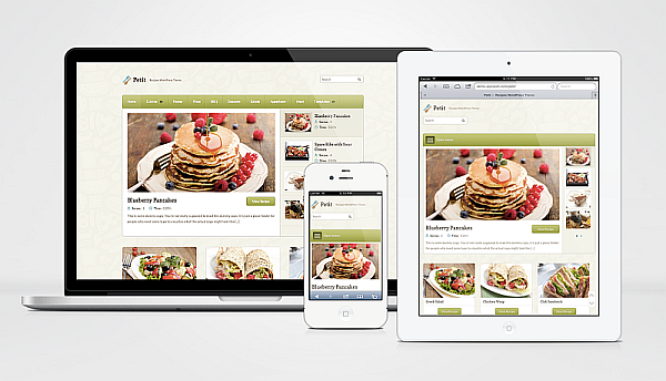
Petit is a theme full of features, enough to be used for a variety of purposes, but especially for a recipe website. It includes a big featured area and a carousel that makes your homepage look like more than a blog.

Petit Premium Features

  • Carousel & Slideshow
  • Responsive Layout
  • Recipe Shortcodes
  • Easy Fonts & Colors Customization
  • Custom Widgets
  • Post Ratings

and much more…

Responsive Layout

The layout of this theme automatically adapts to fit on any screen resolution on desktop and mobile devices (iPhone, iPad).

Built-in Portfolio

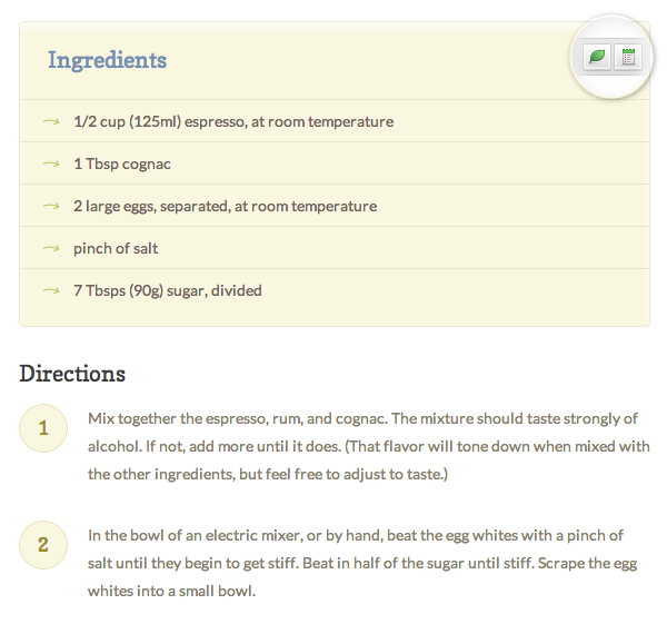
Besides numerous built-in shortcodes in our framework, we’ve also added two custom shortcodes for recipes: Ingredients and Directions, so you can quickly create such sections.

Easy to switch to

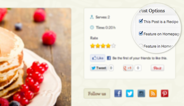
One thing that you’ll be happy about this theme is that it doesn’t use Custom Post Types, like many other themes do, to separate regular posts from recipes. That’s why we have decided to keep on using regular posts for recipes, but there is still an option that allows you to let the theme know which of your posts are recipes, and which are traditional blog posts.

We took this decision vecause we wanted to make the theme accessible to anyone who used a different theme previously, without any custom features, which most of the time will keep you from switching to another theme without losing your content.

So if you already have a food blog, then Petit is the right theme to switch to.

Powered by ZOOM Framework


(view all features)

Easy Customization

From Theme Options you can easily change the colors and fonts for various elements from the theme.

One-click Widgets Install – Get the same look as in demo with single click.

Automatic Updates – Get the latest features and security updates.

Shortcodes – Big variety of additional shortcodes what you can use to customize your posts and page layouts.

Slideshow Shortcode – Beautiful animated image galleries right from the box.

SEO Options – SEO features that allow you to take control of how your website appears in SERPs.

Easy Customization – Don’t mess with theme’s code, change logo, colors to fit your brand with a beautiful UI.

Documentation & Support

Purchasing this theme you take advantage of free support, we take care about our customers and their sites because we build products for you.
All verified buyers have full access to documentation and support.

To access our Support Forum:

  1. Create an account on this address
  2. Send us an email to [email protected] and include your username and purchase code

Download Petit – Recipe WordPress Theme (Food)

Aqua – Responsive Drupal Theme (Corporate)

Aqua is a Fully Customizable, Responsive Business Drupal Theme

Aqua is a Responsive Drupal theme that features a clean and slick design that is suitable for a wide variety of websites. It includes a Theme Styler tool that helps you customize the theme anyway you like: unlimited colors, 3 menu presets, the best of Google Fonts + 2 Layout modes. It utilizes Skeleton CSS Framework and is 100% tablet/phone friendly. Aqua also includes Sequence slider, FlexSlider, jCarousel, Google Web fonts and more to contribute to an enjoyable, intuitive and functionally exhaustive user experience. The theme includes plenty of reusable elements: Sliders, Tabs, Accordions, Testimonials, Messages, Lists, Buttons, Tooltips, HighLights, several presets of Text Titles, tables and some awesome looking icons you can use for your featured text sections. Aqua is also Cross Browser compatible and has very clean code and documentation.

Premium Drupal LayerSlider
  • Great Drupal Layer slider management.
  • Support embed video into slide
  • Video: Drupal LayerSlider
  • LayerSlider (15$ value) extended license and converted from WP plugin.

Responsive

Resize your browser on your desktop to see the responsiveness in action or if you have your phone/tablet scan the QR code below:

Best Drupal Theme, Great Drupal 7 Themes, Free Drupal 7 Themes, Aqua drupal theme

Features

  • Fully Reponsive Design
  • Compatible with Drupal 7++ (tested with drupal 7.21)
  • Boxed and Wide layout!
  • Font Awesome Included
  • Twitter widget, Flickr Widget
  • Unlimited Colors
  • Unlimited Background patterns, Colors
  • Filterable Portfolio
  • Responsive Sliders [Premium Drupal LayerSlider]
  • Supports all major browsers
  • Touch enabled
  • SEO ready
  • Easy Cutomization
  • Well Documentation
  • PSD (included in download package)
  • And much more …

Credits:

Slider – Image 1
– Rights included with theme

Slider – Image 2
– Rights included with theme

Blog Item – Image 1

Blog Item – Image 2

Blog Item – Image 3

Blog Item – Image 4

The images used in the Demo are for presentation purposes only (unless stated otherwise above). Please respect their authors’ work and buy them for a couple of dollars each if you are to reuse them. Thanks!

Download Aqua – Responsive Drupal Theme (Corporate)

One Page PSD Vintage Portfolio – Old School (Portfolio)

Old School – is a grid-based One Page PSD Vintage Portfolio for photostudio, creative or digital agency, frelancers, business.

<<<<<<<<<<<<<<<<<<<<<< Features: >>>>>>>>>>>>>>>>>>>>>>>>>>>>>>>>>>

– Clean, modern design
– Well Organized layers makes it very easy to update
– Site content is 960px wide
– Designed with responsiveness in mind
– Portfolio page has filters
– Smart Objects used for images
– Free Fonts used, download links are in the “read me” file.

<<<<<<<<<<<<<<<<<<<<<< Fonts used in design: >>>>>>>>>>>>>>>>>>>>>>>>>>>>>>>>>>

http://www.dafont.com/kenyan-coffee.font
http://www.dafont.com/beauty-school-dropo.font
http://www.dafont.com/street-cred.font

<<<<<<<<<<<<<<<<<<<<<<Icons used in design:>>>>>>>>>>>>>>>>>>>>>>>>>>>>>>>>>>

http://glyphicons.com/

The images is not included in download.

Download One Page PSD Vintage Portfolio – Old School (Portfolio)

Reprise Responsive Landing Page (Creative)

This is Reprise. A clean, pixel-perfect responsive landing page which will help you turn your visitors into subscribers across any device.

It features a newsletter subscription signup form, smooth scrolling, step-by-step modal description panel, embeddable Google Map and much more.

Landing Page Features

  • Search Engine Friendly
  • Subscription Sign Up Form
  • Instructional Modal dialog
  • Clean commented HTML and CSS code
  • Social Icon inclusion
  • Testimonials
  • CSS3 Buttons – allows you to add any call to action term you want
  • Documentation and Support

A Big Thanks!

If you have questions or comments, please feel free to submit those to the Item Discussion section. If you have purchased the theme please take a minute and rate it as I would really appreciate it. Thanks again!

Stay Up to Date

Follow me on ThemeForest
Subscribe to RSS Feed

Download Reprise Responsive Landing Page (Creative)

Absolution – PSD Template (Creative)

Absolution is a very simple and clean designed PSD template for multi purpose.

The PSD files were made in Adobe Photoshop CS6, and should run in any other Photoshop version.
All PSD files are fully layered and organized, so the customization is easy.

PAGES INCLUDED

  • Home
  • Blog
  • Single Blog
  • Portfolio
  • Single Portfolio
  • Services
  • About Us
  • Shortcodes
  • Contact

CREDITS

IMPORTANT!

Images are used only for preview purposes and are not included in the download files.
Thank you!

Download Absolution – PSD Template (Creative)

GOODCHOICE – Responsive Multi-Purpose Theme (Corporate)

GOODCHOICE WORDPRESS THEME

Powerful WP Theme designed in a clean and minimalistic style. This theme is very flexible, easy for customizing and well documented, approaches for personal and professional use. GOODCHOICE has been coded in HTML5 & CSS3 and jQuery. It has a solid flexible responsive layout that scales from 320px to 1260px width all Bootstrap features. Follow me to be notified for future updates!

Theme features:
  • HTML5 & CSS3 & jQuery
  • JQuery Responsive Dropdown menu
  • Respinsive Design
  • 2 Fullwidth Layouts
  • 2 Boxed Layouts
  • 3 Home page Styles
  • Flexible Images & Videos
  • MORE THEN 300 ADMIN OPTIONS
  • INTEGRATED PAGE BUILDER (25$ VALUE)
  • INTEGRATED REVOLUTION SLIDER (15$ VALUE)
  • Unlimited Colors
  • Unlimited SideBars Big Thanks to FoxSash
  • 6 PORTFOLIO STYLES
  • 8 BLOG STYLES
  • Unlimited sidebar combinations
  • 4 potrfolio details
  • Seo Optimized
  • Google Fonts
  • Demo content Included
  • Many more jQuery Features… (All Bootstrap Features)

Change Log

v1.00 – March 11, 2013
– Initial Release

Recent Projects

COMMANDER – Responsive WordPress Theme

VALERA – Responsive HTML Template

Thanks to:

Slightly Modified Options Framework by Syamil MJ

Download GOODCHOICE – Responsive Multi-Purpose Theme (Corporate)

Matrix Admin (Admin Templates)

Here we are presenting Responsive Admin Template with Clean, Minimal & Metro design. You will find too many options with this theme.

Note: images are only for demo purpose.

Pages we have included

1. Login Screen
2. Homepage / Dashboard
3. Charts
4. Chat
5. Interface Elements
6. Grid
7. Tables
8. Basic Forms
9. Forms with Validations
10. Forms with Wizards
11. Gallery
12. Calendar
13. Buttons and Icons
14. Widgets
15. Error 403
16. Error 404
17. Error 405
18. Error 500
19. Invoice
20. Dashboard 2

For Support, you can email us !

Features

  • Reponsive layout
  • Collapsible Menu
  • Valid HTML5/CSS3
  • Progress Bars
  • Button Dropdown
  • Nav Bar
  • Breadcrumbs
  • Labels & Badges
  • Modal Window, Tooltip
  • Tables (Static & Dynamic)
  • Graphs & Charts
  • Simple Chart
  • Bar Graph
  • Pie Chart
  • Chat
  • Tseries Graph
  • Realtime Chart
  • Buttons & Icons (Font Awesome)
  • Forms and Wizard Forms
  • Calendar
  • CSS3 Animations (IE version 9 and below not supported)
  • Tabbed Widget
  • Accordion Widget
  • Color Picker
  • Date Picker
  • Growl Notifications
  • Alert Boxes
  • Sortable List
  • Bootstrap Components
  • Dropdown Menu
  • Single Button Group
  • Tabs
  • Bootstrap-wysihtml5 Editor
  • Pagination
  • Font Awesome icon

Credits Goes to

Download Matrix Admin (Admin Templates)

Typegrid – Responsive News & Magazine Theme (News / Editorial)

btn-wpbandit
btn-twitter
btn-themeforest
btn-rss
btn-support

A high-resolution theme for news sites, magazines or blogs that focuses on reading experience for all devices – mobile, tablet and desktop. With a polished responsive structure, and thanks to a toggle sidebar for tablet portrait mode, the paragraph width is always kept well-balanced for reading.

Tip: When viewing the theme demo, close the topbar ([X] Close) and resize your browser window’s width to see how it looks and what happens. Hold down Ctrl and zoom with the mouse scrollwheel to see high-resolution scaling.

Flexible Article Formats

Typegrid supports all 10 post formats, including video, audio, gallery and more. Single posts can be set to show as full width, full width header (post format) or default.

Some Theme Features

  • 100% High-resolution (+FontAwesome)
  • Ultra responsive layout
  • Toggle sidebar for tablet portrait mode (768px)
  • Custom “Sharrre” buttons for Facebook, Twitter, Google+
  • Consistent 300px sidebar, great for ads
  • Frontpage featured articles slider
  • Frontpage highlights section
  • Frontpage widget column blocks above and below recent posts
  • Responsive related posts module
  • Clear typography
  • Unlimited accent color options
  • Unlimited widget sidebars
  • 10 blog post formats (“tumblog”)
  • 6 page layouts
  • 3 single post layouts
  • Great shortcodes
  • Footer widget areas
  • Disable or enable sidebar for mobile layouts
  • 2 full-width widget areas in header and footer (for ads)
  • 5 additional base styles
  • Air Framework
  • .pot file for localization available
  • SEO optimized
  • Logo uploader, Favicon uploader
  • Option to have sidebar left or right
  • Social icon links module (pick any of 249 FontAwesome icons)
  • Custom tab/list widget for articles, comments and tags
  • Full demo page content .XML file
  • Option to disable responsive layout
  • …and much more

Note: this demo uses the responsive fancybox plugin called “light” for standard galleries.

Having Trouble? Need Help?

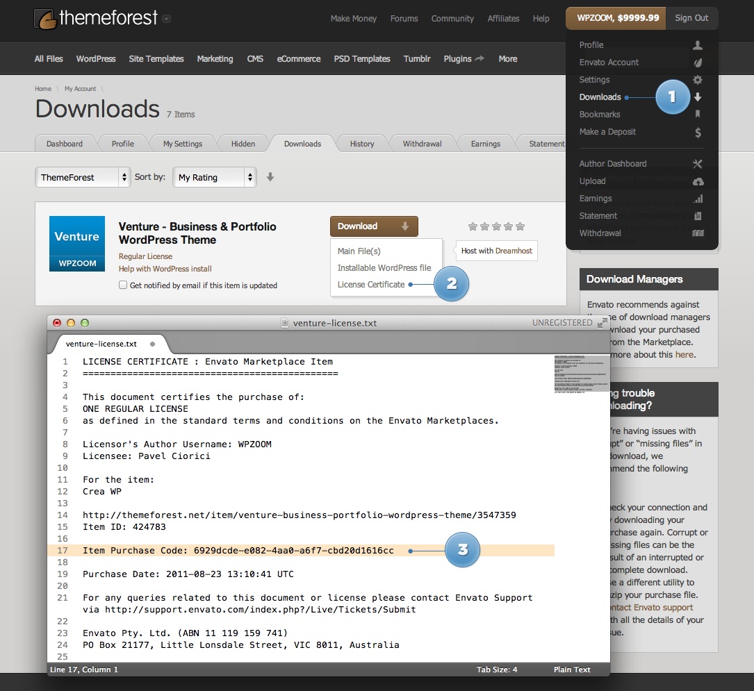
Please visit our support forums if you have a question or need help. You will need your purchase code to create an account in our forum.

How To Find Purchase Code

Changelog

  Theme : Typegrid
Version : 1.0
 Author : WPBandit - http://wpbandit.com

.: March 11 2013 (v1.0) :.
===========================================================
- Theme released

Download Typegrid – Responsive News & Magazine Theme (News / Editorial)

MINETT – responsive HTML template (Business)

MINETT is a responsive HTML template with 12-column grid based on Twitter Bootstrap framework. This template has been designed as a pure corporate graphics solution suitable for business, non-profit organizations, website portfolio or product single sites with the support of responsive layout. This template uses the latest HTML5 and CSS3 technologies.

FEATURES

Responsive HTML5 + CSS3 Design
Based on Twitter Bootstrap (2.3.1)
jQuery 1.8.3
Flex Slider 2
Filterable Portfolio
Working Contact Form
Google Web Fonts
FontAwesome Icon Font
49 Social Networks Icons
Pricing Table
W3C valid
Cross-browser compatible
Photoshop layered .PSD File included
Footer with Google Map
Documentation
Clean Design
Easy to extend

10 HTML Files

Home Page with Flex Slider
About Us with Progress Bars
Services
Portfolio with Filter Plugin
Pricing Table
Blog with Side Bar
Blog Detail with Side Bar
Contact
Examples of Components
Grid System

PSDs

Layered .PSD of Home Design

FONTS

Google Web Fonts – Source Sans
Google Web Fonts – Titillium Web

SOURCES

jQuery – http://jquery.com
Twitter Bootstrap – http://twitter.github.com/bootstrap
Font Awesome – http://fortawesome.github.com/Font-Awesome
jQuery Isotope – http://isotope.metafizzy.co
Contact Form Scripts – http://craftedbydavid.com
FlexSlider 2 – http://flexslider.woothemes.com

CHANGELOG

v1.0 – 13 March 2013 – Initial version

Download MINETT – responsive HTML template (Business)

Words | Responsive Premium Blog Theme (Blog / Magazine)

Welcome to Words!

Words is a slick uncomplicated theme developed for stylish web bloggers who need a sharp and refined website in a jiffy. Complete with a powerful Theme Options Panel, Words is a prefect solution to your next online bloggin’ needs.

Mobile Responsive

All our themes are magically strategically built to take advantage of next-generation CSS media queries to make your website look fantastic on any device of any size. Go ahead, scan this QR Code to view the demo on your device.

Words WordPress Theme

A New & Intriquing Blog Paradise

Here’s a few of the options and coolest features of the home page itself. There’s hundreds of neat features in Words, check them out in the demo.

Words WordPress Theme

Theme Shortcodes

Seamlessly built into the WordPress editor, you will find our shortcode generator. All our shortcodes are easily accessed through our Shortcode generator, which is seamlessly built into the WordPress visual editor. Check them out

Unlimited Widget Areas

Use our widget area generator to easily create & manage an unlimited number of widgets areas throughout your website. There’s no need to install over-complicated plugins just to have different widgets on different pages. Cool ‘eh?

Theme Features

  • Clean, Minimal & Modern Design Appeal
  • Brilliant CSS3 Animations
  • Custom Header Backgrounds on Every Page
  • Header Social Icons (Twitter, Dribbble, Instagram, Email, Zerply, Github, Forrst & Facebook)
  • Light & Dark Styles included
  • Bold & Suave Typography
  • Fully Responsive Build
  • Retina Assets / CSS
  • SEO Optimized
  • Customizable 404 Page Included.
  • Widget Area Generator
  • Full Screen Video Player
  • Powerful Bean Form Builder Plugin
  • Flexible Theme Options Panel
  • Resourceful Customization Options
  • Color picker for styles in Theme Options
  • Fully Customizable 404 Error Page
  • Built with HTML5 & CSS3
  • WordPress 3.5+ Tested and Ready
  • HTML5 / CSS3 Valid
  • Cross Browser Support
  • Widgets: Dribbble Shots, Flickr Images, Twitter Feed, Header Social Counter, Newsletter Subscribe, Skills Widget, Social Profiles
  • Hundreds of Elegant Shortcodes
  • Nice Post Formats: (Standard, Image, Video, Quote, Gallery, Link, Aside)
  • Beautiful Extensive Documentation
  • Top-Notch Customer Support
  • PSD Sources Included
  • Fully translatable po/mo files included
  • And so much more…

Words WordPress Theme
Don’t let the complications of a WordPress Theme turn you off… we are here to help (plus, this theme was built to be really easy to work with). After purchasing this theme, you will receive instant premium access into our Bean Support Forum, where we will help you set up the theme and guide you through any issues that may arise.

Besides our rock-star support team, we’ve created really helpful documentation kits for each theme. Click Here to read this theme’s documentation.

Words WordPress Theme
Set this theme with the same look and feel as the live demo in just a few moments. (Photos not included)

Demo Image Attribution

These images were used in the presentation of the demo site. They are owned by their authors and are not included in the purchase of this theme.

The Bean Newsletter

Our website is currently in the works but we have a lot of neat stuff planned out for you all… plugins, photoshop files, code snippets & the occasional free theme. If you’re interested, add your email here and we’ll let you know when our web site is launched.

Download Words | Responsive Premium Blog Theme (Blog / Magazine)

Tokyo – Business WordPress Theme (Corporate)

Tokyo is a premium WordPress theme by Satori Studio. It is a fresh take on the concept of modern corporate website – uncompromisingly functional, clean, and vivid. Tokyo is a responsive theme, which means it adapts to the screen resolution of the viewing device: your website will be equally usable and good-looking on large monitors, laptops, tablet devices, and smartphones.

Theme Features

Full package | One spot solution – you do not need to install any separate plugins to make it work.

Theme options panel | Everything is done through the unbranded theme options panel – no need to touch the code, no knowledge of CSS, HTML or PHP required.

Unlimited styles | Make your website truly yours – change the color and font of any element. Sensei comes with integrated Google Fonts – you can choose from over 500 varieties.

Custom layouts | Choose from 9 custom page layouts, including widgetized front page, full-width, left-sidebar, right-sidebar, and four types of filterable portfolios. Apart from that, individual layouts for categories, tags, authors, search results, and the 404 page included.

Custom backgrounds | Customize the background of the website – you can choose between a solid color fill, a repeating texture, a background image, or a background slider which will re-size according to screen proportions.

Customizable header | Tailor your website’s façade to your needs – use an image, an image slider, a background slider, an expanding slider, a recent posts slider, a Google map, or custom HTML code in the header. You can individually set a header type on each page.

Textures and icons | Wide choice of custom textures and icons included in the theme package.

Powerful shortcodes | Content columns, buttons, labels, quotes, tabs, charts, and many more – easily add any of the 38 available shortcodes using the shortcode generator, directly from the content editor.

Contact form builder | Create customized contact forms using the form builder directly from the content editor and insert anywhere using shortcodes. A specialized widget is also available.

Easy translation | Localize your website – use the built-in interface to translate any hard-coded string into other languages (or change the wording of the string in the same language if you wish). A ready-made .po file is also included in the theme package.

Custom menu | Sensei has one pre-set menu area to the right of the logo; the theme supports submenus up to three levels deep.

Widget-ready | Areas for widgets in the sidebar and footer, as well as above and below content on the front page template – add standrard or custom widgets.

Unlimited sidebars | Add an unlimited number of customized sidebars to replace any of the widget areas. You can create sidebars and configure defaults for posts, pages, frontpage, category listings, etc, as well as assign a particular custom sidebar to any individual page.

Custom widgets | Five custom widgets included: AdSense banners, twitter updates, recent posts with thumbails, shortcodes, and social connections with custom-made icons.

Google analytics | Built-in support for Google Analytics – insert your Google Analytics account code from the theme options panel to monitor and analyze traffic stats.

Responsive | Follow the growing trend in site-building as more and more users switch to mobile devices! Your website will also look great on any device, be it a desktop computer, a laptop, a tablet device, or a smartphone.

SEO-optimized | Google and other search engines will love your website – make full use of the search traffic thanks to optimized titles, tags, dynamic content, and many more.

Child theme support | Child themes are the most efficient way to customize a theme, separating your changes from official theme updates. A starter child theme is included in the Tokyo package.

Detailed user manual | Full description of how to install, setup, and customize the theme is found in the extensive user manual which is included in the theme package.

Dedicated support | Have questions? – visit our support forums, we will be happy to help you!

Media Used in the Preview

Images
Night View from Westin Tokyo by Joi, Tokyo Flow by Jun Seita, Akabane Bokeh by Monkist, Tokyo Bokeh Special by Kevin Dooley, Hex Wall by Eblaser, Tokyo Bokeh by Eblaser, Tokyo Skyline by Ma_emerson, Texture by Max Barners, 7 Billion People by Kevin Dooley, Shibuya Night by Guwashi999, Tokyo Bokeh by Kevin Dooley, Akihabara Night by Guwashi999, Something in Your Eyes by OiMax, Docklands by Kitt Foo, Light Patterns by Chloester, Light Patterns by Chloester, Lights by Lounia, City Lights by Rares M. Dutu, Hight-Voltage Power Lines by OiMax, Tokyo Tower by JeHu68, Kuraymat by Green Prophet1, Structure by Stefan, Tokyo Shinjuku Skyscraper by Joshikazu Takada, Wind Power in Shohai by Kntrty, Tokyu Hospital by D’n’c, Hiroshi Mikitani by Guillaume Paumier

Videos

Tokyo Timelapse by Orebun, Get Up and Go by Stefan Werc.

Download Tokyo – Business WordPress Theme (Corporate)

NEST HOSTING – Responsive Hosting Theme (Technology)

NEST HOSTING is a Responsive HTML5 / CSS3 (Desktop, tablet, mobile phone…) simple, clean and Professional theme. It comes with Unique Pages, Awesome Slideshows, Unique Color Variations. Easy-to-customize and fully featured design. Create Outstanding Web Hosting site in Minutes!

NEST HOSTING Theme Features

  • Responsive HTML5 and CSS3 template
  • Unique page layouts
  • jQuery enhanced
  • Responsive Design
  • Slider Revolution $12
  • Google Fonts
  • Custom Backgrounds
  • Unlimited Colors
  • Dedicated Support
  • Unlimited Patterns
  • Custom shortcodes
  • 27+ page templates
    • Home
      • Home Versions 1
      • Home Versions 2
      • Home Versions 3
    • Typography
    • Elements
    • Pricing Tables
    • Page Columns
    • Testimonials
    • FAQs
    • Tabs
    • Standard/About Page
    • Services
    • Full Width Page
    • Left Sidebar Page
    • Right Sidebar Page
    • Left Navigation
    • Right Navigation
    • 404 Error Page
    • Blog with Large Image
    • Blog Small Image
    • Blog Post
    • Blog Archive
    • Contact
  • Well Documentation
  • Cross browser support
  • All files are well commented
  • Layered PSD Files
  • Dear buyer! Please Rate * If you like this template and my support.

Download NEST HOSTING – Responsive Hosting Theme (Technology)

Londonpress – Responsive Blog Magazine (Blog / Magazine)

Londonpress is a responsive blog magazine, Built using html5 & css3 designed to make the perfect Magazine’s & Personal Blog’s look great. Londonpress also comes with the Layerslider, A premium slider worth ($15).

Quick Features

  • Built on latest 3.5 version
  • Html5 & Css3
  • 600+ google fonts to choose from
  • Buddypress Intergration
  • Multi-Color Rating System
  • Unlimited Sidebars
  • 2 Sliders (Layerslider, Flex Slider)
  • 6 Listing Styles
    • 2 Latest Article Listing Styles
    • 2 Category Listing Styles
    • 1 Popular Listing Style
    • 1 Selection Listing Style
  • Blog Post Types (Image, Video, Slideshow, Audio, Quote, Link)
  • Dark & Bright skin + Custom styling
  • Responsive(Optional) – Tablet and phone friendly
  • Shortcodes (Columns, Buttons, Slideshow, Accordions, Toggles, Lightbox)
  • Review System
  • Xml file included for easy import
  • Translation files included (.po .mo)
  • Advanced Options Panel
  • Import demo options
  • Child theme support (Child theme included in package)
  • 4 Widgets Included
  • 10 Page Templates (dual page template included)
  • Custom page backgrounds
  • Psd included
  • Detailed Documentation
  • And much more…

Bright & Dark Skins

Very responsive all the way down to mobile

LayerSlider Included

Masonry Home Included

Custom Built Rating System

Need Help?

If you need help or notice anything about the file that needs to be updated let me know by email. I will not hesitate to fix any problems.

Download Londonpress – Responsive Blog Magazine (Blog / Magazine)

Metrofun – Metro Style HTML Theme (Portfolio)

Features

  1. MetroStyle Design
  2. Fully Responsive
  3. Working Contact form
  4. Awesome hover effects
  5. Bonus Underconstruction Page
  6. Flex Slider
  7. Two Homepage Variations
  8. Easy to Modify
  9. Fully layered PSD files

Layouts

  1. Home
  2. blog 1
  3. blog 2
  4. blog 3
  5. contact
  6. home variation 2
  7. portfolio
  8. singlepost
  9. singlework
  10. underconstruction

Credits

Download Metrofun – Metro Style HTML Theme (Portfolio)

Narsis 3D & Responsive Personal Static Template (Virtual Business Card)

Narsis 3D Personal VCard is a Responsive, 3D Animated, HTML5 ‘VCard’ template.

This template is carefully designed with attention to the details. Your visitors will love theme.

You need modern browsers (chrome and firefox) with graphic accelerator for see 3D animations.

Main Features

  • 3D Impressive Animation

    If you are useing a modern browser like chrome
    Then you can see all pages have full 3d animated.

  • Multi color and pattern skins

    26 Color Skins.
    50 Background Images and Patterns.
    620 Free Google Web Font

  • Smart & Simple Design

    Great, Modern and awesome design for future web users

  • Valid and Clean Codes

    All HTML5 and CSS3 codes are fully validated and cleaned.

  • Crossbrowser compatible, IE7 included

    Google Chrome, Mozilla Firefox, Opera, Apple Safari
    Google Android and Aplle IOS Browser compatibile.
    New design for Fully Support in Internet Explorer 6-10.

  • Full Editable Content

    You can edit all contents easily, no need for any Applications or special Skills.

  • Responsive 3D Design

    Dimention, Zoom and 3D Animations will change automaticly in any screen resolution and device dpi

  • Worked in Smartphone and Tablets

    All Responsive designs and codes Optimize for old browser (IE), Smartphone, Tablets

  • Ajax Contact Form

    Send email with Ajax technology.
    Google Map api

  • 1 Page Design

    All data is in 1 page, so the page just load once!

  • Stylus Technology

    All style write in stylus thechnology with powerfull addon like nib and 1stylus plugin.

  • Add 3D Page as Easy as Possible

    You can simply create a new page, Wherever you want.
    All you have to do is just, set x,y,z & 3D Rotate with Depth.
    It will be animated automaticly !

Javascript librarys :

jQuery
Impress.js (3D Paeg Animation)
html5shiv (Tags known in old IE)
Colorbox (Portfolio Open Images)

Change log :

March 11, 2013 (1.5)
Optimise Responsive for Mobile
Improve appearance and performnce

March 8, 2013 (1.4)
Improve appearance and performnce

March 3, 2013 (1.0)
Improve appearance

March 3, 2013 (1.0)
Initial release

Support:

Please feel free to email via our user page contact form.

\

Download Narsis 3D & Responsive Personal Static Template (Virtual Business Card)