SOKA – PSD Templates Fashion Online Shop (Shopping)

Soka is fashion shop PSD website templates for online shop or online stores business owner. It gives you 4 options home layout with the fresh color that give a good looks in the eyes of the visitors of your online shop website.

We know that nowadays the online shop needs a new faces that not only unique and attractive to visitors, but also, nice, tidy layout, and great color combination, so build the mood and the feel of the visitors of the online shop, not only make their eyes comfort with the website, but also to encourage them to buy in our online shop, so the point is turning your visitors into customers who love you.

We have designed this psd online shop templates with these following

Features

-20 PSD Well Layered
-4 Home Page Options
-User Dashboard Template
-Filterable Categories
– and Many More

Download SOKA – PSD Templates Fashion Online Shop (Shopping)

Wedding Planner Theme For Concrete5 (Events)

Concrete5 Theme
Clean design with illustrations specifically for a wedding theme. (view demo for specifics)
Responsive design based on Foundation by Zurb allowing your site to look great on multiple devices.

Features:
Wedding Illustrations:
Bride at computer in showcase, Cake, Heart Flowers, Wedding Dress, Rings

Includes 5 add on blocks
(Please note these are very basic, simple add ons and for more functionality you can find more robust versions in the marketplace.)

Pop up block—Create beautifully styled pop ups that match the theme

Logo creator—Create a logo that is styled with

Button maker—Make your own CSS3 styled buttons on the fly that match the theme

Tab creator—Simple but effective tabs styled to match the site

Flexxy – courtesy of Jordan Lev’s Flex(xy) Slider—Responsive slider that works seamlessly with the theme.

Includes custom attributes and custom views for concrete5 pagelist block for special roll over affects and two columns services.

Download Wedding Planner Theme For Concrete5 (Events)

Spaces | Responsive Retina Blog (Personal)


Overview

Spaces is a clean, minimal, fully responsive, grid-based personal blog to write and collect your favorite things.

The unique Pinterest style layout is perfect for showcasing your work, and collecting and writing about the things you like.

Features

  • Clean HTML5/CSS3
  • Clean & Minimal
  • Three colour themes
    • Ultra Light
    • Light
    • Dark
  • Easy to use
  • Documentation Included
  • Unique Design
  • 100% Fully Responsive
  • over a 100 Retina Ready Icons
  • Clean 404 page
  • Social Icons in Posts/Footer
    • Choose from over 20 social icons to display in the footer or post
    • Add multiple icons
    • Add tooltips
  • Theme Options
    • Pre-installed background textures
    • Pre-installed google fonts
    • Background color
    • Shadow color
    • Multiple slider settings
    • Logo upload
    • Google Analytics
    • Footer text & Icons
    • Background Texture/Color Options
  • Shortcodes
  • Built-in Like System (No plugins required)
  • Multiple Post Formats
    • Images
    • Gallery
    • Audio
    • Video
    • Chat
    • Quote
    • Link
  • 100% Retina Ready
  • AJAX Contact Form
  • CSS3 Animations
  • Fast & Amazing customer service!
  • And many many more!


Full Support

Yes, I provide fast and awesome support.
If you have any questions or require further help, please email me via my user page


Sources And Credits

Example Images by Daniel Nyari, Roman Jusdado

Icons by Glyphicons.
http://www.glyphicons.com/

Download Spaces | Responsive Retina Blog (Personal)

Acute | Beautiful & Responsive Blogging Theme (Blog / Magazine)

ThemeBeans on TwitterThemeBeans on FacebookThemeBeans NewsletterFollow ThemeBeans on ThemeForestThemeBeans Support Forum

Welcome to Acute!

Whether you’re a journalist, aspiring online publisher, photoblogger or just a kind spirit with an inkling to write, you’ll enjoy the flexibility and usability that makes Acute simply brilliant.

Mobile Responsive

All our themes are magically strategically built to take advantage of next-generation CSS media queries to make your website look fantastic on any device of any size. Go ahead, scan this QR Code to view the demo on your device.

Acute WordPress Theme

A Daringly Bold & Brilliantly Beautiful Blog

Here’s a few of the options and coolest features of the home page itself. There’s hundreds of neat features in Acute, check them out in the demo.

Acute WordPress Theme

First Class Theme Options

Acute has an excellent theme options panel, designed solely to give you control of the many built-in features… For example, you may turn on or off the post categories, author meta, comment count, and the date. It’s all in the Theme Options Panel – and they’re each just a simple checkbox away… no coding necessary.

Sliding Sidebar Panel

One neat feature of Acute is the built in sliding panel – which can be easily turned on/off via the Theme Options Panel. Create different panels for different pages throughout your website using our widget area generator.

Theme Shortcodes

Seamlessly built into the WordPress editor, you will find our shortcode generator. All our shortcodes are easily accessed through our Shortcode generator, which is seamlessly built into the WordPress visual editor. Check them out

Unlimited Widget Areas

Use our widget area generator to easily create & manage an unlimited number of widgets areas throughout your website. There’s no need to install over-complicated plugins just to have different widgets on different pages. Cool ‘eh?

Theme Features

  • Clean, Minimal & Modern Design Appeal
  • Light & Dark Styles Included
  • Brilliant CSS3 Animations
  • Custom Header Backgrounds on Every Page
  • Header Social Icons (Twitter, Dribbble, Instagram, Email, Zerply, Github, Forrst & Facebook)
  • Clean & Suave Typography
  • Fully Responsive Build
  • Retina Assets / CSS
  • SEO Optimized
  • Customizable 404 Page Included.
  • Widget Area Generator
  • Powerful Bean Form Builder Plugin
  • Flexible Theme Options Panel
  • Resourceful Customization Options
  • Color picker for styles in Theme Options
  • Fully Customizable 404 Error Page
  • Built with HTML5 & CSS3
  • WordPress 3.5+ Tested and Ready
  • HTML5 / CSS3 Valid
  • Cross Browser Support
  • Widgets: Dribbble Shots, Flickr Images, Twitter Feed, Social Counter, Newsletter Subscribe, Skills Widget, Social Profiles, Popular Post
  • Hundreds of Elegant Shortcodes
  • Nice Post Formats: (Standard, Image, Video, Quote, Gallery, Link, Aside)
  • Beautiful Extensive Documentation
  • Top-Notch Customer Support
  • PSD Sources Included
  • Archives, Left Sidebar, Right Sidebar Templates Included
  • Fully translatable po/mo files included
  • And so much more…

Acute WordPress Theme
Don’t let the complications of a WordPress Theme turn you off… we are here to help (plus, this theme was built to be really easy to work with). After purchasing this theme, you will receive instant premium access into our Bean Support Forum, where we will help you set up the theme and guide you through any issues that may arise.

Besides our rock-star support team, we’ve created really helpful documentation kits for each theme. Click Here to read this theme’s documentation.

Acute WordPress Theme
Set this theme with the same look and feel as the live demo in just a few moments. (Photos not included)

Download Acute | Beautiful & Responsive Blogging Theme (Blog / Magazine)

Maestro – Fully-functional Business Instrument (Corporate)


follow themeforest
 
support forum 
write to PM\

\

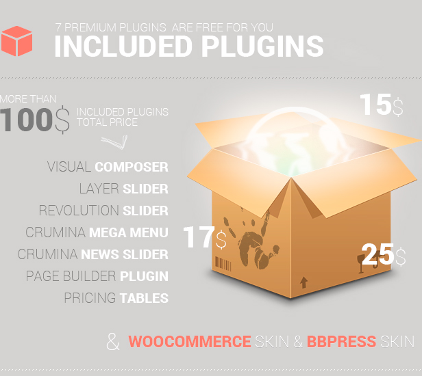
Are you tired of featureless nonprofessional templates? We represent to your attention the new Maestro theme. It is a skill top in construction among WordPress templates and is the best of the existing Crumina Team templates. By means of Maestro theme you are able to easily create either the strict corporate site or bright and easy portfolio. Maestro theme includes all necessary plugins needed for comfortable work, Page Builder, which is magnificent in its functionality, having more than 30 units for creating any page you want. With our outstanding template you show up your personality and really leave your competitors behind.
\\

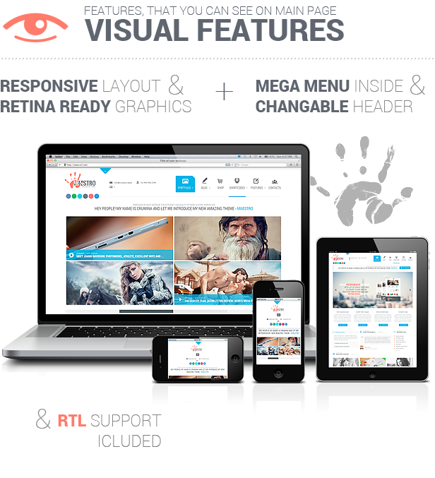
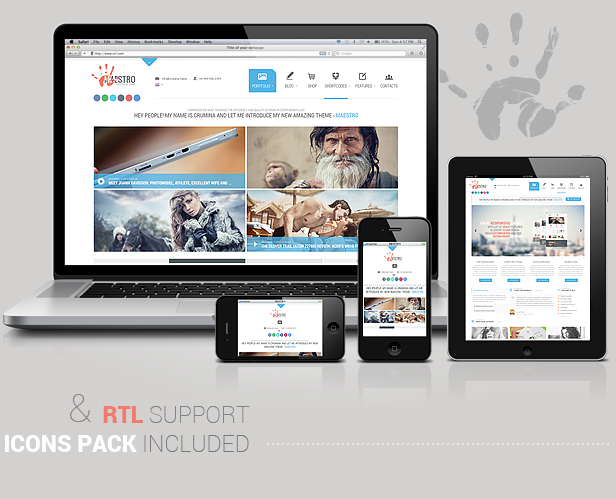
Nowadays the mobile industry develops with incredible speed. There is a great many of the mobile devices produced with different screen resolutions, definitions and orientations. Our Maestro theme has a genius flexible design, which makes it able to view all the site content properly on any device, beginning with the smartphone and ending with the large computer screens.

The great advantage of the new Mega Menu function consists in removing all the nasty navigation from the home page and leaving room for the important features of site content or banners or whatever you wish.

This theme provides you with 2 variants of a header, so you can choose one that is more appropriate for your website. You can easily change the header variant in theme options panel.
Our theme supports RTL option that automatically scans your files and transforms it to the right direction. So when displaying the site our theme handles correct display direction for RTL and LTR languages.
\

BbPress support included to our theme allows you easily setup discussion forums inside your WordPress site. bbPress is focused on ease of integration, ease of use, web standards, and speed.

Create a responsive(mobile friendly) or fullwidth slider with must-see-effects and meanwhile keep or build your SEO optimization (all content always readable for search engines). See the heaps of custom transitions/animations for each object on the page! Customize this slider with our convenient drag&drop backend to your very needs.
\

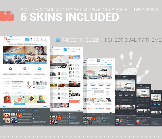
3 different layouts are created for your needs and allow you to make your own site style depending on its purposes, whether it is corporate site, or a magazine or maybe a personal blog. You can easily configure each layout settings changing sidebars, front or background colors, thumbnails, buttons, icons etc.

Moreover there are also dark versions for each layout that you can choose with one click of the mouse in Styling Options.

Our theme offers you unlimited variations to create the site of your dream and that is with a very friendly and easy to use admin panel.
\

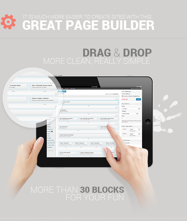
This awesome tool gives you all needed options to create your own unique site as you see it yourself. It is so easy to use that you can create your page template within a few minutes, just add the wanted widgets that are included, define the quantity of rows and site content. You can edit your settings, rearrange the content or delete unwanted elements.

Using this extremely powerful plugin, you can make all of your pages look different. It gives you all needed option to create amazing layouts in the shortest terms.
So there is nothing easier to make your page most beautifully and comfortable!

\

Download Maestro – Fully-functional Business Instrument (Corporate)

News Central – News Template (Creative)

News Central
Magazine & Blog Template

Features –

940 Grid system used.

PSD files included –

Two type Home Page, Review Games Page, Review Movies Page, Video Post Page, Images Post Page, Normal Post Page, Author Page.

Icons Included.

Gogle Web Font Used –

http://www.google.com/fonts/specimen/Open+Sans

Images in the preview file are not included in the main download.

Download News Central – News Template (Creative)

LovelyAgency – Responsive One Page HTML Template (Creative)

A lovely template for lovely people

I’m very excited and proud to bring you my first template named LovelyAgency.

It’s a beautiful clean, minimal and elegant HTML / CSS One page Template.
This template has been designed for small business, landing page or would be perfect for a portfolio.

I have tryed to make something young, easy to use, minimal and attractive!

Featured

  • Clean & Minimal Design
  • Template is compatible with IE7+, Firefox, Safari, Chrome, Opera
  • Valid HTML & CSS
  • Flexslider from Woothemes
  • Documentation
  • Always on Top Header
  • Great Contact form

Responsive Design

The LovelyAgency is fully Responsive for looking great with any tablet, smarthphones, you can also check it how it looks on any format on http://www.responsinator.com/

Support

Do you have a question about this template? Just contact me on my profile, or you can also found my e-mail adress on my website – http://www.iamsupview.be. I’m most of my time behind trying to make some cool stuff, so don’t hesitate to contact me, i don’t realy eat people !

Note

Images from live preview are not included in the template. No worries, it’s remplaced by picture from placeholder.

Download LovelyAgency – Responsive One Page HTML Template (Creative)

Coming Soon Responsive – Construction Area (Under Construction)

This template — is the original author’s vision of how the page “Coming Soon” or “Under construction” should look like. Nice combination of colors, unobtrusive animation — all combine to attract the attention of visitors and your customers to your project.

No coding knowledge required. Buying this item you’ll get easily customizable well commented page with responsive design and valid HTML5. Countdown jQuery script, subscription form with emai validation and social buttons with sexy hover effect.

Credits

  • JQuery plugins: Keith Wood
  • Bootstrap Framework

Download Coming Soon Responsive – Construction Area (Under Construction)

Didactic WordPress Theme (Blog / Magazine)

Envato Twitter Twitter Twitter

Didactic by PeruseThemes

A responsive (mobile friendly) blogging theme with three custom widgets, nine page templates, two collapsible menu locations and four collapsible widget areas, which allows for a one, two, or three column layout.

Customize Didactic In Real Time

Didactic makes use of the Theme Customizer, which allows you to upload a custom logo, custom favicon, adjust the color of the body and headings (h1-h6) elements, modify the footer content, and set your social profile URL’s.

Didactic’s Notable Features

01. Responsive Design
02. Four Collapsible Widget Areas
03. Nine Custom Page Templates
04. Post Format Support
05. Three Custom Built Widgets
06. Translation Ready
07. Two Collapsible menu locations
08. Uses The Theme Customizer
09. Font Awesome. One Font, 249 Icons

Changelog & Documentation

This theme includes in-depth documentation. The latest updates and bug fixes for this theme can be found in the changelog. View The Changelog | View The Documentation

Recommended Plugins

Jetpack

Contact Form 7

Download Didactic WordPress Theme (Blog / Magazine)

Web Design Company -Creative PSD (PSD Templates)

12 psd files
2 color
Layes Group easy to resize RGB high resolution file 1600×7949 px Easy to use
5 page include :
home , aboute us services, blog projects
contacus

font use :
arial
corbel
hero : http://fontfabric.com/hero-free-font/

images use : http://www.shutterstock.com

Download Web Design Company -Creative PSD (PSD Templates)

Smoothie – Responsive Concrete5 Theme (Technology)

This responsive Concrete5 template is based on Twitter Bootstrap. It is designed to give your users the best optimal experience on whatever browser, tablet, or phone they are on. This theme is very lightweight due to the very minimal design, and clean markup. All of the background colors can be changed with ease in the CSS since it’s all color with no images.

Features

  • Twitter Bootstrap
  • Over 10 Custom Blocks, including Google Maps, Portfolio and Twitter blocks
  • Sortable jQuery portfolio
  • Smooth CSS3 Transitions
  • 2 PSDs
  • Blog, with thumbnails and truncated summaries
  • Plenty of sections to add/edit
  • Sample content included for fresh installations, replicating the demo
  • Easy to update

Support

We provide the best support around, if you come across an issue whether it be installation problems or a bug we’ll get back to you right away and sort the issue out! All you need to do is drop us an email, or contact us via our profile page.

Download Smoothie – Responsive Concrete5 Theme (Technology)

Linenity – Clean Responsive WordPress Magazine (Blog / Magazine)

FacebookFacebookFacebookFacebook

Initial theme released. Version 1.0.0

Like it. Rate It 12345

Linenity – Clean Responsive WordPress Magazine

Linenity is a wordpress theme that features a clean and flexible design which suitable for wide variety of websites. This theme includes a huge theme control panel that help user to develop or customize the theme. It also includes different kind of homepage style, widget, footer, post type, shortcode and many others. Linenity also Cross-Browser and Responsive theme, has clean style and well-documented.

Overview

Linenity Showchase

Key Features

  • Easy to Use
  • Responsive Design
  • Unlimited Colors & Backgrounds
  • 10 Pre-defined Colors
  • Flexslider Inlcuded
  • 3 Homepage Style
    • Blog
    • Box
    • Custom (Homepage Builder)
  • Homepage Builder
    • Advertisement
    • Recent Post
    • Category Post (One Column)
    • Category Post (Two Column)
    • jCarousel
    • Separator
  • Unlimited Sidebar
  • 20+ Shortcodes (User Friendly)
  • 300+ Google Fonts
  • 5 Page Templates
    • Archive
    • Blog Post
    • Full Page
    • Redirect
    • Tags
  • 10+ Built-in Widget
  • 11 Footer Layout
  • 9 Post Format
    • Default
    • Images/Gallery
    • Audio
    • Video
    • Review
    • Map
    • Chat
    • Quote
    • Link/URL
  • Auto Slider Content
  • User Defined Slider Content
  • Powerful Options Panel
  • WordPress Theme Customizer
  • Backup/Restore Panel Settings
  • Sticky Navigation Menu
  • Custom Category Colors
  • Life-time Update (Dashboard)
  • Custom Login Logo
  • Multi Dropdown Menu
  • 32 Social Icon in 3 sizes and 2 shapes
  • Social Share
  • Custom Author Social URL (Each)
  • Well-Documented

Easy to Install Data

Set the theme data like the Demo Site (Image not included)

Support

We will reply all support ASAP :)

  • Monday – Friday 01:00pm – 06:00pm (GMT + 7).
  • Saturday & Sunday support will be given anytime.

If you have any problem use the Contact Form on the bottom right of our Profile.

Change Logs

Version 1.0.0
 - Initial theme version.

Credits

Thanks so much for photographers bellow that allow their photos for commercial project.

Flag Counter

Download Linenity – Clean Responsive WordPress Magazine (Blog / Magazine)

ZelhenWina Ultimate HTML 5 (Corporate)


Follow me on ThemForest
Follow me on Twitter

ZelhenWina Ultimate HTML 5 is a Responsive, HTML5/CSS3 theme that features a clean and slick design that is suitable for a wide variety of websites.

Features:

  • Minimalist and Clean
  • Fully Responsive
  • 21 built-in Pages
  • 6 Color Options
  • 4 Homepage Layout
  • Filterable Portfolio : 2 Columns, 3 Columns, and 4 Columns
  • Google Font
  • Interactive CSS3 Graphic Chart
  • Font Awesome
  • Prettyphoto
  • Shortcodes Snippet
  • Twitter Widget
  • Flickr Widget
  • Cross Browser
  • iPad and iPhone compatible
  • Documentation

Credits:

Images :

Creative Commons licensed from these great Flickr author have been used:

Icons:
Iconfinder

Support

I give full support for purchased templates.

Contact me via the Themeforest Contact Form

Download ZelhenWina Ultimate HTML 5 (Corporate)

BRAVE: Dark, clean, fully responsive. By Bonfire. (Mobile)

About BRAVE Quality paired with support to die for

Beautifully dark, minimal and 100% responsive, the goal with BRAVE remains
the same as it was with our previous WordPress mobile and tablet themes: keep
it simple.

You’ll be hard pressed to find a single unnecessary pixel that would get between
your visitor and your content. In fact, we aimed for your content to effortlessly
be a big part of the actual design; as soon as you visit the demo site, you’ll no
doubt immediately notice the focus on bold headlines and other well-placed
content items.

Do read through this entire page and visit the demo site to become familiar
with all the theme has to offer, but for now here’s a short list of more notable
features.

  • works alongside your desktop site
  • ready for localization
  • ‘install as web app’ on iOS
  • beautifully unique menu, comment/contact forms
  • touch/swipe gallery
  • multiple color schemes
  • a variety of extremely customizable shortcodes
  • comprehensive documentation
  • ..scroll down to find out much more!

Stellar support But don’t take OUR word for it

As usual, you have our promise of excellent support which we’re massively
proud of. Below are some kind words from those who’ve purchased our themes:

  • “impressively quick support :) … 5 stars”
  • “Your support is really top notch.”
  • “… fantastic support … You have solved my mobile headache.”
  • “… customer service provided goes above and beyond … An excellent experience from start to finish.”
  • “Best support I’ve ever seen! .. Five stars is not enough!”
  • “… extreme fast response!!!”
  • “This is by far the best support I’ve gotten on TF.”
  • “Wow, thanks for the prompt response.”
  • ”…quick to respond and very helpful.”
  • ”..documentation [has] been a great help..”
  • “Thank you very much for the super-quick support.”
  • “Awesome support!”
  • “Thanks for such a speedy response! You rock man!”

Thoroughly tested: iOS, Android, Windows Phone, and desktop
browsers

BRAVE is thoroughly tested across several browsers and devices, and to that end
works beautifully across smartphones, tablets as well as desktop, allowing your
visitors to easily access your site from whatever device they happen to be using
at the moment.

BRAVE works alongside your existing desktop theme

BRAVE works alongside your existing desktop theme and can easily be shown to
your mobile and/or tablet visitors only. To get a first hand look at the theme,
use
you device to scan the QR code below and visit the live demo site:

Install as a web app (use your own splash screens and icons)

As a part of the theme’s default functionality, BRAVE can be installed on your
iOS device as a web app. Upon arriving on your site, a handy prompt alerts your
visitor
to add the site to their Home Screen, meaning your site will be just a single
tap away.

You can also add your own custom icons and splash screens that the web app will
make use of, as illustrated by the included default images below:

Touch-enabled gallery Swipe, pinch and zoom

BRAVE comes with a customized version of PhotoSwipe, the popular touch-enabled
gallery system, which integrates absolutely seamlessly with WordPress. Let your
visitors
swipe, pinch and zoom their way through your images!

Theme features: The all-mighty feature list

And of course we couldn’t do without a collection of the theme’s features in neat list format:

  • works alongside your existing desktop theme
  • ready for translation/localization (.mo, .po files included)
  • install as web app‘ functionality on iOS (with install prompt, splash screens + icons!)
  • easily create a phone call button and/or menu item
  • tested on several browsers across multiple operating systems and devices (Chrome, Firefox, Internet Explorer, Safari, Opera, iOS, Android, Windows Phone)
  • a fully responsive liquid design that works beautifully on tablets, smartphones and even scales all the way up to desktop (everything from forms and fields to menus and embedded content is automatically resized to ensure your site looks its best on whatever device and resolution it’s being viewed on)
  • fully supports retina screens
  • beautiful and subtle use of CSS3 and jQuery animations
  • includes themes for two different slider plugins
  • 6 color schemes
  • touch-enabled gallery (customized PhotoSwipe)
  • multiple page templates allowing for formatting of content (no title, centered title, back button, and combinations thereof)
  • supports 10 post formats, complete with the option of background images (Standard, Aside, Link, Gallery, Status, Quote, Image, Video, Audio, Chat)
  • a very unique, subtly animated jQuery comment form
  • jQuery contact form with validation
  • a ton of extremely customizable shortcodes (alerts, dividers, buttons etc)..
    ..plus video shortcodes for YouTube, Vimeo, USTREAM, DailyMotion, Blip.tv..
    .. and shortcodes for easily placing content in columns (text, images, as well as video)
  • custom background tool enabled; change the theme’s background color/image in seconds (a dozen background images included)
  • extensive documentation
  • PSD files included

Download BRAVE: Dark, clean, fully responsive. By Bonfire. (Mobile)

Getting Married – Responsive WordPress Theme (Events)

\
\
Items Rss Feed
\

Simple, beautiful and responsive WordPress wedding theme. Very suitable for marriage websites, marriage agencies, or wedding related shops.

Features

  • Responsive
  • jQuery enhanced
  • Flexible
  • Beautiful and efficient code
  • PSD files included
  • 14 pages included
  • 2 Responsive slideshows
  • Unbranded theme options panel
  • Slideshow manager for posts and pages
  • Documentation and support


\


\

Download Getting Married – Responsive WordPress Theme (Events)