Couponize – Responsive Coupons and Promo Theme (Miscellaneous)


About

Couponize is a responsive WordPress template which allows you to store coupons, promo codes and discounts from different brands and companies. Couponize is what you are looking for if you’re looking to release a coupons and discounts website and want to be unique among the competition. It fully works with the latest WordPress 3.6!!!

Being fully responsive, it promises to be bullet-proof on both desktop and mobiles. It comes with a blog page and a blog post page for your personal use.

This is the first coupons and discounts WordPress theme available on ThemeForest and offers all the feature you may need in order to start your promo codes and coupons business!

It offers multiple sorting options for the coupons and discounts: sort by published date, by expiration date, by the number of comments, by the number of thumbs up(based on the GD ratings)

Main features:

  • HTML5 and CSS3 Tableless (Latest Technologies used)
  • Advanced theme options panel
  • Integrated with GD Star Rating and Wysija newsletters
  • Clean and Modern Interface
  • Clean Code
  • Built on Foundation Framework
  • Cross browser Compatbile (This works on every modern browser!)
  • Filtering options
  • Custom designs for coupons discounts(buttons, text, text with border)
  • FlexSlider

Demo images are not included with the download package. They were placed for demo purposes only.

I believe every client should be happy, so I’ll do my best to assist all of you with whatever issues you have with the theme.
I’ll answer questions about minor customization as well, but not for some more advanced customization requests or re-design requests.
If you have any issues with 3rd party plugins, I suggest you to contact the plugin’s developer, as he knows better the code of that plugin and can better assist you.

After you test the theme and our support/documentation, please leave feedback on themeforest. Thank you so much!

Please feel free to leave any questions regarding Couponize or really just say hi, we’re open to everything you might have to say.

This template was designed by bestwebsoft

We are deeply thankful to Aleks Ivic , a really great photographer that let us use his awesome work! Thank you, Alex!

Download Couponize – Responsive Coupons and Promo Theme (Miscellaneous)

Evolve | Responsive Multi-Purpose Theme (Creative)


Evolve is an ultra responsive & highly customizable WordPress Theme for creative folks and companies . It’s an incredible premium theme with powerful customization settings that helps you transform evolve into a powerful website.
The package includes the Revolution Slider Plugin (15$ Value), typographic options with Google fonts, very powerful admin panel, which helps you to customize evolve according to your business needs.

Key Features Overview

  • WordPress 3.9 Compatible
  • Clean and Elegant design
  • Responsive Layout
  • Boxed & Wide Layout
  • Unlimited Colors with Backend Color Picker
  • Powerful sliders
  • HTML5 and CSS3, Cross browser compatible
  • Powerful admin panel
  • built-in patterns and textures with the ability to upload your own
  • Typography options
  • Awesome shortcodes
  • 2 blog llayout styles
  • Pricing Tables
  • 4 different portfolio layouts
  • Includes Iconsweet glyphs
  • Compatible with common plugins.
  • Very Extensive Documentation
  • Demo content

much more…

Credits

Sergey Shapiro
MaxKabuzenko
Annex
Abduzeedo

Download Evolve | Responsive Multi-Purpose Theme (Creative)

Vivera – Multi-Purpose HTML Template (Portfolio)

Vivera is a fully responsive HTML template or Creative Page html template is easily usable with any device (Desktop, tablet, mobile phone…), without removing any content!.
Vivera is a responsive parallax one page html theme that modest for your Business , Portfolio and your website agency that you can be Special with this theme .
The theme has a gallery for featured work special, jquery paginated portfolio layout and blog, awsome hover effect, and contact work. The template offers a quick and easy setup.

Feature:

  • Clean & Minimal Design
  • Bootstrap Build
  • Awesome Fonts
  • Flat Design
  • Responsive Design
  • Revolution Slider Included ($12 Value )
  • HTML5 & CSS3 Validated( http://validator.w3.org )
  • Template is compatible with IE8+, Firefox, Safari, Chrome, Opera
  • Social Media Link
  • Workings AJAX Contact Form
  • Nicely commented code
  • Google Web Fonts
  • Google Maps
  • Feature Service
  • Easily Customizable
  • Always on Top Navigation
  • Parallax style
  • Filterable portfolio
  • Detailed Documentation

If you like our template, please, share your love with us and rate it

Thank You !

Notes:

The photos used in the template are not included in the main download file, they are only for the preview purpose.

Download Vivera – Multi-Purpose HTML Template (Portfolio)

Evolux – Responsive Multi-Purpose WordPress Theme (Business)


Evolux is Responsive Multipurpose WordPress Theme with Attractive clean-wide design, the perfect solution to show off your product or Information. Can be awesome to use for corporate website, portfolio, blog and anything you need.

Responsive Design – Evolux is extremely easy to install and Ultra responsive; adapting to mobile device and tablet computer screens automatically without any code manipulation.

Retina Ready – – Because of computer screen getting better everytime. Evolux is fully adapted for high resolution display. Also, Evolux provides an option to set a custom logo image for retina displays.

Current Versions – 1.1

The Key of Theme Features

  • Ultra Responsive
  • Easy logo replacement with retina display support
  • Minimalist – Breaking News Slideshow
  • Custom Menu
  • Custom Widgets
  • Easy to use the Theme Settings
  • Accent Color Control (via Color Picker)
  • Localisation Ready (.mo and .po files)
  • 5 Posts Format (Standart post, Video post, Slideshow post, Quote post, and Soundcloud post)
  • 8 Page template (Default, Archives, Blog, Full width, Full width Box, Portfolio 2 Column, Portfolio 3 Column, Portfolio 4 Column)
  • WordPress 3.6 Ready
  • PSD files included (8 Files Web Layout + Sprite)
  • Extensive Documentation

Need Help / Support ? Contact on email

First and foremost, thanks for purchasing one of my files, I truly appreciate it!.
Email: [email protected]

Download Evolux – Responsive Multi-Purpose WordPress Theme (Business)

Responsive Supermarket PrestaShop Theme – GoMarket (PrestaShop)

Checkout GoMarket for other platforms:

OpenCart GoMarket 
Magento Go Market 

Look for different styles:

Check out our other templates.

Magento Brand Store 
Magento Electronues 
Magento Fashionista 
PrestaShop Urbanista

PrestaShop Actiwear 
OpenCart GLMobiles 
PrestaShop Toy Store 
Magento Mr.Handsome 
PrestaShop Boutiques

OpenCart DigiWorld 
Shopify Harmony 
Shopify Harmony 

EggThemes GoMarket - Responsive PrestaShop Theme

EggThemes Go Market refers to special theme for marketplace, supermarket online. Whenever you customers are, they can experience your super rich, and impressive product range. An extremely neat and clean layout avoids unexpected distraction as well as messy look.

Wow, what you see on the left side of the home page is vertical mega menu which is much more comfortable to follow, watch and keep track within the website. Beautiful visual effect of revolution slideshow, and promotion static block will space up your website to promote hottest deal. Tab effect shows others product in categories, yet keep it really well-organized. Product modules, and extra footer make it more informative and also easier to know your greatest offers.

Features

Follow us on Facebook  Follow us on Youtube

Follow us on ThemeForest  

Rate for us  Submit a support ticket

Compatibility

  • PrestaShop version 1.5.3.1
  • PrestaShop version 1.5.4

Included in the purchase package:

  1. Theme package to install on your existing store
  2. Full demo site package included all sample data
  3. All free & commercial modules included
  4. 20 Layered PSD design files cover all PrestaShop pages
  5. Detailed installation & user guide documentation.

Responsive Design

Responsive Design

Design is optimized for all the most popular screen resolutions. When screen is resized, design elements are transformed smoothly on each breakpoint (from 240 to 1680 pixels) in order to adapt to the current resolution. Breakpoints at: 320px, 480px, 768px, 1024px, 1200px.

Responsive Sizes

Mega Menu

Add custom menu with many type dropdown option:

  • Specific Category with thumbnail and sub category with multi level
  • Specific Product grid view
  • Static block with free content and support multi language
  • Grid view image and name Manufacturers
  • Specific CMS prestashop page

Well responsive and mobile friendly

Mega Menu

Menu on Mobile

Revolution Slideshow – Mobile CS Slider

  • Showing beautiful slideshow image and caption with many effect
  • Free upload image and custom caption. Supporting multi language
  • Multi layers with multi effects

Revolution Slideshow

Quickshop – Module CS QuickView Product

  • Show icon Quick View for each product in the homepage and category page
  • Help customer quick view product details, select options and Add to cart

Quick View

Custom message Add to Cart with Popup View

Ajax Add to Cart

3 color presets and powerful custom colors and custom fonts – Module CS Theme Editor

  • Free custom color (text color, link color, hover color, background color, background image…) and google font for many elements as header, footer, menu, slideshow, block title, button,…
  • Two css mode Box and Wide

Colors

Settings

Products Grid and List View

Grid & List

Powerful custom column and products grid – Module Cs Theme Editor

  • Can choose the layout one, two or three columns for all page (except homepage)
  • Can set 2,3,4,5,6 or 8 products in a row

Columns

Many banner and custom link, custom html text – Module Cs Static block

Free content (multi language) into many position

Static Blocks

Displaying New Products or Special Products or Top Seller Products… in one module CS Filter Product Center, CS Filter Product Right, CS Filter Products Left

  • Easily configure in admin panel
  • Support jQuery responsive slider /li>

Products Module

Displaying products by specific category in tab effect – Module CS Home Tab

Products Tabs Module

Display a slider of Manufacturer logo with module CS Slider of Manufacturer Logo

Brand Slider

Installer

And many other features supported in this theme as:

  • Quick search in header with autocomplete
  • Mini dropdown cart
  • Newsletter
  • Social network icons
  • One page checkout
  • Product Review
  • Product Comment
  • Product Accessories
  • Zoom and Light box product thumbnail

Other Features

Community Support & Customer Support

Our support team guarantees to respond you within 24 working hours. You can send us email to [email protected], when you receive an auto-response email it means that your question has been delivered to our system ticket system. We will proceed tickets and respond you to in the queue order.

Our working hour is from 8:00AM to 5:00PM GMT+8 Monday to Saturday.

Changelog

Version 1.0.0 - 2013-08-02:
- Initial Release.

Download Responsive Supermarket PrestaShop Theme – GoMarket (PrestaShop)

RoyalStartex – Minimalist Business WordPress Theme (Business)

Visit Our Website
Follow Us on ThemeForest
Follow Us on Twitter
Follow Us on Facebook

Royal Startex is a simple, clean and minimalist business wordpress theme suitable for company, business, portfolio and corporate sites.

This theme is powered by Klasik Framework

Main Features:

  • Responsive
  • Blog
  • Portfolio
  • Menu Manager
  • Auto Image Resizing
  • Custom Widget
  • Simple and Unbranded Theme Options
  • Option to use Right or Left sidebar
  • Translation Ready (Available .po file)
  • Threaded Comment
  • Nivo Slider
  • Multi Level Dropdown Menu
  • Cross Browser Compatible
  • XML sample data included
  • Well Documented
  • PSDs files Included

Theme Support

After purchase please ask support question via our support form.

Download RoyalStartex – Minimalist Business WordPress Theme (Business)

product® (Technology)

product® responsive wordpress theme is best way to present your product. period. Theme is modern, clean, fully responsive with a lot of features …

Thank’s

  • jQuery easing
  • iosslider
  • fancybox
  • smoothscroll
  • scrollTo
  • jQuery One Page Nav Plugin
  • nicescroll
  • AdvanceCustomFields
  • (commercial licenses included in zip archive)

    Video Credits

    The videos used in demo are from vimeo and aren’t included in files.

  • Simon Christen – http://vimeo.com/69445362
  • Seb Toots – http://vimeo.com/61480709
  • Support

    The support on this theme is provided, but in limited amount. We don’t provide support for major theme modifications etc., but if you are experiencing any kind of problem with installing or using this theme, please feel free to contact us via contact box on our themeforest profile or fill a ticket at jewelleries.ticksy.com

    Changelog

    
    /****************  v1.3 ( August 20 2013 )  ******************/
    - Tags added under posts
    - Added styles for all WordPress core widgets
    
    /**************** v1.2 ( August 15 2013 ) ******************/
    - Custom Scroll performance drastically improved
    - JQuery iOS slider updaited to ver 1.3.8
    - html5shiv jQuery removed from header and placed in function.php with wordpress IE checking
    - Big change on backend, we added Home and Blog pages and register them like front static page and page for posts, also we added automatic creation of home static page sections
    - Added xml file with Sample Content
    - Documentation updated
    
    /**************** v1.1 ( August 3 2013 ) ******************/
    - All styles and scripts enqueued in functions.php and divided on header and footer
    - Repaired some errors caused with custom fields
    - Replaced Nice scroll default "on" state to "off" 
    - Changed contact forms validation, and included wordpress functions.
    - Added css for sticky posts and added clearing for floated wordpress core styles
    
    /**************** v1.0 ( July 20 2013 ) ******************/
    - Initial release
    

    Flag Counter

    Download product® (Technology)

    Crumble – Responsive HTML Template (Creative)

    envato-follownewsletters-followtwitter-followfacebook-follow

    Crumble is a Responsive HTML Template, best suited for
    Magazines, News and Blogs.

    Crumble is developed on the Skeleton — beautifull boilerplate for responsive
    development so it look beautiful at any size, be it a 17” laptop screen
    or an iPad, iPhone.

    Images used in the Demo
    All images used in the demo are not distributed with the theme. They are all licensed under Creative Commons and credited to their respective creator/owner.

    Rating

    If you like my work, please rate it. If you’re about to rate it with less than 5 stars, please let me know the reason first and I will do my best to improve the theme.
    Thanks so much!

    Recent Projects

    Pravda – Retina Responsive WordPress Blog Theme

    Phrase – Responsive WordPress Blog Theme

    NewsTrick – Responsive WordPress Magazine / Blog

    TrustMe – Responsive WordPress Magazine / Blog

    CrossRoad – Responsive WordPress Magazine / Blog

    Crumble – Responsive WordPress Magazine / Blog

    Atlantic News – Responsive WordPress Magazine / Blog

    Download Crumble – Responsive HTML Template (Creative)

    Flaty Mobile Retina | HTML5 & CSS3 And iWebApp (Mobile)


    General Features

    • Custom add2home, cookie powered, appears once, if you close it, it doesn’t appear again for 7 days! Check FAQ’s for details!
    • Custom jQuery code.
    • Page preloader with fader!
    • Optimized for all types of mobile screens!
    • WebApp Ready!
    • AJAX/PHP Contact Form with validation!
    • Touch Swipe image slider!
    • Colorbox image gallery!
    • Photoswipe touch image gallery!
    • Full retina support for all graphic elements!
    • 800 icons availalble!
    • 40 icon lists availalble!
    • Google fonts integration!

    Typograpghy features!

    • 1 text column!
    • 2 text columns!
    • 3 text columns!
    • 1 column with icon
    • 2 columns with icon
    • 3 columns with icon
    • 1 column with image
    • 2 columns with image
    • 3 columns with image!
    • Blockquote with icons!
    • Blockquote without icons!
    • CSS3 Highlighted text paragraphs
    • CSS3 Dropcaps text style!
    • CSS3 Table!
    • CSS3 Web 2.0 buttons
    • CSS3 Minimal buttons
    • List with icons!
    • Classic lists with numbers or bullet!
    • Thumbnail adaptive blog post!
    • Fullwidth blog post!
    • Ads widget in blog!
    • Recent widget in blog
    • Comments widget
    • Replies widget!

    jQuery features!

    • jQuery Swipe Slider
    • jQuery Photoswipe thumbnail gallery!
    • jQuery Colorbox 1 column gallery!
    • jQuery Colorbox 2 column gallery!
    • jQuery Colorbox filtrable gallery!
    • jQuery Checkboxes ( retina ready )
    • jQuery Radioboxes ( retina ready )
    • jQuery On/Off Toggle! ( retina ready )
    • jQuery +/- Toggle ( retina ready )
    • jQuery Tabs
    • jQuery Classic Notifications ( retina ready )
    • jQuery Big Notifications! ( retina ready )
    • jQuery Header notifications!

    Epsilon mobile framework! What is it

    Epsilon is the most advanced and easiet to use mobile framework we’ve ever built! It’s made in such fashion that you’ll have all possible elements styled up for this specific template and all you’ll have to do is call them to your page!

    Is Epsilon harder to use than coding old fashion way?

    NO! It’s actually far far easier! All elements are dynamic, you can use as many as you want, they are just copy paste, replace with your information, done! That’s all!

    How is Epsilon/Resepina is built?

    Epsilon is the backbone of Resepina , it has 2 stylesheets and Resepina has the style.css and graphic elements!

    • style.css, has all the design elements of the template!
    • framework-style.css, includes all typography sizes and colors, element styles, and design features for the elements in Epsilon, styled for Resepina
    • framework.css, includes the sizes, alignment, spacing, visual hierachy of the elements! This is basically the engine of Epsilon!

    Thank you dkoated.com for the coach arrows!

    Requires iOS 5.0 or higher, Android 4.0 or higher, Latest RIM, Windows Mobile 8!

    Download Flaty Mobile Retina | HTML5 & CSS3 And iWebApp (Mobile)

    Minimal Clean – A Cool Onepage WordPress Theme (Creative)

    twitter
    facebook
    dribbble
    behance
    themeforest
    support

    A Super Clean Minimal Onepage Portfolio, Blog, Gallery WordPress Theme.
    Fully Responsive

    Documentation/Helpfile Included.

    Authors

    Designed by FreshCreations
    Developed by SlicingArt.com

    Questions and support?

    For any questions please contact us from our profile page.

    Credits :

    Download Minimal Clean – A Cool Onepage WordPress Theme (Creative)

    Venera – Responsive Portfolio and Blog Theme (Creative)

    Gorgeous multipurpose and responsive WordPress theme – ideal for your portfolio, blog, web or mobile application showcase. Page builder will help even unexperienced user to create stunning designs and layouts.

    Theme is compatible even with a latest version WordPress 3.6!

    Comes with a Demo Data to play around with!

    Extensive documentation will walk you through the installation process so you can easily play around with demo data and create your own layouts based on it.

    Documentation & Support

    Check out our extensive documentation which is always growing and is available online whenever you need it most: View Documentation. If you have any questions that are beyond the scope of this help file, please feel free to use my support service.

    Premium Plugins Included

    With a purchase of my theme – you are getting a list of premium plugins and resources for free:

    • Visual Composer – $25 value
    • Revolution Slider – $15 value

    Powerful Visual Page Builder

    Amazing visual composer will help you build complex page layouts without a single line of code, just drag and drop elements you need and define layout for your page – it’s so easy.

    Unlimited Color Combinations

    You can match theme color scheme to your company logo with a powerful settings panel, you can literally change a look of every element on a page. I’ve bundled theme with 4 predefined color combinations to get you started.

    Changelog & Update History

    Version 1.0.1 – August 6

    + Added Support for languages using Cyrillic Alphabet
    + Updated Revolution Slider to latest version 3.0.8
    + Fixed errors for older PHP versions - August 6
    

    Version 1.0 – August 6

    + Initial Release
    

    Credits

    All images viewed in the live preview are for demo purposes only and are not included with your purchase. These images are courtesy of: Justin Mezzell

    Flag Counter

    Download Venera – Responsive Portfolio and Blog Theme (Creative)

    SM Sport – Responsive Magento Theme (Shopping)

    INTRODUCTION

    SM Sport Responsive Magento Theme has released for Magento Community Edition 1.7.x

    A premium theme is built fully responsive layout that looks great on mobile and all tablet devices. If the product image is large, this layout will automatically adjust thumbnail size to fit all screens.

    SM Sport has a strong interface, the main point focusing on flash design, harmonious color scheme and clear layout so it’s really suitable for sports store such as sporty equipment, sports accessories, sportswear… Beside that, this is a multi- purpose theme, you also can easy to customize for any product range.

    Powered by many premium extensions will make your site become stronger: Dynamic Slideshow with smooth transition effects, powerful Mega Menu with mutiple columns styles, Ajax cart pro for customers easily purchase… Moreover, theme allows to show blog outside homepage by using: Blog – Community Edition by aheadWorks

    MAIN FEATURES:

    • Support Magento 1.7.x
    • Cross-browser: IE 8+, Safari, Mozilla Firefox, Opera 9+ and Chrome
    • W3C XHTML 1.0 Transitional Valid
    • 100% table-less design, based on CSS3 with many animated effects
    • Support 3 layouts for pages: 1, 2 or 3 columns
    • Super Mega Menu, Css Menu or Split Menu
    • Integrated Google Fonts
    • Responsive layout for PCs, Mobiles and any Tablet
    • Various color styles and typography by powerful Cpanel
    • Custom wishlist page, cart page and contact page
    • Flash design, Cloud Zoom for product images
    • Carousel Slider for product images
    • Dynamic Slideshow, Responsive Listing Module
    • Ajax Cart Pro for quick purchase
    • Accordion for Shop By and Categories panel
    • Additional Footer, Back to top button and Navigation links
    • Social networks integration
    • Support SEO, pre- and post- text with each instance of modules
    • 6 Color Styles available: tomato (default), boocdo, blue, cyan and orange

    WHAT ARE INCLUDED?

    SM Sport Theme Package
    Use this package to install to your current site

    QuickStart Installation Package
    This package included modules, theme, sample data. By using this package, you will set the theme exactly as demo

    Extension Packages
    Modules which we used for the demo.

    PSD Sources
    All PSD design themes

    Fully Documentation
    Detail userguide to configure theme…

    NOTE: The Images in the live preview will not be part of the design/theme meant for sale.

    Download SM Sport – Responsive Magento Theme (Shopping)

    Eleven – OpenCart Theme (Miscellaneous)

    The Eleven Theme for OpenCart is simple and easy to work with. It is compatible with Opencart 1.5.5.1 & 1.5.6

    Features

    • Admin Color and slideshow options. Change the color scheme easily from the admin panel. See screenshots for more information: http://goo.gl/OHUcpG
      • Change background color, or upload a background pattern.
      • Change the color for links, slider buttons, headings, etc.
      • Change the slideshow animation, speed and time from the admin panel
    • Product tabs on Homepage for the following modules (Content Top):
      • Latest
      • Best sellers
      • Specials
    • Carousel for product module blocks in the footer area. (Latest, Best sellers & Specials)
    • Responsive
    • Well Documented
    • Two layered PNG files included for your customization needs.

    More Themes:

    Download Eleven – OpenCart Theme (Miscellaneous)

    Reborn – Retro Onepage (Creative)

    Reborn is the personification of a combination of two completely different styles. Make your site have a unique atmosphere both retro elements and modern. If you are looking for a creative, colorful and attractive design theme for your Portfolio or corporate client than Reborn is for you.

    Features

    • One Page
    • Parallax Scrolling
    • 100% Responsive
    • HTML 5 + CSS 3
    • Portfolio Filtration
    • Sticky Header

    Download Reborn – Retro Onepage (Creative)

    Ikebana – Masonry WordPress Portfolio Theme (Creative)

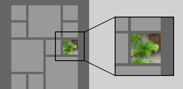
    Ikebana is a premium WordPress portfolio theme created by Satori Studio. Our aim was to develop a minimal, clean, and aesthetically pleasing, yet stable, powerful, and highly customizable theme to use for agency websites, personal portfolios, photography or art showcases, as well as personal blogs and Pinterest-type collections. Ikebana is a responsive and retina-ready theme, which means your website will be equally usable and good-looking on both large monitors, laptops, tablet devices, and smartphones, including those with high-definition screens.

    Theme Highlights

    Set any size for the portfolio items:
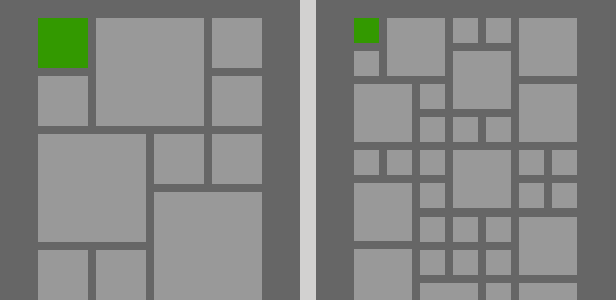
    Set any margin between the portfolio items:
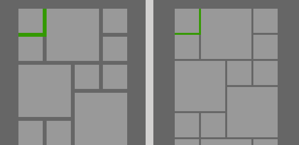
    Portfolio elements adjust automatically to any screen size:
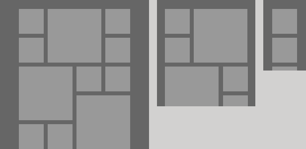
    Retina-ready – crisp graphics on high-resolution devices:
    Other Theme Features

    Full package | Works out of the box – just install the theme, activate the included plugins, and you are ready to go create!

    Theme options panel | All theme customization is done through the unbranded theme options panel – no coding knowledge required.

    Unlimited styles | Make your website truly yours – change the color and font of any element. Ikebana comes with integrated Google Fonts – you can choose from over 500 varieties.

    Fully responsive | Mobile-friendly websites are no longer a fad – if your website does not adapt to smaller screen sizes, you are missing out!

    Page layouts | Choose from 7 custom page layouts, including portfolio, blog posts page, full-width, left-sidebar, right-sidebar pages, as well as individual layouts for archive pages and the 404 page.

    Post layouts | You can set one of three layouts (“right-sidebar”, “left-sidebar”, or “full-width”) for every individual post and portfolio item.

    Post formats | Ikebana supports 6 pre-styled post formats for both portfolio projects and blog posts: “standard”, “image”, “video”, “gallery”, “quote”, “link”, and “aside”.

    Custom backgrounds | Customize the background of the website – you can choose between a solid color fill, a repeating texture, or a background image.

    Textures and icons | Wide choice of custom textures and icons included in the theme package.

    Powerful shortcodes | Content columns, buttons, labels, quotes, tabs, charts, embedded media, and many more – easily add any of the 38 available shortcodes using the shortcode generator, directly from the content editor.

    Contact form builder | Create customized contact forms using the form builder directly from the content editor and insert anywhere using shortcodes. A specialized widget is also available.

    Easy translation | Localize your website – use the built-in interface to translate any hard-coded string into other languages (or change the wording of the string in the same language if you wish). A ready-made .po file is also included in the theme package.

    Custom menu | Ikebana has one pre-set menu area which supports second- and third-level submenus.

    Widget-ready | Areas for widgets in the sidebar and footer – add standard or custom widgets.

    Unlimited sidebars | Add an unlimited number of customized sidebars to replace any of the widget areas. You can create sidebars and configure defaults for posts, pages, frontpage, category listings, etc, as well as assign a particular custom sidebar to any individual page.

    Custom widgets | Four custom widgets included: Twitter updates, recent posts with thumbnails, shortcodes, and social connections with custom-made icons.

    Google analytics | Built-in support for Google Analytics – insert your Google Analytics account code from the theme options panel to monitor and analyze traffic stats.

    SEO-optimized | Google and other search engines will love your website – make full use of the search traffic thanks to optimized titles, tags, dynamic content, and many more.

    Child theme support | Child themes are the most efficient way to customize a theme, separating your changes from official theme updates. A starter child theme is included in the Ikebana package.

    Icon font integrated | Ikebana comes with Font Awesome – a versatile icon font to produce icons that can be styled with common CSS and look equally good on high-resolution displays.

    Detailed user manual | Full description of how to install, setup, and customize the theme is found in the extensive user manual which is included in the theme package.

    Dedicated support | Have questions? – visit our support forums, we will be happy to help you!

    Media Used in the Preview

    Images
    Smartphone Glove by Cog Log Lab, Sakurako Using Stylus Pen by Miki Yoshihito, Traditional Cell Phone vs Smartphone by Takashi Hososhima, Bonsai by Bob | P-&-S, Bonsai Training by Joe Newman, Bonsai by Carol Browne, Bonsai Bud by Dayna Bateman, Artisan Sake Maker by Shinsuke Ikegame, Leather Jacket M8 by Nokton, Tatami Weaver’s Workbench by Matthew Bednarik, Group Work by Kazumissimi, Power Button in the Hinge by Neonarcade, Paper Prototype by Rodolphe Courtier, Home Office by Marko Pakoeningrat, Poster by Joe Jones,
    Afternoon Ritual by Dave Fayram, Green Development by Tom Page, Creative Director by Sean Hagen, Subtle Wacom by Marcus Jeffrey, Tablet by Bark,
    Bootcamp by Sebastiaan ter Burg, Whiteboard by Sebastiaan ter Burg, Photos by Unsplash

    Videos

    Meet Malbox by Mailbox, Evolution of Mobile Phone by Found, Nokia Lumia Commercial by Windowsphone.

    Special thanks to Inga for being my muse.

    Download Ikebana – Masonry WordPress Portfolio Theme (Creative)