POISON – One Page Template (Entertainment)

Key Features Overview

  • Extremely logical & practical
  • Best for music Bands & Singers
  • Bootstrap 3 Grid based layout
  • Built in Audio Player
  • Easy to customize and use
  • Retina Ready graphics
  • Designed using google fonts
  • 100% Clean & flat graphics
  • Well organized PSD file
  • and much more…

Credits (Photos – Icons)

Note: Any media – Images, icons or logos used in previews are not included in this item and you need to contact authors to get permission in case you want to use them in your commercial or non-commercial projects.

Icons Used

Download POISON – One Page Template (Entertainment)

Goodify – Responsive Tumblr Portfolio Theme (Portfolio)

GOODIFY is a responsive parallax Tumblr theme perfect to promote your work or your business. It’s stunning design and layout capabilities will give your portfolio pieces the attention they deserve. The theme is easy to customize, such as color scheme, font color, icon color, compatible with all modern mobile devices and more amazing features.

Features

  • Retina Display Ready
  • Snippet code Highlight on Text Post
  • Font from icomoon
  • Google Analytics
  • Widget for display your lattest post on ( Dribbble, Instagram, and Flickr )
  • Lattest Tweet
  • Support All type tumblr post
  • EXIF ( Exchangeable Image File Format ) on Photo Post
  • 25 Social Icons (Twitter,Facebook,Yotube,dribbble,instagram,flickr, GitHub and many more)
  • Disqus & Facebook Comment
  • And many awesome features

WHAT’S IN THE PACKAGE

  • Tumblr Theme (index.html) & (index.txt) with CSS and JS Code Included
  • Layered PSD Files
  • Documentation goodify-documentation.html

CREDITS & THANKS

THEME SUPPORT

We’re really happy to help you, fell free to contact us [email protected]

Download Goodify – Responsive Tumblr Portfolio Theme (Portfolio)

Plus Responsive Retina Ready One-Page Template (Creative)

Plus Template is a modern multipurposes template. It can be used by a creative agency, a coorporate compagny or as personal portfolio for a freelancer .

The template is responsive, sow you can view it also in the mobile/tablets devices and it looks very in thoose devices.

All the html ,css, javascript code are well organized and commented to make any change easy to do without any problems.

  • Responsive layout
  • Retina Ready
  • One page
  • Html 5 & CSS3
  • Unique design
  • Twitter feed
  • Slideshow
  • Multiple color skin
  • Parallax
  • Scrollable navigation
  • Multiple color skin

Font installation

Please refer to the documentation of the template that you can find in the main download file, then go to the Fonts installation section .

Note

The images used in the template are not included in the main download file, they are only for the preview purpose.

If you like my template, please don’t forget to rate it.\\\\\

Download Plus Responsive Retina Ready One-Page Template (Creative)

Industry (Muse Templates)

Industry is a ‘Minimal Multi-Purpose’ theme. As with all of our themes, Industry is speedy, lightweight and bursting with some amazing custom Widgets, Rollovers and stunning designs.

Main Features:

  • Slideshow Banner
  • Header Drop Down widget
  • Social Lifestream widget
  • Unique Rollover effects
  • Custom Lightbox gallery
  • Client Slider
  • Portfolio Page Slider
  • Subscribe widget
  • Custom Social Icons
  • Beautiful Mobile theme

For support please contact us via our Support Center. To get the latest theme notifications, news and updates please follow us on Twitter or join us at Facebook

Download Industry (Muse Templates)

Alive – Coming Soon Page (Under Construction)

ALIVE is a full responsive and super clean under construction page and it’s compatible with Retina Display. It was made to be simple in use.

Main features

  • HTML5 and CSS3
  • Responsive
  • Animation
  • jQuery countdown
  • Super clean
  • AJAX subscription form with validation
  • AJAX feedback form
  • MailChimp
  • Font Awesome
  • Easy to change
  • Full screen slider
  • Team page
  • About Us page
  • Displays perfect in all major browsers
  • Compatible with MacBook Pro’s Retina Display
  • IE 8 ( Internet Explorer 8 ) support

Download Alive – Coming Soon Page (Under Construction)

ModernMail Responsive E-mail Templates (Newsletters)

If you like my work please vote me.

Modern is a clean , minimalist and responsive e-mail template. Make your e-newsletter memorable with good design and colorful. This would be good for your marketing strategies and This will help you to promote your online business worldwide.

Modern will make not only your work be easier but also your email will have more stylish by the smart-looking layout that will make everything remarkable and easy managing for beginner.

Modern contains 21 unique Templates in 6 colors Total 528 HTML! 2 Skin (Dark, Light). You can also easily use the template that supports MailChimp and Campaignmonitor drag&drop module without HTML edit. already tested on various browser and majors email clients (Outlook, Gmail, Yahoo, Hotmail and browser IE, Firefox, Opera, Safari, Chrome )
and It work well with any kind of email service provider ( Aweber, iContact, Benchmark Email, MailChimp, Campaign Monitor, or Constant Contact)

If I can help you in any way, please don’t hesitate to contact me.

  • Mobile Responsive
  • 6 Colors scheme
  • 2 Skin (Dark, Light)
  • 9 Unique layouts
  • 21 Unique E-mail Templates
  • 528 Html ready to use
  • Browser compatible
  • Clean design
  • premium template
  • CSS inline and CSS button
  • Flexible table structure (delete/copy/replace)
  • html file for MailChimp
  • Feature MailChimp
    • Added the ability to Repeatable
    • Added the ability to Drag and Drop
    • Added the ability to change the background color
    • Hide and remove layout
    • Edit and Change Image
    • Editable content
  • html file for Campaignmonitor
  • Feature Campaignmonitor
    • Added the ability to Repeatable
    • Added the ability to Drag and Drop
    • Edit and remove layout
    • Edit and Change Image
    • Editable content
  • Easily duplicate or hide modules
  • Well Document
  • Commented Code
  • Lightweight as possible
  • Modern techniques used.
  • Works on every major e-mail client.
  • include 12 PSD

Necessary capabilities for you

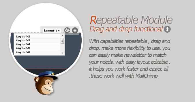
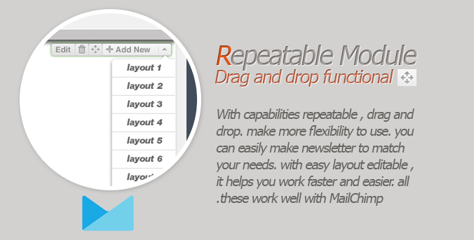
With capabilities repeatable , drag and drop. make more flexibility to use. you can easily make newsletter to match your needs. with easy layout editable , it helps you work faster and easier. all these work well with MailChimp and Campaignmonitor.
you can import this template to MailChimp , Campaingmonitor and change all images and text without HTML edit.

Browser Compatible:

  • Android
  • AOL Mail
  • Apple Mail
  • Eudora
  • Foxmail
  • GMail
  • GMail app
  • Hotmail
  • IncrediMail
  • iPad
  • iPhone 1, 2, 3, 4 and 5
  • KMail
  • Lotus Notus 8
  • Lotus Notus 8.5
  • Mozilla Thunderbird
  • Opera Mail
  • Outlook 2002
  • Outlook 2003
  • Outlook 2007
  • Outlook 2010
  • Outlook 2011
  • Outlook 2013
  • Sparrow
  • Spicebird
  • Yahoo Mail
  • Window Phone

Featured File


Deluxe Responsive Email Template


Download ModernMail Responsive E-mail Templates (Newsletters)

Steve – Responsive Email Template (Newsletters)


Steve Clean design template with a mac like panel style, best for promote your new approcation, also a table to compare between lite version and paid or else.


  • 22 html file.
  • 14 regular html file ready to use.
  • 2 layout style Box and Full single box
  • Commented HTML.
  • Flexible table structure (delete/copy/replace).
  • Campaign Monitor and MailChimp ready.
  • Responsive for your mobile device.
  • Compatible with WordPress plunin MyMail

*please note image in the live preview are not include in the package.

30/09/2013 V 1.0

  • Initial Release

if you love this item give me some love comeback and rate my hard work, I do appreciate. :bashfulcute:

Download Steve – Responsive Email Template (Newsletters)

Geek Press – Responsive News & Magazine Template (Blogger)

Geek Press template was designed as a flat and responsive Blogger template for News and Magazine websites. Geek Press is very easy to work without touch to code, it will help you publish your small news / magazine projects as the fastest way ever.

Geek Press Features

  • 100% Reponsive
  • Build home layout by add / drag / drop widgets (very easy change the sorting of the label sections or repeat label sections)
  • Smart Resize Thumbnail
  • Auto detect social icons
  • Build drop down menu without touch to code
  • Support shortcodes
  • Custom 404 page
  • Allow post reviews
  • Advance Editor: upload background images, change background color, key colors, fonts.
  • Very friendly Admin Panel
  • Well Documentation
  • Threaded comments with emoticons
  • Blogger, Facebook and Disqus comment sytems ready and allow your visitors easy to switch, template will auto remember visitors’s choice for future.
  • Related posts ready.

geek-press-responsive

geek-press-flexible-home

geek-press-template-editor-home

geek-press-flexible-comment-systems

Credits

SUPPORT

You can SUBMIT A TICKER HERE, I will try to reply you as fast as I can. If I delay to reply you, maybe your timezone is different with minev(my TZ is GMT+7). Welcome to my support services.

Below are some useful links:

Download Geek Press – Responsive News & Magazine Template (Blogger)

MA ARGONA – Responsive Magento Theme (Magento)

\
\
\
\

MA Argona is a multi purposes Magento Theme. If you’re going to open your online store using Magento Go service and sell watches, bikes and furniture or luxury stuffs, or you looking for a clean and nice design, this template is perfectly your choice. Homepage contains image slideshow, brand sliders; the footer with extra space allows to show more info of your stores address or links.

This theme has 3 templates : watch template, bike template and furniture template. These template are desgined mainly in green and light yellow. With those green block colors, no need to say, clients can also feel shop’s spirit, as a common place for people love watches, bikes and furniture.

Category navigation, a very helpful tool for shopper to watch products by categories and subcategories avoids messy look for the website. Similarly, “shop by” function will filter products by price. Information of products is not only provided on single product page but also general product page. It helps customers to have quick glimpse on them. Customers will save massive shopping time with it. Currency exchange, language translator, and newsletter are also available.

Surfing on mobiles struggles with small screen, since it is really hard to watch product in details without zooming in or out. It has extremely well-organized, yet keep it super informative. Searching field is just under logo, not difficult to see and easy to use, it helps customers can find products in few seconds. Product categories are shown in the most logical way, to avoid using confusion for visitors. Some featured products still appear on the homepage with minimized prolix details.

\
\
\
\
\
\
\
\
\
\
\

UPDATED AND FIXED

  • 09/28/2013 – Released Version 1.0.0

Download MA ARGONA – Responsive Magento Theme (Magento)

Sympathique – Responsive WordPress Theme (Portfolio)

Sympathique is a modern and clean WordPress theme for creative people. Its versatility makes it the perfect theme for web agencies, freelancers, businesses or blogs and its functionality aims to offer a great user experience.


Main Features

Responsive from Head to Toe – Sympathique is built on a responsive framework which transforms the layout of your website and make it look great on small screen devices, but also on fullscreen monitors, changing its shape from 240px to 1120px.

Drag&Drop Page Builder – Sympathique is packed with the “Visual Composer” Premium WordPress Plugin($25 value) which allows you to create awesome custom pages for your website within minutes, by making use of a nicely drag and drop interface and a set of custom widgets and shortcodes.

Impressive Media Slideshows – Create responsive, SEO friendly and unique sliders for your pages by using the “Revolution Slider” Responsive WordPress Plugin($15 value), directly from a cozy admin panel packed with options for anything. Regular, Fullwidth or Fullscreen, the plugin can handle it!

Easy Theme Setup – Prepare your website for the web within minutes by importing the demo data XML file packed with the theme. The package also includes slider and theme option settings ready to be imported into the system.

Powerful Theme Options Panel – Sympathique comes with a solid yet easy-to-use theme options panel from where you can set default settings for theme styling, typography, social media, etc.

Extended Options for Pages – Each page can be extended with a set of options. Set a custom layout: sidebar on left, sidebar on right, fullwidth page. Set the sidebar. Choose a header style and customize it for your needs. Define a background, being it image or color.

Sidebar Manager – Generate as many sidebars as you want, populate them with widgets and assign them to any page you wish. Simple like that!

Translation Ready The theme is ready for translation into another language. Packed with the theme are the two .po and .mo files which will help you localize the theme for another language.

Search Engine Optimized – Sympathique is built with best SEO practices in mind, so you can maximize the value of your content in front of search engines. It is also compatible and works perfectly with the most popular SEO Plugins(SEO by Yoast, All in One SEO Pack, etc.)

Typography based on Google Fonts – The theme is using the Google Webfonts service to deliver the font styles on the front-end. Customize the look of your website by choosing from more than 600 Google Fonts for content and headings, directly from the admin panel.

Unique Portfolio Layouts – Sympathique features many layouts for showcasing your work. Display your projects on 2, 3 or 4 columns, or better, on a beautiful grid. Add your projects with ease by making use of the custom meta boxes created for portfolio items, or even better, use Visual Composer to lay them on page in an original way. You can create as many portfolio pages as you need.

Blog Enhanced with Post Formats – The standard blogging functionality has been extended to fulfill anyone`s needs: Multiple blog page layouts(regular and masonry on 2 and 3 columns) and Post Formats(Standard, Gallery, Video, Audio, Link, Quote). Transform your website into a veritable digital magazine, by using one of the masonry layouts and the power of post formats!

Coming Soon/Under Maintenance Template – Is the website not ready for the web or you`re doing some maintenance work which requires the website to be down? Use the special template built for moments like these and continue doing your work! Additionally, inform your visitors when you`ll get back online, by using the Sympathique countdown widget.

Child Theme Included – Edit theme files in the safest way possible by making use of the Sympathique Child Theme included into the package.

Download Sympathique – Responsive WordPress Theme (Portfolio)

LENS – An Enjoyable Photography WordPress Theme (Photography)

Follow us on ThemeForest Subscribe to our Newsletter PixelGrade Documentation PixelGrade Video Tutorials
Lens Support Lens Support

LENS is a surprising premium WordPress theme aimed at photographers in need for a solution that focuses on what matters most to them: their work. Every feature was carefully chosen and designed to ease the way to that perfect photography portfolio website.

Packed with a stunning yet minimal,flat design, LENS features fullscreen slideshows and galleries, grid based photo galleries and a journal to help photographers keep up with their visions and thoughts.

Because we know the importance of a pure yet intriguing visual experience, especially in photography, LENS delivers unexpected yet perfectly natural animated page transitions, fast but at the same time super smooth.

This is what LENS is all about: offering the right thing, in the right place, right when photographers need it!

\
\
\

Photo Galleries

Fully packed with fullscreen slideshows, grid based galleries, a journal to keep up with latest photo shoots.

Check out various gallery layouts: Full Screen Gallery, Full Width or Grid of Thumbnails


Portfolio Projects

Perfect in cases when you need to showcase other kind of works that need additional text to explain things fully.

Check out various projects layouts: Full Width Slider, Classic or Right Sidebar.


Social Friendly

So you can easily spread the word around, LENS integrates powerful social media systems including Tweets widget, article sharing on Facebook, Google+ and Twitter, Social Meta Tags and Icons.


Translation Ready

LENS is fully compatible with WPML (.po files) so you can translate everything in your visitor’s language.

LTR and RTL support.
Bonus: translation files included for English, German and Spanish


Unlimited Colors

Customize the look and feel of your site with extensive theme options and change the website’s accent color to match your personal branding.


One Click Demo Install

REALLY!! Just one click and we set up everything: content pages, blog articles, menus, sidebar widgets.
Check out the Installation and Setup video »

Note: Images from the demo are replaced with placeholders.


PixTypes Plugin

Take control of your own content! You shouldn’t loose it if you decide to go with another theme. Using our PixTypes plugin you will never have to worry about losing content. PixTypes is used to create Galleries and Portfolio Projects.

Your content, your way!


\PixCodes Plugin

LENS comes with our powerful visual shortcodes plugin integrated right in your WordPress editor. Quickly add columns, rows, icons, buttons, progress bars and much more.

Shortcodes made easy!

\
\
\
\
\

LENS cares deeply about photography and the men behind it, this is why we have went that extra mile to make sure the the visual options provides cater both to the modern web and, most importantly, to the artist’s vision. We know that every photographer and photo series have a different story to tell. This is why each project can go on different visual path through different gallery and project templates.

Responsive Design and Retina Ready

Because beautiful imagery and carefully written content need to shine on any device, LENS is a fully responsive, Retina-ready WordPress theme, with adaptive images that will look great down to the phone in your pocket.

More Features

Customize the look and feel of your site with extensive theme options, custom website accent color and a multitude of shortcodes.

To ensure quality and consistency across the board, LENS comes with 12 custom designed templates:

  1. The home page can be any of the following templates;
  2. Gallery grid displaying a full width grid of photos;
  3. Full Width Gallery Slider;
  4. Full Screen Gallery Slider;
  5. Portfolio Archive a full width grid of photos, each one representing a project;
  6. Full Width Single Project page with a full width top slider;
  7. Single Project With Right Sidebar;
  8. Classic Single Project;
  9. Blog Archive page with masonry layout;
  10. Single Blog Post page featuring all the elements to ensure that your thoughts and endeavors get the front seat;
  11. About Page – Studio because teams are important; let the others know you workflow, your team members and your social presence;
  12. About Page – Personal for one man shows or to give each team member a place of their own;
  13. Contact Page (Contact Form 7 and Google Maps seamless integrated);

We’ve also provided you with a series of custom widgets so you don’t have to compromise on design:

  • Flickr and Dribbble photostream widgets;
  • Latest posts widgets;
  • Social icons widget with custom icons and drag&drop ordering.

We’ve taken the time to make this theme as easy to use as possible. We’ve integrated with many of the WordPress core features, like featured images and widgets, assuring a smooth crossing from your old theme.

\

We’ve chosen to have a dedicated support forum so you can easily track your tickets, receive notifications when someones answer and make things easier for both of us. You will also be able to review other information that was requested and given to other buyers.

Full Features Overview

  • Responsive Design
  • Retina Ready (provided you upload pictures at least 700px wide)
  • Ultra Smooth scrolling
  • Unlimited colors control of the site-wide accent colour
  • Over 600 Google Web Fonts to choose from
  • Standard & Video Portfolio Projects
  • Floating header with a cool search integrated into it
  • Site-wide area to display the Latest Tweets
  • The custom made and easy to use PixCodes plugin:
    • Grid shortcode with interactive sliders
    • Icons shortcode (302 FontAwesome and 250+ Entypo icons)
    • Progress Bars shortcode
    • Tabs shortcode
    • Divider shortcode
    • Button shortcode
    • Quote
  • Extensive theme options based on our awesome WpGrade Framework
  • Free from PHP notices and warnings (debug mode on was used during development)
  • Multilingual Translation ready and .po/.mo files for localisation included ( WPML )
  • W3C HTML5/ CSS3 Valid
  • Social and SEO optimized:
    • Facebook OpenGraph meta tags
    • Google Plus meta tags
    • Twitter meta tags (Twitter Cards)
    • Schema.org markup for Google Rich Snippets support
  • 12 custom page layouts:
    • Gallery grid
    • Full Width Gallery Slider
    • Full Screen Gallery Slider
    • Portfolio Archive
    • Full Width Single Project
    • Single Project With Right Sidebar
    • Classic Single Project
    • Blog Archive
    • Single Blog Post
    • About Page – Studio
    • About Page – Personal
    • Contact page with Google Maps and Contact Form 7
  • See project images in a lightbox responsive and mobile ready modal window
  • Multiple Post Formats support for Blog Posts (video, audio, quote)
  • 5 custom designed widgets:
    • Twitter Feed Widget
    • Flickr photostream widget (pull the latest images from a Flickr user or RSS feed)
    • Dribbble images widget that can display the latest images from a Dribbble user account
    • Social icons (with custom icons and drag and drop ordering)
    • Latest posts
    • Contact widget

Credits

All images viewed in the live preview are for demo purposes only and are not included with your purchase. These images are courtesy of Laurent Nivalle – All Rights Reserved.

Changelog

The current version is 1.0:Released on September 28th, 2013.

Click here to view the changelog

Download LENS – An Enjoyable Photography WordPress Theme (Photography)

CataMail – Minimalist eCommerce Email Template (Catalogs)

CataMail – Minimalist eCommerce Email Template

CataMail is a ready-to-use minimalist modern email template designed for eCommerce or products promotion. CataMail packed with flexible repeatable modular you can mix and match as you need. There’s also 5 pre-defined layout and 5 color variations, which you can very easy to customize and make it fit with your needs. CataMail is support with MailChimp and Campaign Monitor editor (add, remove, edit, drag and drop blocks).

Read on for further

CLICK HERE TO SEE DEMO Click the color of each layout to see the demo

Videos

CataMail in MailChimp drag&drop powerful editor

CataMail in Campaign Monitor drag&drop powerful editor

Features at glance

  • Maximum clients compatibily, in all major email clients. From old Classic Yahoo! Mail, up to the most used clients like Apple iPhone.
  • Mobile friendly, coded with media query CSS
  • Valid and well-commented codes
  • Ready for Campaign Monitor and MailChimp powerful template editor!
  • 11 unique flexible modular that you can very easy to remix them to create your own layout.
  • 5 sample layouts variations (all modules / mixed layout version included)
  • 5 color variations (that you can very easy to change with your own color with only one-click find and replace code)
  • On-going support along with detailed help documentation files (including the videos) – (cover how to work with PSD file, work with the HTML file, up to sending email with most popular email marketing
    services like MailChimp, GetResponse, Campaign Monitor, AWeber, and how to create your own button).
  • Flexible button with inline CSS (guide to create your own button, see next section). Very easy to make your own button
    and flexible to place it as your needs.
  • Major email inbox compatible (test both direct and tool). Direct test on my Android 4.1.2 phone, iPhone mail, Gmail (IE, Chrome, Firefox, Safari), Yahoo Mail (Chrome, Firefox, Safari), Outlook 2010, Windows Live Mail. Online test using Inbox inspector from Getresponse
  • Repeatable & drag and drop modules with MailChimp and Campaign Monitor template included!
  • Easy to copy, add or remove modules with clear comments in codes. Even you can mix and create your own layout variations while everything is still working properly.
    For MailChimp and Campaign Monitor users, add, remove, move, edit blocks content via their powerful editor.
  • Sliced PSD files included.

Pre and or after-sale questions, feel free to contact me directly via this contact form!

What you’ll get in the download package:

  • Total 40 HTML files, with 1 mixed modules+ 5 sample layout variations.
  • 5 HTML files for MailChimp templates (in separated folder, for each of color), 5 HTML files for Campaign Monitor templates (in separated folder, for each of color), and 30 other for regular HTML templates.
  • Full PSD file
  • Image files, in the “images” folder in each of layout and color variations.
  • Help Docs – Including videos.

Compatible Browsers:

  • Android
  • AOL Mail Chrome
  • AOL Mail Explorer
  • AOL Mail Firefox
  • Apple Mail
  • Gmail
  • Hotmail
  • iPad
  • iPhone 3, 4 and 5
  • Lotus Notus 8
  • Lotus Notus 8.5
  • Mozilla Thunderbird
  • Opera Mail
  • Outlook 2003
  • Outlook 2007
  • Outlook 2010
  • Outlook 2013
  • Outlook.com
  • Windows Live Mail
  • Yahoo Mail
  • And mostly all clients that render valid HTML

Support requests

For support related, please send me your support request / question, or any advice via this contact form. I will respond you usually within 24 hours in Monday – Friday.

Credits

Images on the demo you can purchase from photodune marketplace, here’s the links:

http://photodune.net/item/beautiful-woman-wearing-jewelry-very-clean-image-with-copy-space/1634933
http://photodune.net/item/beautiful-woman-wearing-jewelry-very-clean-image-with-copy-space/1634937
http://photodune.net/item/smiling/2470072
http://photodune.net/item/gold-jewelry-on-beautiful-woman-model-posing-glamorous/5325338
http://photodune.net/item/beautiful-woman-wearing-jewelry-very-clean-image-with-copy-space/1634939
http://photodune.net/item/beautiful-womans-manicure/2381309

Download CataMail – Minimalist eCommerce Email Template (Catalogs)

BizNex | Multi-Purpose Parallax PSD Landing Page (PSD Templates)

BizNex is a Modern Multipurpose Parallax PSD Landing Page. This Template is Suited for any type of website, personal or business use. The Landing Page is designed with modern look and feel while keeping in mind to make it user friendly and eye catching so that people using it can get the best out of their website.

We provide Full Life Time Customer Support and answer to Pre-Sale questions. Click Here to go to the support forum for this item.

Features

  • 2 Fully Layered and Editable Photoshop (PSD) files.
  • 960 Grid Based Design
  • Option of Parallax and without Parallax
  • Clean & Modern Design
  • Web Friendly Fonts

Credits

Note

Images are not included in this file and is only part of Display.

Download BizNex | Multi-Purpose Parallax PSD Landing Page (PSD Templates)

Nordic – Retina Responsive WordPress Theme (Portfolio)

Nordic

Nordic is a clean, minimal responsive WordPress theme, optimized for best portfolio showcase for designers, photographers and other artists.
Nordic is a full ajax theme, which loads only those dynamic parts, and makes browsing experience very smooth for your visitors.

You can check also the dark skin from this URL.

  • 8 page templates
  • 2 Custom Post Types
  • Retina Ready
  • Responsive
  • Written with WP-Debug ON
  • Threaded Comments Support
  • Drop-down menu support (nested menus)
  • HTML W3C Valid
  • Dummy Content Included
  • Clean Design
  • All Google Fonts Included
  • All famous social networks included
  • PSD’s included
  • Translation Ready (.mo and .po files included)
  • Child Theme Ready
  • Short-code Generator (Build Shortcodes easy using our UI)
  • Unlimited theme updates + lifetime support
  • Google Maps
  • Ajax Contact Form
  • Rich Option Panel
  • Internal Like System
  • Built with Bootstrap
  • 2 Custom Widgets
  • Ajax Loading Site (only loads dynamic part’s which makes theme incredibly fast)
  • HTML5 History Push State (even if user is going through site via AJAX browser history keeps working)
  • Custom Shortcodes
  • CSS3 Animations

Download Nordic – Retina Responsive WordPress Theme (Portfolio)