Flatshop – Responsive & Retina Magento Theme (Magento)


Full Features List

Retina ready
Responsive design
Unlimited colors
Ajax add to cart
Ajax toolbar
Ajax quick view
Ajax price slider
Ajax login and register
Ajax contact form
Onepage checkout
Theme options module
Integrated Google fonts
Changeable layout. Ability to change sidebar position (left or right)
Two kind of my cart page. Standard and accordion view
Currency switcher as select box and flags bar
“Sale” label for products with special price
“New” label for products
“More views” block can be displayed as slider
“Related products” block can be displayed as slider
“Categories” block in the sidebar can be displayed as accordion
“Wishlist” block in the sidebar can be displayed as slider
Home page button in the menu
Fully customizable home page
Integration with Cloud Zoom
Social bookmarks for products
Compatibility (IE, Firefox, Opera, Safari, Chrome)
Lots of paterns + ability to upload custom patern
Dropdown cart in header
Ability to upload custom logo image
Language switcher as select box and flags bar
Fancybox on the home and listing pages
“To Top” Button
“Collateral” block can be displayed as tabs or accordion
Two positions of newsletter
Ability to disable any sidebar blocks through the admin panel
“Shop by” block in the sidebar can be displayed as accordion
Previous & Next functionality for the product view page
Fully customizable header slider
Custom widgets: New Products, Featured Category products, Tabs, Social Links.
WYSIWYG HTML5 editor
Optimized & well-structured code
.Psd files included

Updates

We use SVN in our work to control version of templates. What does it mean? It means you can always update your copy of theme very easy even after a ton of custom changes because we provide .diff files with theme files. Just compare your files with changed ones after new version will be realeased.

Ver. 1.0 (15 October 13)

Magento Community Edition 1.8.X.X, 1.7.x.x (1.7.0.0, 1.7.0.1, 1.7.0.2)

Download Flatshop – Responsive & Retina Magento Theme (Magento)

DotCom – Responsive Joomla Corporate Template (Corporate)

DotCom – is a creative, clients need, professional Joomla template which is powered by Gantry.
Its a feature rich, flexible and easy to use template which may cover all of your needs.
DotCom has Revolution Slider (25$ value), K2 Powered Blog, Corporate Pages and So on.
It has cross browser compatibility and clean code with detials documentation. Hope, you will enjoy it.

Features You can like

  • Gantry Framework
  • Excellent Portfolio Style
  • Home Variations
  • About us, Service, Team and Pricing page
  • Revoulion Slider $25 value
  • Roksprocket Slider
  • 6 Preset Style with Unlimited Color variation.
  • K2 for blog
  • Creative Tab style
  • Built by HTML5 and CSS3
  • Custom Blog Style
  • Typography Page

Credits

  • Gantry Framework
  • Acymailing
  • K2 – Award winning CCK Component for Joomla!
  • News Show Pro GK4
  • Roksprocket
  • JBmaps by Joomlabamboo
  • Images credit: ThemeForest Asset Library, Freegreatpicture, All Free Download
  • Content used from lipsum.com
  • Typography from Twitter Bootstrap

Demo images replaced with dummy images.

Version: 1.0

Initial release Version: 1.0 

Download DotCom – Responsive Joomla Corporate Template (Corporate)

The Wedding Day Responsive Theme (Wedding)

  follow us on twitter  \  get support

   set up guideOptions Panelvideo tutorialsfollow us on themeforestdrag and drop builder

   highlights

   highlights

The VamTam team salutes you!

The Wedding Day is a lovely, responsive wedding theme. It is suitable for users with zero programming skills as well as advanced developers. The theme is the perfect match for your wedding with predefined styles, drag & drop builder and beautiful design.

Complete list of features

Highlights

  • Bonus – wedding invitation.
  • Optimised for speed.
  • Sleek and easy to use Drag & Drop page, blog posts and portfolio posts builder.
  • CSS animation option for most of the elements.
  • Easy parallax builder.
  • Revamped Admin Option Panel.
  • 900 Premium Icon Set – $39 Value!.
  • Layered Slider Responsive WordPress Plugin – $15 Value!
  • Support for the premium plugin – Quform.
  • 980, 1080 or 1260 max resolutions.
  • Unique featured slider for pages, blog and portfolio posts.

  Top notch customer support

  • Help Desk with one on one email and ticket support and dedicated support staff ready to assist you.
  • Response times usually less than 8 hours.
  • Video install guides for beginners.
  • Extensive set up guide for beginners.
  • In-Dashboard Contextual Help. There are little helpers everywhere in the interface, that let you retrieve quick information about the particular fields you are currently viewing.

 Next-generation features

  • The VamTam drag & drop page builder is tightly integrated with tinymce editor and you can switch to visual or text editor at any time without losing any changes.
  • Responsive liquid layout (320px to 1260px).
  • Hardware-acceleration on sliders and all javascript.
  • Unique mobile menu.
  • Touch Enabled Sliders with swiping.
  • Touch Enabled Featured Slider with swiping.
  • Gracefully degrades in older browsers.

 Endless layout possibilities

  • Boxed and full-width layout.
  • Choose from three max resolutions – 980 px, 1080 px, – 1260 px.
  • Any page can be home page. Set-up your own home page as you wish! Unlimited Homepage variations.
  • Flexible 6 sidebars in body and in footer.
  • Flexible left, right or both sidebars on inner pages and posts.
  • Unlimited Dynamic Sidebars.
  • Unique widget areas for posts/pages.
  • Global archive templates.
  • Per page and per post option panels.

Teck-savvy

  • Vamtam Rock Solid Theme Framework.
  • Lighting fast. Exceptional page-load performance straight out of the box.Nothing’s required but a standard PHP web hosting .Most of the themes nowadays are bloated with effects and you can hardly scroll the page. The Wedding Day is packed with CSS animations and yet light and with exceptional loading time.
  • Valid HTML5 and CSS3 design following all modern best practices. Designed primarily with CSS, minimal graphics means minimal load-time.
  • Consistent code structure.
  • No Timthumb.Native WordPress Thumbnails support.
  • Easily modify the theme options pages with our meta programming options generator.
  • Very well-maintained and minimalistic code structure.
  • Pixel perfect design.
  • Custom post type support for Portfolios and Testimonials.
  • Unobtrusive CSS3 and jQuery-powered effects.

 Unlimited styles

900 Premium Icon Set – $39 Value!.

Easy Parallax builder

CSS animation option on most of the elements.

15 + custom ready to use pages with amazing design.

Theme skin switcher with 4 predefined skins.
Plenty of Shortcodes.
All our themes include Custom Shortcodes that allow you to easily add buttons, lightbox, icons, drop cap, divider, styled list, tooltip and more to your posts, pages and widgets.

Fullscreen background images.
Set a different background image for each page Set a different background color for each page.

55 + color pickers to style every element
The theme will let you customize the style and typography of every element in the design.
Packed with 100+ options, it allows you to make your website look exactly like you want!

Child Theme Support for Advanced Users.

 9 custom widgets

  • Vamtam Post Formats Widgets.
  • Vamtam Advertisement Widget.
  • Vamtam Links with icons Widget.
  • Vamtam Contact Info Widget.
  • Vamtam List Subpages.
  • Vamtam Flickr Widget.
  • Vamtam Multi Widget. Shows popular,recent post, comments and tags
  • Vamtam Gmap Widget.
  • Vamtam Authors Widget.

 Mobile support

  • Responsive liquid layout (320px to 1260px).
  • Unique mobile menu.
  • Responsive Sliders.
  • Responsive full width portfolio with categories and swipe support.
  • Hardware-acceleration on sliders and all javascript.
  • Touch Enabled Sliders with swiping.
  • Gracefully degrades in older browsers.
  • Dedicated mobile design, looks perfect on your Iphone and Ipad.
  • The columns of portfolio,blog and featured slider layout respond to resolution.4 column layout will go down to 2 in mobile resolutions

 Page/Post drag & drop builder

The VamTam drag & drop page is a very rich tool with simple interface for building any page or post layout with simple drag & drop. You don’t need to touch one line of code for creating your page layout and elements. This tool will save you lots of time on building your pages or posts.

The VamTam drag & drop page builder is tightly integrated with tinymce editor and you can switch to visual or text editor at any time without losing any changes.

Tabs and Accordion elements with drag and drop interface.

Drag & Drop page builder works with pages, blog and portfolio posts.

 Font replacement

You can change any text on your site
to the font of your liking and you can preview fonts in the admin panel

  • Google fonts support – 400+ fonts
  • Font Face

 Sidebar manager

Custom sidebars for posts and pages.
Sidebar Manager allows you to replace all widgetized sidebars in our themes with unique custom sidebar.

  Powerful theme options

  • Sleek and easy to use Drag & Drop page, blog posts and portfolio posts builder.
  • Revamped Admin Option Panel.
  • CSS animation option on most of the elements.
  • Easy parallax builder.
  • Shortcode generator.
  • Tons of shortcodes with tiny MCE visual integration!

 10+ portfolio layouts

  • Re-sizable full screen portfolio with categories and touch swipe support.
  • Masonry style portfolio.
  • Filtered portfolio with cool CSS3 animations.
  • Featured slider for portfolio listing and portfolio posts.

 One-click demo content install

  • Integrated Envato Toolkit – you can update the theme from the admin panel.
  • Demo content and configuration one click install.
  • Widget importer.

 Layered Slider

Layered Slider Responsive WordPress Plugin – $15 Value!

Contact Form 7

  • Create forms easily with Contact Form 7
  • Working Contact Form – right out of the box.

 SEO friendly

  • Built with semantic best practices and search engines in mind!
  • Support for All in one SEO pack plugin.
  • Support for WordPress SEO plugin by Yoost

 Translation Ready

  • 100% WPML compatible.
  • The theme is translation ready – po/mo files included.

Credits

The images used in the demo website are stock images and can be obtained from the link bellow.

Stock Images

Other scripts used in the theme:
Scripts

Updates

Download The Wedding Day Responsive Theme (Wedding)

Reno – Responsive MultiPurpose HTML5 Template (Corporate)

RENO is multipurpose HTML5 template suitable for companies or individuals. RENO is retina ready with 8 color styles, white / gray version, parallax ready, shop ready and much more. It is a great way to present your work at the highest level. It is based on popular Twitter Bootstrap framework. This template uses the latest HTML5 and CSS3 technologies.

\

\

\

\

\

\

\

FEATURES

Responsive (mobile ready) HTML5 + CSS3 Design
8 Color Styles
Retina Ready
White and Gray version
Clean and Unique look
Based on Twitter Bootstrap (2.3.1)
Revolution Slider
Sly Slider
Nivo Slider
Flex Slider 2
Refine Slider
Magnific Popup
Parallax
Shop
Working Contact Form
Isotope Filtering
Animate.css Effects
Fixed Menu
Google Web Fonts
FontAwesome Iconic Font
Blog with Left or Right Sidebar
A lot of Shortcodes
W3C Valid
Cross-browser Compatible
Layered Photoshop PSD File included
Documentation
Flat Design
Easy to Extend

29 HTML Files

Home 1 – Revolution Slider
Home 2 – Parallax

Home 3 – Sly Slider
Home 4 – Flex Slider
Home 5 – Video
Shop
Product Detail
Shop – Left Sidebar
Shop – Right Sidebar
Checkout
Portfilio
Portfilio Detail
Portfilio 2 – 2 Columns
Portfilio 3 – 3 Columns
Portfilio 4 – 4 Columns
Blog
Blog Detail – Left Sidebar
Blog Detail – Right Sidebar
Blog Full Width
Services
About Us
Pricing Tables
404 Error
Components
Sliders
Typography
Awesome Icons
Grid System
Contact with Google Map

Included Photoshop file

Layered Photoshop PSD file of Home

FONTS

Google Web Fonts – Open Sans
Google Web Fonts – Fauna One
Font Awesome – http://fortawesome.github.com/Font-Awesome

Photos

http://www.flickr.com/photos/fiddleoak
http://www.flickr.com/photos/astragony
http://www.flickr.com/photos/anieto2k
http://www.flickr.com/photos/markjsebastian

Images are not included in template

SOURCES

jQuery – http://jquery.com
Twitter Bootstrap – http://twitter.github.com/bootstrap
jQuery Isotope – http://isotope.metafizzy.co
jQuery FlexSlider 2 – http://flexslider.woothemes.com
jQuery Owl carousel – jQuery OwlCarousel v1.19
jquery appear – https://github.com/bas2k/jquery.appear/
prettyPhoto – http://www.no-margin-for-errors.com
jQuery Fitvids – http://fitvidsjs.com/
jQuery Easing – http://gsgd.co.uk/sandbox/jquery/easing//
jQuery Parallax – http://www.ianlunn.co.uk/plugins/jquery-parallax/
jQuery RefineSlide plugin v0.4.1 – http://github.com/alexdunphy/refineslide/
Retina – http://retinajs.com
Respond – https://github.com/scottjehl/Respond
Animate js /css – http://daneden.me/animate/
jquery.nicescroll 3.0.0 – http://areaaperta.com/nicescroll
meanmenu.2.0.min.js – https://github.com/weare2ndfloor/meanMenu
Sly slider js – https://github.com/Darsain/sly
Revolution slider – http://www.themepunch.com/codecanyon/revolution/
Magnific Popup – v0.9.5 – http://dimsemenov.com/plugins/magnific-popup/
Mail it – http://craftedbydavid.com

CHANGELOG

v1.0 – 22 October 2013 – Initial version

Thanks for all the reviews

Download Reno – Responsive MultiPurpose HTML5 Template (Corporate)

SuccessPlus HTML template (Site Templates)

SuccessPlus is a clean multipurpose HTML5 Template powered with Twitter Bootstrap 3.0 Framework. It suits for any type of business, personal website, portfolio, design studio etc.This template offers a lot of useful features that will help your work stand out from the crowd. SuccessPlus has fully responsive design ready to look stunning on any device. Code is easy to modify and understand so you can personalize it in the easiest way. Enjoy using SuccessPlus!

Main Features

  • Based on Twitter Bootstrap 3.0
  • Fully Responsive
  • HTML5 and CSS3
  • Valid HTML Markup
  • Based on 1170px grid
  • 8 full layered PSD files included
  • Used Only Free Fonts
  • Icons Font Included

Credits

  • Modernizr detecting a browsers features.
  • jQquery is a popular JavaScript library.
  • bootstrap.js is a stantard Twitter Bootstrap library.
  • respond.js is required for Twitter Bootstrap 3.0 works in older browsers.
  • Superfish is a plugin that enables a dropdown menu.
  • hoverIntent is a component for Superfish menu.
  • jquery.actual.js is a plugin that can calculate dimensions for hidden HTML elements.
  • Elastislide is a jQuery plugin that we use for horizontal slider.
  • Flex Slider is a jQuery plugin for main and bottom sliders.
  • Isotope is a jQuery plugin for filtrable gallery.
  • PrettyPhoto is a jQuery plugin for displaying lightbox content.
  • jquery.ui.totop.js is a jQuery plugin for to top button.
  • jquery.easing.1.3.js is a jQuery plugin for different types of animation.
  • placeholders.js enables a placeholder functionality for input tags in older browsers.

Download SuccessPlus HTML template (Site Templates)

Goodworks – Multi Page Company or NonProfit Theme (Corporate)

THNDRBOLT’s Goodworks Adobe Muse theme is a multi-page website template for any NonProfit or Company to use. With ease, anyone can start editing each asset, change colors, and import your own photos. No coding needed!. We’ve included 7 uniquely styled pages for Desktop and Mobile. Also comes with documentation to help you get started.

Features also include

  • 7 uniquely designed pages for Desktop & Mobile
  • Full documentation to help you install & change site assets
  • Editable source files in Adobe Muse & Photoshop
  • Unique Desktop & Mobile versions included
  • Use over 100 fonts from Typekit
  • Import your own Photos or Videos
  • Easily customize the colors, text, & objects within Muse to fit your needs
  • Image galleries

Advocacy Theme
Agency Visual Theme

Connect With Us

\
\

Download Goodworks – Multi Page Company or NonProfit Theme (Corporate)

8 COLORS – Responsive HTML Coming Soon Page (Under Construction)


8 COLORS is a Simple, Minimalistic, Responsive Coming Soon and Under Conctruction Page.
It is based on Bootstrap.

Details:

  • HTML5 & CSS3 – Bootstrap based
  • Responsive
  • Awesome, circle countdown
  • 8 default color styles
  • Very easy to customize
  • Tons of great icons (Awesome Font icons based)
  • Google Fonts
  • Beautiful tooltips
  • Newsletter form (collect adresses to CSV file or in MailChimp – PHP nedded)
  • Simple email adress validation
  • MailChimp integration
  • Google Analitycs integration
  • Easy to set up config file

Full list of available icons: Font Awesome

Config file options:

  • Date and time to countdown
  • Text after completion of countdown
  • Google Analytics ID

Included:

  • HTML, CSS, JS and PHP (newsletter form scripts) Files
  • 8 default CSS color variations
  • A lot of social icons through the integration of Font Awesome
  • Documentation

Important! Circle countdown doesn’t work on IE < 9. The normal counter is displayed on this browsers.

We would be glad to help you. If you have any questions relating to this theme – write a comment.

History

v 1.0.0 - 18.10.2013

Download 8 COLORS – Responsive HTML Coming Soon Page (Under Construction)

Flicon Mobile Develop Muse Theme (Corporate)

Flicon Mobile Develop One Page Muse Template

Flicon Mobile Develop – Flicon is a modern and clean one page Muse template designed for Agencies, Freelance Designer, Creative Development Studios. To edit this template is very easy! You can change colors, texts or replace the images in a few minutes. Desktop and Mobile version.

Main Features:

  • Desktop, Mobile Version
  • Muse and HTML
  • Parallax Scroll Motion Effect
  • Portfolio Widgets
  • Lightbox
  • Contact Form
  • Typkit Webfonts
  • Easy to Editable
  • Drag and drop your content
  • Use free Image for preview (Link inside download file)
  • All Graphics and Icons are inside the download file. (only not the people images)

Support

If you have questions or need help please contact us via Email.

Download Flicon Mobile Develop Muse Theme (Corporate)

Dynamo – Retina Onepage WordPress Theme (Corporate)


Support Forums


Follow us on Themeforest


Follow us on Themeforest


Support Forums

Dynamo is minimal & flat responsive WordPress One Page Template, perfect to promote your portfolio. With a responsive design it is easily usable with any device (desktop, tablet, mobile phone…).

Features

  • Fully Responsive

  • Single Page

  • Retina Display Graphics

  • PSD Included

  • iOS 7 inspired Design

  • Sticky Navigation

  • HTML5/CSS3

  • Slider Revolution

  • Ajax Contact Form

  • Cross-browser Compatible

  • Filterable Portfolio

  • jQuery Enhanced

Theme Features

Credits

To see all contributors and credits for images and scripts used please click here: Candy WordPress Credits

Download Dynamo – Retina Onepage WordPress Theme (Corporate)

X – The Ultimate WordPress Theme (Miscellaneous)

X WordPress Theme – Overview

Stacks – X includes multiple unique designs inside of one powerful theme. No setup required, works simply and easily. We refer to these designs as “Stacks.” There are currently three Stacks available in X, with more on the way. It’s like buying one theme and constantly getting access to new themes all the time! The Stacks currently included in X are as follows:

  • Integrity
  • Renew
  • Icon

Experts – X was built upon the input of industry-leading experts. We consulted numerous individuals and asked them what sort of features they wanted to see in a theme from an SEO standpoint, design, feature-set, et cetera, and built their suggestions right into the theme. Forget the marketing speak, X truly delivers on what it promises.

Customizer – Being on the cutting edge of WordPress development is something we wanted to do from the start. Because of that, we made sure that we avoided the use of clunky additional admin panels and instead, opted to utilize the native WordPress Customizer (or rather, our souped up version of the WordPress Customizer). With this setup, you can preview all of the changes you make to your site live without any need to switch windows or refresh the browser over and over again. When you’re happy with your changes, select “Save & Publish” and your updates will go live. Within the WordPress Theme Customizer, the following can be edited:

  • Stack selection (Integrity, Renew, or Icon)
  • Site layout (fullwidth or boxed)
  • Site max-width (in pixels)
  • Site width (in percentage)
  • Content layout (content left – sidebar right, sidebar left – content right, or fullwidth)
  • Background color, pattern, image, and image fade
  • Countless Stack-specific options
  • Enable custom fonts and their subsets if desired
  • Logo font, color, size, weight, letter spacing, and choose to enable uppercase styling
  • Navbar link color, link color hover, size, weight, and choose to enable uppercase styling
  • Headings font, color, weight, letter spacing, and choose to enable uppercase styling
  • Body font, color, size (base and content area), and weight
  • Link color and link color hover
  • Button style (3D, flat, or transparent)
  • Button shape (square, rounded, or pill)
  • Button size (mini, small, regular, large, extra large, or jumbo)
  • Button font color, background color, and border color (and set values for the hover as well)
  • Header position (static top, fixed top, fixed left, or fixed right)
  • Navbar top height (in pixels)
  • Navbar side width (in pixels)
  • Logo upload
  • Make logo retina ready
  • Navbar top and side logo alignment (in pixels)
  • Navbar top and side link alignment (in pixels)
  • Mobile navbar button alignment (in pixels)
  • Mobile navbar button size (in pixels)
  • Header widget areas (one, two, three, or four)
  • Header widget area button color
  • Header widget area button color hover
  • Enable or disable topbar
  • Topbar content for taglines, contact information, or secondary navigation (accepts HTML input)
  • Enable or disable breadcrumbs
  • Enable or disable top footer area)
  • Footer widget areas (one, two, three, or four)
  • Enable or disable bottom footer, footer menu, footer social menu, and footer content area
  • Bottom footer content (accepts HTML input)
  • Enable or disable the Content Dock, a unique widget area perfect for alerting your users of important information
  • Enable or disable the Scroll Top Anchor, allowing your users to return to the top of your site with the click of a mouse
  • Enable the excerpt or full post content on your index page.
  • Custom URL slug for your portoflio
  • Custom portfolio title
  • Portfolio column layout (one, two, three, or four)
  • Enable or disable portfolio sidebar
  • Posts per page for the portfolio
  • Enable cropped featured images
  • Custom portfolio tag list title
  • Custom portfolio project title
  • Custom portfolio project button text
  • Manage and preview all of your Slider Revolution sliders
  • Select which sliders to display
  • Select which page to display your slider on
  • Select page location (above or below the header)
  • Enable optional fullscreen video backgrounds if needed
  • Enable scroll bottom anchors (moves page to the bottom of your slider on click)
  • Manage and preview your WooCommerce shop
  • Update shop layout
  • Select product columns
  • Posts per page for the shop
  • Enable or disable various product tabs with ease
  • Enable or disable Related Products and alter their appearance (post count, columns, et cetera)
  • Enable or disable Upsells and alter their appearance (post count, columns, et cetera)
  • Enable or disable Cross Sells and alter their appearance (post count, columns, et cetera)
  • Adjust WooCommerce widget image alignment
  • Integrated social sharing for Facebook, Twitter, Google+, Pinterest, Reddit, and email
  • Profiles for Facebook, Twitter, Google+, Pinterest, Dribbble, LinkedIn, and RSS
  • Input custom CSS right in the Theme Customizer
  • Input custom JavaScript right in the Theme Customizer
  • And so much more!

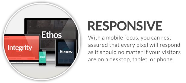
Responsive – Let’s face it: we live in a mobile world. It’s absolutely essential that your website be as accessible as possible on all devices. However, we felt that responsive design was something else we wanted to make even better. Instead of utilizing a design that merely changes every so often at fixed breakpoints, we opted for a completely fluid (percentage-based) design that looks great on all screen sizes (even the “in-between” ones). It’s something that truly has to be seen to gather the whole experience. So fire up your 27” iMac, 11” netbook, Kindle Fire, Android phone, or anything else you can conjure up – X will look fabulous on all of them.

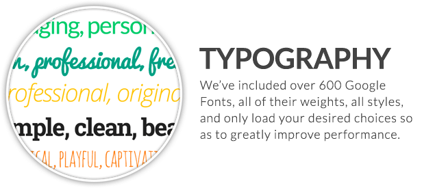
Typography – The web is first and foremost a typographic medium. Because of that, we wanted to ensure that the level of control over your site’s type was unparalleled in any other WordPress theme on the market. We’ve not only included over 600 free Google Fonts to use in your theme, we’ve made it so that all respective weights of each font are dynamically loaded, ultimately providing you with more choice, and better overall site performance. Adjust sizes, colors, letter spacing, capitalization, and so much more with X’s near endless typographic options.

Shortcodes – The bread and butter of any good theme. Shortcodes enable you to become a power user and take your site to new heights. But you’re only as good as what you’re provided with in your theme. With X, we’ve built 40 stellar shortcodes (plenty of them truly one of a kind), allowing you to build virtually any layout your mind can imagine. All shortcodes are included via a custom built plugin for easy maintenance. Included plugins are as follows:

  • Accordon
  • Alert
  • Audio Embed
  • Author
  • Block Grid
  • Blockquote
  • Buttons
  • Callout
  • Clear
  • Code
  • Container
  • Content Band
  • Columns
  • Columnize
  • Custom Headline
  • Dropcap
  • Entry Share
  • Feature Headline
  • Gap
  • Highlight
  • Icon List
  • Icons
  • Images
  • Line
  • Map
  • Popovers & Tooltips
  • Promo
  • Prompt
  • Protected Content
  • Pullquote
  • Recent Posts
  • Responsive Lightbox
  • Responsive Pricing Table
  • Responsive Slider
  • Responsive Text
  • Responsive Video
  • Responsive Visibility
  • Search
  • Skill Bar
  • Tabbed Content
  • Table of Contents

To see examples of the shortcodes and how they look in each stack, check out the links below:

WooCommerce – Easily transform your WordPress website into a full fledged eCommerce storefront with the click of a mouse (and for absolutely no additional cost). The X WordPress theme is fully integrated with the WooCommerce plugin for those who need it; however, if you don’t need an eCommerce feature on your site there will be no additional impact on your site’s performance. X only uses what needs to be used at any given time, keeping load times fast and visitors happy. But that’s not all! Since X was created to support multiple, completely unique designs called Stacks, each Stack has it’s own look and feel when it comes to WooCommerce integration. If you are looking for an eCommerce solution, you now have three completely unique looks to chose from!. Check them out below:

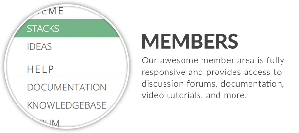
Marketing – Some people merely provide you with a theme and send you on your way to figure the rest out yourself. With our comprehensive member area, you won’t be alone in purchasing X. You’ll not only receive advice from industry experts on how to finely craft your content to reach a larger audience, but you’ll also receive training on how to use the theme itself. Dozens of HD videos and detailed documentation make working with X one of the best experiences you’ll ever have.

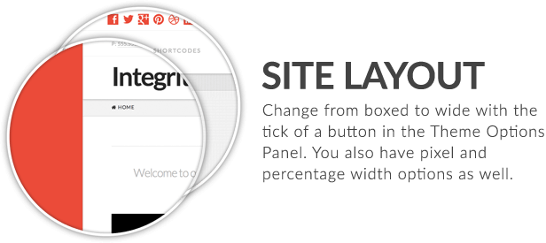
Site Layout – It’s always nice to have decisions. Choose between boxed or fullwidth layouts across all stacks to find a design that truly suits your needs.

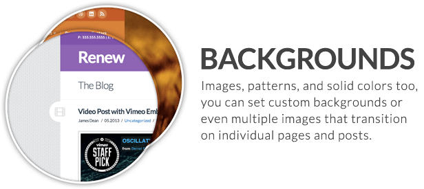
Custom Backgrounds – Setting a background to your site helps to set the mood you’re trying to achieve. Simple colors can be light, clean, and professional, patterns can provide some texture and depth, while whole images can make a powerful statement. With X, there’s no fuss with any of these options as you can easily alter each Stack fit your style. Additionally, you can even set unique background images on individual pages, including using multiples to create fullwidth background slideshows (a very creative use for portfolios). You’ve never had this much fun playing around with background images.

Helpful Page Templates – X comes with numerous pages templates to provide you with plenty of flexibility and power when it comes to building the site you want. Easily turn off certain elements like your header or footer on particular pages to assist you in creating marketing squeeze pages, long form sales letters, and anything else you can think of. Our included blank templates are perfect for crafting unique homepage designs along with our powerful shortcodes, ensuring that your site will never look like anyone else’s who is using X. Included page templates are as follows:

  • Blank – Container | Header, Footer
  • Blank – Container | Header, No Footer
  • Blank – Container | No Header, No Footer
  • Blank – No Container | Header, Footer
  • Blank – No Container | Header, No Footer
  • Blank – No Container | No Header, No Footer
  • Layout – Content Left, Sidebar Right
  • Layout – Sidebar Left, Content Right
  • Layout – Fullwidth

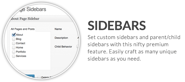
Unlimited Sidebars – It’s a given with most themes these days and it’s no different with X. You have unlimited sidebars at your disposal to achieve whatever your project desires. Our sleek, intuitive sidebar manager interface has a couple tricks up it’s sleeve, and paired with our layout templates, you can accomplish anything. Some of the things you can do with sidebars in X include:

  • Create and manage unlimited unique sidebars
  • Set sidebars on either side of the page (left or right)
  • Manage all unique sidebars from one streamlined interface
  • Set sidebars on parent pages to be inherited by all child pages as well

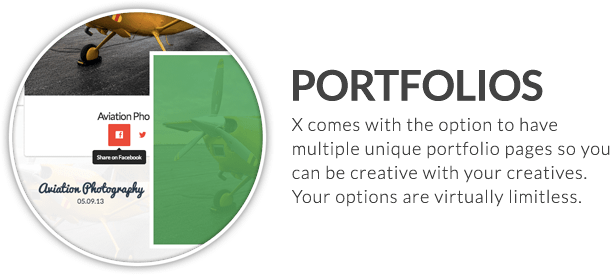
Unique Portfolios – Each Stack in X features it’s own unique, one of a kind portfolio layout. While each portfolio appears visually different, you can still achieve all of the same desired results across all of them. Some features of the portfolios include:

  • Set a unique URL slug for your portfolio
  • Set how many posts per page you want to appear on the index listing
  • Set how many columns you want to use on the index listing
  • Supports images, galleries, and video
  • Display either the featured image or the media type (e.g. gallery, video) on the index page
  • Set unique backgrounds on each individual post to mirror your work
  • Categorize and tag your portfolio pieces like normal posts for easy organization

Slider Revolution – X not only supports, but includes the premium Slider Revolution plugin (a $15 value) for free along with your purchase of the theme. Effortlessly create and manage unique slideshows with captivating transitions and animations that are all completely responsive. With X, you can easily include a slider at the top of any page using a simple option dropdown, or to the body of your pages and posts using the generated shortcodes.

Icon Fonts – They’re all the rage right now, and for good reason. Icon fonts are easy to use, look great across all devices (we’re talking about you retina displays), and aren’t much of a performance hit. With X, we’ve chosen to include two icon font libraries, Font Awesome, and the Foundation Social Set, combined to give you nearly 400 icons to use throughout your paragraphs, buttons, lists, and just about anything else you can think about.

Integrated Social Sharing – Facilitating the sharing of your content is a breeze with X. Built-in options allow for a quick, efficient, and seamless sharing experience that always feels custom tailored and never tacked on.

Retina Ready – Along with HTML5, CSS3, and icon fonts, X also ensures things like your logo look crystal clear across all devices.

Dynamic Thumbnail Sizing – Since we’ve provided you with not only the ability to control the width of your site, but also your content area, that much variable room can cause problems with your media (i.e. too big, too small, et cetera). However, we’ve included some custom scripting that takes care of all that, dynamically sizing all featured image content across your site based upon the dimensions you’ve chosen for your theme. What does it all mean in the end? Better performance and happier users. What else could you ask for?

Photoshop Files – Yep, we’ve got those, too. All available Photoshop files are included with your purchase of the X WordPress Theme.

Clean Code – X conforms to industry best practices at all levels. The attention to detail given by our developers on all levels is absolutely unparalleled. Implementing the latest HTML5 and CSS3 techniques, along with cutting edge WordPress standards ensures that your theme will provide you with the best possible experience you could hope for with a premium theme. Better load times and performance means your content is more readily consumed by your visitors, leading to repeat customers and increased exposure.

Demo Data – Sometimes it’s nice to get a little head start. Included with your purchase of X is a set of demo data illustrating how to accomplish dozens of unique layouts, along with how to take advantage of X’s unique feature-set. A truly valuable addition.

iLightBox jQuery Plugin – To make your images as beautiful as possible, we’ve integrated the iLightBox jQuery plugin directly in the theme in conjunction with the responsive lightbox shortcode. This $13 value is free with your purchase of X, and will ensure that your photographs look beautiful as ever in it’s fully responsive, minimal display.

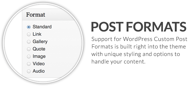
Custom Post Formats – Manage your blog posts better by taking advantage of WordPress’ custom post formats. The following post formats are included, each with their own unique set of data inputs for managing content efficiently and easily:

  • Standard
  • Image
  • Gallery
  • Audio
  • Video
  • Quote
  • Link

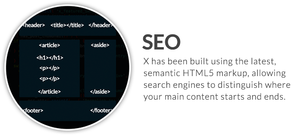
Search Engine Optimized – A lot of people boast about search engine optimization. We actually have data to back it up. X was built with the help of industry experts, SEO included. Rest assured that everything from the foundational markup utilizing the latest semantic HTML5 elements, up to specialized shortcodes for increased clickthrough rates have all been expertly crafted to ensure that your site ranks as best it can.

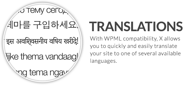
Translation Ready – X is translation ready and comes with included .mo and .po files.

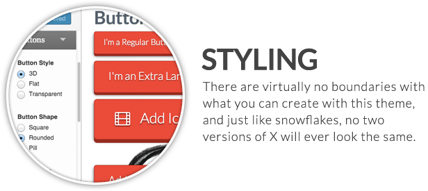
Unlimited Styling – Trust us on this: virtually any layout or design you can think of is possible with X WordPress Theme. We even believed in this so much, we created 30 demo sites (yes, 30), to show off what is truly possible with X, and these were just from our team. Imagine what you could create with your own imagination and the tools necessary to make it happen.

WAI-ARIA Roles – X includes WAI-ARIA roles throughout each and every template file to ensure that your site conforms to the latest accessibility standards set forth by the W3C.

Unbelievable Member Resources – Experience a member area like you’ve never seen before. Fully responsive, helpful support forums, HD tutorials, expert contributions, and so much more. X is more than just a theme, it’s an experience unto itself.

Updates – Our #1 priority is to keep X on the cutting edge of functionality, and our team is quick to address bug fixes as well as adding new features.

Multisite Tested – X has been thoroughly tested across numerous multisite setups (including our own demo installations), so you can rest easy knowing that everything will function as it should across your network.

Child Theme Compatible – X is child theme compatible, with child themes available upon your purchase of the theme to make customization easy and painless.

Custom Widgets – It’s a breeze to include your Flickr or Dribbble feed into your theme with X’s custom widgets. Simply drag and drop them wherever you desire, input your user information, and you’re good to go!

Cross Browser Compatibility – No browser is left behind with the X WordPress Theme! All modern browsers supported by X include:

  • Google Chrome
  • Firefox
  • Safari
  • Opera
  • Internet Explorer 11
  • Internet Explorer 10
  • Internet Explorer 9
  • Internet Explorer 8

Threaded Comments – Threaded comment support is active in X and fully responsive, allowing your users’ comments to be easily viewable and readable on all devices, no matter how small.

Best WordPress Theme 2014 – X is truly the ultimate WordPress theme, and we look forward to proving it to you. Pick up your copy today!

X WordPress Theme – Changelog

– ADD (Addition)
– BUG (Bug Fix)
– MOD (Modification)
– NEW (New Feature)
– OPT (Optimization)

v1.0.0 – October 24, 2013

– ADD: Initial release.

v1.1.0 – November 14, 2013

– ADD: x_has_shortcode() function to check for the presence of shortcodes for
       optimization of script loading.
– MOD: Moved "Customizer" to its own top-level menu in the admin.
– NEW: Customizer settings import.
– NEW: Customizer settings export.
– NEW: Added "Blog" section in the Customizer with the option to display full post
       content or an excerpt for posts on the theme index page.

v1.2.0 – November 19, 2013

– MOD: Updated Font Awesome to 4.0.3 (note that some icon names have changed in this
       version so they won't appear if in use).
– BUG: Moved x_has_shortcode() function from theme to plugin to avoid error if theme
       isn't active but plugin is.
– BUG: Moved Customizer script and style enqueues into action hooks to avoid
       potential wp_register_script() errors.

v1.3.0 – December 03, 2013

– ADD: x_get_stack() function to check which Stack is being used. If the theme has just
       been activated and no settings are saved from the Customizer, it defaults to
       Integrity.
– MOD: Updated the theme so that it no longer requires you to save settings in the
       Customizer before activating it the first time for it to work.

Download X – The Ultimate WordPress Theme (Miscellaneous)

NumberOne – Flexible OnePage & Multipurpose Theme (Business)

\
twitter

Overview

NumberOne is a professional multipurpose WordPress Theme. It’s also can be used as OnePage Website allows you to build any type of websites. It’s highly customizable with a powerful visual section manager. You can build unlimited layouts without touching any code! It’s totally Responsive and tested with iPad, iPhone, and android devices.

Customize your website as you like, you have tons of layout possibilities with unlimited variations and colors.

Take a look at what you can build by checking our demo!

Some Features


Features Overview

  • Translation ready with mo/po files
  • WPML plugin ready:WPML Plugin, in case your business needs a multi language site
  • Responsive Layout that addapts to smaller devices (tested on iphone, ipad, etc)
  • Highly Customizable!
  • Slider Revolution included ($15 Value)
  • Multiple Flexslider or Revolution slider in a page, post or portfolio entry (unlimited sliders)
  • Custom Menu: You can assing new menu to each page
  • Easily create unlimited ONE PAGE website with uniqu navigation menu
  • Lots of functional multi-color shortcodes (see yourself!)
  • 600+ google fonts
  • 300+ font awesome icons
  • Change icons design as you like visually!
  • Ability to change the sidebar alignment to left/right or disable it generally and page/post specifically.
  • Over 20 ready to use unique homepage templates
  • 7 Premade About Page
  • 6 Premade Contact Page
  • Around 100 ready section templates (included in demo content)
  • 10 Custom widgets
  • Video Support: Supports Videos from any major video hosting service
  • Visual shortcode & section manager
  • Unlimited Color Options with Backend Color Picker.
  • Custom unlimited sidebars for each page, post, or portfolio entry possible
  • Use custom sidebar in page section. Multiple sidebars in one page with sections
  • Ability to change page sections colors, backgrounds, etc to create colorful/dark pages
  • Unlimited portfolio pages + styled wordpress gallery shortcode
  • Contact Form 7 Ready
  • SEO Optimized
  • Typography options, choose custom google fonts for navigation, sidebar heading, body, and headings.
  • Various header options ( dark header, top bar layouts, …)
  • Child theme support for easy customization, that is not affected by theme updates.
  • PSD file included
  • DEMO Content included with lots of homepages, sections, page templates
  • Professionl support
  • Extensive Help file


Resources

Note: Demo photos are mostly purchased for our demo only. They’re not included.

Download NumberOne – Flexible OnePage & Multipurpose Theme (Business)

‘Novus’ – Responsive And Modular Basic Email (Newsletters)

About ‘Novus’ Email Template

‘Novus’ provides an ultra modern innovative flat design concept. It has been tested on every major email client and Inline CSS used for a full cross browser compatibility. Html’s are lightweight, commented and modular which makes the job of duplicate or hide modules very easy.


Email Marketing

Email Marketing Is The Most Effective Online Marketing Tactic. almost half of American Internet users check or send emails on a typical day (by Wikipedia). With my professional Email-Templates you can do Email Marketing significantly cheaper and faster than before.

Purchase This Email Template and Start Email Marketing!

Responsive

This is a responsive Email Template, able to adapt its layout to the screen size of your visitors. (try resizing the screen and see for yourself) This means it’s working super sleek on mobile device like ipad or iphone

Support

If you encounter any problems or have questions once you purchased the Email Template,
feel free to email me


Key Features Overview

  • Clean, Modern Design can be used for any type of business type
  • Multiple Color Options to suite your business needs.
  • W3C Valid HTML’s
  • Inline CSS for Cross Browser Compatibility
  • Responsive Design that adapts to smaller devices (iphone, ipad)
  • MailChimp Ready with repeatable modules
  • Well Documented
  • Free Lifetime Updates and Support
  • Beginner’s Guide for smooth start

Compatible Browsers

Android
AOL Mail Chrome
AOL Mail Explorer
AOL Mail Firefox
Apple Mail
Eudora
Foxmail
Gmail
Hotmail
IncrediMail
iPad
iPhone 1, 2, 3, 4 and 5
KMail
Lotus Notes 8
Lotus Notes 8.5
Mozilla Thunderbird
Opera Mail
Outlook 2000
Outlook 2002
Outlook 2003
Outlook 2007
Outlook 2010
Outlook 2011
Outlook 2013
Outlook Online
Spicebird
Yahoo Mail
And all clients that render valid HTML.

Product Updates and History

Created, 16 October 13

Testimonials

“I love this template. Robbie helped me get it working and even offered special support to make it work in additional email clients. GREAT support for a great template!”

comment by ‘repairshopr’ on ’’Infinity’ – Flexible Email Template’

“Very easy to customize, I am so happy I made this purchase! All I have to do is choose a template, remove the parts that I don’t need, and change the images and links. I’m so happy with this template, I hope it will increase my traffic and conversion rates! Thank you!”

comment by ‘medusa’ on ‘Summer Metro – Email Template’

“Ah, thanks. I just sent the first campaign using the template, looked fantastic and very professional, the click through rate was sky high.”

comment by ‘Andrew Stevens’ on ‘Summer Metro – Email Template’

“Best email template on here! It looks like all elements are “MC Edit” ready… Cool Stuff”

comment by ‘charlie4282’ on ‘54 General Metro Email Templates – Dark / Light’

“This is so great, nails everything in litmus!”

comment by ‘Robert’ on ‘Infinity’ – Flexible Email Template

“This template works smooth guys! Thanks for this beautiful newsletter, keep up the great job!”

comment by ‘tootsboo’ on ‘BigSeller – Modern Email Template’

“i’m really enjoying working with your metro responsive template. it looks really sharp, thanks.”

comment by ‘Lisa’ on ‘54 General Metro Email Templates – Dark / Light’

Credits

  • Photoshop design and layout by ‘Robbie.W’
  • Html code and Mailchimp implementation by ‘Thomas.S’
  • Q.A and code review by ‘Emily.B’


Download ‘Novus’ – Responsive And Modular Basic Email (Newsletters)

Magfolio – Responsive Magazine Blog Site Template (Portfolio)

The Magfolio HTML5 website template is a colorful yet powerful solution for displaying artwork. The template features a fully responsive framework that looks fantastic on any mobile device. It contains single portfolio layout and multiple blog layout options and a staff page template. The Magfolio template features the coded with HTML5 CSS3 and Bootstrap 3.0 and 6 custom color schemes included It’s compatible with all modern browsers and search engine friendly. — so showcase your artworks and blogging posts with this awesome template!

Start using a professional solution to showcase your work. Get the magazine / blog template to professionally promote and sell your talent today.

Like this template? please don’t forget to rate it

Large-star-on
Large-star-on
Large-star-on
Large-star-on
Large-star-on

KEY FEATURES

  • Twitter Bootstrap 3.0 Based
  • 100% Responsive Layout Design
  • 6 Different Color Schemes
  • 19 Custom and Valid HTML5 Templates
  • Portfolio Ready with Filterable Function
  • Colorful Pricing Table Elements
  • Social Media Friendly
  • Search Engine Optimization
  • 500+ Google Fonts Usable
  • 700+ Awesome Font Icons Included
  • Awesome Shortcode Scripts
  • Awesome Animation Effects
  • Detailed Documentation
  • 24/7 Ask Questions via Email, Twitter
  • and much more…

Support

You can support via contact form on our profile page!

Licenses

Javascripts

Photos

Thanks

Thanks for interesting & purchasing our work! I hope so you like it. Please don’t forget to check our other works.

Download Magfolio – Responsive Magazine Blog Site Template (Portfolio)

Metroid Responsive – HTML5 vCard (Virtual Business Card)

Features:

  • Fully Responsive Design;
  • 10 Colors Schemes – Ready to use;
  • 20 Background Patterns;
  • Very Easy to Edit;
  • HTML5, CSS3 and Cross Browser;
  • Well Organized and Documented;
  • Form with jQuery Validation;
  • Portfolio Hover Effects;
  • Responsive Lightbox;
  • Exclusive Animations;
  • Exclusive Grid;
  • Blog Page;
  • Retina Ready;
  • Animated Progress Bars;
  • Basic Slider;
  • Modernizr, Normalize and HTML5 Boilerplate;
  • jQuery Scroll Pane (animated);
  • Load Function;
  • Page Transition Effect;
  • Google Maps Integrated;
  • Basic Slider (Rotator) on Profile Page;
  • Quick Guide at Preview;

And more…

Sources and Credits:

Notes:
* All plugins are licensed for commecial use.
* Preview images are NOT included.

** Please Don’t forgot to rate us! **
Please rate us

Download Metroid Responsive – HTML5 vCard (Virtual Business Card)