Review: The Sphero, A Ball With Personality

scaled.IMG_4659

The first time I was chased around a room by a glowing, buzzing ball I was in college and I had just come home from a rave. The last time was when I opened the Sphero and set it loose on my rug.

The Sphero is a ball with a brain. Designed by Orbotix, this 3-inch toy has an internal motor and a set of LEDs that can make it flash nearly any color of the rainbow. It’s run by iOS or Android apps that allow you to control the Sphero, play virtual golf, and draw images in light (albeit in a roundabout way).

We live in interesting times when it comes to hardware. It’s easier than ever to create cool stuff, as evidenced by the rise of gadgets like the Fitbit and the Parrot AR.Drone. The Sphero is no exception. It’s one of the coolest hardware projects I’ve seen in a while and the ease-of-use and simplicity of the concept is impressive.

Sphero is a toy and the kids in my house really enjoyed it… for a while. Sadly, I think Sphero will be relegated to the bottom of the toy box far too soon and the various apps that interact with it, while fun, aren’t all that compelling. After all, there are only so many ways you can sell “Make ball go forward. Now make ball turn green” before you get bored.

As a technological artifact, the ball is incredible. When’s the last time you’ve seen a small, self-propelled ball with built-in gyroscope, accelerometer, Bluetooth radio, and compass? You could put a little explosive in these and they could be a Bond villain.

Is the Sphero fun? Sure, for about a day. It would make a great desk or office toy and should be fun for cats (it’s clearly fun for 3-year-olds). It think the ball will be really great once Orbitix releases their SDK, allowing users more control over these wee fellows. For example, I could definitely see some cool applications in experimental robotics. Could you imagine a flock of these things rolling down the street.

As it stands right now the Sphero is cool – but maybe not cool enough. Give it a few months to see where the platform is headed and then maybe scoot over to the online store and get the ball rolling.

The Sphero is shipping now for $129.

Product Page


Sunday Is The Best Day To Launch Your Mobile App

mobile-apps

According to new research from mobile analytics service Mobilewalla, Sunday is the best day to release a mobile app, but Wednesday is the most popular day among developers. The company studied the apps released in the iTunes App Store and Android Market over a 17-week period between May 16th and September 8th, 2011, to determine its findings. During this time, there were 91,754 iOS apps released into the iTunes App Store and 122,220 apps released into the Android Market.

Yes, that’s a lot of apps! The company reported earlier in December that the app count rose to 987,863 across all four platforms (iOS, Android, BlackBerry, Windows Phone) and is now growing at an average of 2,000 apps per day. In the last 12 months, iOS apps grew from 338,000 to 589,148. Android apps grew from 115,000 to 319,774.

During the 119 days of the study, Mobilewalla sorted apps by the day of the week they were released. However, it should be noted that on Android, developers control the release date, while iOS apps’ release dates are affected by the iTunes review cycle. So it may not be fair to proclaim Wednesday as developer’s “favorite” day universally, given that they’re not always in control of the release timeframe.

Even if Sunday was not always the developers’ chosen launch day, Mobilewalla found that apps released then statistically performed the best. That is, they made it into the list of the top 240 mobile applications. In this case, Mobilewalls is defining the “top 240″ apps as those that achieve the highest ranking in their respective stores. 42% of the iOS apps released on a Sunday made it into the top 240, while 11% of Android apps did the same.

Meanwhile, Thursdays were the worst day to release apps on Android, as only 7% of apps reached the top 240 then. On iOS, Fridays were the worst, as only 10% of apps reached the top 240.

Although unrelated to trends regarding the best and worst days of the week to launch, the company stumbled upon a relatively sad finding during its research: an app on Apple’s platform is four times more likely to be discovered than an app on the Android Market. That speaks to the challenges Google still has to overcome in terms of its ability to better showcase the best new apps within its app store, perhaps.

Explains Anindya  Datta,  Ph.D., founder  and  chairman  of  Mobilewalla, “Apple users discover apps more conveniently than Android users. And while it is impossible to identify exact causes for this pattern, users may find it easier to browse items in the relatively low number of apps launched over the weekend.”


Sips Gas, Doesn’t Skimp on Fun

Forty is the new 30, or so the automotive fuel economy cliché goes.

But the dark side of the penny-pinching trend is the slew of well-intentioned cars that strike the magic 40 mpg figure at the expense of good, ol’ fashioned driving dynamics. Folks who take pleasure in piloting a vehicle are (ironically) pouring a forty on the graves of steering feel, brake feedback, and seat-squishing acceleration — all victims of the quest for that nice, round, and eminently marketable highway fuel economy number.

Can budget-strapped enthusiasts find bliss in this brave new world of electric steering, low rolling resistance tires, and detuned engines? Mazda thinks so, and it’s invented a fancy word for its eco-minded, driver-oriented technology: Skyactiv.

The moniker identifies a series of tweaks debuting on the facelifted 2012 Mazda3, though this particular application isn’t as extensive as you’ll find on the first Mazda to receive the full-blown Skyactiv treatment, the upcoming, redesigned CX-5 crossover.

But the Mazda3 Skyactiv still has plenty of slick tech up its sleeve, helping boost its 2.0 liter, 4-cylinder engine’s fuel economy by up to 21 percent over its predecessor. Mazda’s mad scientists say they spent a decade studying high compression ratio powerplants. Their research led them to minimize heat loss by downsizing the Skyactiv’s combustion chamber, and to counteract the displacement change by lengthening stroke. Fuel is pressurized to a stratospheric 2,900 psi, and introduced using a multi-injection strategy during both the intake and compression stroke. Though the mill achieves a 12:1 compression ratio on 87 octane fuel, that figure is curtailed by limitations in the current chassis; the European version already comes packaged with enough room for a bulkier exhaust system, enabling a 13:1 compression ratio on 87 octane, and a superbike-like 14:1 ratio when running on 91 octane gas. That system will be available in the next-gen Mazda3 along with a diesel variant, though the current U.S. model benefits from tiny improvements throughout, and reduced drag and friction everywhere from the oil pump to the valvetrain.

The Mazda3 Skyactiv squeezes 155 hp and 148 pound-feet from the same displacement as its weaker, thirstier, and lower-priced 2.0 liter offering. The new Skyactiv is also available with an all-new automatic gearbox which uses a torque converter for low speed creeping, but switches to a multi-plate clutch when quicker shifts are in order. Mazda says the ‘box offers greater efficiency than CVT or dual-clutch setups.

Nostalgically inclined drivers can mate the engine to an all-new manual transmission that’s been revised for slicker shifting, lighter effort, and better fuel economy — though its 27/39 mpg figure is bested by the 6-speed auto’s 28/40 mpg (Bingo!) numbers. The five-door version barely misses 40, achieving 28 city and 39 highway with an automatic transmission. If you’re not afraid of combusting some additional dino juice and spending a few more Benjamins, there are 167-hp “s” and 263-hp Mazdaspeed3 versions also available.

Finally, Android Has a Soul

Photo by Ariel Zambelich/Wired

Like the T-1000 standing in a sea of Arnolds, the Galaxy Nexus is better, faster and smarter than any other Android phone on the market.

Not that current Android phones fall short in machine power. Rather, much like the androids of the silver screen, the operating system has been the weak point. Previous versions of Android have lacked some intangible spark. A human element, perhaps — a missing je ne sais quoi that has been keeping many critics and users from fully engaging with the platform.

It’s a debatable point, but I’d argue that “special something” can be found in Android’s biggest competitor, Apple’s iOS. Siri, the voice-activated digital servant on the iPhone 4S, is a great example of a feature that marries technical prowess with a human touch: We speak to “her”, not to “it.”

Android, on the other hand, has always been sold on the strength of its robotic nature. Power, hardware specs and hackability were the reasons why we were supposed to buy an Android. It’s not a posh concierge, it’s a Swiss Army Knife.

But with the Galaxy Nexus, Google has put a little soul into the machine.

The Galaxy Nexus is a collaboration between Google and Samsung, and the device runs the purest, most “true” representation of Android 4.0 you can get your hands on.

The smartphone, available Thursday for Verizon’s 4G LTE network, runs Android 4.0, aka Ice Cream Sandwich, the latest iteration of Google’s mobile OS. To date, it’s only shipping on this phone — the Galaxy Nexus is a collaboration between Google and Samsung, and the device runs the purest, most “true” representation of Android 4.0 you can get your hands on.

Ice Cream Sandwich brings a collection of subtle touches and flourishes to the OS, all of which add up to an enormous leap forward.

Gestures play a much larger role, and this goes a long way towards humanizing the interface. The settings menus inside of native applications, once only navigable via inscrutable, nested lists, are now neatly tucked off to the sides of the screens. By using your thumb to slide the screen to the side in most native apps, you can bring up (and dismiss) these hidden menus. Pinch-to-zoom is incorporated more intuitively into apps, too. In the calendar, for example, reverse-pinching on a list of the whole day’s events zooms in on a specific block of hours. Touch-typing has also been revamped to receive user input more accurately.

The opacity of certain elements like the notifications area has been reduced, making the slider translucent so you can always see what’s going on beneath it. The phone’s contacts menu is smarter, as it now pulls info from all of your synced social apps. All this leads to fewer taps, swipes and squints.

Even Android’s system-wide typeface was reimagined, giving the OS more personality. “Roboto,” Android’s new official font, permeates all parts of the OS. Google’s Android user experience chief Matias Duarte tells Wired the font serves a dual purpose, staying “modern, yet approachable,” but with mechanical forms underscored by a “cheerful demeanor.”

Though they may seem like insignificant changes, these things are the meat, the true stuff of which “soul” is composed. When a device cooperates with you more fully, you develop a stronger emotional connection with it. You start to smile as you notice all the little details and flourishes.

Photo by Ariel Zambelich/Wired

Buying Guide: Musical Hardware for iPad Songsmiths

<< Previous
|
Next >>


Apple iPad Camera Connection Kit

When musicians first laid eyes on the iPad, they immediately recognized its huge potential as a music-making machine. The versatility of the touchscreen quickly gave rise to a bevy of synths, drum machines, multitrack recording apps and otherworldly, touch-sensitive instruments.

And while making music on the iPad is still mostly about the appsAnimoog, Korg iElectribe, NodeBeat, GarageBand, Sunrizer, JazzMutant Lemur — the tablet becomes even more useful if you can plug other stuff into it.

At first, we only had the ability to plug in guitars and microphones to record songs. But now, ever since Apple added support for the CoreMIDI framework to iOS and introduced the Camera Connection Kit, we can plug in a variety of keyboards, drum pads and other hardware to control our apps. Instead of tapping the touchscreen to make a noise, you can play a chord, press a key or twist a knob.

Here’s our guide to this season’s latest gear for iPad musicians.

iPad Camera Connection Kit, $30

In order to use most music-making devices with an iPad, you’ve got to get one of these. Apple’s $30 device (the square-ish white adapter in the photos above and below) essentially turns the iPad’s dock connector into a USB port. The company calls it a “Camera Connection Kit” because that’s what most consumers are going to use it for. But musicians can use it for much more than holiday snaps. USB keyboards, hardware controllers, preamps, headphones, digital-to-analog converters — this little dongle is your lifeline to hundreds of audio toys.

Photos by Ariel Zambelich/Wired

<< Previous
|
Next >>

Daily Crunch: Low Tech

1500

Here are some recent posts on TechCrunch Gadgets:

2011 Gift Guide: Best Stuff For Luddites

Review: Krups EA82 Automatic Espresso Maker Makes You Love To Love It

Samsung Releases Extended Battery Bundle (With Cover) For Your New Galaxy Nexus

Little iPads, Little Pixels, And Resolution Independence (An Apple Rumor Medley)

TC Gadgets Weekly Webcast: The iPad Mini, CES, And A Coffeemaker


Kicksend Goes Mobile With A New iPhone App For Instant, Asynchronous Sharing Of Big Files

127344v9-max-250x250

Last we covered Kicksend in November, the Y Combinator-incubated web file-sharing tool for the non-technical crowd, had just raised $1.8 million in funding from True Ventures, with participation from Digital Garage, SV Angel, Start Fund, and Milo Founder and CEO Jack Abraham. The team was heads-down fixing, tweaking, and developing some new features for their file-sharing service.

But, today, the startup is going mobile with a new iPhone app to let users take all of their photos videos they have stored on their phone and instantly send them to any friend, list of colleagues, or email address, instantly — across platforms.

For those unfamiliar with the service, Kicksend has launched web and desktop apps that connects users in realtime, enabling them to drag and drop big batches of files from their desktop and have them delivered instantly to their desktop and web apps. And now this functionality has arrived on mobile.

Kicksend’s advantage over other file sharing media is that it has no size limits, is private, and works asynchronously — unlike IM. With Kicksend, there is no need for share folders and permissions, and now with its mobile app, the startup is live on all the major platforms.

Like its desktop and web apps, Kicksend allows users to send large batches of high-res photos and videos from their phones to any friend, instantly, regardless of whether or not they’ve downloaded the Kicksend app.

Basically, Kicksend has enabled simple file-sharing on the iPhone, so if users send documents from other apps, or, say, you’re using GoodReader and you view a PDF, users can choose “Open in Kicksend”, you can share that with any other user in realtime — something that will be awesome for all those holiday photos.

Thus, documents, photos, and videos will appear instantly on the recipient’s desktops and mobile devices in realtime, or, in turn, users can view, send, and comment privately on PDFs, documents, photos, videos and more. If recipients don’t have the Kicksend app, they can receive files via email with links to download within minutes.

There are a ton of file-sharing services out there, but Kicksend has a great user interface, is extremely simple to use, and pretty much allows users to send any size file easily, instantly, to any device, across any platform, offering notifications and statistics to boot, so that users can see how many people in a group have downloaded the file. It’s a great tool. For more, check out the app here.


“Goodbye, With. Hello, Path 2.” Morin Migrates Users to New App

With Winds Down

Dave Morin and Path’s secondary standalone app With “is winding down”, according to a tweet, email, and blog post from Path. “Now tweet who you’re with directly from Path”, the email explains. The encouraged migration signals the end of Path’s experiment with a stripped down, single feature experience. Details are sparse but this looks like an early warning to With users that the app will be sunsetted soon, though it still currently functions.

Path’s blog posts says “After a long and friendly coexistence, two apps have become one. And the pair has settled on a name: Path 2.” With’s end just 6 months after its launch resurfaces the standalone vs comprehensive app debate. Companies have to decide whether their apps should provide many functions but bury them in menus, or offer rapid access to one function.

Path recently released its more comprehensive 2.0 update, which has led to 30x growth of the app’s user base. Rather than force users to waste home screen space and choose what they want to do first, Path 2.0 simply integrates With’s functionality. In addition to tagging who you’re “with”, you can share your sleeping habits, music, and now standard content like photos and location.

Morin’s former employer Facebook is moving in the opposite direction. This summer it released its standalone Messenger app based off of its acquisition Beluga, and we hear it’s still working on its standalone mobile photos app that leaked in June. I see this as a slippery slope where instead of bloat you get a fractured experience.

I like comprehensive apps that let me bounce from once use case to another without having to exit to the homescreen, so I’m happy to see With go. Often times the functions split between apps are highly related, and saving one extra click through a menu doesn’t seem to warrant downloading and updating an extra app. The With wind down will also keep Path’s team focused on building a distinct experience from Facebook and Twitter where you share a lot but to only your closest friends.


Aetna Reveals It Acquired Healthagen, Developer Of The #1 Mobile Health App iTriage

Aetna Acquires iTriage Done

At an investor conference yesterday, health insurance and tech giant Aetna revealed that it acquired Healthagen, the developer of mobile app iTriage, though it did not disclose the price. Aetna’s Chairmen, CEO, and President Mark Bertolini told investors “About a month and a half ago we bought at little company called iTriage…the fastest growing consumer application in healthcare today.” iTriage lets users check symptoms, find doctors, make appointments, and do medical shopping. It will be augmented with new features and become part of Aetna’s accountable care organization. Bertolini said ”We’re going to begin to change the health care industry by giving people tools they can put in the palm of their hand.”

Aetna’s goal is to get customers more engaged with their health care via iTriage, and thereby prevent them from sliding to other providers. Bertolini said iTriage will aid “retention, which is the catalyst for growth.” The app’s 3 million iTunes downloads will also bring Aetna new potential customer, and Healthagen’s digital relationships with hospitals and urgent care facilities. The privately held Lakewood, CO-based Healthagen hasn’t announced any funding, and also offers iTriage for Android tablets.

iTriage recreates the experience of popular web-based symptom checkers like WebMD, but for mobile. Not only can these apps act as portal to expensive purchases and services, they can collect valuable data on trending ailments. Considering iTriage’s early lead in app vertical, the acquisition looks like a smart move for Aetna.

MobiHealthNews‘ deep coverage of the investor conference indicates that Aetna will add cost estimation to iTriage. This will help Aetna’s customers to ”be a partner in reducing the cost of care”, according to Dr. Charles Saunders, Aetna’s Head of Strategic Diversification. This could significantly reduce Aetna’s own costs.

Additionally, Bertolini said regarding Aetna’s iNexx health care app platform, “we will give away the SDK for both the consumer platform and the provider platform to allow anyone to write apps to be sold on our platform.” This could create more opportunities in the mobile healthtech market that is projected to quadruple to $400 million by 2016.


A New Path: Path Grows Daily Users 30x Since Relaunch

Screen Shot 2011-12-16 at 6.38.43 PM

There is something about waking up day after day to write about people who take risks; You end up rooting for some of them. This is the case with photo-sharing underdog Path. Almost every investor I’ve talked to loves founder Dave Morin and wants him and his talented team to succeed. Morin has managed to hold on to top talent like Nathan Folkman and Danny Trinh despite stiff competition and poaching attempts from some of the hottest startups in the Valley.

Morin famously didn’t sell Path to Google for $100 million, and at the time we broke that story, the murmurs around the tech world were that that wasn’t necessarily the smartest decision. Which is why it’s cool to stick around as a tech writer, sometimes the people you end up rooting for, win.

Path relaunched 18 days ago, changing course from photo-sharing to everything sharing, in a beautifully wrapped package with emphasis on simplicity. Many have likened the product to a better designed Facebook for your phone, which is fair and probably a compliment. But everything isn’t coming up roses, and the product still has kinks it needs to iron out.

But still, the relaunch is a success; Morin tells me that users are sharing more things on the new Path in a day then they had on the old Path in a year — at a rate of 12 moments per second. The company is seeing 30x the number of daily active users, going from 10K to 300K in two and a half weeks. Rumor has it that it’s seeing 100k downloads a day (Morin wouldn’t confirm).

Morin is most happy about the fact that over a million people have shared when they wake up and go to sleep via the app. And over a million and half people have now downloaded the new Path since its launch — it took the company a year to get to its first million.

These numbers are encouraging, miraculous even — and now the story of Path will follow its efforts in sustaining usership after this second post-launch spike. Morin says he’s dealing with scale problems now (many users are reporting too many friend requests, a “good problem to have”) and building out the next features. “It’s been delightful to see the response,” he says.

Of course.


Healthtech Accelerator Rock Health Peels Back The Curtain On Its Second Batch Of Startups

DSC_0442

As Dave Chase wrote earlier this year, the healthtech space is heating up, and a lot of serial entrepreneurs with consumer web experience are turning their focus to fixing some of the big problems inherent in the legacy health systems we have today in the U.S. and abroad. Yet, in spite of the $1 billion pool VCs have poured into startups last year, for example, healthtech startups, specifically, aren’t seeing a lot of that capital. There are a lot of challenges inherent to launching a healthtech startup that companies in the consumer web just don’t have to deal with, HIPAA-compliance, among others.

While it’s difficult for all startups, establishing B2B relationships and intricate partnerships is no simple task. That’s where health-focused accelerators like Rock Health come into the picture. (And we need more.) Rock Health has a great list of mentors (more here), and list of financial and health-related partners is growing fast as well.

Today, the company is officially pulling back the curtain on their second batch of startups. There are 15 companies in this batch, which will begin the 5-month Rock Health program beginning in January 2012. (You can read more on the accelerator’s inaugural batch here.)

Without further ado, here they are:

Agile Diagnosis is creating a web and mobile platform that provides clinicians with evidence and expert-consensus based, best practices in the form of highly actionable clinical algorithms. The startup wants to make it easier and quicker for clinicians to give their patients the best possible care.

Avva is the first, online patient-focused breast cancer management tool that allows patients to comprehensively organize, manage, and communicate important information throughout the breast cancer experience.

Cardiio empowers ordinary people with simple yet powerful tools to experiment, gain insight and take charge of their health and wellbeing.

Care at Hand is a mobile-based electronic health records and workflow automation software for home health care agencies. It also allows for new participation by family members via an online portal. With increased efficiency, agencies will be able to retain and attract new customers at a higher rate.

ChickRx is a healthy living community and marketplace for young women. Young women are preoccupied with health and wellness (diet, weight, birth control, STDs, mental health, skin, etc.), but existing health sites are clinical, target everyone or target moms.

Cognitive Health Innovations provides an online environment to help people address mental health issues and achieve personal growth goals using scientifically validated psychotherapeutic techniques and structured social interactions.

Docphin is the Bloomberg for Doctors. Docphin is a platform that personalizes medical news and research. In an environment that includes over a thousand medical journals with content that is increasingly complex and fragmented, physicians have grown tired of searching for relevant news. Docphin was created to address the “find” problem which has challenged physicians for decades. Docphin’s platform enables users to easily personalize the news and research that matters most to them and their patients.

Epi.MD is creating a dynamic, social population management tool that’s designed to help medical providers manage their patient population, disseminate information about new health care trends, and take immediate action to improve the health of their patients.

GetMyCare is a home health care marketplace that helps families find high quality caregivers at the lowest cost. Caregivers on our network range from non medical home care aides to physical therapist to licenced registered nurses.

HealthRally is a crowdfunding platform that lets friends and family motivate one another to achieve health goals with money and rewards. Think KickStarter for personal health motivation. (Read our coverage of HealthRally’s seed raise from Esther Dyson and more here.)

Helpful Systems is building an analytics system to predict and identify patients who are most at-risk for developing a hospital-acquired infection based on patient demographics and behavior patterns, hospital staff behavior patterns, and hospital logistics.

Nephosity shares medical images on the iPad. Doctors have access to a patient’s medical images anywhere, anytime, and can collaborate with their colleagues.

Sano is developing a powerful mobile health monitoring product that will reveal new insights about stage zero care.

Senstore is a spin-out from Singularity University’s Graduate Studies Program 2011. We are developing open innovation tools and a community of developers and entrepreneurs to catalyze innovation around sensor devices and applications. Our long term vision is to crowdsource the development of a medical tricorder which will enable low cost medical diagnosis to be performed by anyone, from anywhere.

Sessions aims to unlock social exercise by allowing people to share and discover exercise sessions around them. Think Meetup meets Foursquare for exercise.


SOPA Delayed – But Not For Long

protect_ip_21

The extremely unpopular SOPA bill was supposed to be the last order of business today as the House Judiciary Committee prepared to break for the holidays, but a parade of objections and amendments (over 50) kept the bill in discussion and at last the committee adjourned without resolving the issues.

What was expected in this contingency was for the committee to resume work whenever the House reconvenes in January. After all, with such controversial and far-reaching legislation, it is better to take one’s time. But no: the committee has announced it will continue markup this coming Wednesday, the 21st of December.

Very few of the suggestions by opponents have been heeded, and the chairman, Lamar Smith (R-Texas), demonstrated his contempt for these concerns with the following words, which I am sorry to say make me very angry:

I am pleased that the unfounded claims of critics of the Stop Online Piracy Act have overwhelmingly been rejected by a majority of House Judiciary Committee members. The criticism of this bill is completely hypothetical; none of it is based in reality. Not one of the critics was able to point to any language in the bill that would in any way harm the Internet. Their accusations are simply not supported by any facts.

This casual, smirking dismissal of the objections from people who are more informed than himself, and which unlike the media lobbyists and other proponents have little to gain from their advocacy, is distressing. The only place the committee seemed willing to make a change was holding off on some of the bill’s portions until a study could be made on the potential effects to DNS and other critical systems. Smith said he would consider a briefing.

It’s telling how badly the bill’s supporters want this thing to go through that they’re willing to come in right in the middle of the holidays to do work that could easily be done a few weeks from now. We’ll follow up on Wednesday, when the bill is likely to be approved and sent on to the House.


Review: Grand Theft Auto III 10th Anniversary for iOS

GTA Logo

In October of 2001, Rockstar Games dropped a bomb on the gaming world. That bomb was called Grand Theft Auto III. In just one release, Rockstar shifted their flagship 2D series into a 3D world, introduced an enormous chunk of the population to the concept of massive sandbox games, and stirred up the first of many controversies that the company has since become known for.

Just over 10 years later, GTA3 is back — but now it’s mobile. As of yesterday, it’s available for iOS and Android. Same game, same grit, same campy over-the-top action… but in your pocket.

So, how has the game held up? How well did it make the jump from controller to touchscreen? Is it worth your $5?

Lets go ahead and answer those immediately: Surprisingly well, moderately okay, and probably.

For a game that’s probably older than the TV sitting in your living room, Grand Theft Auto 3 is still remarkably entertaining. I won’t wax on too much about the gameplay itself; many hundreds of reviews did that a decade ago, and it’s still the same game (save for a few little perks ported in from modern GTA games, like instant retries on failed missions) it was then. What worked well then still works well today: you run around, explore, go on a few hundred missions, then blow up everything in sight whenever all that gets boring.

It’s not what most would call “gorgeous” by today’s gaming standards (read: it’s no Infinity Blade II), but it really does still look good. The audio is also wonderful, with an absurd amount of dialog, sound, radio chatter, and music crammed into the 500 MB package. At the very least, it’s a wonderful testament of how far technology has come; what required a big ol’ dedicated gaming console just a decade ago now runs effortlessly on an itty-bitty battery-powered slab of glass.

To say it “runs effortlessly” requires a bit of a caveat, though. Rockstar claims support for all of the more recent iOS devices, including the iPhone 4, iPad 1, iPhone 4S, and iPad 2. On the latter two, it’s butter. On the iPad 1, graphic quality takes a massive hit (see the comparison shot above) — and still, framerate issues tend to rear their head. (Alas, I don’t have an iPhone 4 handy to test it on, so I can’t comment on the compatibility there.)

Look up at the screen shot above. The buttons! They’re everywhere! You can feel your hands cramping already.

It’s actually quite playable — in most cases, at least. The D-pad drops wherever you put your thumb when you’re hoofin’ it, and the other buttons are big enough that they’re not too much trouble to find (Oh: and if you think you could layout a better control scheme, you can re-arrange/re-size them in the settings screen.) Driving isn’t too bad either (though, man is it easy to flip your car now. I don’t know if they tweaked the physics engine or something, but it’s far easier to find yourself upside down and covered in flames than I remember.)

Shooting, however, is a rather terrible experience… which is unfortunate, considering how crucial it is to the game as a whole. The game has an autolock system which, even after fair amount of playtime, never seems to work the way I expect. It’s not so bad as to make the game impossible (just quite frustrating at times) but is detrimental enough that it influences my recommendation.

As for said recommendation: if you’ve never played through GTA3, I wouldn’t suggest having the mobile experience be your first. The controls, while acceptable, just take away too much of the magic. GTA3 is a great game and was far ahead of its time; if it’s going to be played by a newcomer, it deserves to be played as originally intended. If you played through the original (or started it, and never got a chance to finish before Mom slung the PS2 at a garage sale) and are just looking to swim in nostalgia, however, it’s easily worth the 5 bucks.

You can find GTA3: 10th Anniversary in the App Store here


MyYearbook Hits Half A Million Daily Mobile Users, Launches iPad App

myyearbook06_match

It’s hard being a social network not called Facebook, but myYearbook isn’t one of those erstwhile rivals being sold off for assets. Instead, it’s been seeing strong mobile growth and revenue growth over the last year, building on its $100 million merger with QuePasa in July. Expect both to accelerate with the launch of its new iPad app today (available here).

The company is now reaching half a million mobile users daily across major operating systems, chief operating officer and cofounder Geoff Cook tells me, with 200 million (unduplicated) monthly sessions in total. Android has grown to be the largest, beating iPhone usage by two to one. The set of mobile app developer acquisitions that the company did earlier this year seems to be paying off.

Revenue is also up. After posting revenues of $23.7 million last year, it’s grown to $36.3 million in the 12-month span through September.

The new iPad app, which you can download here, improves on the existing mobile interfaces by adding a multi-pane interface for doing things like flipping through profiles while using specific features like apps.

Look for it to get more of the main myYearbook.com site features early next year, Cook says. MyYearbook has transitioned from its roots as a high school social network to, in its words, the place to “meet new people near you.” That obviously translates to lots of dating-oriented features. It’s been launching games and other apps in-house, powered by its own virtual currency, that are designed to bring strangers together.

The iPad app already has some of those features in place, but so far it’s been monetizing through ads. The virtual currency is coming to mobile next quarter, Cook says, along with the games, which should help mobile monetization increase considerably. Dating apps, including mobile ones, have been quiet but substantial businesses.

Cook also says that the iPad launch should be a hit with its users, a company survey recently showed that a large percentage of them are expecting iPads from Christmas. He’s aiming for a repeat of last year, when the sales of iPod Touches helped fuel the year’s growth.


Little iPads, Little Pixels, And Resolution Independence (An Apple Rumor Medley)

pads

Another crop of Apple rumors has grown up under our feet, and it seems a little reaping is in order. Two rumors are making the rounds, both of which warrant a little consideration but should, as usual, be taken lightly until more substantial evidence appears. Both have their origins in Digitimes, which prides itself on catching scraps of news from upstream suppliers but isn’t always correct in its conclusions.

Earlier this week a little bird told Digitimes that the upcoming redesign of the MacBook Pro won’t simply be thinning down the body, but will upgrade the displays to a mind-blowing 2880×1800 resolution. And then just today there has been a recurrence of the 7.85″ iPads we first heard about in October. The implications of the first rumor especially are quite serious, and while the second one seems unlikely, its resilience must be acknowledged.

Let’s talk about the little iPad first. I wrote in October that essentially these reports could easily be exaggerations of the usual testing companies like Apple do. They said smaller tablets were DOA, but that was more than a year ago, and things change. The Fire has proven that many people do indeed want a smaller tablet, and everyone would think it a fine joke if Apple went back on that and said “we waited until we could do it right.”

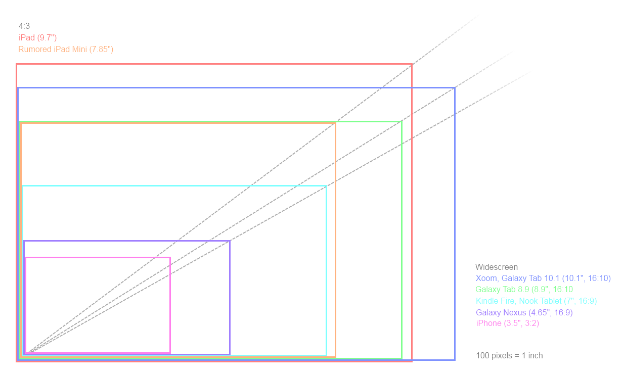
Supposedly this smaller iPad would retain the 1024×768 resolution, which is really the only option they had. The size is significantly smaller, but the fact that it’s 4:3 means that it’s also quite a bit larger than the Fire and other 7″ tablets. Here, I made you this chart, which may even be accurate:

Looks like a fairly comfortable size, this supposed 7.85″, like a slightly stubbier Galaxy Tab 8.9, which I think is a great size. It would naturally be extremely thin and light, much more so than the iPad 2. But it’s hard for me to believe they would simply put this thing out there without any kind of real differentiating feature. The iPod Classic, Nano, Touch, and Shuffle are all very different products, not just different sizes. It doesn’t seem likely that this rumored smaller iPad would be just that — smaller. To simply reduce the size would be to admit a design failure, and Apple would hate to do that. But from the very little info that’s out there (two reports giving the screen size and a late-2012 date) we can’t draw any conclusions.


The resolution upgrade for the MacBook Pro series is what’s really blowing my mind. Apple isn’t the only one looking into high-PPI screens (it’s something of an arms race, really), but they leapfrogged everyone with the iPhone 4 screen and hope to do the same elsewhere.

It would be an extremely powerful sales tool to have all primary Apple products be high-resolution. People see the screen of the iPhone 4 and they instantly understand how it’s better (though competition is getting tougher). They’ll see the screen of the new iPad and these high-res laptops and they’ll understand it there as well. Text will be clearer, images will be sharper, and no doubt Apple will have a few flashy features that demonstrate other benefits.

But it’s not quite that simple. With the iPhone, moving to high-res meant a bunch of upgraded art, sure, though the 2x mode saved a lot of trouble and looked just fine for the most part. But compared to the iPad and especially to OS X, the iPhone is really quite a limited ecosystem in many ways as far as the display and interface goes.

The question of resolution independence, then, again rears its head. Resolution independence, for those who have forgotten, is where an interface does not use bit-mapped graphics like, say, buttons 50 pixels wide and 15 tall, with rounded edges formed by falling off in graduated steps, producing the illusion of a curve. Instead, it uses either very high resolution versions of those graphics or scalable vector-type graphics to ensure that visual elements can be displayed at any resolution with the maximum fidelity possible. The curve on the corner of the button would not be measured in pixels but calculated geometrically and rendered in pixels as best it can be.

It’s not demonstrated perfectly (the proportions ought to be the same) but you can see how a seamlessly scaled UI might look here:

Apple has an on-again, off-again relationship with resolution independence. They’ve made some strides, such as in how icons are scaled, but creating a scalable but consistent interface is extremely tricky; PPI, DPI, scaling, filtering, and all their effects on design are a jungle few care to walk into. And at any rate screens haven’t had a high enough resolution to make the work of creating a resolution-independent interface worthwhile. Until now, that is.

For the present, 2880×1800 is big enough that current high resolution of the 15-inch MacBook Pro (1440×900) would neatly fit inside via pixel expansion, meaning that UI elements would appear the same size on this new device, but would be “rendered” at a higher resolution. For the present, I say, because it is only natural that OS X should, like iOS, be remade with the benefits of high resolution in mind. Given that there has been talk of this change for years, and that we’ve seen concrete examples here and there where it’s useful on current screens, I would say that Apple has been working on this design overhaul for quite a long time. It’s going to be their main volley against Windows 8, which, though it has a lot going for it, is very unlikely to beat Apple to the punch on this.

But they can’t introduce it with the new MacBook Pros, which will likely ship in the second quarter of 2012. Lion has, relatively speaking, just arrived, and the changes are too major to be included in anything less than a full decimal release. I don’t have a solution to this problem, and it may be that the rhythms at Apple will have to be disrupted in order to fully take advantage of this new technology.

The last thing that must be said about all this high resolution talk is that it may mark a return to the high end for Apple. For a couple years now, Apple has been focusing on cost and volume, driving down on-contract prices for the iPhone, aggressively pricing the iPad, and bringing the MacBook Air (once a luxury item and likely could have stayed there) below $1000 — to say nothing of how they’ve cooled towards professional applications like Final Cut Pro.

But this new screen not only commands a premium on its own, it will also actually be expensive. Possibly, in the first round, a major upgrade for several hundred dollars. The MacBook Pros will live up to the moniker; the Air will be the low-cost laptop and the Pro will be the high-cost one. What will accompany this turn? I don’t think desktops are ever going to be an Apple focus again; too much of their IP is in portability. I’m thinking that these MBPs will be able to be specced out to desktop levels, though, as if Apple still wants people to use their computers for serious media purposes, octa-core processors and 16 gigs of RAM will be in demand. That all is just my personal speculation, though.

One more word and then I’m done. I’ve seen a few articles crying about Digitimes as if it were deliberately trying to damage Apple by leaking these items. Let’s be realistic. Apple is one of the biggest companies in the world, and arguably the most important company in consumer electronics. It is perfectly right that Digitimes and other outlets like it should want to focus on this massive, interesting company and the devices which for a few years now have been leading the rest of the industry. They report these things because these things are what they report. And don’t forget that their Apple coverage, while it gets the most attention, is only a fraction of what they cover.

Whether these things are true will only be seen in time, but the topic of resolution independence and high-res displays is one which gives way to many other discussions and has many tangential implications, some of which I felt needed to be explored. It all starts with pixels.