Loyalty Startup Belly Hits 1 Millionth Check-In; Active Merchants Say Belly Check-ins Top Foursquare

belly

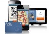
Belly, the Chicago-based loyalty platform which just closed its $10 million Series B from Andreessen Horowitz earlier this month, is today announcing a pretty significant milestone: its 1 millionth check-in. The startup allows customers to check-in to a location using a physical loyalty card or mobile app which they scan via a consumer-facing iPad installed at point-of-sale. By doing so, customers collect points that can later be redeemed for unique rewards tailored specifically for the business in question.

The company has been growing fast, and CEO Logan LaHive tells us that in some of Belly’s locations, there have been more Belly check-ins within its first month of being up-and-running, than the total number of Foursquare check-ins the business has seen to date.

“I’m not here to make outlandish statements,” says LaHive, referring to this impressive metric. “Some stores are more active and engaged than others, so it would be ridiculous for me to say 100% of locations. But in our active locations, they’re surpassing all-time Foursquare check-ins in their first month.”

For those unfamiliar with Belly’s operations, the now 50 plus-person team works with each business to develop custom and unique digital loyalty programs for retailers’ stores. Merchants pay a monthly subscription, and Belly provides an iPad, physical cards and key chain tags, the consumer-facing mobile apps, marketing materials, and a backend analytics system. For consumers, the idea is that Belly could eventually grow large enough to replace all the different loyalty cards cluttering up customers’ wallets.

Given that the startup works directly with the businesses in question, very much one-on-one, some may wonder if Belly is hard to scale.

“That’s a question we hear often, particularly from folks out in the Valley,” says LaHive. “Look, loyalty in general is not a new concept. There are a lot of competitors out there in the space trying to build an app with three guys in a garage and trying to scale it to all small business owners. But we’ve found that’s not the way this business works,” he says.  ”Loyalty is successful when it’s built on relationships. In order for us to really build and sustain that with a business over time, it takes a hands-on approach. We’re building and staffing a team that can support that.”

The company is currently up-and-running in 1,500 locations across the U.S., including recently added markets of New York and Boston, plus Chicago, Austin, Madison, Milwaukee, D.C., Phoenix and Miami. LaHive says that they’re growing at a rate of about 100 locations per week.

While some new startups are hesitant to reveal their metrics early on, Belly gladly shares practically everything they have on file. The company’s over 200,000 users are delivering 10,000 check-ins on average per day. A third of Belly’s users check in to more than one business, 55% have checked in more than once, and 22% have checked in more than five times.

It took Belly 166 days to reach its first 100,000 check-ins, 27 more days to reach 200,000, and is now seeing around 100,000 check-ins every eight days. Around 2,000 to 3,000 new users are added per day to the service, and customers have redeemed over 14,000 rewards since the company’s launch in August 2011.

Belly has nearly $13 million in total funding from Andreessen Horowitz, Lightbank, and others. The company is now working to transition to HTML5 for its apps, and is planning aggressive expansions to new markets, thanks to the recent infusion of capital.


Apple’s iOS and Mac App Stores Now Feature “Free App Of The Week” And “Editor’s Choice” Promotions

facebook_camera_editors_choice

In an apparent effort to help its users find more interesting apps in its cavernous digital stores, Apple today made an interesting tweak to its iOS and Mac app stores. Both now feature a “free app of the week” and an “editor’s choice” section. As Apple’s official App Store Twitter account announced yesterday, Cut the Rope: Experiments is Apple’s choice for this week’s free app in the iOS store. Editor’s Choice apps include Extreme Skater and Facebook Camera for iPhone, Sketchbook Ink for iPad, and Cobook and Deus Ex Human Revolution in the Mac App Store.

Other app stores, including Amazon’s Appstore for Android, of course already feature similar free apps programs. The iTunes Store, too, offers a free single of the week.

Even though this isn’t the most original promotion, free apps are always welcome and it’s no secret that Apple’s App Store has a massive problem when it comes to discoverability. Unless an app appears in the various stores’ top 10 or at least top 25 lists, chances are that most users will never see it unless Apple decides to feature the app in its “new and noteworthy” section.

Earlier this year, Apple acquired app store search and discovery service Chomp. Chomp, which is still up and running, allows users to just say what kind of app they are looking for and goes beyond the easily gamed keywords and app names that are the hallmark of Apple’s own limited app store search feature. For the time being, though, Apple hasn’t integrated Chomp’s features into its own app stores and it still remains to be seen if it ever will.


Southeast, Here We Come: The Savannah, Atlanta, Charlotte, And Raleigh-Durham Meetups Are Go

atlantaskyline

TechCrunch is headed down south this summer and we’re starting our trip in Savannah, Atlanta, Charlotte, and Raleigh-Durham. We already have some great spots lined up but we definitely need your help finding a few more locations.

We begin by riding down to Savannah where we’ll see what the Coast is up to then on to Atlanta, Charlotte, and ending in Raleigh-Durham where we’ll have a great night planned of networking, chit-chats, and boozing.

The goal here is networking and connecting with the exciting projects happening in your cities. These mini-meetups are a great way to get noticed and to chat about what you’re working on and, in addition, get some advice on next steps. That said, we’ll have very limited time in each city so please drop jordan @ techcrunch.com a line if you’d like to meet with us. We’ll probably be holding office hours at a central location. Because of the vagaries of city travel, we won’t be able to come to your office, even if you ask nice.

If you’d like to help nailing down Atlanta and Charlotte, drop me a line as soon as possible at john @ techcrunch.com. Also note that we’ve changed the dates for the meetups to better work around vacation schedules.

Here, then are the dates and locations so far:


Savannah is happening on July 6th at the offices of The Creative Coast, 15 West York Street. It’s going to be a smaller crowd, I suspect, but considering we found Vinylmint at the Norfolk mini-meetup, I’m excited to see what Savannah has to offer. You can RSVP here.


Atlanta is happening on July 9. Location is still TBD so if you have any ideas, please drop us a line as soon as possible. You can RSVP here.


Raleigh-Durham is happening on July 10th at the Tyler’s Taproom in the American Tobacco Historic District. We will be taking over most of the restaurant and garden so roll on over. You can RSVP here.


Special thanks to the fellows at GBW Strategies who helped us organize the event. GBW Strategies is a new era, Triangle-based public relations and marketing firm serving clients such as Facebook and the Cherokee Challenge.


Charlotte is happening on July 11th. We are still looking for a location although we’ll finalize it by Monday. You can RSVP here.


Techmeme’s Gabe Rivera Opens Up About New Vs. Old Media

Screen shot 2012-05-25 at 12.22.24 PM

To any member of the tech media, Techmeme is the first site you visit in the morning, and the last site you check before bed. It’s a thermometer of today’s news, with more context per headline than any single news source can offer. This is the beauty of aggregation, which some more traditional media outlets frown upon.

But founder and CEO Gabe Rivera has been doing this since 2004, and has incredible insight into the differences between old media and the young guns. I grabbed him backstage during Disrupt NYC 2012 after his panel on the tech media to see how he felt about new media’s dependance on sources like The New York Times, the myth of objectivity, the difference between click bait and link bait (if there is one), and his personal source preference when he sits down with a cup of coffee to read the day’s news.

“In the area we cover, I think we could do pretty well without [traditional media],” said Rivera. “It’s a very artificial experiment but if they disappeared overnight, I think that the remaining tech sites would cover everything just fine. I think some of the financial stories would be the exception to that, but all these blogs would reorganize very quickly to cover that.”

But one of the most glaring differences between new and traditional media is their views on objectivity. While old media holds true to a bias-less existence, blogs offer news through the filter of an expert, injecting opinion when necessary. Rivera believes that the beauty of aggregation (also new media) is that you can offer both point A and point B almost simultaneously and adjacently so the reader has as much context as they desire.

In the interview, Rivera also discusses the difference between link bait and click bait, and how Twitter makes it really simple to disguise a story within the headline.

Rivera said that his personal preference changes based on the content itself. Some days he doesn’t read very much news at all, despite the fact that Techmeme reads just about everything. But on days when he’s consuming current events, it all depends on the story type and who’s breaking it.

“The site that has industry people as its target readership will contextualize in a way that’s more meaningful to me,” said Rivera. “That’s usually TechCrunch or AllThingsD. Once in a while, the New York Times will uncover the story and have enough exposure to the details first so that they have the best account. For the first half hour, at least.”


Umbel Gets Strategic Investment From Knight Foundation To Change The Way Online Audiences Are Measured

Umbel_Logo_Blue_on_Transparent

Reporting and analytics firm Umbel wants to provide new metrics for measuring content online, to help publishers better monetize their content. And it’s getting some validation from the Knight Foundation, which was just announced as a strategic investor in the startup.

Umbel uses big data analysis of publisher data to better measure audiences that view their content. By using public data provided by social logins, it can provide real-time data about those audiences and help publishers engage with them. It has data from 2.5 million registered users today, which it correlates against 30 different data sources to provide composite audience information.

Umbel therefore provides publishers with more granular data about who’s viewing their content, going beyond just the usual demographics and geography data provided by most third-party measurement systems. That will help publishers to better pitch their audience’s value and interests to brands and agencies.

To help with this, the Knight Foundation has made a strategic investment in Umbel, as part of the $3.7 million Series A Round it announced in April. That round was led by Austin Ventures and also included investment from angels such as Herbert Simon, Chairman and Director of the Simon Property group, and Gordon Paddison, CEO Stradella Road and former EVP of New Media Marketing at Newline Cinema.

The investment was made as part of the Knight Enterprise Fund, an early-stage venture fund focused on innovation in the media industry. In addition to money, Umbel and other Knight Enterprise Fund investments will gain access to advisers that include Joi Itoh, John Palfrey, and Chris Hughes. It will also give Umbel an inside track into the Knight Foundation’s journalism network — the idea is to position Umbel’s measurement services as a value-add to other services provided by the foundation.

As more and more publishers have fewer resources to boost monetization, Umbel’s technology — and this strategic partnership — could give them the tools to engage with audiences and pitch them to advertisers.


CloudFlare To Launch Service For Sites Dealing With Tortuous EU Cookie Law

3213621460_d00c0c142c_m

The European “Directive on Privacy and Electronic Communications” that regulates the ways websites can track users, is coming to sites which serve European users, which covers plenty out there. The Directive requires that sites disclose the use of cookies on their site and allows visitors to opt-in to their use. It could be an immediate turn-off for users, but it’s here to stay. On Saturday, May 26, the UK implements the first phase of the law, so website owners are scrambling to ensure they are in compliance (assuming they even know about it). As we’ve said before, we think it’s dumb and will make it much harder on European startups.

The first requirement of the UK law is that sites do an audit to determine what cookies are used on their site. The Directive asks them to identify two types of cookies: those it deems “strictly necessary” and those that are not. The problem is that most sites have no idea what cookies it might be serving to users. However, US-startup CloudFlare is about to launch a service which will tell site what cookies they are serving and a way to control them: CloudFlare Audit + Control.

CloudFlare launches its Audit service first, possibly later today. This will interrogate a site and deliver a report on what cookies are being served.

Once that is in operation and people are using it, the data collected will form a sort of collective intelligence about what cookies are actually doing. This is useful because cookies can get dropped by multiple sources including the Facebook Like button, widgets, ad networks and analytics services. CloudFlare’s Audit will identify all the cookies floating around and will let a website owner see how other site owners have classified those cookies. Then they can work out which are the “strictly necessary” cookies.

After building a database of all the web’s cookies and the widgets that drop them, CloudFlare then plans to enable the second portion of the Audit + Control app. This will allow site owners to selectively enable/disable cookies and third party scripts on an individual basis via CloudFlare’s interface. Site owners won’t need to change any of their underlying code.

The idea is that sites will then be able to comply with the opt-in requirement of the EU law, which comes into effect later this year, without harming the core functionality of their sites.

The service is available for free to any CloudFlare users (CloudFlare’s basic plan is also free) but non CloudFlare customers will get the Audit portion in three weeks. The Control part of the service will only be fore CloudFlare users.

CloudFlare knows its onions on this score. It already powers nearly half a million websites and sees over 45 billion monthly page views across its network for more than 450 million unique visitors.

Clearly the Directive will put sites run out of Europe at a disadvantage to their US competitors, and slap bang in the middle of a recession. Not only that but the law applies to any website that has European visitors, so it’s not just an issue EU webmasters need to worry about. However, I’d love to see the European Union try to bring an action against multiple Stateside sites.


The TechCrunch iPad App Is Now Live

TC_app_icon_512

Spring has sprung and like Persephone loosed from Hades’ bonds, our iPad app is now available to all and sundry. This app is literally years in the making and we have been back and forth and up and down regarding functionality, design, and look and feel for most of this month. I’m pleased to report, however, that it is ready to go, free, and fabulous.

The app connects our blog content with live Internet reactions as well as some amazing functionality centered around CrunchBase data. You can also just view Gadgets and Mobile content with one click and an offline mode will cache content for the road. It is retina-ready and looks pretty darn good.

An Android version is forthcoming and should be available this summer.

This is, obviously, version 1.0 and we’re planning updates over the next few months that will smooth out the interface and potentially reflect a new design direction for the site in general. Until then, sit back, relax, and start slip-sliding through the new TechCrunch iPad app.

Product Page
Click to view slideshow.

Special thanks to the whole team at AOL and thanks to you for reading.

Star Wars music homage by Will Gannon.


Samsung Focus 2 Is a Windows Phone Bargain

Samsung’s latest Windows Phone device has two key things going for it: slick looks and a low $50 price tag. Photo by Ariel Zambelich/Wired

Nokia has committed wholly to the Windows Phone platform with its flagship Lumia line, but it isn’t the only manufacturer investing in Microsoft’s mobile OS. Samsung’s new Focus 2 is the company’s fourth Windows Phone device, and it’s a smartphone worth your attention.

Unlike the company’s Android devices, Samsung’s latest Windows Phone isn’t aimed at the upper echelons of the smartphone market. It’s the kind of device that will appeal to first-time buyers and seasoned consumers looking for a good deal.

And this is a really good deal. At $50 with a two-year AT&T contract, the Focus 2 is a bargain. That’s only half the price of the Lumia 900, and a third of the cost of HTC’s Titan II, even though all three phones run on the same AT&T 4G LTE network. And since the Windows Phone platform is consistent across the devices — you’ll see a few pre-loaded manufacturer and carrier apps, but not much else — you’re not sacrificing much software experience with the low price tag. The Samsung Focus 2 was just as quick and responsive as any other Windows Phone Mango device I’ve used.

Having access to AT&T’s 4G network is also a big plus. While I was using it in the downtown San Francisco area, I consistently had between three and five out of five bars. And all of my calls sounded clear and and sharp.

Of course, just because the software is consistent, that doesn’t mean all Windows Phone devices are alike. The hardware design, camera quality, display, and battery life are just a few of the important features where these smartphones can dramatically differ.

Dangerous curves. Photo by Ariel Zambelich/Wired

If you’ve ever seen or used the Samsung Focus, then the Focus 2 will look familiar. Instead of the hard edges Samsung employed in its last Windows Phone, the Focus Flash, the company has returned to the rounded corners of the original Focus and opted to further smooth and round out its edges. The curves on the back of the device are reminiscent of the iPhone 3GS. I got into the habit of turning the phone over again and again in my hand, just because I liked the smoothness of it.

The Samsung Focus 2 gets you access to AT&T’s 4G LTE in a compact, appealing, and most importantly, cheap device.

In terms of size, the Focus 2 is the tiniest bit shorter and narrower than the original Focus, but also a little thicker — it’s 4.79 x 2.47 x 0.43 inches, while the original Samsung Focus measures 4.84 x 2.56 x 0.39 inches. The extra thickness gives the Focus 2 some weight over the Focus, at 4.3 ounces compared to 4.1 ounces. It’s not much of a difference, but one of the first things I noticed when I picked up the Focus 2 was that it felt heavier than its predecessor — and in a good way.

Still, regular plastic just isn’t as strong or sturdy as polycarbonate, so the Samsung Focus 2 does feel rather cheap when compared to the Nokia Lumia 900. But it’s a tradeoff that might be worth it for those who want a compact and light phone that can easily fit in a skinny jean pocket.

As for camera quality, the Focus 2 is just average. You get a camera shutter button — standard, but much appreciated, in Windows Phone devices. The phone sports a 5-megapixel camera with an LED flash on the back, and a front-facing VGA-quality camera (a feature missing from the original Focus). Photos are easy to take in daylight, and if you play around with the settings — adjusting the sharpness, saturation level, white balance, ISO, and contrast just right — you can get a decent low-light shot as well. Still, results are not even close to as nice as iPhone 4S shots, and aren’t quite as good as photos taken with the Nokia Lumia 900′s 8-megapixel camera.

The camera isn’t fantastic, but it’s actually pretty good for an entry-level phone. Photo by Ariel Zambelich/Wired

The phone’s 4-inch 800- by 480-pixel Super AMOLED display is on par with other Windows Phone devices. My only complaint is that it never got quite bright enough. Even the highest brightness option looked lackluster, and was noticeably less bright next to the original Focus and the Nokia Lumia 900.

A few other drawbacks with the Samsung Focus 2: It comes only in white with silver trim, it has just 8GB of storage and no MicroSD card slot for extra storage, and it comes with a single-core Qualcomm MSM8255 1.4GHz processor — something that didn’t noticeably affect the phone’s performance, but is behind the dual-core times.

The Samsung Focus 2 gets you access to AT&T’s 4G LTE in a compact, appealing, and most importantly, cheap device. Don’t get me wrong, this definitely isn’t a better phone than the Nokia Lumia 900. It doesn’t have the same curb appeal and falls short in comparative specs like the onboard camera and available storage. But if you’re looking for an affordable, entry-level smartphone and are curious about the Windows Phone platform, the Samsung Focus 2 is a good choice.

WIRED Very affordable. Slick and compact design. Good call quality. Camera is not bad for a $50 phone.

TIRED Display doesn’t get bright enough. Only 8GB of storage without the option to expand. Comes only in white.

Toyota Rediscovers the Joy of Rear-Wheel Performance

The Scion FR-S is filled with playful rear-drive character. Photo courtesy of Toyota Motor

Scion’s 2013 FR-S sports car succeeds on the most important level: It’s fun to drive.

Too bad Toyota couldn’t have had a little more fun with the name. The FR-S is known as the Toyota GT-86 in the rest of the world, and even wears GT-86 badges on its front panels. The name brings to mind the expression, “86-ed,” restaurant slang meaning a menu item has sold out, a customer has been banned, or something has otherwise been eliminated.

Imagine a television commercial wherein a Gen-Y hipster driving a GT-86 bests a competitor on a twisty road. At the end, we cut to a close-up of the winner as he looks straight at his nemesis in a VW or Hyundai and says, “You’ve been 86-ed!”

The actual TV ads for the Scion FR-S aren’t as much fun, so it’s a good thing the car is. It has a playful rear-drive character and curvaceous styling that should make it a hot commodity among Scion’s under-30 target market.

The design represents a revisiting of the past for Toyota, evoking a time when the company turned out affordable, rear-wheel-drive performance cars like the 1980s enthusiast-favorite AE86 Corolla. Toyota’s 1960s Sports 800 and 2000 GT are also cited as ancestors. The FR-S, which starts at $24,930, is also Scion’s first proper sports car, augmenting the less expensive, merely “sporty” tC.

The FR-S (“front-engine, rear-drive, sport”) was reportedly drawn up to appease Toyota president Akio Toyoda, who asked, “Where is the passion in our lineup?”

Scion’s emphasis here is on driving character, not big performance numbers.

So absent was the passion that Toyota looked outside its corporate boundaries and developed the FR-S in cooperation with Subaru. As a result, most of the FR-S’ engineering and mechanicals — like its FA20 2.0-liter, four-cylinder boxer engine — come from Subaru. Subie will sell its own, nearly identical version — the BRZ — at a slightly higher price point.

The car’s styling is determined by functional elements under the sheetmetal. For example, the engine is a flat, horizontally opposed four-cylinder, enabling a low hood line that highlights the front wheel arches. From the driver’s seat, the benefits are a low cowl and the ability to place the car visually using those bulging arches. Also, the gaping grille is flanked by intakes with integrated fog lamps, ensuring adequate engine and brake cooling with minimal aerodynamic penalty. With these low-slung curves, the Scion’s silhouette is vaguely Toyota 2000-esque. Its trapezoid-shaped rear incorporates a diffuser, dual exhaust and 12-element LED tail lamps.

The car’s front-end styling is dictated by its flat engine design. Photo courtesy of Toyota Motor

This functional approach continues in the cockpit, where the black instrument panel is dominated by a big tachometer, a relatively simple center stack and a flat glovebox area. Imagine the central satnav/audio display pulled out, wires casually hanging, and it smacks of a stripped-out race car interior. The fabric seats are comfortable and bolstered enough for serious track work with attractive double-stitching. The steering wheel is, appropriately, Toyota’s smallest, measuring just 14 inches in diameter.

A standard 300-watt Pioneer audio system can be upgraded to Toyota’s 340-watt BeSpoke app-based multimedia system, whose 5-inch display can be used to call up Pandora, Facebook or Twitter, and includes points-of-interest and routing functions through satellite navigation. There are also the usual USB inputs and extra RCA outputs for external amps.

The FR-S’ sporting intent is signaled by a refreshingly light curb weight (between 2,700 and 2,800 pounds, depending on options) with a 53/47 percent front/rear weight distribution, a rigid chassis, and an independent suspension with MacPherson struts up front and double wishbones in the rear. Add a reasonable 200 horsepower, put power down at the rear wheels, and you’ve got a zippy handler.

Scion’s emphasis here is on driving character, not big performance numbers. The direct-injected 2.0-liter boxer keeps the FR-S’ center of gravity lower than a Porsche Cayman’s, and power delivery is linear up to the 7,400-rpm redline. The FA20 engine is also tuned for sound: A “Sound Creator” channels audio from the engine’s air intake into the cabin. Unfortunately, the note isn’t that appealing, and my guess is that aftermarket exhaust makers will step in profitably.

Capo Race Bibs Will Make You Want to Move to Italy

Photo: Ariel Zambelich/Wired

Despite the relatively crowded marketplace for high-end cycling apparel, eight-year-old Capo has quickly become a favorite of the race set. The company designs all of its products in Emeryville, California, but manufactures it all in Italy, where everything in cycling goes to get cooler. Emeryville isn’t far from Wired’s offices in San Francisco, and it’s rare that I go for a ride without seeing several people in Capo gear.

I’ve been riding the company’s race-oriented SC-12 bibs for several weeks, and they’ve become a favorite. I’ve always felt that $200 was too much to pay for bibs — I’m still on the fence — but these have me questioning that. The fit and fabrics are just so much better than anything I’ve ridden in before.

The lower four inches of leg band is made from a fabric called Power Lycra that blends seamlessly into your skin and keeps your legs clean of seam impressions. I know that for durability’s sake, the upper portions of the shorts have to be made of thicker stuff to withstand the friction of hours in the saddle, but in my dreams there are bibs made entirely of this material.

The Anatomic-DP Carbon chamois, which is proprietary to Capo, is cushioned enough for long training rides, but not so bulky that I wouldn’t race it. And the articulated cut and sturdy-yet-thin Lycra of the upper legs holds the chamois perfectly in place.

Photo: Ariel Zambelich/Wired

Capo goes with silicone grippers to keep the leg openings in place, but it’s a much more minimal strip than some companies use. Too much silicone can tug and get sweaty, but I forgot about it in these shorts. Still, if you don’t have a fresh leg shave, pulling them on will be painful.

The bibs are cut really short in front. This is great for mid-ride rest stops, but the trade-off is less support for your midsection when you’re hunched over. If you’ve got any sort of spare tire, it’s only going to look bigger in these.

WIRED Low-cut front for quick nature breaks. Euro-style materials feel as minimalist as body paint. Tiny Italian flag on the left leg makes me want to watch Breaking Away again. Zero chafing from seams.

TIRED Strap fabric is a bit itchy. Sizes are a lie. Unless you’re a very small Italian racer, buy a size up. Or two.

Photo: Ariel Zambelich/Wired

Magnetized Helmet and Glasses: High on Form, Short on Function

Photo: Ariel Zambelich/Wired

When Lazer debuted its Helium helmet in 2010, it brought with it a remarkably comfortable fit system. A dial on top of the high-end race lid — kind of odd placement, but OK — spools a cable that runs down the sides of the helmet and around the back of the wearer’s head. Cinch it down, and it feels like something has suddenly been vacuum-formed to your head. My first reaction was, “Whoa, that’s nice.”

Since then, though, Lazer has been updating the helmet by periodically adding magnets. Lots of magnets. First came the Magic Buckle, which uses magnets, rather than a clip, to fasten the straps. Now Lazer has built magnets into the straps themselves. These ones match up with magnets in the company’s new Magneto glasses. The Magneto is basically just a lens with, yes, magnets, that snap it into place on the helmet, sort of like a Smart Cover for an iPad.

Think about wearing a good pair of cycling glasses with snug-fitting temples. Then think about wearing just the lenses snapped onto thin fabric straps at the sides of your head. Yeah, they flop around. A lot, with every bump, stop, and stiff wind gust.

The Magneto shades are photochromic and get dark in a hurry, which is nice. And the lens comes with temple pieces so you assemble the kit and wear them as regular glasses, which is far superior to using just the magnets. Still, the fit isn’t as good as comparable cycling-specific shades. The main reason for buying these would be to wear them with the Helium, and on that count, they fall short.

Photo: Ariel Zambelich/Wired

The Magic Buckle, also, while very well-intentioned, doesn’t quite deliver on its promise. The goal here was to create a buckle that a wearer could close one-handed. And it definitely works. But the buckle sometimes snaps into place backward, which is less secure, and the magnets make the buckle too heavy. It tends to hang low and sway back and forth.

The Helium is a great helmet that seems to have been led astray by fancy add-ons. I’d like it better if Lazer would just go back to the basics here — the venting, the light weight, and the awesome fit system. As for cycling glasses, I’ll stick with what I’ve got.

WIRED Perhaps the nicest fit adjustment of any bike helmet. Breezy vents and comfy pads.

TIRED Bells and whistles distract from overall quality. Magnets add bulk and weight. Shaky, annoying Magneto glasses are optional, but the magnets that hold them in place aren’t; they’re sewn into the straps. One “improvement” too many.

Lazer Helium helmet: $230 at LazerSport.com


Magneto glasses: $120 at LazerSport.com


Photo: Ariel Zambelich/Wired

Waste Not: Refillable Printer Ink From Silo

Silo sells ink refills and cartridges that can be used in most printers. Photo courtesy of Silo Ink

Printer ink cartridges are like razor blades. The hardware that holds them goes for peanuts, but refills are priced for champagne budgets.

Take my Canon MX410 printer, for example. It set me back $78, pretty cheap for a multi-function printer. But a pair of ink cartridges, one black and one color, cost around $45, more than half the cost of the printer.

Like everyone else, I’m always looking to save a buck and accordingly shopped around for refillable-ink cartridge alternatives, despite the stern warnings from Canon (and other printer manufacturers) which claim I’d cause irreversible damage to the printer by using anything other than its branded ink. There was a time the major office supply chains carried generic ink replacements, but thanks to some legal shenanigans, they now only serve name brands. You can still find cartridge refill and recycling services on the web, but the quality, depending on your printer, is untested and varies widely.

U.S. citizens toss more than 375 million empty toner and ink cartridges into the garbage every year, most of which wind up in landfills.

But it makes sense, both economically and environmentally. According to Inkguides.com, a comparison shopping and information website for third-party ink products, U.S. citizens toss more than 375 million empty toner and ink cartridges into the garbage every year, most of which wind up in landfills. They’re slow to decompose, too, taking between 450 and 1,000 years to break down, depending on the polymers and plastics used.

I tested some cartridges from Silo Ink, a company which claims up to an 80 percent savings over brand-name ink cartridges, and whose cartridges are compatible with over 100 different printers. Of course, you don’t see that “80 percent savings” until you’ve reloaded the Silo cartridge up to 10 times with the company’s refill bottles.

The initial cost for the refillable cartridges and bottled ink for my printer was $90. That’s equal to the cost of two sets of Canon ink, but I’d ostensibly get at least eight times the output with Silo Ink. Additional refill bottles, good for 10 refills each, cost about $15 per bottle after the initial purchase.

The Silo Ink cartridges snap into the printer the same as the Canon ones, and after printing a dozen black text pages (alternating between “standard” and “draft”), there was no noticeable difference in quality between the Canon ink or Silo Ink pages. Color photos, however, suffered. I printed some colorful city shots on glossy photo paper, and the Silo output was slightly muddy with muted colors and less-than-sharp contrast levels.

While most people could tolerate the slight loss of color vibrancy given Silo’s eye-opening price savings, the refill process was, for me, a deal-breaker. Once the Silo ink cartridges run through their load, you refill them with the needle-tipped refill bottles. Simple enough — open the pop-top plug to expose a tiny air vent, stick the bottle tip into the refill hole, and pour. But what a friggin’ mess. The fine people at Silo Ink supply a pair of plastic film gloves because they know what’s coming. I didn’t use them, and I have rainbow fingers to prove it. But gloves couldn’t have prevented the christening of my Silo rainbow-spotted jeans, or the patch of Rorschach carpet. The next refill will be over the sink in the garage.

There’s another quirk. The Canon cartridges can tell the printer how much ink remains inside, and the printer will convey that information to you. The Silo cartridges are not detected by the printer, so the only way to tell how much ink is left in the cartridge is to remove it every so often and take an educated guess.

But the print yields (the number of pages printed from one cartridge) proved equal to or better than Canon’s inks. So, yes the cost savings is admirable.

In all, I’d say the financial savings make Silo’s cartridges worthwhile, but color reproduction suffers (though black quality is about the same), and refilling the things can be very messy if you’re not careful. If you’re willing to live with those hassles — say, if you only require your printer to be functional, and not exact — check them out.

WIRED A wickedly inexpensive way to save bucks on printer cartridges. Page yields equal to or better than the brand-name printer cartridges. Sharp black text. Won’t anybody think of the environment?

TIRED Color performance is sub-par. Messy refill process takes practice — wear gloves and an apron. Cartridge capacity levels can only be checked by removing them from printer.

Specialized Prevail Helmet Is a Big Chiller

Photo: Ariel Zambelich/Wired

The Kevlar-reinforced internal skeleton inside every Specialized S-Works Prevail helmet helped the company’s designers get away with massive vents that wouldn’t be possible with pure foam. The added structural support allowed them to shave away external foam to create massive ports and channels, which have a double benefit: They allow more cooling air to flow over the wearer’s head and also, according to Specialized, improve aerodynamics.

I don’t have easy access to a low-speed wind tunnel, so I can’t speak to aerodynamics, but all of Wired’s testers who’ve been wearing the Prevail over the past several weeks agree it’s possibly the most well-vented helmet they’ve worn. It’s markedly cooler than my 2009 S-Works helmet.

Our testers were also unanimous, though, in dinging the Prevail for its large profile. The vents may let a massive volume of air through, but there’s no getting around the fact that, straight on, this lid looks larger than other high-end bike helmets. That doesn’t come with a weight penalty, though. The sub-8-ounce Prevail is right in line with the competition, but delivers the best venting I’ve ever encountered in a helmet. So if that was Specialized’s target, the company has nailed it.

Photo: Ariel Zambelich/Wired

There are some other technological wins inside, too. The simple one-handed adjustment system lets the wearer dial in the fit on the go, and the rear part of the fit mechanism ratchets up or down to snug up against the back of your skull. It locks down without feeling oppressive.

Unlike with most helmets, though, there’s no fore-aft adjustment on the straps. The Prevail straps join at fixed points to create an “ear box” that prevents them from slipping over your ears. This is great, but we all missed the ability to take the slack out of the rear straps. The only adjustment here is tightening or loosening the main chin strap.

So, if you ride in hot places, there may be no better helmet for you. My quibbles with the size and strap system aside, this is my new favorite helmet.

In the end though, its girth grew on me. The advantages in aerodynamics and heat relief go a long way to make this a great lid, and I recommend you give one a go.

WIRED More air flow than a jet intake. Micro-adjustable fit system for fine-tuned snugness.

TIRED Fixed strap system may not be for everyone. If you are already self-conscious about the size of your melon, beware.

Photo: Ariel Zambelich/Wired

Shades That Help Keep Your Eyes on the Road

Photo: Ariel Zambelich/Wired

When you’re powering your bike alongside traffic at 20 mph and you’ve got a six-inch stretch of street between you and the shoulder, the last thing you need is to be blinded by an unrelenting sun. Like the wind in your face, there’s not much you can do but fight through it, but a competent pair of shades will help you plow through any angle of sun. Oakley’s latest, the cycling-specific Radarlock Pitch, which expands the company’s push for better lens-swapping designs, proved more than up to the task.

During our group bike test, a few of us ran the Radarlocks through the rigors while biking around San Francisco Bay and the challenging terrains around northern California. On first usage, the lens provided noticeable protection against the sun’s unforgiving UV rays as well as any unexpected fog or haze — always a concern around these parts. When the sun did go down, switching out the dark polarized lens and popping in one designed for low light was a cinch, thanks to the innovative Switchlock button located near the left eye hinge. You just slide the button back a little, bend the hinge, and gently pull the lens out. Swapping one lens for another can be done in under a minute, once you get the hang of it.

As far as comfort, these Oakleys could still use a bit of work. Even with moderately sized skulls, the glasses could feel a wee bit snug. It was most noticeable upon initial wearings but faded over time. For some folks, the nose clamps got a little tight. For others, it was more noticeable around the head. For those with smaller heads, fit issues generally won’t be an problem.

Structurally, the glasses were durable and felt like a necessary kit component in any condition. There were occasional difficulties fitting them over or under helmet components at times, but the shades were always dependable and didn’t slip, due to the rubberized side pads along the sides, made Oakley’s proprietary Unobtainium material. (No, that’s not the same as the fictional element featured in Avatar. It’s a rubber that gets sticky when it gets wet, so your glasses don’t slip.)

Oakley does offer an upgraded line of Radarlocks with polarized lenses for an $80 markup. The tradeoff is that ambient objects you may encounter along the roadside — really, anything that might present a wavy glare into your retinas — come off as slightly psychedelic, which some of our testers found distracting. Trust yourself to look past it while maintaining a command of your surroundings and you’re golden. But if easily distracted by shiny objects, you may want to stick with the baseline model.

After nearly 100 miles on the road, the Wired Bike Team came off feeling as if the Radarlock Pitch was one of the best sunglasses we’ve ever worn. While not perfect, they’re the best road-specific cycling shades Oakley has ever made, and that’s saying something.

WIRED Excellent protection against bright glare. Structurally sound. Decent wind deflection in all elements. Nail the balance between coverage and venting.

TIRED Tight fit around some noggins. Cumbersome to slip on while helmeted.

Photo: Ariel Zambelich/Wired

Attain Any Tone With These Tweakable Guitar Effects

Use your iOS device to load whatever pedal sound you want into the DigiTech iStomp. Chorus, distortion, echo – you name it. Photo by Ariel Zambelich/Wired

All guitarists* suffer from the same disease: pedal lust.

In our quest to improve our tone, we voraciously hoard stompboxes — fetching little things with pretty lights that we mash with our shoes, adding different colors to our instrument’s raw signal as we switch them on and off.

The best pedals are pricey ($200 or $300 each), and they’re single-serving devices that only make one sound. For the cost of one pedal, you could just buy a multi-effects unit — a shoe-box-sized rhombus with an array of switches that can add up to a dozen effects at once.

I tried multi-effects units like the Line 6 M9 and the Boss GT-10, and even the massive DigiTech iPB-10 pedalboard, which uses the processing power of your iPad to manipulate the guitar’s sound. But I wasn’t satisfied. The boxes sound good enough, but they’re bulky, clumsy, and a little over-the-top. More importantly, I missed the tactile, granular control afforded by twisting the knobs on individual pedals.

I found two simpler solutions: DigiTech’s iStomp pedal, and the TonePrint line of effects from TC Electronic. They look like regular guitar effect pedals. But connect them to a computer or an iOS device and they become customizable. You can download sounds and burn them onto a firmware chip inside the stompbox, altering the tone, tweaking the behavior of the controls, or, in the case of the iStomp, changing it into a completely different pedal altogether.

DigiTech’s iStomp and the TonePrint line of pedals from TC Electronic look like regular guitar effect pedals. But connect them to a computer or an iOS device and they become customizable.

TC Electronic’s TonePrint is the more conservative of the two. The Danish company makes several different TonePrint pedals — there’s a chorus, a flanger, a vibrato effect and a delay pedal. I tested the Corona Chorus and the Vortex Flanger. Both are excellent pedals to begin with, and they sell for the modest price of around $130 each.

The Corona Chorus, for example, is a great pedal in its default state, offering both a 1980′s-sounding SCF chorus and a tri-chorus mode that overlays three chorus effects on top of one another (listen to TC’s sound samples).

But flip a little switch on the face of the pedal, and you can access a third voice: whatever TonePrint setting you’ve downloaded.

Adding a TonePrint preset to the pedal is dead easy. You install a simple updater app (Mac and Windows) and attach the pedal to your computer via a USB cable. Then, go to the TC Electronics website and browse the signature settings developed by professional recording artists and by the engineers at TC Electronic. Download the TonePrint you want (each pedal holds only one at a time) and load it onto the pedal.

The most common tweaks add things like high-end filters, reverse effects, or recreations of bygone classics. On the chorus pedal, I found the TonePrints built to emulate vintage effects (like the Boss CE-2) to be the most appealing, as well as the settings by Syu, Dann Huff and Orianthi. Many of the other artist’s selections were too digital-sounding or extreme for my tastes. Plus, maybe I’m just old, but who are these guys? I had to search Wikipedia to uncover the pedigree of Bumblefoot (“Guns N’ Roses”), Munky (dude from Korn) and Uwe Hassbecker (uhh…). Any chance we can get David Gilmour, Daniel Ash or Gene Ween to throw us a bone here?

There are certainly enough sounds on offer — dozens for each pedal in the line — to satisfy every taste. As I mentioned, I especially liked TC’s in-house builds, or the subtler, vintage treatments. Dann Huff’s setting sounded great on a finger-picked guitar, and Orianthi’s setting did wonderful things to my Fender Rhodes piano.

No matter what I loaded onto the Corona Chorus, it was still a chorus pedal. But what about a pedal that can turn into anything?

That’s the special sauce inside the DigiTech iStomp ($150). It’s a slim gunmetal enclosure (too slim for a battery, so the power adapter is mandatory) with four unlabeled knobs. It comes with a cable that connects the box to your iOS device. Once you download DigiTech’s free StompShop app, you can browse the various effects, called “e-pedals,” and download them for between $1 and $10 each. Your in-app purchases are stored within the app on your iOS device, so to load up the pedal, you just connect your iPhone/iPad and choose the e-pedal you want to imprint into the hardware. Voila — in about 60 seconds, you can change a filthy fuzz pedal into a rotating speaker pedal, a delay/looper pedal, or whatever.

When the guts of your pedal change, the knobs on the face don’t control the same parameters anymore. It gets a little confusing when your “fuzz” knob suddenly becomes a “rotation speed” knob, so DigiTech includes removable labels for each effect, plus a few blanks you can use to mark your favorite knob positions.

I tried out most of the 25 or so e-pedals on offer, thanks to the feature that lets you test anything in the store for five minutes. I also purchased a few and tried them for longer periods. The sounds themselves are of varying quality. Just like with the TonePrint selections, I found the DigiTech e-pedals that mimic the vintage effects (the Small Stone phaser, Tube Screamer distortion and the classic Fuzz Face) to be the best. The more extreme or ambitious effects were too harsh and digital-sounding, but the subtler creations sounded really nice.

For the tone generation, DigiTech is using the same technology found in its iPad-powered iPB-10 pedalboard. So if you’re familiar with the iPB-10, you’ll recognize the same smells here.

I can see the iStomp being an excellent choice for an effect that you only need for one song. Why spend the same money on a pedal that only does one thing when you can get a pedal that can easily be wiped and rebirthed as something entirely different at a later date? It’s not going to replace anything in my starting line-up of beloved, boutique effects. But for the random sounds, or when I’m asked to play a one-off gig, the iStomp fits perfectly.

* Not all guitarists, only those who believe more pedals, and not focused practice, will improve your playing.