Quick Tip: Bringing More Power To Your Drum Samples in FL Studio

Powerful drum sounds in a mix is something that we all probably desire and strive for, unless of course the type of instrumental composed doesn’t call for a heavier drum.  However, for most music such as hip hop, rap, house, techno, and other styles, the presence for a nice sounding drum section is a great addition to a mix.

In this quick tip tutorial, I am going to show you a quick, simple way that you can make your drum sounds, especially your snare and kick, sound more present in your mix.  This little trick comes in very handy especially for producing hip hop beats, rap beats, and house music, where the kick and snare (or clap) is desired to be more dominant in the mix.


Step 1: Load Your Drum Samples

Before you can start this process, you of course need to load up the drum samples that you are wanting to use.  Simply go to the top menu and click View and Browser (if you don’t already have it open) and look for the drum samples you plan to use.  Right click on the drum sample and select "Send to selected channel".  For this tutorial, load up a kick drum sample you wish to use, and a snare sample as well.

Step 1 - Select Drums


Step 2: Assign Your Drum Samples A Channel

Now, you must assign each drum sample its own mixing channel.  To do this, click on the drum sample you loaded up on the sequencer.  You should see the Sampler tool appear.  If your Sampler doesn’t appear like the one on the image, click on the "SMP" that I have circled in red to get your sampler to appear like the one in the image.  In the upper right corner of the Sampler, you will see a small box with "FX" under it. 

In this way, you assign a mixer channel to each instrument, drum sample, or any other instrument you load.  For this tutorial, let’s assign your kick channel to #1 and your snare channel to #2.  To do that, simply hover over the box, and hold your left mouse button and drag up or down on it to change the number.

Step 2 - Assign A Mixer Channel


Step 3: Load Up The Fruity Free Filter Plugin

This is the meat and potatoes to making your drum samples sound more powerful.  The Fruity Free Filter allows certain audio bands to pass through while filtering out the undesired ones to come through.  This plugin is more powerful than some people give it credit for, or even know about. 

To load up the Fruity Free Filter, simply go to your mixer as shown on the image.  Make sure you have the proper channel highlighted to the mixer channel you chose in Step 2.  For this instance, we’ll use Channel 1 with the kick we loaded from Step 1. 

Note the little red circle I created over the down arrow box.  Click on this box.  A menu will appear.  You will then hover over "Select", and then the menu will appear on the side, where you can choose Fruity Free Filter.

Step 3 - Load Fruity Free Filter


Step 4: Changing The Knobs To The Proper Settings

Okay, with the Fruity Free Filter, there are four knobs that enhance and tweak the audio to your liking.  You have the type of filter noted as "Type", the band frequency noted as "Freq", the filter resonance (for some types) noted as "Q" which shows short or longer lines depending on the amount used, and the amplifier noted as "Gain".  To make your kick drums pack more punch, set the Free Filter as follows:

Type:  Low Shelf     Freq:  357 Hz     Q:  set this to 4 longer lines     Gain:  7.5 db

You can hear the difference in the two audio files below.  The first audio plays four kick drums without using the Fruity Free Filter.  The second audio afterward plays the same drums using only the Free Filter to boost them up.

Download audio file (4 Kick Drums without Free Filter Used.mp3)

Download audio file (4 Kick Drums Using the Free Filter Only.mp3)

This setting will allow you to hear your kick drums bring out more punch.  You can tweak the settings a bit more to your liking, or even experiment.  The above settings will bring more presence to your kick drums though.  You can also use it on the channel for your bass instrument, though I’d recommend lowering the Gain a bit.  To set up a stronger snare drum, use the Free Filter with the following:

Type:  High Shelf     Freq:  149 Hz     Q:  set this to about halfway     Gain:  5.0 db

You’ll hear a distinct difference and punch in your snare drums, making them sound more present in the mix while not taking away from the other instruments.  You can hear the two audio files below regarding the difference in the sound of snares, the first without using the Free Filter, and the second Using the Free Filter:

Download audio file (4 Snare Drums without Free Filter used.mp3)

Download audio file (4 Snare Drums Using the Free Filter Only.mp3)

You can also see how I set up the Free Filter tool for each example.  The images are below for you:

Step 4 - Free Filter Settings

Finally, listen to the two brief audio snippets below of a hip hop beat snippet created in FL Studio.  The first audio example is created without using any plugins at all.  The second example is the same audio file using only the Fruity Free Filter on the drum sounds.  You can hear a distinct difference between the two.

Download audio file (Beat Snippet without using Free Filter.mp3)

Download audio file (Beat Snippet Using Free Filter on Kick and Snare.mp3)

With this quick tip tutorial, you’ll have your drums sounding more powerful in no time.  You can also use the Free Filter to bring out hats, though I’d recommend a lower gain as well since hats usually take up most of the drum pattern’s space with the most use.  The Free Filter is even a great tool to use with musical instrument sounds such as brass ensembles, strings, or even piano.  You can find great uses for it simply by experimenting with it in your mix. 

The Fruity Free Filter is indeed underestimated, but proves to be a great tool to your mix in FL Studio, especially for those power hitting styles of instrumentals like house music, hip hop beats, techno music, and others of similar sound.  It is a vital tool I’ve used in my music production for years.


Read More

Tuts+ Quiz, Day 7 – Audiotuts+

It’s Day 7 of our stupendous Tuts+ Holiday Quiz competition. Today, you’ll be tested on your knowledge of Audiotuts+. Read on to unlock the seventh part of the entry form URL!

Day #7 Question
Audiotuts+

The Top 20 New Features Bryan listed for you,
Which version of Pro Tools did he review?

Find the correct answer (a single digit number) and add it to the URL string to unlock the next part of the entry form URL.

Search for the answer on Audiotuts+

Important: Please do not post answers in comments or elsewhere in public. Entrants found to have shared answers will be disqualified. By sharing answers, you take the fun out of the competition and lower your own chances of receiving a prize!


GOT IT? Good!

You’ll find the next question on Vectortuts+ within the next 24 hours.


Quiz Calendar

Assemble the answers in the following order to unlock the URL when all questions are released. The URL is enva.to/############. Replace every # with the answers!

Important: The following dates are based on U.S. / European timezones.

  1. Psdtuts+ / 20th December
  2. Activetuts+ / 21st December
  3. Cgtuts+ / 22nd December
  4. Webdesigntuts+ / 23rd December
  5. Nettuts+ / 24th December
  6. Mobiletuts+ / 25th December
  7. Audiotuts+ / 26th December
  8. Vectortuts+ / 27th December
  9. Phototuts+ / 28th December
  10. Aetuts+ / 29th December (ENTRY FORM UNLOCKED)


Read More

How to Draw an MP3 Player Skin

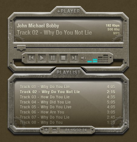
In this tutorial, we will use a combination of layer styles, textures, and a bit of manual drawing to create a Winamp-style mp3 player skin.


Tutorial Assets

The following assets were used during the production of this tutorial.


Step 1: Draw Basic Shape

To get accurate size, we will use grid to help us designing. Open Preferences dialog box (Command/Ctrl + K). In Guides, Grid & Slices setting, set Gridline every: 100 pixels and Subdivisions: 5.


Step 2

Create a rectangular shape with size 400px x 200px and color: #4f4834.


Step 3

Activate pen tool. Click path to add two points on each corner. See picture below for its placement.


Step 3

Hold Alt to temporarily change Pen Tool to Convert Point Tool. Alt-click all new points we have just created.


Step 4

Still using pen tool, click on all corner points to delete them.


Step 5

Click top line to add 4 points. Alt-click on each point to convert them to sharp point.


Step 6

Move upward two middle points as high as one box.


Step 7

Create a rectangular path inside our path and select Subtract from option bar. Add two sharp points on each corner, after that delete all corners.


Step 8

Our corner is just too thick. We will try to keep its size uniform, one column width. To help us, draw a one column size in rectangular shape, rotate it 45 degrees, and place it on the corner.


Step 9

Manually, move points using direct selection tool.


Step 10

Repeat step 8 and 9 to other corners to give them an equal size.


Step 11

Add these layer styles.


Step 12: Add Textures

Create new layer and place it above the shape. Use splatter brush to draw some dirt. Hit Command/Ctrl + Alt + G to convert layer to Clipping Mask.


Step 13

Add scratched metallic textures

on top of the shape. Click Image > Adjustments > Desaturate to remove its color. Set blend mode to Screen with Opacity: 45%. Hit Command/Ctrl + Alt + G to convert texture layer to Clipping Mask. The texture is now inside the shape.


Step 14

Bevel and Emboss layer styles add 3D effect on our shape. However, since I’m not satisfied with the result, I will add more light onto its side. So, select the side using polygonal lasso, create new layer, and draw black to white gradient. Change Blend mode to Screen and reduce its Opacity to 20%. Below, you can see the difference before and after adding gradient.


Step 15: Add Title

Write PLAYLIST for the title of this shape. Add following layer styles.


Step 16

Draw a circle shape. Set layer Fill to 0%, add layer styles.


Step 17

I notice that lower part of the shape is too dark. There’s no detail seen. To fix this, I will draw manually. Command/Ctrl-click shape layer. Use small soft brush then paint it with white. You can see the difference before and after painting white.


Step 18: Create Background

Currently, we are using white for background. This doesn’t help because white tends to make everything around it lighter. So, let’s add background now. Double click Background to convert it to layer. Click Edit > Fill and select Color: #332c1c. Add texture onto the layer. You can do this by pasting a texture onto the layer and set its Blend mode to Screen or Multiply, or you can add layer style Pattern Overlay and use one of the available patterns.


Step 19: Draw Screen

Draw a rectangular shape and place it behind the shape. Set Fill to 0%. Add layer style Gradient Overlay.


Step 20

Duplicate the path we’ve just created. Click Add Adjustment Layer and choose Gradient Fill. Draw another path exactly described as seen in the picture below and select Intersect. The combination of both paths will give us a nice reflection on the top left corner.


Step 21

Let’s add another gradient to make the top screen brighter. Draw a rounded rectangle on top. Set Fill to 0%. Add layer styles Gradient Overlay with blend mode Screen to keep lighter pixel.


Step 22

Add more shadows on lower part of the screen. We just need to repeat the previous process. Draw a rounded rectangle, set Fill to 0%. Add layer style Gradient Overlay, but this time, choose blend mode Multiply to hide all lighter pixels.


Step 23: Add Ornaments on Screen

Use pen tool to draw some shapes and place them behind the screen. Add layer styles.


Step 24

Reduce layer ornament Opacity to 50%. Add layer texture on top of the ornament. Set blend mode to Screen and reduce its Opacity to 45%. Convert layer texture to Clipping Mask.


Step 25

Duplicate the ornament and place it on the opposite side. Hit Command/Ctrl + T, right click, and choose Flip Horizontal.


Step 26: Add Details on Screen

Let’s add more details on screen. Start by adding highlight. Create a crescent shape path and place it on the top left corner. Click Add Adjustment Layer icon and select Gradient Fill from white to transparent. Set Opacity to 50%.


Step 27

Duplicate highlight and place it on the top right corner. Hit Command/Ctrl + T, right click and select Flip Horizontal. If you notice, in real life, lighting is never perfect. It’s almost impossible to have the same highlight on both sides. So, for this duplicated highlight, change Opacity to 20%.


Step 28

Repeat the previous steps, but this time, use black to transparent to create shadow.


Step 29: Add Cracks

I always love small details. Small details altogether give perfect impression on your work. One thing you can do to add realism on your work is adding some imperfections, in our case, a crack. This is pretty easy actually. Start by creating new layer, draw 1px black line using Pencil tool. Duplicate layer (Command/Ctrl + J), move it 1px. Hit Command/Ctrl + I to invert its color to white. Reduce black line Opacity to 30% and white line to 20%. Delete both ends of the lines using soft small Eraser tool.


Step 30

Repeat the same process to another crack.


Step 31

At 100% zoom, you can see our little cracks.


Step 32: Add Highlight

Let’s add some random highlight. Start by drawing a white dot using 2px soft brush. Hit Command/Ctrl + T and stretch it horizontally. Erase its ends using soft Eraser tool.


Step 33

Duplicate highlight and place it on other positions.


Step 34: Add Playlist Title

Add text for playlist. Add bold style to one of the songs to indicate it is active. Use color #ffffc5 and add following layer styles.


Step 35

To fade the playlist, add layer mask and draw gradient from white to gray.


Step 36: Add Playlist Button

Draw a polygonal shape and place it on the lower part of the playlist. We need to repeat Step 11 to 13 to add similar textures onto the shape. Add scratched metallic textures, desaturate its color (Command/Ctrl + Shift + U). Set blend mode to Screen, reduce Opacity to 45%. Hit Command/Ctrl + Alt + G to convert layer to Clipping Mask. Add following layer styles.


Step 37

Duplicate circular shape from the corner of the playlist. Place it on both edges of the new shape. Resize it to 90%.


Step 38

Draw a rectangular shape. Set Fill layer to 0%. Add following layer styles.


Step 39

I want to add more definition to lower part of the rectangular shape by adding more light. To do this, we just need to draw a 1px line using pencil tool and set its opacity to 20%.


Step 40

Below, you can see the slight difference before and after adding 1px line.


Step 41

Using rectangular tool, draw + sign and add following layer styles.


Step 42

Duplicate + sign and remove its horizontal shape to turn it into a – sign.


Step 43

Draw longer rectangular shape next to the – button.


Step 44

Inside the shape, add text for Current Track Time/Total Playlist Time.


Step 45: Drawing Player Interface

Duplicate Playlist interface. Change its title to +PLAYER. We don’t need the song playlist so delete its text.


Step 46

Draw a rectangular path and select Add to Shape. Draw a poygonal path, place it on lower part of the player and select Subtract.


Step 47

We don’t want this interface to be exact duplicate of the playlist. To make it unique, let’s add some difference. Move textures, move highlights, and add more cracks.

Don’t forget to reposition the screen. Move its highlights, shadows, and accessories on bottom corner.


Step 48: Time Indicator

Draw a thin rectangular shape and add some layer shapes.


Step 49

We’ll draw a time track indicator. Draw shape made of rounded rectangle and a triangle. For its color use: #4f4834.

Add texture on top, set its blend mode to Screen with Opacity 45%. Convert texture layer to Clipping Mask. Add following layer styles.


Step 50: Add Player Button

Draw another polygon on top of the player interface. Repeat Step 36, adding texture and layer styles.


Step 51

Draw a rectangular shape, set Fill to 0%. Add following layer styles.


Step 52

Draw shape made of rectangle and triangle. Add following layer styles.


Step 53

Use same technique to create another button.


Step 54

Draw a small speaker icon shape. Next to it, create a crescent shape made of two overlapping circle. Add following layer styles, similar to previous buttons.


Step 55

Draw some rectangular shapes. Add following layer styles.


Step 56

Duplicate layer shape (Command/Ctrl + J) and delete some of them. Remove all used layer styles and add following Color Overlay.


Step 57

Add circular shape on both ends of the shape. See Step 37 for reference on how to do it.


Step 58: Add Song Info

Add text contains track informations. Add layer mask. Draw wite to black gradient to make it fade away.


Step 59

We’re done with the interface.


Step 60: Changing Interface Color

We can also change its color. Add Adjustment Layer Hue/Saturation and place it on top of the interface. Change its settings.


Conclusion

As you can see, designing interfaces is not just about adding layer styles. There’s a lot more in the process. I hope you can learn some new techniques from this tutorial. If you have any questions, feel free to ask in the comment form below.

Read More

A lot of Articles –Native English writers 30 articles by omd34322

We have thousands of articles that need to be written and we are looking for some writers who are native speakers of English to help on this project. The rate of pay is $0.20 per 100 words. The average requested length of articles 500-600 words… (Budget: $30-$250 USD, Jobs: Article Rewriting, Articles, Copywriting, Ghostwriting, Reviews)


http://www.leveltenhosting.com Website Build & data upload by BNC173

Ok Look at the Level 10 hosting website. They are no help & I have no idea what I’m doing. I need somebody that will take what has been screwed up so far & build the database so it will upload all my products correctly from my csv file that will need columns change to work on the website… (Budget: $30-$250 USD, Jobs: Website Design)


Looking For Article Proofreader ASAP =–]- Start Immediately by omd34322

We are looking for proofreaders to check articles for spelling, grammatical, and formatting errors. This would also include checking articles for proper keyword density and that they pass Copyscape. … (Budget: $30-$250 USD, Jobs: Article Rewriting, Articles, Proofreading, Publishing, Research)