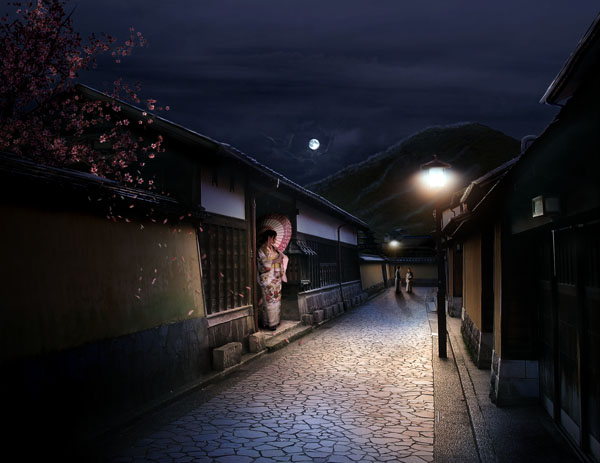
We often talk about what an incredible tool Photoshop is to create imaginary scenes from stock photography. In today’s tutorial, we will create a sleepy Japanese village in Photoshop by combining several stock photos. Let’s get started!
Tutorial Assets
The following resources were used during the production of this tutorial. To save time, give them a download before you begin.
- Kanazawa Samurai Houses
- Cherry Blossom Tree 2
- Japan Vacation XXI
- Moons Stars Sparkles Brushes
- Hanami 20
- Moss Texture
- Matte Painting Brushes
- Sky Stock 131
- Sky 8
- Sky Stock 104
Step 1
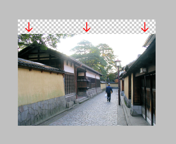
Start by opening the Kanazawa Samurai Houses in Photoshop. Double-click on the Background layer to unlock it and name it "Plate." Then move it down a little.
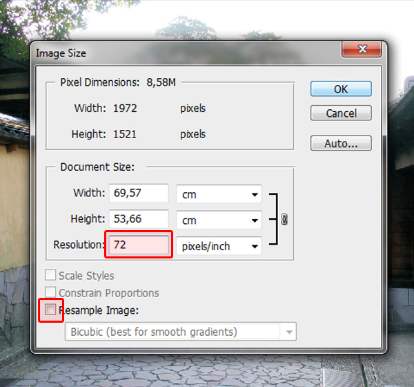
Since this image will only be used on the web, I suggest you set the screen resolution to 72 dpi. You can do this by going to Image > Image Size (Cmd/Cmd/Ctrl + Alt + I) and entering 72 in the Resolution field. Make sure the Resample Image case is not checked in order to preserve the picture’s quality. It is also a good idea to make sure the picture’s color mode is in RGB. In our case, it already is. I also suggest you save your file after every step.
Step 2
Now, using the Lasso Tool (L) along with the Polygonal Lasso Tool, trace the contour of the house’s and the alley wall’s roofs, keeping the two street lamps as well. For the parts that are hidden by the trees, use your imagination and try figure out how the roof would go. Don’t be afraid to really zoom-in in order to get the most precise mask.
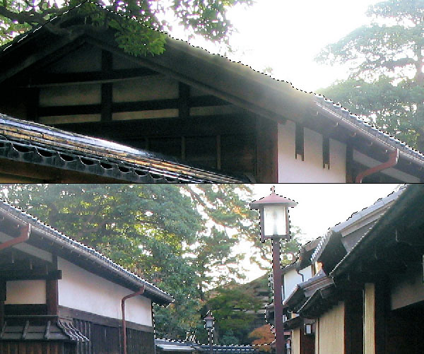
Once your selection is done, invert it (Shift + Cmd/Ctrl + I or Select > Inverse) and with your "Plate" layer selected, click the Add Layer Mask button.
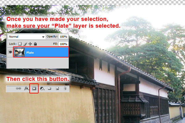
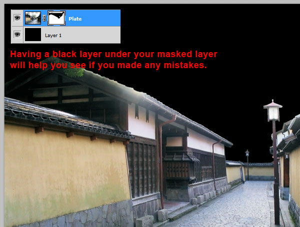
Now you can go into your layer mask and with a hard-edged black Brush, correct the places you feel don’t look right. Since the area we are masking is rather bright, placing a black filled layer under your "Plate" layer will help you see parts you might have missed. Don’t overdo it though, since most of the roof’s contour will be redrawn later on.
Step 3
Duplicate your "Plate" layer and name it "Plate Backup." Place it under your "Plate" layer and hide it. This is done in case something goes wrong when playing with your "Plate" layer.
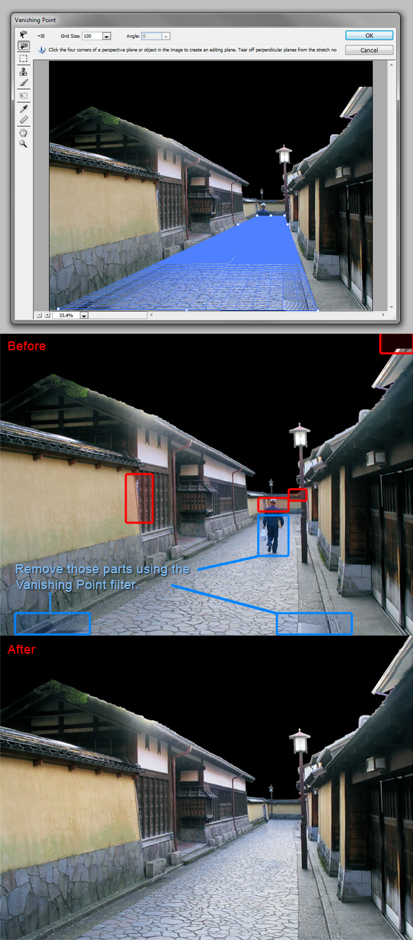
Open up the Vanishing Point filter (Alt + Cmd/Ctrl + V or Filter > Vanishing Point). Using the Create Plane Tool (C), create a basic four-point grid following the street’s perspective. Then with the Stamp Tool (S), start removing the bottom part of the man and the sewer grates. The Stamp Tool work just like the Clone Stamp, except it will follow the perspective you just created. In our case, we use it to keep the street perspective.
Once this is done, close the window and use the Clone Stamp to remove the upper part of the man. I also removed the small annoying blue shape between the left wall and the left house, the tree’s leaves covering the far away wall, and I completed the right house’s roof following its perspective. Those are all small details that are needed to fix in order to get a professional result.
Step 4
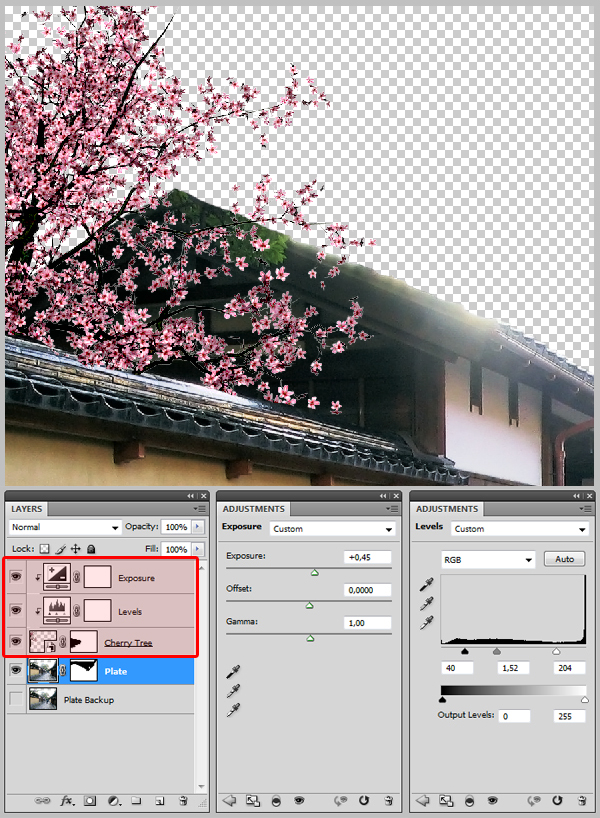
At this point, I removed the black background layer, which was not needed anymore. Download the "Cherry Blossom Tree 2" and place it to the left of your canvas. Name it "Cherry Tree." Add a mask to it, and with a hard edged black Brush (B), paint out the bottom so the tree looks like it is behind the wall. Then create an Exposure layer and a Levels layer, input the values indicated below and clip them to the "Cherry Tree" layer by holding ALT and clicking between the two layers.
Step 5
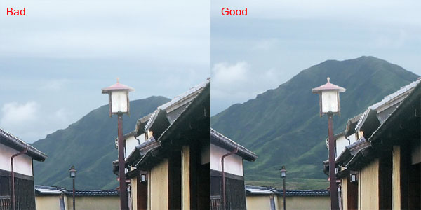
Download the "Japan Vacation XXI" and place it on your canvas, under the "Plate" layer. The basics rules of composition tells us that the majors visual lines created in an image should not cross each others. Therefore, make sure the mountain’s shape is not in conflict with the street lamp’s shape. If you are interested to learn the rules of composition, there is a really interesting article you can find here about it.
Step 6: Turning day into night
As we work, our file will be getting more complex. That is why we need to organize our layers. Create a new folder, name it "Background" and place the "Mountain" layer inside. Create another one, name it "Midground" and place the "Plate" and "Cherry Tree" layers inside along with the adjustment layers. Then create another one on the top of all, and name it "Night Adjustment." In this step we will be working in this folder.
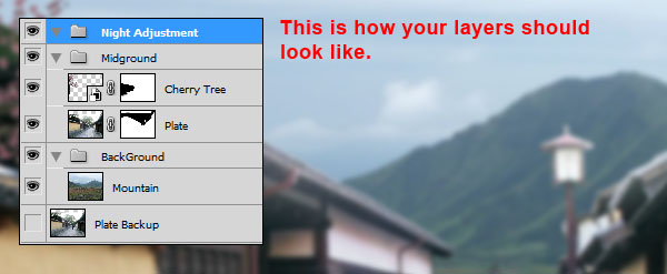
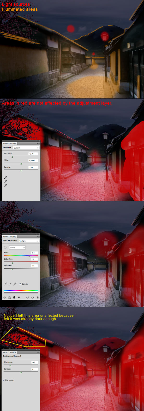
At this point, it was really a trial and error process. I can’t stress enough how important it is to know where your light will be coming from. In our case, it comes from the moon and the two lamps, so we know that the roofs will be illuminated along with the mountain, and the area near the lamps.
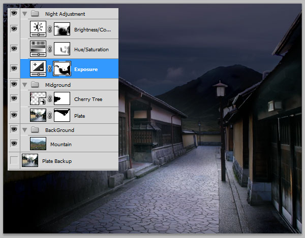
I first created an Exposure layer, lowered the exposition and painted in black, inside of the layer’s mask, the area I didn’t want to be affected by it. Then I made a Hue and Saturation layer, checked the case Colorize, give it a bluish tone and dropped the lightness. And finally, added a Brightness/Contrast layer, and dropped the brightness. I suggest you try do this part by yourself and try to find your own way of adjusting the light. As I said, this is really a trial and error process and there is no wrong way to do it.
In the end, you should have this result.
Step 7
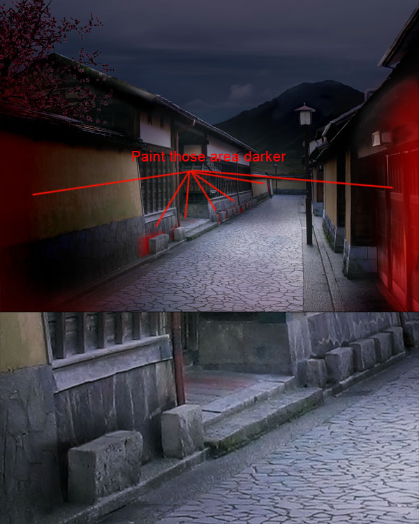
Still in the "Night Adjustment" folder, create a layer and name it "Shadows." Now with a small soft-edged black Brush (B), zoom-in and paint shadow behind the blocks on the left of the alley. Then with a larger Brush (B), darken the foreground elements, in order to create a "vignette" effect. This will also help the viewer focus on the center part of our image.
Step 8
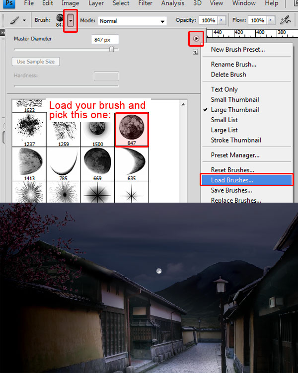
Download the "Moon Stars Sparkles" brushes set, and load them. Then take the second Brush in the set, which should be a full moon, give it a diameter of 36 pixels and a white color, and paint it on a new layer. Name the layer "Moon" and make sure you place it in your "Night Adjustment" folder.
Step 9
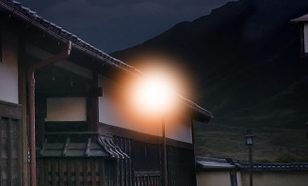
Now, still inside your "Night Adjustment" folder, create a new folder and name it "Nearest Light." Create a new layer inside, then, with a soft 190 px Brush (B), choose a near-red orange color (FF911A in my case), and click tree consecutive times on your canvas. Then reduce the size of your Brush to around 140 px, and with the white color selected, click two time in the center of the orange circle you just created. This is what you should get.
Give this layer a Screen Blending Mode, with about 70% opacity. Duplicate it, increase its size to 150% (Cmd/Ctrl + T to open the Transform tool, then, by holding Shift and Alt, you can increase its size proportionally, while keeping an eye on the % in the options window), and set this layer to 25% opacity, making sure it is also in the Screen Blending Mode. Then duplicate this layer, increase its size by 150%, and this time set the new on to 15% opacity. Give them a name, like "Light1", "Light2", "Light3", then move the group over the closest alley lamp. This is what you should get.
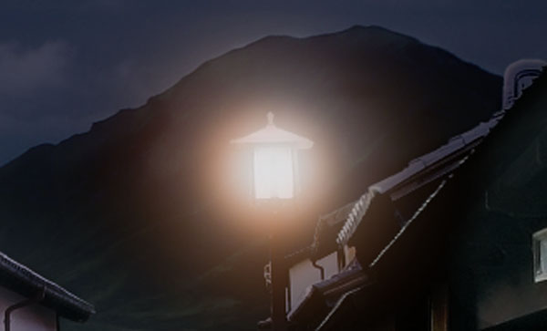

Now give the "Closest Light" folder a mask, and paint out the top with a black soft Brush (B) so the lamp is only illuminating downward.
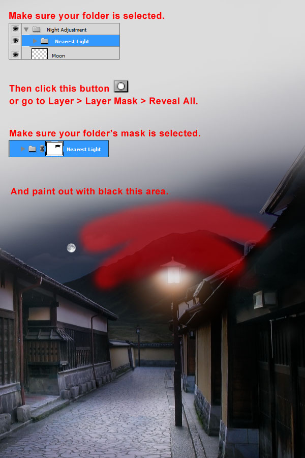
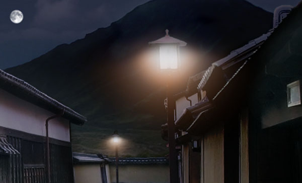
Duplicate the folder, place the new one over the farther lamp, scale it down to about 40%, and name the new one "Far Light." Using the same method as I just explained, make it just a little bit brighter. This should be your final result.
Step 10
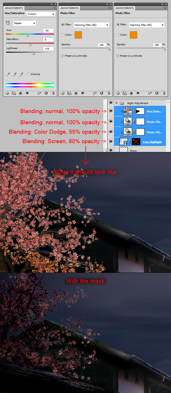
Now that we have made our three light sources, it is time to make these lights affect their nearby elements. Duplicate your "Cherry Tree" layer, place at the top inside of your "Night Adjustment" layer and name it "Tree Highlights." Create a Photo Filter layer, and choose the Warming Filter (85) and set it at 100% and clip it to your layer. Duplicate the Photo Filter layer and set it to Color Dodge, 55% opacity, and place it under the previous Photo Filter layer. Create a Hue and Saturation layer, set the Hue to -10 and the lightness to +15, and place it on the top all. Set your "Tree Highlight" layer to Screen and 80% opacity. Finally, fill your "Tree Highlight" layer’s mask with black, and with small white soft Brush (B), paint the area of the tree that you think would be illuminated by the lights sources we have spoken of previously. Once again, don’t be afraid to zoom in and take your time in order to get a well done effect.
Step 11
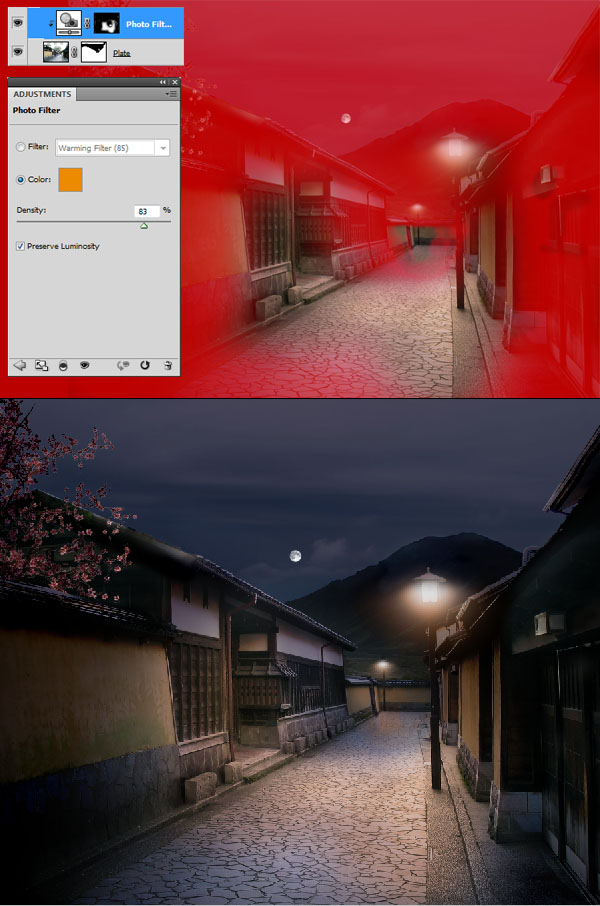
Let’s go back to our "Plate" layer located in the "Midground" folder. Create a Photo Filter adjustment layer, keeping the Warming Filter (85), at about 85% density, check Preserve Luminosity, and clip it to your "Plate" layer. Now, the photo filter is a wonderful tool for giving your artwork an ambient color in a photorealistic way. If you check the Preserve Luminosity, Photoshop will calculate how a given color will bounce against the colors behind. It usually takes years for a traditional artist to master how to use lights and colors. The beauty of today’s tools is that by using them correctly, you can make them calculate the whole thing. This is also why we are actually adjusting our "Plate" layer under all our "Night Adjustment" layers, that way we let Photoshop calculate how the illuminated floor would show up in a dark ambiance. This way we get a much more realistic result that if we had just tried to paint orange light on top of all layers.
Add a mask to the Photo Filter layer, fill it with black, and with a white soft Brush (B), and paint the area on the ground and the wall that would be affected by the lamp’s light. You should get this result.
Step 12
Now the image isn’t bad, but it lacks something important, a center of interest. Giving your artwork a center of interest is a must in order to make it interesting and give it purpose. Man-made structures, animals or human figures are good point of interest because it is where the human eye tends focus the most. If set correctly, your point of interest will give your piece depth, personality and mood. That said, download the Hanami 20 picture and open it in Photoshop. Use your favourite tools to extract the girl from the background, and paste it in your working file. Name the layer "Woman", and place it in a folder with the same name. In order to have the most control when color correcting this layer, make sure it is on the top, over the "Night Adjustment" folder.
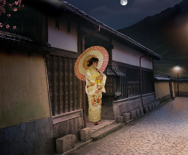
Step 13
As you can see, there is a strong dominant yellowish color in this picture, so we will need to correct that. Also the highlights and the shadows need to be adjusted to fit with the ambient light we just set up. I used seven masked adjustment layers in order to correct it, so rather than write them up, I thought you would prefer to refer to the picture.

Step 14
Give either the "Woman" layer or folder a mask, and paint out with black the left area so the woman look like she’s inside the doorway. Also, create a layer under the "Woman" layer, name it "Shadow" and paint the woman’s shadow with a black soft Brush (B).
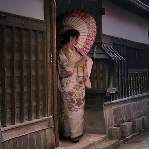
Step 15
The scene isn’t bad, but it looks a little flat. Let’s give it a bit more of contrast by creating a Curves layer on the top of everything, with the following settings.
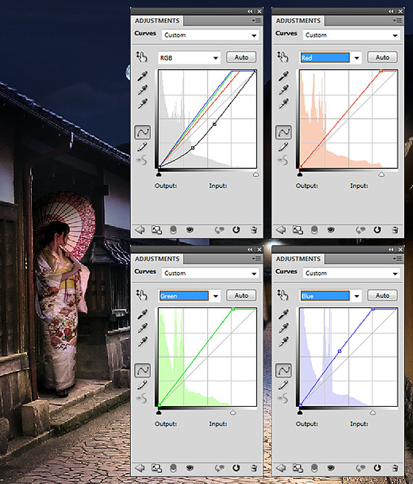
Step 16
From here on, you could probably call this image finished. But there are little things we can fix to make it better. As we can see, we have lost most of our mountain’s texture when we darkened our scene. So get the Moss texture from CGtextures and place it onto your canvas. Duplicate it three times and tile the four layers as shown in the picture. Merge them together and name the resulting layer "Mountain Texture."
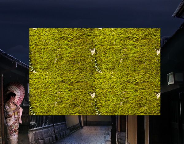
Find your "Plate" layer, holding Cmd/Ctrl, click on its mask in order to make a selection from it, invert the selection (Shift + Cmd/Ctrl + I or Select > Inverse) and with your "Texture" layer selected, click the Add Layer mask button.
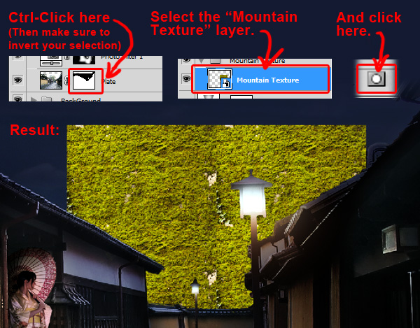
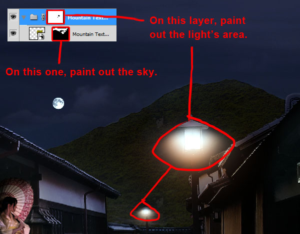
With a hard black Brush (B), paint your layer mask so you remove the texture from the sky. Then set the layer’s opacity to 10% and the Blending Mode to Difference. Create a folder, name it "Mountain Texture", and place your layer inside. Create a mask, and with a black soft Brush (B), paint out the light’s area so the texture doesn’t interfere with the light. Giving a layer multiple levels of mask using folders will allows you to manage all of them individually without affecting the other masks. For this example, we can paint in the light’s area without affecting the mask that is protecting our "Plate" layer and the sky.
The texture is a bit flat, so we will give it perspective. Unlock your "Mountain Texture" mask and go to Edit > Transform > Distort or press Cmd/Ctrl + T, then right click on your canvas, and click Distort. Move the side anchors to give your texture perspective. Unlocking a layer’s mask allow you to freely transform your layer without affecting the shape of the layer’s mask.
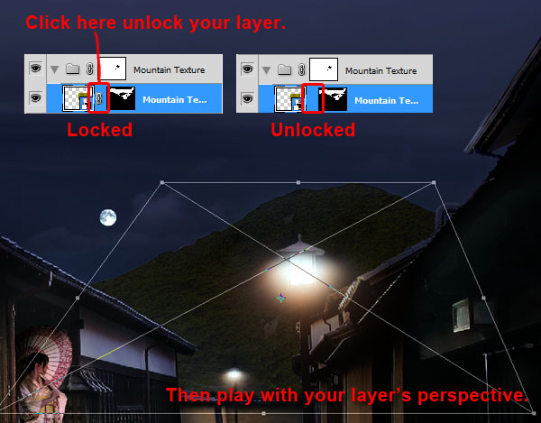
At this point I reduced the "Mountain Texture" layer’s opacity to 5% because I thought it was too apparent. Here is the final result.

Step 17
Now download the Mordecai Brushes and load them like we did for the moon in step 6. Now pick one of the Tree brushes and apply the settings below.
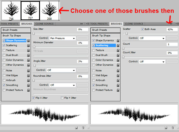
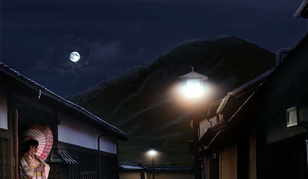
Pick up some blue shades from the sky (holding Alt when using the Brush Tool will give you the Eyedropper Tool). Create a new layer, name it "Mountain Highlight", and paint small highlighted trees on the mountain. You can choose to put the layer outside of the "Mountain Texture" folder so it doesn’t get affected by the folder’s mask.
Step 18
We also want the moon’s light to bounce off the clouds. We will use cloud pictures to do this in order to get a photo-realistic effect. Since the moon’s light hits the clouds from the back, we will need to find some backlit clouds. Hatestock from DeviantArt has a really nice gallery of these. Download Sky Stock 131 to start with, place it on your canvas, mask it, and remove the unwanted part using a scattered Brush. Then shrink it and make it at about 10% opacity.
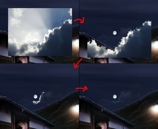
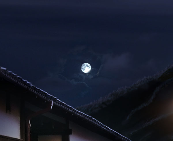
Repeat with different photos until you get a satisfying result. You can use as many clouds as you want. Feel free to zoom in and paint details. Once you are done, merge everything into a layer, name it "Clouds Highlights" and set the layer to Luminosity.
Step 19
Now our sky is somewhat boring. We will fix that. Hide all of your layers except the "Background" folder by holding Alt and clicking on the eye next to the "Background" folder. Download "Sky 8" (http http://night-fate-stock.deviantart.com/art/sky-8-98984395?q=) and place it on your canvas. Scale it up to about 105%. Make sure the layer is inside the "Background" folder, over your "Mountain" layer, and name it "Clouds 1." Then create a folder for it (Cmd/Ctrl + G with your layer selected) and name it "Skies."
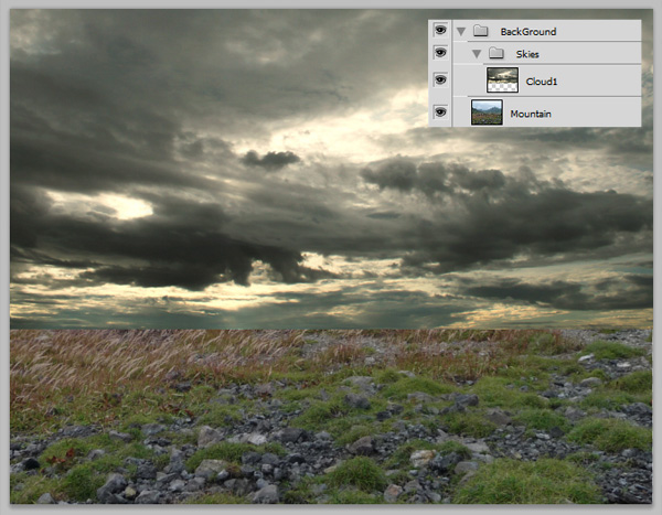
We will apply a mask to the folder so our new sky doesn’t affect the mountain. Hide the "Cloud1" layer, and with the Magic Wand tool, or any tool you like, create a selection of the sky. Then, when having your folder "Skies" selected, apply a layer mask. Reveal your "Cloud1" layer. You should get this.
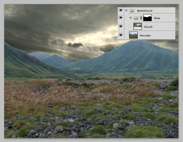
Then set the layer to Overlay and set it to 30% opacity.
Step 20
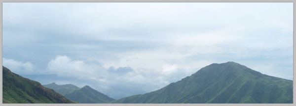
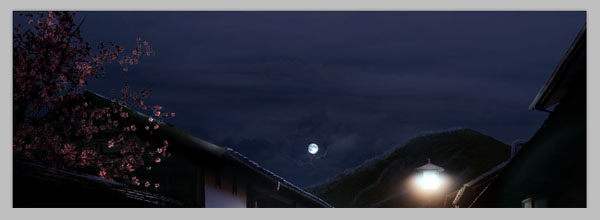
Let’s make the sky even more complex. Load the Sky stock 104 picture onto your canvas. Scale it down to about 62% so it fit your working area, and flip it horizontally (Edit > Transform > Flip Horizontal or Cmd/Ctrl + T, right click on your canvas and Flip Horizontal). Name it "Cloud2." Set the layer to Overlay with 50% opacity.
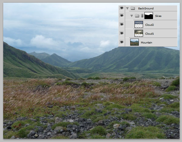
Then, reveal all of your hidden layers.
Step 21
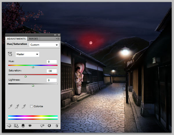
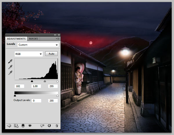
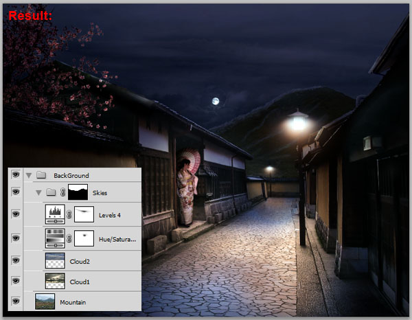
At this point, I found that the sky looked too bright and saturated for a night scene. So, still in the "Skies" folder, I applied the following filters.
Step 22
Create a new layer and place it on the top. Name it "Leaves". Then, using a small Brush (B), at 100% hardness, paint some falling leaves next to the tree. I picked the colors directly from the tree using the Eyedropper Tool (I). When Painting, I tried to follow some kind of randomness to achieve realism. I also kept in mind the direction of the ambient lights.
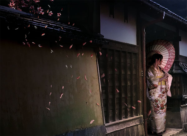
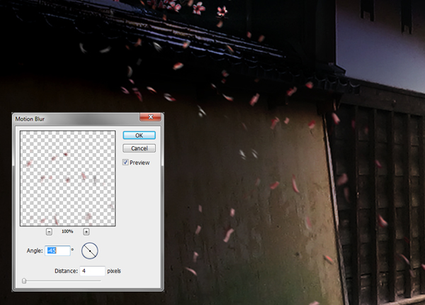
Then, duplicate the layer in case something goes wrong. Call the new one "Blurred Leaves", and hide the old one. Having the layer selected, apply a motion blur (Filter > Blur > Motion Blur) with an angle of -45° and a distance of four pixels.
Step 23
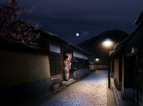
This is the last step, where we blend the whole image together, and fix everything we aren’t satisfied with. Create a new layer and name it "Final touches". Place it on the top of everything. On this layer, zoom in, and by picking the colors on your canvas, paint over everything that you feel looks wrong. Feel free to paint some more details as well like other people and background buildings. Don’t be afraid to zoom in and really take the time needed to make them as realistic as possible. Art is all about patience and perseverance. You may refer on the following pictures to get an idea of what can still be improved.
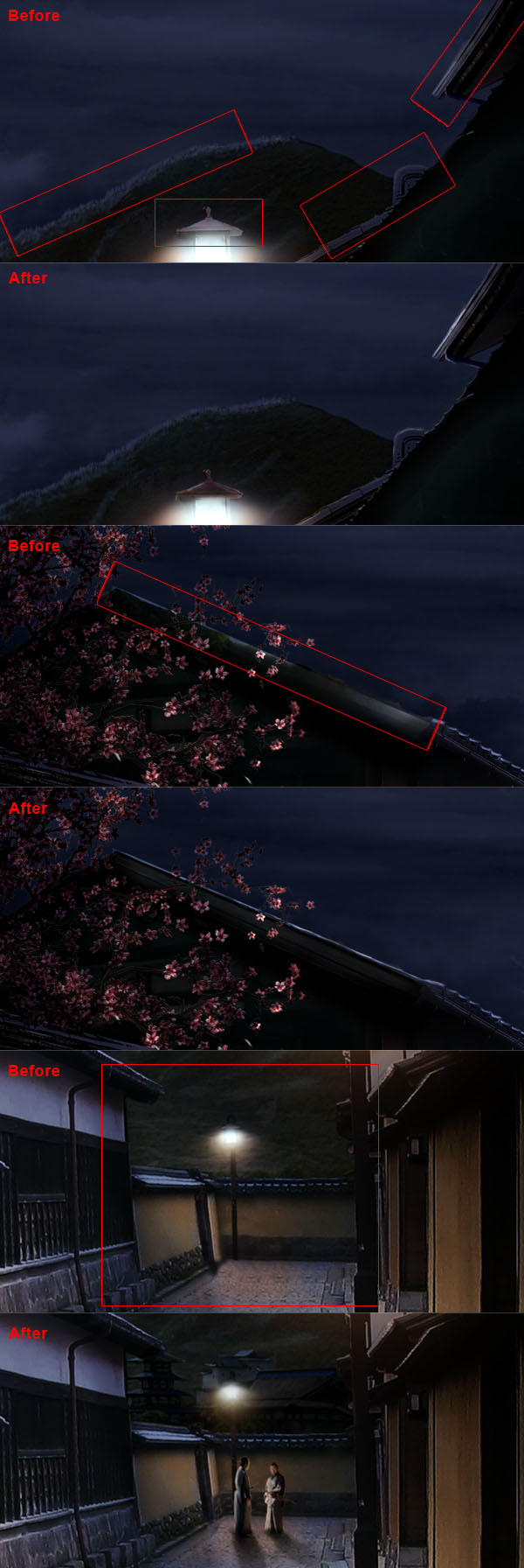
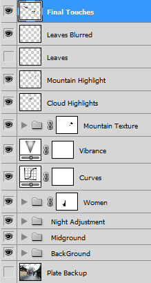
If you have missed anything, here is how your layer panel should look like in the end.
Final Image
