Welcome to a series of Quick Tip lessons in which we’ll learn about components in Flash Professional CS5. In this week’s tutorial we’ll be learning about the Button and Label components.
Brief Overview
In the SWF you see two buttons and two labels. When you click on the top button the Label will update with how many times you have clicked the button. The bottom button acts like a toggle with an on and off state. When you click the bottom button the label changes to show whether the button is on or off.
The bottom label allows different colors in the same text. This is achieved by inserting HTML in the text (which we will also cover in this tutorial).
Step 1: Setting up the Document
Open a new Flash Document and set the following properties:
- Document Size: 550x400px
- Background Color:#FFFFFF
Step 2: Add Components to the Stage
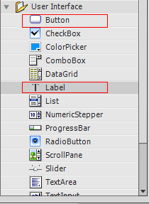
Open the components window by going to Menu > Window > Components or press CTRL+F7
Drag two buttons and two labels to the stage.
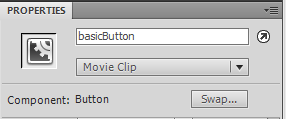
In the Properties panel give the first button the instance name “basicButton”. If the Properties panel is not showing go to Menu > Window > Components or press CTRL+F3
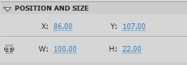
Set the button’s X to 86.00 and its Y to 107.00.
In the Properties panel give the first label the instance name “basicLabel”.
Set the label’s X to 239.00 and its Y to 107.00
In the Properties panel give the second button the instance name “toggleButton”.
Set the button’s X to 86.00 and its Y to 234.00
In the Properties panel give the second label the instance name “htmlLabel”.
Set the label’s X to 239.00 and its Y to 234.00
Step 3: Import the Classes
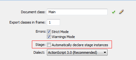
Create a new actionscript file and give it the name Main.as. We will be declaring our components in Main.as so we need to turn off “auto declare stage instances”, the benefit of doing this is that you get code hinting for the instance.
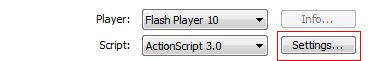
Go to Menu > File > Publish Settings. Click on settings next to Script [Actionscript 3.0]
Uncheck “Automatically declare stage instances”.
In the Main.as Open the package declaration and import the classes we will be using.
Add the following to the Main.as:
package
{
	import flash.display.MovieClip;
	import fl.controls.Button;
	import fl.controls.Label;
	//needed to automatically size the labels
	import flash.text.TextFieldAutoSize;
	import flash.events.MouseEvent;
	import flash.events.Event;
Step 4: Setup the Main Class
Add the class declaration, extend MovieClip and set up our constructor function. Add the following to Main.as:
public class Main extends MovieClip
{
	//This is our basicButton component on the stage
	public var basicButton:Button;
	//This is our toggleButton component on the stage
	public var toggleButton:Button;
	//This is our basicLabel component on the stage
	public var basicLabel:Label;
	//This is our htmlLabel component on the stage
	public var htmlLabel:Label;
	//Used to keep track of how many times the user has clicked the button
	var numClicks:Number = 0;

	public function Main()
	{
		//Used to setup the buttons and add eventListeners
		setupButtons();
		//Used to setup our labels
		setupLabels();
	}
Step 5: Main Constructor Functions
Here we’ll define the setupButton() and setupLabels() functions.
In the code below we use the htmlText property of the Label; this allows us to insert HTML into the text string. It should be noted that Flash only supports a limited set of HTML tags; check out the livedocs for a list of supported HTML tags. We’ll use the <font> tag to alter the color of the text.
Add the following to the Main.as
public function setupButtons():void
{
	//sets up the label on the button
	basicButton.label = "Click Me";
	basicButton.addEventListener(MouseEvent.CLICK,basicButtonClick);

	toggleButton.label = "On";
	//We use selected here to put the button in it's "On" state
	toggleButton.selected = true;
	//Used to toggle the button..each time you click the button it turns selected to true/false
	toggleButton.toggle = true;
	//The toggle property expects a change so here we use Event.CHANGE not MouseEvent.CLICK
	toggleButton.addEventListener(Event.CHANGE,toggleButtonClick);
}

private function setupLabels():void
{
	//This sets the label to where it automatically sizes to hold the text passed to it
	basicLabel.autoSize = TextFieldAutoSize.LEFT;
	//Sets the initial text of the label
	basicLabel.text = "You have clicked the button 0 times";
	htmlLabel.autoSize = TextFieldAutoSize.LEFT;
	//To be able to use flashes supported html tags we use the htmlText of the label
	htmlLabel.htmlText = "The button is <font color ='#00FF00'>On</font>";

}
Step 6: Event Listeners
Here we’ll code our Event Listeners we added to the Buttons. Add the following to the Main.as:
private function basicButtonClick(e:Event):void
{
   //Increments the number of times the user has clicked the button
	numClicks++;
  //Here we cast numClicks to a string since text expects a string
	basicLabel.text = "You have clicked the button " + String(numClicks) + " times";
}

private function toggleButtonClick(e:Event):void
{
   //If the button is selected we set the htmlText of the label with a green "On";
   //And change the buttons label to "ON";
   //Preferably you'd do something useful here like show a movie clip
	if(e.target.selected==true){
		htmlLabel.htmlText = "The button is <font color ='#00FF00'>On</font>";
		e.target.label = "ON";
		//Do something useful
	}
	else
	{
	   //If the button is not selected we set the htmlText of the Label with a red Off
	   //And change the buttons Label to "OFF";
	   //Preferably you'd do something useful here like hide a movie clip
		htmlLabel.htmlText = "The button is <font color ='#FF0000'>Off</font>";
		e.target.label="OFF";
		//Do something useful
	}
}
Then, close out the class and package declarations with two closing curly braces.
Conclusion
Using Button and Label components is a simple and fast way to have fully functional buttons and labels without having to build them yourself.
You’ll notice in the Component Parameters panel of the components that you can check and select certain properties.
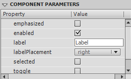
Button component properties.
Properties for the Button Component
emphasized: a Boolean value that indicates whether a border is drawn around the Button component when the button is in its up stateenabled: a Boolean value that indicates whether the component can accept user inputlabel: the text label for the componentlabelPlacement: position of the label in relation to a specified iconselected: a Boolean value that indicates whether a toggle button is toggled in the on or off positiontoggle: a Boolean value that indicates whether a button can be toggledvisible: a Boolean value that indicates whether the component instance is visible
Properties for the Label Component
autoSize: indicates how a label is sized and aligned to fit the value of its text propertycondenseWhite: a Boolean value that indicates whether extra white space such as spaces and line breaks should be removed from a Label component that contains HTML textenabled: a Boolean value that indicates whether the component can accept user inputhtmlText: the text to be displayed by the Label component, including HTML markup that expresses the styles of that textselectable: a Boolean value that indicates whether the text can be selectedtext: the plain text to be displayed by the Label component.visible: a Boolean value that indicates whether the component instance is visiblewordWrap: a Boolean value that indicates whether the Label supports word wrapping
The help files are a great place to learn more about the component properties you can set in the Component Parameters panel. Here are the livedocs pages for the Button and for the Label.
Thanks for reading and watch out for more upcoming component Quick Tips!