Instagram made headlines (including this one) when product head Adam Mosseri said in June that the app is “no longer just a square photo-sharing app,” since it’s pivoting its focus to shopping and video. But where does that leave photographers who want a social photo-sharing experience?
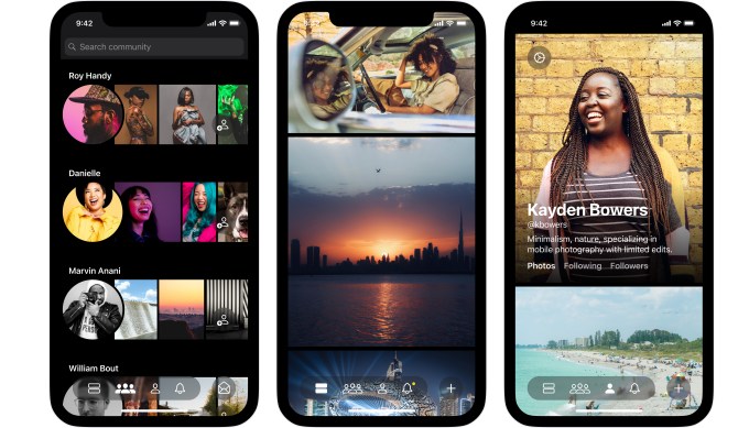
According to Tom Watson, a former product designer at Facebook and Pinterest, photographers have lacked a social network for a while. That’s why, with co-founder Stefan Borsje, Watson built Glass, a subscription-based iOS app designed to be a home for photographers.
“I’ve always loved photography, and when Flickr got bought by Yahoo, it was a sad moment for me. I love that kind of nerdy photography community,” Watson told TechCrunch. “Then you started to see it pick up with Instagram to take the torch into the mobile space. But I was at Facebook when Facebook purchased Instagram, and you could kind of see that it would inevitably be where it is today.”
For those of us accustomed to free, ad-supported social media, it might feel unfamiliar to pay a monthly fee for an app. Glass costs $4.99 a month (or $29.99 a year) to use, but you can try it without charge for 14 days. Still, the app takes your App Store payment info right away, so it could be a barrier to entry for people who worry they won’t remember to delete Glass before the trial period ends, should they not want to continue with it. But this model is intentional. Watson and Borsje are specifically trying to build their app — which only has five team members — without any venture funding or ad revenue. They only want to have to answer to their community of photographers.
“I wanted to do something different and start with a social subscription model and to bootstrap without venture capital,” said Watson. “We’ve seen in the past what happens when you take on venture capital and go for the moon. You keep pivoting away from your photographer community in order to become more broad.”

Image Credits: Glass
From the moment you open the Glass app, it’s clear that the emphasis is on the photography itself. When you follow photographers, their posts will appear in a feed of images designed to minimize distractions. The photos take up the entire screen, and you can only see who posted them if you drag them to the right. When you click on an image, you can see its caption and other information about how the photograph was shot. You can engage socially through comments, but there aren’t likes on photos — this is an intentional design choice, though Watson says some users are asking for a like button, even if it just helps them bookmark images for later browsing. In the coming weeks, Glass will launch discovery features, like categories for photographs. Glass also has a feedback board, which allows users to request features and upvote or downvote other users’ ideas. If Glass chooses to develop a suggestion, it is noted as “in progress” on the board.
Though it’s only in its beginning stages, Glass already sets itself apart from Instagram or VSCO by offering EXIF data, which is like candy for the “photography nerds” that Glass hopes to attract. EXIF data shows what camera a photographer used, as well as the photo’s ISO, aperture, shutter speed, and focal length. This data and sense of community was what drew people to Flickr in its early days, but when Yahoo gave free users up to one terrabyte of data, it became more of a personal archive than a community. Then, when SmugMug bought Flickr from Yahoo in 2018, it tried to backpedal by only allowing free users to have 1000 photos, warning that they could delete free users’ photos if they didn’t upgrade to a paid plan.
Glass also appeals to photographers by allowing for a wider variety of image sizes on the app — the maximum aspect ratio is 16 x 9, which accommodates the size of standard camera photos. But on Instagram, even after the platform moved away from its square image motif, it’s not possible to post vertical photographs from most cameras without cropping them. Like VSCO, Glass doesn’t show how many followers each user has, though you can see comments. While you can’t see how many followers someone else has, you can see who is following your own account.
“We thought that was important for safety. If someone follows you, you need to know who that is, and to be able to block them,” Watson said. “We really wanted to build blocking and reporting features from day one.”
Watson declined to share how many users have downloaded the app so far, but Watson said he’s “extremely happy with the response” to Glass. It launched with a waitlist in August, and Wednesday the app opened up to all iOS users. The goal of the waitlist wasn’t to generate hype, but rather, to make sure that the user experience remained smooth, and that the app wouldn’t get overloaded. At the time of the app’s waitlist launch in August, Watson told TechCrunch that Glass was sending hundreds of invites out every day.
“I’ve been on the internet a long time, and I used to feel like there was a cozier, safer space,” Watson said. “I hope that by having this subscription model, these spaces can feel that way a little bit more again.”