Nestled among the many indistinguishable buildings of Microsoft’s Redmond campus, a multi-disciplinary team sharing an attention to detail that borders on fanatical is designing a keyboard… again and again and again. And one more time for good measure. Their dogged and ever-evolving dedication to “human factors” shows the amount of work that goes into making any piece of hardware truly ergonomic.
Microsoft may be known primarily for its software and services, but cast your mind back a bit and you’ll find a series of hardware advances that have redefined their respective categories.
The original Natural Keyboard was the first split-key, ergonomic keyboard, the fundamentals of which have only ever been slightly improved upon.
The Intellimouse Optical not only made the first truly popular leap away from ball-based mice, but did so in such a way that its shape and buttons still make its descendants among the best all-purpose mice on the market.
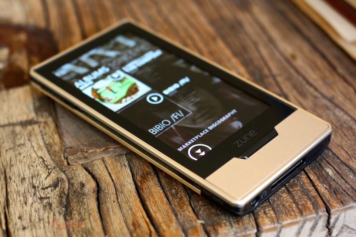
Remember me?
Although the Zune is remembered more for being a colossal boondoggle than a great music player, it was very much the latter, and I still use and marvel at the usability of my Zune HD. Yes, seriously. (Microsoft, open source the software!)
More recently, the Surface series of convertible notebooks have made bold and welcome changes to a form factor that had stagnated in the wake of Apple’s influential mid-2000s MacBook Pro designs.
Microsoft is still making hardware, of course, and in fact it has doubled down on its ability to do so with a revamped hardware lab filled with dedicated, extremely detail-oriented people who are given the tools they need to get as weird as they want — as long as it makes something better.
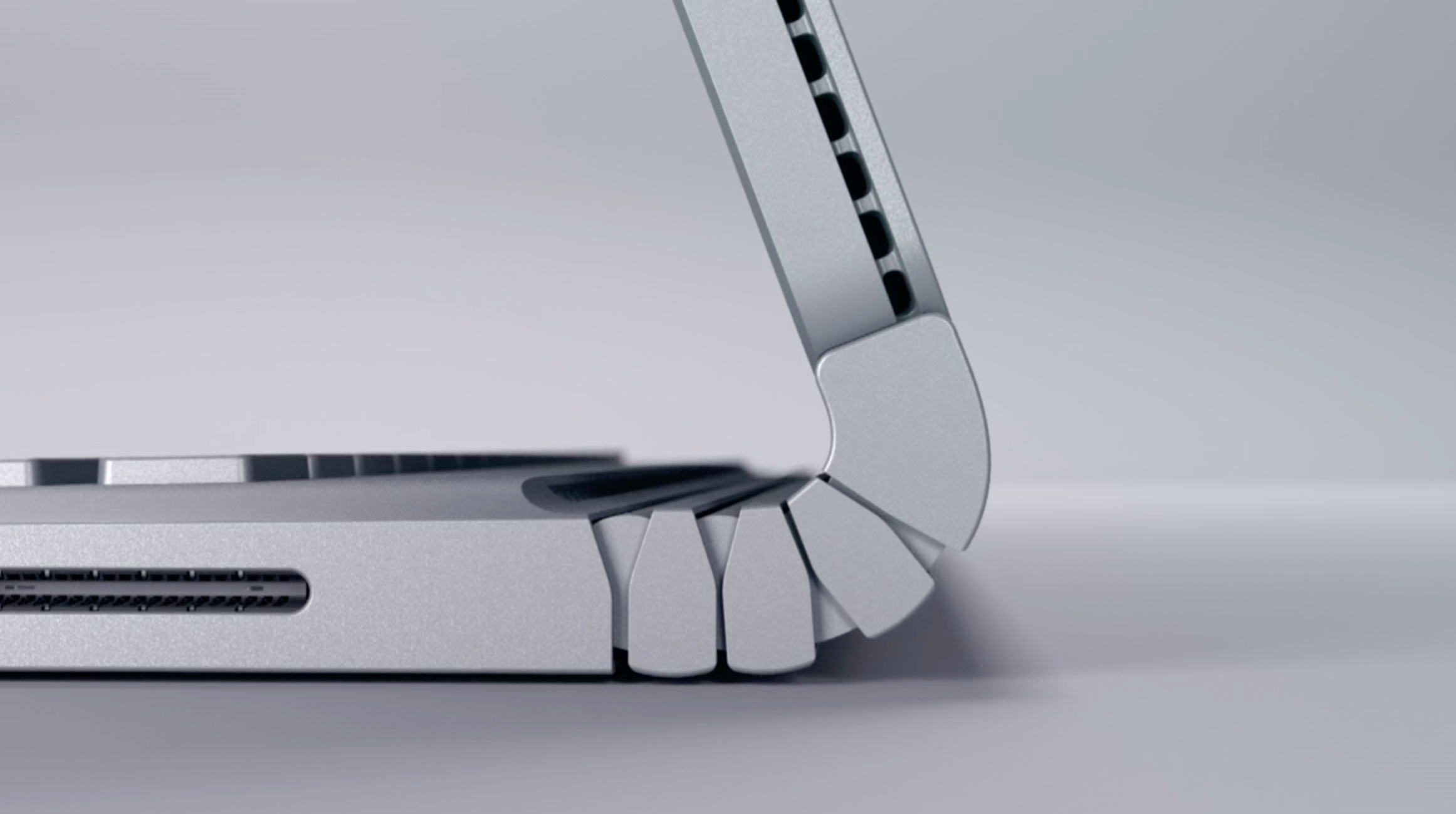
You don’t get something like this by aping the competition.
First, a disclosure: I may as well say at the outset that this piece was done essentially at the invitation (but not direction) of Microsoft, which offered the opportunity to visit their hardware labs in Building 87 and meet the team. I’d actually been there before a few times, but it had always been off-record and rather sanitized.
Knowing how interesting I’d found the place before, I decided I wanted to take part and share it at the risk of seeming promotional. They call this sort of thing “access journalism,” but the second part is kind of a stretch. I really just think this stuff is really cool, and companies seldom expose their design processes in the open like this. Microsoft obviously isn’t the only company to have hardware labs and facilities like this, but they’ve been in the game for a long time and have an interesting and almost too detailed process they’ve decided to be open about.
Although I spoke with perhaps a dozen Microsoft Devices people during the tour (which was still rigidly structured), only two were permitted to be on record: Edie Adams, chief ergonomist, and Yi-Min Huang, principal design and experience lead. But the other folks in the labs were very obliging in answering questions and happy to talk about their work. I was genuinely surprised and pleased to find people occupying niches so suited to their specialties and inclinations.
Generally speaking, the work I got to see fell into three general spaces: the Human Factors Lab, focused on very exacting measurements of people themselves and how they interact with a piece of hardware; the anechoic chamber, where the sound of devices is obsessively analyzed and adjusted; and the Advanced Prototype Center, where devices and materials can go from idea to reality in minutes or hours.
The science of anthropometry
 Inside the Human Factors lab, human thumbs litter the table. No, it isn’t a torture chamber — not for humans, anyway. Here the company puts its hardware to the test by measuring how human beings use it, recording not just simple metrics like words per minute on a keyboard, but high-speed stereo footage that analyzes how the skin of the hand stretches when it reaches for a mouse button, down to a fraction of a millimeter.
The trend here, as elsewhere in the design process and labs, is that you can’t count out anything as a factor that increases or decreases comfort; the little things really do make a difference, and sometimes the microscopic ones.
“Feats of engineering heroics are great,” said Adams, “but they have to meet a human need. We try to cover the physical, cognitive and emotional interactions with our products.”
(Perhaps you take this, as I did, as — in addition to a statement of purpose — a veiled reference to a certain other company whose keyboards have been in the news for other reasons. Of this later.)
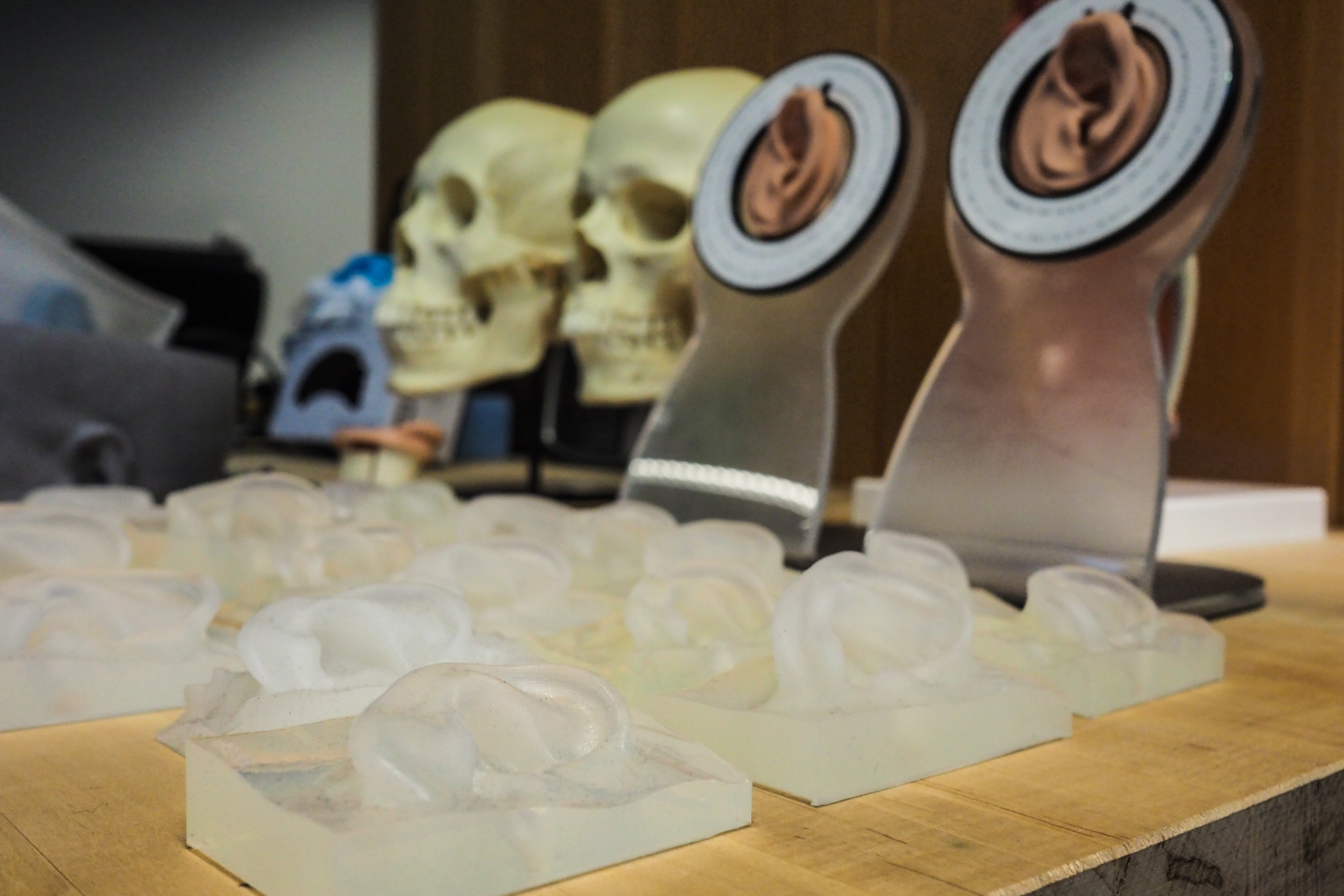
The lab is a space perhaps comparable to a medium-sized restaurant, with enough room for a dozen or so people to work in the various sub-spaces set aside for different highly specific measurements. Various models of body parts have been set out on work surfaces, I suspect for my benefit.
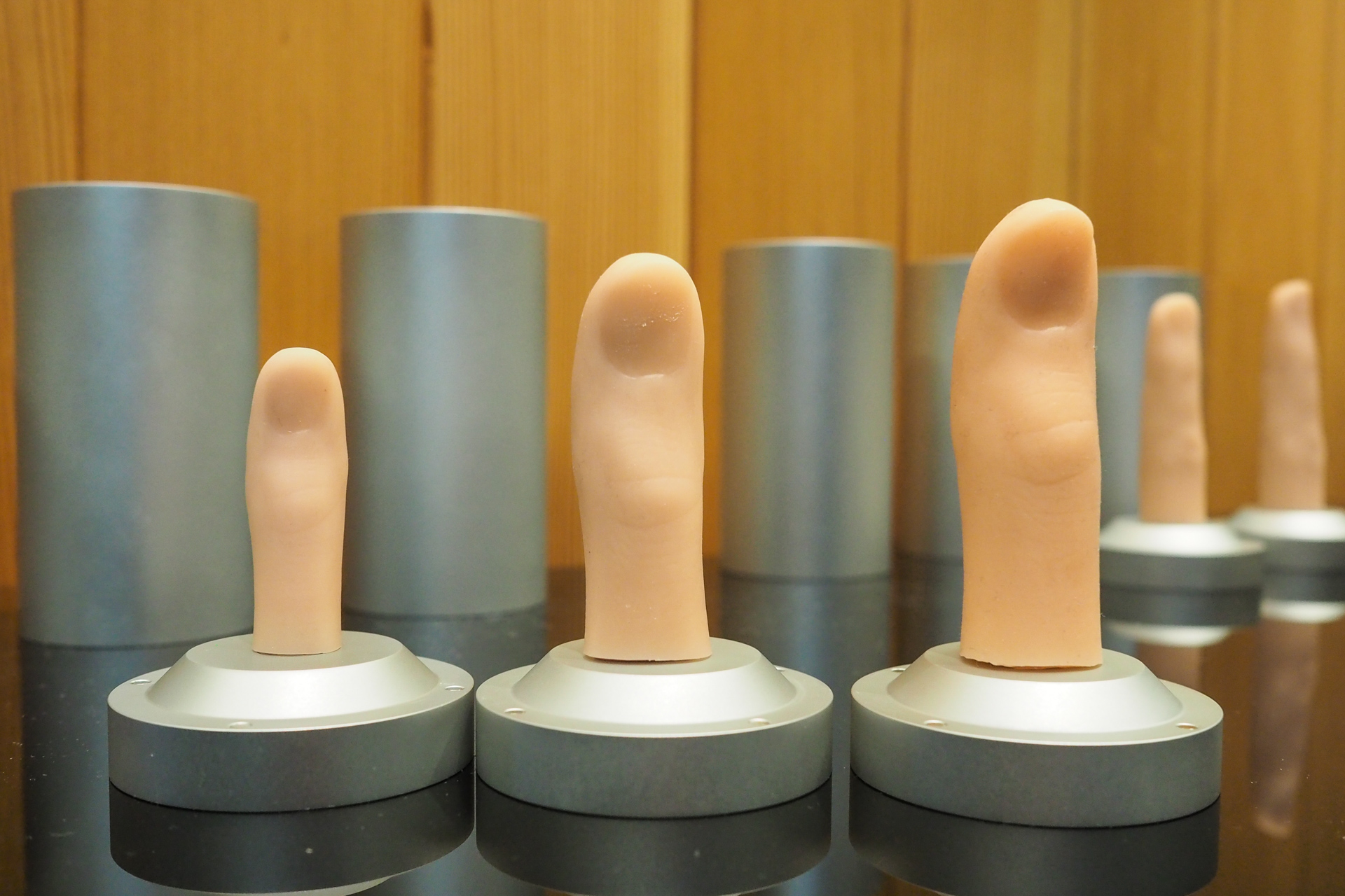 Among them are that set of thumbs, in little cases looking like oversized lipsticks, each with a disturbing surprise inside. These are all cast from real people, ranging from the small thumb of a child to a monster that, should it have started a war with mine, I would surrender unconditionally.
Next door is a collection of ears, not only rendered in extreme detail but with different materials simulating a variety of rigidities. Some people have soft ears, you know. And next door to those is a variety of noses, eyes and temples, each representing a different facial structure or interpupillary distance.
This menagerie of parts represents not just a continuum of sizes but a variety of backgrounds and ages. All of them come into play when creating and testing a new piece of hardware.
 “We want to make sure that we have a diverse population we can draw on when we develop our products,” said Adams. When you distribute globally it is embarrassing to find that some group or another, with wider-set eyes or smaller hands, finds your product difficult to use. Inclusivity is a many-faceted gem; indeed, it has as many facets as you are willing to cut. (The Xbox Adaptive Controller, for instance, is a new and welcome one.)
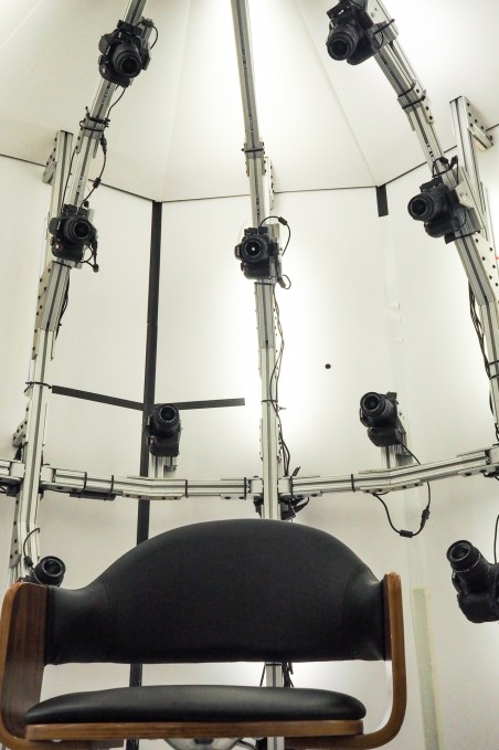
In one corner stands an enormous pod that looks like Darth Vader should emerge from it. This chamber, equipped with 36 DSLR cameras, produces an unforgivingly exact reproduction of one’s head. I didn’t do it myself, but many on the team had; in fact, one eyes-and-nose combo belonged to Adams. The fellow you see pictured below also works in the lab; that was the first such 3D portrait they took with the rig.
With this they can quickly and easily scan in dozens or hundreds of heads, collecting metrics on all manner of physiognomical features and creating an enviable database of both average and outlier heads. My head is big, if you want to know, and my hand was on the upper range too. But well within a couple standard deviations.
So much for static study — getting reads on the landscape of humanity, as it were. Anthropometry, they call it. But there are dynamic elements as well, some of which they collect in the lab, some elsewhere.
“When we’re evaluating keyboards, we have people come into the lab. We try to put them in the most neutral position possible,” explained Adams.
It should be explained that by neutral, she means specifically with regard to the neutral positions of the joints in the body, which have certain minima and maxima it is well to observe. How can you get a good read on how easy it is to type on a given keyboard if the chair and desk the tester is sitting at are uncomfortable?
Here as elsewhere the team strives to collect both objective data and subjective data; people will say they think a keyboard, or mouse, or headset is too this or too that, but not knowing the jargon they can’t get more specific. By listening to subjective evaluations and simultaneously looking at objective measurements, you can align the two and discover practical measures to take.
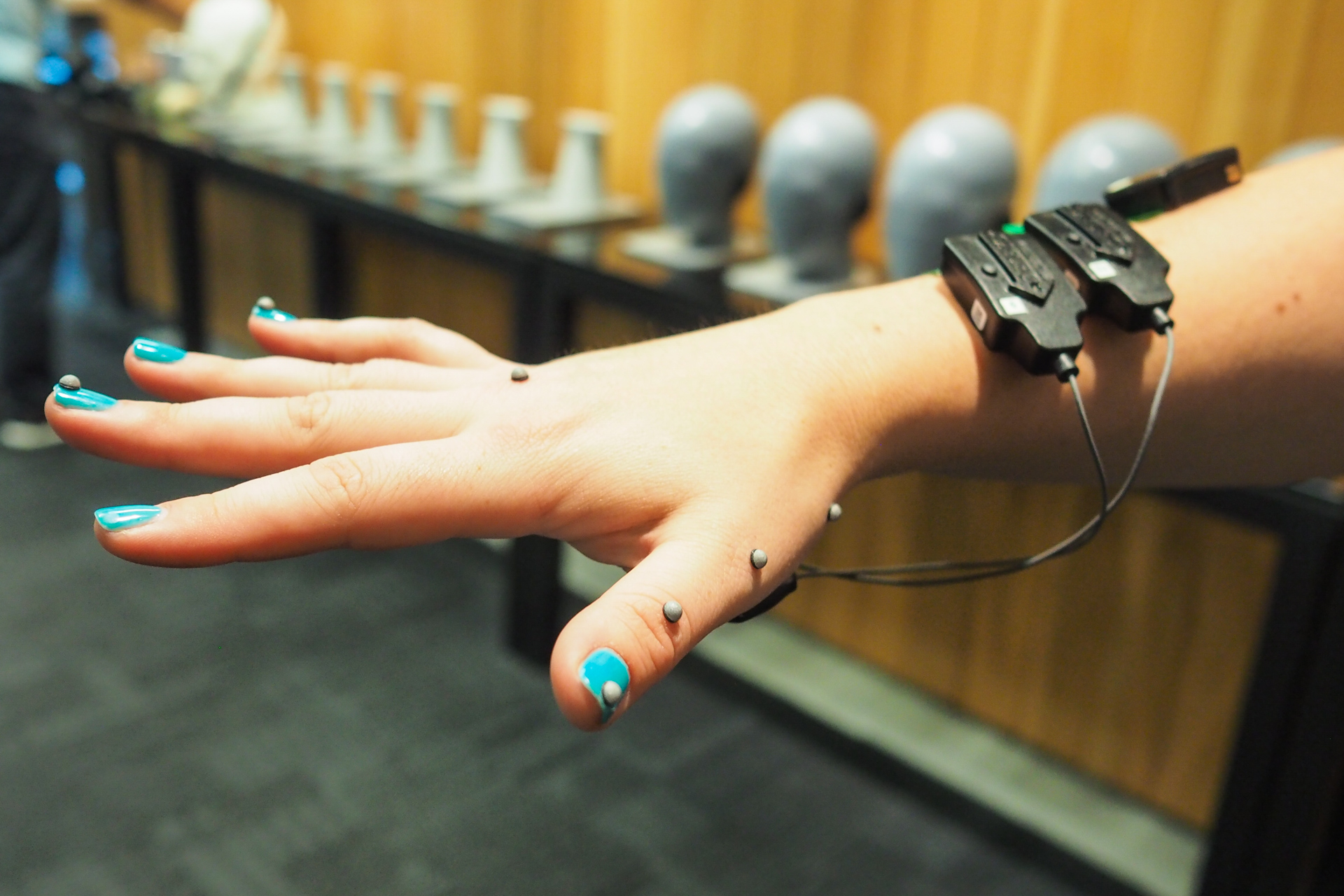 One such objective measure involved motion capture beads attached to the hand while an electromyographic bracelet tracks the activation of muscles in the arm. Imagine, if you will, a person whose typing appears normal and of uniform speed — but in reality they are putting more force on their middle fingers than the others because of the shape of the keys or rest. They might not be able to tell you they’re doing so, though it will lead to uneven hand fatigue, but this combo of tools could reveal the fact.
“We also look at a range of locations,” added Huang. “Typing on a couch is very different from typing on a desk.”
One case, such as a wireless Surface keyboard, might require more of what Huang called “lapability,” (sp?) while the other perhaps needs to accommodate a different posture and can abandon lapability altogether.
A final measurement technique that is quite new to my knowledge involves a pair of high-resolution, high-speed black and white cameras that can be focused narrowly on a region of the body. They’re on the right, below, with colors and arrows representing motion vectors.
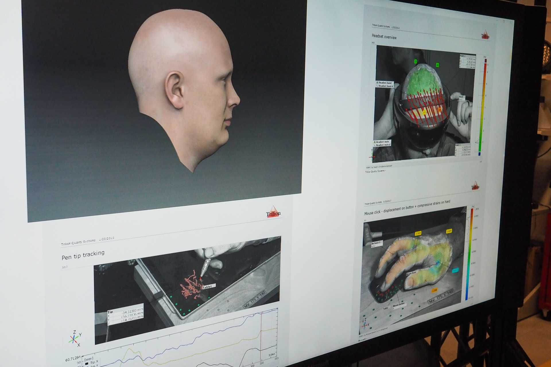
A display showing various anthropometric measurements.
These produce a very detailed depth map by closely tracking the features of the skin; one little patch might move farther than the other when a person puts on a headset, suggesting it’s stretching the skin on the temple more than it is on the forehead. The team said they can see movements as small as 10 microns, or micrometers (therefore you see that my headline was only light hyperbole).
You might be thinking that this is overkill. And in a way it most certainly is. But it is also true that by looking closer they can make the small changes that cause a keyboard to be comfortable for five hours rather than four, or to reduce error rates or wrist pain by noticeable amounts — features you can’t really even put on the box, but which make a difference in the long run. The returns may diminish, but we’re not so far along the asymptote approaching perfection that there’s no point to making further improvements.
The quietest place in the world
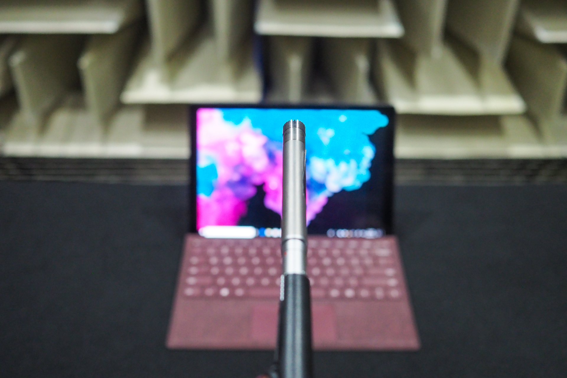 Down the hall from the Human Factors lab is the quietest place in the world. That’s not a colloquial exaggeration — the main anechoic chamber in Building 87 at Microsoft is in the record books as the quietest place on Earth, with an official ambient noise rating of negative 20.3 decibels.
You enter the room through a series of heavy doors and the quietness, though a void, feels like a physical medium that you pass into. And so it is, in fact — a near-total lack of vibrations in the air that feels as solid as the nested concrete boxes inside which the chamber rests.
I’ve been in here a couple of times before, and Hundraj Gopal, the jovial and highly expert proprietor of quietude here, skips the usual tales of Guinness coming to test it and so on. Instead we talk about the value of sound to the consumer, though they may not even realize they do value it.
Naturally if you’re going to make a keyboard, you’re going to want to control how it sounds. But this is a surprisingly complex process, especially if, like the team at Microsoft, you’re really going to town on the details.
The sounds of consumer products are very deliberately designed, they explained. The sound your car door makes when it shuts gives a sense of security — being sealed in when you’re entering, and being securely shut out when you’re leaving it. It’s the same for a laptop — you don’t want to hear a clank when you close it, or a scraping noise when you open it. These are the kinds of things that set apart “premium” devices (and cars, and controllers, and furniture, etc.) and they do not come about by accident.
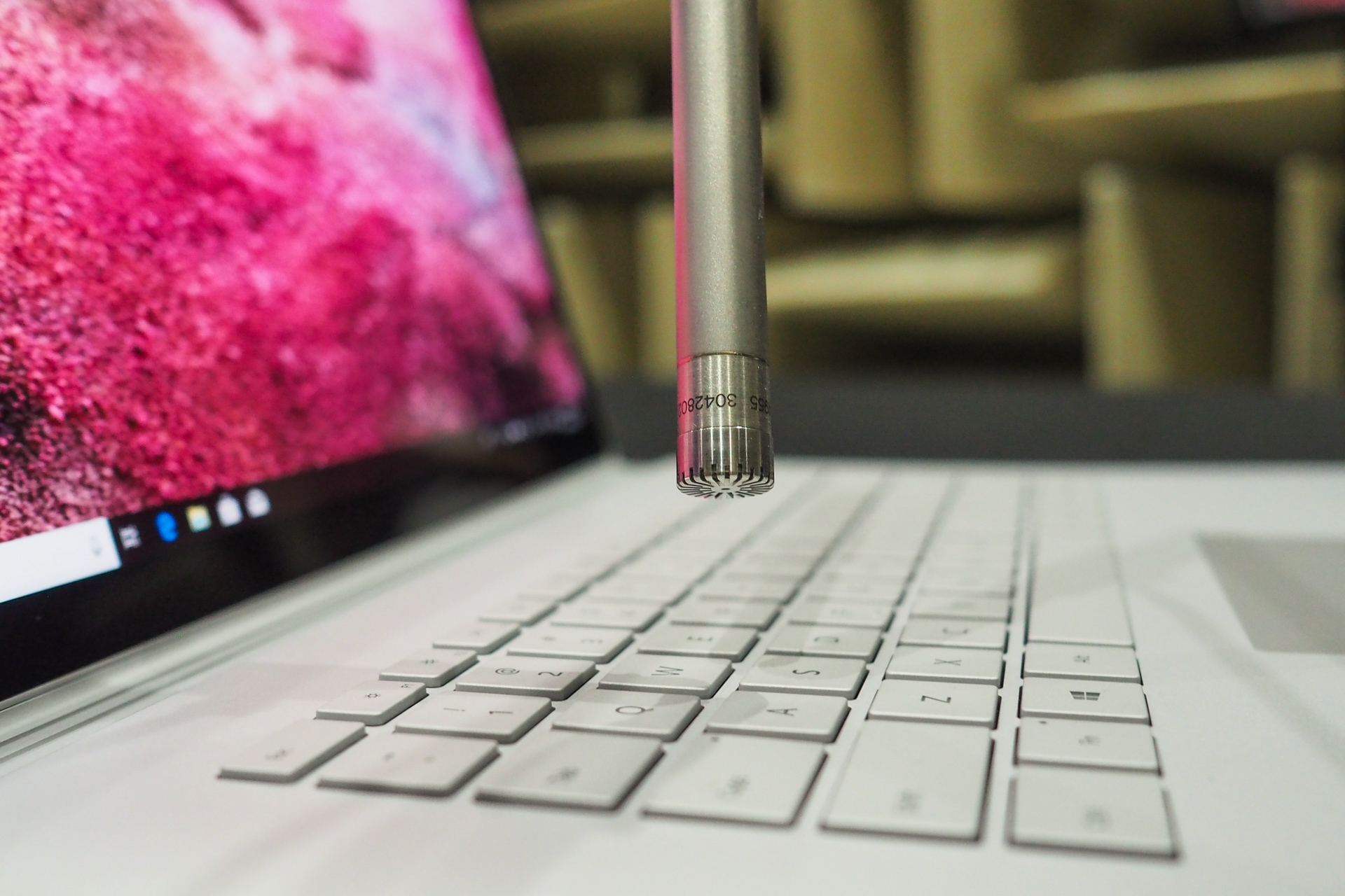 Keyboards are no exception. And part of designing the sound is understanding that there’s more to it than loudness or even tone. Some sounds just sound louder, though they may not register as high in decibels. And some sounds are just more annoying, though they might be quiet. The study and understanding of this is what’s known as psychoacoustics.
There are known patterns to pursue, certain combinations of sounds that are near-universally liked or disliked, but you can’t rely on that kind of thing when you’re, say, building a new keyboard from the ground up. And obviously when you create a new machine like the Surface and its family they need new keyboards, not something off the shelf. So this is a process that has to be done from scratch over and over.
As part of designing the keyboard — and keep in mind, this is in tandem with the human factors mentioned above and the rapid prototyping we’ll touch on below — the device has to come into the anechoic chamber and have a variety of tests performed.
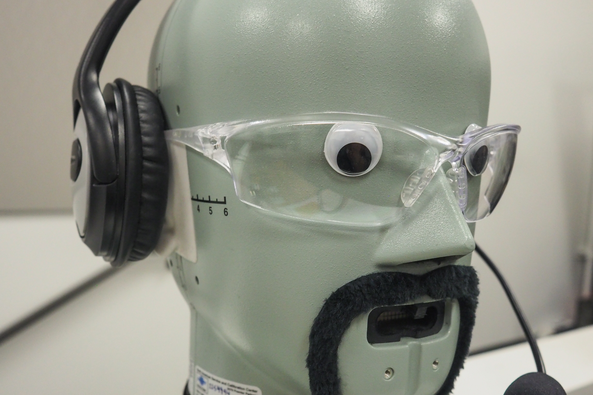
A standard head model used to simulate how humans might hear certain sounds. The team gave it a bit of a makeover.
These tests can be painstakingly objective, like a robotic arm pressing each key one by one while a high-end microphone records the sound in perfect fidelity and analysts pore over the spectrogram. But they can also be highly subjective: They bring in trained listeners — “golden ears” — to give their expert opinions, but also have the “gen pop” everyday users try the keyboards while experiencing calibrated ambient noise recorded in coffee shops and offices. One click sound may be lost in the broad-spectrum hubbub in a crowded cafe but annoying when it’s across the desk from you.
This feedback goes both directions, to human factors and prototyping, and they iterate and bring it back for more. This progresses sometimes through multiple phases of hardware, such as the keyswitch assembly alone; the keys built into their metal enclosure; the keys in the final near-shipping product before they finalize the keytop material, and so on.
Indeed, it seems like the process really could go on forever if someone didn’t stop them from refining the design further.
“It’s amazing that we ever ship a product,” quipped Adams. They can probably thank the Advanced Prototype Center for that.
Rapid turnaround is fair play
If you’re going to be obsessive about the details of the devices you’re designing, it doesn’t make a lot of sense to have to send off a CAD file to some factory somewhere, wait a few days for it to come back, then inspect for quality, send a revised file, and so on. So Microsoft (and of course other hardware makers of any size) now use rapid prototyping to turn designs around in hours rather than days or weeks.
This wasn’t always possible, even with the best equipment. 3D printing has come a long way over the last decade, and continues to advance, but not long ago there was a huge difference between a printed prototype and the hardware that a user would actually hold.
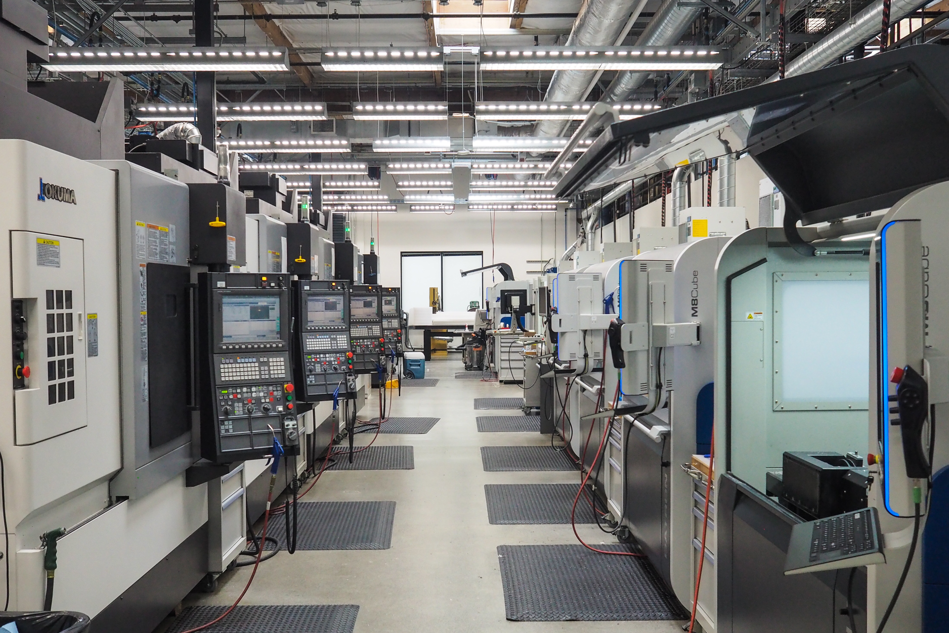 Multi-axis CNC mills have been around for longer, but they’re slower and more difficult to operate. And subtractive manufacturing (i.e. taking a block and whittling it down to a mouse) is inefficient and has certain limitations as far as the structures it can create.
Of course, you could carve it yourself out of wood or soap, but that’s a bit old-fashioned.
So when Building 87 was redesigned from the ground up some years back, it was loaded with the latest and greatest of both additive and subtractive rapid manufacturing methods, and the state of the art has been continually rolling through ever since. Even as I passed through they were installing some new machines (desk-sized things that had slots for both extrusion materials and ordinary printer ink cartridges, a fact that for some reason I found hilarious).
The additive machines are in constant use as designers and engineers propose new device shapes and styles that sound great in theory but must be tested in person. Having a bunch of these things, each able to produce multiple items per print, lets you for instance test out a thumb scoop on a mouse with 16 slightly different widths. Maybe you take those over to Human Factors and see which can be eliminated for over-stressing a joint, then compare comfort on the surviving six and move on to a new iteration. That could all take place over a day or two.
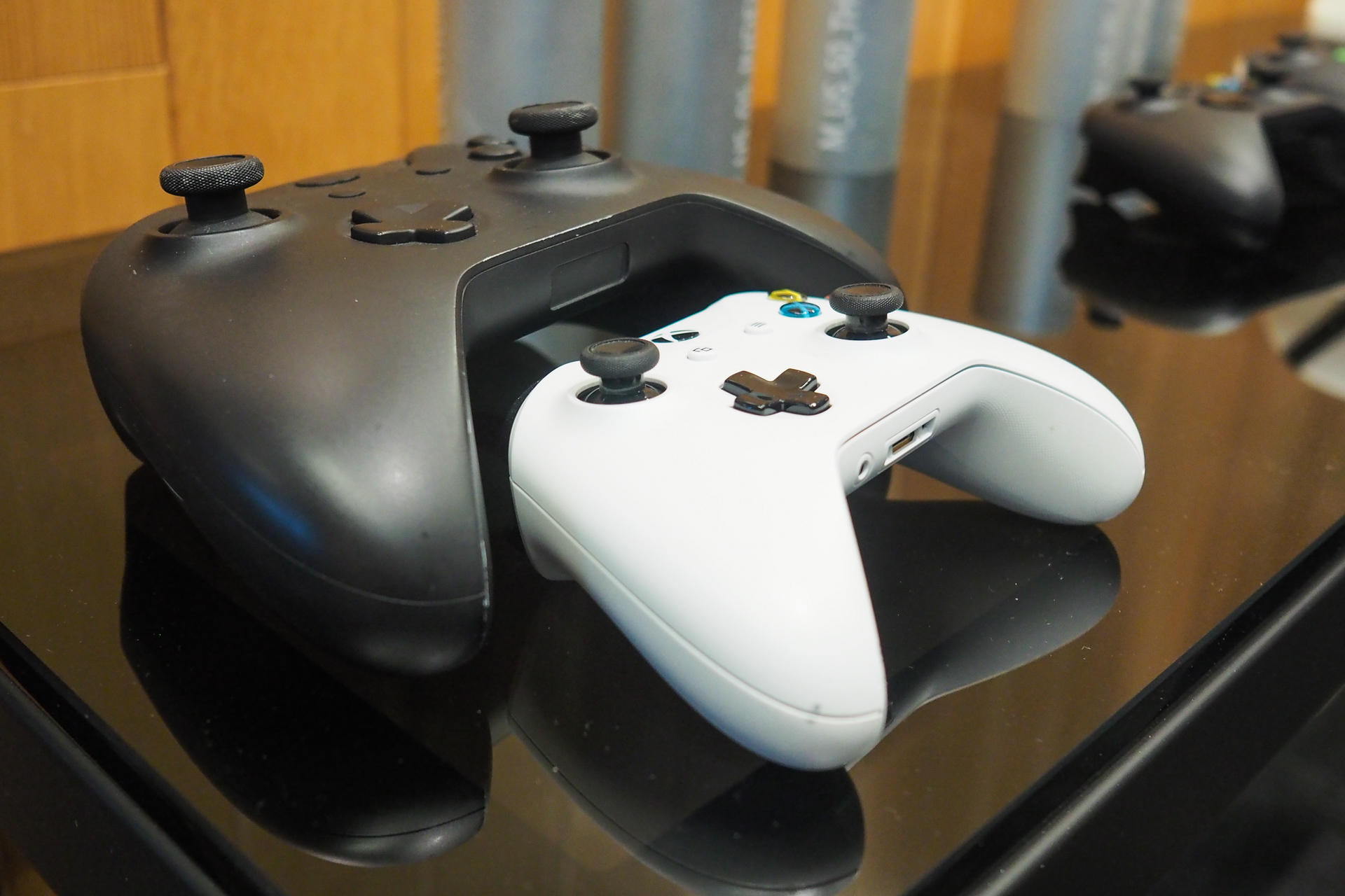
Ever wonder what an Xbox controller feels like to a child? Just print a giant one in the lab.
Softer materials have become increasingly important as designers have found that they can be integrated into products from the start. For instance, a wrist wrest for a new keyboard might have foam padding built in.
But how much foam is too much, or too little? As with the 3D printers, flat materials like foam and cloth can be customized and systematically tested as well. Using a machine called a skiver, foam can be split into thicknesses only half a millimeter apart. It doesn’t sound like much — and it isn’t — but when you’re creating an object that will be handled for hours at a time by the sensitive hands of humans, the difference can be subtle but substantial.
For more heavy-duty prototyping of things that need to be made out of metal — hinges, laptop frames and so on — there is bank after bank of five-axis CNC machines, lathes and more exotic tools, like a system that performs extremely precise cuts using a charged wire.
The engineers operating these things work collaboratively with the designers and researchers, and it was important to the people I talked to that this wasn’t a “here, print this” situation. A true collaboration has input from both sides, and that is what seems to be happening here. Someone inspecting a 3D model for printability before popping it into the five-axis might say to the designer, you know, these pieces could fit together more closely if we did so-and-so, and it would actually add strength to the assembly. (Can you tell I’m not an engineer?) Making stuff, and making stuff better, is a passion among the crew, and that’s a fundamentally creative drive.
Making fresh hells for keyboards
If any keyboard has dominated the headlines for the last year or so, it’s been Apple’s ill-fated butterfly switch keyboard on the latest MacBook Pros. While being in my opinion quite unpleasant to type on, they appeared to fail at an astonishing rate judging by the proportion of users I saw personally reporting problems, and are quite expensive to replace. How, I wondered, did a company with Apple’s design resources create such a dog?
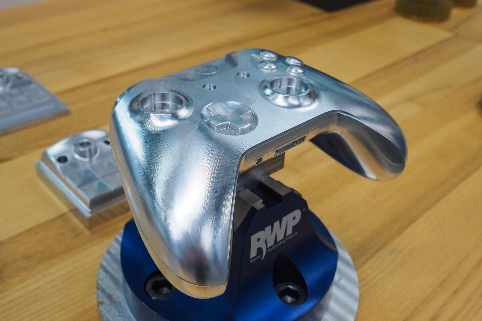
Here’s a piece of hardware you won’t break any time soon.
I mentioned the subject to the group toward the end of the tour but, predictably and understandably, it wasn’t really something they wanted to talk about. But a short time later I spoke with one of the people in charge of Microsoft’s reliability managers. They too demurred on the topic of Apple’s failures, opting instead to describe at length the measures Microsoft takes to ensure that their own keyboards don’t suffer a similar fate.
The philosophy is essentially to simulate everything about the expected three to five-year life of the keyboard. I’ve seen the “torture chambers” where devices are beaten on by robots (I’ve seen these personally, years ago — they’re brutal), but there’s more to it than that. Keyboards are everyday objects, and they face everyday threats; so that’s what the team tests, with things falling into three general categories:
Environmental: This includes cycling the temperature from very low to very high, exposing the keyboard to dust and UV. This differs for each product, as some will obviously be used outside more than others. Does it break? Does it discolor? Where does the dust go?
Mechanical: Every keyboard undergoes key tests to make sure that keys can withstand however many million presses without failing. But that’s not the only thing that keyboards undergo. They get dropped and things get dropped on them, of course, or left upside-down, or have their keys pressed and held at weird angles. All these things are tested, and when a keyboard fails because of a test they don’t have, they add it.
Chemical: I found this very interesting. The team now has more than 30 chemicals that it exposes its hardware to, including: lotion, Coke, coffee, chips, mustard, ketchup and Clorox. The team is constantly adding to the list as new chemicals enter frequent usage or new markets open up. Hospitals, for instance, need to test a variety of harsh disinfectants that an ordinary home wouldn’t have. (Note: Burt’s Bees is apparently bad news for keyboards.)
Testing is ongoing, with new batches being evaluated continuously as time allows.
To be honest, it’s hard to imagine that Apple’s disappointing keyboard actually underwent this kind of testing, or if it did, that it was modified to survive it. The number and severity of problems I’ve heard of with them suggest the “feats of engineering heroics” of which Adams spoke, but directed singlemindedly in the direction of compactness. Perhaps more torture chambers are required at Apple HQ.
7 factors and the unfactorable
All the above are more tools for executing a design and not for creating one to begin with. That’s a whole other kettle of fish, and one not so easily described.
Adams told me: “When computers were on every desk the same way, it was okay to only have one or two kinds of keyboard. But now that there are so many kinds of computing, it’s okay to have a choice. What kind of work do you do? Where do you do it? I mean, what do we all type on now? Phones. So it’s entirely context dependent.”
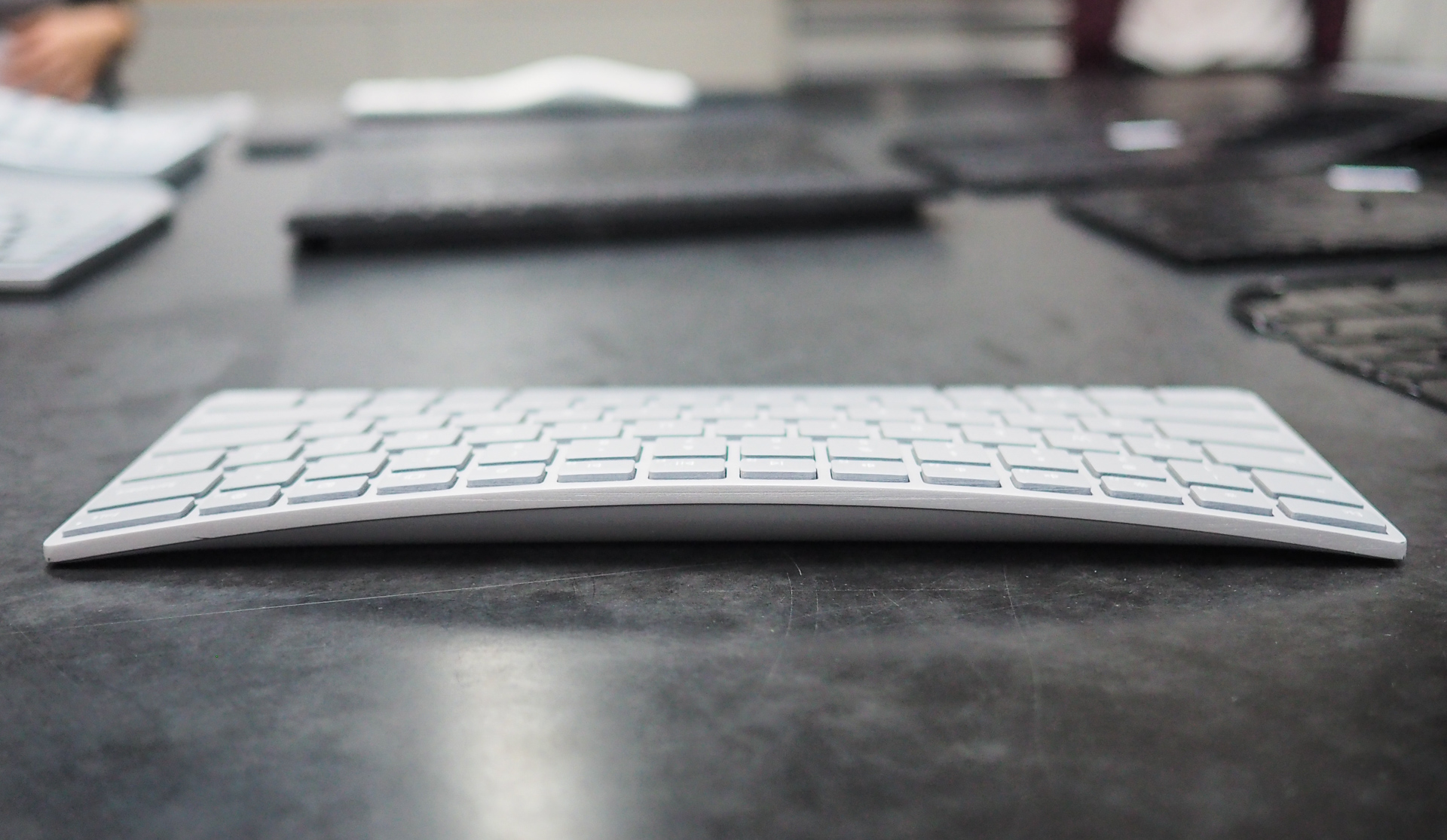
Is this the right curve? Or should it be six millimeters higher? Let’s try both.
Yet even in the great variety of all possible keyboards there are metrics that must be considered if that keyboard is to succeed in its role. The team boiled it down to seven critical points:
- Key travel: How far a key goes until it bottoms out. Neither shallow nor deep is necessarily good, but serve different purposes.
- Key spacing: Distance between the center of one key and the next. How far can you differ from “full-size” before it becomes uncomfortable?
- Key pitch: On many keyboards the keys do not all “face” the same direction, but are subtly pointed toward the home row, because that’s the direction from which your fingers hit them. How much is too much? How little is too little?
- Key dish: The shape of the keytop limits your fingers’ motion, captures them when they travel or return and provides a comfortable home — if it’s done right.
- Key texture: Too slick and fingers will slide off. Too rough and it’ll be uncomfortable. Can it be fabric? Textured plastic? Metal?
- Key sound: As described above, the sound indicates a number of things and has to be carefully engineered.
- Force to fire: How much actual force does it take to drive a given key to its actuation point? Keep in mind this can and perhaps should differ from key to key.
In addition to these core concepts there are many secondary ones that pop up for consideration: Wobble, or the amount a key moves laterally (yes, this is deliberate), snap ratio, involving the feedback from actuation. Drop angle, off-axis actuation, key gap for chiclet boards… and of course the inevitable switch debate.
Keyboard switches, the actual mechanism under the key, have become a major sub-industry as many companies started making their own at the expiration of a few important patents. Hence there’s been a proliferation of new key switches with a variety of aspects, especially on the mechanical side. Microsoft does make mechanical keyboards, and scissor-switch keyboards, and membrane as well, and perhaps even some more exotic ones (though the original touch-sensitive Surface cover keyboard was a bit of a flop).
“When we look at switches, whether it’s for a mouse, QWERTY, or other keys, we think about what they’re for,” said Adams. “We’re not going to say we’re scissor switch all the time or something — we have all kinds. It’s about durability, reliability, cost, supply and so on. And the sound and tactile experience is so important.”
As for the shape itself, there is generally the divided Natural style, the flat full style and the flat chiclet style. But with design trends, new materials, new devices and changes to people and desk styles (you better believe a standing desk needs a different keyboard than a sitting one), it’s a new challenge every time.
They collected a menagerie of keyboards and prototypes in various stages of experimentation. Some were obviously never meant for real use — one had the keys pitched so far that it was like a little cave for the home row. Another was an experiment in how much a design could be shrunk until it was no longer usable. A handful showed different curves à la Natural — which is the right one? Although you can theorize, the only way to be sure is to lay hands on it. So tell rapid prototyping to make variants 1-10, then send them over to Human Factors and text the stress and posture resulting from each one.
“Sure, we know the gable slope should be between 10-15 degrees and blah blah blah,” said Adams, who is actually on the patent for the original Natural Keyboard, and so is about as familiar as you can get with the design. “But what else? What is it we’re trying to do, and how are we achieving that through engineering? It’s super fun bringing all we know about the human body and bringing that into the industrial design.”
Although the comparison is rather grandiose, I was reminded of an orchestra — but not in full swing. Rather, in the minutes before a symphony begins, and all the players are tuning their instruments. It’s a cacophony in a way, but they are all tuning toward a certain key, and the din gradually makes its way to a pleasant sort of hum. So it is that a group of specialists all tending their sciences and creeping toward greater precision seem to cohere a product out of the ether that is human-centric in all its parts.