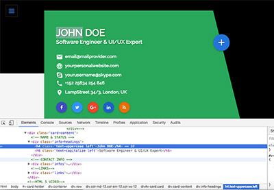
Are you looking for a position with a new company or looking to collaborate on big projects as a specialist? You’re going to need a resume!
To stand out in today’s marketplace with a memorable first impression, you’ll need a resume website.
A whole website just for your resume? Yes. And with the amazing resume website templates available nowadays, it’s much easier to create that you may think. So let’s get to it.
Why You Need a Creative Online Resume Website
If you’re a creative working in one of the many (and expanding) digital fields such as web design, graphic design, web development, coding, animation, photography, or music production, among many others, then the necessity of an online resume should be pretty self-evident. You can’t form part of the digital workplace without a digital identity card. That would be like a journalist trying to gain backstage access to an exclusive event without a press pass—not going to happen!
Web resumes, however, haven’t quite substituted a traditional paper resumes (yet!), and it’s important to understand their use and role in today’s marketplace so you can select the right online resume template for your needs.
What to Include On Your Resume Website
Web resumes are versatile tools that can serve many purposes:
1. Showcase Your Work
To begin with, you can place the link to your online website on your regular resume that most employers ask for. But not to showcase the same resume in HTML format rather than Word or PDF. That would be pointless. The reason to add the link to your resume website would be to showcase things you can’t show on your regular resume.
For example, if you’re a web developer, web designer, or video editor, you can’t really showcase your work on a traditional resume. But on your online resume you can include screenshots, live links to websites, and even videos you created for easy and direct access.
2. A Stand-Alone Addition to Traditional Resume
There are, moreover, employers who’ve already started requesting that applicants submit online resumes. That means your resume website shouldn’t simply be an addition or an afterthought to your “regular” resume. It should be a stand-alone piece containing all the information that a proper and complete resume needs to convey in order to get you hired.
3. Control What Employers See When They Google You
But there’s an even more important reason why you need to create a resume website today. And it’s called Google. What do you think is the first thing a future employer or an HR manager will do once your name makes it passed the first slush pile of resumes and into the shortlisted candidates? Google you, of course!
And no, they won’t (simply) be looking to see if you’ve got any “inappropriate” photos on social media, or if your name comes up in relation to any suspicious activity. They’ll be mostly looking to get a glimpse of you—trying to better understand who you are and what you do and whether you may be a good fit for their company culture.
But letting the fragmented representation of yourself on social media and other online resource do the talking means taking a big risk. Because that haphazard pastiche of yourself that Google turns up probably doesn’t correspond to the real and professional you. The best thing you can do, instead, is taking things into your own hands by creating a creative resume website for yourself containing all the right information in one place.

So how should you create this increasingly important document that can potentially open many online doors for you? By finding and selecting the best online resume template for your personality and purposes and customizing it to your specific style!
Here’s a tutorial that can help you create a creative online resume using a template:
And below I’ve got 10 creative resume ideas to help you get started with making your own online resume. All of the resume ideas come with example screenshots and links to online resume templates that you can begin customizing right away!
10 Creative (CV) Online Resume Website Ideas
Here are ten great creative resume ideas for online resumes:
1. The Sectioned One-Pager
Since your resume is the story of you, the first resume idea I’d like to propose is the one-page resume that’s based on the popular website style called parallax. Now as you know, a single web page can be a thousand miles long, if you want to, so don’t worry about your resume being too short.
The benefit of the one-pager is that it allows you to tell your story to the viewer in a specific order. Whether you want to start with your professional achievements, your education, your previous positions and collaborations, or some interesting fact about yourself, it’s up to you. But by choosing the scrolling one-page resume idea, you’re choosing to say something important about the order in which you present your story.
That’s not to say of course, that scrolling should be the only navigation of your web resume. That would simple be annoying and impractical. Your online resume template should still provide a menu to help viewers quickly and easily navigate to specific places on your page.
In the one page resume template below, the static menu at the top provides anchored navigation, while the alternating background colors help break up the long page into easily viewable and digestible sections that the visitor can take in with a glance.

Not a big fan of much too much color and fanfare? This personal one page resume website template allows you to implement the same idea in a sleeker version that still adds a dash of color (of your choice) to a clean, modern design.
2. The Timeline
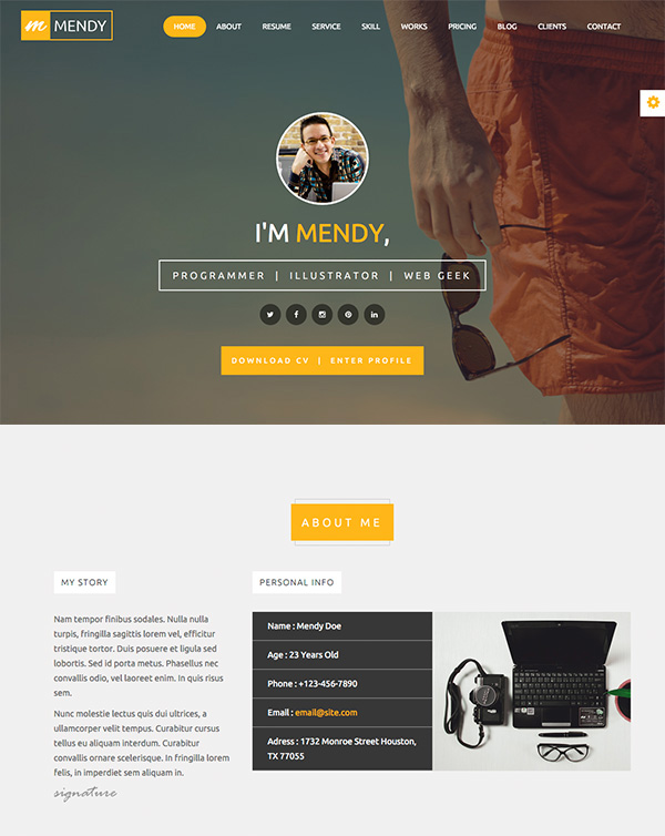
Another creative resume idea is to build your resume website using a timeline. Something like the old Facebook newsfeeds, if you remember those.
The benefit of the timeline is that you can build quite a rigorous storyline for your viewer to follow. Perhaps there’s much to be said about the development of your work and career, or maybe you want to outline the outstanding path of your education. Whatever it is, the timeline structure of this structured resume template can offer your reader a line to follow on your story, but in a more flexible and even “messier” layout than the parallax style.
3. The Tiles
But what if your story isn’t so structured? Or maybe your entire thesis as a creative rests on deconstruction and broken storylines? Then neither of the resume ideas above will serve you well.
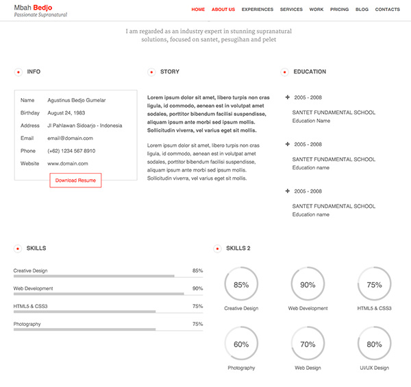
The wonderful thing about resume websites, however, is that unlike paper resumes you can structure them any way you want. And tiles is one of your many creative options.
Have a look for example, at the tiles on this responsive resume template that allow viewers to choose their own journey through your resume by clicking what interests them most.

Want an even more tiled experience? How about breaking up your face or a featured work you’ll choose as your cover photo into the menu tiles? You can easily do so with this interactive, online cv/resume template.

4. The Slide
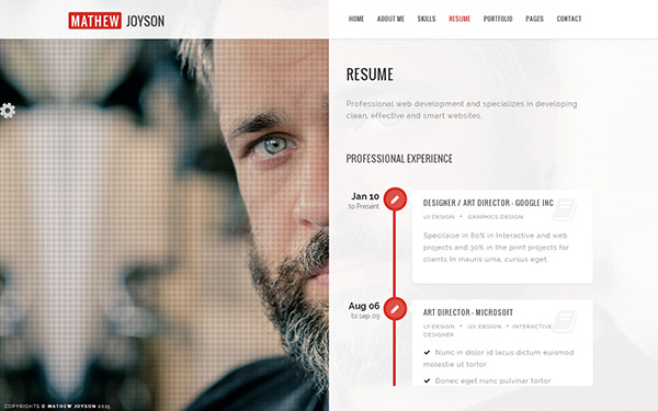
Don’t fancy all that scrolling and want to offer a more “grounded” experience? How about staying “put” on the page and simply doing a left-to-right slide with your content? This way you can keep your reader’s attention focused to just that one page at a time and the information it contains.
In the online resume template featured below, you can choose a nice image of yourself as the backdrop to your information to emphasize the connection to the details of what make you a real person.
5. The Dancing Resume
Another awesome feature the web provides and paper doesn’t is movement and animation. If you’re a high-energy person, or in general identify with movement in your work and life, why not choose a resume website template that subtly communicates this aspect of yourself?
In the resume website template below, which is built similarly to the sectioned one-pager we saw above, all the elements come sliding in or popping up onto the screen as the reader scrolls down. They really capture the attention creating a fun and unique experience!

Want even more action? Check out this creative resume template that literally drop out of nowhere (including the profile pic!). This template also features color-changing photos that go from black-and-white to colorful when mousing over them.

More of a “riser” than a “dropper”? Check out this fun and colorful online resume where all the elements surface from below as you scroll down. This resume website template also displays an animated mouse-over picture feature, but this time the selected colorful pictures gets a slight grey film over it.

6. The Screen Play
Looking for creative ways to break up the screen view for a new experience? How about an interactive resume with animated timeline and portfolio?
Check out how the timeline in Jordan online resume template comes into view as you scroll down the page and how the portfolio items pop up on the screen! What’s more, there’s a subtle movement in the design process section that hints at all the parts of the process being connected. Quite brilliant!
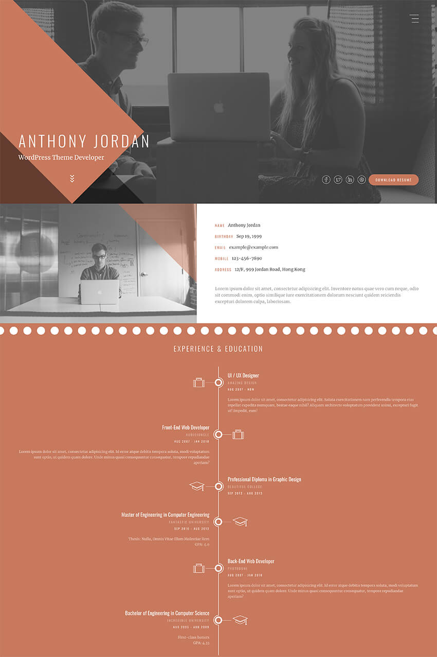
The next online resume template example also includes a nice play with images as the tiles in the main beehive formation open up when clicked to offer more information.

7. In Full Swing
Another thing that paper can’t do? Play video of course!
So why not use your resume website to feature a short video about yourself or your work? Video playing capabilities can play a definitive role in the presentation of the work of people who create and produce videos. But it can also serve other creatives who want to showcase their fun and friendly personality, or even those who want to make a video with finished products of their work.
The creative, online resume template below opens with a full screen video of your choice and a discreet menu that allows the viewer to focus on the video undistracted before moving on to other sections of your resume.

Don’t want your video to feature so prominently? This bold template allows you to link videos into your portfolio with a play button ready to go when the viewer scrolls over them. The videos open in a pop-up box allowing comfortable viewing.

8. Sleek and Minimal
How about a sleek and minimal resume with a filterable portfolio? Sometimes, all you need is a splash of creativity paired with a sleek design to stand out from the crowd. Check out how the NEW Retina Ready Vcard template uses a minimal design that makes it easy to focus on your resume details. It then shows a hover animation over portfolio element along with a sleek animation as you filter through the project examples.
.jpg)
Another great example of minimal design paired with subtle animation details in the portfolio section can be seen in the Confidence template. On top of that, this creative online resume example uses minimal color and an elegant parallax effect that draws attention to different resume sections.

9. An Open Book
Want to give future employers the feel of reading a book? Then the Bookcard online resume example will do the job. This template starts off like a book or magazine cover and then flips open when you click the button. Employers can then scroll through each section to get more information and close it when they’re done—just like they would with a physical book.

The MahaZara.S creative resume template uses the same principle, but with a slightly different approach. While you still need to click on different sections to see the next page, the template uses the full available width of the screen and gorgeous background imagery instead of mimicking a physical book.

10. Going Material
A popular trend in websites is the use of material design. Take advantage of this by using a creative material resume template like Matresume. This template is fully responsive and resembles a mobile application making it a perfect choice if you want to make sure your resume looks great on mobile devices.

An interesting variation of the material style is used in the I’m Mat template. Not only does this template use material design, but the background image zooms in and out as you’re scrolling through.

Free Online Resume Website Tutorials (From Tuts+)
Now that you’ve seen what’s possible when you use a creative resume template, here are a few helpful online resume tutorials that’ll help you take your resume to the next level. The tutorials below will teach you how to make the most out of your resume website and are completely free:
 ResumesWhat Should You Include on Your Personal Resume Website?Brenda Barron
 BlogHow to Improve Your Personal Resume Website With a BlogBrenda Barron
 Resumes10 Resume Website Mistakes to Avoid on Your Personal SiteBrenda Barron
Do You Need a Resume Website?
How will you build your resume website? And which creative idea do you consider most important to showcase your work and personality to future employers? Have a look through the online CV and resume templates on ThemeForest or Envato Elements to find the best fit for you to stand out online.
Editorial Note: This post was originally published in 2016. It has been comprehensively revised to make it current, accurate, and up-to-date by our staff—with special assistance from Brenda Barron.
{excerpt}
Read More
