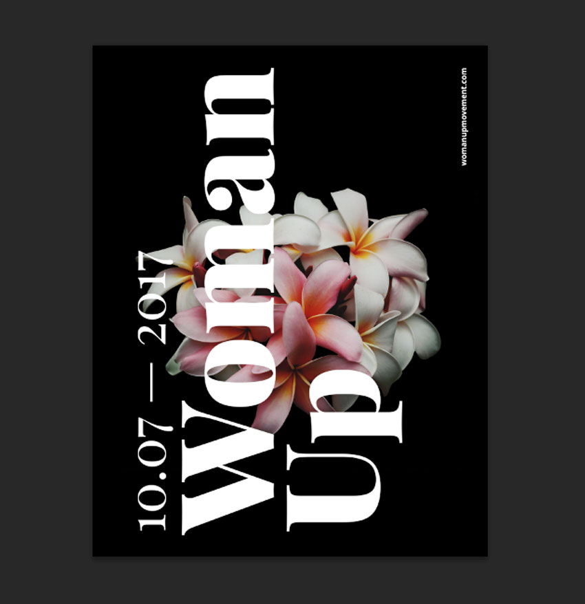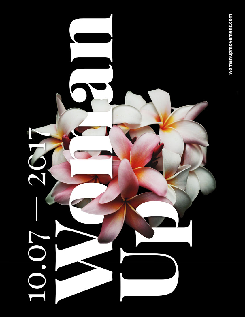
For this tutorial we will design an empowering poster using typography interwoven into flowers using the Layer Mask tool in Adobe Photoshop.
For poster and flyer inspiration, head on over to GraphicRiver.
What Will You Need
You will also need to download and install the following font file and image:
- Playfair Display and Open Sans by Google Fonts
- Flower photo by Charlie Harutaka via Unsplash
Install the font on your system and you are ready to get started!
1. How to Prepare the Flower Image
Step 1
Open the flower photo in Photoshop.

Step 2
We need to remove the background before using the flowers on the poster. To do this, on the Layers panel, Duplicate the Background layer by pressing Command-J and Hide the visibility of the original Background layer.

Step 3
While selecting the new layer on the Layers panel, click on the Vector Mask button to add a Layer Mask to Background copy.

Step 4
While selecting the new Layer Mask, use the Brush Tool (B). Reset the foreground/background colours by pressing D and X to switch between them. Use black as the foreground color and paint over the image to erase the background.

Step 5
Once we have painted over with the Brush Tool, we can zoom in and work on the details. Tap the backslash key (\) to display a red overlay on the layer mask. This is useful to see if we are erasing the right parts on an image.

We should have something like this:

2. How to Set Up a New Document and Create Guides
Step 1
In Photoshop, go to File > New. Name the document Woman Up and set the Width to 1275 px and Height to 1650 px. I am using this composition as an online pamphlet, so I will be using 72 dpi. Click OK to create the document.

Step 2
Select the Background Layer and paint the layer using the Paint Bucket Tool (G) and black as the foreground colour.

Step 3
Activate the rulers by pressing Command-R. I am using inches—you can change this by going to Photoshop > Preferences > Units and Rulers.

Step 4
Click on the rulers and drag towards the page to create guidelines. I’ve set mine to 1 inch on each side. Hold Shift to drag the guideline to an even number.

3. How to Duplicate Layers
Step 1
We will duplicate the cleaned-up flower layer into the new file. To do so, select the layer Right Click > Duplicate Layer, under As: change the name to Flowers, and select Document > Woman Up. Click OK to continue.

Step 2
The flowers will appear larger than we need, so let’s resize by pressing Command-T while selecting the flowers layer. Head over to the options bar, on the Reference Point Location select the top left corner, and also select the Maintain Aspect Ratio icon. Change the Width to 30% and press Enter.

Step 3
Let’s centre the image on the poster by selecting the Background layer, pressing Shift, and clicking on the flowers layer. Head over to the options bar and click on Align Vertical Centre. Then visually align the flowers layer to the poster.

4. How to Add Text Layers
Step 1
Bring up the Characters panel by going to Window > Character. Press T to add a new text layer. One the first layer, add a date, and on the second layer, add Woman Up.

Step 2
Select the text layers by holding Command and clicking on both. Let’s rotate these two layers vertically by pressing Command-T, head over to one of the corners until the rotation symbol appears, and hold down Shift to make an even rotation.

Step 3
We want to fill up the whole poster to create something with impact. Bring up the guides by pressing Command-;. Resize both text layers by pressing Command-T to fill the poster, vertically, from guide to guide. The goal is to have the title and date interact with the flower.

Step 4
Let’s add a website to balance the poster. I used Open Sans, at 25 pt, white in colour, and placed it in the top right corner, leaving about an inch margin. I used something different because Playfair Display is used, as its name suggests, for display settings and doesn’t read well in small sizes.

5. How to Add Mask Layers
Step 1
We want to create an illusion that the text is interwoven with the flowers. Let’s duplicate the flower layer by pressing Command-J and place it at the very top of our Layers panel.

Step 2
We want to work on the new flower layer and more specifically on the layer mask. Start by setting the Brush Tool (B) followed by Right-Click to a size of 30 px and Hardness of 100%.
You can interchange between black and white colours to hide or reveal parts of the image. Pressing X will interchange between these two colours, making it easier to work on the details.
We also want to pay attention to the petals that are in the foreground and background for these to make sense in terms of what is covering the text and what is behind the text. The final file and layers should be looking like the image below:

Step 3
Do the same with the date on the very left.

6. How to Add Effects to a Text Layer
Step 1
To create a depth of field, we will add a Drop Shadow layer style to the main text. Select the Woman Up text layer on the Layers panel. Click on Effects > Drop Shadow.

Step 2
A Layer Style window will pop up, and you will notice that on our poster, the text will have a shadow. We want a softer look, so let’s change to the values in the image below and click OK.

Step 3
Our text layer now will have an “fx” symbol next to it. We want to copy the drop shadow effect onto the date text layer. Select the Woman Up text layer and Right click > Copy Layer Style. On the date text layer, Right click > Paste Layer Style. The layers and the image should be looking like the image below:

7. How to Add Adjustment Layers
Step 1
At the bottom of the Layers panel, click on Add Adjustment Layer > Brightness/Contrast.

Step 2
The Properties panel for this new layer will open. We want to add more contrast and some brightness to the image to make it stand out. I added the following values; Brightness: +15 and Contrast: +20.

8. How to Save the Poster as .PSD and for Web
Step 1
Click File > Save As to save the file as a .PSD to edit it later.

Step 2
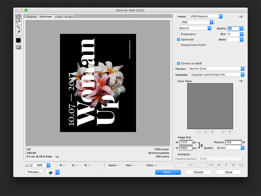
For a lower-resolution web jpeg and smaller file size, click File > Save for web (Shift-Option-Command-S). Here you can alter the quality of the image and the image size. Click on Save … and save the file.

Congratulations on Finishing This Tutorial!
We have covered an interesting skill for putting together typography poster that interacts with an image. Today we’ve learned to:
- Use Layer Masks to hide and reveal parts of an image.
- Use Adjustment Layers to add Brightness/Contrast to an image.
- Format typography and use it in different directions to interact with the image.
- Use the image’s levels of focus to our advantage to create a poster with depth.
- Use Effects layers to add drop shadows to a text layer to create depth of field.

{excerpt}
Read More