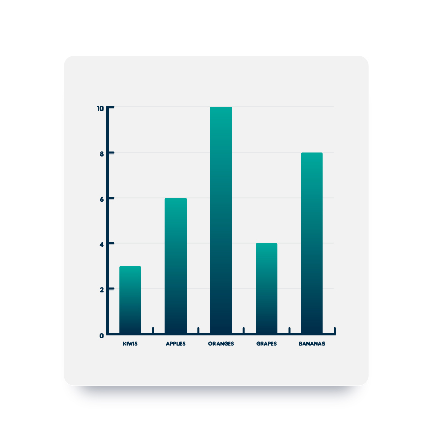
In the following steps, you will learn how to create a fully editable chart in Adobe Illustrator and how to adjust its style.
First, you will learn how to create the starting chart using the Column Graph Tool. Using the Direct Selection Tool and the Graphic Styles panel along with some basic colors and effects, you will learn how to stylize the main components of your chart. Taking full advantage of the Appearance panel, you will learn how to add a frame to your chart and how to apply subtle shading and highlights. Finally, you will learn how to easily adjust the data on your chart.
For more inspiration on how to adjust or improve your final chart, you can find plenty of resources at GraphicRiver.
1. How to Create a New Document and Create the Starting Chart
Step 1
Hit Control-N to create a new document. Select Pixels from the Units drop-down menu, enter 850 in the width box and 870 in the height box, and then click that More Settings button. Select RGB for the Color Mode, set the Raster Effects to Screen (72 ppi), and then click Create Document.
Don’t forget to set the unit of measurement to pixels from Edit > Preferences > Units.

Step 2
Focus on your Toolbar and double click the Column Graph Tool (J) to open the Graph Type window. Enter the attributes shown in the following image and then click OK.

Step 3
Make sure that the Column Graph Tool (J) is selected and simply click on your artboard to open the Graph window. Set both Width and Height to 450 pt, and then click OK.
Enter the data shown below and then click that Check button. Your graph should look roughly as shown in the following image.

2. How to Adjust the Text on the Chart
Step 1
Using the Direct Selection Tool (A), select that column of text and open the Character panel (Window > Type > Character). Select the Insaniburger font, set the size to 15 px, and change the color to R=0 G=43 B=73.

Step 2
Using the Direct Selection Tool (A), select that row of text and focus on the Character panel. Select that same Insaniburger font, set the size to 12 px, and change the color to R=0 G=43 B=73.

3. How to Adjust the Line Separators on the Chart
Step 1
Using the Direct Selection Tool (A), select the large, vertical path and focus on the Appearance panel (Window > Appearance). Change the stroke color to R=0 G=43 B=73 and then open the Stroke fly-out panel. Increase the Weight to 4 px and check the Round Cap button.
With this path still selected, open the Graphic Styles panel (Window > Graphic Styles) and click the New Graphic Style button.

Step 2
Using the Direct Selection Tool (A), select the shorter vertical paths (highlighted in the first image) and simply apply your graphic style from the Graphic Styles panel.

Step 3
Using the Direct Selection Tool (A), select the large, horizontal path and focus on the Appearance panel. Select the stroke, change its color to R=0 G=43 B=73, and then open the Stroke fly-out panel. Increase the Weight to 4 px and check the Round Cap button, and then go to Effect > Stylize > Drop Shadow. Enter the attributes shown below and then click OK.
With this path still selected, go to the Graphic Styles panel and click the New Graphic Style button again.

Step 4
Using the Direct Selection Tool (A), select the shorter horizontal paths (highlighted in the first image) and simply apply your newest graphic style from the Graphic Styles panel.

Step 5
Using the Direct Selection Tool (A), select only one of those short, horizontal paths and focus on the Appearance panel. Add a second stroke using the Add New Stroke button and select it.
Drag this new stroke below the original one, lower its Opacity to 5%, decrease the Weight to 2 px, and then go to Effect > Distort & Transform > Transform. Drag the Move-Horizontal slider to 7 px, enter 62 in that Copies box, and then click OK.
With this path still selected, go to the Graphic Styles panel and click the New Graphic Style button.

Step 6
Using the Direct Selection Tool (A), select the other four short, horizontal paths (highlighted in the first image) and simply apply your newest graphic style from the Graphic Styles panel.

4. How to Adjust the Bars on the Chart
Step 1
Using the Direct Selection Tool (A), select one of those black bars and focus on the Appearance panel. Remove the color from the stroke and select the fill. Replace the existing color with the linear gradient shown below and then go to Effect > Stylize > Rounded Corners. Enter a 3 px Radius and click OK.
With this shape still selected, go to the Graphic Styles panel and click the New Graphic Style button.

Step 2
Using the Direct Selection Tool (A), select the other four black bars (highlighted in the first image) and simply apply your newest graphic style from the Graphic Styles panel.

5. How to Add a Frame to Your Chart
Step 1
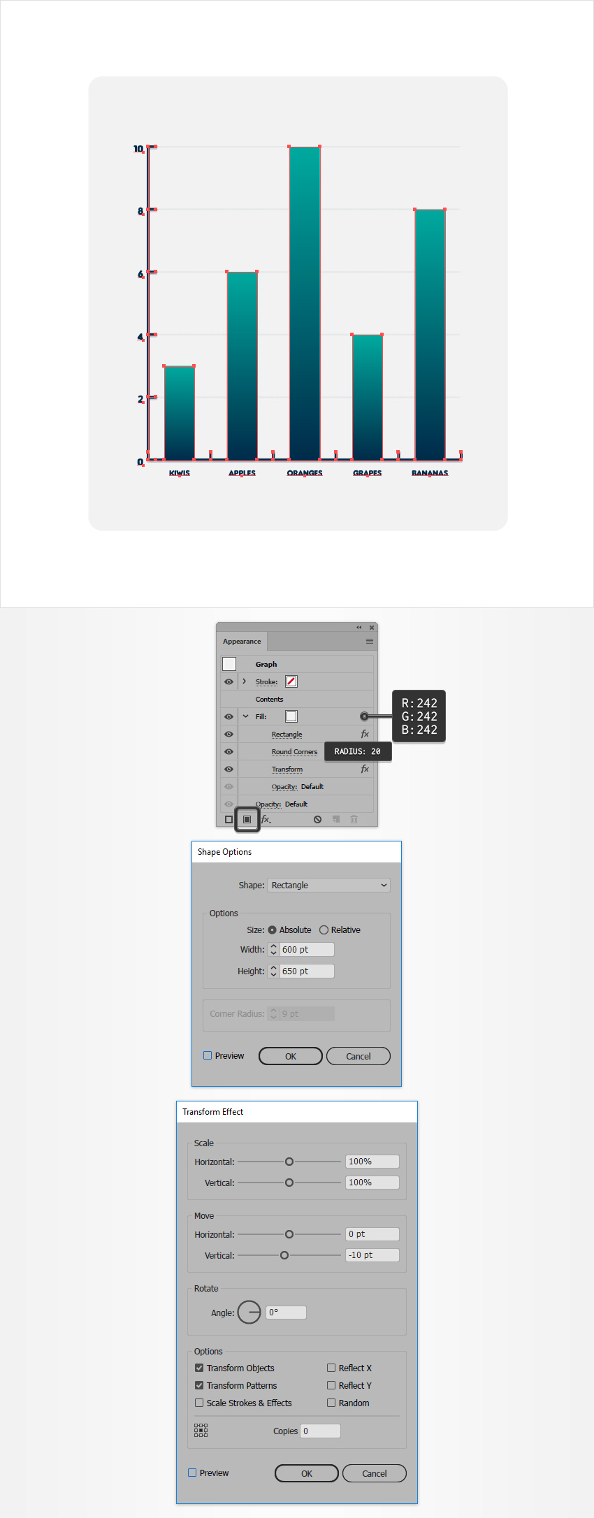
Select your entire graph, focus on the Appearance panel, and add a new fill using Add New Fill. Drag this new fill below that Contents section and select it.
Set the color to R=242 G=242 B=242 and go to Effect > Convert to Shape > Rectangle. Enter the attributes shown below, click OK, and go to Effect > Stylize > Rounded Corners. Enter a 20 px Radius, click OK, and go to Effect > Distort & Transform > Transform. Enter the attributes shown in the following image and then click OK.

Step 2
Make sure that your graph stays selected and keep focusing on the Appearance panel. Add a second fill and drag it below the existing one.
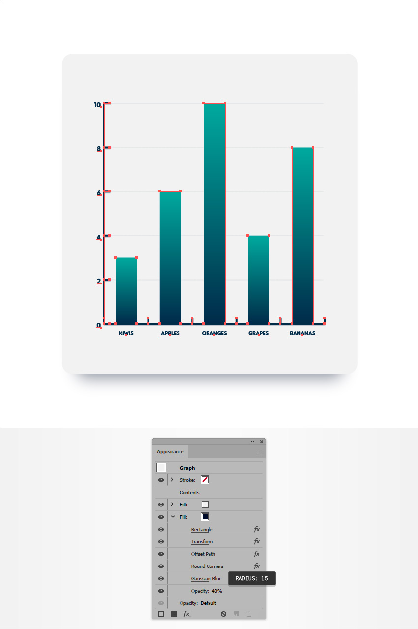
Select this new fill and set the color to R=0 G=13 B=43. Lower its Opacity to 40% and then go to Effect > Convert to Shape > Rectangle. Enter the attributes shown below, click OK, and then go to Effect > Distort & Transform > Transform. Enter the attributes shown in the following image, click OK, and then go to Effect > Path > Offset Path. Enter a -30 px Offset, click OK, and then go to Effect > Stylize > Rounded Corners. Enter a 20 px Radius and click OK.

Step 3
Make sure that your graph is still selected and keep focusing on the Appearance panel. Reselect that dark fill and go to Effect > Blur > Gaussian Blur. Enter a 15 px Radius and click OK.

Step 4
Make sure that your graph is still selected and keep focusing on the Appearance panel. Reselect the top fill and go to Effect > Stylize > Drop Shadow. Enter the attributes shown in the following image and click OK.

6. How to Edit Your Chart
Finally, remember that you can always edit the data from your chart, and your design will not change.
Here’s how you can easily do it: Make sure that your chart is selected, right click anywhere on your artboard, and go to Data. Adjust your data and then click that check button.

Congratulations! You’re Done!
Here is how it should look. I hope you’ve enjoyed this tutorial and can apply these techniques in your future projects. Don’t hesitate to share your final result in the comments section.
Feel free to adjust the final design and make it your own. You can find some great sources of inspiration at GraphicRiver, with interesting solutions to improve your design.

{excerpt}
Read More