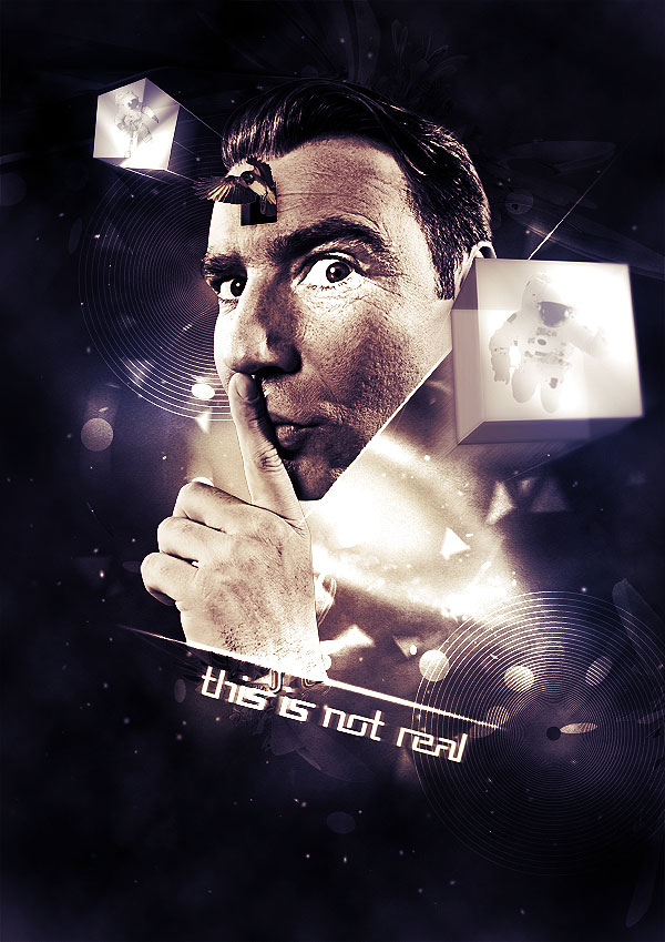
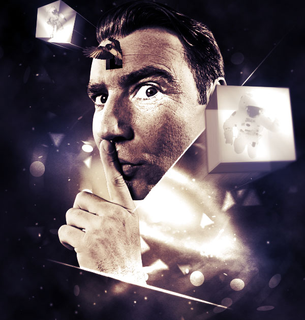
In today’s tutorial we will demonstrate how to use stock photography, 3d elements, and various techniques to create a cosmic-inspired dreamy scene in Photoshop. Let’s get started!
Resources Used
The following images were used during the production of this tutorial.
Step 1
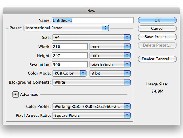
Let’s start by creating a new A4 document in Photoshop. I want to design the composition for print, so it’s best to work with large files and high quality resources. If you want a new poster in your room, consider doing the same.
Step 2
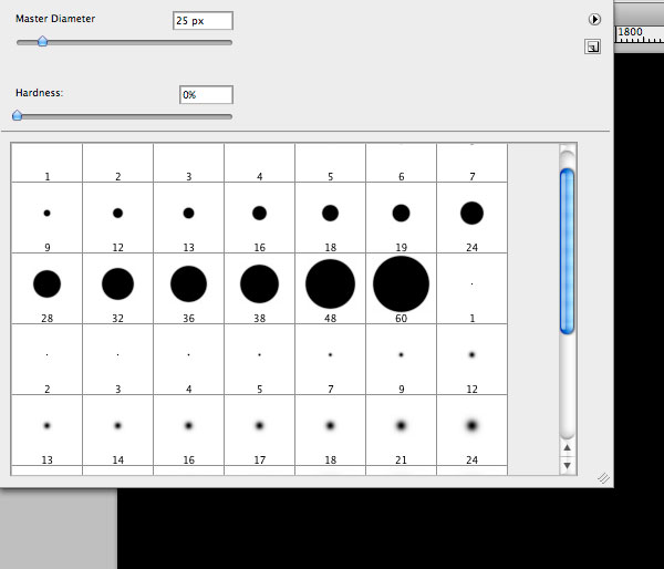
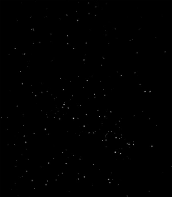
With black as the foreground color, press Alt + Delete to fill the background layer. There are several techniques to create a space looking background filled with stars. For example you could use the noise filter and play with levels. But I think that brushes give more control on how stars will look. Also by using brushes options you are able to create stars of different size and opacity with just a few clicks. Having said that, create a new layer and grab the brush tool. Set white as foreground color and choose a 25px round brush with hardness 0%.
Step 3
Go to Window > Brushes and apply the following settings:
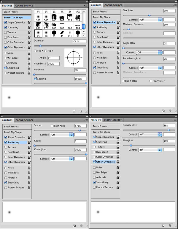
Now you can freely give life to your stars. You don’t need to do much more than click on the canvas. Feel free to re-size brushes or use several layers with different opacity levels to make them more realistic. All these features can be controlled with brushes options.
Step 4
It’s time to add some clouds. Create a new layer and go to Filter > Render > Clouds. Set the layer to screen in order to remove black areas, reduce opacity to around 30% and use the erase tool – or a mask if you prefer – to remove clouds from the edges of the canvas, so that they are concentrated into the center of the composition.

Step 5
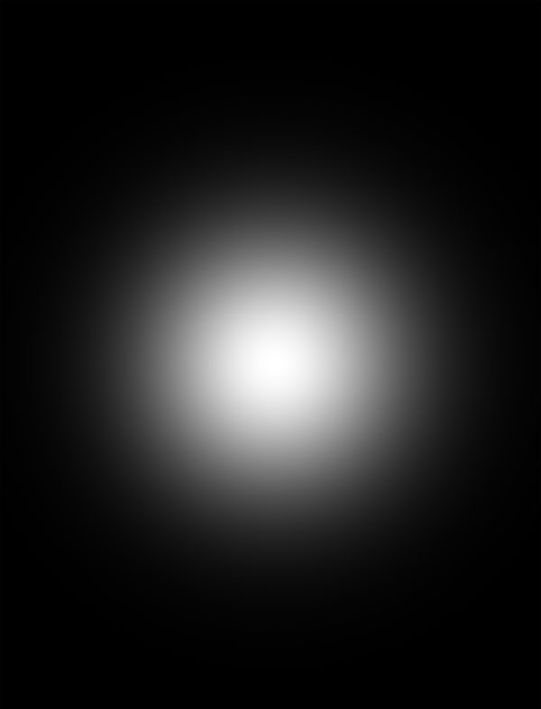
I want to create a space scene, with a galaxy in the center. Instead of using a stock image of a nebula, we can try creating it with some Photoshop tricks. Create a new layer and fill it with black. Then grab a large soft brush and paint a white spot into the center.
Step 6
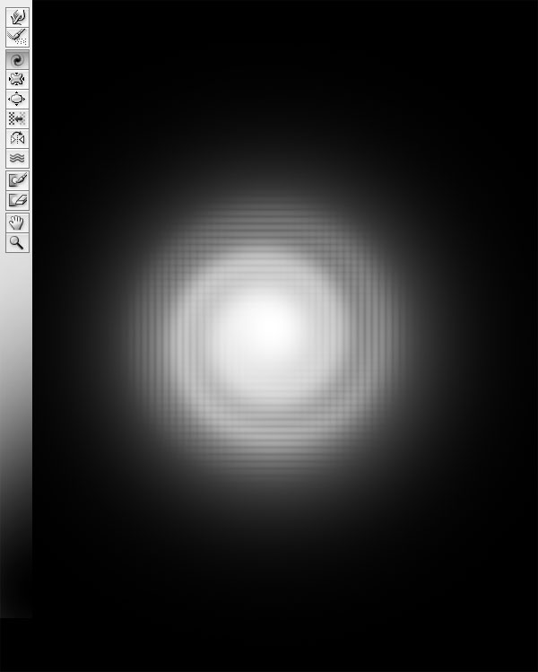
Go to Filter > Liquify. Then, select the Twirl Clockwise tool and click over the spot to create a kind of spiral. The best way to use this tool is to click and drag, creating small circles. If you only click without moving the mouse, nothing will happen.
Step 7
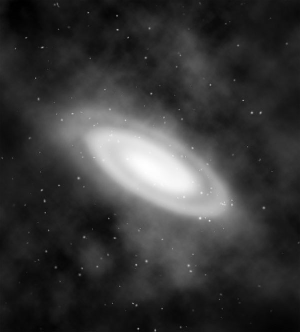
Press Cmd/Ctrl+T to activate the transform tool and stretch and rotate the spiral. In case you want to make it softer, eliminating those inner black lines caused by the liquify filter, apply a Gaussian blur (Filter > Blur > Gaussian blur) with a low value (around 3px).

Step 8
Finally, set the layer blending mode to screen.
Step 9
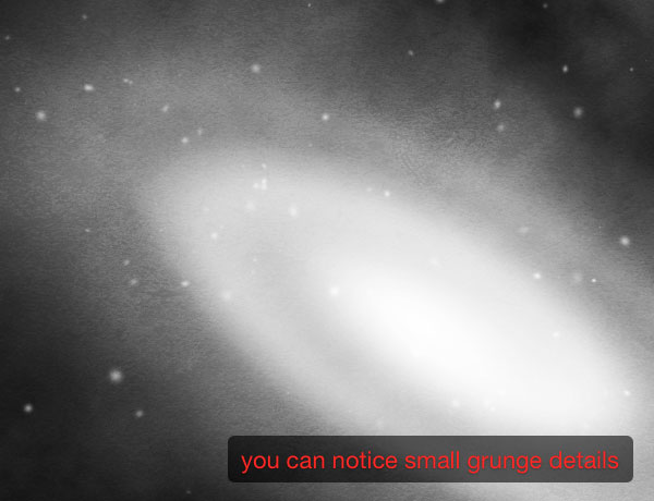
The galaxy looks too "clean". If you look at a photo of a nebulae, there are concentrations of materials similar to condensed clouds. So the first thing to do is to use a grunge texture. Download this Grunge Texture and drag it on the canvas. Press Cmd/Ctrl + Shift + U to desaturate it, and set the layer to overlay with opacity 15%.
Step 10
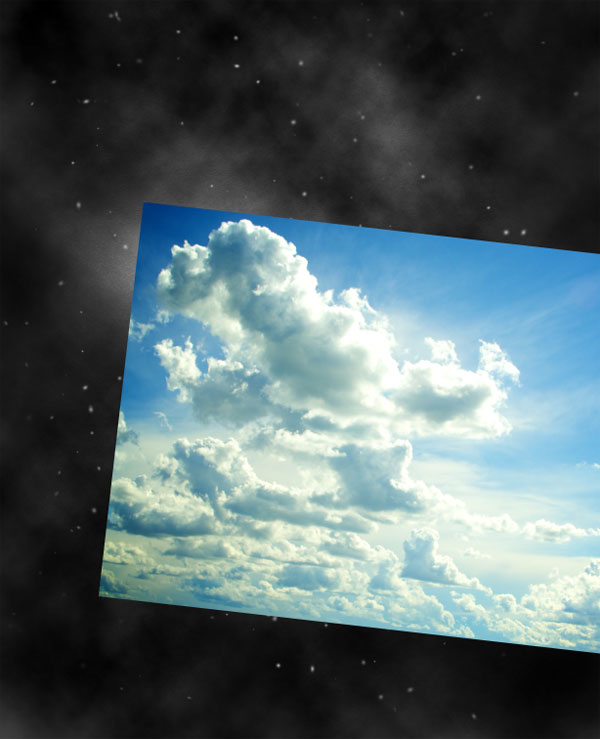
Download this photo of clouds and paste it into your document.
Step 11
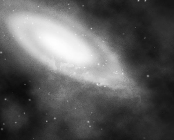
Set the layer to overlay and use the eraser tool to eliminate the left part of the cloud so that you will retain only a kind of "trail" going away from the nebula. Now that the background is almost complete, you can select all the layers from the layers window, press Cmd/Ctrl + G to group them and title the group "background".
Step 12
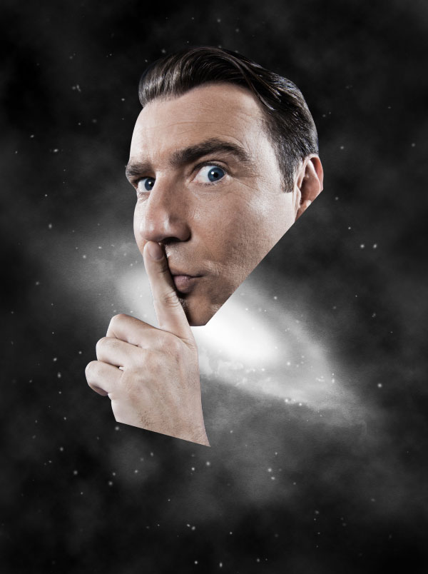
It’s time to put in the main character of the composition. I’ve used this nice portrait downloaded from Shutterstock. I know, many of you may protest because I’m using a premium image. The reason is that final result depends on the quality of the resources used, and it’s very difficult to find an expressive face surfing through sites that offer free images. Anyway you could consider using a picture of a friend (if possible a friend with a Quentin Tarantino’s style look) or use any type of image you prefer. You will be able to continue following the tutorial without problems. As you may have noticed, after extracted the dude using the pen tool, I’ve eliminated some areas that were exuberant in my opinion.
Step 13
Select the dude layer and press Cmd/Ctrl+ Shift + U to desaturate the image. It’s my habit to always work with low saturated images. Those who have followed my tutorials on WeGraphics may have noticed that I love to colorize the work at the end of the process using layer adjustments and brushes. It’s surprising how the appeal of an image can be transformed at any time of the process using Photoshop color tools.
Step 14
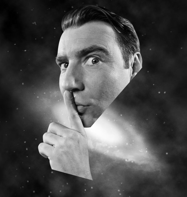
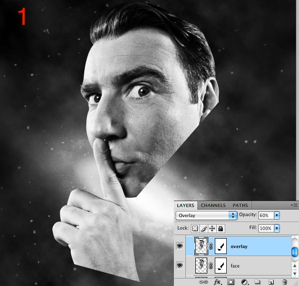
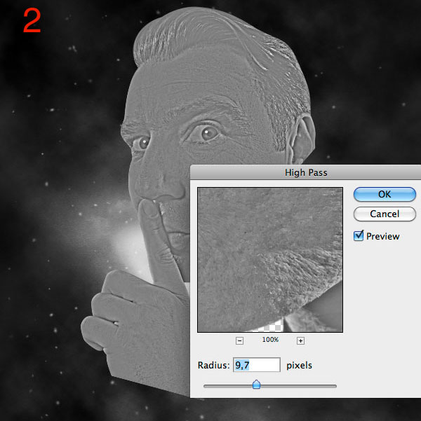
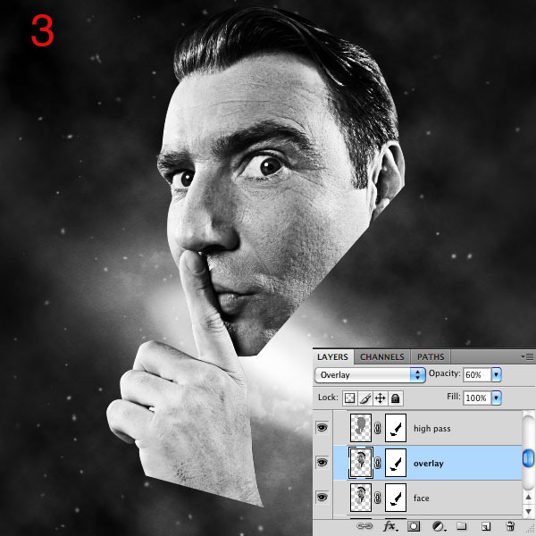
Here are 2 classic steps used to increase color contrasts and enhance the details of an image. First duplicate the dude’s layer (Cmd/Ctrl + J) and set the duplicated layer to overlay with opacity around 60%. Secondly duplicate again the original dude layer and move it at the top of the three layers. Go to Filter > Other > High-pass, enter a value around 10 pixels and set the layer to overlay.
Step 15
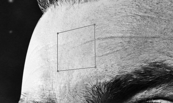
At this point, without a specific reason, I decided to create a hole on the forehead of the dude. There is always a point of the process when you need the help of your creativity. Until now I didn’t know exact goal of this piece but after taking a look at what I had, I decided this was the best next step.
Now let’s create the hole. Create a new layer and grab the pen tool in paths mode, and create a sort of square in perspective as shown in the screenshot below.
Step 16
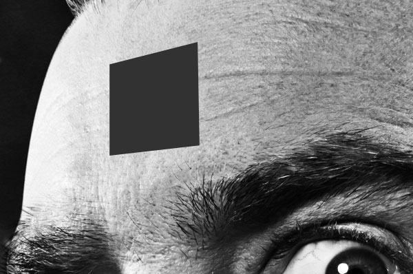
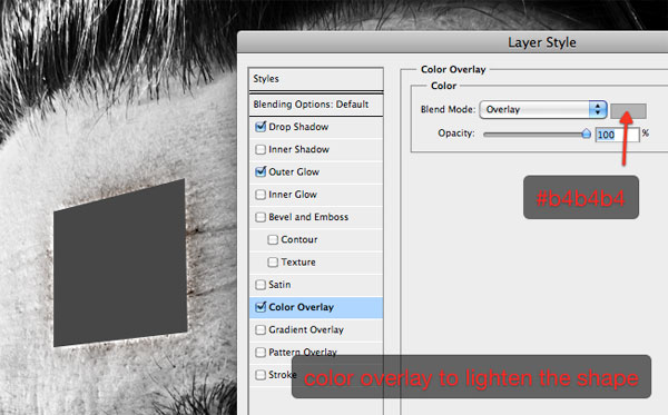
Press Cmd/Ctrl + Enter to activate the selection. Make sure to have a dark grey (#323232) as foreground color and press Alt + Delete to fill the selection.
Step 17
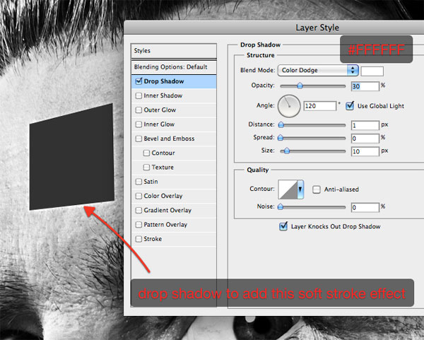
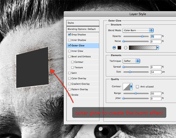
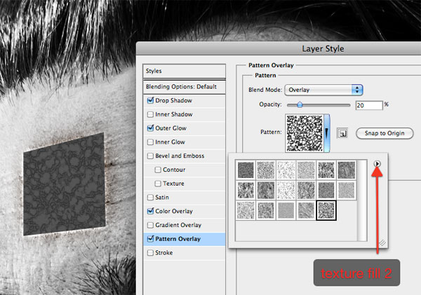
Apply the following layer styles to the shape.
Step 18
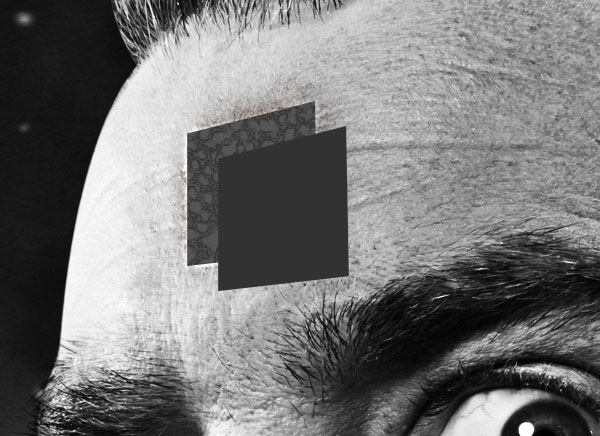
Press Cmd/Ctrl + J to duplicate the layer, then remove all the layer styles. Then move the duplicated layer bottom-right. We will use it to give depth to the hole.
Step 19
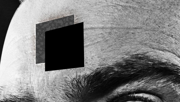
The duplicated shape is too light, so add a black color overlay to darken it.
Step 20
Now with the duplicated shape layer selected, Cmd/Ctrl + Click on the original shape in order to make a selection of its pixels, and add a layer mask by pressing the "add layer mask" button at the bottom of the layers window. In this way you will eliminate the area of the shape above that exceeds the one below.
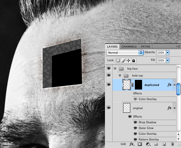
Step 21
Select the original shape, then grab the pen tool in paths mode and make a selection as shown below. We will add now some shadows to create the 3d effect. Remember, you have to click Cmd/Ctrl + Enter to turn the path created with the pen into a selection.
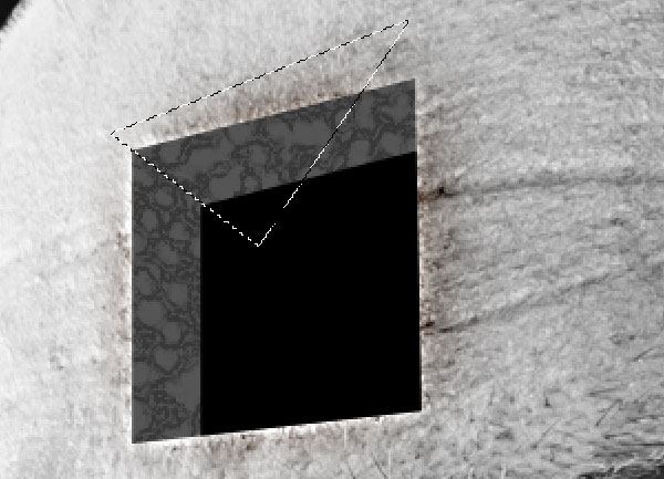
Step 22
At this point, use the burn tool to darken the left corner.
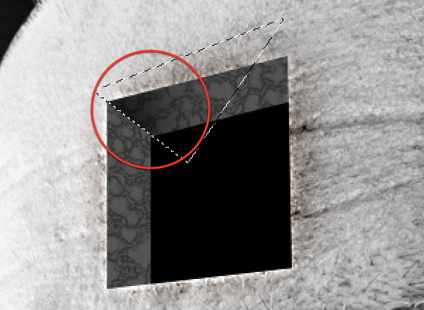
Step 23
Press Cmd/Ctrl + D to deselect and use the burn tool to darken the bottom-left area of the shape.
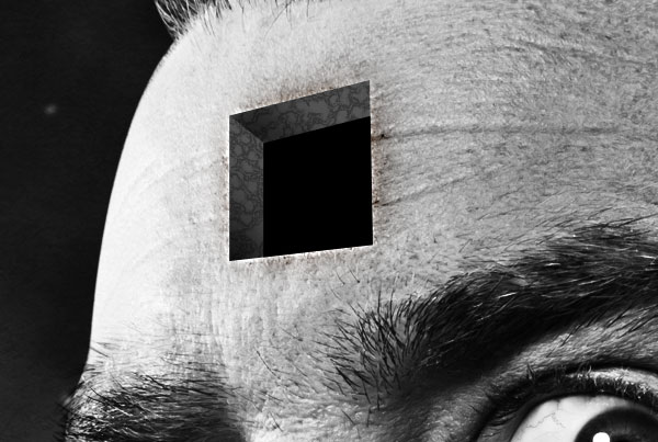
Step 24
The hole looks more realistic if we make something coming out of it. Download this crow image and paste it onto your canvas.
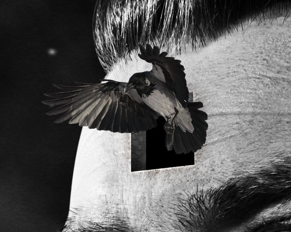
Step 25
The crow is too dark. If you zoom out you’ll notice that it’s difficult to distinguish. Go to Image > Adjustments/Brightness and increase brightness to 70. Now it looks better.
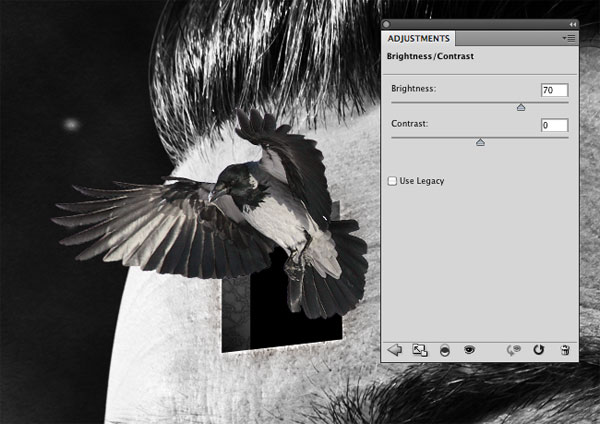
Step 26
As before, let’s apply another layer mask, this time to the crow. Cmd/Ctrl + Click on the shape layer (the original one) and add the mask. You can now select all the dude’s layers and group them (Cmd/Ctrl + G).
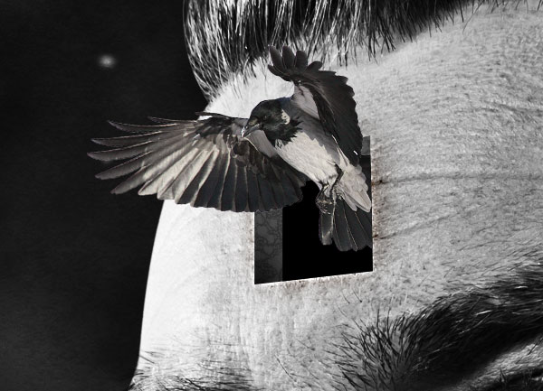
Step 27
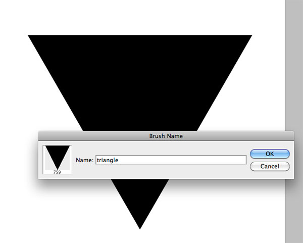
We can now add some interesting details. Let’s start from a custom brush. Create a new 1000 x 1000 pixels document and use the Polygon tool to create a black triangle. Then go to Edit > Define brush preset to create the brush that we will use later. You can now delete this document and switch to the main canvas.
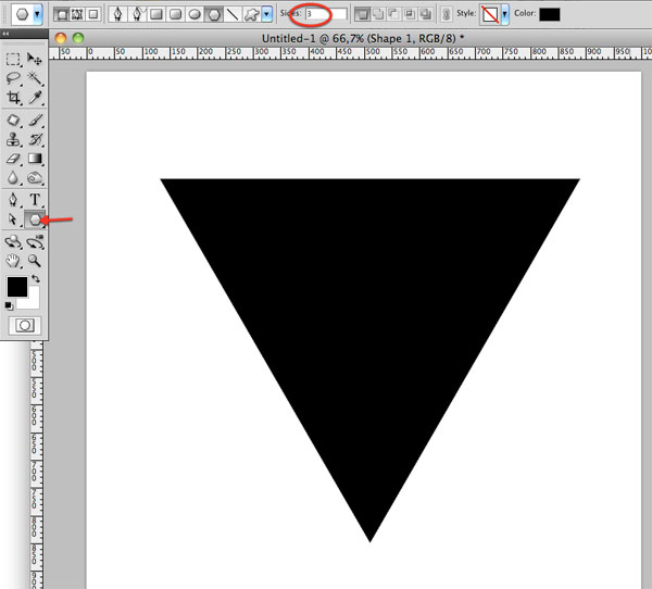
Step 28
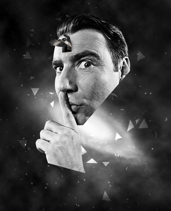
Select the brush we just created and apply the same settings we used before with the stars. In this way the brush will give you a kind of animated effect, with different angles and opacities. Create a new layer below the dude’s group and play with the brush.
Step 29
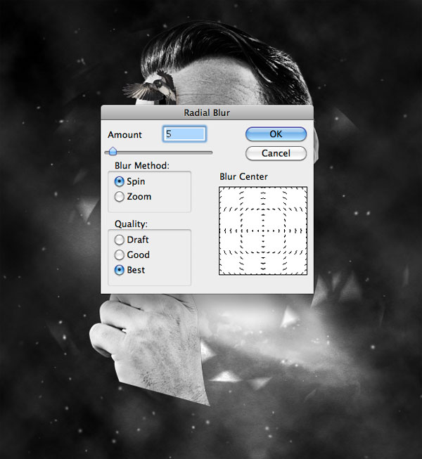
Go to Filter > Blur > Radial blur and enter the following settings.
Step 30
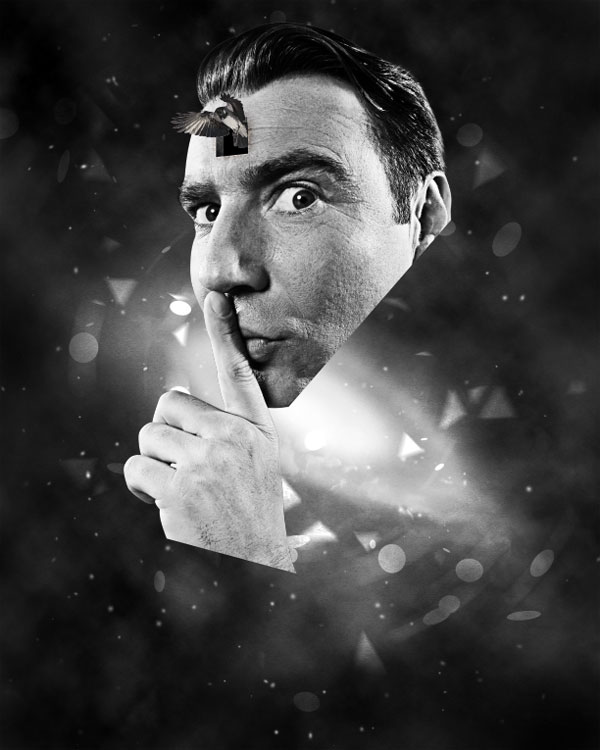
Repeat Steps 28 and 29 with a round brush.
Step 31
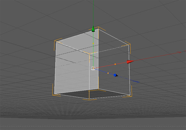
There’s a hole in the forehead of this crazy man. But why? Maybe because of a floating cube that has gone through his head? I want to create a semi-transparent cube, not a flat one, so I can put something inside it that will be visible. It comes naturally to me to open Cinema4D to create the cube. In case you don’t have Cinema4D, the cube can be download in the source file or you can download it here.
Otherwise open Cinema 4D and go to Object > Primitive > Cube and rotate the cube so that its angulation will match the one of the hole.
Step 32
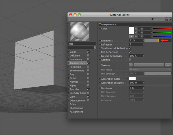
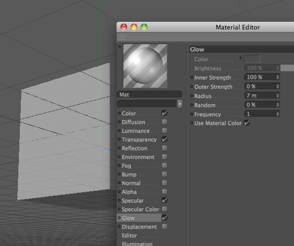
Double-click on the material window to create a new material, and then double click on the new material to open the Material editor. Add Transparency and Glow with the following values.
Step 33
Drag the material over the cube to apply it. Press Cmd/Ctrl + R to render the cube. Ok, looks nice. A similar cube can be created in Photoshop. It depends by your workflow. I personally find it easier to create the 3d cube in Cinema4D in 2 minutes.
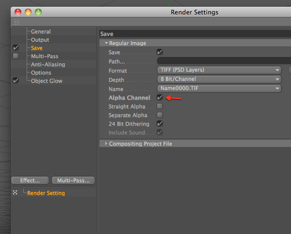
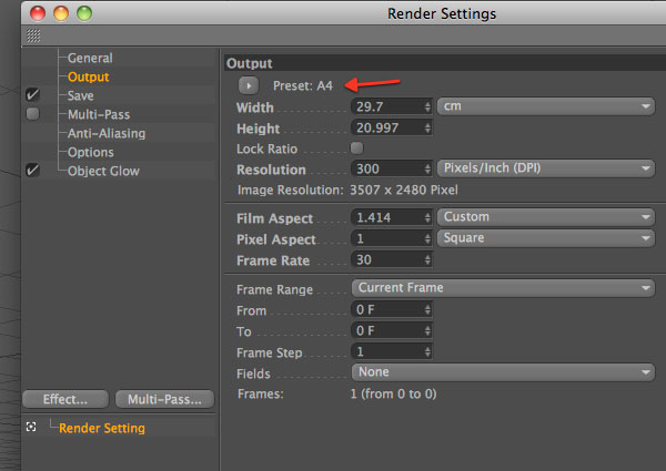
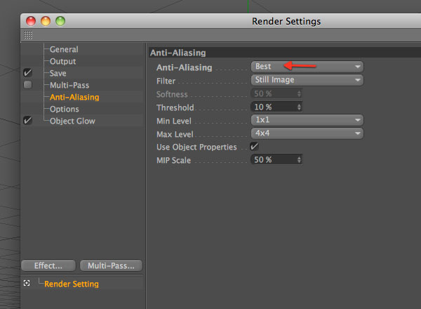
Now, before saving, set up the render settings. Go to Render > Render settings and follow the instructions in the screenshot below. Remember to check Alpha Channel, that we will use in Photoshop to extract the cube from the background.
Step 34
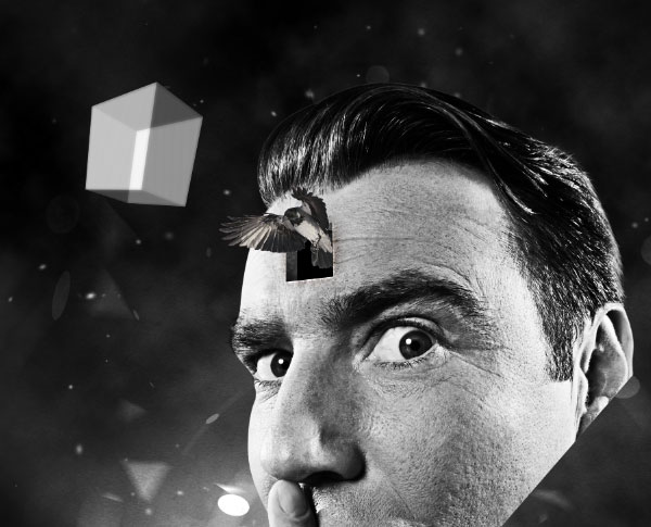
Now go to Render > Render to picture viewer and save the file as a tif. Open it with Photoshop. In the Channel window you can notice a separate channel. Cmd/Ctrl + Click on it to select the cube, copy (Cmd/Ctrl + C) and paste it (Cmd/Ctrl + V) into the main canvas.
Step 35
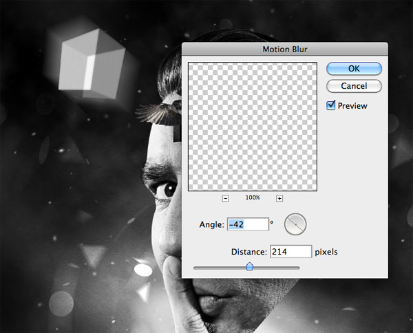
Duplicate the cube and move the duplicated below. Go to filter > Blur > Motion blur.
Step 36
With the eraser tool, eliminate the upper part of the motion effect.
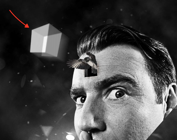
Step 37
Grab the line tool (2px weight) and create 4 lines in correspondence with 4 edges of the cube.
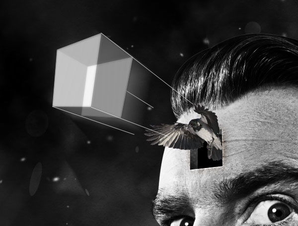
Step 38
Then, use the eraser tool – 0% hardness – to gently erase the ending points of the lines.
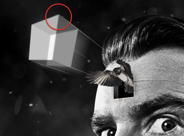
Step 39
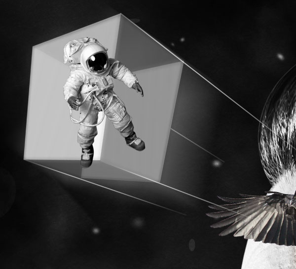
At this point you are free to decide what to put inside the cube. I like the idea of an astronaut in mission (impossible).
Step 40
The point now is how to modify the astronaut so that he looks inside the cube? Grab the pen tool in "shape layers" mode and create 3 shapes that cover the 3 front faces of the cube.
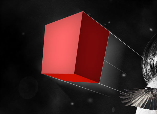
Step 41
Now add the following styles to the shapes. The only thing that you have to change for each shape is the gradient overlay angle.
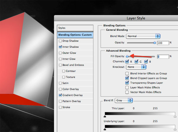
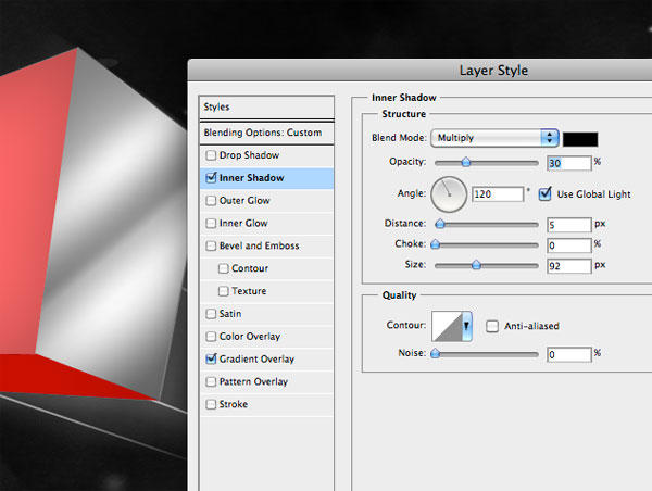
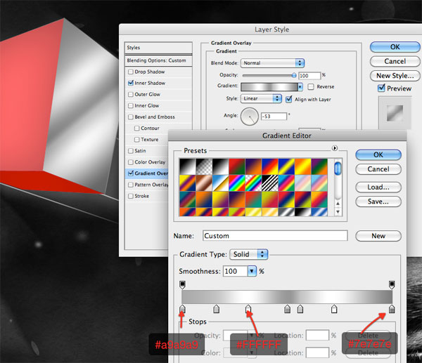
Step 42
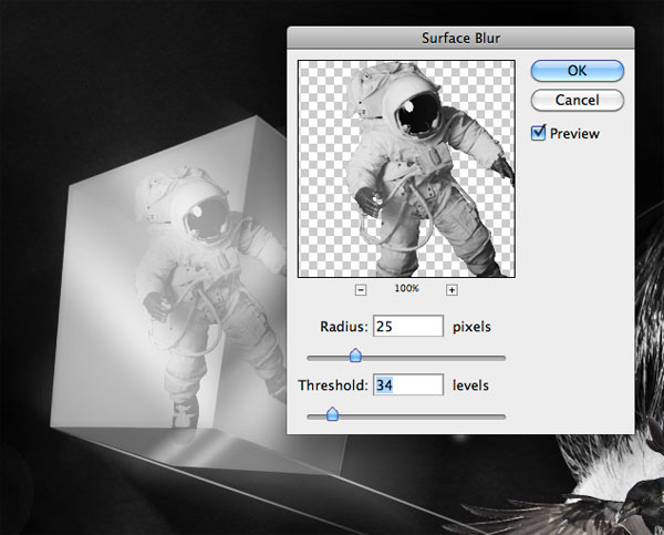
Reduce the opacity of the 3 layers so they will look transparent. Finally apply the Surface filter to the astronaut (Filter > Blur > Surface blur).
Step 43
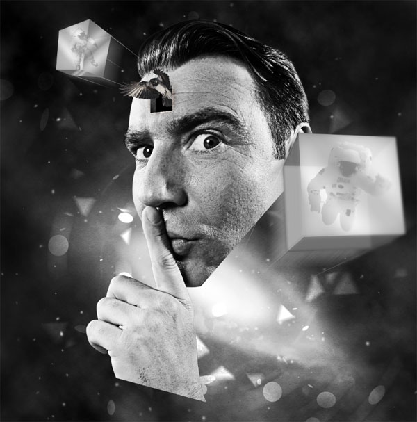
Using the same method, I’ve added a second cube (and a second astronaut of course).
Step 44
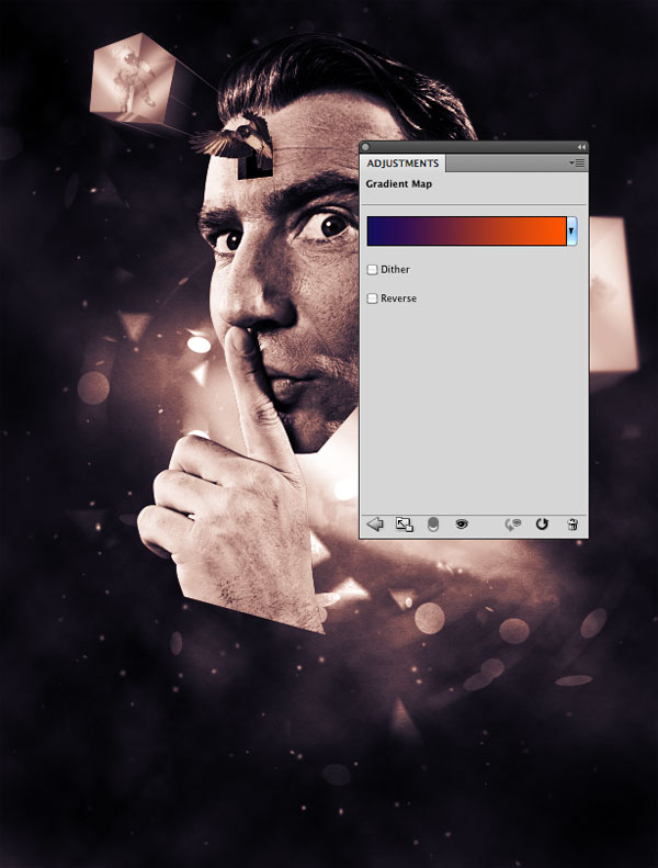
Create a new group, title it "adjustments" and put it at the top of all the other layers and groups. Here we will add 2 layers that will give color to the entire composition. Keep in mind that this group will be always on top of the others, and, every time you want to modify color combinations, you simply have to play with these layers.
Go to Layers > New adjustment layers > Gradient Map and add a gradient going from blue (#13055c) to orange (#ff5400). Set the layer to overlay with opacity 50%.
Step 45
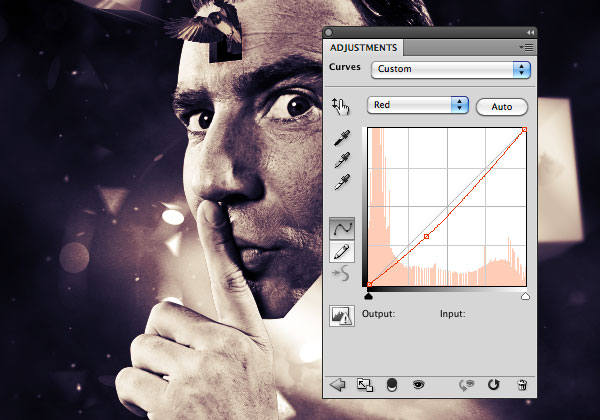
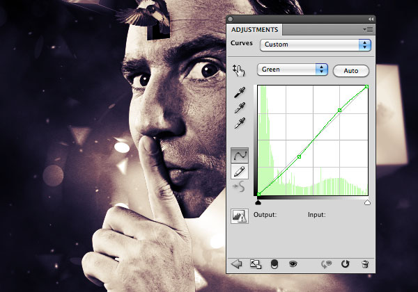
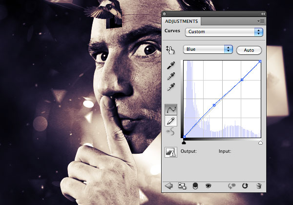
Now add a curve adjustment layer. Here I’ve played with curves until I’ve achieved a good color combination. There’s no secret recipe for this. Simply play with options and don’t worry if you obtain something totally different. Follow your taste.
Step 46
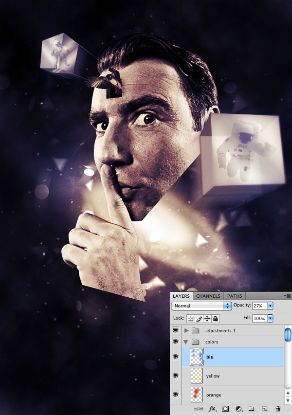
Create a new group below the "Adjustments" one and title it "colors". Set the blending mode of the group to overlay. It’s my habit to use some layers set to overlay to change the color of specific areas, and put these layers on top of the others. For example if I want to enhance the center, I will paint over it using a white soft brush – with the layer set on overlay.
In this case I’ve used blue to paint over the edges. I had the impression that a dark color would have directed the user attention to the center. Secondly I’ve painted over the face using a large soft orange brush, and over the nebula with a yellow brush.
Step 47
We are near the end, don’t worry. Create a new group below the "colors" one, and title it "light effects". Switch the blend mode to Color dodge. Then create a layer inside it and create some spots over the areas you want to enhance. Create several spots on different layers and play with their opacity. The aim of this step is to make the composition more vivid. Focus you attention on the points that you consider more important – the face, the cubes, the nebula – and click over these.
Step 48
Inside the "light effects" group, grab the Ellipse tool and create a stretched ellipse. Place it at the bottom of the hand. Do the same with the bottom of the head.
Step 49
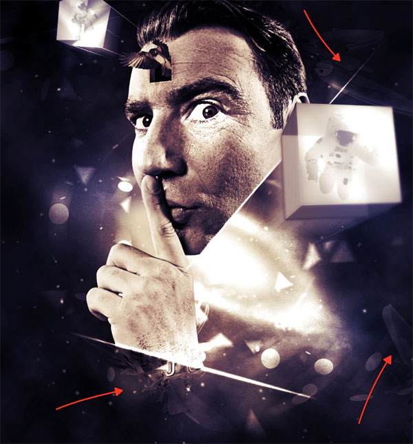
We can now add the last details. The first thing I want to enrich is the background. Download this free sample of 3d abstract renders published on WeGraphics. Paste them onto the canvas immediately above the background group. desaturate them (Cmd/Ctrl + Shift+Alt + U) and set their layer blending mode to overlay.
Step 50
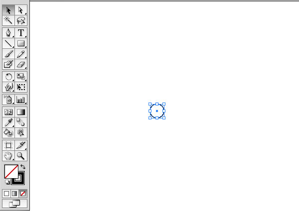
We will need Illustrator for 2 minutes. Open a new document in Illustrator and create a circle with 1pt black stroke and no fill color.
Step 51
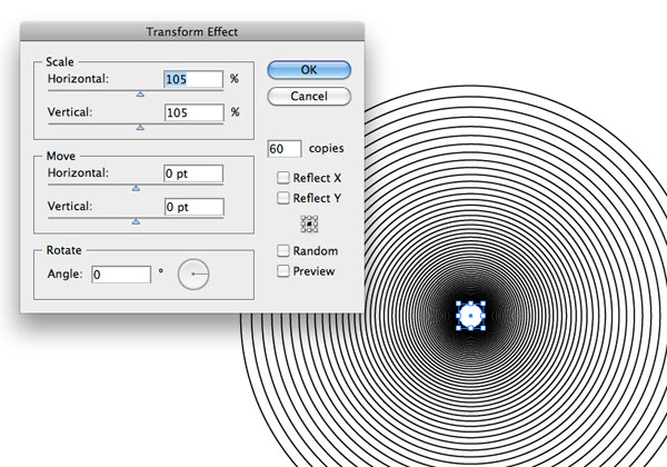
Go to Effect > Distort&Transform > Transform and apply the following settings.
Step 52
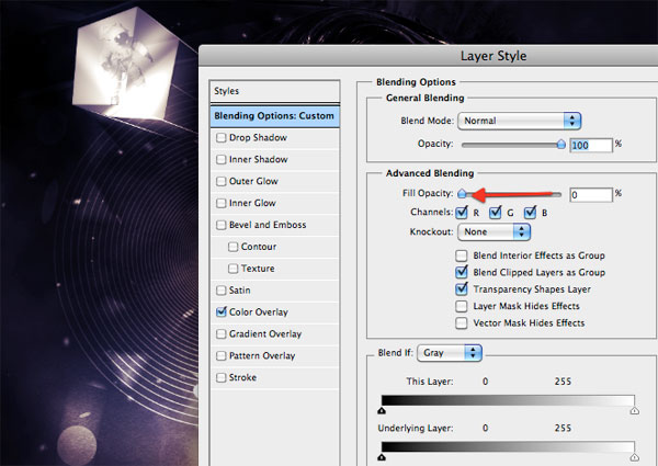
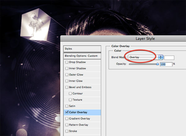
Copy and paste the illustrations in Photoshop (as smart objects in order to prevent scalability), and add the following styles.
Step 53
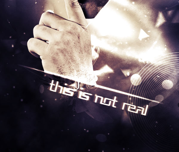
The last touch (I promise!). I’ve written “This is not real”, thus underlining the sense of the entire composition. The font used is Republika. To give more style to the text, I’ve duplicated it and applied a soft motion blur to the duplicated text.
Final Image
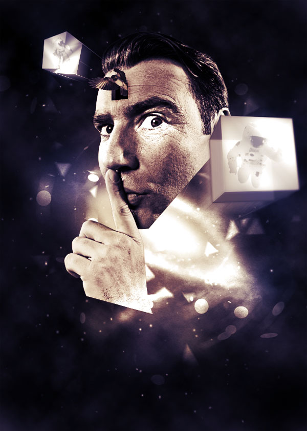
We’ve finished guys! We could have added more details, but I think it’s sufficient for the purposes of this tutorial. I hope you have learned something new, and that you like the end result!
