This tutorial was originally published in November 2012 as a Tuts+ Premium tutorial. It is now available free to view. Although this tutorial does not use the latest version of Adobe Illustrator, its techniques and process are still relevant.
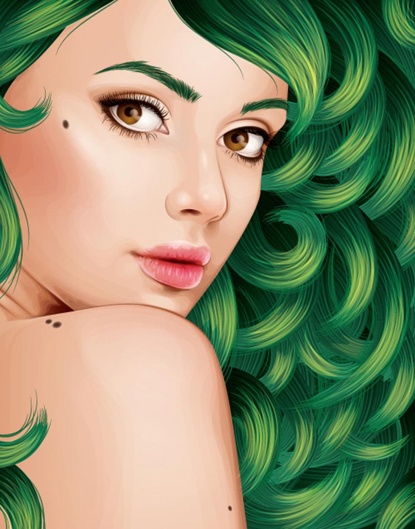
I’ve created several vector portrait tutorials in the past, but one request is made several times and that is how to create curly hair. In today’s tutorial, I’m going to show you one of the easiest ways of creating detailed curly hair. So let’s jump in and begin creating!
To create gorgeous portraits of your own, consider one of our amazing Adobe Illustrator Hair Brushes from GraphicRiver. Or enlist the help of a design professional to create your very own portraits from Envato Studio.
1. How to Prepare the Document
Step 1
I start by creating a New document and then File > Place my stock image onto the canvas. As I want the hair to be one of the biggest features of this composition, I want to make sure that it has enough space to garnish the attention from the viewer.
I then set up my layers as shown in the Layers panel below. In the layer “BG” I have placed a white fill Rectangle (M) over the stock image set to 50% Opacity. This is to make the edges of my shapes more prominent against the stock image when I’m tracing shapes.

Step 2
I often use the default “Skintones” palette from Adobe Illustrator. You can access these by clicking on the drill-down menu in the Swatches panel > Open Swatch Library > Skintones. For Caucasian skin, I select the top four palettes so I can mix them to create multi-tone shading. Skin isn’t all one color—there are different shades depending on the area of the face/skin, which I’ll go into later on. By clicking on the folder to the left of the palette, you can automatically add them to your Swatches panel.

I’ve then selected a mid tone and used the Pen Tool (P) to trace my overall skin base shape.

2. How to Render the Skin
Step 1
For the initial skin shading shapes, I’ve used the same skin tone as the base and traced areas of highlight on the face with the Pen Tool (P). I’ve then created a Compound Path (Control-8) with the first set of shapes and used Pathfinder > Minus Front from a duplicate of the skin base shape.

I use the same process several times. Once done, I set the shapes to Blending Mode Multiply, Opacity 10%, and then Group them (Control-G).

Step 2
Using a slightly darker skin tone, I trace areas of shadow with the Pen Tool (P). Again after one set is created, I’ll add it to its own Compound Path (Control-8). Each Compound Path is then set to Blending Mode Multiply, Opacity 10% and then Grouped together (Control-G).

Step 3
As you may have noticed the shapes go beyond the base shape. I’ve duplicated the base shape and Grouped the two groups of skin shading shapes (Control-G) and then created a Clipping Mask (Control-7). All future skin shading shapes will be added to this Clipping Mask to keep a clean edge.

Step 4
Using an even darker shade, I add darker shadows with the Pen Tool (P) using the same process. Typically the darker the area, the smaller the shapes created. These shapes are set to Blending Mode Multiply, Opacity 10%.

Step 5
Now to add the highlights. I create a transparent radial gradient using the lightest skin tone. I then use it to fill shapes highlighting areas of the skin. These shapes aren’t added to a Compound Path.

Instead each set of shapes is Grouped together (Control-G). Each set is set to Blending Mode Screen, Opacity 15%.

Step 6
There are areas which are in deeper shadow than anywhere else. Typically it’s areas where the skin folds (eyelids, lips, nose crease), but also near the hairline, along the nose to help it stand out, and around the nostrils. These shapes are much darker and are set to Blending Mode Multiply, Opacity 15%.

Step 7
From the more pink hue skin tones, I’m going to add a light pink transparent radial gradient to the skin, first to just below the cheekbone within an Ellipse (L).

The next is on the shoulder. These shapes are set to Blending Mode Multiply, Opacity 60%. I’ve added the cheek coloring above the other skin shading, whereas the shoulder is below the skin shading.

Step 8
To modify the overall base of the skin shading, I’m going to add gradients below the rendered skin shading shapes. Duplicate the original base shape and first add transparent radial gradients with the highlight gradient. Using the Gradient Tool (G) move the sources of the gradients over the face and over the shoulder/arm. These are set to Blending Mode Screen, Opacity 30%.

I’ve then added a transparent linear gradient under the skin shading set to Blending Mode Color Burn, Opacity 100%.

Step 9
Using the skin highlighting radial gradient, I’ve then added more intense highlights to the eyeball and skin. These are set to Blending Mode Screen, Opacity 60%.

Step 10
Skin isn’t all one color—there are a variety of tones throughout. Typically you’ll find a hint of grey towards the corner of the eyes. Use a transparent radial gradient set to Blending Mode Color to add a grey tint. Reduce the Opacity accordingly, although keep in mind that the more prominent the grey, the more aged a person will appear.

The tip of the nose typically is more rosy. So use a red radial gradient set to Blending Mode Color Burn, Opacity 20% to add a hint to the nose.

To make the cheekbones stand out more, add shading underneath them. I’ve added more color to the cheekbone with a purple transparent radial gradient. This is set to Blending Mode Color Burn, Opacity 10%.

Step 11
To show the creases in the neck, I’ve added further highlights using the highlighting skin gradient. These are set to Blending Mode Screen, Opacity 30%.

3. How to Render the Lips
Step 1
When I begin skin shading, I always treat the lips as if they have no color and shade them with the skin. This is because I don’t want the lips to look as if they are floating independently on top of the skin.
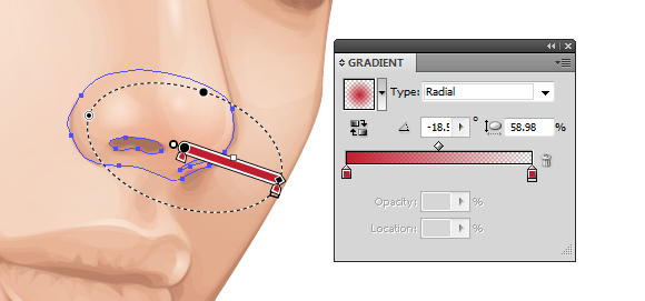
I then use gradients to add color to the lips. I’ve used a pink transparent radial gradient on the three shapes I’ve created for the lips: one for the overall lips shape and one each for the top and bottom lips. They overlap in the center to help darken this area which is in shadow. These shapes are then set to Blending Mode Color Burn, Opacity 40%.

Step 2
I use a brown transparent radial gradient to add shadow and creases to the lips. These shapes are set to Blending Mode Color Burn, Opacity 50%.

Due to the contrast created with these shapes, I’ve added further shading to the face with the same gradient. These shapes are set to Blending Mode Color Burn, Opacity 100%.

Step 3
With the Pencil Tool (N) and a light pink transparent radial gradient, add highlights to the lips. The Pencil Tool (N) will allow you to add many shapes much quicker than using the Pen Tool (P). These shapes are then set to Blending Mode Overlay, Opacity 30%.

Then using the highlighting skin gradient, add further more intense shapes. These are set to Blending Mode Color Dodge, Opacity 40%.

Step 4
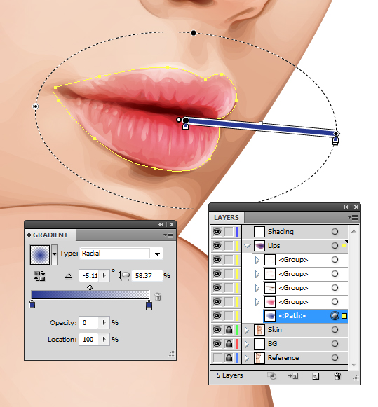
I want the lips to appear more pink than red/orange, so I duplicate the shape covering the whole of the lips area and add a dark blue transparent radial gradient. Set it to Blending Mode Soft Light, Opacity 100%. This helps “neutralise” the red/orange tone.

4. How to Render the Eyes
Step 1
Using a similar theory, I’m going to “neutralize” the red/orange tones on the eyeballs slightly by using a light blue radial gradient. This will be set to Blending Mode Color and Opacity 30%.

Then I’m going to add highlights to the eyeball using the highlighting skin gradient set to Blending Mode Screen, Opacity 40%.

Step 2
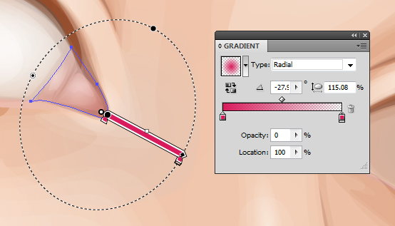
I’m going to add a pink tint to the water line with a rose transparent radial gradient set to Blending Mode Color, Opacity 100%.

Then add a bolder and darker gradient in the corner of the eyes set to Blending Mode Multiply, Opacity 30%.

Step 3
With a golden brown fill color, use the Pencil Tool (N) to add shading around the waterline and corner of the eye. These shapes are set to Blending Mode Multiply, Opacity 10%.

Then with a light pink, add highlights with the Pencil Tool (N) set to Blending Mode Screen, Opacity 40%.

Step 4
I’m going to use Clipping Masks (Control-7) for the iris. First duplicate the largest shape for the eyeball. Then draw an even circle with the Ellipse Tool (L).

Create a Clipping Mask: first a duplicate of the iris and then a Clipping Mask containing this iris mask, with the eyeball duplicated shape. This will give you a Clipping Mask within a Clipping Mask. You will see the benefit of this soon.

Step 5
I’ll be adding the detailing to the eyes via the Appearance panel. I’ve used a mid brown for the iris. The first fill is set to 60% Opacity, and the second from bottom fill is Offset Path by -1 pt and 100% Opacity. This gives the iris a soft edge.
Then the pupil is made from two dark brown fills. One is Offset Path by -12 pt with a Blending Mode of Multiply, Opacity 40%. The next is Offset Path by -13 pt and with a Blending Mode of Multiply, Opacity 80%. Again this is to create a soft edge.

Step 6
Gradients are then added to the iris. These are Offset Path by -1 pt. An inverted dark brown radial gradient is applied to give a vignette effect around the iris.

This is then duplicated and with the Gradient Tool (G) is enlarged and brought down towards the bottom of the iris. This gives a slight shadow at the top of the iris.

Then a green to orange radial gradient is applied to the bottom of the iris. This is to give a golden brown tone to the eyes.

Step 7
Duplicate Item and give an Offset Path -1 pt and a dark brown transparent radial gradient fill. Then go to Effect > Transform & Distort > Zig-Zag and use the settings below. If the two Clipping Masks were not applied, the zig-zag effect would overlap onto the eyelid and onto the eyeball. Once done, go into the Graphic Styles panel and Add New Graphic Style and apply it to the other eye so you’ve got the same effects on both.

Step 8
Using the Pen Tool (P) and a dark brown fill, draw shapes around the eye and eyelid crease. This is to help build upon a base for the eyelashes and to define the eyelids. These shapes are set to Blending Mode Multiply, Opacity 30%.

Further, more subtle shapes are added with a black fill, set to Blending Mode Multiply, Opacity 10%. These help to add shadow onto the eyeball.

Step 9
Using the skin highlighting gradient, add a light reflection along the waterline and over the pupil. These are set to Blending Mode Screen, Opacity 70% to 100%.

Step 10
Eyelashes are added using the Width Profile 1 brush I’ve created in a previous tutorial. Both lashes use a dark brown stroke color, but the top are set to Blending Mode Multiply, Opacity 70%, and the bottom are set to Blending Mode Multiply, Opacity 40%.

5. How to Render the Hair
Step 1
Before I begin adding the hair, I decide to sketch out ideas. I use the Blob Brush Tool (Shift-B) to sketch with. I Create New Layer above and below the core elements of the portrait to sketch hair on top and underneath the portrait. I’ve decided in this case I’m going to fill all the negative space with hair.

Step 2
For curly hair, you need to treat each curl as its own entity. Each curl should cover any hair which is underneath it to create a mane of healthy, thick curls. One of the easiest ways of going about this is to create an Art Brush of a curl. Of course we’re not drawing an actual curl, but imagine pulling a curl straight.
Using the Rounded Rectangle Tool, draw out a shape and use the Direct Selection Tool (A) to select the end points of the shape. Then use the Free Transform Tool (E) to reduce the size at the end of the shape to create a tapered effect. I want to give the portrait a mass of green hair.

Step 3
As you can’t include a gradient or a Clipping Mask with an Art Brush, I’m going to create a gradient effect using a Blend. Duplicate the tapered shape twice. Use the Free Transform Tool (E) to reduce the size of the shape on top. For the larger one, set it to 0% Opacity. Then with both shapes selected create a Blend (Control-Alt-B) with Specified Distance Spacing of 4 pt. Set the Blend to Blending Mode Multiply.

Step 4
Using the Width Profile 3 brush, add strokes using the Line Segment Tool (\) at the tip of the tapered end with a 2 pt Stroke Weight. These strokes should be the same green as the original tapered shape and placed below the Blend.

Step 5
With the Width Profile 1 brush, add 2 pt Strokes with the Line Segment Tool (\) on top of the shape with Blending Mode Screen, Opacity 30% to add highlights. Then using the same settings, add darker strokes with a Blending Mode of Multiply, Opacity 30%. Group all the elements once done (Control-G).

While the group is selected, in the Brush panel create a New Brush > Art Brush and click on OK.

Step 6
Using the Pen Tool (P) for a smoother curve, add curls around the face underneath the face elements. Group them together once you’ve applied the initial curls (Control-G).

Add the curls in groups so you can place them underneath the previous ones. The curls in front should be above all the others and the curls at the back should be at the bottom of the layer.

Step 7
While layering the curls, for any gaps present I use a dark green shape to block the gaps.

Then when I’ve finished the layering of curls, I add a dark green Rectangle (M) behind all the curls.

Step 8
Using the Width Profile 1 brush and the Paintbrush Tool (B), I add strokes with a medium green along the sides of the curls and at the tip. As each curl is identical, I want to make them look more individual. So adding additional strokes helps me achieve this. These strokes are set to Opacity 80%.

I repeat this same method for the curls at the back and add them in stages.

Step 9
With a lime green, I add 4 pt Stroke Weight, Width Profile 1 strokes to the curls. These are set to Blending Mode Color Dodge, Opacity 40%. These strokes add a highlight to the curls and give them further definition.

I then add 2 pt Stroke Weight strands to add more detail to the highlights. These are set to Blending Mode Screen, Opacity 40%.

Step 10
Using the Pencil Tool (N), I add lime green transparent radial gradients over the top of the highlighted areas of the curls. This adds a smoother highlight to them. These are set to Blending Mode Color Dodge, Opacity 25%.

6. How to Create the Eyebrows
The finishing touches are to add eyebrows. I’ve used the Width Profile 1 brush to add 1 pt strokes to the brow bone. The initial strokes are set to Blending Mode Normal, Opacity 80%.

Finishing off with some strokes set to Blending Mode Multiply, Opacity 50%.

Awesome Work, You’re Now Done!
If you’ve followed my tutorials in the past, you’ll know I finish off with a couple of moles to the face and skin. These are created using two-layered brown transparent radial gradients set to Blending Mode Multiply. I hope you’ve enjoyed this tutorial and learnt one of the methods possible for creating curly hair.

Adobe Illustrator Hair Brushes From GraphicRiver
To help save time with your next fabulous portrait, consider using one of the amazing Adobe Illustrator Hair Brushes from GraphicRiver to speed up time. Check out one of these helpful brush packs below!
Easy Hair Brushes for Adobe Illustrator
Create quick hairstyles like a pro with this amazing brush pack! Designed with 17 easy hair brushes, simply drag and drop the brushes into the preset folder to begin creating realistic hair of your own in no time! Ideal for use with the Pen Tool, you can also use these brushes with a mouse or graphics tablet!

{excerpt}
Read More