In the following Quick Tip you will learn to create a satisfaction guaranteed seal with basic shapes and gradients. You will find that the basic structure of this graphic can be reused many times to make a set of web assets that are perfect for e-commerce. Let’s get started!
Step 1
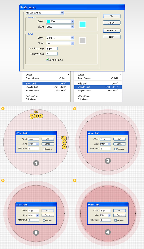
Create a 700 by 700px document. Start by turning on the Grid and the Snap to Grid then go to Edit > Preferences > Guides & Grids. Enter "5" in the "Guideline every" box and "1" in the "Subdivisions" box. Now, you’ll need to make 9 concentric circles.
- Select the Ellipse Tool (L), hold Shift and create a 500x500px shape. Name it "1" then go to Object > Path > Offset Path, enter a "-30px" offset and hit OK.
- Name the resulting circle "2", select it and go again to Object > Path > Offset Path. Enter a "-5px" offset and hit OK.
- Name this new shape "3". Select it, go to Object > Path > Offset Path, enter a "-5px" offset and hit OK.
- Name the resulting shape "4", select it and go again to Object > Path > Offset Path. Once again enter a "-5px" offset and hit OK.
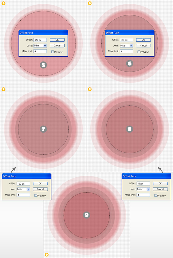
- Name this new circle "5" then go to Object > Path > Offset Path. Enter a "-25px" offset and hit OK.
- Select this new circle, name it "6" go to Object > Path > Offset Path. Enter a "-20px" offset and hit OK.
- Select the resulting shape, name it "7" and go one more time to Object > Path > Offset Path. Enter a "-10px" offset and hit OK.
- Select this new shape, name it "8" and go one last time to Object > Path > Offset Path. Enter a "-5px" offset and hit OK.
- Select this last circle and name it "9".
Step 2
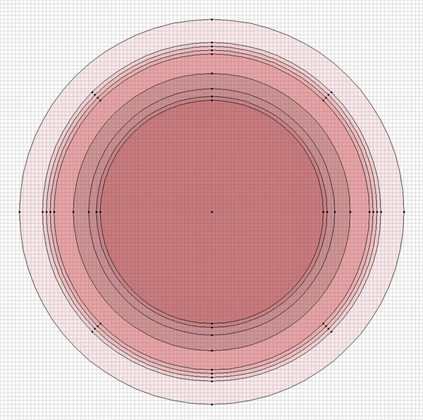
Here, you can take a closer look at the shapes created so far. Next, you’ll need to select the shapes from 2 to 9 and make them invisible (for the moment).
Step 3
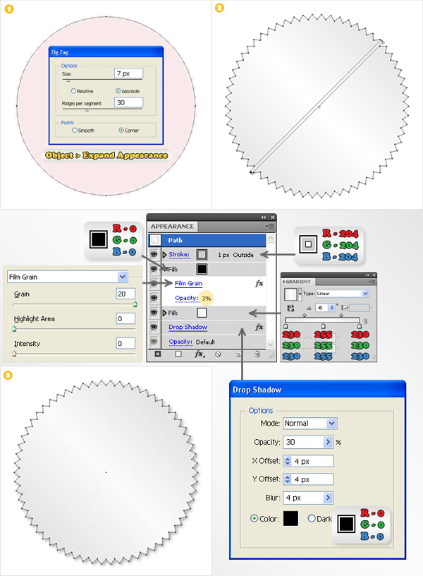
Turn off the Grid and the Snap to Grid. Now, let’s focus on shape #1. Select it, add the Zig Zag effect then go to Object > Expand Appearance. First, fill it with the linear gradient and add a 1pt aligned to outside stroke (R=204 G=204 B=204). Next, add a new, black fill. Select this fill (from the Appearance panel), lower its opacity to 3% then and add the Grain effect. Finally, reselect the entire path and add the Drop Shadow effect (Effect > Stylize > Drop Shadow).
Step 4
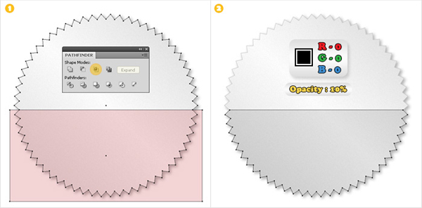
Create a copy of shape "1" then select the Rectangle Tool (M) and create a shape like the red one shown in image #1. Select these two shapes and click on the Intersect button from the Pathfinder panel. Fill the resulting shape with black, lower its opacity to 10% and move it right above shape #1 (make sure it’ll stay there until the end).
Step 5
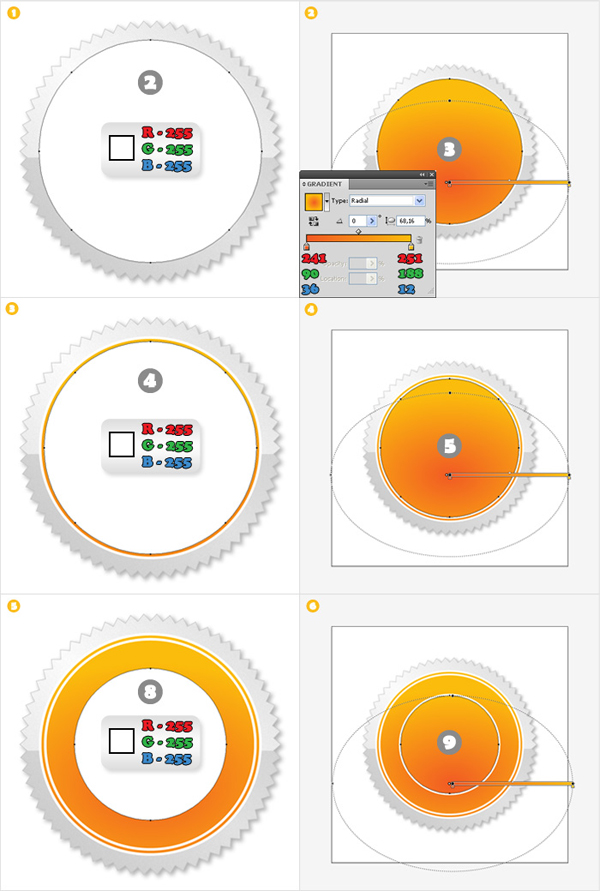
Turn 2,3,4,5,8 and 9 back to visible. First, fill 2,4 and 8 with white then fill 3,5 and 9 with the radial gradient shown below.
Step 6
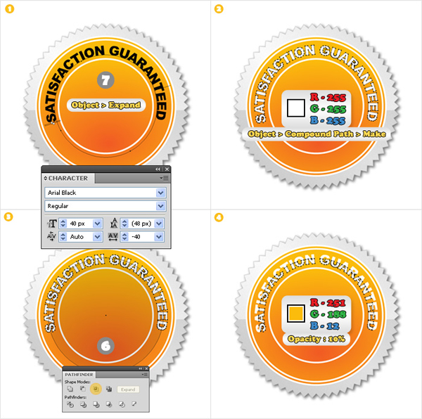
Turn shape "7" back to visible. Select the Type on a Path Tool, click on the path ("7") to bring up a blinking cursor then add the Satisfaction Guaranteed text. Use the Arial Black font with a size of 40px. Reselect this text and go to Object > Expand. Select the resulting shapes, fill them with white then go to Object > Compound Path > Make. Name the resulting shape "Text". Turn circle "6" back to visible. Duplicate "Text". Select this copy along with circle "6" and click on the Intersect button from the Pathfinder panel. Select the resulting group of shapes, fill it with R=251 G=188 B=12 then lower its opacity to 10%.
Step 7
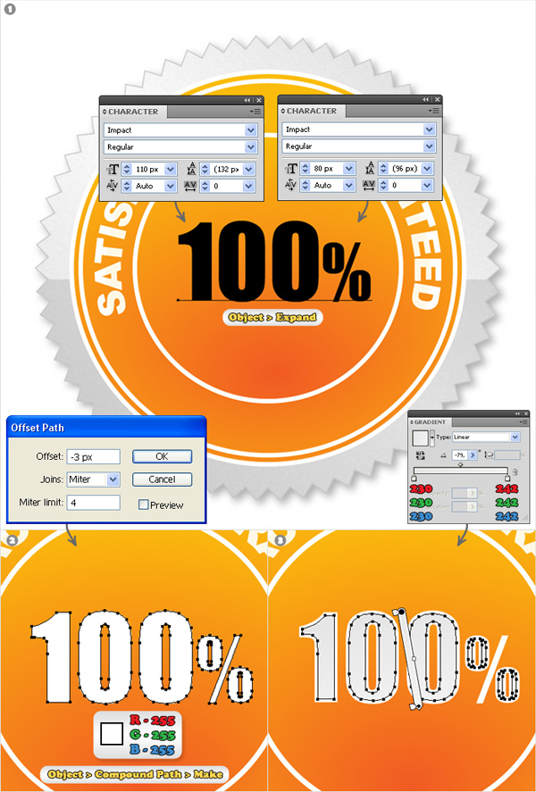
Select the Type Tool and add the 100% text in the middle of circle #9. Use the Impact font (110px for the text and 80px for the percent sign). Expand this text, fill the resulting shapes with white then go to Object > Compound Path > Make. Select the resulting shape, go to Object > Path > Offset Path, enter a "-3px" offset and hit OK. Fill the resulting shape with the linear gradient.
Step 8
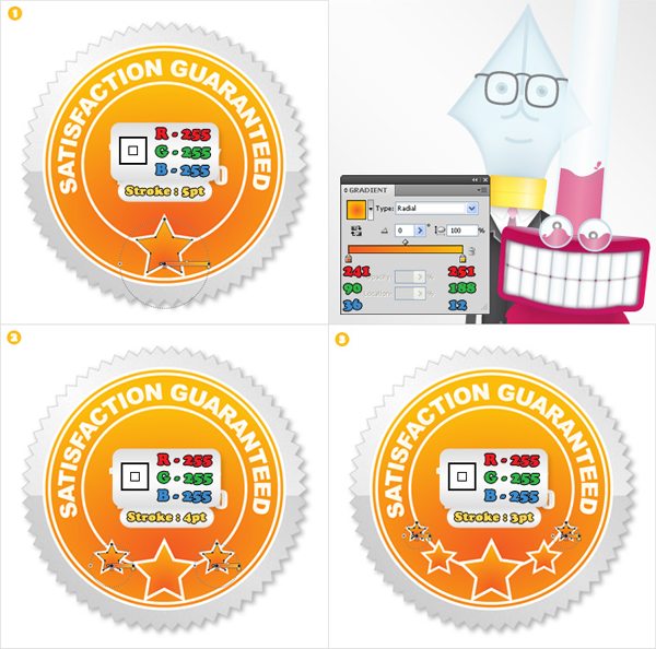
Pick the Star Tool and create a star shape like the one shown in image #1. Hold Control, while you click & drag, to increase/decrease the volume of your star. Fill it with the radial gradient and add a 5pt white, aligned to outside, stroke. Reselect the Star Tool and create four smaller star shapes. Fill them with the same radial gradient but use a different stroke size.
Step 9
Create a copy of shape "2" then select the Rectangle Tool (M) and create a shape like the red one shown in image #1. Now, select both shapes and click on the Intersect button from the Pathfinder panel. Fill the resulting shape with white and lower its opacity to 15%.

Step 10
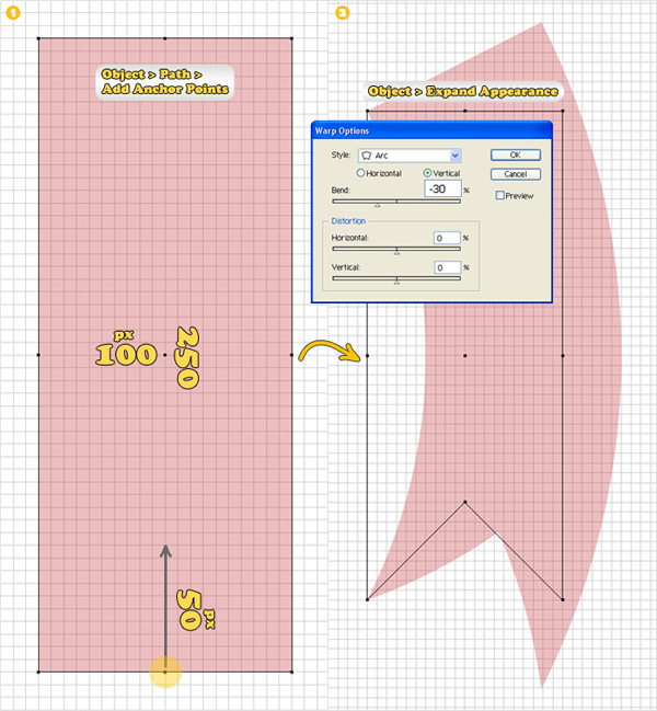
Now, let’s create the ribbons. Turn on the Grid and the Snap to Grid. Select the Rectangle Tool (M) and create a 100 by 250px shape. Select this rectangle and go to Object > Path > Add Anchor Points. Pick the Direct Selection Tool (A), select the anchor point highlighted in image #1 and move it 50px up. Reselect the entire shape, add the Arc effect (Effect > Warp > Arc) then go to Object > Expand Appearance.
Step 11
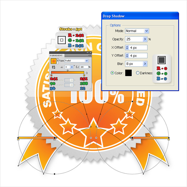
Duplicate the shapes made in the previous step. Now, rotate these two shapes and place them as shown in the image below. Fill them both with the same radial gradient then add a 5pt aligned to inside, stroke (R=242 G=242 B=242).
Conclusion
Finally, add the Drop Shadow effect and you’re done. This style of graphic is particularly useful for e-commerce sites as it can be re-colored to suit different needs.

This Quick Tip is available as a Free Download to all Vectortuts+ visitors, and is just a fraction of the content you can access via our Premium Membership System.
Tuts+ run a Premium membership system that costs $9 a month (or $22 for 3 months!). Members have full access to the hundreds of full length tutorials, professional source files and periodic extra tutorials available from all our Premium Program sites!
To join today and begin downloading High Quality Vector Resources and Tutorials visit Vector Premium.