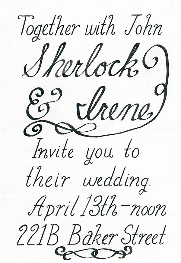
Mastering calligraphic letters is one thing, but how do you make those fancy flourishes that appear so often on wedding invitations?
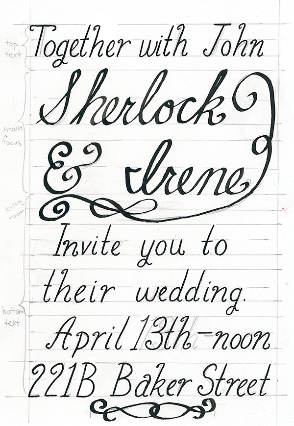
In this tutorial, I’m going to show you some easy ways to make both asymmetrical and symmetrical flourishes so that you can elevate any invitation you write this year. I’ll be continuing the theme from my drop cap tutorial by making a special bit of stationery for Sherlock Holmes.
What You’ll Need

- Scratch paper
- Bristol paper
- Pencil
- Ballpoint pen (optional)
- Pen holder
- Pen tips (as many as you want)
- Ink
- Eraser
- Ruler
1. Practicing Asymmetrical Flourishes
Step 1
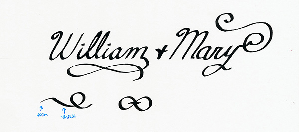
Before we get started, we’re going to practice some flourishes so that you know what options you have to choose from. You can use the picture below, which shows many different types of flourishes (and their start points marked in blue) as a reference. You can also find a wealth of others with a quick search online.

Step 2
On your scratch paper, use your pen and make several swooping, asymmetrical lines, using the reference sheet to help you. Try pushing the pen in the small curve of the swoop to make the width of the ink increase. Asymmetrical flourishes can be simple or elaborate. They also can start or end a letter.
Depending on how fancy your invitation will be, you might want to start words with a flourish, or you might like to end a word with a flourish that dips below the line.
Step 3
Keep practicing several different types until you have a feel for how your pen can curve. Don’t worry if they don’t look perfect. We’re going to pencil the final flourishes in before we bring out the ink.
2. Practicing Symmetrical Flourishes
Step 1
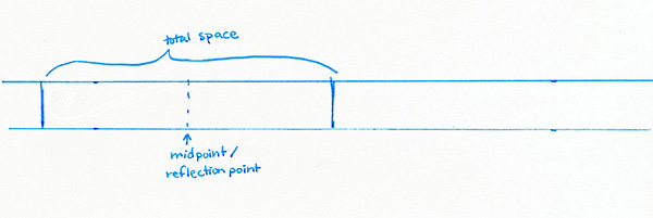
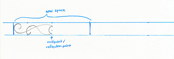
Symmetrical flourishes are a bit trickier because they’re…well…symmetrical. Thus, you’ll want to measure off not only a space in which to draw the flourish, but also a midpoint or reflection point line.
Step 2
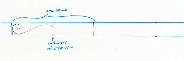
Practice drawing symmetrical flourishes, using the reference picture from the last step for inspiration. Look at a flourish and start on the left. Find an end of a line. With your pencil, trace out the path of the line till the midpoint.
Step 3
Then find another start to a line on the left side, and again follow it to the midpoint.
Step 4
You have two ways to finish the flourish. You can do it the simple way and by hand copy those lines onto the other side of the midpoint simply by following the shape of the lines on the right side of the midpoint. Or, if it’s easier, use a piece of tracing paper for this step and trace your lines from the left side in ballpoint pen. Here in the image, tracing paper is used over top of the pencil.

Step 5
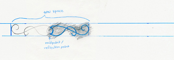
Flip your tracing paper over and rub the front side of your tracing paper (the side you just drew on) with your pencil. Place your tracing paper (pencil lead side down) onto your paper on the right side of the midpoint line and trace your original lines.
Step 6
Remove your tracing paper. Voila! You have a symmetrical flourish!

Step 7
Make several more symmetrical flourishes and start practicing with your pen until you have a feel for how your pen can curve. Don’t worry if they don’t look perfect. We’re going to pencil the final flourishes in before we bring out the ink.
3. Measure Out Your Paper
Step 1
I’m making an invitation so I want to make sure it fits in an envelope. Thus I’m using paper that’s 5″ x 7″ so it can fit in a 5.25″ x 7.25″ envelope.
Once you’ve selected your paper, measure off your margins. I’m making my margins .5″.

Step 2
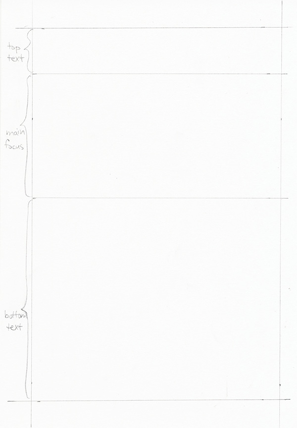
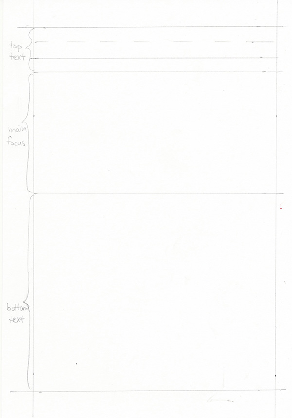
Look at the text you want to write out. The main focus of the invitation (Sherlock & Irene for me) will obviously be bigger and take up more room. So decide how much of your page you want it to take up. For me, inside my margins I have 6″ of space so I want the main focus to be 2″ tall.
4. Pencil in the Top Text
Step 1
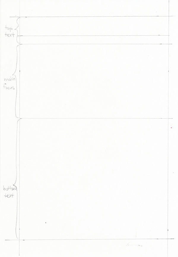
Now that you know the space for each part of the text, it’s time to measure out the line spacing. Let’s start at the top. Use the margin line as the top of your text line. Then decide how tall you want your text in this area to be. I have one line to fit in here so I’m simply going to measure .25″ up from the line of my main focus section.
Step 2
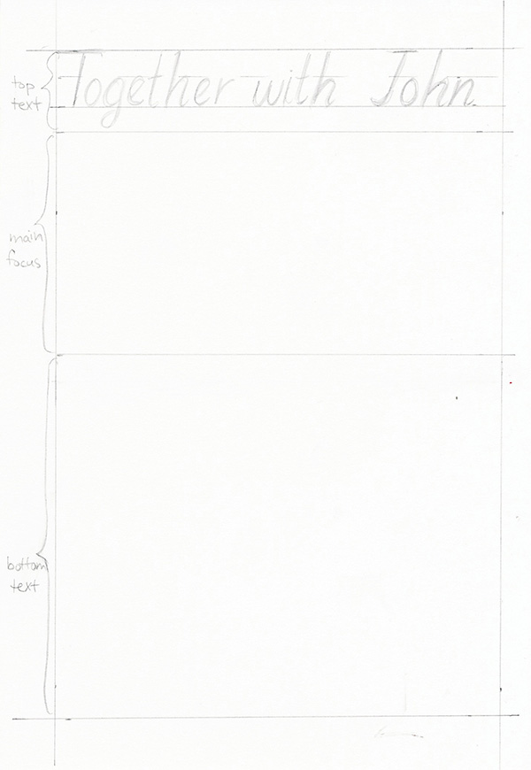
Draw in the mid-line for the lines of text you just created.
Step 3
Pencil in your text.
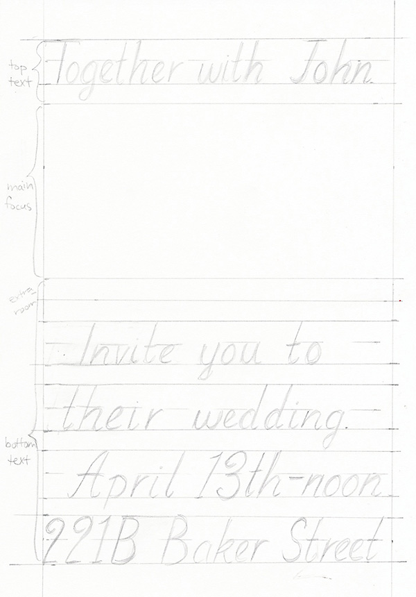
5. Pencil in the Bottom Text
Step 1
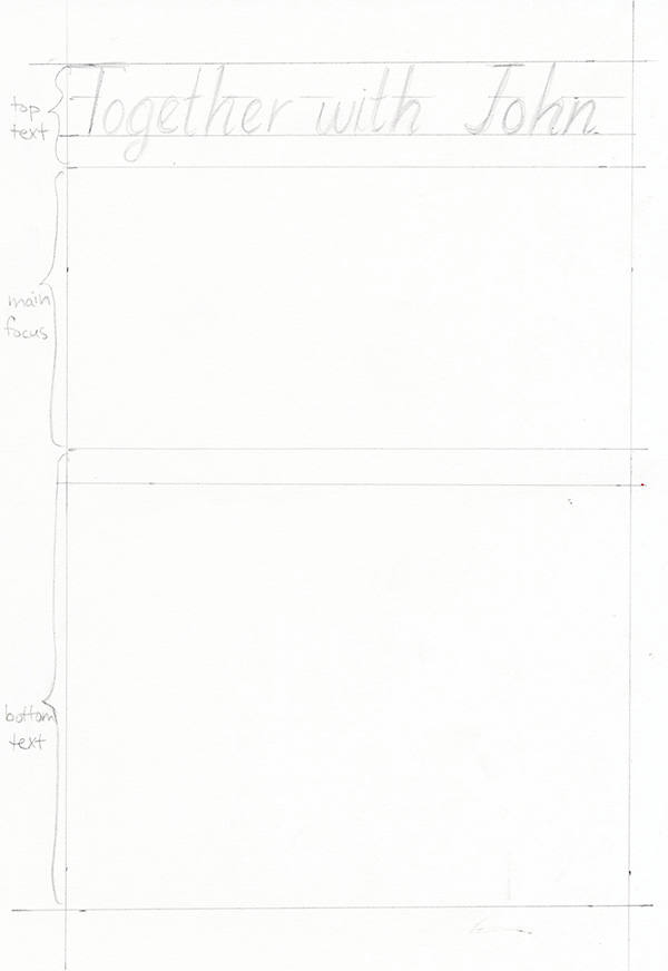
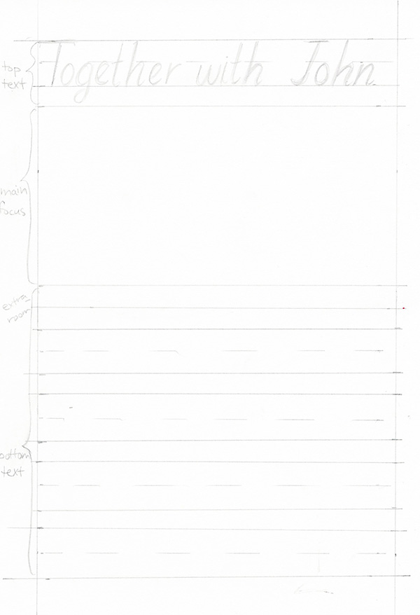
For now, we’re going to skip the big letters, so move on to the bottom section of your invitation. Measure out another .25″ margin below the bottom line of your main focus section. Now comes the hard part which may take some trial and error. I generally start measuring out my lines from the bottom margin line and work my way up. This time, I had .25″ extra space, and I’ll use that to put in an extra flourish below my main focus letters.
Step 3
Draw in the mid-line for the lines of text you just created.
Step 4
Pencil in your text.
6. Pencil in the Main Focus Text
Step 1
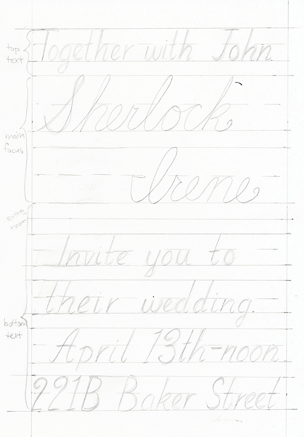
Finally we’re to pencil in our main focus text, which in my case is Sherlock and Irene. First you want to decide how many lines of text you will need to fit in the space you set aside. I’m going to fit it all on two lines.
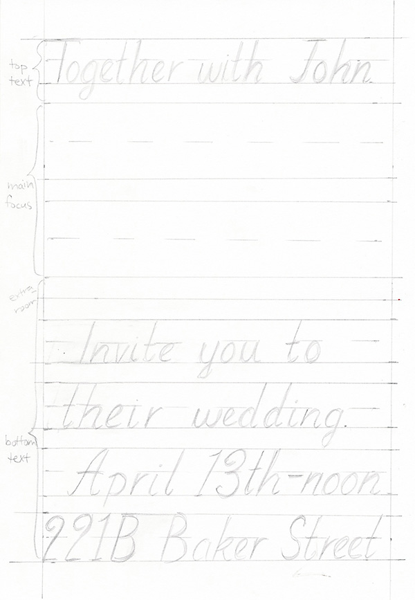
Step 2
Pencil in the bare bones of the letters.
7. Ink in the Small Text
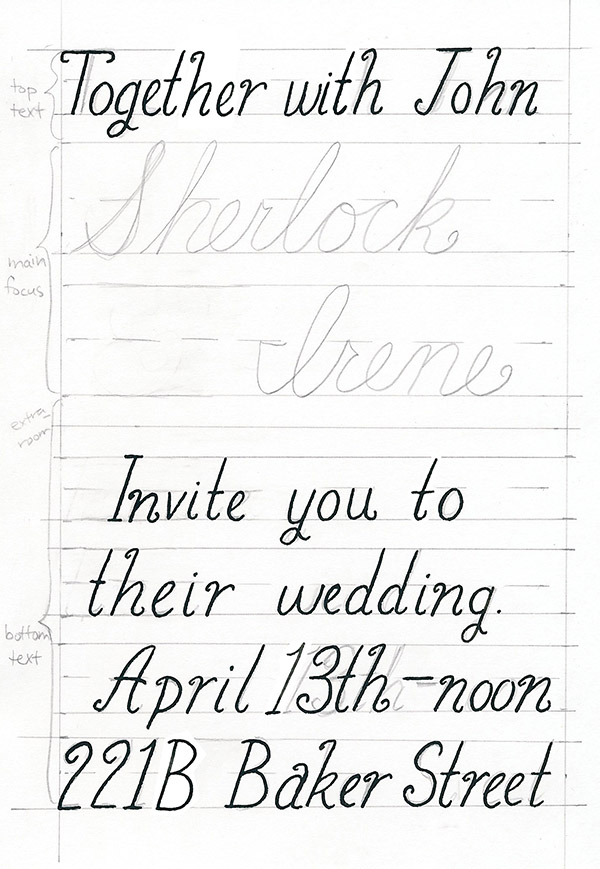
Step 1
We have a lot of pencil marks on our paper now, so we’re going to start inking in the small text. Start at the top of your paper and slowly work your way through the text.
8. Drawing in Flourishes
Step 1
Looking back at the symmetrical and asymmetrical flourishes we practiced at the beginning of this tutorial, decide which ones would work well for your main focus letters.
Step 2
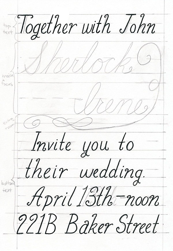
For asymmetrical flourishes, it’s much easier to simply pencil in the flourish. I always start on a scratch sheet of paper first to decide which ones will work best. For this card, I’ll be using an asymmetrical flourish and a symmetrical one so you can see the difference. Since none of the starting or ending letters of Sherlock and Irene lend well to flourishes (w’s, m’s, and y’s work great for flourishes), I’m going to fill in the space below and around the names with an asymmetrical flourish.
Step 3
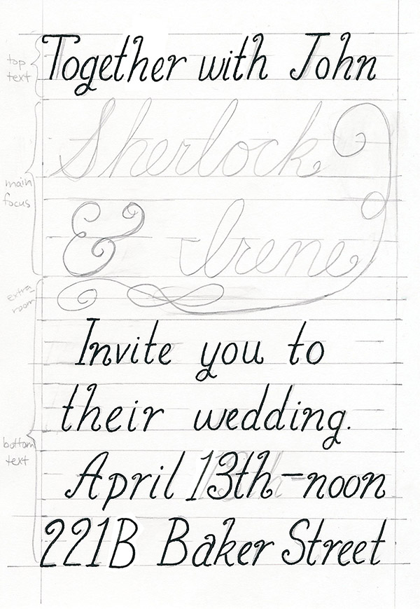
I’m also going to use my ampersand as an asymmetrical flourish, based on an ampersand flourish design I found via search.
Step 4
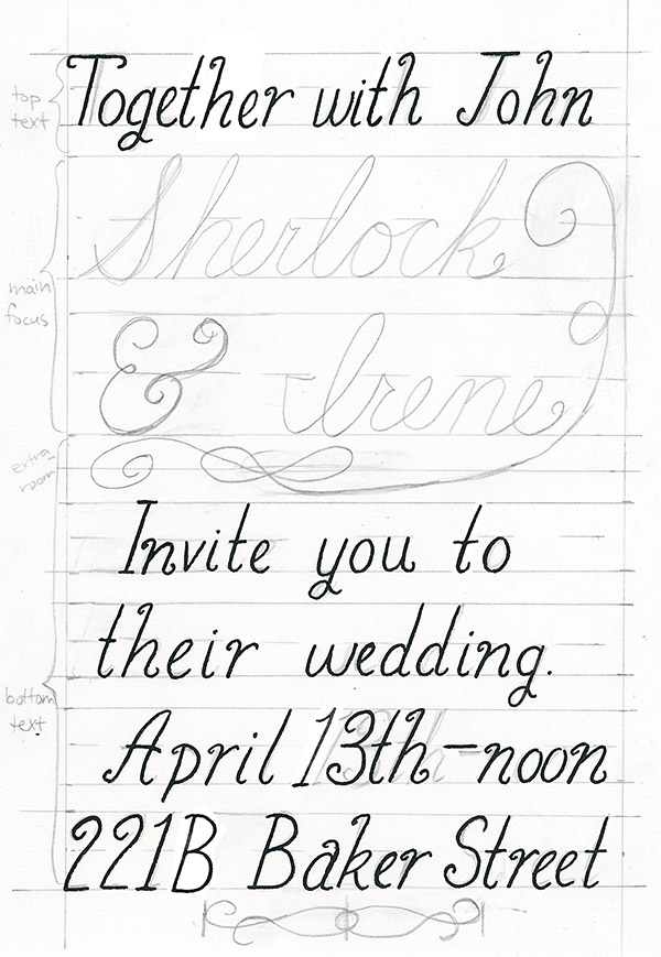
Now I’m going to add a symmetrical flourish to the very bottom of this invitation to make it even fancier. Use the same procedure from the practice at the beginning and measure out your space and midpoint. Then pencil in your symmetrical flourish.
9. Ink the rest of the piece
Step 1
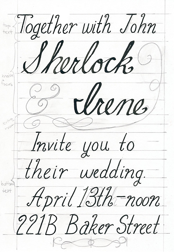
Start with the remaining words and slowly ink in the main focus part of your invitation. In order to further set off Sherlock and Irene in my piece, I’m changing nibs on my pen and using the flat-tipped nib.
Step 2
Ink in the flourishes using the techniques you learned in the practice section at the start of the tutorial.
10. Erase
Step 1
Carefully erase the pencil lines on your invitation.

And with that, your first fancy invitation is complete!
Flourishes on your calligraphic letters can add such a fancy touch and elevate any event you’re making invitations for, whether it’s a bridal shower or a moving sale. If you’re making invitations for a party, you can either hand-letter them all or ink, scan, and print them out. Experiment and find what works best for your style, and have fun adding class to your hand-lettered pieces.
{excerpt}
Read More