
Sponsored Content
This is a sponsored post featuring a product/service that’s particularly relevant to our readers.
I often hear designers say that although they love vector artwork they wish it wasn’t so inherently flat. So, to give vectors more life and add realism to your designs, I’m going to show you a simple method with the help of two powerful plug-ins from Astute Graphics; VectorScribe2 and Phantasm. This tutorial will show how to create a near realistic shield with swords by easily creating shapes using VectorScribe2 and then enhancing them with Phantasm. Find out more at the jump!
1. Install the Plug-ins and Create a New Document
Download 14 day free trials of VectorScribe2 and Phantasm plug-ins.
These videos cover the installation, licensing, and activation process. We’ll learn more about how they work during the tutorial.
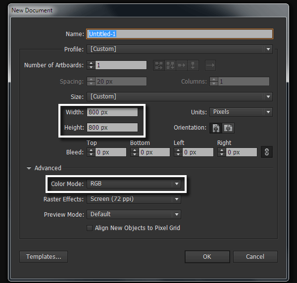
Run Adobe Illustrator, then hit Control-N to create a new document. In the opened dialog box, set the parameters of the artboard and choose the RGB color mode.
2. Create Basic Geometric Shapes
Step 1
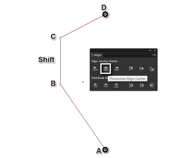
Take the Pen Tool (P) and create a path consisting of three straight-line segments. Segment B-C must be placed vertically, so when creating it hold Shift down. Select points A and D using the Direct Selection Tool (A), then click on the Horizontal Align Center button in the Align panel.
Step 2
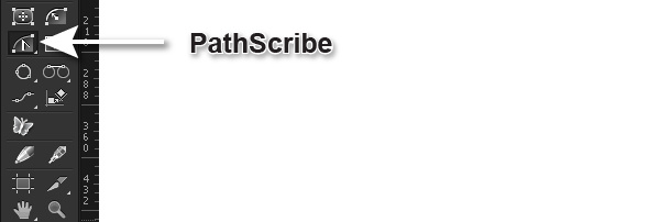
Convert straight-line segments A-B and C-D into curvilinear ones. Do this with the PathScribe Tool from the VectorScribe2 plug-in.
After choosing the tool, you’ll see new additional controls called Ghost Handles appear on the selected straight-line segments.
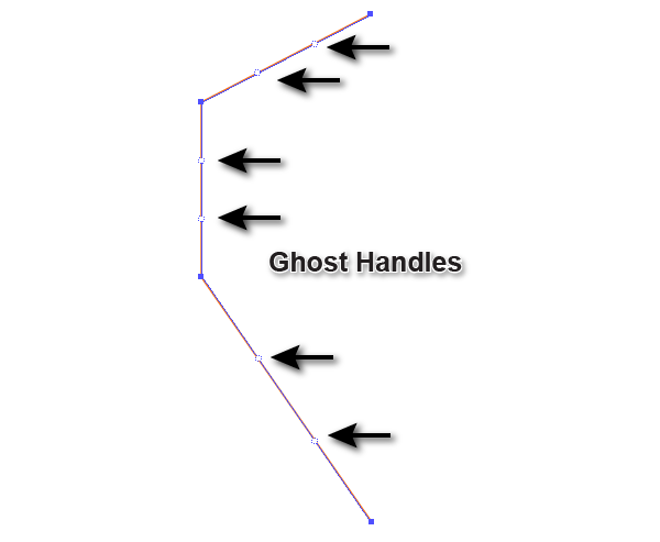
You can activate each of these individually by click-dragging the Ghost Handles, (this converts them into standard Bezier curve handles), or by dragging along the segment in the right direction to reshape it. Whilst dragging the second Ghost Handle hold Shift to lock it in the upright position.
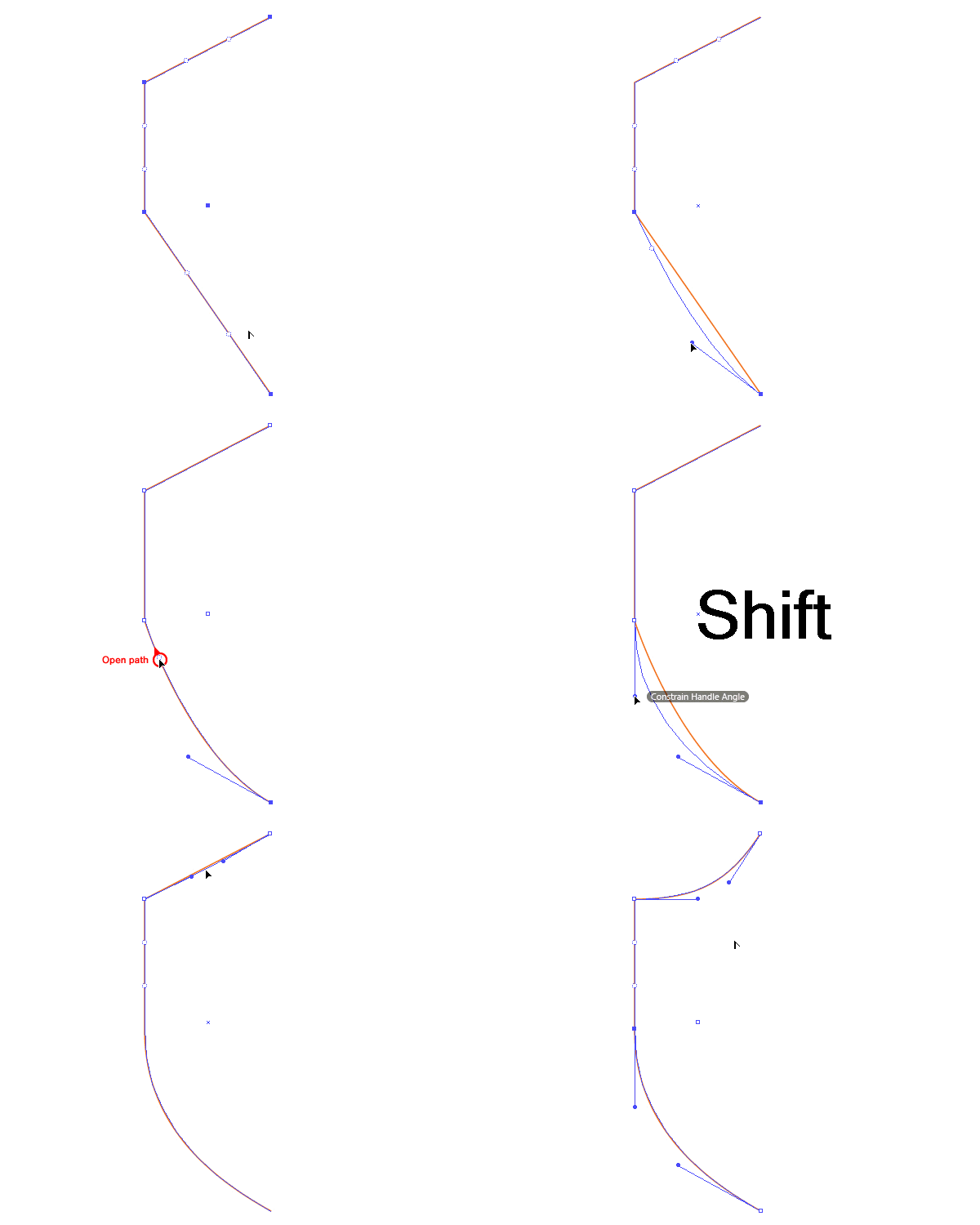
Although the current release of Adobe Illustrator CC 17.1 has an improved feature of the Reshape segment, the PathScribe Tool is still extremely useful thanks to Ghost Handles. Also, if you’re not yet using the Creative Cloud version of Adobe Illustrator but are using CS4-CS6 then you can definitely benefit from the PathScribe Tool.
Step 3
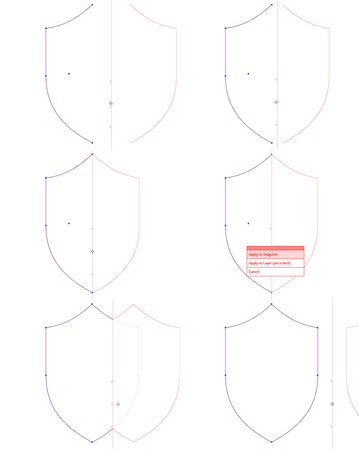
Select the path, take the Reflect Tool (O), and holding Alt key, click at the point D. In the opened dialog box, select Vertical Axes and click on the Copy button.
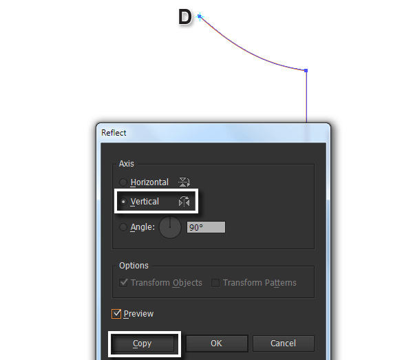
Select the upper points of the shield using the Direct Selection Tool (A), then press Control-J to join paths at the correct point.
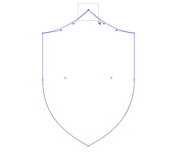
Carry out the same actions for the lower points of the shield.
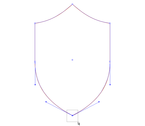
Incidentally, all the actions in this step could be replaced with just two clicks by using the MirrorMe Tool. This tool allows you to draw in symmetry instantly and you can find more details of how it can be used in an earlier tutorial How to Create a Pattern Suitable for Royalty in Adobe Illustrator.
Step 4
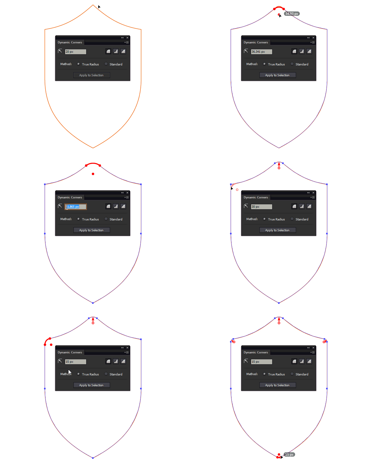
To round the corners of the shield, use the Dynamic Corners Tool (VectorScribe2 plug-in).

To open the tool’s panel go to Window > VectorScribe > Dynamic Corners panel. Set the desired radius here, and then with a single click round off the selected corner. You can change the radius of the rounding by dragging the corner marker/markers or setting new values in the Dynamic Corners panel.
Step 5
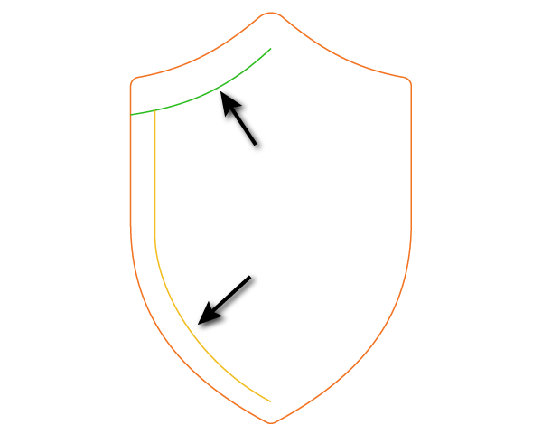
Using the Pen Tool (P) create two paths as shown in the picture below.
Reflect them along the vertical axis using the technique described in step 3, or by using the MirrorMe plug-in.
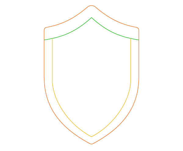
Both parts of the green path must be connected. Round off the corner at the point A using the Dynamic Corners Tool.
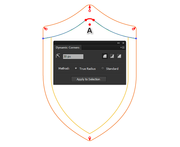
Duplicate the green and yellow paths (Control-C > Control-F), then turn off the visibility of the copies in the Layers panel. These objects will be needed later.
Step 6
Fill the shape of the shield with a neutral gray color and disable the stroke.
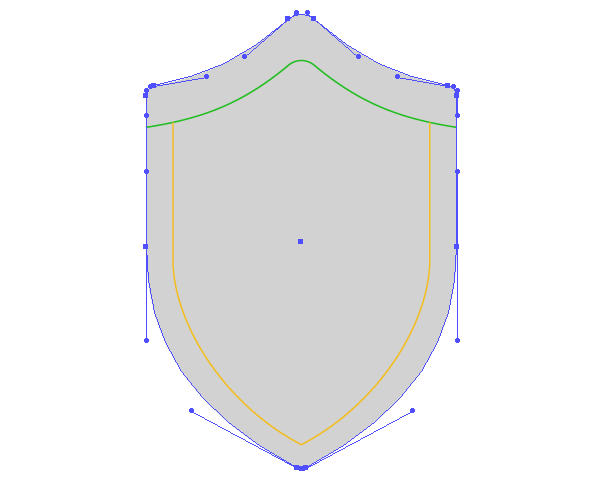
Select the paths inside the shield, take the Shape Builder Tool (Shift-M), then select the fill color of your choice (I chose orange). Click with the tool pointer in the center of the shield.
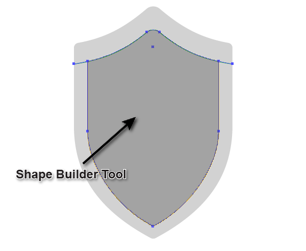
This action will create a new object with your chosen fill color.

Disable the stroke of the object and remove the left-over pieces of the paths in the upper part of the shield.

Step 7
Turn on the visibility of the paths that were hidden in step 5. Choose the color dark gray for the stroke and increase its width in the Stroke panel.
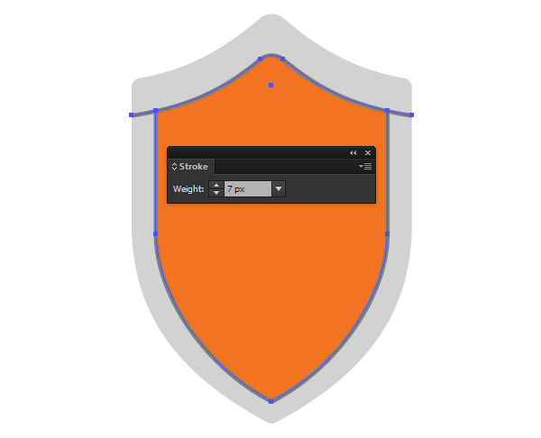
Duplicate the orange shape, then turn off the visibility in the Layers panel. We’ll return to this object later. Using the Line Segment Tool (\) create horizontal and vertical lines, holding down Shift. Both of these lines should extend beyond the orange object.
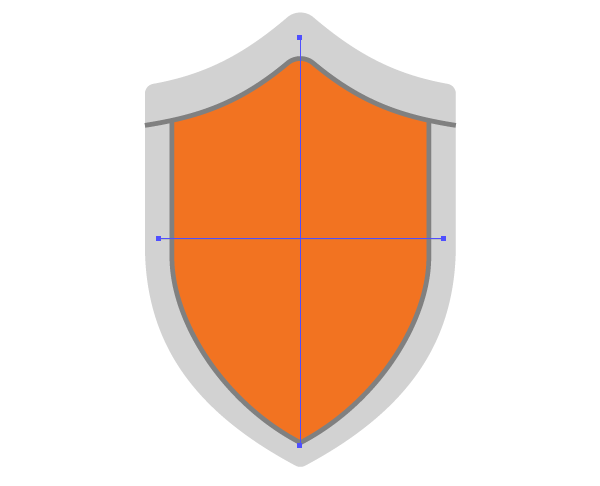
Step 8
Select the created lines and the orange shape, then click on Divide in the Pathfinder panel.
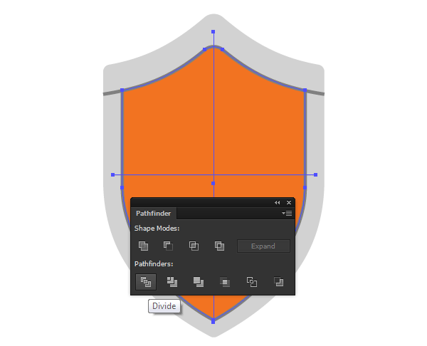
Doing this will separate the colored object into four parts. Using the Direct Selection Tool (A) select two opposite parts of the colored object and recolor them in dark gray as shown below.

Step 9
Using the Pen Tool (P) create a path shown in the picture below.
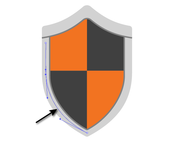
Create a circle filled with gray using the Ellipse Tool (L).

Drag the circle to the Brushes panel and save a new brush as Scatter Brush, without changing the default settings.
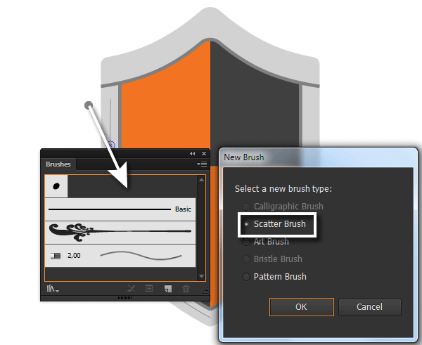
Step 10
Select the path created in this step, and then apply the Scatter Brush to it.
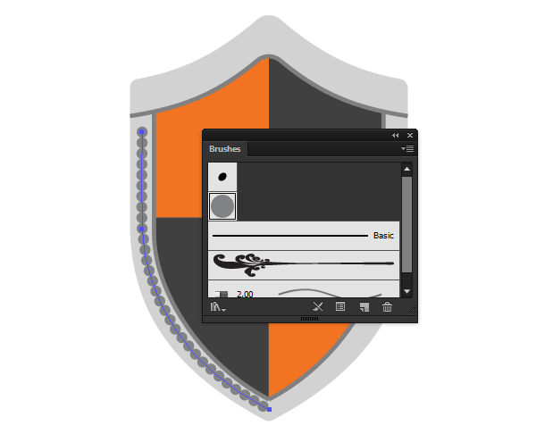
Double click on the scatter brush icon in the Brushes panel to open the brush settings. Increase the Spacing while watching the changes.
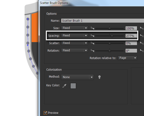
Click OK, then click Apply to Strokes in the new dialog box.

Keeping the path selected, go to Object > Expand Appearance.
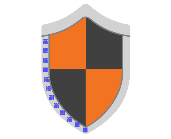
Step 11
Select the lower circle and increase its diameter.
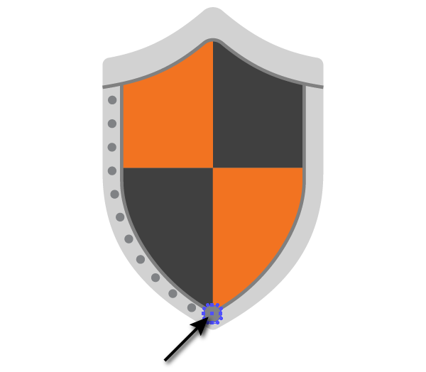
Select all the circles except for the bottom one, then using the Reflect Tool (O) copy them across to the vertical axis of the shield, using the technique described in step 3.
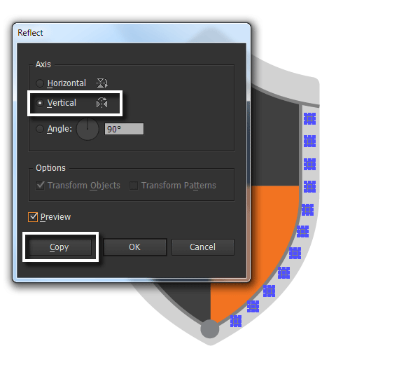
Using the same principle create circles in the upper part of the shield.

Step 12
You’ve now created the basic elements of the shield, so it’s time to start on the swords. With the help of the Pen Tool (P) create a path that consists of straight-line and curvilinear segments.

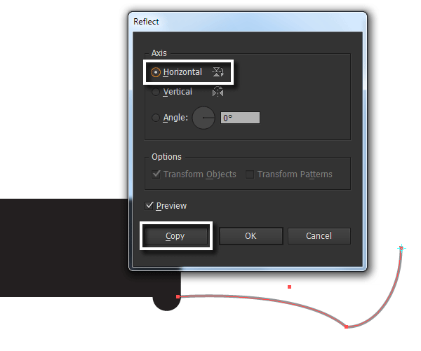
Reflect by copying the path across to the point A and the horizontal axis with the help of the Reflect Tool (O).
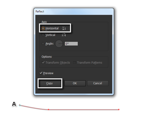
Connect the path at the point A (Control-J).

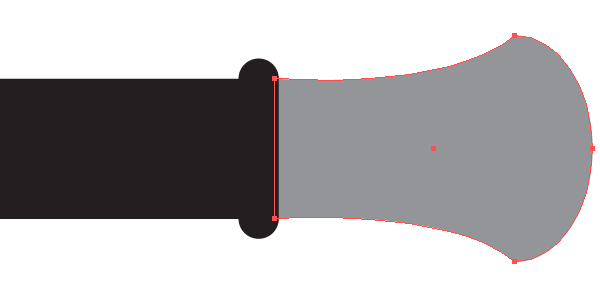
Close the path on the right using the Pen Tool (P).

If you want to change the length of the sword’s blade you can do this with the Direction Tool (A). Select the points on the right of the object and move them further to the right while holding Shift.

Step 13
Using the Rectangle Tool (M) create the sword’s handle. Align the blade and the handle vertically using the Align panel.

Using the Pen Tool (P) create half of the cross-guard.

Reflect by copying the object relating to the horizontal axis of the sword using the Reflect Tool (O).
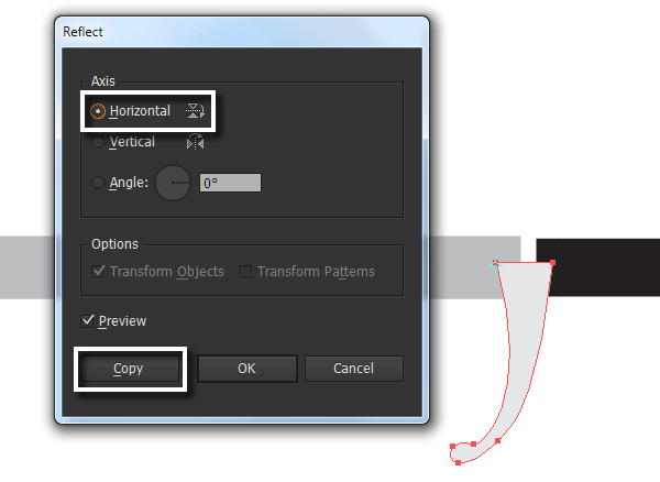
When I’m creating new objects I paint them in different colors so I can clearly see the shape’s borders.
Step 14
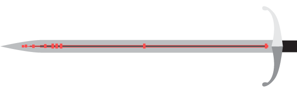
Using the Line Segment Tool (\) create a horizontal line, with a stroke and no fill, to coincide with the horizontal axis of the sword.

To sharpen this line, take the Width Tool (Shift-W) and create a new width marker (not far from the left hand side) and double-click. Without changing the settings of the dialog box, click the OK button.
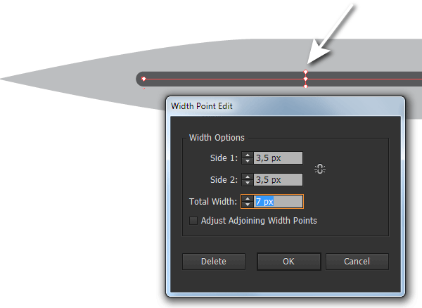
Now double-click with the pointer tool at the starting point and set 0px for the Total Width in the opened dialog box.

Go to Object > Path > Outline Stroke.
Step 15
In my opinion, basic geometric shapes are easier to create using the Dynamic Shapes Tool (VectorScribe2 plug-in). The tool icon is shown in the image below on the Tools panel.
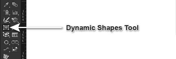
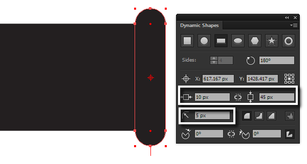
To open the panel, go to Window > VectorScribe > Dynamic Shapes panel. In this panel, we can control all the parameters of a shape. Using the Dynamic Shapes Tool create a rounded rectangle on the right end of the handle of the sword, as shown below.
Step 16
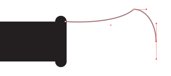
Using the Pen Tool (P) and Reflect Tool (O) create the pommel of the handle.
Create a small square using the Rectangle Tool (M) and place it as shown below.

Select and Group up (Control-G) all elements of the sword.
Step 17
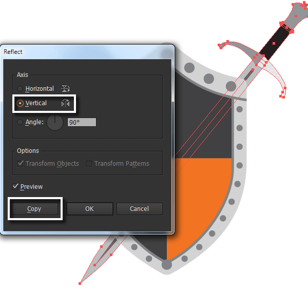
Place the sword below the shield and rotate it using the Selection Tool (V), as seen below.

Keeping the sword selected, reflect it by copying it across to the vertical axis of the shield using the Reflect Tool (O).
3. Create the Background
Step 1
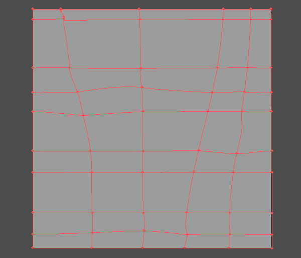
Before coloring the composition’s basic objects, I always create a background. This allows me to determine the position of the light source and the overall level of illumination. First, create a rectangle with a gray fill, the size of which corresponds to the size of an artboard. Using the Mesh Tool (U) create a gradient mesh. Displace some of the mesh points using the Direct Selection Tool (A). You don’t need to repeat the pattern shown below exactly, just follow the general guidelines.
Step 2
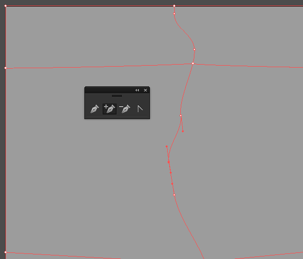
The background will represent an old cracked wall. To create new mesh points without creating mesh lines, use the Add Anchor Point Tool (+). This will allow us to do a more detailed mesh line without complicating the entire gradient mesh. Control over the mesh points and their handles is done using the Direct Selection Tool (A). This mesh line will become the basis for the crack in the wall.
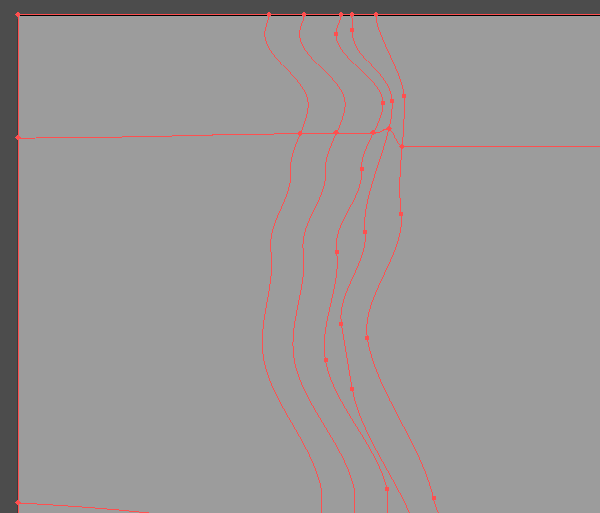
Create a few more mesh lines next to it using the Mesh Tool (U). Add some mesh points using the Add Anchor Point Tool (+) to easily control the shape of the mesh lines.
Step 3
Color mesh points with one mesh line in different shades of dark gray. You’ll only be able to color the mesh points that are at the intersection of the mesh lines.

Color the mesh points of the adjacent mesh lines with shades of gray which are lighter in comparison to the background.
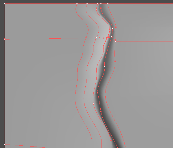
This has created the crack in the wall.
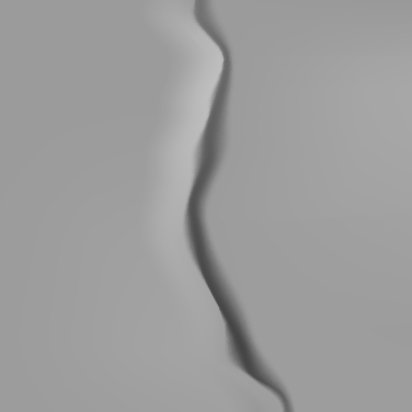
Using this described technique, create another crack at the bottom of the background. Color the rest of the mesh points in different shades of gray to create the rough textured effect on the wall.

Step 4
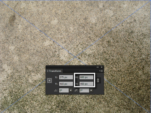
Now let’s create the texture of the wall. Here I’ve used the free Urban Texture Pack. Choose a concrete texture and place it into the current document (File > Place…). To accelerate the process of tracing, reduce the size of the raster image by entering new sizes in the Transform panel.
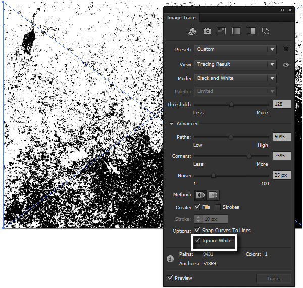
Open Image Trace panel (Window > Image Trace). Adobe Illustrator automatically selects the optimal settings for the texture tracing. The only thing we need to do is to select Ignore White option and press the Trace button.
Proceed to Object > Expand or click on the Expand button in the Control panel.

Step 5
Fill the object of the vector texture with dark gray.

Apply the Soft Light Blending Mode in the Transparency panel to the texture.
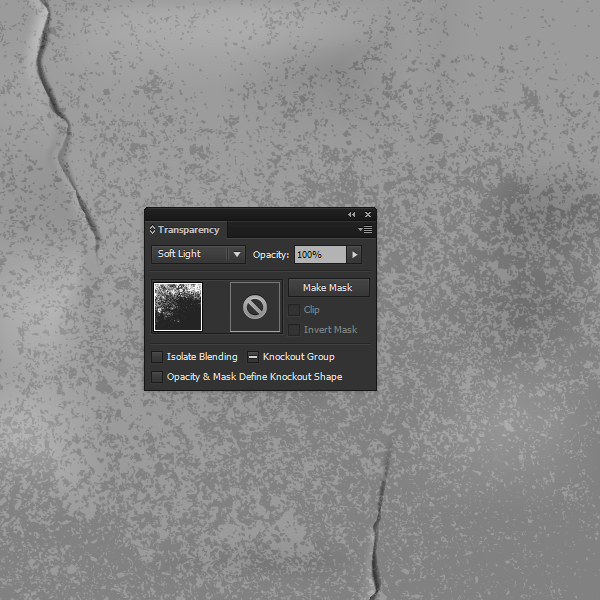
Step 6
Copy the texture of the concrete, then paste it back in (Control-C > Control-B). Move the lower texture a few pixels down, pressing the Down Arrow key, then fill it with a light gray.
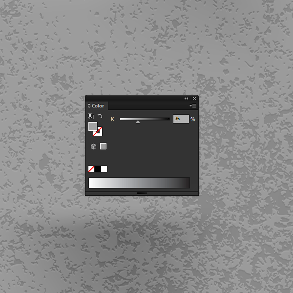
By doing this the texture now looks more voluminous.
Step 7
Create a rectangle filled with white. The size of the rectangle should correspond with the size of the artboard. Using the Mesh Tool (U) create a simple gradient mesh consisting of three rows and three columns.
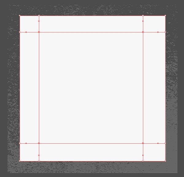
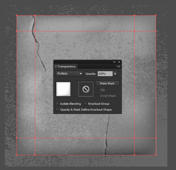
Color the mesh points, which are at the edges of the gradient mesh, with shades of light gray. In the lower part of the background, the gray color should be a little bit darker than at the top. Let’s assume that the light source is located at the top of the composition.

Apply the Multiply Blending Mode in the Transparency panel to the mesh.
Step 8
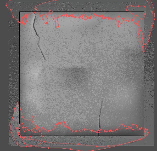
To create the streaks on the wall take the Pencil Tool (N) and create the shape shown below near to the top of the background. Fill this object with a linear gradient from white to light gray.
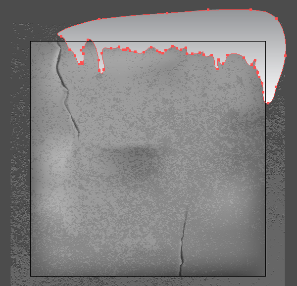
Apply the Multiply Blending Mode and reduce the Opacity to 10% in the Transparency panel.
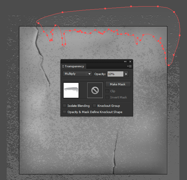
Create a few more similar objects in the upper and lower parts of the background. These objects must overlap each other.

Step 9
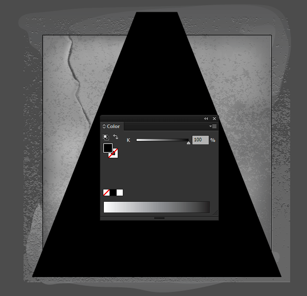
Using the Pen Tool (P) create a trapezoid shape with a black fill.
Using the Mesh Tool (U) create a gradient mesh as shown below. Control the position of the mesh points and their handles using the Direct Selection Tool (A).
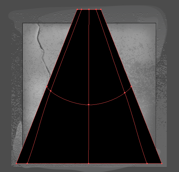
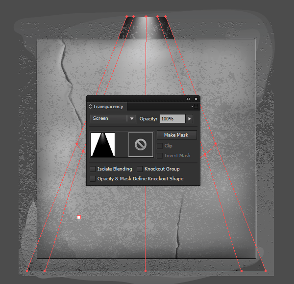
Color the mesh point A with light gray.

Now apply the gradient mesh to the Screen Blending Mode.
Step 10
Hide the elements of the background that go beyond the artboard. Create a rectangle to correspond with the size of an artboard. Select this rectangle and all the objects of the background, then go to Object > Clipping Mask > Make or use Control-7 shortcuts.
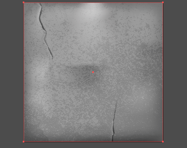
Step 11
As you can see, the background consists of a complex combination of different properties. I’m going to adjust the color, brightness and contrast of the entire background. Let’s do it with the help of the Phantasm plug-in.
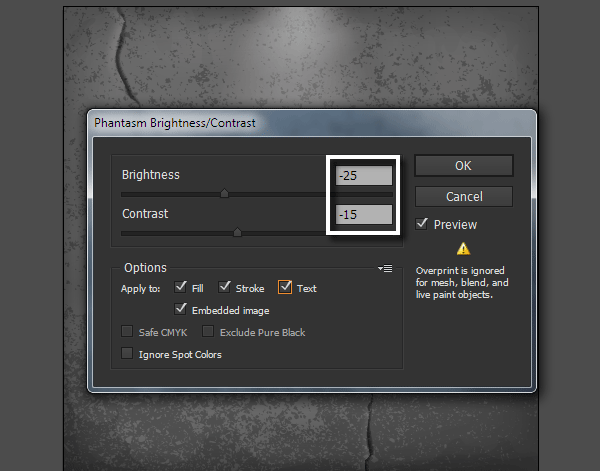
Phantasm is invaluable for controlling color directly in Illustrator for vectors, text and embedded images. In fact if you’re familiar with Photoshop’s color control, then you’ll really appreciate Phantasm as it carries out the equivalent functions in Illustrator. Select the background, then go to Effect > Phantasm > Brightness / Contrast…. Now reduce the values of both the Brightness and Contrast and keep an eye on the changes.
Step 12
Now set the background color by using Phantasm’s Hue/ Saturation feature. By using this we can simultaneously manage the hue, saturation and lightness of vector and bitmap embedded images. Color control can be carried out in both CMYK and RGB documents. Select the background, then go to Effect > Phantasm > Hue/ Saturation …. Tick the Colorize option then change the value of Hue and Saturation to achieve your desired background shade.
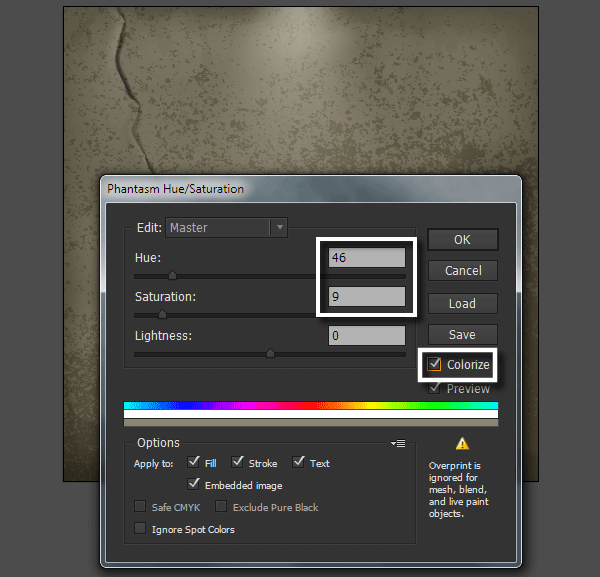
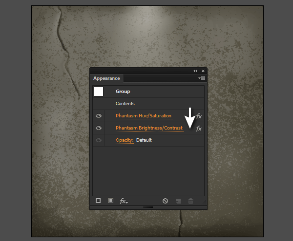
The Colorize option changes the artwork to a single hue whilst allowing simultaneous adjustment of the Saturation and Lightness. If you use Phantasm’s effects, you can access its parameters in the Appearance panel. This gives a clear advantage over any other native methods of recoloring in Adobe Illustrator.
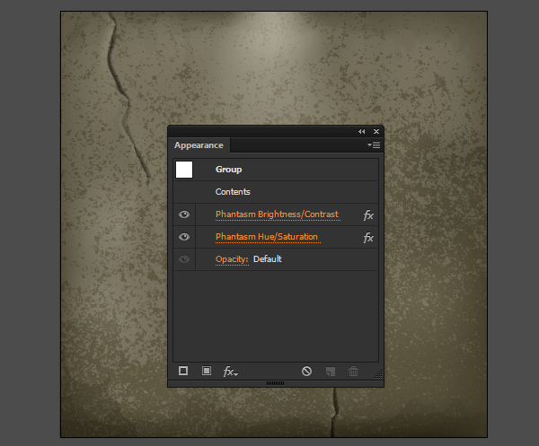
You can even change the sequence of effects in the Appearance panel and it will affect the result.
4. Color the Shield and Swords
Step 1
Copy the group with the shield and swords, then paste it in front (Control-C > Control-F). Keeping the new group selected, click Unite in the Pathfinder panel.
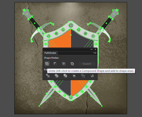
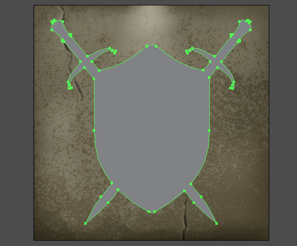
Temporarily disable the visibility of the resulting object in the Layers panel. We’ll come back to it later.
Step 2
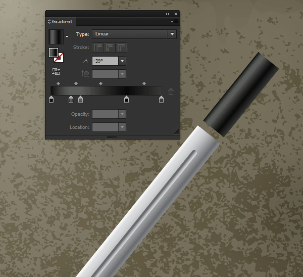
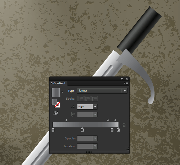
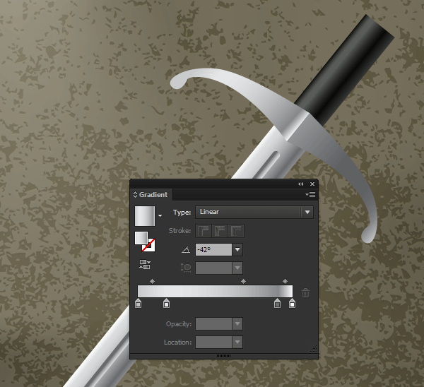
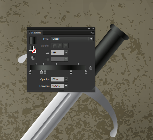
Fill the sword’s blade with a linear gradient made up of white and three shades of gray. Using the Gradient Tool (G) arrange the gradient perpendicular to the edge of the blade. Gradient colors are located according to the position of the light source so that the lightest color is located at the top.

The process of filling the sword object with linear gradients is shown below.
Step 3
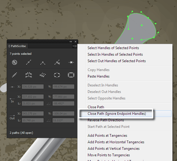
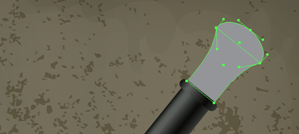
Cut the pommel of the sword at the points A and B using the Scissors Tool (C).
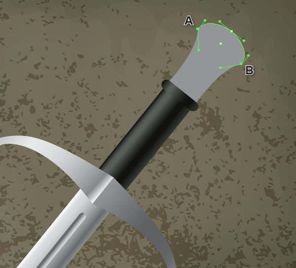
We can quickly close the obtained paths using the PathScribe Tool (VectorScribe2 plug-in). Select both paths, then click on the Close Path (Ignore Endpoint Handles) in the fly-out menu of the PathScribe panel (Window > VectorScribe > PathScribe panel).
2
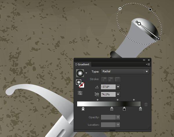
Fill the upper object with elliptical radial gradient as per the image.
Step 4
Cut the second object of the sword pommel into three parts using the Knife Tool.
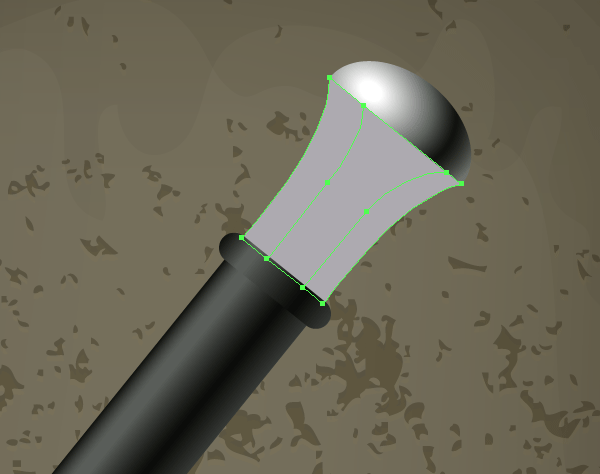
Using the Rectangle Tool (M) create a rectangle and then turn it into a gradient mesh. To do this, go to Object > Create Gradient Mesh…. In the opened dialog box set 1 row and 1 column.
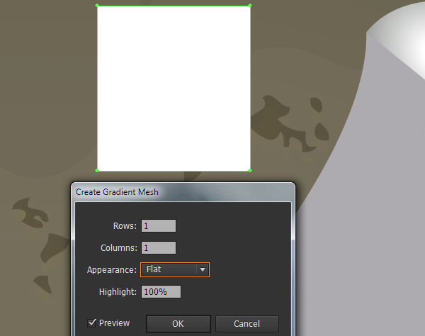
Step 5
Controlling the mesh points and their handles, change the shape of the gradient mesh so that it’s as close as possible to one of the shapes obtained in the previous step. For more convenience temporarily reduce the opacity of the gradient mesh.
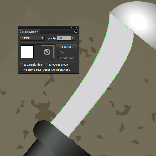
Restore the opacity to 100% after creating the desired shape, then create new mesh lines using the Mesh Tool (U) and color them as shown in the picture below.

Using the described technique, color the two remaining edges of the sword’s pommel.

Step 6
Create the shadows on the sword using the Pen Tool (P). Fill objects with a linear gradient from white to gray, then apply the Multiply Blending Mode.
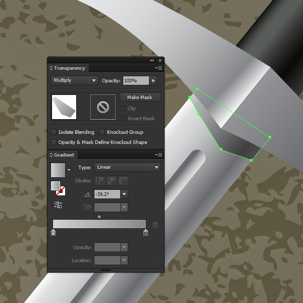
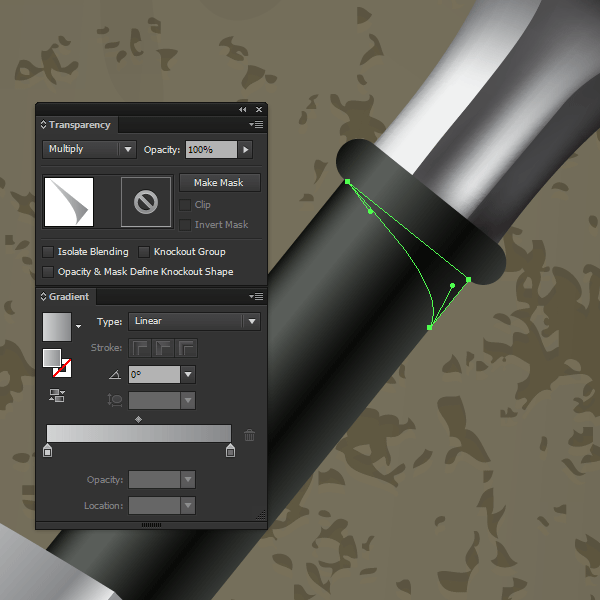
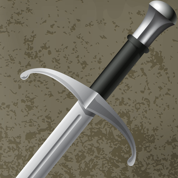
For the shape of glares on the metal’s surface, use the Screen Blending Mode.
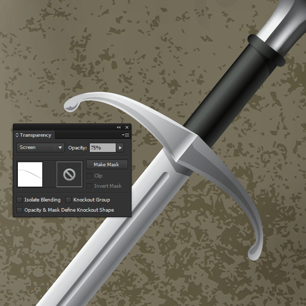
Step 7
We now need to adjust the colors of the sword using the Hue / Saturation feature of Phantasm as we did previously.
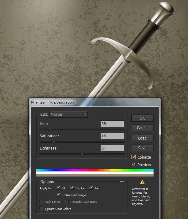
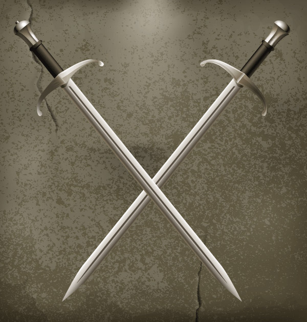
I think it’s easier to fill objects with a gray color and then add the desired hues using Phantasm. Using the described technique color the second sword.
Step 8
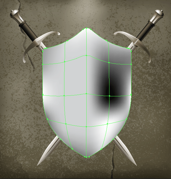
Create a gradient mesh from the lowest shape of the shield, which consists of several rows and columns using the Mesh Tool (U). Color the nodes with different shades of gray. As we’re creating metal objects, the range of shades must be very broad, from very light to very dark ones.
Step 9
Color all of the round shaped rivets on the shield in dark gray.

Copy the rivets then paste them back in (Control-C > Control-B). Recolor copies with white, then move them a few pixels down using the Down Arrow key to create glares at the edge of the hole.

Step 10
Copy all the dark gray circles and paste them in front (Control-C > Control-F). Ungroup new circles if they are in groups. Now go to Object > Transform > Transform Each…. Set 90% for Scale options in the opened dialog box.
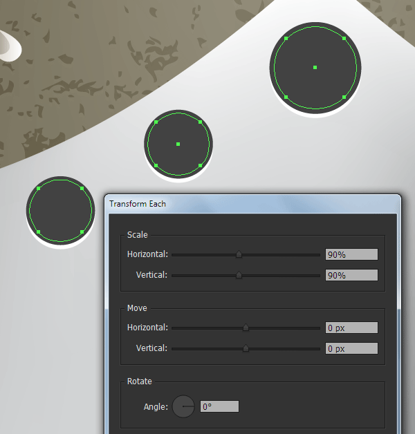
Keeping the circles selected, go to Object > Create Gradient Mesh…. Set 3 rows and 3 columns in the opened dialog box. Color the gradient mesh as shown in the pictures below.


Step 11
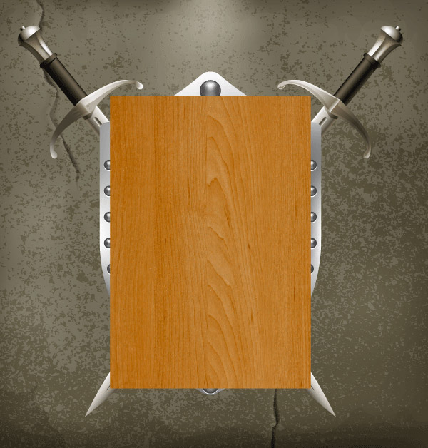
I want the central part of the shield to be be wooden.

To create this effect, I’m using the free raster wooden texture from freestocktextures.com. Paste the image into your document (File > Place…). Now click on the Embed button in the Control panel.
Step 12
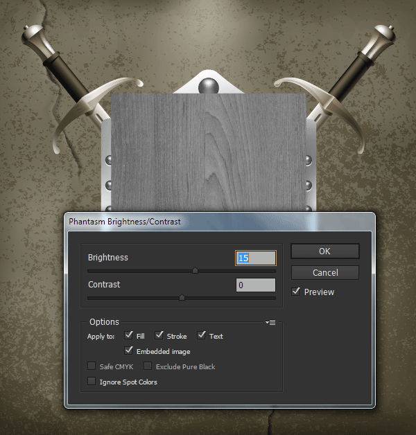
As already mentioned, Phantasm can control the colors of the bitmap embedded images directly in Adobe Illustrator. Keeping the wood texture selected, go to Effect > Phantasm > Desaturate ….
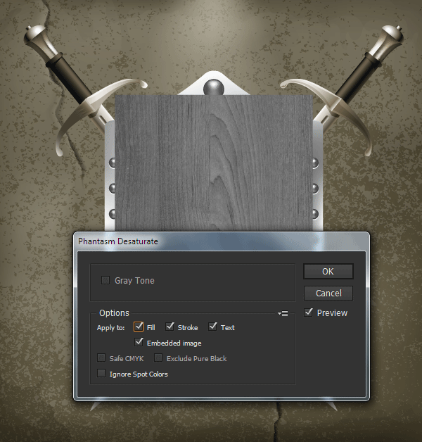
Now increase the brightness of the image by going to Effect > Phantasm > Brightness / Contrast ….
Step 13
Set the Hard Light Blending Mode for the wooden texture in the Transparency panel.
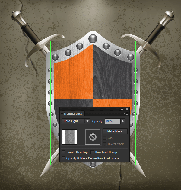
Turn on the visibility of the orange shape which we hid in step 7 of the second division.

Duplicate this shape (Control-C > Control-F) and turn off the visibility of the upper object in the Layers panel.
Step 14
Fill the orange shape with white, then using the Mesh Tool (U) create a gradient mesh, as shown below.
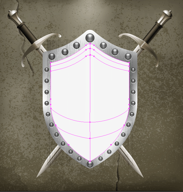
Color the mesh points on the top of the gradient mesh in a dark gray, and the mesh points on the sides and bottom of the gradient mesh in a light gray.
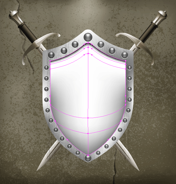
Apply the Multiply Blending Mode to the gradient mesh.
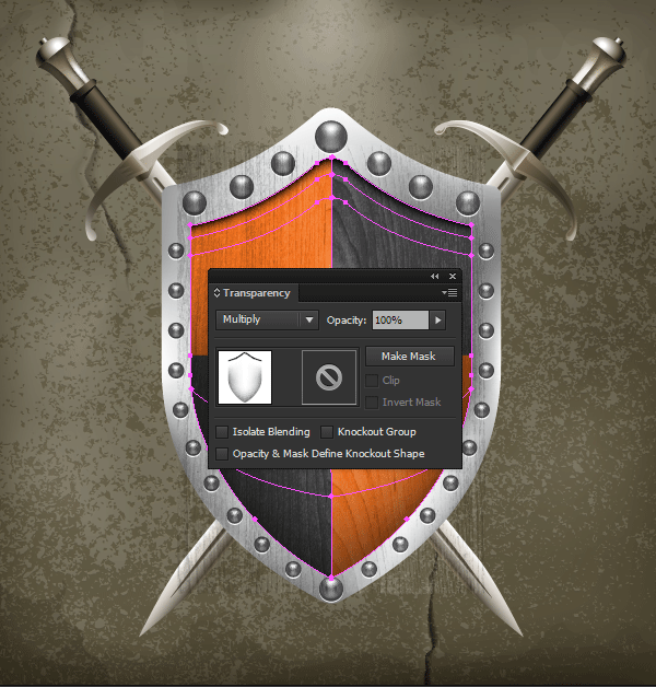
Step 15
Turn on the visibility of the orange object that we hid in step 13 of this section.

Select the bitmap texture, gradient mesh, and orange object, then go to Object > Clipping Mask > Make.

Step 16
Fill the paths on the edges of the shield’s metal with a gradient consisting of white and two shades of gray using the Gradient Across Stroke. Here I’d like to note that you can only apply a gradient fill to the stroke if you’re using recent versions of Illustrator (CS6-CC).
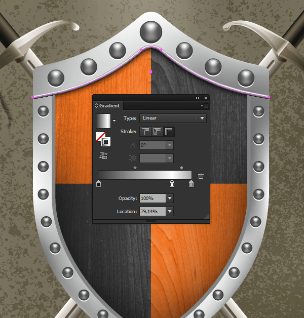
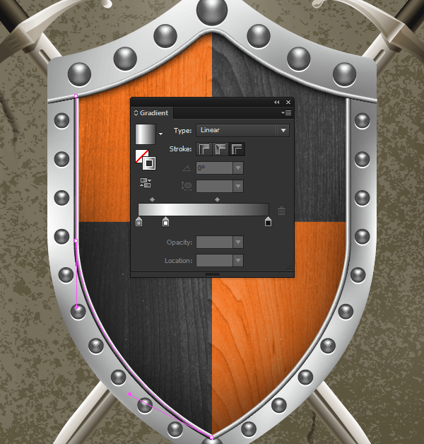
Step 17
As well as the swords, the objects of the shield must correspond with the lighting. Change the hue of the metal objects by using Phantasm’s Hue/Saturation feature.
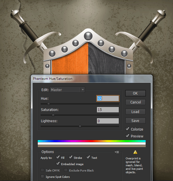
You can work with each object individually as well as with selected groups of objects, depending on what result you want to achieve.

Step 18
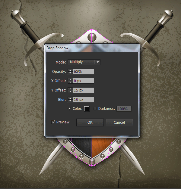
Select the bottom object of the shield. This is gradient mesh. Now go to Effect > Stylize > Drop Shadow… and set the parameters shown in the picture below.
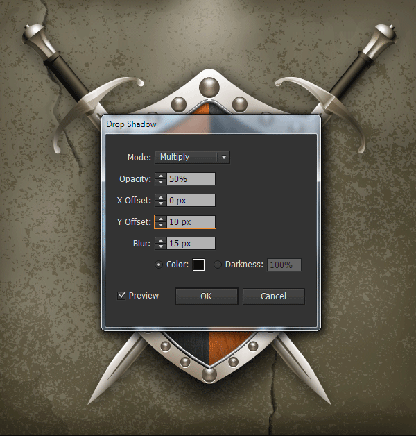
Now select all the objects we’ve created, except for the background, and then group them up (Control-G). Apply the Drop Shadow effect, with the parameters listed below, to the group.
Step 19
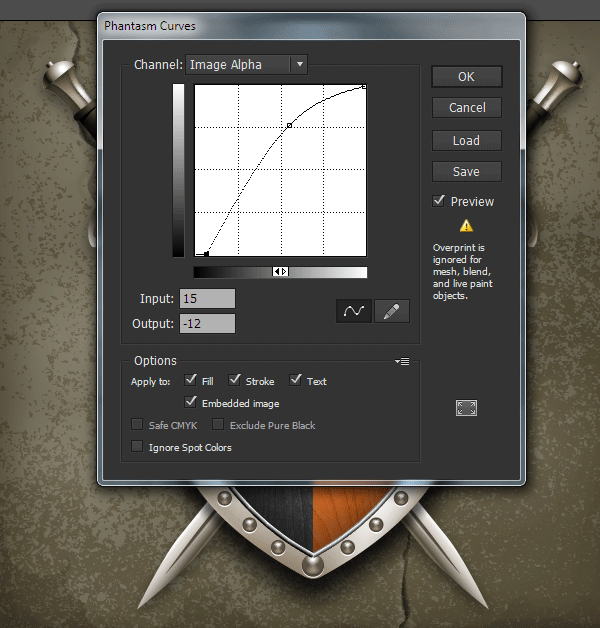
One of Phantasm’s unique features is that the plug-in can work with the Alpha channel which contains raster effects. By controlling the Alpha Image channel, we can change the transparency level and lower and raise the color strength. In other words we can gain complete control over this effect which can’t be done by controlling the parameters of the Drop Shadow effect.
Select the object or the group to which the Drop Shadow effect is applied, then go to Effect > Phantasm > Curves…. In the opened dialog box, select Image Alpha from the drop-down list. Change the shape of the curve while watching the changes.
Step 20
For the last step of this tutorial we need to create a texture for the metal elements. The method of creating a vector texture isn’t different from the method described in step 4 of the third division. Color the vector objects by auto tracing the gray-green.
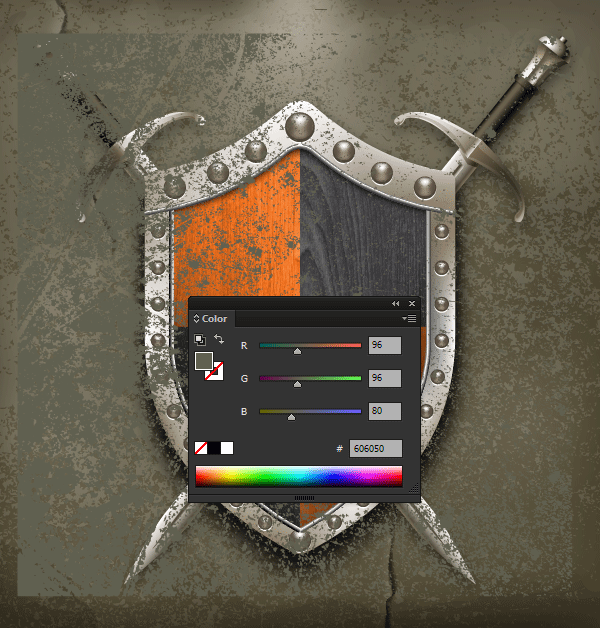
Apply the Multiply Blending Mode to the texture and reduce the opacity in the Transparency panel.
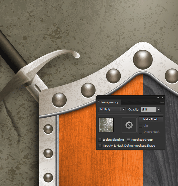
Turn on the visibility of the hidden layer in step 1 of the fourth section and place it above all the created objects.
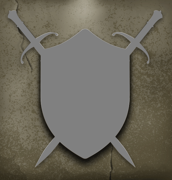
Select the texture and the upper object, then apply Control-7 shortcuts to create a Clipping Mask. Place the resulting Clipping Group below the shield’s wooden elements, moving it down in the Layers panel.
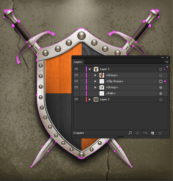
Congratulations! You’re Done.
We did a good job today with the help of two plug-ins from Astute Graphics to add realism to our vector artwork, so I think it’s appropriate to place the company logo on our shield.

{excerpt}
Read More