Mobilempathy?
An another fancy word we have invented for our brand new responsive email templates. They work perfectly across browsers, desktop and mobile email clients.You can test responsive email templates by resizing your browser. Tested throughly with mobile devices, and also tested with both Litmus email tester and manually for email clients on desktops and browsers. Crafted to provide an optimal viewing experience across a wide range of devices (from browsers & desktop monitors to mobile phones). You’re on safe hands.
Built with email specific bulletproof techniques.
Ensures full consistency across browsers, desktop and mobile email clients.
Please Note:
- Live Previews are encrypted for security reasons , so they may take a while to load, please be patient, it will worth it. Please also keep an eye on the F.A.Q. section above the Preview Image on top for UPDATES and helpful information.
- If a layout doesn’t fit itself to the size of your browser(for example, Mozilla Firefox 18), that’s because LIVE PREVIEWS are using encrypted html for security reasons.
If this is the case, you can see an EXAMPLE LAYOUT with 480px(mobile screen Landscape) AND 320px(mobile screen Portrait) SCREENSHOTS HERE
Can be used in any email program or online service which supports importing / editing HTML file (such as Mozilla Thunderbird, Aweber, Campaign Monitor, Mailchimp, Constant Contact, Vertical Response, etc. etc… )

Comes with both Mailchimp Ready and Regular HTML Versions
If you don’t want to deal with HTML, just upload the template into Mailchimp and never touch HTML again when updating your content.
Regular HTML Versions also included with both Embedded and inline CSS for those who still in love with plain HTML and CSS.
Eye-Catchy and Elegant Design. Pick your color !
In our time , almost everyone has very short attention spans , so your email should stand up from the crowd , it should look eye-catchy and elegant in an inbox…
What’s In The Download Package..?
- Mobilempathy comes with 10 color schemes including the plain HTML versions with both embedded and inline css, and Mailchimp-ready templates for those who don’t want to deal with HTML. All included in seperate folders.
- Extremely easy to customize colors
- A very descriptive Help file , covering..:
- Instructions for making changes to the both content and presentation, customizing/modifying your templates.
- Instructions about the usage of “SUBSCRIBE”, “UNSUBSCRIBE”, “FORWARD TO A FRIEND” options. They are ready to use and already working. Anyway, extra info included in the help file for those options, about how do they work.
Why do you need a “SUBSCRIBE” option..?
Because , if one of your customers forwards your email campaign to some of his/her friends by using the Forward To a Friend link , they will need an option to subscribe to your emailing list. - Step by step “how to send an email campaign” instructions with up to date screenshots from Mailchimp.
- And More…
Full features list
- Besides Plain html files, also includes Mailchimp-ready files which allow you to change your content without touching HTML. Customize your layout with ease, add and remove modules by using Mailchimp ide.
- Responsive ! Ensures a beautiful experience on mobile devices, desktops and browsers
- Can be used in any email program or online service which supports importing / editing HTML code (such as Mozilla Thunderbird, Aweber, Campaign Monitor, Mailchimp, Constant Contact, Vertical Response, etc. )
- Renders perfectly on all email clients and browsers starting from old browsers such as Internet explorer 5.5 till new email programs like Outlook 2013 and Thunderbird 17.
- Clean, Modern & Most importantly Unique design. Email with style !
- Uses tables for every aspect of the design, even for the paddings and margins. This ensures the best results for consistency across the browsers, desktop and e-mail clients.
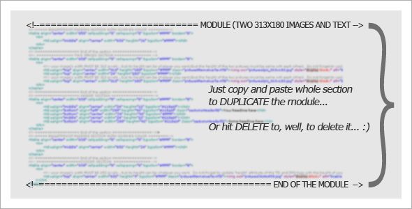
- Flexible table construct allows you to build your very own layout if you wish , building a custom layout is just easy as copying & pasting your favourite modules (tables) from one layout to another.
You can delete or duplicate the modules very easily.
You can copy/paste content blocks (tables) from one layout to another to create your very own layout. Layouts will always remain Responsive

- Deeply Commented & Valid HTML Code.
- Inline & Embedded CSS Versions added for each template.
- Useful linking options including..:
– Links for “SUBSCRIBE”, “UNSUBSCRIBE”, “FORWARD TO A FRIEND”, “VIEW ONLINE” options. They are ready to use and already working. Anyway, extra info included in the help file for those options, about how do they work.
– Links for targeting specific sections of yourCompany’s webSite.
– Links for Social accounts, yourCompany’s email accounts and yourCompany’s homePage etc.
– You can add / delete links easily.
- Layered PSD Files included for the JPG and PNG images.
- Descriptive Help File , Including MailChimp Instructions with up to date screenshots.
- Mailchimp mergeTags included in each template for “Subscribe”, “Unsubscribe” & “ForwardToAFriend” options.They are ready to use and already working.
Anyway, extra info included in the help file for those options and how do they work.
Tested With LITMUS In All Major E-mail And Desktop Clients including…
- Versions of Outlook
- Apple Mail
- IPhone, IPad, IPod
- Hotmail
- Yahoo
- Gmail
- Mozilla ThunderBird
- Spicebird
- Windows Live Mail
- GMX
- AOL
- Opera Mail
- Foxmail
- Sparrow
- Incredimail
- Lotus Notes 8 – 8.5
- Eudora
Photo Credits
The images used in the previews are from the courtesy of the users from FLICKR…:
MarkJSebastian
Victor 1558
Support + Please ask questions…
I would love to hear your voice.
Please feel free to get in contact with me with the form on my Profile Page for any questions.
Or you can just send an email to apkarbedo.yahoo.com
Please don’t forget to rate with five stars.
Thank you very much for visiting MobilEmpathy – responsive email templates.
