With the latest advancements in CSS, we now have access to powerful styling techniques, including box shadows, rounded corners, background gradients, etc. However, we don’t currently have the ability to apply gradients to the text itself. Luckily, with a bit of trickery, we can force this effect — at least in webkit browsers! I’ll show you how in today’s video quick tip.
Subscribe to our YouTube page to watch all of the video tutorials!
Prefer to watch this video on Screenr?
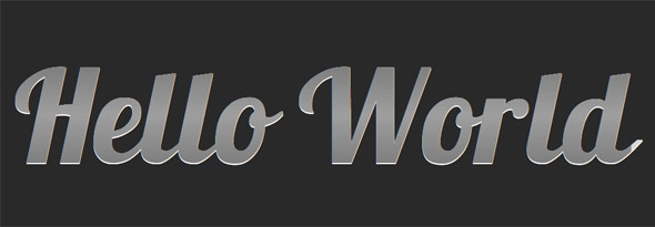
Final Code
<!DOCTYPE html>

<html lang="en">
<head>
	<meta charset="utf-8">
	<title>Text Gradients</title>
	<link href='http://fonts.googleapis.com/css?family=Lobster' rel='stylesheet' type='text/css'>

	<style>
	body {
		background: #292929;
		padding: 1em;
	}

	h1 {
		position: relative;
		font-size: 70px;
		margin-top: 0;
		font-family: 'Lobster', helvetica, arial;
	}

	h1 a {
		text-decoration: none;
		color: #666;
		position: absolute;

		-webkit-mask-image: -webkit-gradient(linear, left top, left bottom, from(rgba(0,0,0,1)), color-stop(50%, rgba(0,0,0,.5)), to(rgba(0,0,0,1)));
	}

	h1:after {
		content : 'Hello World';
		color: #d6d6d6;
		text-shadow: 0 1px 0 white;
	}

	</style>
</head>
<body>
     <h1> <a href="#"> Hello World </a> </h1>
</body>
</html>
I originally learned this technique from the guys over at NiceWebType.com. Be sure to visit their website to learn more! So what do you think?