


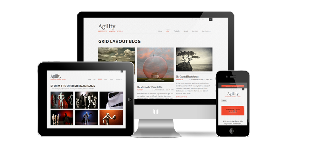
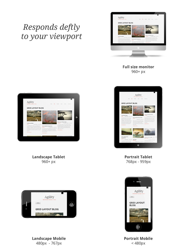
Agility is a fully responsive WordPress theme, ready to look stunning on any device – from a widescreen monitor to a mobile phone.
How does a responsive template work?
You create one site, and Agility’s responsive framework does the rest. As the user’s viewport size shifts, Agility responds dynamically to optimize viewing for that screen size. That makes experiencing your site on a mobile phone much more enjoyable (no more pinching and zooming just to read a paragraph), without sacrificing complex grid layouts at the full-screen level.
Agility is built on a 960gs-based responsive grid system called Skeleton. Using the magic of media queries, as the viewport size changes, the grid adapts to fit the viewport optimally.
What’s in the box?
- 4 Home Page Layout options
- 3 Background options (white, smoky noise, paper fiber)
- 5 Highlight color options (grey, red, blue, green, purple)
- 2 Blog Layouts – Standard or Grid
- Featured image, featured video, or featured slider for each blog post
- Post Formats (Standard, Image, Video, Gallery, Status, Quote)
- Responsive Video Embedding (YouTube & Vimeo)
- Unlimited Responsive Sliders
- Advanced Portfolio system
- BrickLayer – Visual Layout Builder to create your own Page layouts
- Self-hosted video support
- CSS3 Effects (gracefully degrade)
- CSS3 Buttons (7 colors, light and dark text, small or large)
- Mobile-friendly tabs
- Maps, Twitter, Testimonial, Toggle, Alert shortcodes, and more
- Alternative responsive select box menu available with SevenSpark Responsive Select Menu plugin
- Responsive Skeleton Grid System
- Built on the WordPress/Automattic standard _s (Underscores) framework
Featured Media for Posts and Portfolios
Each post and portfolio item supports the following featured media types:
- Featured Image (cropped or uncropped, your choice)
- Embedded video
- Self-hosted video
- Slider of attached images
Unlimited Portfolios
- 1 to 4 columns
- Filterable with Isotope
- Supports both Portrait and Landscape images – choose whether or not to crop
Easy to Customize
- Control Panel for easy configuration
- Hybrid customization system – use BrickLayer Visual Layout Builder or the WordPress template system (or both) to build your custom layouts (BrickLayer is optional and does not prevent conventional customizations at all)
- Included starter child theme to make it easy to get customizing
Includes Detailed Documentation with Narrated Video Tutorials!
- Agility Support Guide – searchable with CTRL +F !
- Theme Installation & Setup Video Tutorials (4)
- Home Page Video Tutorials (2)
- Slider Video Tutorials (3)
- Portfolio Video Tutorials (5)
- BrickLayer Video Tutorials (6)
Requirements
- WordPress 3.3+ (downloaded from wordpress.org)
A note on CSS3 Usage
The theme uses CSS3 for many non-essential styles and animations, but gracefully degrades in browsers that don’t support it (IE7, IE8 ). That also means that Agility won’t be responsive in IE8 , since it doesn’t support CSS3 Media Queries.
Credits
Read the Support Guide