Typography from the 70s and 80s is inspirational to both designers and illustrators. It often takes on a storytelling role in it’s design. With the tools that you and I have available to us today, we can be inspired by the work that has been done in the past, but try to push forward into new territories. Software like Illustrator, Photoshop, and Cinema 4d really allow me to create illustrative typography quickly and explore many options – which is always good when dealing with clients. I’d like to share with you some tips and observations I have made from doing numerous retro typography illustrations.
Inspiration
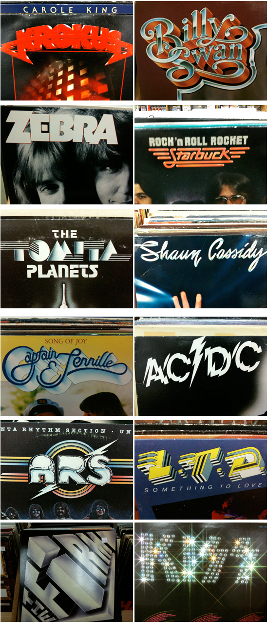
Inspiration for retro typography can be found online relatively easy these days. I do searches for old album covers as well as movie posters from the 70s and 80s. Used book stores or music stores are often filled with inspirational artwork and designs. I found all of these amazing examples of type artwork in the same store one night.
Originality
Retro typography has been very popular over the last couple years because there are some amazing artists like Ronald Ashburn and Sakke Soini breaking new ground with their techniques. I think the key to having some success in this style of typography is to bring something new to the forefront of your designs. Study what has been done, but look for ways to use modern tools to be creative rather than just recreate.
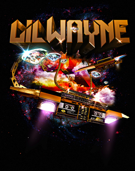
Finding inspiration from more obscure sources always helps with originality as well. If you are being inspired by the ACDC logo, then there’s a good chance people will notice it and your work will get lost in the comparison to the original. I saw this Petra album created in the late 70s and was blown away by the detail and the concept. The lighting effects look as if Chuck Anderson got ahold of them and the flying spaceship-guitar looks as if it should have been created in Cinema 4d. Truly amazing work!

My concept for this Lil’ Wayne tee was a direct inspiration from the Petra album cover. I modeled the boombox spaceship so that I could use it from multiple angels – something that would have taken me forever to try to accomplish by hand.
Font Choice
I noticed in my research and the retro artwork that grabbed my attention, most of the fonts were custom illustrated. The fonts take on a form of illustration rather than design/layout. Whether it was KISS and their bling type logo treatment or Shaun Cassidy and his continuous line drawing font (both shown above), there was a lot of detail and storytelling happening in the lettering. Chrome is a popular method for making your text feel very retro. I love this font treatment for the cover of Michael Jackson’s Sega video game debut.
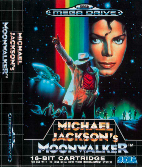
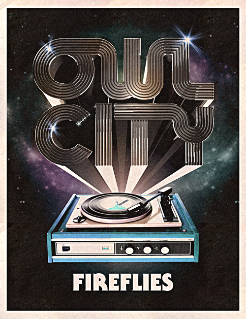
The detail in this font for MJ inspired my Vertigo artwork/typeface. This Vertigo poster was also used in Owl City “Fireflies” video – which was very retro in theme.

Texture and Colors
I love how an old album cover shows its age with colors that fade and scuff marks. That is a big part of how I treat my artwork. Adding the right type of wear and tear contributes so much to the retro vibe.
The blacks are never black anymore. The colors are slightly faded and don’t really pop like they once did. Adding a worn in texture can be a tough step to take. It’s easy to feel done with your design without including those details. I remember the first time I treated my artwork with a retro texturing. I was very nervous that I was ruining the artwork and the client would never go for it. Now it is a go-to technique that is often requested.

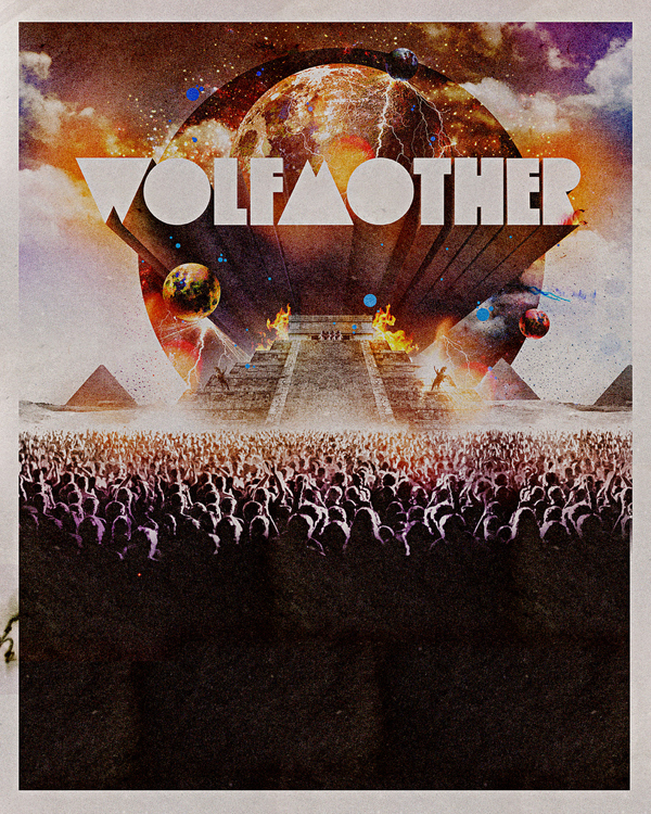
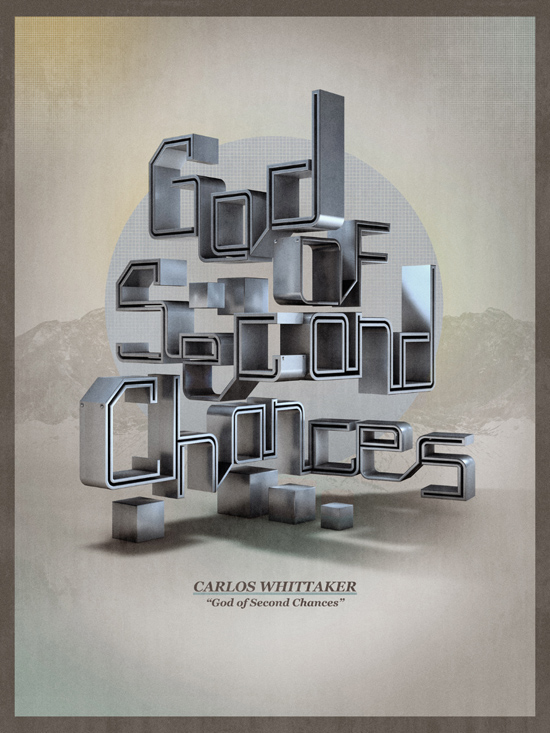
I used very similar texturing techniques for the following: Wolfmother, Owl City, and Carlos Whittaker type-artwork pieces.
Final Thoughts
Computers and Software allow us to experiment quite a bit more than the artists of the 70s and 80s. It’s important to keep originality at the forefront of your concepts in order to stand out. Look for ways to be inspired by artwork from the past, but use technology to your advantage. See where you can push your limits and add something to what has been done before.