It’s Halloween next week and if you are having a party you might need some last minute invites. Today’s tut contains the knowledge of how to design an invitation quickly. We are going to make the most of free online resources, including vectors and fonts.
You may want to print this invitation at a professional printers or you might have a good quality printer at home. Either way it is a good idea to think about the size of your document before starting out.
I am going to set my invitation up at 210 x 99mm. There are two reasons for this, firstly I can get three invites per A4 page (I am printing mine on a home printer) and secondly it is quite easy and cheap to find envelopes to fit the flyer size.
Step 1
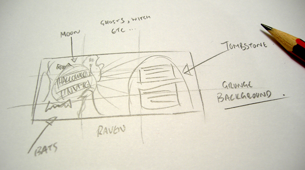
So we can be efficient and specific in what we are searching for online, I recommend drawing a rough sketch of how you want the invitation to look. It doesn’t have to be anything flash, just a rough idea of the layout. Here is mine.
Step 2
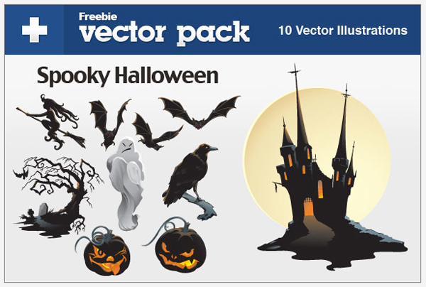
By doing a simple keyword search on google it is easy enough to find free vectors, backgrounds and images. So based on your sketch have a look around the net for photos or vectors. I didn’t need to look any further than vectortuts, thanks to Iaroslav Lazunov’s previous vector pack I have found some images perfect for the invite. Spooky Halloween Vector Pack
Download your freebies to your project folder ready for importing later.
Step 3
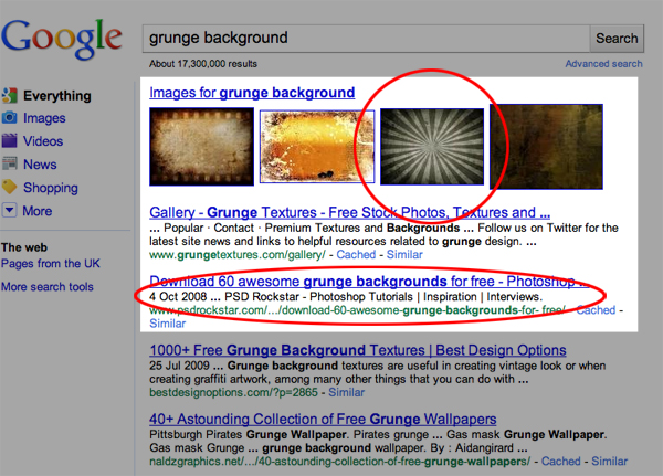
Now I need a dark grunge background to add some depth and texture to the invite. Again a simple search on google located this image. Of course it is free to download, perfect. Link here: Grunge Background
Step 4
We need an effective typeface, so go to DaFont.com and pick a halloween themed typeface. Download and install. I have chosen to use Feast of Flesh. Here is the link to the halloween themes: Halloween Fonts
Step 5
Ok, we are now ready to fire up InDesign. First create a new document based on your requirements. Here is my setup:
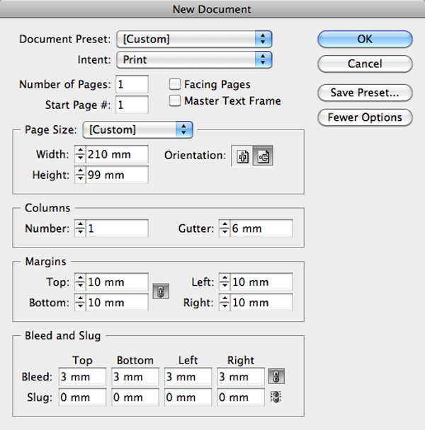
You have probably noticed that I have included bleed and you are probably wondering why when a home printer is doing the printing? The simple reason is, my printer prints edge to edge, which is quite handy for projects like this. Having mentioned that, it is worth checking your print specifications if you are deciding to print in house. For example, some printer’s have border restrictions and have a set print area.
Step 6
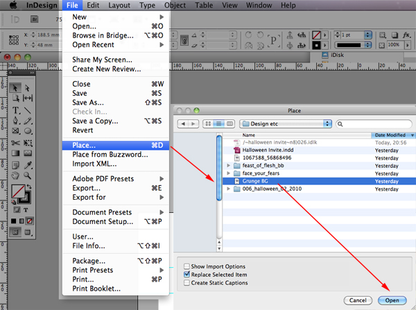
Let’s start importing the images. I am going to start importing from the bottom layer up. So first up is the background grunge image. Go to File > Place, navigate to where the image is stored, select it and click Open. Now position it to suit your design.
Step 7
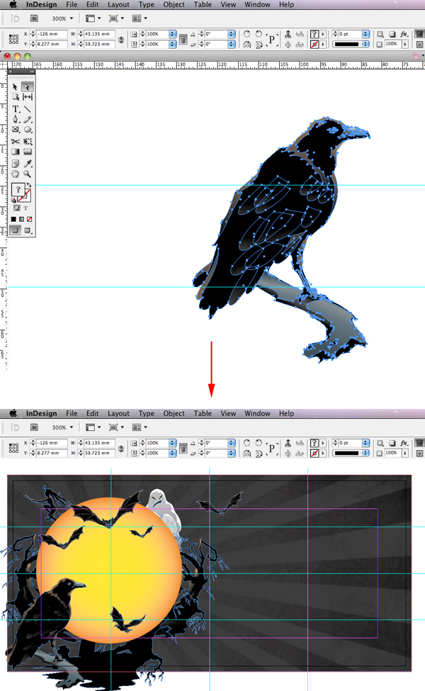
The vector set downloaded from vectortuts contains an Illustrator eps. This is perfect as I want to import each element separately and retain the transparency. To do this, open the eps in Illustrator. Select one object and copy it (thanks Iaroslav for grouping the characters. Grouping makes life so much easier). Go back to InDesign and paste directly into the document space. You will notice that the vector has retained the paths, should you wish to edit it, you can now do so within InDesign. Import the reminder of the vectors and position them based on your sketch and design.
Step 8
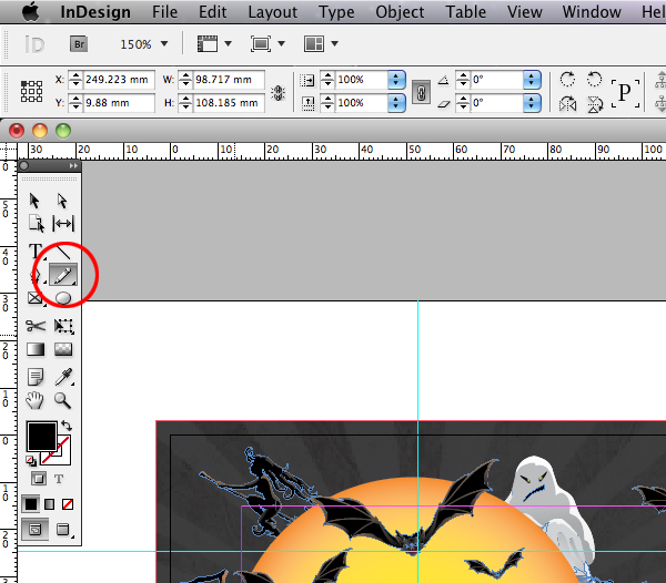
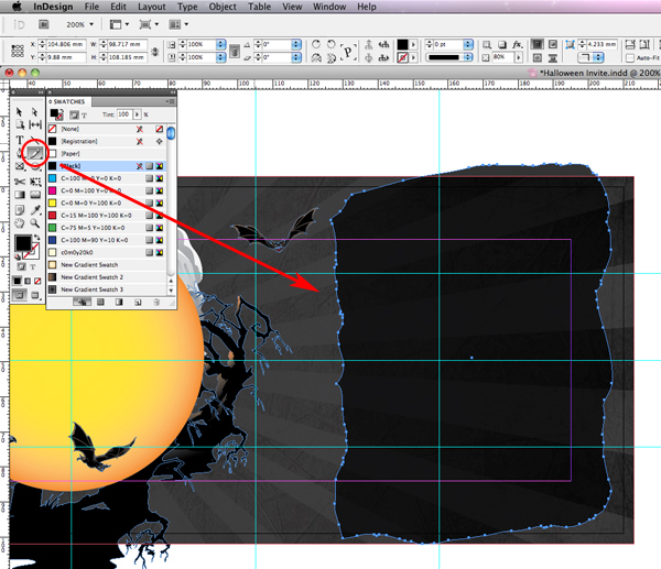
Graphic wise I only need to create a panel for my body text to sit on. To achieve a rough edge I am going to use the pencil tool to roughly draw the shape of a tombstone. I am using a Wacom tablet but a mouse is sufficient. Go to the toolbox and select the Pencil tool.
Step 9
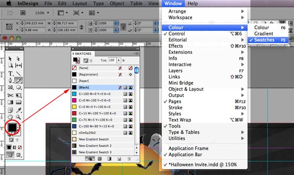
Staying within the Tool Box set the stroke to None by clicking on it and pressing the none button.
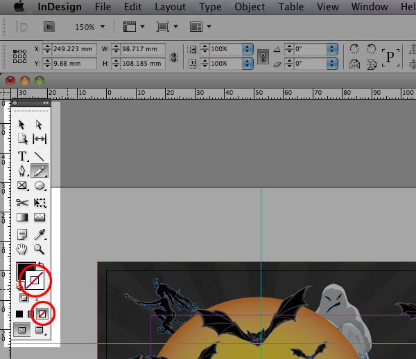
Now click on the Fill box and navigate to the swatch panel, go to Window > Color > Swatches and choose your colour you want to add to your graphic, I am using Rich Black.
Step 10
Use the pencil tool to draw your required shape. Click, hold and move the mouse along until you have completed the path of your shape. Release the click to finish the shape.
Step 11
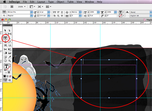
Now we can set the type. Go to the Tool Box and select the Type Tool, draw a text frame and from the Control panel select the font you installed earlier and set your required point size, leading and various attributes to suit your design. Type or paste your content as required. Finally, check the position of your graphics and proof read the text. Once you are happy with the design print it!
And here is my finished flyer.

Conclusion
The internet can prove invaluable to a designer who is facing a tight deadline. There are countless websites and blogs that offer free stock. As this tut proves, online resources can add real value to your projects and more importantly save time. One final tip, always read the licence before you use any free stock. Here are a handful of my favourite websites for freebies to get you started.
{excerpt}
Read More