A few times a each month we revisit some of our reader’s favorite posts from throughout the history of Vectortuts+. This tutorial by Nik Holmes was first published on August 30th 2010.
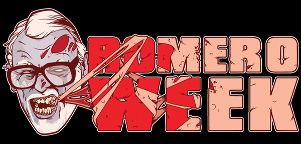
When Horror Site Freddy in Space recently ran "Romero Week" they asked Nik Holmes to provide a type treatment to tie the articles together. Could you possibly think of a better Vector Artist for the job? Among one of the best illustrators of this genre, Nik will take you though the process he used to create the character and type treatment for this blood-curdling illustration.
Note: This tutorial assumes some familiarity with the basic drawing tools and features found in Adobe Illustrator, because of the creative skills needed to illustrate the character, it has been marked "Advanced". Intermediate users will find this tutorial challenging but not out of their skill set.
Step 1 Drawing Romero
I knew I wanted to include a Zombie in the logo, and after considering some of my favorites from Romero’s "Dead" films I decided to Zombie up the man himself, so I need an image of Romero. A quick google turns up plenty of pictures, but I don’t just want to directly trace an image. I ended up taking a photo of my own ugly mug pulling a suitably Zombieesque grimace. This can easily be re-drawn to match Romero’s own features quite easily as the man has a very iconic visage — White beard and oversized glasses. Once I have a photo I’m happy with I need to import it into my illustrator document. after creating a new document, I locate the image and import it. File > Place.
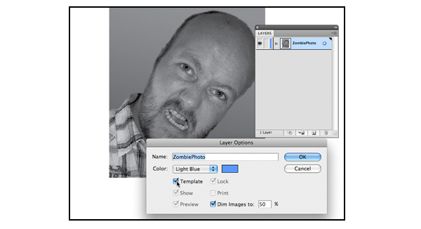
Once imported, I label the layer and prepare for it to be worked on. Double Click the layer in the Layer Palette window and select the relevant Layer Options. Selecting Template automatically locks the layer so I don’t start accidentally editing my base image and also dims the image which stops it from overpowering the necessary line work which is to follow.
Step 2 Create Basic Line Work
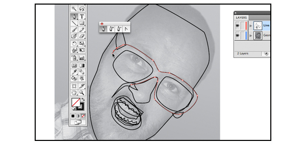
I use the photo to lay down the first basic shapes for the illustration. I don’t like to rely to heavily upon Illustrator’s tracing capabilities as it can all too easily move away from a fresh and exciting illustration. However there is no point in ignoring the tools available as they can lay down a quick yet strong start to your piece. Using the Pen Tool (P) with a black outline and no fill I draw around the key features. By using no fill I can ensure I keep an eye on the image below.
Step 3 Fill the Line Work
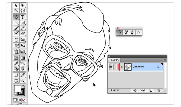
Once the basic shapes are in place, I select all of the shapes and add a white fill. At this point you will no doubt find that some shapes are hidden behind others depending upon the order they were drawn in. Simply spend a few minutes selecting your shapes and shuffle the layer order around until all is as it should be ( Order > Arrange > Bring Forward/ Send Backward)
Step 4 Insert Shapes Within one Another
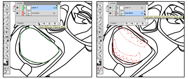
Now that I have arranged all of the elements into the order required, some objects need to placed inside others, such as the teeth within the mouth. The first step is to create a Mask Layer with the mouth shape. You can do this by selecting the mouth shape and placing it onto its own layer ( Order > Arrange > Bring Forward/ Send Backward ) then either use the layers menu to create a clipping mask or use the menu bar ( Order > Arrange > Bring Forward/ Send Backward).
Once you have created the mask, select the elements such as teeth and tongue and place them within the mouth. Simply select the required objects and drag them into your masked layer. It is worth noting that when you create the clipping mask the mouth will lose all of it’s color values, so these will need to be re-applied.
Step 5 Fill the Solids
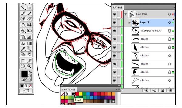
Now that I have complete the line work, I want to fill in the solid blacks. Simply select all the areas that require solid black using the selection tool (V) and using the Swatches window apply a black fill.
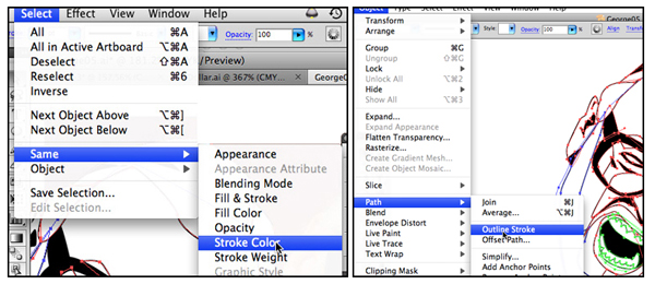
I am now left with a black and white line drawing, which I may tweak at this stage. Once I’m happy with the image and the line work I want to transform the lines to solid shapes so they can be pushed and pulled to give "body" to the piece. Selecting the line work is easy as all of it is the same color I simply select any piece of line work in the document and then go to Select > Same > Stroke Color and any object with the same stroke color as my current selection is then also selected. This tool is very useful when applying broad changes across a piece, particularly when dealing with color
Once I have all of the line work selected I convert it to a solid filled object ( Object > Path > Outline Stroke ) I then tweak the line weight where I think it is required. I like the line weight to be nice and chunky, so using the Direct Selection Tool (A) I grab the points on the outline which are then tweaked to my liking.
Step 6 Laying Down Colors
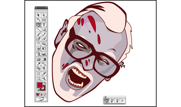
Once I’ve got some basic line work down it’s time to apply block colors I know that I want the piece to be on a black background, so my first step is to change the color of the line work which is where Select > Same > is handy, this time selecting the Fill Color option. Because I am now dealing with a solid shape, other elements such as the glasses will also be selected. Once I have the face colored , I can move away from the original image and begin to get creative. My first step is to apply the rips in the flesh using the Pen tool (P).
Step 6 Custom Brush Work
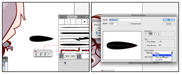
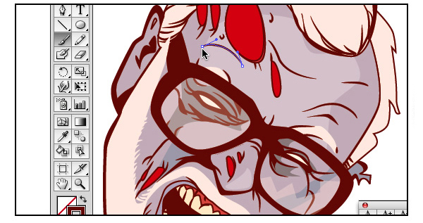
At this point the face still looks very flat and digital, so I want to create some brush work to add some fluid lines. Using the Pen Tool, I create a basic brush shape which will give a tapered finish to the lines.
I then drag it into the brush panel at which point I’m given various options for the brush. I want an Art brush with Tints Colorization. I choose to scale the brush down to a low percentage, this way I can duplicate the brush later and apply different percentages to give me a range of different sized brushes.
Working around the image I apply lines and detail until I am happy the illustration is losing the static feel vectors can give. Applying these lines independent of the original photo, rather than tracing, also allows the image to feel fresher and more spontaneous. The photo can still be used as reference, but trusting in your own mark making really does help to breathe life into the piece.
Step 7 The Text
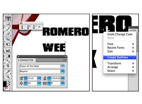
Now that I have a face that I am happy with, it’s time to create the text. I choose a font that is suitably distressed and Zombie like, but is also nice and bold. I type out the title and then while it is still selected I Right-click my Mouse and choose Create Outline. This transforms the type into a graphic which I can manipulate and work on in the same manner as the face. Unfortunately once type is transformed into outlines you can no longer edit it as text, so it’s important to make sure you are happy with it. It is always helpful to keep a copy of the original type on a hidden layer, just as a back up.
Step 8 Adding Skin
My idea is to have the Zombie face munching away on the type. One approach could be to work into the current type layer, adjusting it and subtracting areas. However I decide that I want to create an outer skin, so using the Pen Tool once more I begin creating the skin on a new layer above the type.
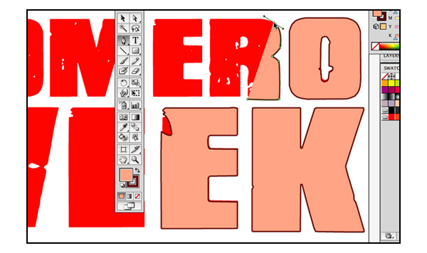
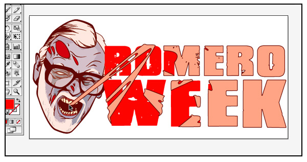
The next stage is basically a repeat of the first stage involving the face, but using the red text as my base versus a photo. While creating the skin I also add some loose shreds which extend to the mouth of the Zombie, tying the two elements together and also bringing a sense of "life" to the piece, it also adds a sense of "stretch and bounce" to the skin. To make the logo sit together the red portion requires an outline as with all the other elements so I paste a copy of it behind itself and add a stroke. Applying the stroke to the copy rather than the direct object ensures that the stroked object sits behind any smaller gaps and ‘fills’ them up.
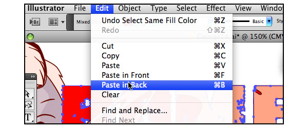
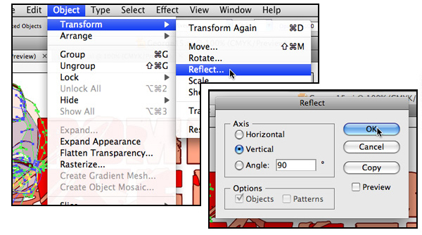
Now that I’m nearly finished, it’s simply a matter of tying the image together. I realize that the head isn’t giving quite the right feeling of "pull" that I would like. The eye reads left to right across a page so if I have the head moving in the opposite direction it should give the impression of resistance. This is quickly accomplished by flipping the head vertically ( Object > Transform > Reflect) and then applying some further tweaks to how the elements all interact with each other.
Conclusion
With the majority of the work completed I can have some fun, I go back in with my brush and pen tools and as I would with traditional media and I fine tune the piece as a whole. I crack the glasses, decay the teeth and generally just add the right touch of Zombie funk until the piece is finished. I hope you’ve had fun following on with this tut.
{excerpt}
Read More