In this Quick Tip, you will learn how to create a scalable web button with the Appearance Panel and Adobe Illustrator’s 9 Slice Scaling. This technique is especially useful for web designers that need to use the same style button with various lengths of text. Let’s get started!
Introduction
This tutorial will show you how to create a scalable vector button using 9-Slice scaling in Adobe Illustrator CS5. In the example below you will see how the button scales with and without 9-Slice scaling, you will notice that the regular scaling moves everything within the button image. With 9-Slice you can specify how the image scales to create re-usable web elements.

Step 1
Make a new RGB document of any size. Option + Click onto the artboard with the Rectangle Tool (M) and enter the button dimensions. Because the button will be scalable Horizontally, the Width isn’t important. I’ve set my rectangle to 200px by 60px.

Step 2
Open the Appearance Panel and select Fx > Stylize > Round Corners, set the corner radius to 8px, click OK.

Step 3
Add a gradient fill to the button with the following colors. If you want to chose your own, follow the guide below for an indication of the position and shade of the colors. You will notice that color 2 and 3 are very close, this is key to the super glossy appearance of the gradient.
Step 4
If your button has a line, delete it. Add another fill in the Appearance Panel and position it below the gradient layer. With the Appearance Settings, go to Fx > Path > Offset Path and set the offset to 1px.

Step 5
Fill the second fill layer with a gradient in the following colors. Again, you can make the colors your own choice, just remember to keep the light shades near the top and the dark one at the bottom.

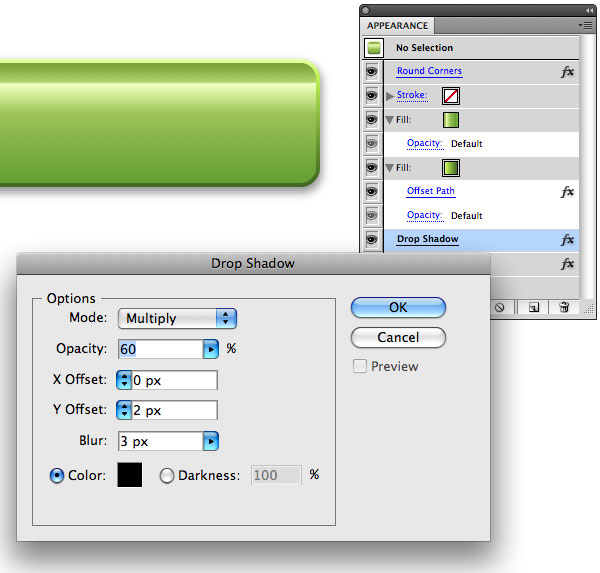
Step 6
Add a Drop Shadow below the two fills in the Appearance Panel by going to Fx > Stylize > Drop Shadow and set the opacity to 60%, the X offset to 0px and the Y offset to 2px. Make the Blur 3px
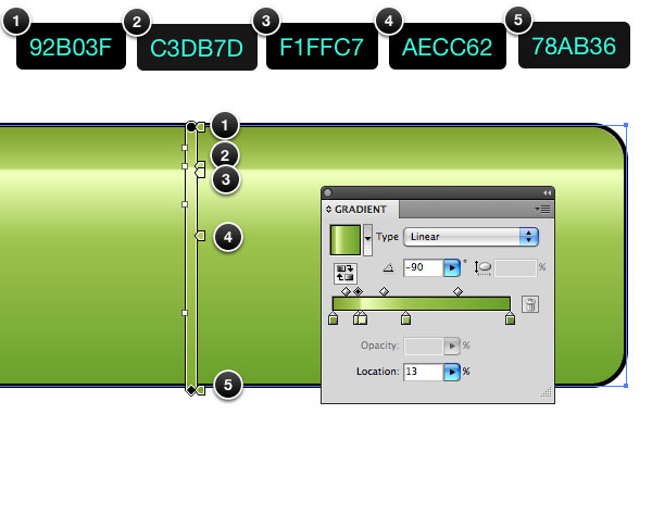
Step 7
Zoom into the button so you can see the lines lines you need to make in this step. Part of the way into the right side of the button, draw two 1px lines next to each other. Make the first one the same color as the top of the gradient outline and the second line the same color as the bottom of the outline gradient. I’ve written the color numbers in the following image for reference.

Step 8
This part is for Adobe Illustrator CS5 – Select the button and the lines and drag it into the Symbols Palette. Click Enable 9-Slice Scaling (This will enable the horizontal scaling) and Align to Pixel Grid (This will stop the button from rendering blurry on web sites). These two settings will make the button perfect for web use.

When you create the Symbol, you will see a screen like the image below. Move the dotted lines to mark out the areas that shouldn’t be scaled. I’ve positioned the dotted lines to the side of the area that I want to place a symbol, this will ensure that it won’t change if I alter the length of the button. Double Click on the artboard area to go back to the main image.

Scale the buttons to test the areas you marked out. If you need to make any edits, double click the symbol to go back to the settings.

Step 9
Add some text and symbols to the buttons and chose one to apply the appearance to. You can then apply the appearance to the rest of the items when you’re finished the settings. Start with a gradient fill. This one is a simple dark to light gradient. I’ve written down the colors I’ve used in the image below.
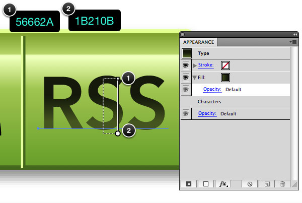
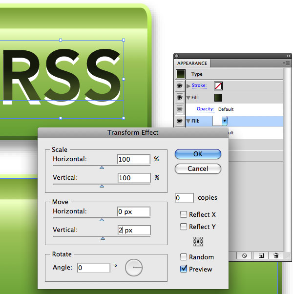
Step 10
Add a white fill under the gradient layer in the Appearance Panel and set it to move 2px Vertical. Click OK.
Step 11
Add an Outer Glow by going to Fx > Stylize > Outer Glow. Set it to a bright tone of the colors on the button and the blur to 1px. This will add a subtle haze to the layer effect and make the button look like it’s slightly glowing.

Step 12
Add a stroke to the top of the Appearance Settings in a dark de-saturated tone of the button color. Set the stroke to 0.5px.

Step 13
Test the style out on variety of symbols and buttons, save the two styles to the Graphic Styles Palette. by selecting the object with the style and clicking the Add Style button at the bottom of the Graphic Styles.

Conclusion
There you have it. A scalable web button that’s easy to use and re-use. If you want to alter the rounded corners you can click back into the symbol and change the appearance by toggling the rounded corners to invisible. If you want to make a new button, drag a the button symbol from the Symbols Palette. onto the artboard and Control Click to navigate to the options to break the link with the Symbol. From there, the button won’t change the other symbols and you can edit it to be a new style. I hope you enjoyed this tut.

{excerpt}
Read More