In this Quick Tip on Flash Professional CS5 tools we are going to look at the Text Area and and Text Input components.
Final Result
Let’s take a quick look at what we’re working towards in this Quick Tip:
Brief Overview
In the demo you see five labels, four of them are just static labels describing what the components are for. The bottom left label shows how many characters are available to type and will change each time the user enters text into the comments text. The name text input allow only uppercase and lowercase numbers and spaces. The password box shows the text as a password with asterisks and allows only 16 characters to be entered (as most password are a set length). The comments textArea allows the user to enter text, but only allows for 250 characters. The styled text area is styled using a combination of the TextFormat Object and HTML.
Step 1: Setting up the Document
Open a new Flash Document and set the following properties:
- Document Size: 450 * 400
- Background Color:#FFFFFF
Step 2: Add Components to the Stage
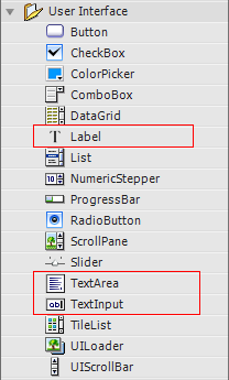
Open the components window by going to Menu > Window > Components or press CTRL+F7.
Drag five Labels, two TextInputs and two TextAreas to the stage.

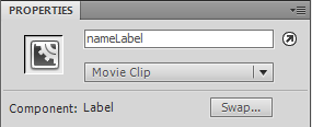
In the Properties panel give the first label the instance name “nameLabel”. If the Properties panel is not showing go to Menu > Window > Components or press CTRL+F3.

Set the label’s X to 35.00 and its Y to 45.00
Set the label’s width to 100.00 and its height to 22.00

- In the Properties panel give the second label the instance name “passwordLabel”, X: 35, Y: 119, width: 100, height: 22.
- In the Properties panel give the third label the instance name “commentsLabel”, X: 35, Y: 209, width: 100, height: 22.
- In the Properties panel give the fourth label the instance name “numCharsLabel”, X: 35, Y: 354, width: 100, height: 22.
- In the Properties panel give the fifth label the instance name “styledLabel”, X: 294, Y: 45, width: 100, height: 22.
- In the Properties panel give the first TextInput the instance name “nameTI”, X: 35, Y: 77, width: 100, height: 22.
- In the Properties panel give the second TextInput the instance name “passwordTI”, X: 35, Y: 155, width: 100, height: 22.
- In the Properties panel give the first TextArea the instance name “commentsTA”, X: 35, Y: 240, width: 180, height: 100.
- In the Properties panel give the second TextArea the instance name “styledTA”, X: 249, Y: 79, width: 172, height: 162.
Step 3: Import Classes
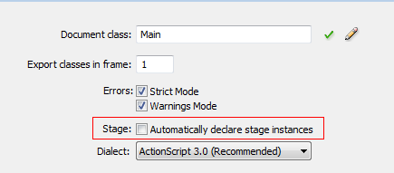
Create a new ActionScript file and give it the name Main.as. We will be declaring our components in the Main.as so we need to turn off “auto declare stage instances”, the benefit of doing this is that you get code hinting for the instance.
Go to Menu > File > Publish Settings and click on Settings next to Script[Actionscript 3].

Uncheck “automatically declare stage instances”.

In Main.as, open the package declaration and import the classes we will be using. Add the following to the Main.as:
package
{
	//Components
	import fl.controls.Label;
	import fl.controls.TextArea;
    import fl.controls.TextInput;

	//Need to extend movie clip so we import it
	import flash.display.MovieClip;

	//Needed to automatically size our labels
	import flash.text.TextFieldAutoSize;

	//Events
	import flash.events.TextEvent;
	import flash.events.Event;

	//Needed to style the textArea
	import flash.text.TextFormat;
Step 4: Set up the Main Class
Add the class, extend MovieClip and set up our Constructor Function. Add the following to Main.as:
public class Main extends MovieClip
{
	//Labels
	public var nameLabel:Label;
	public var passwordLabel:Label;
	public var commentsLabel:Label;
	public var numCharsLabel:Label;
	public var styledLabel:Label;

	//Text Inputs
	public var nameTI:TextInput;
	public var passwordTI:TextInput;

	//Text Area
	public var commentsTA:TextArea;
	public var styledTA:TextArea;

	//Number of characters permitted in comments area
	private var  numChars:uint = 250;

	//Used to style the text area
	var taFormat:TextFormat;

	//String to be used in textArea
	var theString:String;

	public function Main() {
		//Used to setup our lables
		setupLabels();
		//Used to setup the textInputs
		setupTextInputs();
		//Used to setup the TextFormat for the TextArea
		setupFormat();
		//Used set up the String we use in our TextArea
		setupString();
		//Used to sets= up the Text Area
		setupTextAreas();
	}
Step 5: Main Constructor Functions
Here we define the functions that are used in our constructor. Here’s what we’ll do:
In the setupTextInputs() function we use the restrict property to restrict what character the user can enter. Since this is a proper name, we restrict the usage to upper and lowercase letters and spaces (no numbers).
By using displayAsPassword, when the user enters text the input will show asterisks (very similar to what you’d do in HTML).
By using maxChars we set a predefined number of characters the user is able to enter; here they can enter up to 16 characters.
The TextFormat is an Object we will pass to the TextArea. Here we set the color, size, and set italics to true.
When we set up the string for the TextArea we embed HTML, which will be available by using the TextArea’s htmlText property.
In the setupTextAreas() function we make the comments TextArea editable so the user can type in it; we also set the max number of characters and set “word wrap” to true so words will wrap when reaching the end of the textArea. We set the htmlText equal to the string we created and setup its text format. The HTML in the string overrides the textFormat but the rest of the string inherits what we have put into the TextFormat Object.
Add the following to the Main.as
private function setupLabels():void {
	//Setup the text for our Labels
	nameLabel.text ="Enter your Proper Name";
	passwordLabel.text ="Enter your Password";
	commentsLabel.text="Enter your Comments";
	//Here we cast numChars to a string since the text property expects a string
	numCharsLabel.text=String(numChars)+" characters left";
	styledLabel.text ="A styled Text Area";

	//We use autosize so our label can hold all the text
	nameLabel.autoSize = nameLabel.autoSize = TextFieldAutoSize.LEFT;
	passwordLabel.autoSize = passwordLabel.autoSize = TextFieldAutoSize.LEFT;
	commentsLabel.autoSize = commentsLabel.autoSize = TextFieldAutoSize.LEFT;
	numCharsLabel.autoSize = numCharsLabel.autoSize = TextFieldAutoSize.LEFT;
	styledLabel.autoSize = styledLabel.autoSize = TextFieldAutoSize.LEFT;
}

private function setupTextInputs():void {
	//Here we restrict input to only lowercase a-z, uppercase A-z and spaces
	nameTI.restrict = "a-zA-Z ";

	//Use displayAsPassword to make the textinput display like a password field
	passwordTI.displayAsPassword = true;
	//Limit the number of characters the user can enter since most passwords
	passwordTI.maxChars = 16;
}

private function setupFormat():void {
	//Here we set up a TextFormat Object which is used to add
	//style to the textArea
	taFormat = new TextFormat;
	taFormat.size = 16;
	taFormat.color = 0x0000FF;
	taFormat.italic = true;
}

private function setupString():void {
	//This is the string containing HTML we pass to the textArea
	theString="<b>This text is bold</b>We can change the color to ";
			 theString+="<font color='#FF0000'>Red too</font> by using HTML";
			 theString+="The rest of this text is set by the text Format";
}

private function setupTextAreas():void {
	//Setting the textArea to editable meanst the user can type in it
	commentsTA.editable = true;
	//Sets the maximum number of characters the textfield can hold here we want comments
	//To be 250 characters or less
	commentsTA.maxChars = numChars;
	//Sets word wrapping to true, the words will wrap when reaching the end
	//of the textArea
	commentsTA.wordWrap = true;

	commentsTA.addEventListener(TextEvent.TEXT_INPUT, textEntered);

	styledTA.htmlText = theString;
	//Here we set the format to the textArea
	styledTA.setStyle("textFormat", taFormat);
}
Step 6 Define the textEntered Function
The textEntered() function is used by the commentsTA eventsListener. Here we get the number of available characters left to type and update the
label to show how many are left.
Then we close out the class and the package.
		private function textEntered(e:Event):void {
			//Gets the number of avialable characters left to type
			var charsLeft:uint = numChars - e.target.length;
			//Cast charsLeft to a string and update the label
			numCharsLabel.text=String(charsLeft)+" characters left";
		}
	}//close out the class
}//close out the package
Conclusion
Using textInputs and TextAreas is a great way to let your user enter text or to show styled text.
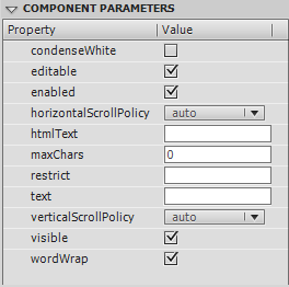
You’ll notice in the components parameters panel of the components that you can check and select certain properties.

The above image is for the TextArea component
Properties for the TextArea Component
condenseWhite: a Boolean value that indicates whether extra white space is removed from the component that contains HTML texteditable: a Boolean value that indicates whether the text field can be edited by the userenabled: a Boolean value that indicates whether the component can accept user inputhorizontalScrollPolicy: sets the scroll policy for the horizontal scroll bar. This can be one of the following values:ScrollPolicy.ON: The horizontal scroll bar is always on.ScrollPolicy.OFF: The scroll bar is always off.ScrollPolicy.AUTO: The scroll bar turns on when it is needed.- Defaults to
AUTO htmlText: the text to be displayed by the Label component, including HTML markup that expresses the styles of that textmaxChars: the maximum number of characters that a user can enter in the text field.restrict: the string of characters that the text field accepts from a usertext: a string which contains the text that is in the componentverticalScrollPolicy: the scroll policy for the vertical scroll bar. This can be one of the following values:ScrollPolicy.ON: The scroll bar is always on.ScrollPolicy.OFF: The scroll bar is always off.ScrollPolicy.AUTO: The scroll bar turns on when it is needed.- Defaults to
AUTO visible: a Boolean value that indicates whether the component instance is visiblewordWrap: a Boolean value that indicates whether the text wraps at the end of the line
Properties for the TextInput
displayAsPassword: a Boolean value that indicates whether the current TextInput component instance was created to contain a password or to contain texteditable: a Boolean value that indicates whether the text field can be edited by the userenabled: a Boolean value that indicates whether the component can accept user inputmaxChars: the maximum number of characters that a user can enter in the text field.restrict: the string of characters that the text field accepts from a usertext: a string which contains the text that is in the componentvisible: a Boolean value that indicates whether the component instance is visible
To see the properties for the label be sure to check out my previous Quick Tip on labels and buttons.
The help files are a great place to learn more about the component properties you can set in the parameters panel.
Thanks for reading and watch out for the next upcoming component Quick Tip!