
In the following steps you will learn how to create a grunge, vintage text effect in Adobe Illustrator. For starters, you will learn how to set up a simple grid and how to create a pretty basic pattern. Next, you’ll learn how to create a subtly textured background using a built-in pattern, the Film Grain effect, and some blending techniques. Finally, you’ll learn how to create the fully editable text effect using the Appearance panel and multiple fills and effects, along with your saved pattern and a built-in art brush.
For more inspiration on how to adjust or improve your final text effect, you can find plenty of resources at GraphicRiver.
Tutorial Assets
The following assets were used in the production of this tutorial:
1. How to Create a New Document and Set Up a Grid
Hit Control-N to create a New Document. Select Pixels from the Units drop-down menu, enter 850 in the Width and Height boxes, and then click that Advanced button. Select RGB for the Color Mode, set the Raster Effects to Screen (72 ppi), and then click Create Document.
Enable the Grid (View > Show Grid) and the Snap to Grid (View > Snap to Grid). You will need a grid every 1 px, so simply go to Edit > Preferences > Guides > Grid, and enter 1 in the Gridline every box and 1 in the Subdivisions box. Try not to get discouraged by all that grid—it will make your work easier, and keep in mind that you can easily enable or disable it using the Control-“ keyboard shortcut.
You can learn more about Illustrator’s grid system in this short tutorial from Andrei Stefan: Understanding Adobe Illustrator’s Grid System.
You should also open the Info panel (Window > Info) for a live preview with the size and position of your shapes. Don’t forget to set the units of measurement to pixels from Edit > Preferences > Units. All these options will significantly increase your work speed.

2. How to Create and Save a Pattern
Step 1
Pick the Rectangle Tool (M) and focus on your toolbar. Remove the color from the Stroke and then select the Fill and set its color to R=87 G=174 B=217.
Move to your artboard and simply create a 15 px square—the grid and the Snap to Grid feature should make this easier.

Step 2
Return to your toolbar, remove the Fill color, and then select the Stroke and set its color to R=47 G=47 B=47. Pick the Pen Tool (P), create a 25 px horizontal path, and place it exactly as shown in the first image.
Make sure that this new path stays selected, be sure that the Stroke Weight is set to 1 px, and then switch to the Direct Selection Tool (A). Select the right anchor point and simply drag it 25 px up as shown in the second image.

Step 3
Make sure that your black path is still selected and go to Effect > Distort & Transform > Transform. Drag that Move-Vertical slider to 5 px, enter 5 in the Copies box and then click OK.

Step 4
Make sure that your black path stays selected and go to Object > Expand Appearance. Next, go to Object > Path > Outline Stroke and then hit Control-8 (or go to Object > Compound Path > Make) to turn your group of black shapes into a compound path.
Select your blue square and add a Copy in the same place (Control-C > Control-F). Select this fresh copy along with the black compound path, open the Pathfinder panel (Window > Pathfinder), and click the Intersect button.

Step 5
Reselect your blue square and simply remove the color from the Fill to make it invisible. Select all the shapes made so far and drag them inside the Swatches panel (Window > Swatches) to save them as a pattern. Once you can see this pattern, feel free to Delete the selected shapes from your artboard.

3. How to Create the Background
Step 1
Using the Rectangle Tool (M), create an 860 px square and Fill it with R=117 G=177 B=169, making sure that it covers your entire artboard.

Step 2
Make sure that your square is still selected, focus on the Appearance panel (Window > Appearance), and add a second Fill using the Add New Fill button.
Select this new Fill and be sure that the color is set to black. Lower its Opacity to 5%, change the Blending Mode to Multiply, and then go to Effect > Artistic > Film Grain. Enter the attributes shown in the following image and then click OK.

Step 3
Focus on the Swatches panel, open the fly-out menu, and go to Open Swatch Library > Patterns > Basic Graphics > Basic Graphics_Textures to open that set of built-in patterns. Make sure that your square is still selected, return to the Appearance panel, and add a third fill using that same Add New Fill button.
Select this new Fill and add the Diagonal Lines pattern from that set. Lower its Opacity to 30% and then go to Effect > Artistic > Film Grain. Enter the attributes shown in the following image and then click that OK button.

4. How to Create the Text Effect
Step 1
Pick the Type Tool (T) and open the Character panel (Window > Type > Character). Select the American Captain font and set the size to 150 px. Increase the Leading to 180 px and the Tracking to 150 px and then click on your artboard. Add your text and make it white.

Step 2
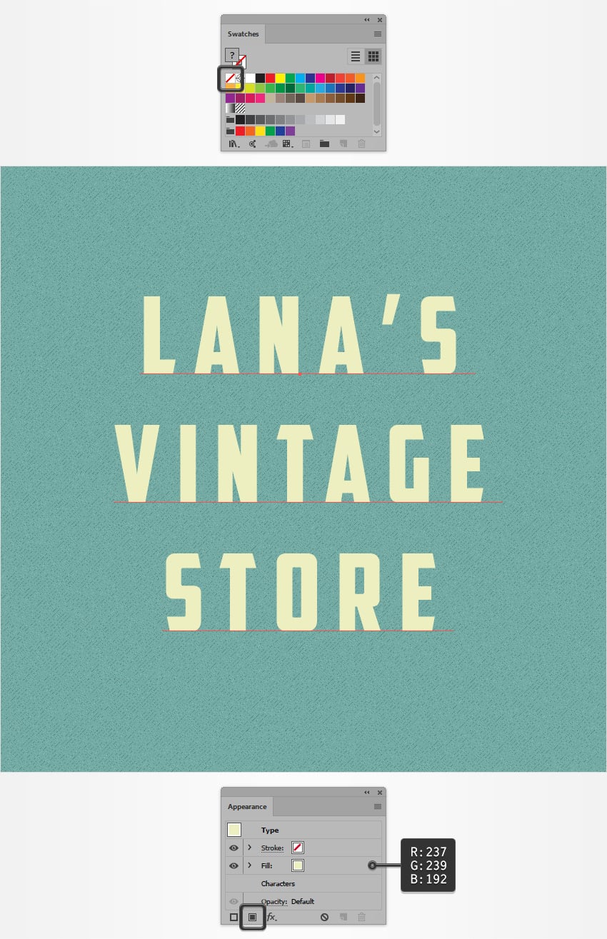
Make sure that your text stays selected. First, go to the Swatches panel and simply remove that white from the Fill. This will make your text invisible.
Next, go to the Appearance panel and add a new Fill using the same Add New Fill button. Select it and set the color to R=237 G=239 B=192.
Step 3
Make sure that your text stays selected and keep focusing on the Appearance panel. Add a second Fill and drag it below that other fill.
Select this new Fill, set its color to R=47 G=47 B=47, and go to Effect > Stylize > Rounded Corners. Enter a 2 px Radius, click that OK button and then go to Effect > Distort & Transform > Transform. Drag both Move sliders to 8 px and then click that OK button.

Step 4
Make sure that your text stays selected and keep focusing on the Appearance panel.
Select the top Fill and go to Effect > Stylize > Rounded Corners. Enter a 2 px Radius, click that OK button, and then go to Effect > Distort & Transform > Transform. Drag both Move sliders to 5 px and then click that OK button.

Step 5
Make sure that your text stays selected and keep focusing on the Appearance panel. Add a third Fill and drag it below the other two fills.
Select this new Fill, add your pattern from the Swatches panel, and go to Effect > Stylize > Rounded Corners. Enter a 2 px Radius, click OK, and then go to Effect > Distort & Transform > Transform. Drag both Move sliders to 13 px and then click OK.

Step 6
Make sure that your piece of text stays selected and keep focusing on the Appearance panel. Add a fourth Fill and drag it above the other fills.
Select this new Fill and set the color to R=117 G=177 B=169. Lower its Opacity to 15% and then go to Effect > Path > Offset Path. Enter a -8 px Offset, set the Joins to Round, and click that OK button.
Next, go to Effect > Stylize > Rounded Corners. Enter a 2 px Radius, click OK, and then go to Effect > Distort & Transform > Transform. Drag both Move sliders to 2 px, click OK, and then go to Effect > Blur > Gaussian Blur. Enter a 4 px Radius and then click OK.

Step 7
Finally, you’ll need one of those built-in art brushes. Go to the Brushes panel (Window > Brushes), open the fly-out menu, and go to Open Brush Library > Artistic > Artistic_ChalkCharcoalPencil.
Reselect your text and focus on the Appearance panel. Select the stroke and set its color to R=17 G=17 B=17. Add the Pencil – Thin art brush and then go to Effect > Stylize > Rounded Corners. Enter a 2 px Radius and then click OK.

Congratulations! You’re Done!
Here is how it should look. I hope you’ve enjoyed this tutorial and can apply these techniques in your future projects.
Feel free to adjust the final design and make it your own. You can find some great sources of inspiration at GraphicRiver, with interesting solutions to improve your design.

{excerpt}
Read More