Flow: Task Management With Mac Sex Appeal

I’ve never really been happy with the task management apps I’ve tried. There were always features missing, a less than ideal design, over complicated, too simple and so on. I’ve been jumping from app to app for as long as I can remember and somehow I always end up with a desk littered in bright yellow sticky notes, covered in lists of tasks, notes and all sorts of info.

I recently spent yet more time using some of the most popular task management apps in an effort to find “the one.” While there are many out there I like, only two really fit my tastes and needs — Producteev and Flow. Between those two, I decided on Flow (after using both) and I couldn’t be happier with Flow.

I’ll take a look at Flow, by MetaLab, and why I think I’ve found “the one” task management app for me.

Flow’s Sexy Design

To start, Flow has a downright sexy interface design. It’s clean, organized, easy, goes along well with the “Mac style” and is just a pleasure to look at when using. It doesn’t really begin there though; take a look at http://getflow.com and you’ll see that the Flow team put just as much effort into creating a sexy site for the app.

Flow Home

Flow Home

Flow’s home page loading animation makes you go “ooohh, nice.” I won’t get into their site design but suffice it to say, this is a prime example of how web app developers should be designing their app websites. Even little things like the small bounce when clicking the device images above “Work anywhere” count as it makes me feel like the page responds to me. Silly? Maybe. But I like it.

Another absolute must is a tour video. Flow’s is fun and creative, although I wish they had one that walked through Flow’s interface so I could see it in action before signing up. They did a great job with screenshots further into the page so it’s not really necessary, but it’d be nice.

Home Screenshots

Home Screenshots

App Interface

Flow’s interface, as I said before, looks fantastic but also functions extremely well. Flow is essentially a desktop app built in the cloud and although there are slight delays here or there that show its web roots, they’re very minimal and definitely well “hidden” compared to pretty much all other web apps around. (Most people probably won’t even notice the tiny delays.)

Flow Interface Dashboard

Flow Interface Dashboard

Left Column

The far left column is split between your Focus and a tabbed selection between Projects, Tags and Contacts. The Focus section lets you jump between varying views of your tasks (in other words, you focus on a specific area of tasks). Although you can’t change the Focus “categories,” the one’s they’ve included provide just the right level of focusing ability.

Standard Lists

Standard Lists

The Projects, Tags and Contacts areas are pretty straight forward and can be created using the + at the bottom of the column. To edit or delete folders, lists, tags or contacts, just hover over the item and click the icon that appears to the right. You can also drag and drop your lists to reorder them.

The icon at the lower left of the column (arrow in a box) brings up the standard task lists: All, Followed, Unread, Untagged and Completed Tasks, which cannot be deleted, renamed or moved.

Using the search bar in this column will immediately show your filtered results, making it very quick to find what you’re looking for among possibly hoards of lists, tags or contacts. This kind of functionality in web apps is really what sets apart the good from the great.

Center Column

Flow’s center column displays your tasks according to the focus view you have selected and related task information such as tags, due date and icons for description, flagged or comments. The task checkmark box and text color will change according to the tasks due date and status. Once a task is checked as completed, it changes to a light grey to indicate it’s completed and allow better contrast between completed and uncompleted tasks.

Task Lists

Task Lists

Once you’ve created a task, if you added a description, you’ll notice a small grey icon (looks like a piece of paper with folded corner) just to the right of the task name. This indicates there is a description for this task and clicking the icon will take you to the task details page, but you can also simply hover over the icon to view the description.

Task Description

Task Description

Task Hover Menu

Task Hover Menu

You’ll also notice that while hovering over a task a new menu will appear at the far right of the task. The menu allows you to drag and drop rearrange, edit, delete, comment or flag the task.

You can click a tasks tags to quickly view all tasks with that particular tag. You can also click edit to view the task’s overlay for quick editing.

Right Column

The right column won’t be displayed by default but if you have project members, you’ll be able to see a list in the right column as well as invite new members. I’ll get into task delegation and project collaborators later.

Navigation

The navigation bar at the top let’s you (from left to right) quickly jump to your inbox (by clicking the logo), get help from various sources, view your settings, view notifications, create new tasks, clear completed tasks, organize tasks, set task list actions and search your tasks. I’ll get into all this here in just a moment.

Navigation

Navigation

Creating Tasks

Creating tasks is super simple. Just click the icon at the top that looks like a pencil in a box. A new task overlay will appear enabling you to enter your new task’s details. The form makes great use of auto-complete so you can quickly add tags, assign task lists, invite people, etc.

New Task

New Task

You can upload as many attachments as you need up to 100 MB in size for each task. Attachments appear in the task’s details page.

You’ll also notice that little quick tips appear throughout the app, which are quite helpful when you’re getting to know the app and how to use everything. I wish other app developers did this in such a seamless way. Once you’re familiar with the app and no longer want to see these quick tips, just click the question mark icon in the top navigation and select Turn Off Quick Tips in the pop-up menu.

Task Details

To view a task’s details page, click the chat bubble icon when hovering over a task. The details page shows all the tasks information in a very clean and organized layout. You and any task collaborators are able to leave comments, attach files, etc. with all the tasks activity displayed in a clean thread.

Task Details

Task Details

Live Comments

Live Comments

Flow provides real-time updates, so you’ll see comments from collaborators, notifications and other changes in as they’re happening. You’ll even see a status update when someone is writing a comment for a task!

Real-time is what web apps need to be competitive these days and Flow definitely delivers in this area.

Other Flow Features

Settings

Flow’s settings options are straight forward and, thankfully, not overcomplicated or overly simple. You’ll notice on the General tab that you can even set the desired badge count when using the app with Fluid on your Mac. You can set your profile information on the My Info tab, which includes just the right about of details.

General Settings

General Settings

Changing notifications is simple and really lets you fine tune the notifications you receive. Billing is as expected but shows your next payment date (something most apps don’t do easily), add accounts at increasing discounts (the more you get, the more you save, up to 50%) and the feature I find most frustratingly missing from most apps — you can delete your account easily (though I doubt you’ll want to).

Notification Settings

Notification Settings

Keyboard Shortcuts & Email Integration

One of the last bits I’ll cover is Flow’s keyboard shortcuts and email integration. No web app can emulate a desktop app without keyboard shortcuts and Flow doesn’t disappoint. It’s odd that so many apps focused on productivity lack this level of usability but Flow makes it easy to spend less time using the app and more time getting things done.

Keyboard Shortcuts

Keyboard Shortcuts

Email integration is pretty simple. Creating tasks is as easy as emailing [email protected] with some basic formatting and Flow will do the rest. You can see the formatting “rules” in the help menu under Email Integration.

Desktop & Mobile Apps

Flow has an iPhone and Mac app, though the Mac app is still in beta. I won’t get into these but I will say I use both and they both work and look great. The desktop app isn’t actually a full version of Flow, but rather a small menu bar app that makes it a little faster for Mac users to create tasks and jump into the web app. You can, of course, setup Flow with Fluid, which works very well (it’s what I’m using daily).

Pricing

Flow offers a 14-day free trial and costs $9.99 per month after that. It’s certainly not the cheapest task management app around, but it’s definitely worth the price based on my experience with the app so far. Discounts are also available for those purchasing multiple accounts, up to 50% off for 10+ accounts.

Final Thoughts

Flow is simply an incredibly well built app. It looks and functions very, very well and offers the features and functionality individuals and teams need to be able to get things done efficiently. It’s not often I have the pleasure of reviewing apps like this and while Flow has a few things that could be improved, they’re few and far between. With that in mind, we happily give Flow a 10/10 rating.

I also wanted to take a moment to note that Flow allows you to invite others to collaborate on projects or tasks without requiring them to sign up for the service. This is a great move as it allows me to delegate tasks to people who wouldn’t sign up for the app (like family). I can’t think of any other apps (at the moment) that do this. Kudos Flow team!

If you’re wondering, here’s a few things the Flow team could improve or add to their app.

  • Repeating tasks (on the way, possibly ready by the end of April)
  • Possibly more control over task delegation
  • Maybe a deeper hierarchy of project viewing (top level groups, sub groups) for companies

If you’ve used Flow or are familiar with other popular task management apps, what is Flow missing that you would need or want? If you use or used Flow, how was your experience?

Weekly Poll: Which Team Communication Apps Do You Use?

If you’ve ever worked in teams, especially large teams where everyone is located all over the world, you’ll know just how important efficient and effective team communication apps are. Communicating via email is generally standard, but let’s be honest, email works but isn’t efficient or effective enough for many situations — it’s too slow, difficult to use with more than a few people at once and and, depending on your organizational skills, can get wildly out of control.

There are plenty of great team communication apps around for varying purposes ranging from instant messaging to forums to real-time group chat rooms. No single app will work best for everyone’s specific communication needs. I’d like to put together a roundup covering the varying types of team communication needs and the best solutions available.

So let us know which, if any, team communication apps you and your company uses to stay in touch with co-workers, clients and everyone else. We’ve listed a few popular apps in the poll to the right but be sure to submit other’s we’ve not listed. Thanks!

QuickLook: InVision

Quick Look posts are paid submissions offering only a brief overview of an app. Vote in the polls below if you think this app is worth an in-depth AppStorm review!

In this Quick Look, we’re highlighting InVision. Here’s how the developer describes InVision.

InVision allows designers to build fully-interactive, high-fidelity prototypes using the tool they know best — Photoshop. You can share your prototypes with your design team, developers, clients, and even run live usability tests with end-users. InVision will change the way you think about user experience design.

Read on for more information and screenshots!

Screenshots

InVision

InVision

InVision

InVision

About the App

Here are the top five features you can expect to see in the latest version:

  1. Create stunningly beautiful, fully interactive web application prototypes using the tool you know and love — Photoshop.
  2. Build your wireframes and prototypes in whatever fidelity you like.
  3. Share prototypes with stakeholders and gather feedback directly on the screen.
  4. Collaborate on your designs and make the UX process a team effort.
  5. Stage realistic usability tests and gather important feedback early.

Two examples: http://bit.ly/invisionwireframe and http://bit.ly/invisionsample

Requirements: Browser on any OS
Price: $9.99
Developer: Ben Nadel

Vote for a Review

Would you like to see us write a full review of this app? Have your say in our poll:

Quick Look posts are paid submissions offering only a brief overview of an app. Vote in the poll if you think this app is worth an in-depth AppStorm review! If you’re a developer and would like to have your app profiled, you can submit it here.

Facebook Deals: Social Buying at a Whole New Level?

As expected, Facebook Deals is now being unveiled (a smidgen early too). Could Facebook Deals be a Groupon and/or LivingSocial killer? It’s very possible.

More details inside.

While Groupon and LivingSocial are likely safe for now, their long term future may well be at risk. Although they brought what turned out to be a very popular idea into fruition, they are still lacking the depth of social connectivity Facebook has to offer. I don’t expect their demise will be swift, but rather slow and painful as the social media giant branches out and potentially dominates another market.

Facebook Deals

Facebook Deals

In truth, it’s very likely other social buying apps will be just fine but Facebook will certainly prove to be a competitor on a whole new level. According to the New York Times, Facebook Deals will launch in Atlanta, Austin, San Diego and San Fransico for initial testing. It will no doubt be an instant hit (think Groupon in your Facebook feed) with many of its 600+ million users, not to mention the added opportunities for businesses.

Everyone knows social networking is a goldmine, the question was how businesses would be able to tap into it in a new way other than advertising. Social buying is one of those ways and one of the most popular. Apps providing social buying know exactly what social networking means to their business, but it will be entirely different once the experience is directly integrated into a social network, especially the worlds largest. The depth of integration will be on a completely different level from apps like Groupon or LivingSocial.

OpenTable

OpenTable

In addition to this new integration, there will be other apps such as OpenTable, PopSugar City, Zozi and more that Facebook Deals will be working with.

Of course the other relatively quite part of this new equation is Facebook Credits. It’s been rumored for quite awhile but this will be a real implementation where you can use them to obtain something more tangible. While the Facebook PR team clarified to the TechCruch staff, “You can’t use Credits to directly buy real goods.” You will, however, be able to use Credits to buy “Deals” in which you’ll receive a voucher to print and redeem the deal’s goods.

In other words, it’s like fake money that has real value and likely enables Facebook to avoid the hassle and legal implications of regular financial transactions.

Are You Excited?

I’m generally pretty pessimistic about Facebook as I’ve not been fond of their privacy practices, though I’ll be honest, I am looking forward to a more directly integrated form of social buying on Facebook. I subscribe to Groupon and SocialLiving but I expect the process and social aspect to be of much greater ease and enjoyment directly in Facebook. On the other hand, I’m not really fond of the idea of Facebook having any sort of hand in or knowledge of my financial information.

Do you think Facebook Deals will or could be a killer for sites like Groupon and SocialLiving? Will you be using Facebook Deals once it’s been released in your city? You can see the Facebook Deals landing page here.

CloudApp vs Droplr: Is There a Clear Winner?

Of course not! There never is. However, by comparing them we might be able to help you make a decision better suited to your needs. I, for one, have been torn between the two for quite a long time but always stuck with Droplr. We’ll take a look at the pros and cons of each and why you might want to choose one over the other. Take a look!

CloudApp vs Droplr

These two apps seem so similar at first glance you might be wondering if it even matters which one you choose. And, to be honest, it really won’t matter for most people as their basic functions are very, very similar. However, there are differences and for those who really want to use the full potential of these apps, the small differences will be the deciding factors.

What Do They Do?

In case you’re not familiar with either of these apps, they basically make it drag and drop easy to share files. What can you share? Well, you can pretty much share anything; images, videos, music, links, files, etc. However, they make it especially easy for sharing screenshots quickly.

The apps’ web interface makes it super easy to manage your uploads, URLs, bookmarks, etc and check the view count for each. They both have options for access on different platforms and offer free accounts.

Pricing

Both apps are free, but CloudApp offers a Pro plan at $5 or cheaper if purchased in chunks.

Droplr

  • 1 GB storage
  • 32 MB file size limit
  • URL shortening (private or public)
  • Custom domain
  • Built on Twitter integration
  • iPhone ($3.99), Windows (third party) and OS X

Be sure to check out our review of Droplr’s iPhone app via iPhone.AppStorm.net.

CloudApp – Free

  • 10 uploads per day
  • 25 MB max file size
  • Unlimited storage
  • URL shortening (private or public)
  • iPhone (third party), Android (third party) Windows (third party) and OS X

CloudApp – Pro

  • Unlimited uploads per day
  • 250 MB max file size
  • Unlimited storage
  • Custom domain
  • URL shortening (private or public)

See our recent review of CloudApp.

Droplr Web & Desktop Interface

Web Interface

Both apps have a great looking web interface, although they are both missing details that would be nice. Droplr’s home page lists your uploads in pages of 20, showing name, link, view count and date uploaded. Click the upload attributes’ link (Name, Link, Views, etc) to change the listing order.

The filter option is great if you’re looking for something more specific, but overall the app would be much better if it were using AJAX to eliminate front end page reloads. That would make the web interface much more fluid feeling.

Droplr Dashboard

Droplr Dashboard

To delete files, just select the desired files and hit delete in the lower left-hand corner. You can select multiple files, or deselect files by clicking them again. Hold shift and click another file in the list to select multiple files quickly.

The lack of textual titles for the navigation might bother some people, but I prefer it without. From day one I knew what each link meant but I can see how someone less familiar with web icons might be confused. Either way, a quick click through the pages will answer your questions.

Droplr’s image listing page is designed more like a gallery, rather than a basic list, and gives you all the information shown on the dashboard as well as file size. Click images to select or deselect them, just like you can on the dashboard. If you’d rather see your images in list format, you can select that view up at the top right.

Droplr Gallery

Droplr Gallery

The other pages are essentially the same except they list your uploads according to upload type (links, notes, files). The last page is for your settings, where you can enter a custom URL or change the number of rows listed.

Droplr Settings

Droplr Settings

Oddly, the List View option wouldn’t change anything for me and appeared to be non-funcitonal.

That’s about all there is to Droplr’s web interface. You can log out using the white link at the lower right of the page if you want. Unfortunately there’s no way to upload through the web interface, which I find very unusual, although I suspect the web app was an addition to the desktop app rather than the other way around.

Desktop Interface

Droplr Desktop Menu

Droplr Desktop Menu

Droplr’s desktop interface is just as simple as its web interface. There’s really not much to it, but that’s really the point. It’s built on the idea of simplicity so it’s not getting in your way. Just drag and drop links and files or snap screenshots with the keyboard shortcut.

Droplr Preferences

Droplr Preferences

Viewing the app preferences includes the basic options you’d expect; start at login, hide dock icon, notifications via Droplr pop-up or Growl, account login details and keyboard shortcuts. You’ll also have the option of selecting how the app interfaces with Twitter (posts via Twitter.com or a desktop app).

CloudApp Web & Desktop Interface

Web Interface

CloudApp’s web interface is just as simple as Droplr’s, though I slightly prefer Droplr’s design. CloudApp, however, takes advantage of more modern web techniques and has a more fluid interface that let’s you navigate through content very quickly without waiting on long page reloads (except when navigating to your Account page).

Your dashboard shows All files under the Library selection column on the left. Selecting other “categories” quickly displays the relevant files. Just as in Droplr, you can quickly jump between grid and list views, though Droplr only allows this for the image gallery view whereas CloudApp allows this for all your uploads.

CloudApp Dashboard

CloudApp Dashboard

When viewing your CloudApp web interface and uploading a file via desktop, the upload appears nearly instantly in the web interface. Just the kind of app design we like to see!

Clicking upload names allows you to quickly rename the file or select a different privacy setting (public or private). CloudApp also offers a “Trash can” so you can “recover” files should you decide you didn’t want to delete files from an earlier instance. From your Trash view you can permanently delete or restore files. This is a great feature Droplr is missing — once deleted on Droplr, it’s permanent.

You’ll notice CloudApp has a Bookmarks section and form for creating bookmarks at the top of the web interface. Bookmarks are simply shortened URLs. So, technically Droplr has this as well except you can create new ones from within CloudApp’s web interface. Not only that, but you can also upload files from within CloudApp’s web interface, a seemingly required feature for an app like this. (Although their upload progress indicator could be improved.)

CloudApp Upload File

CloudApp Upload File

You’ll also notice CloudApp’s page navigation allows you to easily jump to specific pages, whereas Droplr requires one page at a time (unless to edit the URL directly, which is easy).

CloudApp’s settings page lets you easily change your email address, password, default privacy settings (you can update existing items too), set a custom domain or purchase a Pro plan.

CloudApp Privacy

CloudApp Privacy

The last bit I’d like to point out about CloudApp’s web interface is that when viewing images, you don’t get any ads and there’s a little “+” in the lower right hand corner. When clicked, the plus expands a small menu with CloudApp’s icon (links to their site), the embed URL and a clipboard icon to quickly copy the embed URL.

CloudApp View Menu

CloudApp View Menu

In Droplr, your image view page has ads (although you can link directly to the image by adding a “+” to the URL). However, Droplr makes it easier to embed images (by adding the “+”). Both apps’ file download page is simple and sexy, but Droplr’s provides more information (kind, size and upload date).

CloudApp Upload Page

CloudApp Upload Page

Droplr Upload Page

Droplr Upload Page

Desktop Interface

CloudApp’s desktop interface is just about as simple as Droplr’s but offers a few other options such as sound selection, whether to copy the URL to your clipboard or not, raindrops for desktop application integration and support.

CloudApp Raindrops

CloudApp Raindrops

The Winner

If you’re still with us, you might think the clear winner is CloudApp. From this review, I’d agree with you. However, Droplr is a winner in it’s own way and sports one more feature that’s made me hold onto it for quite a long time — the ability to quickly upload notes with plain text, markdown or code formatting.

Droplr Notes

Droplr Notes

This has been an invaluable feature for me, and one that, when combined with Droplr’s other features and my particular needs, makes it the winner in my personal situation. That being said, Droplr could make quite a few improvements that would make me love it much, much more. Like what?

  • Paid accounts with much more (unlimited?) storage
  • Uploads and URL shortening via web interface
  • Enhanced web interface usability with more fluid navigation
  • File recovery option(s)

I’d love to see both apps offer video playback in addition to downloading. It really throws a wrench in the system when you upload a video for family or friends and they have to download it and figure out how to play it first. That makes me avoid sending video with these apps, which is really a shame.

I’d like to see CloudApp offer the following.

  • Easier way to select multiple files quickly
  • Multiple file upload via web interface
  • Better social network sharing integration

Which of these apps do you prefer and what features would you like to see them offer?

Quick Look: PSDvoid

Quick Look posts are paid submissions offering only a brief overview of an app. Vote in the polls below if you think this app is worth an in-depth AppStorm review!

In this Quick Look, we’re highlighting PSDvoid. Here’s how the developer describes PSDvoid.

Just entering our 3rd phase of testing we have started our invite only Open Beta of the world’s first PSD Publishing, Sharing, and Collaboration web app. Our site does all the work of creating thumbnails and preview files to cut down on your time. We allow you to license your work with a Copyright, Creative Commons, or Public Domain, select a category, and tags.

Read on for more information and screenshots!

Screenshots

PSDvoid

PSDvoid

PSDvoid

PSDvoid

About the App

Here are the top five features you can expect to see in the latest version:

  1. Upload PSD and PSB file and preview images are automatically created behind the scenes.
  2. Preview validated PSDs that are guaranteed to be valid files.
  3. The ability to follow users, categories, and tags all or view all PSDs uploaded by everyone.
  4. Ability to Collaborate with other designers online. (coming soon)
  5. Ability to export your work to external applications such as Twitter (twitpic), Facebook, Forrst, Myows, ect. (coming soon).

Requirements: Web Browser and Photoshop
Price: Free
Developer: Jonathan Yarbor

Vote for a Review

Would you like to see us write a full review of this app? Have your say in our poll:

Quick Look posts are paid submissions offering only a brief overview of an app. Vote in the poll if you think this app is worth an in-depth AppStorm review! If you’re a developer and would like to have your app profiled, you can submit it here.

Meet the Developers: AJ of Marketcircle

Today’s interview is with Alykhan Jetha (“AJ”), the CEO of Marketcircle. Developers of popular applications Billings and Daylite, Marketcircle has a long-standing track record as a top-notch Mac software development company.

In today’s interview, we’ll be talking about the Marketcircle team, inspiration for their products, the Mac App Store, and some very interesting updates currently in the pipeline for Billings.

I hope you enjoy the interview!

Tell us a little bit about the Marketcircle team – where are you based, how many of you are there, and what motivates you as a company?

We’re based in Toronto, Canada and we are about 32 people with customers in over 100 countries. The thing that motivates us is helping small businesses (1-2 persons) grow into bigger companies (20-50 persons).

This is why we make software that helps you get new customers, get things done and then get paid. We feel that the small business market is where future growth is as opposed to large enterprises.

The Marketcircle Team

The Marketcircle Team

What does a typical day look like for you? Walk us through your usual schedule and activities!

Now that I have two young kids (7 & 3), my days are super busy and pretty “interrupted”. It used to be that my life was 90% work and 10% everything else. I could focus for large stretches of time. Now it’s 60% work and 40% family. I’m CEO and chauffeur at the same time!

I still code, but not as much as I would like and probably more than I should. My code days are Tuesdays, Thursdays and the odd weekend. My meeting/planning days are Mondays, Wednesdays and Fridays. I’m not sure I like this combo, but I’m trying it for now.

AJ at work...

AJ at work…

As someone who uses your Mac all day, every day, do you feel the need to always be running the latest hardware?

I don’t feel that I have to have the very latest in regards to desktop stuff, but on the iOS front, I like to have the latest. I do have the excuse that I have to test stuff on the latest hardware…

What inspired you to originally create Billings and Daylite, and which came first?

This is the short version. Daylite came first, but it was an accident. We originally built Daylite as an internal app to help us grow our business and a technology showcase to get customers. We where looking to do development work for customers rather than actually sell our own applications.

Some people at Apple caught wind of what Daylite did and convinced us to sell it as a commercial app. So we did and here we are. It took a number of years and some really rough patches before we could give up our consulting business.

As someone who has been developing for the Mac for over a decade, how do you feel the industry has changed in recent years?

It has changed drastically. I actually started developing stuff in Objective-C back in 1991. I remember when you couldn’t even buy a book on Objective-C (unless you found some old NeXT book). Now you can find a ton of Objective-C and Cocoa books. 

How has the iPad and iPhone impacted the success of Marketcircle and your software?

Needless to say, the iOS devices have changed the landscape of business software. As you can imagine, most business people are on the road. The iOS versions of Daylite and Billings have been well received and has driven sales up.

The key thing to remember is that for our customers, the desktop and mobile apps have to be integrated, collaborative and continue to work whether there is a network connection or not. It took quite a bit of effort to get our backend and sync technology to make this happen.

Thankfully it has worked well and, in some situations, we are seeing customers buying more iOS licenses than desktop licenses.

What type of sales and customer response have you seen after launching your apps on the Mac App Store?

We’ve seen sales increase. Initially the Mac App Store and our online store where selling equally. Now we are seeing our online store sales diminish and App Store sales increasing.

Having dealt with physical box distribution, I can tell you that we were looking forward to the Mac App Store. We knew it would be a success. What we didn’t know is how soon that success would be achieved. So far, it is doing really well. Let’s see what happens when a bunch of apps have major upgrades.

The Meeting Room

The Meeting Room

Which websites, Twitter users, and magazines do you follow in an effort to stay up-to-date with the activities of other developers, and the Apple eco-system in general? 

I used to follow many people, go to many sites and be diligent with RSS. Then at some point, I just snapped. It was too much info from all over the place. I was reading more than I was working or getting things done.

Now I go to a few sites and follow a few people on Flipboard. Techmeme, Daring Fireball, GigaOM, Asymco and few others are high on my list, others are “compile time” fillers.

Do you have any interesting updates or apps in the pipeline that you can give us a sneak peak at?

Just a few days ago, we announced our new cloud based service and we are pretty excited about it because it will make the lives of our customers easier.

They won’t need to worry about servers and networking, yet will have collaborative, multi-user mac/iOS apps. We had all the server infrastructure in Objective-C (v2 no less) and had to find a way to leverage that in the cloud.

As you may know, there aren’t any Objective-C 2 based cloud services out there. We explored rewriting our backend stuff in languages such as Python, Ruby, Java etc. In the end we came up with our own architecture comprised of a bunch of Linux servers and a bunch of “disposable” Mac Minis. So far it’s working quite nicely I must say!

On the front end, our engineers are working on some good stuff, but we aren’t ready to talk about that just yet.

What are you most proud of achieving in your career as a Mac developer?

I guess that would be building a company doing mac business software, able to sustain a team of 32 people.

Marketcircle know how to have fun...

Marketcircle know how to have fun…

Thanks, AJ!

Thanks for taking the time to share your thoughts and experience with us. I really appreciate you taking the time to contribute, and we wish you all the best with the future success of all your apps!

Fresh Feed: A Simple Menu Bar RSS Reader

Keeping up with an RSS reader can be overwhelming, especially if you have a lot of feeds that you read. Sometimes it feels like RSS readers are more of a burden than they are helpful. There are many reader apps that know this, and try to take a minimalist, relaxed stance – but few accomplish it.

Today we are reviewing perhaps the simplest reader we’ve ever seen. It’s called Fresh Feed and it has a very interesting take on reader apps. Is it for you?

Getting Started

Fresh Feed

Fresh Feed

Fresh Feed is a very simple app, available on the Mac App Store for free. It is technically an RSS reader, but it’s actually quite different than most others you’ll have seen.

It’s a very simple and sleek menu-bar reader that allows you to check a few of today’s headlines on your favorite websites through a funky-looking drop down interface.

After downloading the app and opening it for the first time, it will have Engadget’s feed configured by default (which you might want to delete!)

Managing Feeds

Managing Feeds

Managing Feeds

You can add new feeds by going into the “Config” button on the bottom of the app. A window will pop up with the feeds that you have configured, and from there you can activate or deactivate some of them to keep them from appearing on your feed. You can also delete any of the feeds from this list.

Also on the bottom is a small text bar where you can input any of your favorite website’s feed URLs (be careful though, you have to put the RSS address, not just a link to the website). Once you configure a new address, it will automatically start appearing on your feed. Click “Save” and the app will update the changes you made.

Want to add Mac.AppStorm’s RSS feed? Here’s the link you need!

Checking New Items

Checking Items

Checking Items

Once you have your feeds configured, you can start checking them out from the app. They will be organized by time, and you will only be able to see the title of every item along with the publishing date and time, as well as the source of the article. If you want to read the article you have to click “More” and you will be directed to the website.

The little menu icon of Fresh Feed (a friendly looking milk bottle) will indicate how full your feed is with new items. You can scroll through your items, which will allow you to see the icon image of each of them (one at a time).

For some reason, the app will only pull the most recent items from each feed (I could only read items newer than two weeks from Mac.AppStorm) and there’s no way to mark your items as read, unread, starred, etc.

The Issues

The first and most notable issue with this app is how it could quickly become hard to manage more than a handful of feeds with it. It just would be too difficult to keep up with more than 50 new items per day. It’s not organized enough or convenient enough to handle that much new information.

Then there’s other small but noticeable problems with the app. While it’s supposed to be fast like most menu-bar apps are, I felt it very slow for the most part – especially when I started adding new feeds. It would take too long loading them and it just felt uncomfortable.

The other issue is that it does not support your Google Reader account, so you’ll have to go old-school and add your own feeds by yourself, one by one. This, coupled with the lack of features stated above (you can’t mark your items, you can’t check items older than a certain period of time) make this app hard to love as a primary RSS reader. Which brings us to the next topic:

Will It Replace Your Current Reader?

Google Notifier

Google Notifier

Fresh Feed isn’t really trying to compete with your normal RSS reader, and if you are comfortable with what you are using right now, Fresh Feed will definitely not make you want to change apps.

My guess is that this is a piece of software made for people that aren’t really familiar with RSS readers and would like a way to quickly access the headlines of their favorite newspapers or blogs without having to quit what they’re doing or having to get into complicated services or apps. Casual users, some might call them.

As for us non-casual RSS users, this might be a nice complement to an app like Gruml, NetNewsWire, or even Google Reader’s web interface. Right now I use a Chrome add-on that does a great job at complementing Google Reader’s web app, as it allows me to check recent items in my feed without going into the app and wasting time. You could give it or Fresh Feed a try, as they are not so different.

Conclusion

On the whole, I really like this app. It wouldn’t work for me as a stand-alone RSS reader, but it would do a good job of complementing another reader app. I just love how simple and easy to use it seems. If it wasn’t for the notifier I use right now (which does support Google Reader), I’d definitely be giving it a try long-term.

If you only have a few feeds that you constantly check out, and you do not use a reader, this app if for you too. It’s free, it works, and it’s pretty!

10 Patterno Licenses Up For Grabs

As well as sponsoring the site this week, Patterno have kindly agreed to offer ten free licenses to a handful of Mac.AppStorm readers.

This unique app is a tiled pattern and background image generator for Mac OS X, and can be a huge time-saver for graphic designers everywhere. Patterno allows to create various images that you may use to design your site, Twitter, MySpace or just to create a new wallpaper for your desktop!

Entering the competition is really easy. All you need to do is:

  1. Post a link to this competition – either on your website, or via Twitter
  2. Leave a comment, letting me know where you posted the link!

Best of luck, and I’ll be picking the winners in just over a week. The competition closes on Wednesday 4th May, but you can head over to the Patterno site to download a trial in the meantime!

25 Marvellous Mac Menu Bar Apps & Utilities

The humble menu bar is a fascinating part of the Mac OS X interface. It’s always visible, and holds a remarkably prominent position on your display – far more so than the Dock.

Some people love to keep it as empty as possible, while others have so many menu bar apps that it’s literally full to overflowing. Whichever camp you fall into, almost everyone has at least one or two apps that they feel are worthy of a place in the magical menu bar.

Today we’re going to take a close look at 25 different apps that offer really useful menu bar functionality. Each has a short description, and a example video of the app in-use.

I’m not for one moment suggesting that you download and run all of these. That would be crazy. Rather I hope that you’ll find one or two that particularly stand out for you, and become a permanent resident in the top-right corner of your display…

FuzzyClock

Often you don’t need the exact time in hours, minutes and seconds. A more human readable style like “five past ten” makes more sense. FuzzyClock is a menubar clock which displays the current time in a “fuzzy” style.

I find this to be particularly useful as it removes the temptation to worry about one minute of time here or there. It also removes the mindless “clock watching” you may find yourself falling into, just watching the minutes tick by!

Radium

If you’re a little tired of your iTunes music collection, Radium offers a simple way to tune in to thousands of online radio stations. The execution is wonderfully minimal, with basic search functionality and the ability to mark your favourite tracks for easy access.

We’ve reviewed Radium in the past, and I’m a big fan. Various preferences let you scrobble music to Last.fm, integrate with Growl, or even hook Radium up to subscription radio services such as Sirius, Sky.fm, and various others.

ExpanDrive

There’s no shortage of FTP applications on OS X, but our readers seem to be dedicated Transmit fans.

I was interested to see how few people use ExpanDrive. This is a menu bar app that’s capable of mounting an FTP volume on your local desktop, which acts in completely the same way as a physically attached USB drive. It’s a whole new way to work with FTP, and an absolute must-see.

Take Five

Take Five is the latest creation to come from the Iconfactory, bringing their popular iOS app to the desktop. Take Five gives you a simple way to quickly pause your music, and have it resume after a certain amount of time (five minutes, by default).

Although a simple idea, this comes in handy more often than you’d think. The interface is beautiful, and it’s a menu bar app that’s well worth giving a try.

RescueTime

If you’ve ever reached the end of the day and found yourself wondering where your time went, RescueTime might be just what you need. Although more of a web app than a desktop app, the menu bar agent keeps track of all the apps, documents, and websites used throughout the day.

You can then login to the RescueTime site to see a breakdown of all this information, and figure out what you need to cut out to improve productivity!

TinyAlarm

As the name would suggest, TinyAlarm is a quick way to set an… alarm. You can either select a time from a pre-selected list, or specify one using the OS X clock widget. When the time arrives, TinyAlarm will notify you with a message and sound.

All these are customisable in preferences, and there are plenty of different sounds to choose from – some better than others! You can also select a “snooze” interval, for when you want to delay the alarm by a few minutes.

Caffeine

Although it can be very handy to have a computer that automatically put itself to sleep after a certain period of inactivity, there are times when this can be a real nuisance (when listening to music, or watching a film).

Caffeine gives you an attractive menu bar icon that can quickly enable or disable your Mac’s automatic sleep functionality with a single click.

Jumpcut

Jumpcut is a simple way to store the items you copy to your clipboard for later reference. Rather than each new item overwriting the previous, you can recall them at any time with a few keystrokes.

Although many applications offer this functionality (Alfred, for one), it’s handy to have a single-serving app for the purpose of supercharging your clipboard!

AllBookmarks

Bookmarks and favourites are probably the most-used feature of web browsers, and I don’t need to explain how helpful they can be for heavy web users. AllBookmarks puts your browser bookmarks right in the menu bar – for all major OS X browsers.

You can navigate through your bookmark folder structure, and go to a website with a single click. From the developers of the excellent 1Password, this is a fantastic utility to have at your fingertips.

Fluid

Fluid is a fairly unique piece of software, designed to create a “SSB” (site specific browser) for your favourite websites and web applications. This creates a dedicated native application for a particular website that can be placed in your Dock.

An interesting feature of Fluid is the ability to create an SSB that attaches to your menu bar and displays as a small drop-down window. This works particularly well for using mobile-optimised websites, such as mobile Gmail as shown in the example above.

FaceTab

As if Facebook wasn’t already enough of a drain on international time and attention, FaceTab offers a way to make accessing the social networking site even easier. Just click the icon in your menu bar, and you’ll be able to navigate around the majority of what Facebook has to offer.

You can check your wall, post messages, comments, browse photos, and see any pending notifications – all without actually opening the Facebook site. It’s actually a very well-executed piece of software, but won’t help those of you with a Facebook addiction…

iStat Menus

Even if the immediate idea of a series of live statistics in your menu bar doesn’t particularly appeal, don’t write iStat Menus off. It’s far more versatile that you might expect, and can be a very useful tool for digging into system information. The interface is beautifully designed – as you’d expect from Bjango.

You don’t need to automatically display every available option, but certain pieces of information can be useful to have at your disposal. There’s a 14 day trial available that should give you a good idea of how the app works and whether it’s for you.

SpaceControl

Although the storage capacity of hard drives seems to be ever-increasing, since installing an SSD I have begun to keep closer track of the data that’s eating up space on my drive. It feels good to be back in control, without a hard drive that’s full of scattered information.

SpaceControl gives you a really simple way to keep track of the space available on one (or several) hard drives, and receive notifications when you’re running a little low on space. Though not particularly packed with functionality – you could do the same thing with AppleScript – it’s a handy utility for a couple of dollars.

Isolator

Concentrating on a single application at any one time can be a frustrating problem for computer users. There are so many different distractions present – from Twitter and Facebook, to your bouncing email icon – that it’s difficult to keep focus.

Isolator aims to help this problem by, when enabled, only showing one application at a time. The rest of the screen can either be blurred, or “isolated” completed with a single colour. Although not as advanced as a solution such as Concentrate, it’s a great free option.

WeatherBug Alert

Although there seems to be a wealth of different weather apps available for iOS, the same isn’t really true for the Mac. Maybe it’s because dedicated weather websites offer so much information for free that it can be hard to compete.

WeatherBug Alert for Mac helps you plan your day with confidence by putting severe weather alerts and your live temperature on your desktop. It also contains links across to the full forecast at the Weatherbug.com site.

Although it would be good to have these integrated into the app, this simple menu bar widget won’t cost you a cent (and so it’s hard to complain!)

F.lux

If you often use your computer into the early hours of the morning, you’ll be familiar with how frustrating a bright computer screen can be with the rest of the room in relative darkness. It definitely isn’t good for your eyes!

F.lux serves the interesting purpose of adjusting your screen colour to be better suited for night-time viewing. There are various preferences to tweak how this happens, and it can be a very handy utility for nocturnally-inclined readers.

Just don’t use it if you’re planning on doing any design work that relies on colour, as you’ll stand to be shocked when returning to your computer in the morning!

SMARTReporter

Although you should certainly be backing up on a regular basis, there’s no harm in also keeping an eye on the ongoing health of your hard drive. Many new models integrate SMART (Self-Monitoring, Analysis, and Reporting Technology), a technology that detects and reports on various indicators of reliability, in the hope of anticipating drive failures.

SMARTReporter sits in your menu bar as an ongoing reminder that your drive is in a good condition. If any problems occur, you’ll be notified in advance so that you can double-check your backups and look into purchasing a new drive!

Spirited Away

We’d all love to have a faster processor in our Mac, but what if there was a way to make better use of the processing power you already have? Spirited Away makes it easy to automatically “pause” a particular application, and stop it using any processing power if it’s been inactive for a period of time.

You can choose to exclude certain applications (for instance, you might be watching a video in your browser and would prefer it not to “pause”), and select preferences relating to the inactivity time.

Dejumble

“Not another to-do list”, I hear you say. There are certainly enough task managers available to completely overflow your Applications folder, but Dejumble takes a slightly simpler approach to most. It has a unique interface, differentiating itself from the usual Mac experience.

You have a task inbox, a list of projects, and simple search functionality. Although it doesn’t technically drop down from your menu bar, it feels more akin to a menu application rather than a traditional piece of software.

Notify

If you’re looking for a simple email client that resides in your menu bar, Notify is very likely to fit the bill. You can add multiple accounts, check, read, and reply to messages. Notify supports mutliple accounts, including Gmail/Google Apps, MobileMe, and Rackspace Email. All in a beautiful interface.

Rather than replacing your current email client (although it could, in theory), Notify is meant to be a way to stay up-to-date with new messages, filing those that don’t warrant your attention, deleting spam, and firing back simple replies.

MailCue

MailCue is another email client that sits in your menu bar, but offers a more full-featured interface and experience that Notify. This isn’t necessarily better, and it all depends upon how you’d like to interact with your new emails and messages.

Particularly welcome is the functionality to “sleep” an email account, so that you can leave email alone and get down to work when needed.

Ejector

Ejecting volumes has long been a frustrating process in OS X – both for virtual, software volumes and physical devices as well. To do so, you’re required to either open Finder and click eject next to the drive name, or head over to your desktop to right click > Eject.

Ejector makes the process a little bit quicker, by listing all mounted volumes in your menu bar and giving you a one-click location to eject them. Particularly handy for ejecting all volumes if you’re wanting to unplug your laptop to take with you!

Desktopple

Desktopple gives you a few unique and interesting ways to experiment with, clean up, and interact with your desktop. A key piece of functionality is a quick button to hide all the icons, folders, and drives on your desktop – they’re replaced with an image or wallpaper of your choosing.

It can also automatically hide windows that haven’t been used for a while (“Window Cleaning”), or dim your menu bar to further reduce distractions when working.

Desktopple is particularly handy if you regularly find yourself giving a presentation – or if you just hate desktop clutter!

MenuPrefs

MenuPrefs does more or less exactly what you’d expect – puts System Preferences right in your menu bar! Depending on how often you find yourself dipping into System Preferences, you may find this amazingly useful or slightly unnecessary.

It’s certainly very handy to be able to jump straight to a particular preference pane, rather than bringing up the main System Preferences window first.

Coming Soon: Fantastical

A final application I wanted to give a quick shout-out to is the upcoming Fantastical. I’ve been beta-testing the app for a few weeks, and it seems set to be a very handy piece of software that you won’t want to miss.

Residing in the menu bar, it revolutionises the way you interact with iCal and enter new items. Get your details registered to find out more when Fantastical is released!

Share Your Thoughts!

I’ve brought together a thorough collection of some of my favourite menu bar apps today, but I’m sure there are plenty more that I have missed. I’d love to hear a few more suggestions in the comments – share your favourite menu bar apps, and let me know which you couldn’t live without!

Also, I’d be interested to hear what you think of the mini-screencasts used above. Are these a helpful way to showcase the applications that we feature, and would you like to see them used more often?

Quotebook iPhone App Review [App Giveaway]

Want to win a copy of Quotebook? Post your favorite motivational quote on my Facebook post HERE to be entered into a drawing for a Promo Code ($2 value).

Quotebook iPhone App Review

Quotebook for iPhone ($2 as of this writing) is a cool little app that grabbed my attention because it serves a good purpose for me as a lover of inspirational quotes.

Every now and then I come across a quote that I want to remember, and what do I do? Usually I paste the quotation into a note in my iPhone. The result is that over several months I accumulate many different notes with quotes in them. Sure, I could paste all my favorite quotes into one single note, but this is not ideal since I have such a mess of other notes in my Notes app — shopping lists, account numbers, and other random things I’d like to remember — and no good way of organizing them.

Quotebook is an app that is intended solely for storing and organizing your favorite quotes in one place. Maybe you read a quote on a poster somewhere that you like. Put it in your Quotebook. Maybe you are reading a book and you want to jot down several excerpts. Put them in your Quotebook and note the Source (i.e. the name of your book).

Entering a Quote

To enter a quote into your Quotebook, simply hit the “+” sign in the app and paste your quote in the textfield. You can also set an Author, Source, Rating, and one or more Tags.

Browsing Your Quotes

What makes Quotebook great is that you can filter your quotes by any one of the aforementioned categories, as described below.

By Quote

This page displays a list of all of your quotes. In the settings, you can choose whether to display your quotes from newest to oldest or vice versa.

Quotebook Quotes

By Author

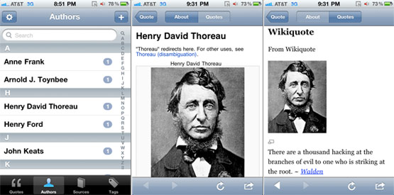
You can display your quotes alphabetically by author. What is really neat about this feature is that you can tap on an author and Quotebook will bring up the Wikipedia entry for that author, if one exists. It will even pull up other quotes from this author from Wikiquote.

Quotebook Authors

By Source

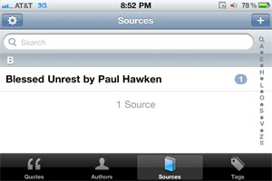
You can display your quotes by source, which is a great feature if you have entered many quotes from a specific source into your Quotebook. Then you can browse all the quotes that you enjoyed from a particular book, or newspaper article, etc.

Quotebook Sources

By Tag

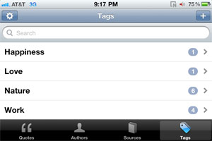
You can also categorize and sort your quotes by Tag.

Quotebook Tags

Suggested Improvements

I think Quotebook is a fantastic, minimalistic app that serves a focused purpose that will appeal to people who love quotes. However, if the developer would like to really soup up this app, I think it would be great to have the ability to add photos to the app as well as audio.

So if, for example, you see a billboard that’s really funny, you can snap a photo of it and add it to the Quotebook. Or if you want to simply say a quote out loud and record it instead of typing it out, you could do that as well.

How to Win a Copy of Quotebook

Matt, the developer of Quotebook, has kindly offered to give away a Promo Code to one lucky reader of AppleiPhoneReview.com. To enter the drawing to win a copy of Quotebook ($2 value), all you have to do is post your favorite inspirational quote as a comment on my Quotebook Facebook post HERE and I will send the winner a message with the promo code by Thursday, April 28.

Quotebook iPhone App Review [App Giveaway] is a post from Apple iPhone Review.


Developer gets crash report from device running iOS 5

iOS app developer FutureTap has received a crash report from a device running iOS 5. FutureTap notes the crash involved MKUserLocationBreadCrumb, which 9to5Mac notes is related to the maps/location functions in iOS and could mean these APIs have been altered in iOS 5.

Since Apple is now testing third-party apps with iOS 5, it likely puts the next version of the iPhone’s operating system on-track for a public unveiling in June at WWDC. It’s still not clear if we’ll see iOS 5 released in mid-summer as we have previous major iOS updates, or if Apple will wait until the fall to release iOS 5 alongside updated hardware.

Developer gets crash report from device running iOS 5 originally appeared on TUAW on Thu, 28 Apr 2011 00:00:00 EST. Please see our terms for use of feeds.

Source | Permalink | Email this | Comments

AT&T does right by weather-impacted iPad owner

Sadly, the south central US has been hit with a powerful cluster of tornadoes today, and scores of communities have been affected. Tuscaloosa, AL has been particularly hard hit, with several fatalities, scores of injuries and thousands of structures and vehicles damaged.

While the human and fiscal cost of today’s storms has yet to be calculated, in one small way AT&T helped to ease the challenge for a TUAW reader. Adam T. wrote in to say that his home in Huntsville, AL is likely to be without power for several days, meaning that his Internet connectivity is also going to be knocked out. He planned to use his 3G iPad to keep track of weather alerts and emergency information, but realized that he was rapidly going to overflow his 250 MB data plan.

Adam called AT&T customer service to explain the situation and request a data plan upgrade to the 2 GB plan. To his surprise, the service rep gave him the bump to the 2 GB plan at no charge. A small gesture in the scheme of today’s events, perhaps, but one that Adam appreciated — and so do we.

AT&T does right by weather-impacted iPad owner originally appeared on TUAW on Wed, 27 Apr 2011 23:00:00 EST. Please see our terms for use of feeds.

Source | Permalink | Email this | Comments

Three reasons Apple might ship the iPhone 5 in the fall

Will Apple hold off on releasing the iPhone 5 (or as Richard Gaywood amusingly names it, the “4S”) until September or early fall? Your guess is as good as ours. And yet, while brainstorming this morning, TUAW staffers noted arguments that had us going “hmmmm.”

We’ve shared them for your consideration. Here are several points that could support a later release date than usual. Or not. What do you think?

Verizon and the White iPhone

With the Verizon iPhone 4 shipping in February ’11 and the white iPhone debuting in April ’11, it’s natural to allow for a breathing space (especially considering the 2-year contracts these units carry) before the next generation of handsets replaces current models. An October shipping date would give those with white iPhones time to enjoy their purchases without temptation from the Next Great Thing.

Continue reading Three reasons Apple might ship the iPhone 5 in the fall

Three reasons Apple might ship the iPhone 5 in the fall originally appeared on TUAW on Wed, 27 Apr 2011 21:00:00 EST. Please see our terms for use of feeds.

Source | Permalink | Email this | Comments

Seattle T-mobile stores challenging iPhone

T-Mobile is having some fun challenging its adoptive parent AT&T and its competitor Verizon Wireless to a speed test that pits the Android-powered Samsung Galaxy S 4G against the iPhone 4.

Starting Friday April 29, iPhone owners can challenge the Galaxy S 4G to see which handset is the fastest. If the iPhone beats the Galaxy S 4G in two of three tests, the iPhone owner will walk away with a cool $1000.

Before you start spending that cash prize, be aware that the Galaxy S 4G is a HSPA+ handset. It’s capable of download speeds up to a blazing 21 Mbps, while the iPhone 4 is limited by its 7.2 Mbps HSDPA radio. Undoubtedly, T-Mobile chose Seattle based on the disparate speeds of the two networks in this wireless market.

If you don’t mind falling for a marketing tactic, then by all means head out to one of the participating Seattle T-Mobile stores and risk public embarrassment. Otherwise, iPhone owners may want to steer clear of their taunting T-Mobile friends for the next few days.

[Via BGR]

Seattle T-mobile stores challenging iPhone originally appeared on TUAW on Wed, 27 Apr 2011 20:00:00 EST. Please see our terms for use of feeds.

Source | Permalink | Email this | Comments