Author: Blancer
The 3 Best Ways to Become the “Go to Guy”
Workspace Before + After Competition – 200 MOO Business Cards for 5 Winners!
5 Smart Routes to Gain Respect in the Workplace
Top Productivity App Wunderlist Available Today for Android
10 Crazy Must-See Camera Tripods and Mounts
How to Set Up and Shoot an Enchanted Photoshoot in the Woods
Can You Hack Your Own Site? A Look at Some Essential Security Considerations
Getting Started with CouchDB
20 Outstanding GraphicRiver Flyers and Posters
Putting together a party or an event can be stressful enough without having to worry about the invitations or promotional material. Recently, GraphicRiver has been collecting a ton of really cool flyer/leaflet templates that are ready for print. We wanted to highlight some the variety of templates that are available for your next business or personal shindig.
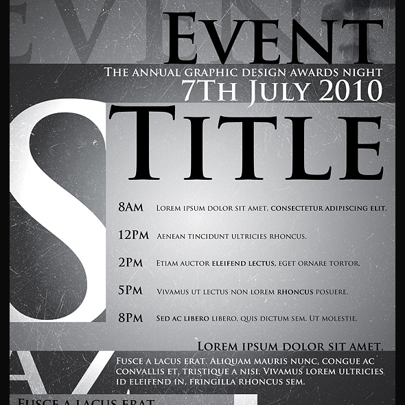
1.Legacy Poster/Flyer Template

Legacy Poster/Flyer Template
This sexy event poster comes packed with 7 different styles to try out. There are many layers to move around/change blend mode etc. to create unique looks.
2.Full Page Magazine Ad or Flyer Templates

Full Page Magazine Ad or Flyer Templates
This high resolution magazine or flyer ad is ready for print and includes all the bleed, cut and text safe guides you’ll need.
3.Flashy Nightclub / Event Poster-Flyer

Flashy Nightclub / Event Poster-Flyer
If you like the night life as much as you like to boogie, you’ll love this retro nightclub event poster/flyer. Includes several variations.
4.myFlyer – Party Celebration Flyer
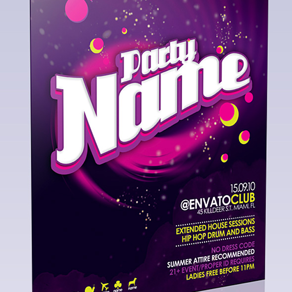
myFlyer – Party Celebration Flyer
This colorful party flyer really pops off the page. Also, there’s no rasterized layers to worry about; all the text is fully editable!
5.Get Minimal – Flyer 02

Get Minimal – Flyer 02
If you love the classic style of strong typography mixed with minimalist design, you’re going to love this flyer. Feel free to change colors, positions and typefaces.
6.Club Flyer Template

Club Flyer Template
Grab their attention with this flyer/poster for your next club event. The photoshop document is well organised and super easy to edit.
7.Business Flyer Template With 4 Color Schemes

Business Flyer Template With 4 Color Schemes
When the party is over, it’s time to get back to business. This attractive business flyer comes with 4 different color schemes.
8.Business Sale Postcard Mailer

Business Sale Postcard Mailer
Mailouts can get pretty expensive, so don’t waste your money on a blah looking one. This 8.5 x 5.5 postcard template is ready to send!
9.Indie Flyer

Indie Flyer
Be sure to wear your flannel for this Alternative inspired party flyer. Suitable for a festival, concerts, special evening in a club, concerts or parties.
10.Wavy Style Flyer Template

Wavy Style Flyer Template
This clean and professional flyer template is perfect for a business flyer or mailout. Print bleed lines included.
11.Music Festival Poster & Flyer
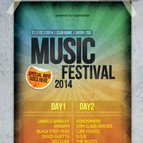
Music Festival Poster & Flyer
A touch of grunge and eye-catching colors will make this poster/flyer stand out. Also included is a smaller version for mailouts.
12.Green Valley Poster Template
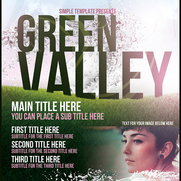
Green Valley Poster Template
Got a summer blockbuster in the works? This poster template would go well with your next indie movie screening or off-broadway play.
13.Contemporary Flyer Template
Contemporary Flyer Template
Bold typography and images make this flyer jump out at you. Comes with several different styles and sizes.
14.Typographic Poster Template
Typographic Poster Template
Who says text-only can’t be beautiful? This poster template combines texture, light and typography to deliver a high quality product.
15.Business Flyer Template

Business Flyer Template
This flyer template is perfect for a business that wants a clean, modern look. 3 color schemes are included.
16.Clean Simple A3 Poster and A6 Flyer

Clean Simple A3 Poster and A6 Flyer
If you’re looking for a flyer or mailout with tons of breathing room, this is your template. Every layer is vector based, no pixel layers, patterns, or smart layers so it is completely editable and scalable.
17.Sensation Flyer
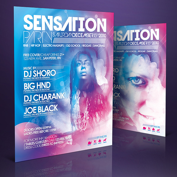
Sensation Flyer
As sexy as it is sensational, this flyer template really grabs you. Ultra easy to modify, change colors, dimensions and place your own photos.
18.Elegant Product Flyer

Elegant Product Flyer
If you’re looking to announce your newest product, you can’t go wrong with this clean, elegant flyer template. Super simple to change text and images of your own.
19.Poster Template

Poster Template
Stars, grunge, bold typography – what’s not to love? This poster template is quick to adapt and edit.
20.Outline – Business Flyers

Outline – Business Flyers
Keep things professional with this cool business flyer template. Three different versions are included along with video instructions on how to edit and use the files.
Sell Your Own Design Templates?
GraphicRiver has been growing very fast and top authors there earn thousands of dollars a month these days. If you’ve got the skills, you should consider uploading your files for sale! Anyone can join and become an author, and with a bit of work you’ll get to enjoy a nice, steady income stream.
Learn more about selling on GraphicRiver
Win a Free HP EliteBook 8740w Laptop
A couple months back I had the opportunity to review an HP EliteBook 8740w Workstation laptop for HP. HP sent me this computer for free and asked me to unbox it, use it, and then give my honest opinion of it in a review. If you follow my personal account on Twitter, you may have seen some of my tweets about it. I put my computer through the ringer. Played a lot of video games and really pushed this laptop to its limits. I had a lot of fun doing this and overall, really liked this machine, even though it was a PC and not a Mac. With that said, after I finished reviewing the machine, HP agreed to give another one of these machines away to one lucky reader of my website.
Instead of giving this machine away on my Colorburned site, I decided to instead, give it away here on Psdtuts. I decided to do this, mostly because Psdtuts is a much bigger site than my Colorburned site and I wanted to give as many people the opportunity to win a new computer as possible.
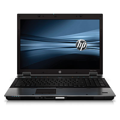
Before I tell you how you can win this computer. First, you should probably know a little about it. The computer that you may win is exactly like the one that I reviewed. It’s a beast! It has an Intel Core i7-740QM (1.73ghz, 6mb L3 Cache) processor, 8gb DDR3-1333 memory, 17 inch WUXGA (1920×1200) LED-backlight DREAMCOLOR display, an NVIDIA Quadro 5000m with dedicated 2gb DDR5 workstation-class GPU, 500gb 7200RPM HD, Full-sized backlit keyboard, 230w external power adapter, it also includes a fingerprint scanner, ambient light sensor, dual microphones, a three button trackpad mouse as well as a three button point stick mouse, touch-sensitive media keys, a 2.0mp integrated webcam, and a LightScribe DVD +- RW burner. It’s also got a Bluetooth module and an Intel Centrino Ultimate N Wireless Adapter.
So HP isn’t messing around here. It’s their top of the top of the line laptop. If you were to buy this computer on your own, you’d spend about $5,000 USD.
Now that you know a little about this machine, it’s time to tell you how it can become yours. First of all, we can only ship this machine within the U.S. If you don’t live in the U.S., sorry ![]() . For those of you who do, to win, all you have to do is answer the following question correctly and submit it using this form.
. For those of you who do, to win, all you have to do is answer the following question correctly and submit it using this form.
What video game did I play while I reviewed this machine?
Submit your answer here by Friday, March 11, 2011 at 11:59 PM EST. I will select the winner at random from those of you who answer correctly. You can find the answer in a number of ways. Read my review, Google it, or take a look through my Tweets. It doesn’t matter how you find the answer; only that you submit the correct one. You may only enter once. Entering more than once will disqualify your entry. Also make sure that you leave a valid email and shipping address. Otherwise, I can’t send you the machine. Good luck everyone!
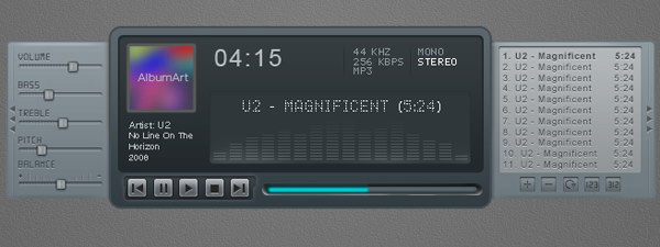
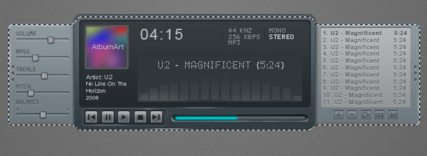
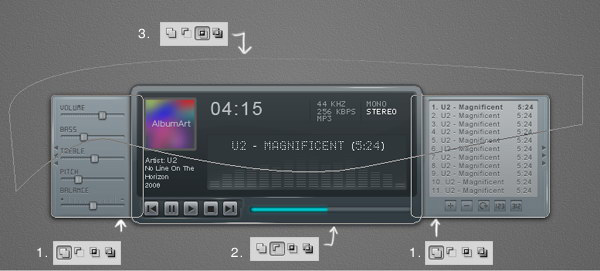
Create a Sleek and Clean MP3 Player Interface
In this tutorial, we will design a sleek and clean MP3 player interface. The process involves a lot of manual drawing and lots of layer styles. Let’s get started!
Tutorial Assets
The following assets were used during the production of this tutorial.
- Font Digital-7 from Chess-7
- Font LCD Phone from Raúl Andrés Pérez Canseco (Grafito Design)
Step 1: Background
Let’s start by creating a background for our mp3 player. Draw a radial gradient from white to gray.

Step 2
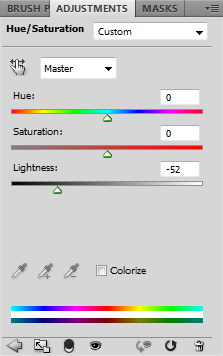
Darken the gradient by adding Adjustment Layer Hue/Saturation. Reduce the Lightness setting.

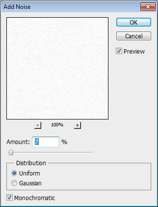
Step 3
Create a new layer and fill it with white. Make sure you have white and black as foreground and background by pressing D. Click Filter > Noise > Add Noise. Set Distribution to Uniform and select Monochromatic.

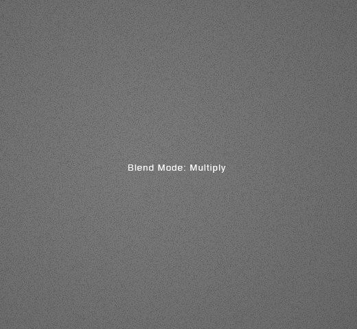
Step 4
Change the blending mode of the layer to Multiply.
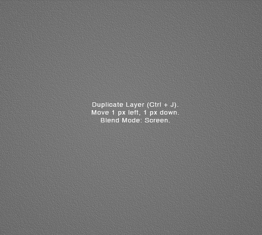
Step 5
Duplicate layer by pressing Command/Ctrl + J. Move layer 1 px left and 1 px down by activating tool move then press left arrow then down arrow. Change blend mode to Screen.
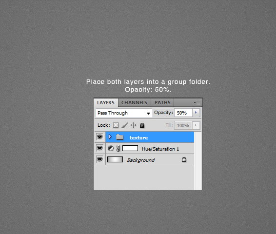
Step 6
Put both noise layers into a group folder and reduce its Opacity to 50%.
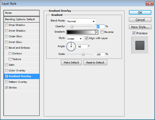
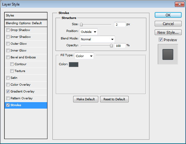
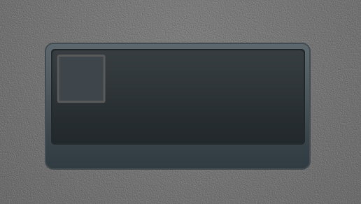
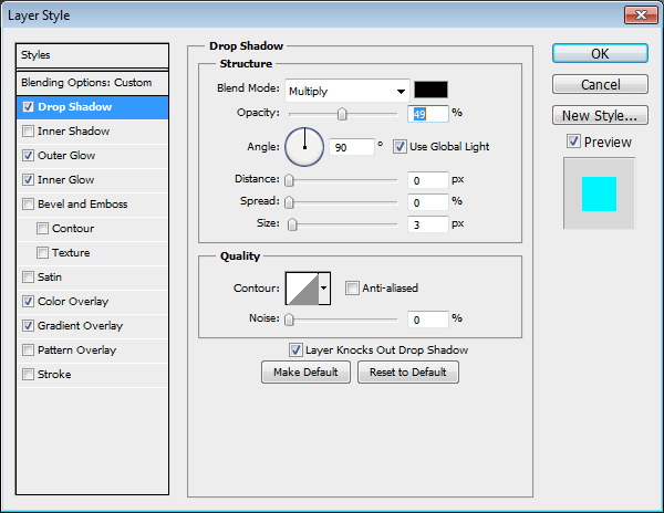
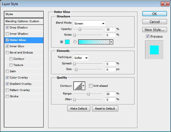
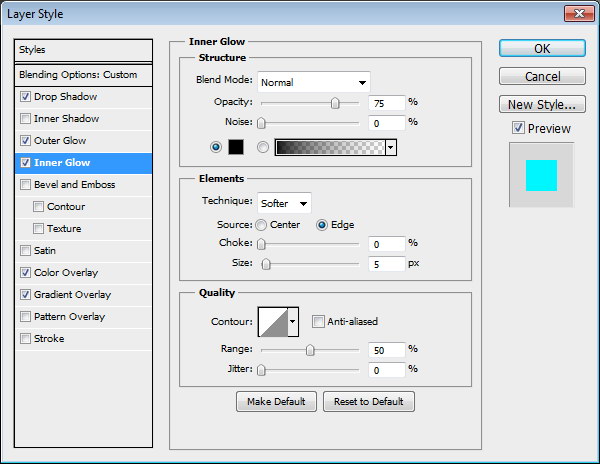
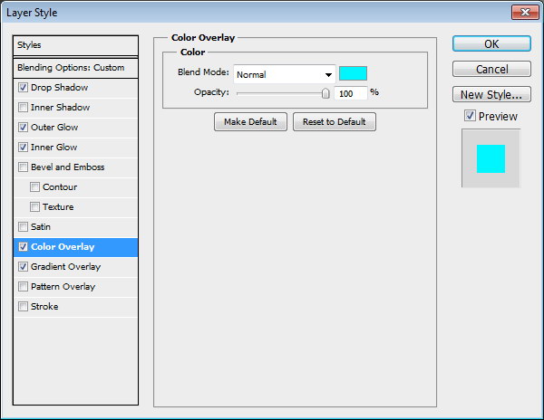
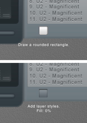
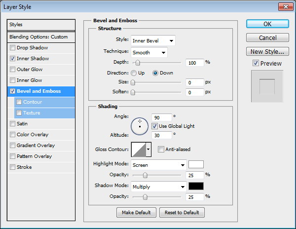
Step 7: MP3 Basic Shape
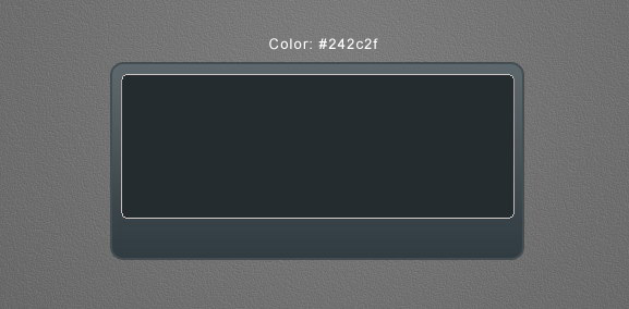
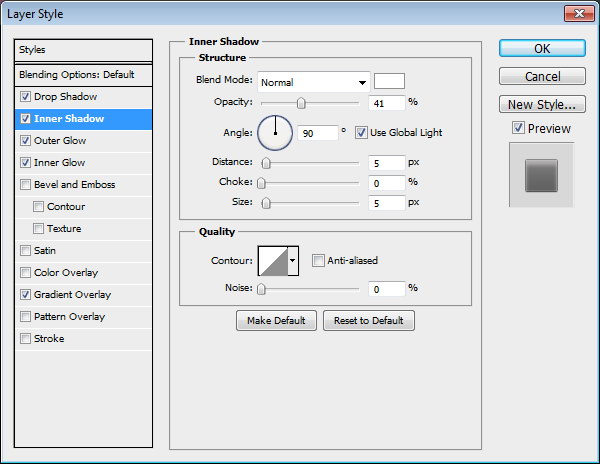
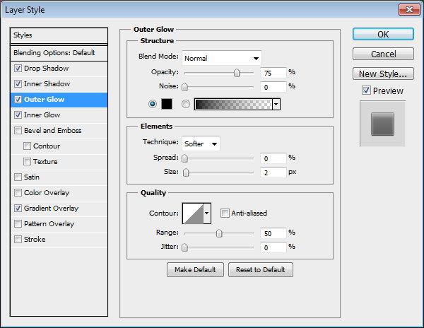
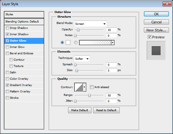
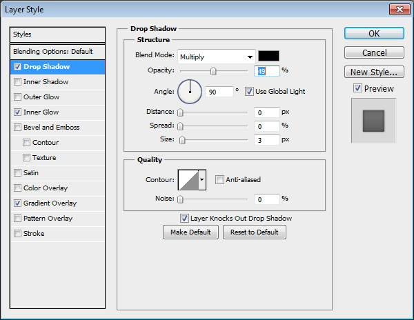
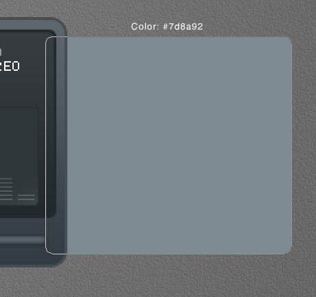
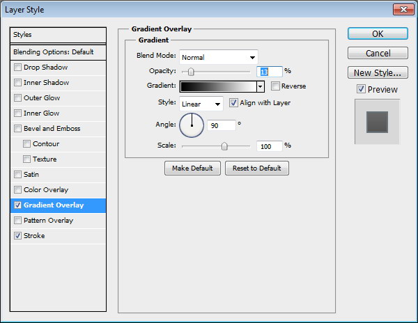
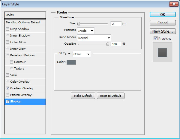
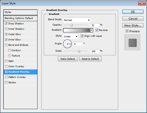
Create a rounded rectangle on the canvas. Use #3b484f as its color. Add following layer styles.
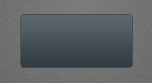
Step 8: Screen
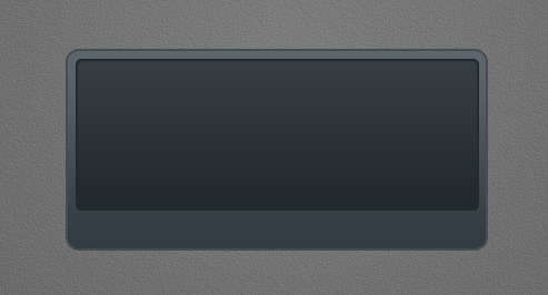
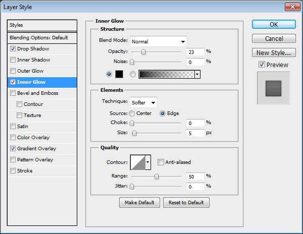
Draw a smaller rounded rectangle. Add following layer styles.
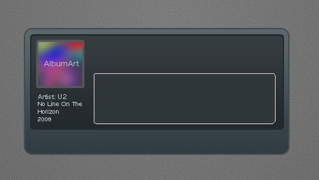
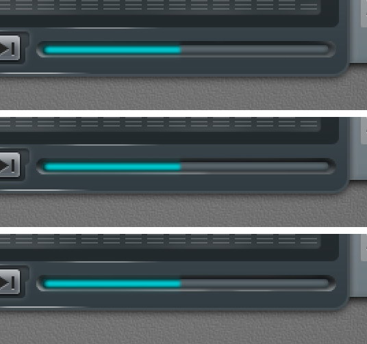
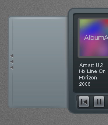
Step 9: Album Info
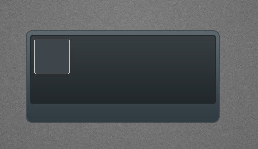
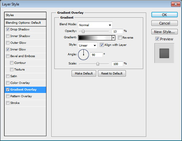
Add a small rounded rectangle. We’ll use it as a container for album cover. Add following layer styles.

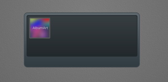
Step 10
Paste a picture on top of the rounded rectangle. Hit Command/Ctrl + Alt + G to convert it to clipping mask and put it inside the rounded rectangle.
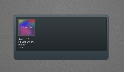
Step 11:
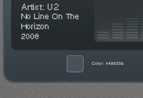
Add artist info, album’s name, and its year underneath the album cover.
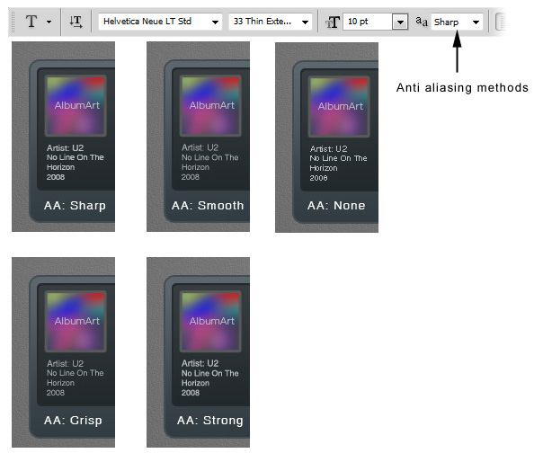
Step 12
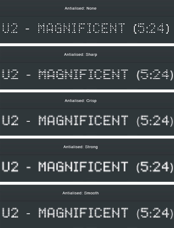
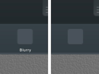
From the option bar, you need to select the best Anti-aliasing methods to prevent blurry appearance. I can’t say which one is better because it’s different for each font type and size. You need to experiment with each setting. As you can see below, in this case None works best.
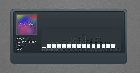
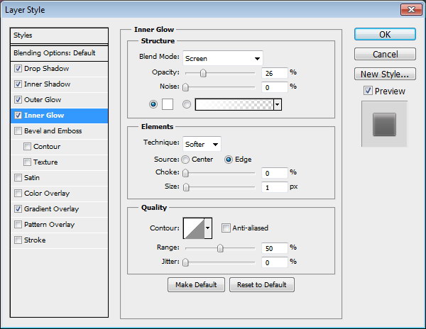
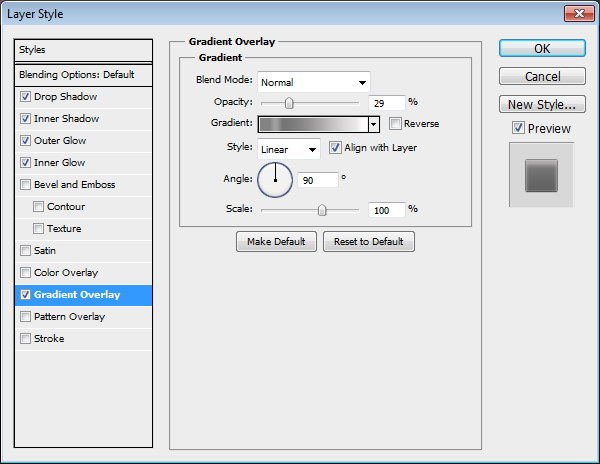
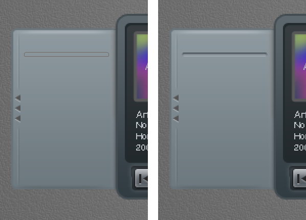
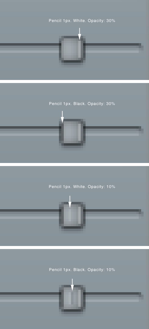
Step 13: Equalizer
Draw a rounded rectangle. Add following layer styles.
Step 14
Create new layer. Paint white using using a soft brush (Hardness: 0%) with low Opacity (10-15%). This will add a subtle light source under the equalizer.
Step 15
Select line tool and set its weight to 1 px.
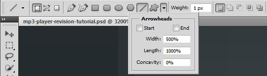
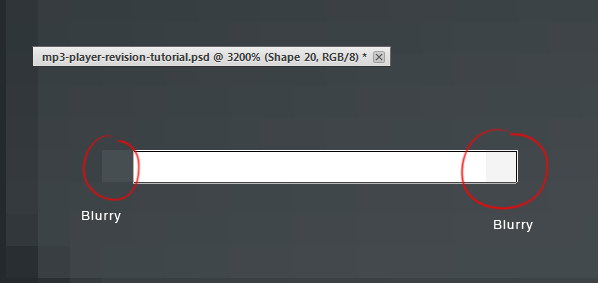
Step 16
Draw a white line inside the equalizer. Activate zoom tool and click few times to zoom in to maximum view. We need to make sure that the line is not blurry. As you can see below, there is blurry spot on both ends of the line.
Step 17
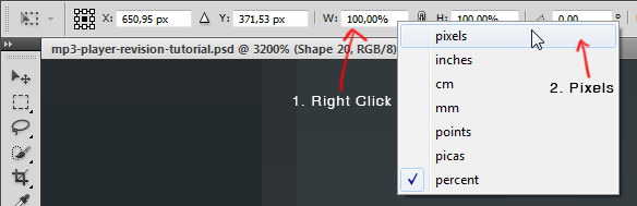
There are two ways to fix this blurriness. First we need to round up the size. Second is fixing its placement.
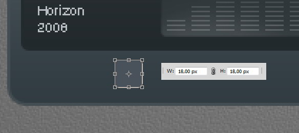
Hit Command/Ctrl + T to transform the line. Right click Width (W) box and select pixels. Do the same to Height (H) box.
Step 18
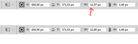
We need to round up the size. In this case we will need to change 11,97 px to 12 px.
Step 19
Next, let’s fix its position. Select line shape with tool Path. Hit arrow key to fix its position. Do this until we have no blurry spot.
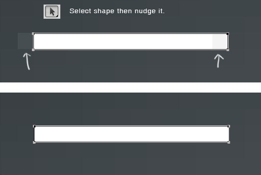
Step 20
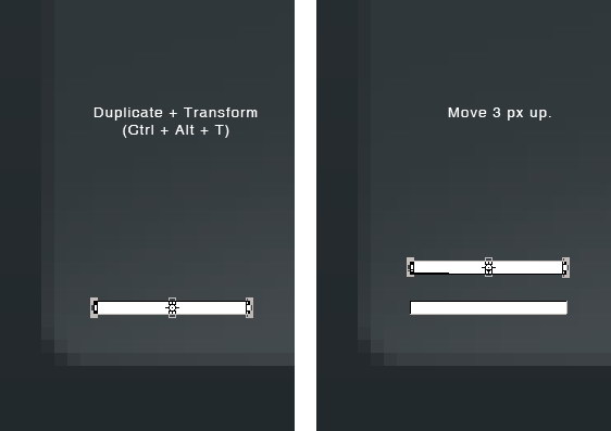
Duplicate and transform the line by pressing Command/Ctrl + Alt + T. Move it upward 3 px..
Step 21
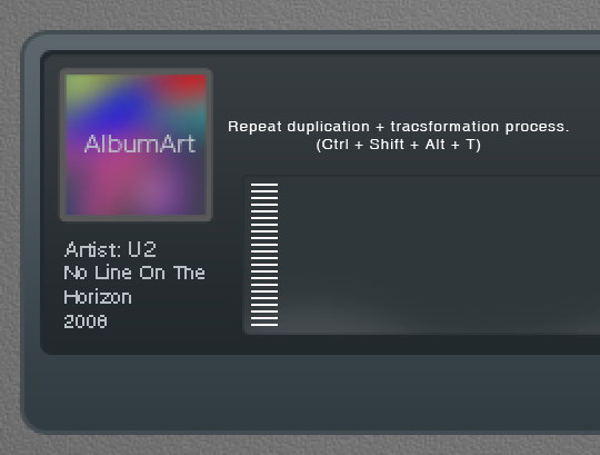
Repeat the duplication and transformation process by pressing Command/Ctrl + Shift + Alt + T.
Step 22
Select all lines, duplicate it and place it to the right. Remember to keep it sharp. Make sure the position is perfect to avoid blurry spot.
Step 23
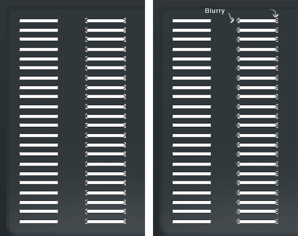
Repeat this process until we have some columns of 1 px height lines.
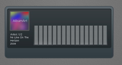
Step 24
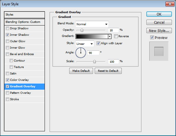
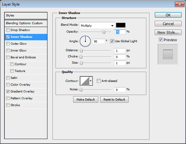
Delete some of the lines until we get a natural shape of equalizer. Add following layer styles. Set Fill to 0%.
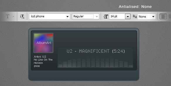
Step 25: Song Info
Add artist name, song title, and total track time on top of the equalizer. I’m using font type LCD Phone here. The Anti-aliased Method used here is None.
Step 26
Below, you can see the result with each Anti-aliased method.
Step 27
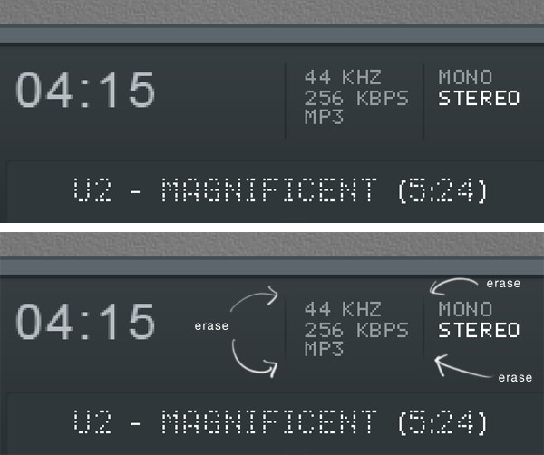
Add more text for more info on top of the LCD. Use Pencil tool to draw a small black 1 px line separating each text. Erase both ends of these lines.
Step 28
Hit Command/Ctrl + 1. Let’s step back and see the result we have so far in 100% view. This is important to make there’s no blurry spots in our design.
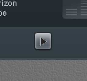
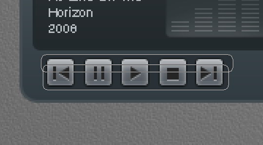
Step 29: Main Buttons
Draw a small rounded rectangle for the button.
Step 30
Again, we need to check its size and position to avoid blurry spots. Hit Command/Ctrl + T and make sure to round up its size.
Step 31
Make sure to check its position, we don’t want to see blurry edges.
Step 32
Add following layer styles.

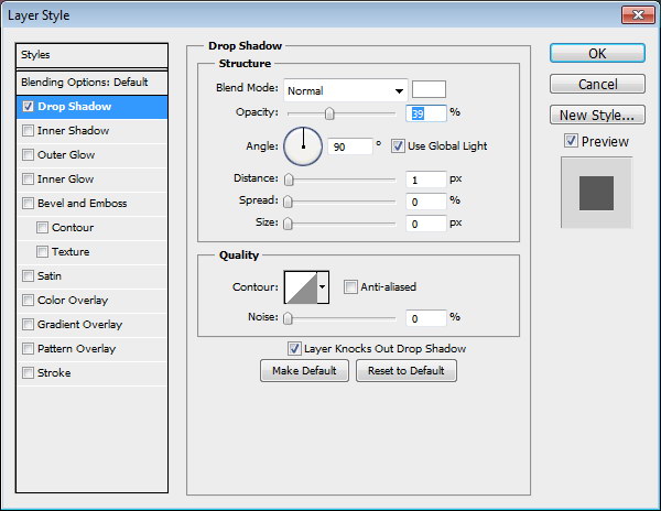
Step 33
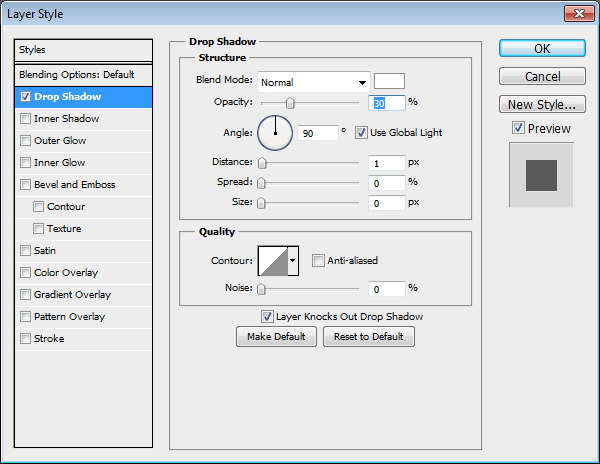
Draw a black triangle on top of the button. Add Drop Shadow with following settings.
Step 34
Repeat the process to create more buttons.
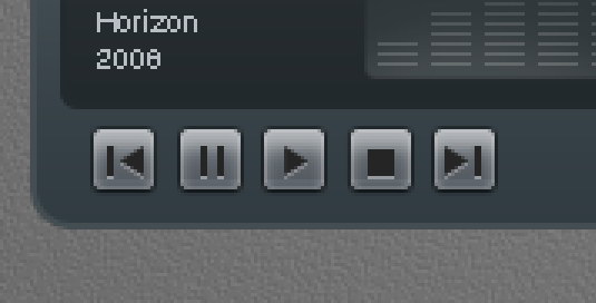
Step 35
Create button background made from two overlapping rounded rectangle. Add following layer styles.

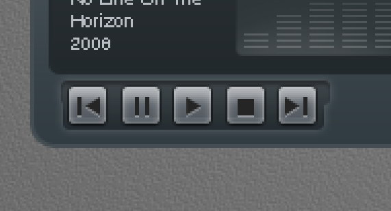
Step 36
Let’s step back again and take a look at the design in 100% view. We need to make sure that there is no blurry spots.
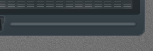
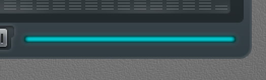
Step 37: Total Time Track
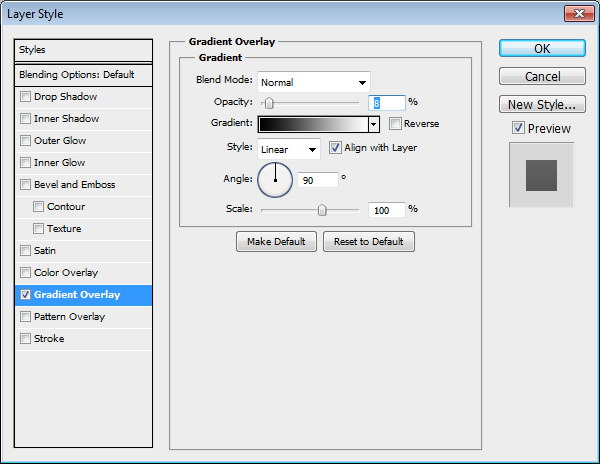
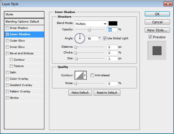
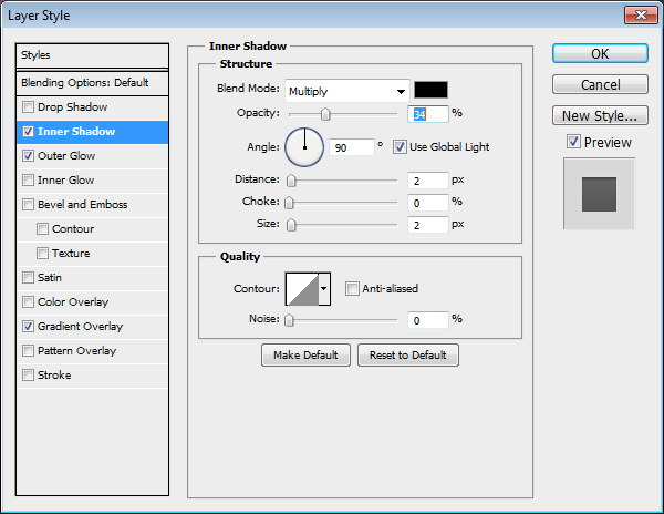
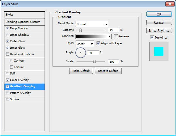
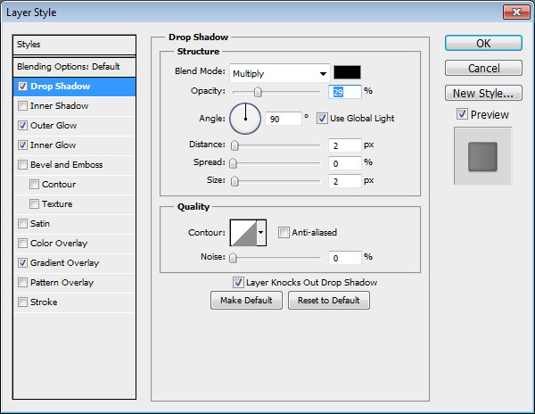
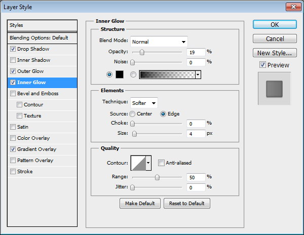
Create a long rounded rectangle. Add this following layer styles.
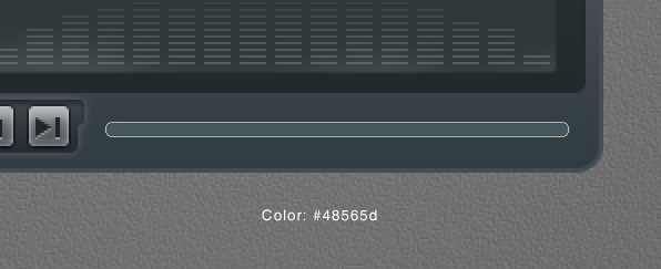
Step 38
Duplicate layer shape we have just created and add these layer styles.
Step 39
Add layer mask. Select half of the shape and fill it with black.
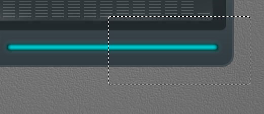
Step 39
Currently, layer styles are applied to the layer mask and they are adding a rounded shape on right end of the shape. To remove this, activate Layer Mask Hides Effects from layer style dialog box.
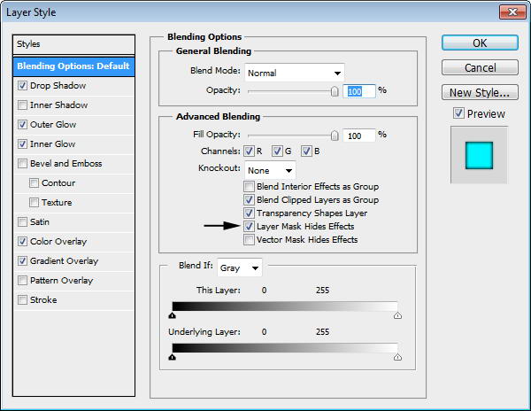
Step 40
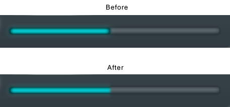
You can see the difference below. The effect from layer style is now hidden by the layer mask.
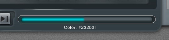
Step 41
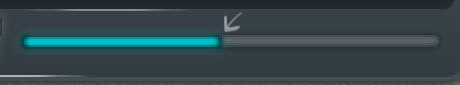
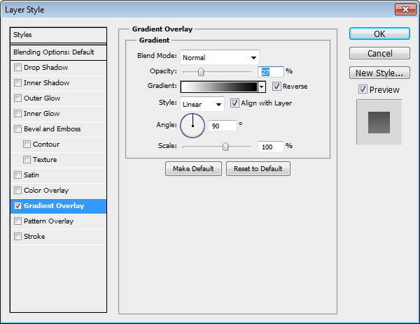
Create bigger rounded rectangle behind the time indicator for its background. Add this layer style.

Step 42
Create new layer on top of the time indicator background. Paint some highlight and shadow. You can see the progress I made below.
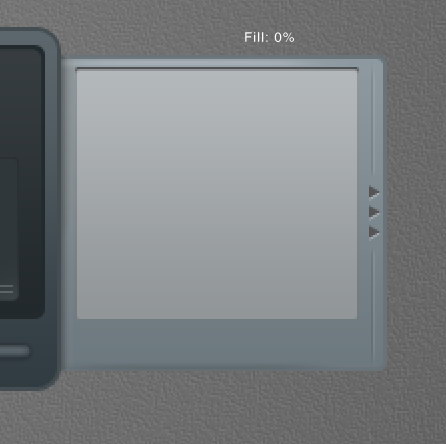
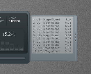
Step 43: Right Window – Playlist
Create a rounded rectangle and place it on right side behind the main shape. Add following layer styles.
Step 44
Create new layer on top of the rounded rectangle shape. Paint some highlight and shadows.
Step 45
Create some triangles and place them on right side of the shape. Add following layer style.
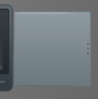

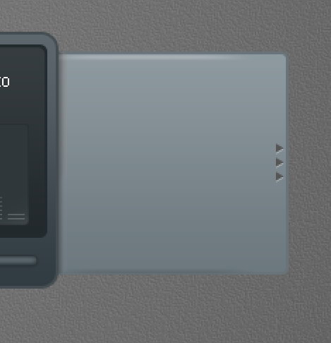
Step 46
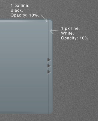
Use pencil tool to draw two 1 px line, black and white. Set its opacity to 10%.
Step 47
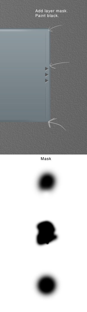
Add layer mask and paint some parts of the line with black. Below you can see the mask used here.
Step 48
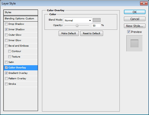
Draw a rounded rectangle and add following layer styles. Set Fill layer to 0%.

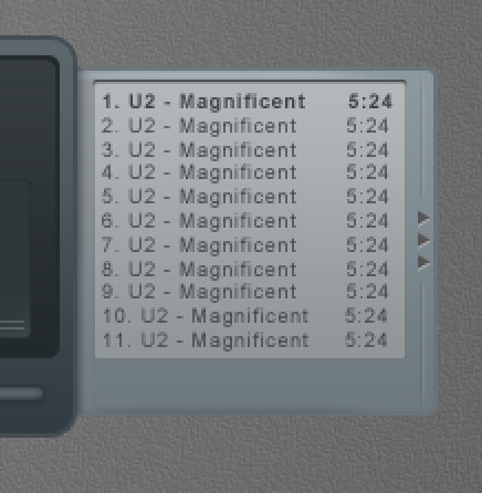
Step 49
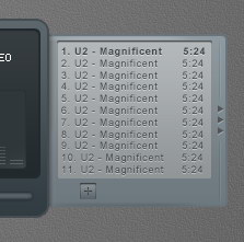
Add song titles. Set one of the songs to bold to indicate it as an active song.
Step 50
Add Drop Shadow to give it inset effect.

Step 51
Draw a rounded rectangle. Add following layer styles and set its Fill layer to 0%.

Step 52
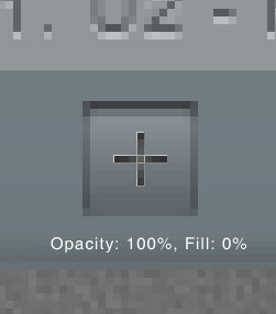
Create a plus sign made from two overlapping line shape. Set Fill to 0% and add these layer styles.


Step 53
Repeat the process to create other buttons.
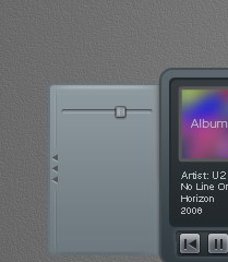
Step 54: Left Window – Player Settings
Duplicate playlist basic shape. Hit Command/Ctrl + T, right click and choose Flip Horizontal. Move it to left side.
Step 55
Draw a thin rounded rectangle and add these layer styles.
Step 56
Create a small rounded rectangle for the slider. Add following layer styles.
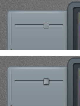

Step 57
These layer styles is still not enough to get a convincing 3D appearance. Using pencil tool, we need to add some 1 px line detail on the slider. See picture below for reference.
Step 58
Let’s step back and see the result in 100% view.
Step 59
Paint some black stripes behind the slider.
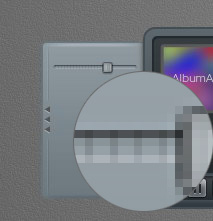
Step 60
Let’s add label "VOLUME" for the slider. The font used is Digital-7. Add Drop Shadow.
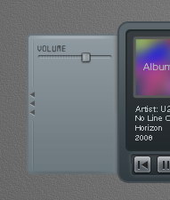
Step 61
Create another slider by duplicating previous slider and change its label.
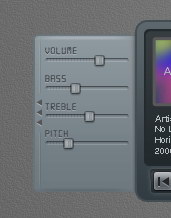
Step 62
Now let’s focus on creating balance slider since this is a bit different. Add more space between the slider and its label. Delete stripes behind the slider. Use pencil to draw alternating 1 px black and white line. Set the layer’s Opacity to 10%.
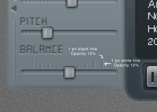
Step 63
Add plus (+) and minus (-) character on both ends and add Drop Shadow.
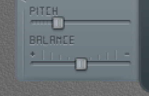

Step 64
Hit Command/Ctrl + 1 to see the result at 100% view.
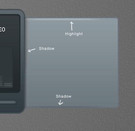
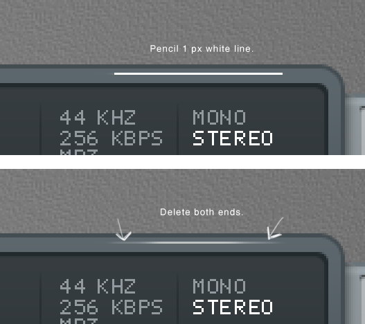
Step 65: Highlight
Our design is simply too clean and unnatural. To fix this let’s add some highlights. Draw a white 1 px line using pencil tool. Delete both ends.
Step 66
Repeat this process to create another highlights.
Step 67: Shadow
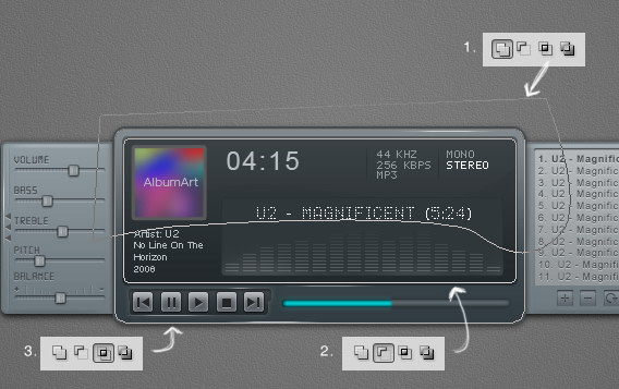
Hold Command/Ctrl and click basic shape, playlist shape, and player settings shape to create a new selection based on the mp3 player’s shape. Press down arrow a few times to nudge the selection down.
Step 68
Create new layer underneath all other layers. Fill selection with black. Presst Command/Ctrl +Shift + I to deselect. Soften the shadow by adding Gaussian Blur filter.
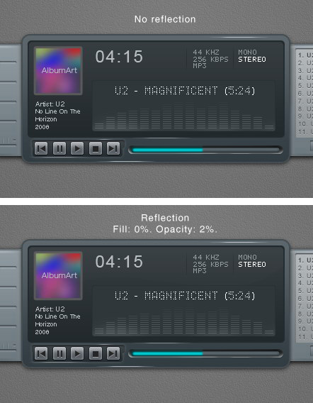
Step 69: Reflection
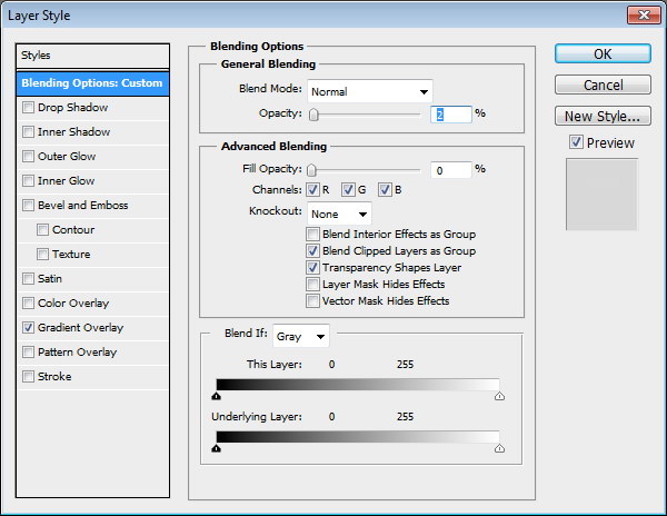
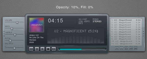
Let’s add reflection onto the surface of the mp3 player. Copy screen path (1). Click Adjustment Layer icon and select Solid Color. You can use any color here. Create another path covering top part of the screen and set it to Intersect (2). Change Opacity to 2% and Fill to 0%.
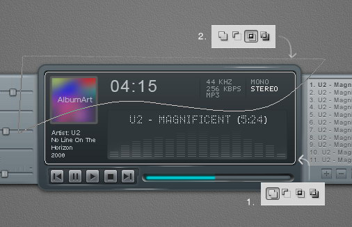

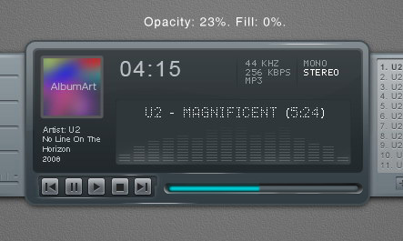
Step 70
Now we’ll create another reflection on outter side of the main window. Create new path covering top part of the main window (1). Click Adjustment Layer icon and select Solid Color. Subtract it with screen shape path (2). Intersect it with main window shape path (3).
Step 71
Set Opacity to 23% and Fill to 0%. Add following layer styles.

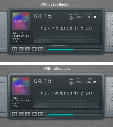
Step 72
Below, you can see the difference with and without reflection.
Step 73
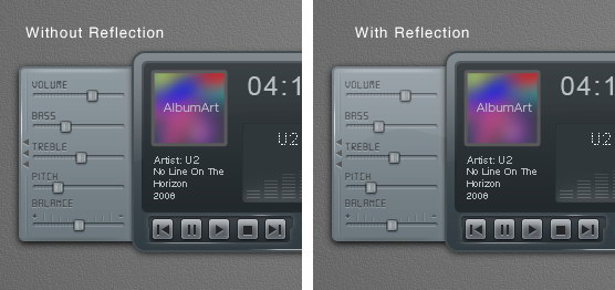
Next we will add reflection on left and right window. Copy left and right window path, set their mode to Add (1). Click Adjustment layer icon and select Solid Color. Subtract path with the main window path (2). Create new path covering top part of the interface and set it to Intersect (3).
Step 74
Set Opacity to 10% and Fill 0%.

Step 75
Below, you can the difference with and without reflection. Very subtle but it gives more depth onto the shape.
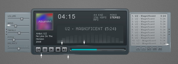
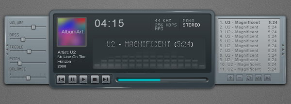
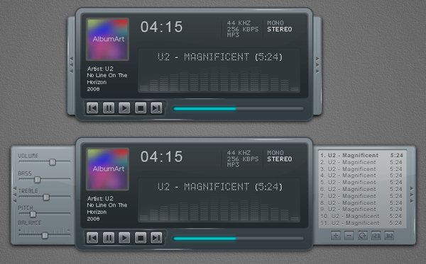
Step 76: Interface with Closed Playlist and Settings
Put all shapes and layer that create the mp3 player into a group folder. Duplicate the group and move the left and right window until they are closed.
Step 77: Sharpening
We have tried to sharpen every pixel on the interface, we still need to sharpen it again. Create new layer on top of all layer. Hit Command/Ctrl + Shift + Alt + E to merge all visible layers. Now, we have exact duplicate of the image in one single layer.
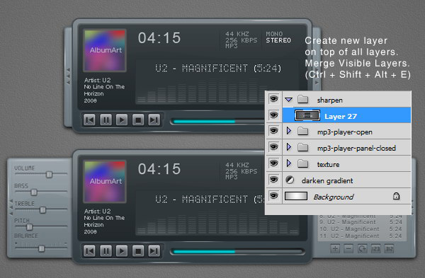
Step 78
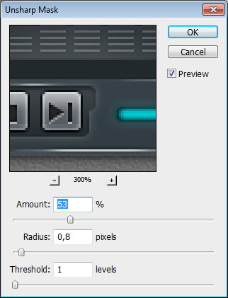
Click Filter > Sharpen > Unsharp Mask. This filter will sharpen all the pixels on the layer.
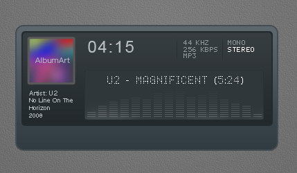
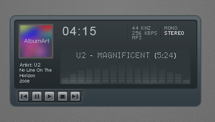
Final Image

Create a Download Folder Icon in Photoshop
Icons are an important part of most interactive and web design. While icons are small, they can often be challenging to create. In today’s tutorial we will demonstrate how to create a download folder icon using different shapes and reflections in Photoshop. Let’s get started!
Step 1 – New File/Pen Tool Technique
Open Photoshop and set up a new document (Command/Ctrl + N). Use the following settings:
- Resolution: 72dpi
- Color Mode RGB color
- Dimensions: 600×600 px
Create the following shape using the Pen tool (P).
Step 2 – Creating Shapes Using Pen Tool
Draw the back part of the folder using the Pen Tool using the same drawing technique. Then draw the stripe as shown.
Step 3 – Finishing the Shapes
Once you have finished drawing your folder, go ahead and add the paper and arrow as shown. You should now have the following 5 layers. Each shape will be in its own layer. Be sure to give each layer a unique name.
Step 4 – Adding Colour Effects
Add the following layer styles to the front part of the folder. Lower opacity to 90%.
Add the following layer styles to the Paper. Lower the opacity of the layer to around 90-95%.
Add the following layer styles to the Stripe.
Add the following layer styles to the rear part of the folder.
Add the following layer styles to the arrow.
Your icon should now look like this.
Step 5 – Adding Reflections
Add a new group named "refs." Use the pen tool to draw reflections as shown. Make sure you draw your shapes as paths instead of shape layers (see arrow). After you have closed the path, right-click on the workspace and choose "make selection" (feather 0). Pick up a big brush (master diameter around 470, hardness 0) and brush round the right part of the selection as I did creating a white reflection. Change the blending mode to Overlay and reduce the opacity to 63%.
Step 6 – Margins
Create a new group named "margins," create a new layer in it (Command/Ctrl + Shift + N). Adding highlights on the margins emphasizes the effect of the 3d icon. Use the pen tool to create the stroke lines around the corners and all the margins of the folder, paper and arrow. Then, right-click on the workspace and choose stroke path – brush. The brush settings must be changed to 8 px master diameter, hardness 0.
Step 7 – Shadows
Create a new layer (Command/Ctrl + Shift + N) for shadows and place it into a new group (Command/Ctrl + G). Make selection as you did in step 5 for creating reflections. Fill the selections with black and then blur the margins using the blur tool. If the shadows look too strong, it means that you must lower the opacity of the layer to 40%.
Step 8 – Adding Text
Add text using whichever font you like. In this case, I chose "Agency FB." Font size: 40, Layer Opacity: 75%.
Step 9 – Add the Final Reflections and Shadows
Add some more reflections to the paper using the same techniques we demonstrated in Step 5.
Add a shadow using the ellipse tool (E). Draw an ellipse as shown and add a slight motion blur. Reduce the opacity to your liking.
Final Preview
I hope you enjoyed this tutorial. I added some additional icons that I created using the same techniques below.
Create a Glowing, Sci-Fi, Line Art Collage – Psd Premium Tutorial
When you’re creating a composition, often you will need to combine stock images with vector line art. In this Psd Premium tutorial, author Kervin Brisseaux will juxtapose various resources using straightforward techniques and subtle photo manipulation to create a dense sci-fi image. If you are looking to take your illustration skills to the next level then Log in or Join Now to get started!
Professional and Detailed Instructions Inside
Premium members can Log in and Download! Otherwise, Join Now! Below are some sample images from this tutorial.


Psd Premium Membership
As you know, we run a premium membership system here that costs $9 a month (or $22 for 3 months!) which gives members access to the Source files for tutorials as well as periodic extra tutorials, like this one! You’ll also get access to Net Premium and Vector Premium, too. If you’re a Premium member, you can Log in and Download the Tutorial. If you’re not a member, you can of course Join Today!
The Answer to All Your Problems: Masking – Basix
Are you new to Photoshop? Have you been trying to teach yourself the basics of Photoshop but have found the amount of educational material available on the net a bit overwhelming? As the world’s #1 Photoshop site, we’ve published a lot of tutorials. So many, in fact, that we understand how overwhelming our site may be to those of you who may be brand new to Photoshop. This tutorial is part of a 25-part video series demonstrating everything you will need to know to start working in Photoshop.
Photoshop Basix, by Adobe Certified Expert and Instructor, Martin Perhiniak includes 25 short video tutorials, around 5 – 10 minutes in length that will teach you all the fundamentals of working with Photoshop. Today’s tutorial, Part 12: The Answer to All Your Problems: Masking will explain how to save selections as layer masks and refine them using the brush tool. Let’s get started!