In this tutorial you will learn how to make a great looking Wireless Phone. You will be using Offset Path and various gradients to create a three dimensional phone with realistic highlights and reflections.
Freelance Projects, Design and Programming Tutorials
In this tutorial you will learn how to make a great looking Wireless Phone. You will be using Offset Path and various gradients to create a three dimensional phone with realistic highlights and reflections.
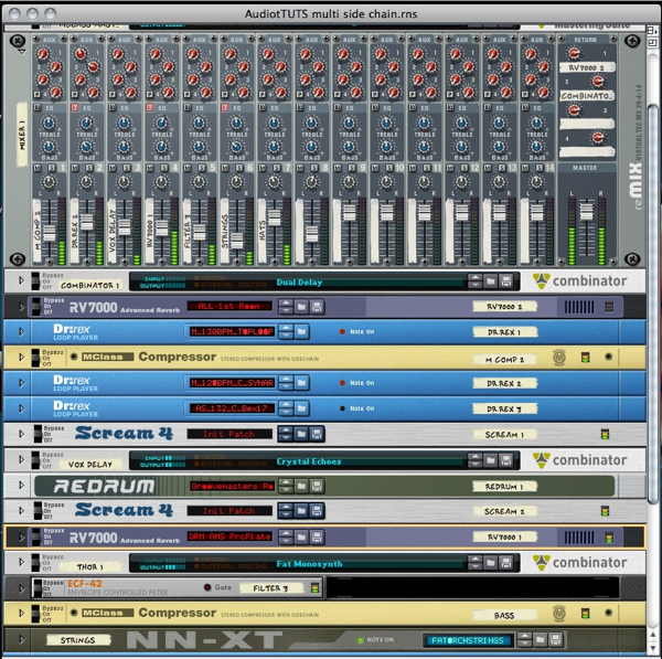
If you are working in Reason it’s highly likely you will be utilising the side chain capability of the MClass compressor. As with everything in Reason the process of setting up a side chain is totally open-ended and because of this it’s possible to use one sound as a global side chain source, across a whole mix.
Even though there are several ways to do this I find that using a Redrum drum sampler in conjunction with one or more Spider audio splitters works very well. Here’s how…
So, you’ve got a pretty good project or loop running in Reason but if you are using lot’s of grooves, busy sequences or continuous baselines you might find that things can get a little hectic. In situations like this some side chaining synced with the kick drum can really clean things up.
Here is my loop without any side chaining. We’ll now look at the process I use to create several side chain streams from the same source. As ever I’m sure many of you have your own methods for doing this… this is only one ![]()
The untreated Reason project.
The Reason project with no side chaining.
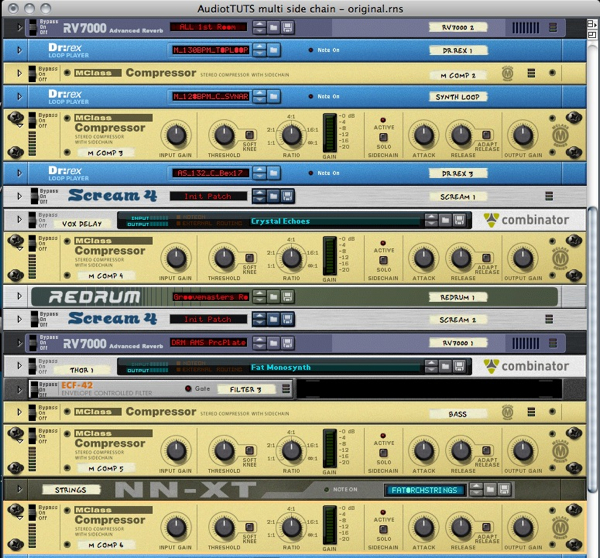
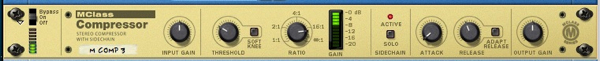
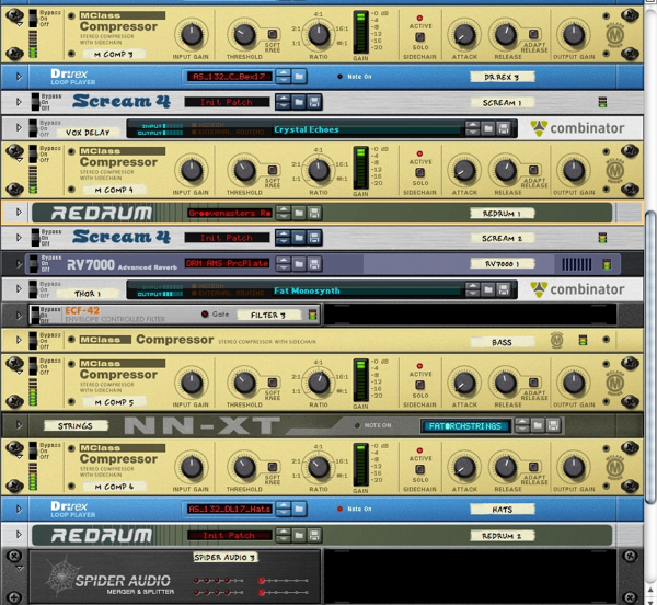
The first step is to add an Mclass compressor to every element you want to ‘duck’. You want to focus on instruments that are playing constantly or are masking the drums or percussion in any way.
I’ve strapped compressors on a synth line, vocal sample sequence, bass line and strings. By selecting your chosen devices when you create your compressors, all your routing will be done for you. Obviously at this point all you’ll heat is some light compression from the default settings. Next up we’ll create a side chain source…
The compressors are added to selected elements.
The routing is automatic.
I like to use a totally dedicated source for side chaining purposes. This way you have total control over when it plays and how it plays. Also it doesn’t have to be heard in the mix, this means you can have your side chain effect present even when your actual kick drum is not present. This is great for breakdowns etc.
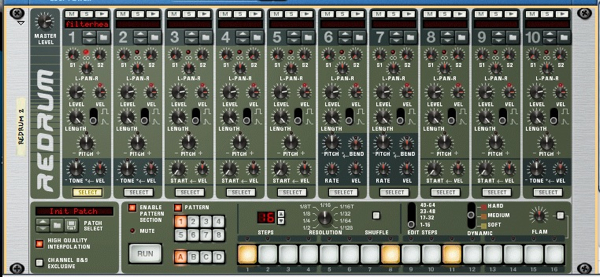
Using a Redrum as the side chain source.
So load up a Redrum and load your kick drum sound into the first slot, I’ve opted for the same sound I’ve used in the mix, I find this gives you a certain amount of consistency. Now simply copy the pattern of your main kick into the Redrum’s step sequencer. At this point unplug your Redrum from the mixer or any other input.
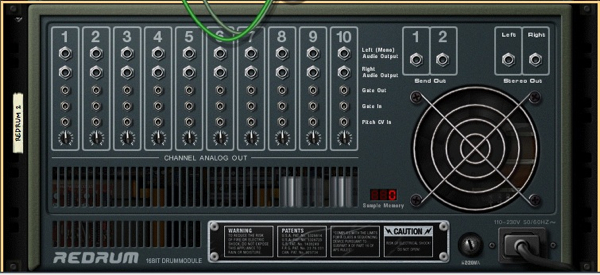
Make sure your Redrum is not connected at this point.
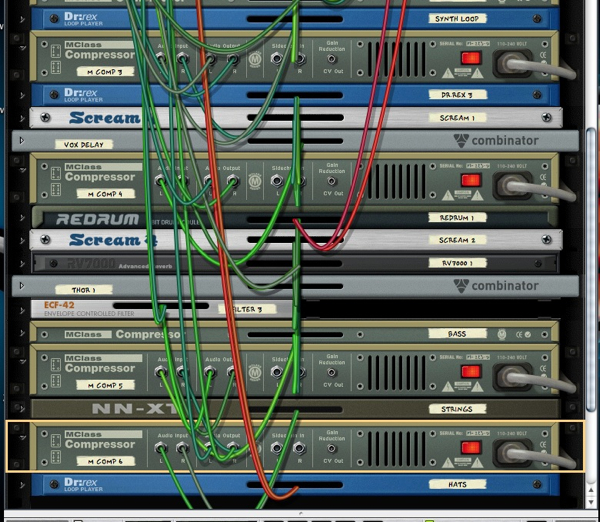
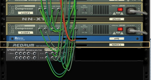
Create a spider merger/splitter in easy reach of the Redrum. Now route the output from the first slot of the Redrum to the main splitter input on the right of the Spider’s rear panel.
Creating a Spider splitter/merger.
Now route the first splitter output to one of your compressors side chain input. You should now be able to see the kick drums pattern effecting the compressor’s gain reduction. At this point you can adjust the compressor’s settings so the intensity of the effect is suitable.
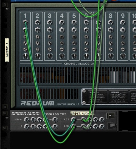
Routing the Redrum to the compressor through the Spider.
I have applied the effect to the synth loop so you can hear it action. Here it is both with and without the effect…
The synth loop un effected.
The synth loop with side chaining applied.
The compressor is now receiving the side chain signal.
Next you can just repeat the process and route the side chain source to other compressors in your mix using the Spider’s other outputs. You can now hear all the side chains in action. Not only does it give your drums more prominence but also adds a very definite pumping effect.
Adding more routings.
Whether you love or hate this effect it is very popular in many forms of music at the minute and it’s really straight forward in Reason using this method.
The mix with side chains in action.
The whole mix with side chaining appied.
Using this method is great for sending your new side chain source to exactly four compressors but beyond that multiple spiders are required. Creating a chain of splitters is easy simply route the last output from your first spider in the splitter input of the second, you not have four more slots to use.

Two Spiders chained together.
In the last installment you learned about the history of icon design and how it has evolved from black and white representations of office items into full colored, glassy, hyper-rendered, isometric representations of… office items. In this installment I will be delving further into the world of icons and exploring what icons mean to us today.
i·con – noun (Computers) a picture or symbol that appears on a monitor and is used to represent a command, as a file drawer to represent filing — dictionary.com
So we know the meaning of "Icon" in the traditional computing sense of the word, but how does this explain all the illustrative icons we see today? How is a beautifully rendered image of a Teapot, Space Ship or Bucket of Chicken supposed to represent something within the user interface? There’s a few answers to this question.
No matter how strict or unusual your design is, all icons should be made to specification – there will be more about that soon.
Below you will see a breakdown of modern icon design. Some people may argue that the icons on the "illustration" side of the chart shouldn’t be considered icons. This is partly true, they’re not traditional icons, but they are Modern Icons in the sense that they could represent applications, games or a specific context.
The icons on the left side of the chart are icons that would be considered to be Traditional Icons with a modern twist. We immediately associate these icons with their function, this is achieved by over 30 years of visual language, which is a powerful factor in the designs success.
The icons down the middle of the chart are icons that are neither illustrative or informative, but a combination of both. The Envelope is traditional because of its form, but it could be perceived differently due to its rendering, a design like this works best within a certain context. The Blue Twitter Bird has immediate recognition from internet users, but is reduced to an illustration of a blue bird for non-users (like my mum) and the stylistic GTalk Bubble is also fairly reliant on brand association.
Links to the Icons above (in no particular order)
Pump It Up, by mgilchuk, My Breafast, by blink, SNOW.E 2 XP, by RADE8, CS3 iKons – Win, by -kol, iChat Bubble, by Delta909, Icecream icon set, by Miniartx, Batman Mask, by Svengraph, In Spirited We Love, by Raindropmemory, Twitter Bird, by freakyframes, StarWars Vehicles Archigraphs, by Cyberella74, Systematrix Full, by royalflushxx, New Moshii World, by anekdamian, Somatic Rebirth Extras, by The Iconfactory and David Lanham
When designing icons for an interface you can’t go past convention. Check previous designs for an indication of how to approach yours. You will find that most Software packages and User Interfaces have similar icons, this is because of User Experience (UX). If a user is suddenly confronted with a design that they’re not expecting or comfortable with, they’re likely to get confused.
If you’re designing for a specific platform, always check the developers notes before you start, these will give you an idea of the size, perspective, and color palette you should be using. You can find links to both the Apple and Microsoft developers notes in the “Resources and Further Reading” section at the end of this post.
Green = Good — Blue = Help — Yellow = Alert — Red = Error
Icon specifications get more complicated with each new technology or operating system. Windows and Mac are in an Arms Race over icon size, with the largest icon to date measuring a massive 512 pixels. The trend for huge icons has much to do with modern screen resolutions, but there’s also a certain drool factor with a giant, perfectly rendered icon. Look at the examples below if you don’t believe me!
Now that I’ve shown you the Drool Worthy icons, let’s move onto some icons I’ve designed myself. The example below is a de-constructed .ICO file made in my previous life as an icon and interface designer (those who know me as LoungeKat probably didn’t know this fact). The main 256px icon has been made in Adobe Photoshop with shapes and layer styles, it was then re-scaled for each individual size (64, 48, 32, 16) and imported into Microangelo Toolset to be combined as an .ICO. The 256px icon isn’t part of the icon file itself, but included in the software as a Transparent PNG that windows calls on if the size is required. This keeps the file size down.
As you can see, I’ve used a few variations on the design depending on the color depth and size of the icon. Icons include all of these sizes and color spaces to accommodate all of the different ways that they can be viewed by the operating system.
It’s important to design each size separately, scaling a large image can make the design look blurry. When you’re designing a 16px icon it’s always best to get right down to pixel view. As you can see, a few well placed pixels can convey much more than you think. You can read additional information on Icons, various specifications, and industry recommendations in Axialis Software’s icon guide.
An example of scaling
To get a better understanding of icons I would suggest looking at as many different operating systems, programs, interfaces and portals as possible. Think about the different way color and metaphor is used for each application. Which icons stand out as being easy to understand (perhaps the folder or trash can strike you as the most recognizable?), which icons need further explaining? Trust me, you will be surprised what you find out about the psychology behind the visual language we use every day and often take for granted.
Compositions that combine both photographic and illustrative elements are often popular among graphic designers. Today, we will demonstrate how to combine these elements to create a vintage squid illustration. Let’s get started!
The following resources were used during the production of this tutorial.
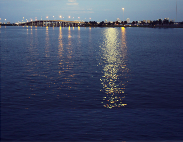
Alright let’s get started with this tutorial! The first thing we need is a base image to use as our background for which the character will be drawn onto, (for this tutorial I took a nice shot of the bay the other day and I think it will do just fine). Now keep in mind the perspective, angles and depth of the photo since anything we draw has to match those angles as to create the illusion successfully.
After you have selected the image you’re going to use, go ahead and print it out; 8×11 standard letter size is fine. Next, grab a sheet of tracing paper and a piece of scotch tape as we’re now going to place the tracing paper over the photo we just printed and draw our giant squid on it (if you have a lightbox handy go ahead and use this as it makes things much easier). Go ahead and draw a light simple outline of our squid character, you don’t have to draw the details right now, we’ll do those later on. Right now it’s more important to get the angles and base size of the squid right so it matches the original photo.

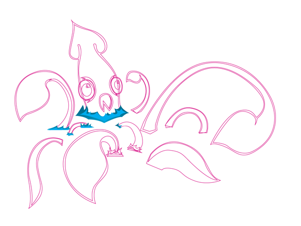
When you have your rough sketch ready remove it from the photo and scan it at 300 dpi (very important to get the hi-res scan otherwise you won’t be able to get the right curves of the lines). Take this scan and place it in a new document in Illustrator, this is the part that’s the most time consuming as we need to trace the octopus using the pen tool. So first just draw all the outside lines, which in the end will be the outside stroke, (right now you don’t have to worry about colors, black and white will do fine). After you’re done tracing all the outside lines, move on and trace the inner pieces, (these pieces will make the "skin" of the squid).
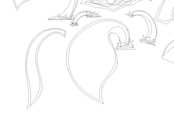
Ok, so we finally got all of the squid done, that took forever. After all of the lines are done go ahead and double check that; A) You don’t have any open paths, and B) The curves and angles of your lines look very smooth and flow together nicely. It’s important that you notice the details and your craftsmanship as it will make all the difference in the end result. Having 1 shape instead of 2 shapes overlapping might look like extra work but in the end gives more control, since every shape is an individual piece this makes it easier to adjust the colors, sizes, strokes, etc. later on.

Now let’s make a splash and create some water. Since the squid is coming out of the water there might be some splashes, this is where the decisions can get tricky. I originally had planned to create the splashes with images in Photoshop, but i think it would be cooler to do them using vectors. So using the pen tool create a variety of splashes at the beginning of each tentacle and than fill them with this gradient. C: 95, M: 17, Y: 25, K: 5 for the first color and C: 77, M: 11, Y: 0, K: 0 for the second color. then draw a smaller wave and fill it with, C: 77, M: 11, Y: 0, K: 0.
After you have all you outlines ready, find the color palette to use; for this I was thinking of saturated colors to further enhance that vintage/new school look we’re going for. We really want this to look like an older picture, yet have the art style of the squid be contemporary. Fill the outside line with this color: C: 6, M: 92, Y: 5, K: 0 and C: 0, M: 83, Y: 0, K: 0 for the inner pieces, for the eyes: the outline is C: 9, M: 25, Y: 100, K: 0 and the eyeball C: 20, M: 0, Y: 98, K: 0.

It’s moving time. The easiest way to do this is to create a new document in Photoshop at 8×11 landscape at 300 dpi, (nothing worse than creating a piece and then finding out you’ve been working in low-res). So once again make sure you’re working at 300dpi, then while leaving this window open first drag the water photo (our background) and then repeat with the vector squid from illustrator, (the squid will be linked as a smart object which is great since you can just click on the icon and the original squid will open in illustrator where you can edit over and over until you feel comfortable and not have to keep dragging files back and forth all day).
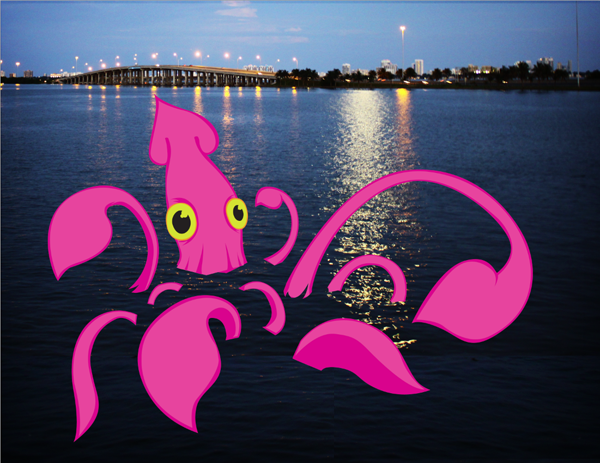
Now that we have this going let’s add the waves we created. After that, arrange all the vector pieces around and scale them until you have the right composition. Composition is super important when creating pieces, we want everything balanced and appealing to the eye.

After looking around at this piece for a while I wasn’t completely happy with the beak on the squid so I thought it would look cool if we just saw the head peeking out of the water. So using a mask I hid the lower part of the squid. After that, I duplicated the layer where the squid is on and rasterized it. Now we can work on the tones and shadows of the squid.
We now need to add shadows and highlights to give the image some depth. There are tons of different ways to add shadow effects (like using the brush tool on low opacity); but for this piece, I used dodge and burn at 5% to 10% around the edges. It’s important to notice where the light source is in the photo so when you add the shadows to the squid they will look more organic. It’s always best to use a tablet for this since it gives the natural brush look, but a lot of people can do a great job with a mouse too. In the end it’s what’s most comfortable for you and your style.
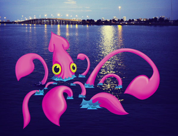
Now let’s add some texture to the photograph to give it that worn vintage look. I used a paper texture to give it a yellowish tone. Add this on a new layer and set it to overlay and set the transparency to 27%. Than duplicate this layer and set it to 60% on multiply and you’ll end up with something like this.

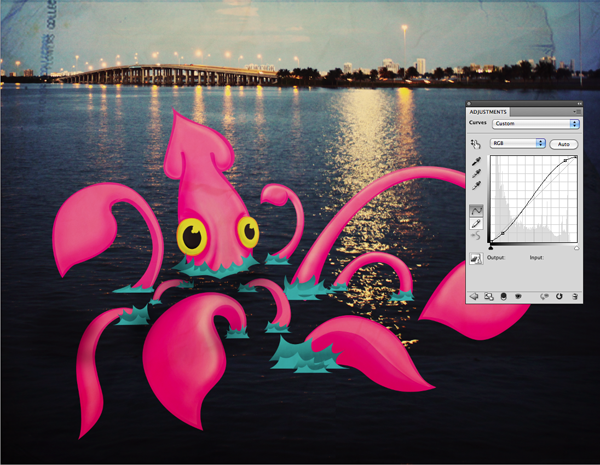
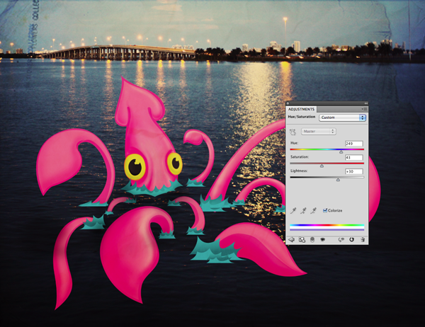
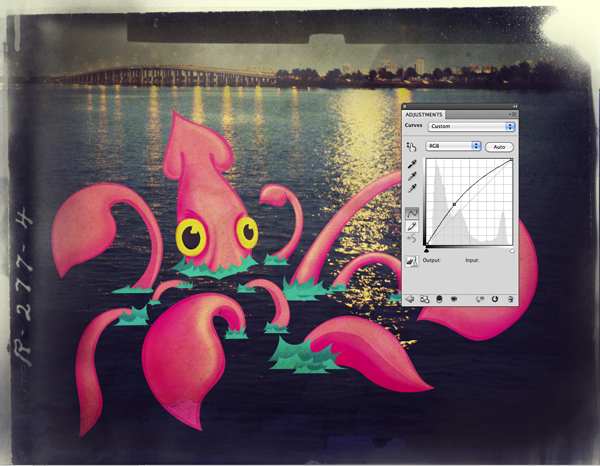
Now we’re going to play with the tones a bit to perfect the vintage look. Usually with older photographs the white edges start to turn yellow and the shadows turn to a blueish tint, we’re trying to mock this look. First we’ll adjust the curves, by making the shadows darker and the highlights brighter the image will look richer. After that change the hue/saturation: Hue: 249, Sat: 43, Lightness: +30.
To further add to the vintage look we’re going for, we need to add a frame around our piece. I found this image on flickr and it has some nice edges and textures we could really use, so add this as another new layer and mask the face, you can use the pen tool to outline the edges and really get some details.
Looking at the borders there are some more textures in there we could use so, duplicate the layer and with a soft brush at a low opacity (10%) mask around the edges to give the image the paper texture of the photograph, set the opacity to 48% and the blend mode to multiply.
More Curves! Add another adjustment layer, this time curves again this will help to blend the frame and all these new elements together, since adding curves makes all the tones equal, it helps to create the illusion.
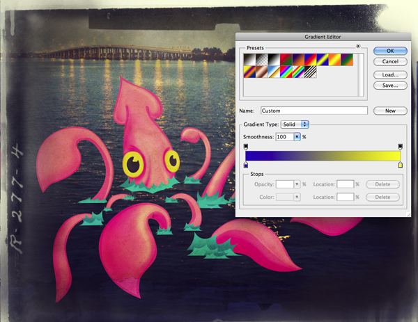
Do a final adjustment layer, a gradient map pick the default blue, red, and yellow gradient then by dragging down on the red color chip remove it, this will give all the shadows a blueish tone and the lighter colors a yellow tint.
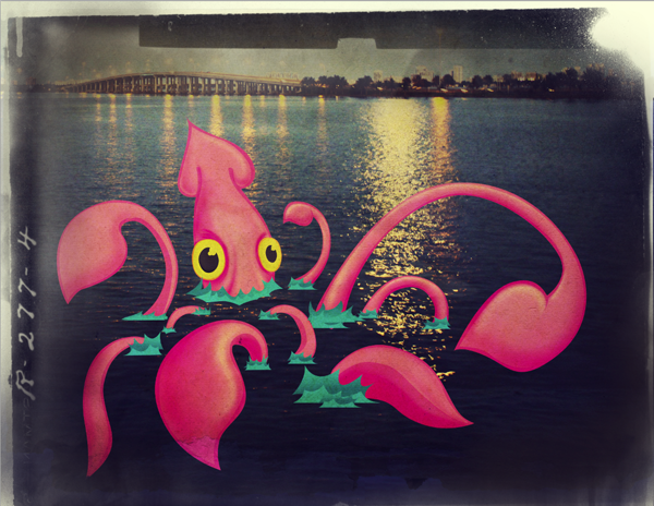
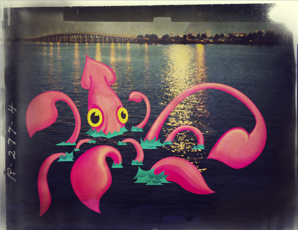
So there you have it, our final image. Hope you enjoyed creating it as much as I did.
Private Project! (Budget: $30-250, Jobs: Website Design)

hello i want to ask if we can build ipad software (internet browser) that includes arabic keyboard? please let me know if there is one also i want to ask if we can build the same idea for email ?… (Budget: $30-250, Jobs: iPad, iPhone)
I need 2 PR’s done in 48 hours. $10 per PR. details to winning bidders. perfect grammar. excellent content needed. please post sample PRs u have already done. no escrows. payment strictly after buyer approval… (Budget: $30-250, Jobs: Articles, Copywriting)
Hi, I need 200 Pr6+ angela and paul profile links. Then do rss, rss submission and ping Thanks. (Budget: $30-250, Jobs: Link Building)
Hello, I need someone to write 500 descriptions for my website. All of them should be different and unique. Should contain my keywords. I’ll pay $30 per 5000 words. Please do not bid if you do not have rating… (Budget: $30-250, Jobs: Article Rewriting, Copywriting)
Hello, Firstly, please READ my requirements before responding to this project. I have a very simple requirement to create a website that is similar to the website specified in the attached document… (Budget: $30-250, Jobs: AJAX, jQuery / Prototype, MySQL, PHP, Website Design)
as described (Budget: $30-250, Jobs: .NET)
Custom design project for Cine (Budget: $30-250, Jobs: Concept Design, Website Design)
i need help with javascripts which we use to extract data. we have the sample scripts which were written with winhttprequest fuction calls with string formatting. you need to make changes to the script to work with the new site see attachment there are 2 files 1… (Budget: $30-250, Jobs: Javascript)
Hello I require the creation of an online adult directory that will display profiles of escorts which will be created in PHP/MYSQL. This is a straight forward directory with simple functional requirements that is easy to understand and implement – I have detailed requirements… (Budget: $30-250, Jobs: AJAX, jQuery / Prototype, MySQL, PHP, Website Design)
Hello We have one site, You have to insert the product images properly 120-130 images to our product pages according to the general style of the template and possibly make some changes to look better… (Budget: $30-250, Jobs: CSS, Dreamweaver, Photoshop, Photoshop Coding, Photoshop Design)