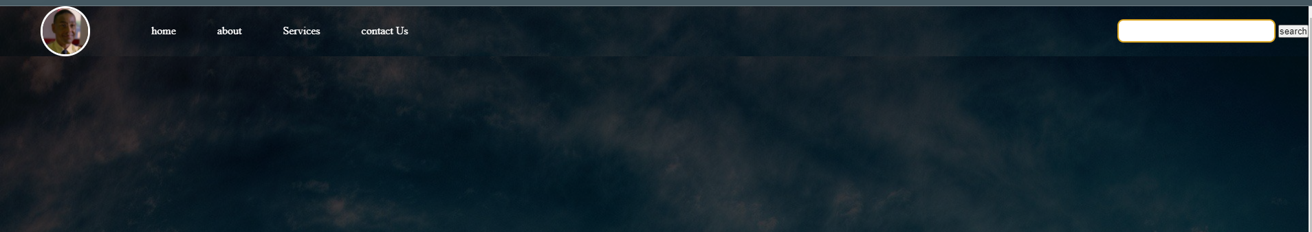
I have been trying to create a website using HTML and CSS by watching a tutorial. As in the tutorial they have their Navigation bar and background blended in I did everything the same as their code except for a few pictures but my nav bar has a sharp outline which is pretty visible
I’m just learning HTML and CSS so any help is appreciated. Thanks!
*{
    margin: 0;
    padding: 0;

}

.navbar{
    display: flex;
    align-items: center;
    justify-content: center;
    position: sticky;
    top: 0;
    cursor: pointer;


}
.nav-list{
   width: 50%;

   align-items: center;
   display: flex;
}

.nav-list li{
    list-style: none;
    padding: 20px 30px;

}

.nav-list li a{
text-decoration: none;
color: white;
}
.nav-list li a:hover{
    text-decoration: none;
    color: blue;
    }

.rightNav{

    width: 50%;
    text-align: right;
}


.logo{
    width: 20%;
    display: flex;
    justify-content: center;
    align-items: center;

}

.logo img
{
    width: 35%;
    border: 3px solid white;
    border-radius: 50px;
}


#search{
    padding: 5px;
    font-size: 17px;
    border: 2px solid goldenrod;
    border-radius: 9px;
}


.background{
    background: rgba(0, 0, 0, 0.7) url(/img//back.jpg) ;

    background-size: cover;
    background-blend-mode: darken;
}

.box-main{
display: flex;
justify-content: center;
align-items: center;
color: white;
font-family: 'Franklin Gothic Medium', 'Arial Narrow', Arial, sans-serif;
max-width: 50%;
margin: auto;
height: 80%;
}


.firsthalf{
    width: 80%;
    display: flex;
    justify-content: center;
    flex-direction: column;

}

.sndhalf{
    width: 30%;

}


.firstsection{
    height: 100vh;
}

.sndhalf img{
    width: 200px;
    height: 200px;
    border-radius: 50%;
    overflow: hidden;
    /* width: 60%;

    border: 4px white;
    border-radius: 150px; */
    display: block;
    margin: auto;
}
<!DOCTYPE html>
<html lang="en">

<head>
    <meta charset="UTF-8">
    <meta http-equiv="X-UA-Compatible" content="IE=edge">
    <meta name="viewport" content="width=device-width, initial-scale=1.0">
    <link rel="stylesheet" href="css/style.css">
    <title>ABCD</title>
</head>

<body>
    <nav class="navbar background">
        <ul class="nav-list">
            <div class="logo"><img src="img/logo" alt="logo"></div>
            <li><a href="#home">home</a></li>
            <li><a href="#about">about</a></li>
            <li><a href="#Services">Services</a></li>
            <li><a href="#Contact_us">contact Us</a></li>
        </ul>
        <div class="rightNav">
            <input type="text" name="search" id="search">
            <button class="btn btn-sm">search</button>
        </div>
    </nav>
    <section class="background firstsection">
        <div class="box-main">
            <div class="firsthalf">
                <p class="big-text">big text</p>
                <p class="small-text">small text</p>