Google gave everyone a sneak peak of the next version of Android (Honeycomb) at CES earlier this year. Today they released the SDK for the upcoming tablet geared OS. Here’s a look at what we all can expect from Honeycomb.
UI
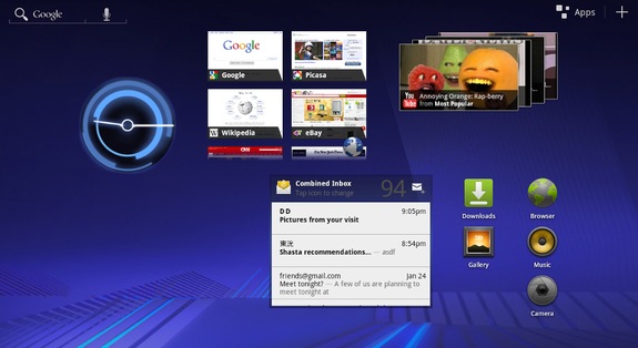
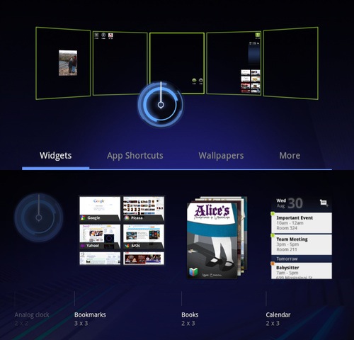
The biggest change is the UI. Older versions of Android weren’t geared towards tablets, Honeycomb changes all of that. You will now have more space on your home screen to accommodate more widgets and icons. As you can see from the image above, you will be able to fit all sorts of things on your home screen(s)
Home Screen(s)
The layout of the screens look much like older versions. There is a new 3D look to all of it that might cause problems with older hardware, the new Tegra 2′s should be able to handle it without much effort.
Notification Bar
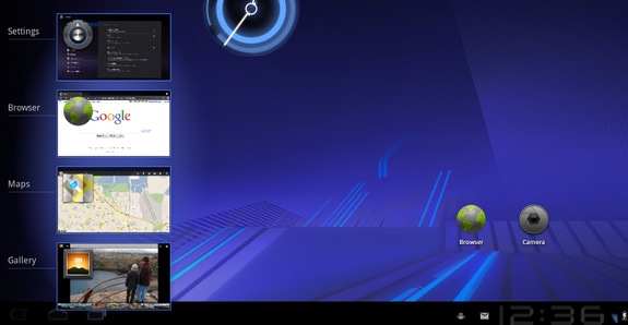
The notification bar has been moved to the bottom ala Windows and they have added some new buttons that work like the capacitive hardware buttons on most Android devices. They have also added a recent apps button that will show you the current state of apps running the background.
Keyboard
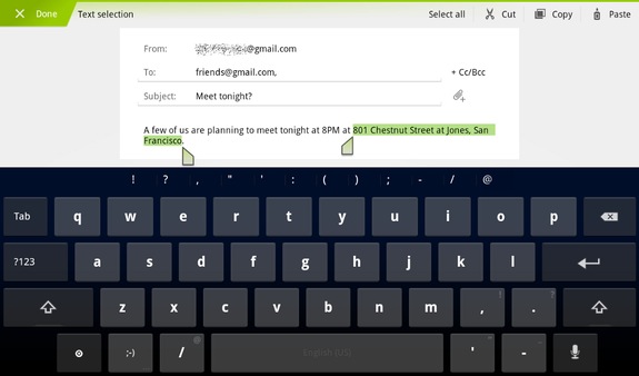
The new keyboard is a great improvement over the older iteration with larger reshaped keys. They also include keys like “Tab” which should make the transition for desktop users easier. Copy and Paste has also seen some change. Much like iOS, a long press will select a word and you can drag the selector to choose more text.
Over all it looks like a great improvement, especially if you are running 2.2 on a tablet currently (like I am). A welcome upgrade if I ever saw one.

![]() A Look At Android 3.0 – Honeycomb originally appeared on tech.nocr.at on 2011/01/26.
A Look At Android 3.0 – Honeycomb originally appeared on tech.nocr.at on 2011/01/26.
© tech.nocr.at 2011 |
Permalink |
Comments |
Read more in Tech News |
Add to del.icio.us |
Stumble it |
Digg this
Explore more in: 3d, ac, android, apps, cat, comb, copy, ds, ea, eff, google, honeycomb, id, ios, key, keyboard, keys, loa, make, mod, os, paste, pc, press, sdk, space, tablet, tech.nocr.at, text, tor, ui, widgets, wind, windows