The Cosmos: Create a Spiral Galaxy


This entry is part 3 of 3 in the series The Cosmos

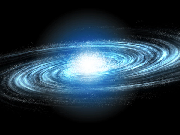
A galaxy is a massive collection of stars, stellar remains, gas, dust, and planets. Galaxies can contain as few as 10 million stars, or as many as 100 trillion. Astronomers believe that there are about 170 billion galaxies in our universe, each varying in shape from spiral, elliptical, to irregular. In today’s tutorial, we will demonstrate how to create a spiral galaxy of your own and will depict a fleet of ships making its way through the universe to find a new home.

Today’s tutorial is part of a 4-part series depicting the journey of the inhabitance of a dying world that must travel into the unknown to find a new world to call home. In this series, we will explore the cosmos from the perspective of this fictional civilization making their way through the universe and will demonstrate the techniques that you can use in Photoshop to depict your own cosmic scenery. In addition to written content, this tutorial also includes about 90 minutes of video instruction to help you along the way. So what are you waiting for? Let’s get started!


Step 1 – The Galaxy

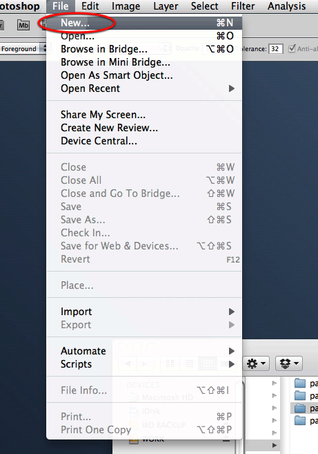
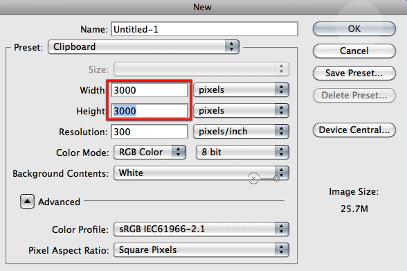
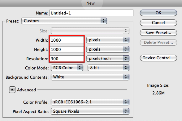
We will begin with the main feature of this image and the most important. This is a very long step because of all the settings and clicks you have to go through, but its not complicated its just a matter of following it and you will see soon enough how we will progress through it and how each steps provides us with valuable content. Let’s begin by creating a document where we will be generating the base for the galaxy not the main image document; so go ahead and create a new document with the settings as shown here.
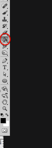
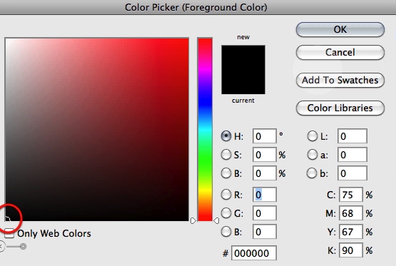
Now select black and fill in your canvas.
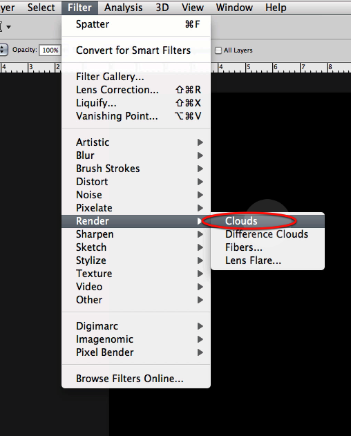
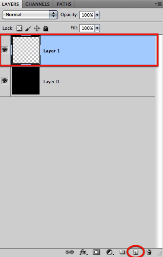
OK next create a new layer on top and go to the clouds filter and generate some.
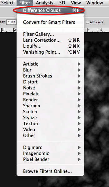
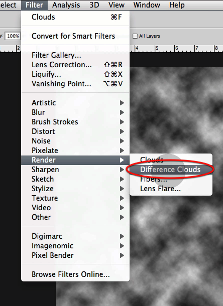
Then you will go to difference clouds and generate some on the same layer twice.
This is what you should get after these steps.
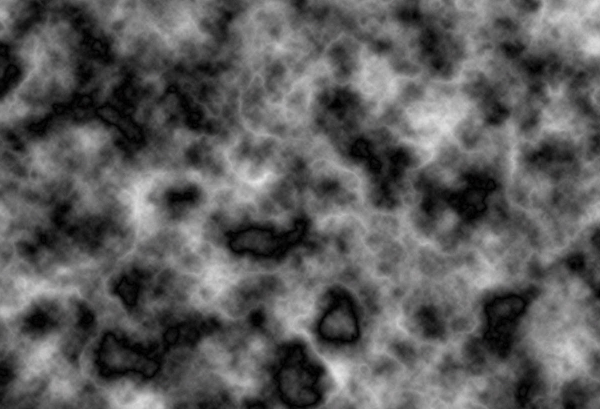
OK now let’s create another layer and fill it up with black.
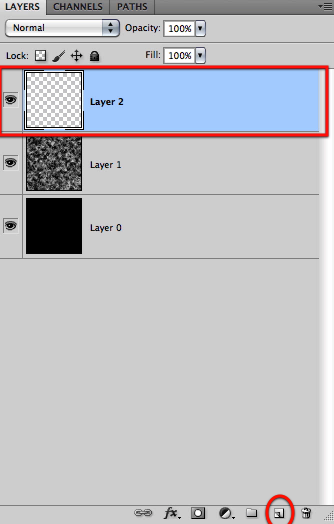
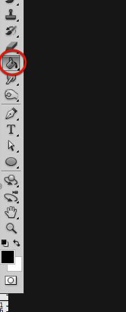
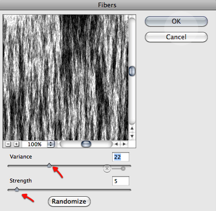
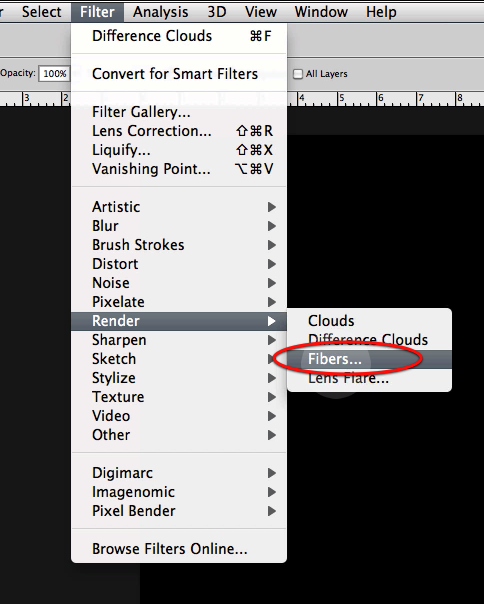
This time we will be using the fibers filter with the settings shown below.
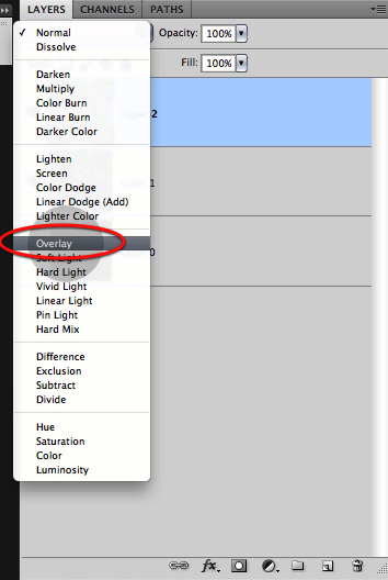
Now just setup this new layer to overlay so it mixes nicely with the clouds we did before.
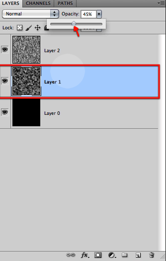
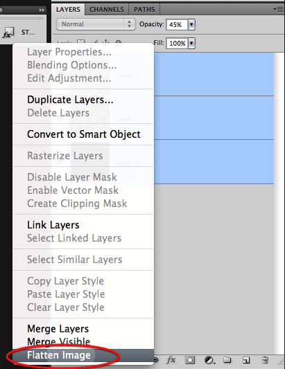
Next we will reduce the opacity of the cloud layer as shown to make the two blend even further, and then just flatten all the layers.
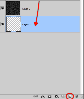
Now we will create a new layer, drag it to the bottom and fill it up with black.
OK perfect, now we will have to define a big circular selection with a feather of about 50px over our texture.

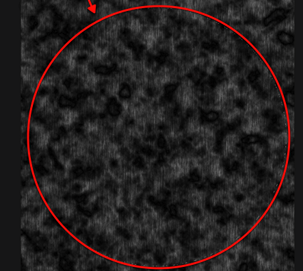
Then you can either copy and paste it to a new layer or inverse it and delete what its outside to end up with a big soft circle of the texture we created.
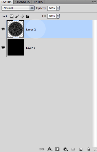
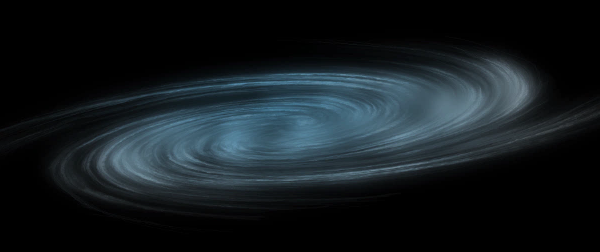
OK next up to give some twist and form to this we will apply the warp filter a couple of times with the twist option as shown below.
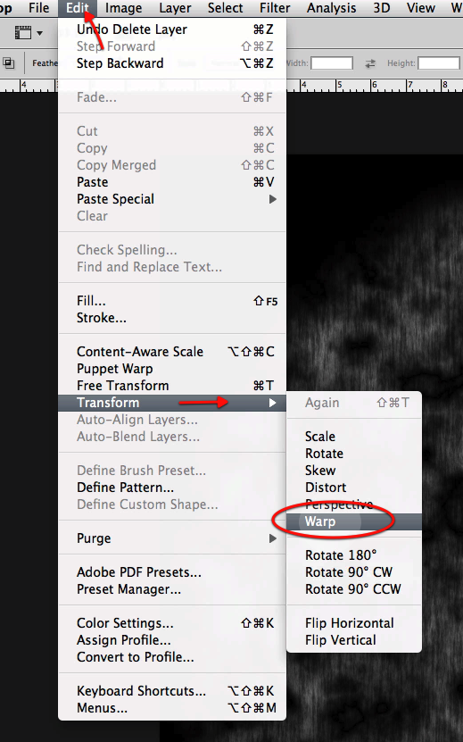
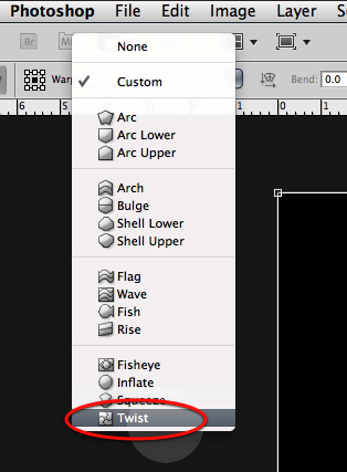
As soon as you select the twist option you will get its options in the top bar so let’s type 100 for the bend setting.

This is what you will see in your Photoshop screen, so hit apply and repeat the process once more.
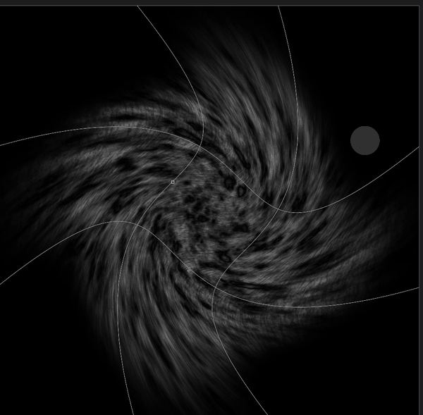
Once both warp distortions have been applied let’s use yet another filter; this time the twirl and use the settings shown below.
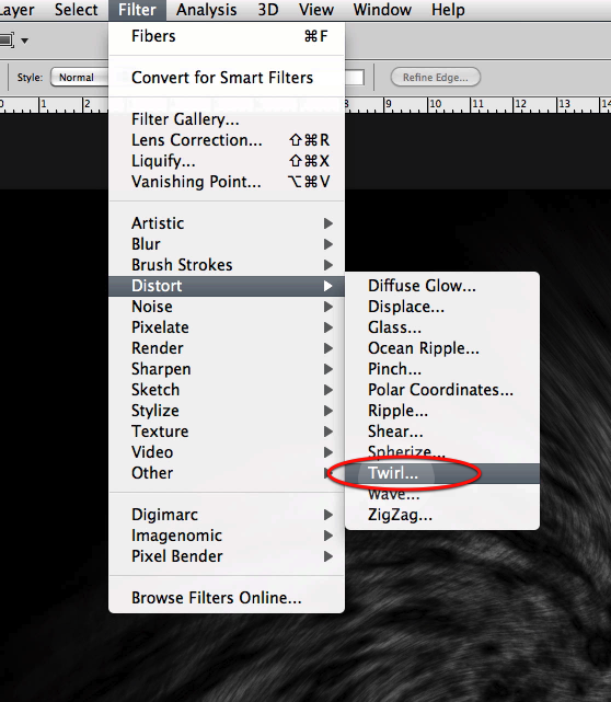
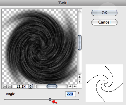
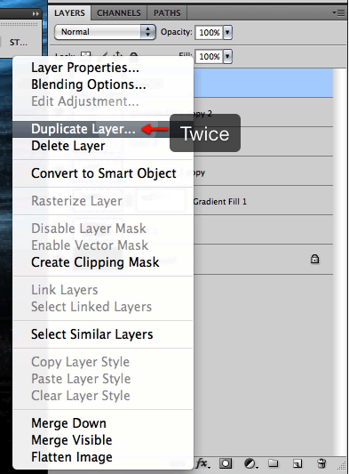
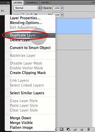
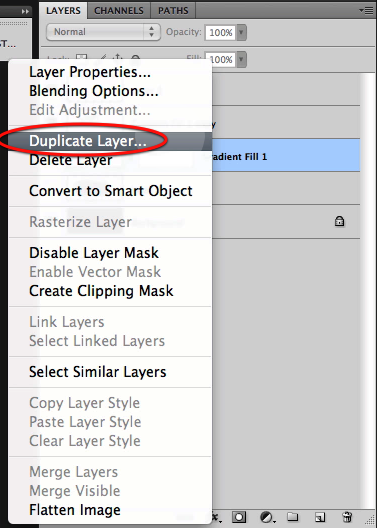
OK great now let’s duplicate the layer so we can add some more detail.
And in this new layer let’s apply a spatter filter with the settings shown here.
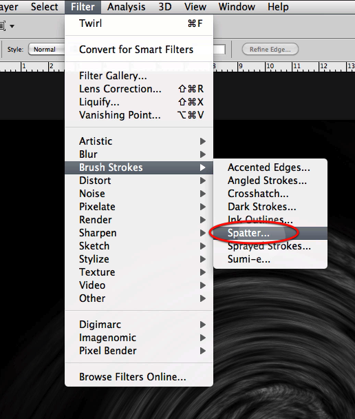
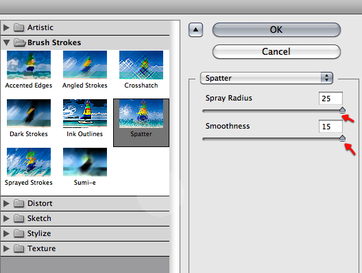
Here is what you will get from this last filter.
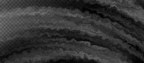
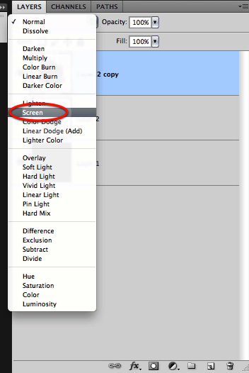
Now set this new effect to screen and reduce the opacity a bit to about 61%
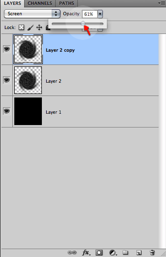
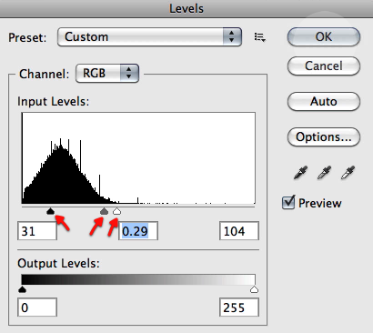
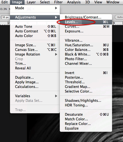
Very good now make a duplicate of this last layer and apply some levels to it as shown below, so we get nice intensified highlights.
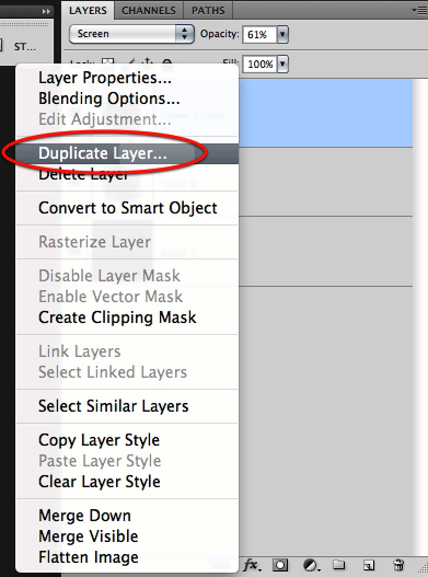
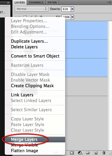
Perfect we are done with this filter bonanza, now select all the layers excluding the black background and merge them together.
OK now we are ready to create the document for the image we will be working on, so select new file and create it with the settings below.
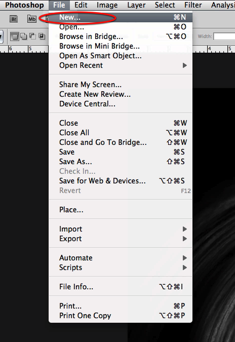
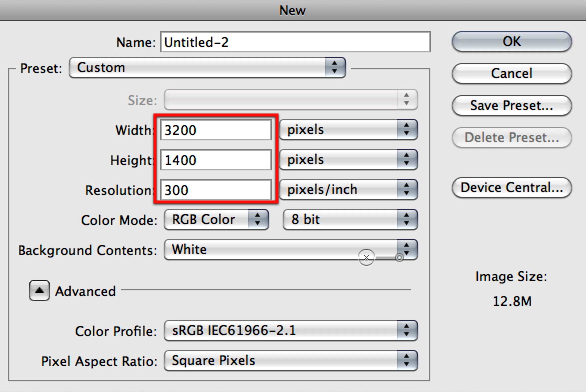
Now fill the canvas with black.

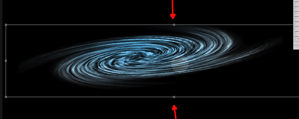
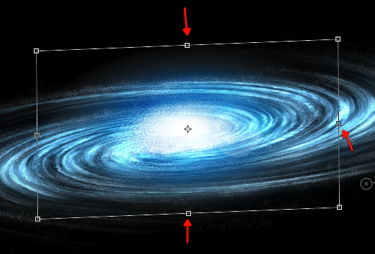
Next we will copy and paste our galaxy work on to this new document and in a new layer, then we will use the distort command so it fits inside the top and bottom boundaries of the new document as shown below.
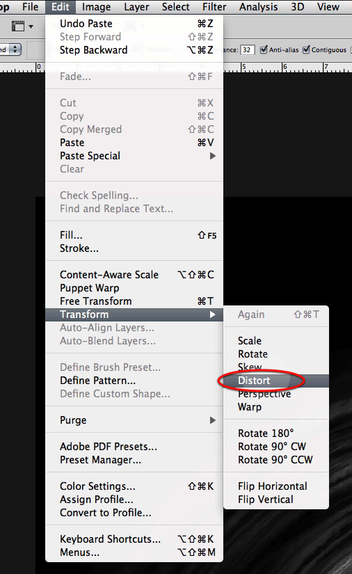
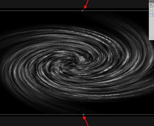
Before going any further let’s duplicate the layer and hide one of them by clicking on the visibility icon.
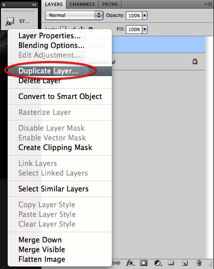
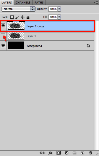
Then let’s distort the layer further as shown here so we get the appearance of perspective and also to adjust its size to what we want.
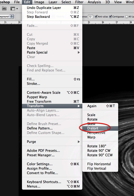
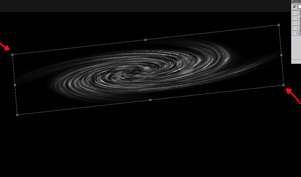
Once we have the image of the galaxy base setup let’s create on top of it a new gradient layer.
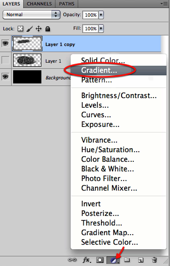
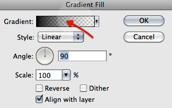
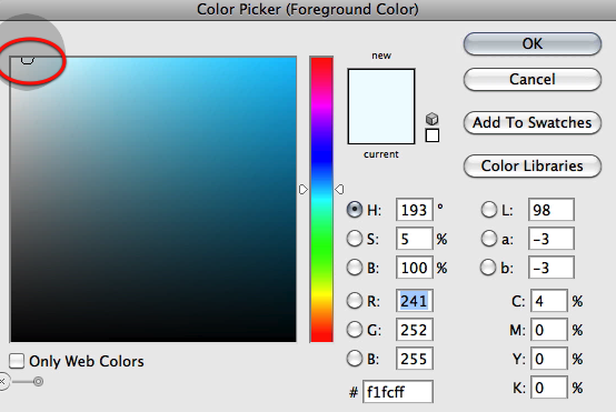
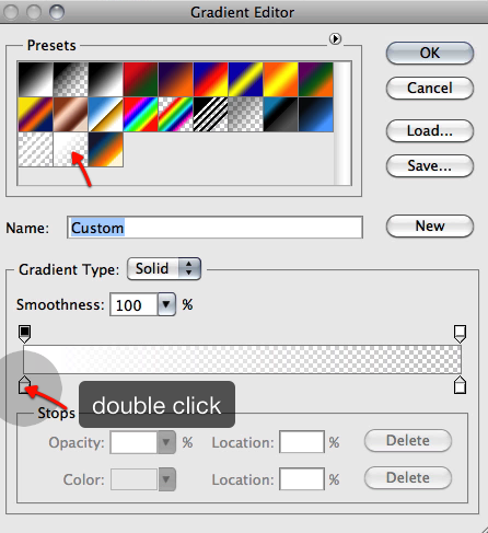
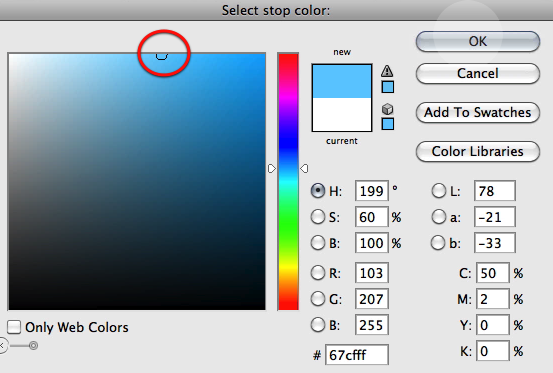
Let’s choose for the gradient a standard white to transparent gradient, and for the first color to the left let’s double click on it and select a blue color as shown below.
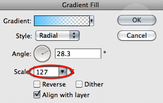
Now let’s setup the gradient to radial with an angle as shown here and while this dialog its open drag the center of the gradient to the center of the galaxy base.
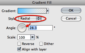
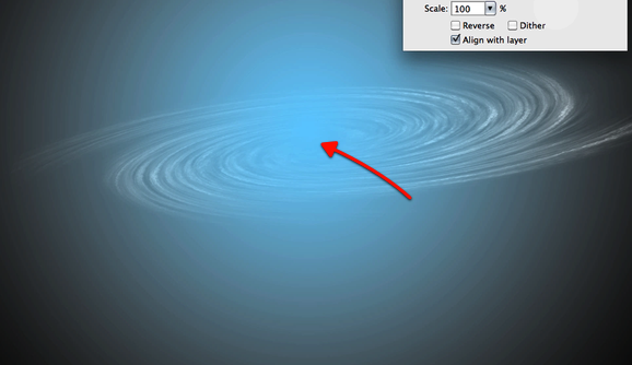
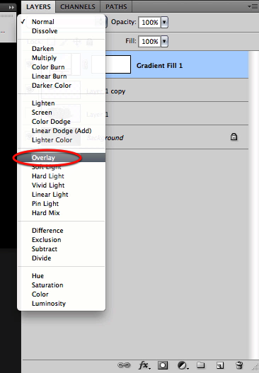
Then set the scale to 127 and click OK. And now set this layer mode to overlay.
And now let’s distort the gradient layer itself to adjust its shape to our galaxy, so rasterize the layer and distort it as shown below.
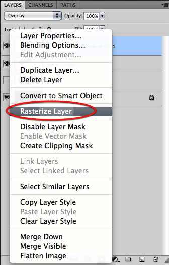
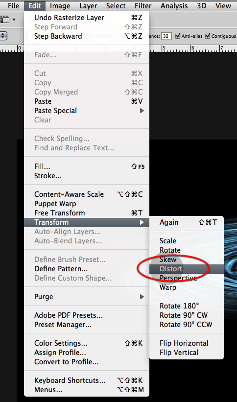
Next just create a clipping mask so the gradient affects only the galaxy base and then merge the two layers together.
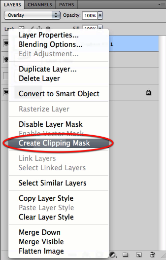
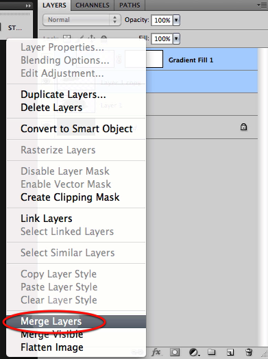
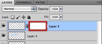
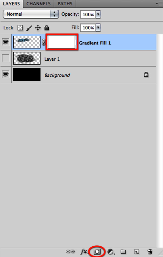
Now create a layer mask for the resulting layer.
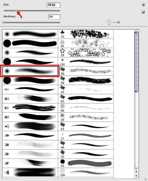
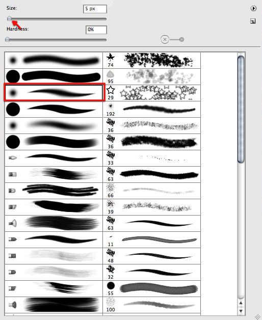
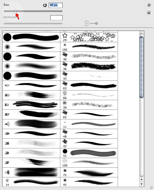
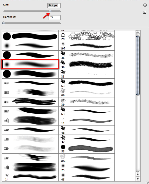
And to proceed we will select a soft brush as shown below.

Then we will mask off sections of the galaxy as shown here to make it more dynamic and less disk like.
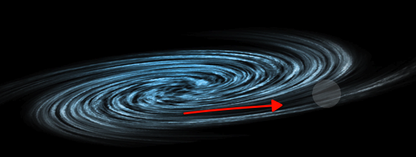
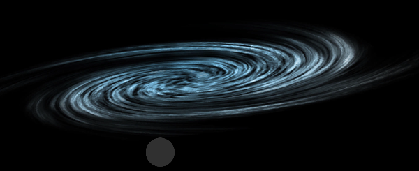
Now before we move on we will duplicate the galaxy layer once we are happy with the mask and hide the original for safe keeping.
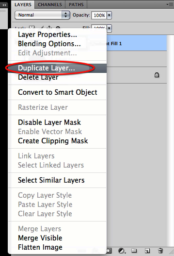
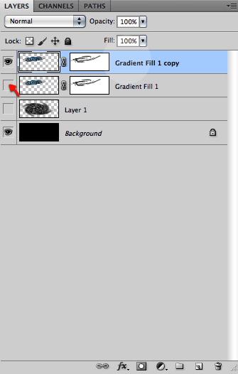
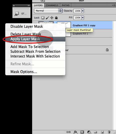
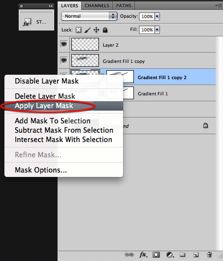
Then on the visible galaxy layer right click on the mask thumbnail and select apply layer mask.
Now its time to start making this galaxy our own and unique at the same time so let’s go to our smudge tool and set the brush size as shown below.
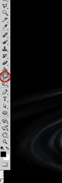
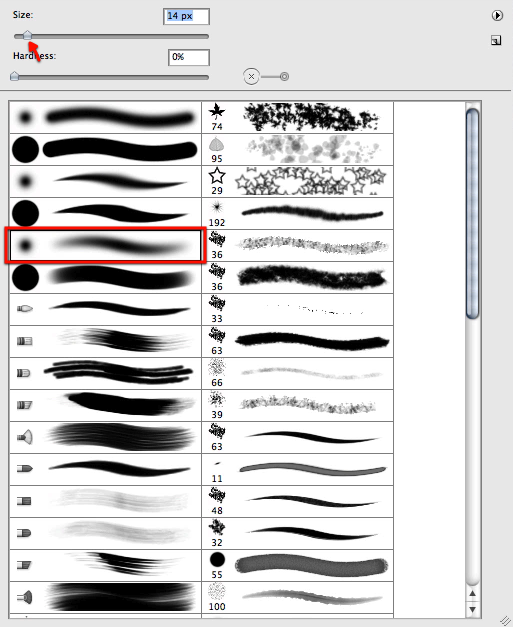
We will start smudging some new flow and features to it as shown here.
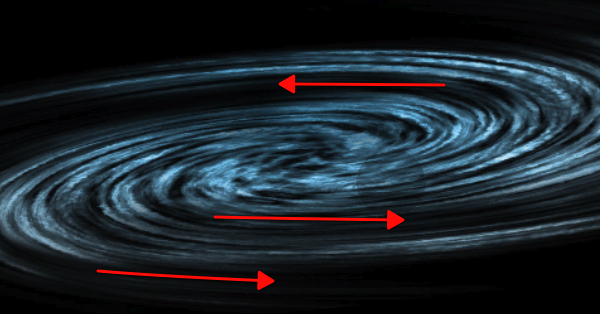
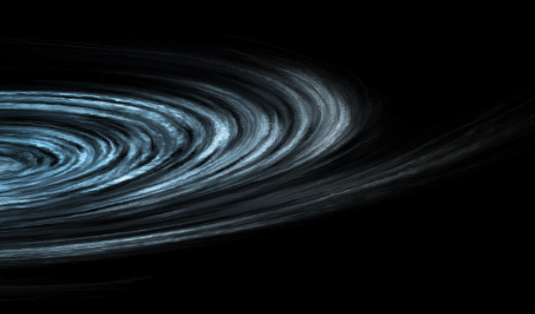
Then let’s reduce the size of the brush quite a bit and start working on more tiny detail all around the galaxy introducing new features and detail, but at the same time following the established flow.
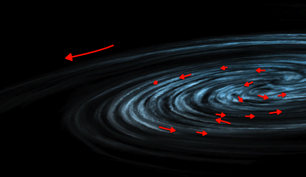
Here you can see what we are after by smudging our way through it, yet this is quite personal and its up to you how far we want to go here.
Next up let’s make a copy of our "safe" hidden layer, and once again apply the layer mask.
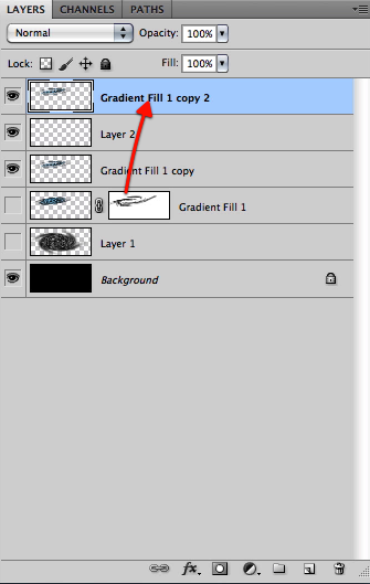
Now let’s bring this new layer copy all the way to the top.
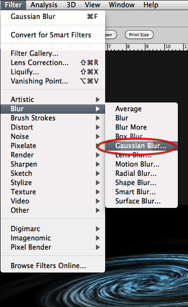
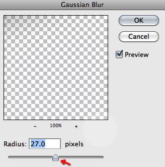
Then apply a Gaussian blur filter to this layer with the settings shown here so we get the results below.
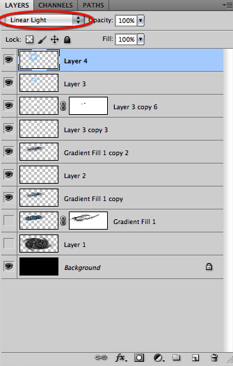
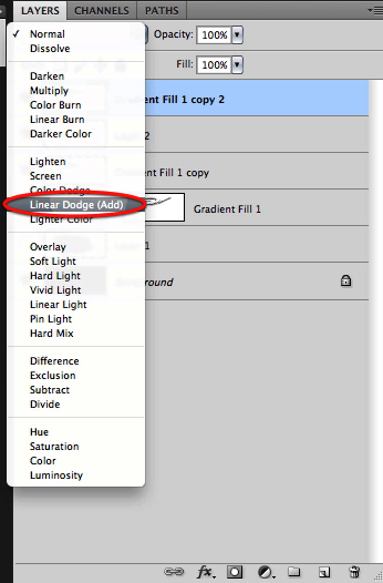
Also set this top layer to linear dodge.
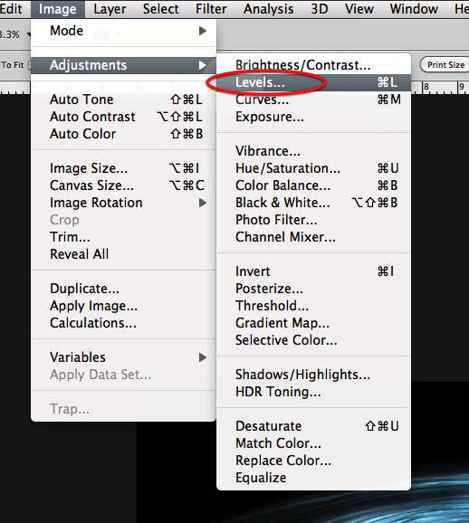
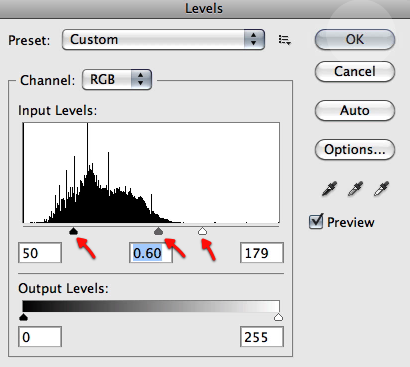
And let’s adjust the levels directly for this layer as shown here
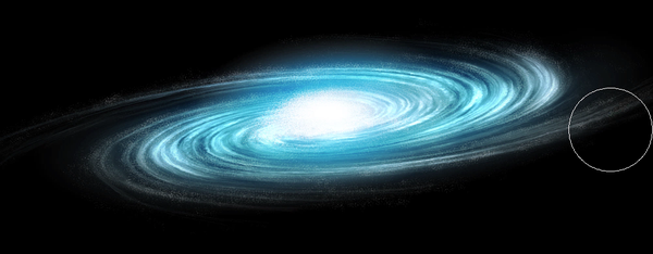
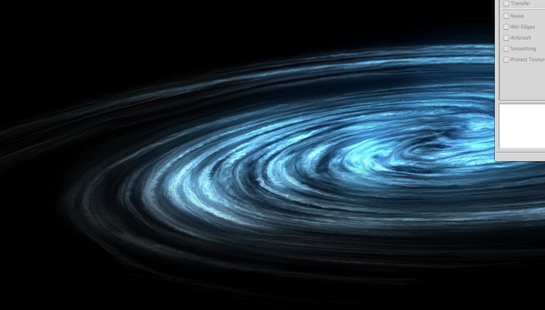
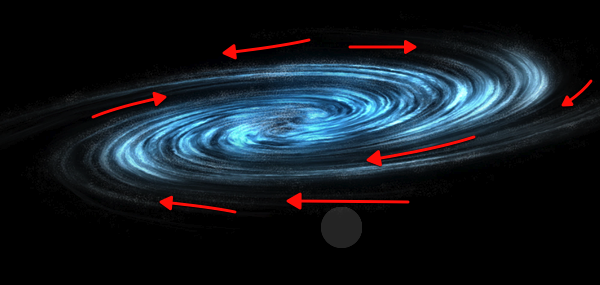
Here you can see the results of the process we have followed, looking quite nicely so far we have a detailed good looking galaxy base to work on.

Step 2 – Stars and Glow

Now all galaxies are made up mostly of stars, of course every star has planets, yet what we visually see is the stars, hundreds of billions of stars. So to try and illustrate this we will need a special brush just for it that will help us paint all these stars without spending the rest of the decade making them. Let’s make a new document as shown here, and fill it with black.
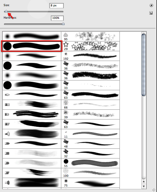
Now with this brush here and with 100% white we will click some defined dots randomly spread like shown below.
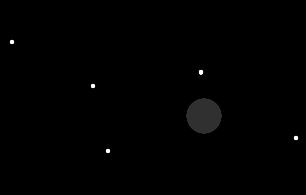
Now let’s drag a selection around these and invert the image so we get black dots on a white background.
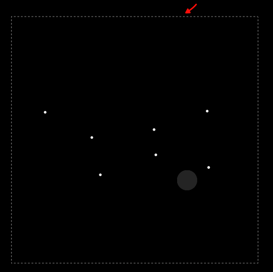
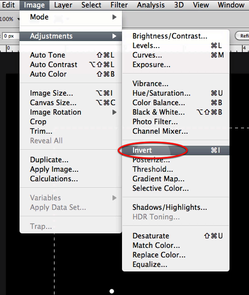
Now just define the brush preset as shown here.
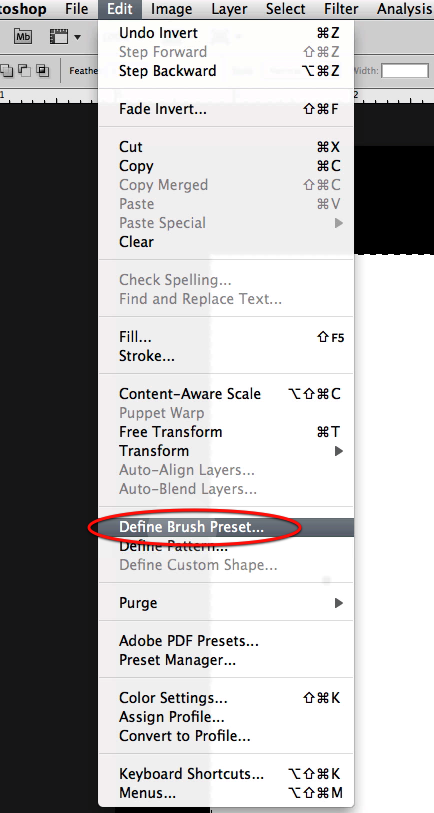
Now let’s go back to our image and scroll down the brush list to find the new brush. Now let’s setup the brush palette, first enabling scattering with the settings below.
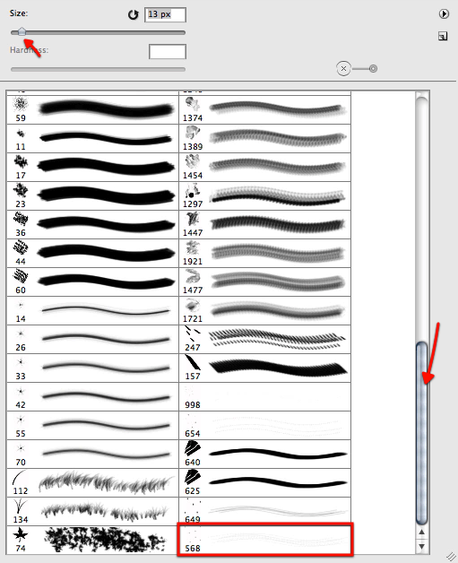
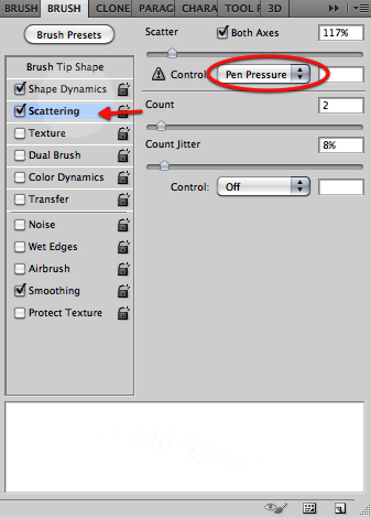
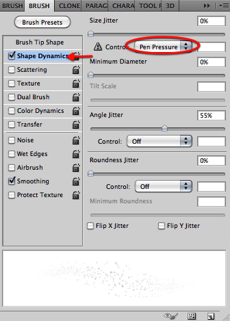
Then enable shape dynamics with the pen pressure option and in the brush tip shape section let’s adjust the settings as shown.
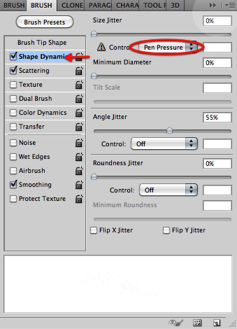
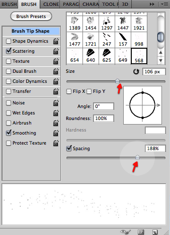
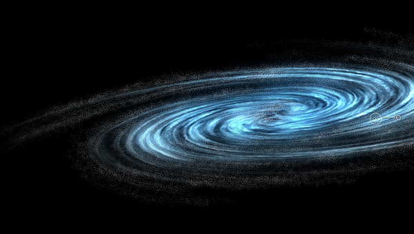
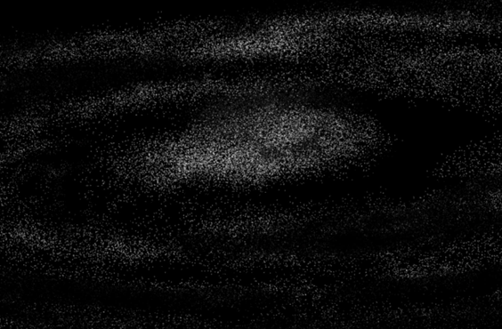
Now let’s reduce the size of the brush a bit and start painting some stars in a new layer as shown below, that follow the flow of our galaxy. Don’t mind the fait look they have now we will fix that in a second.
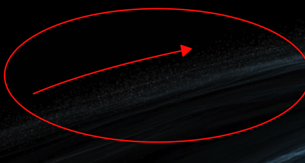
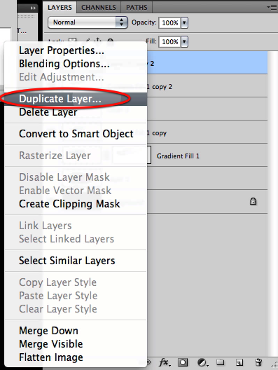
Once we have covered the galaxy let’s select the layer and duplicate it twice.
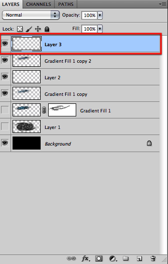
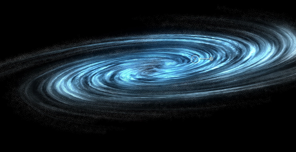
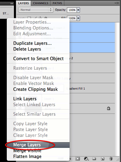
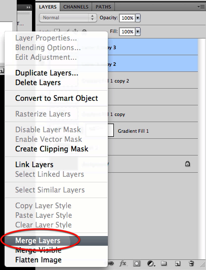
You can see here the look of the stars gets intensified, now grab all the layer copies and merge them together.
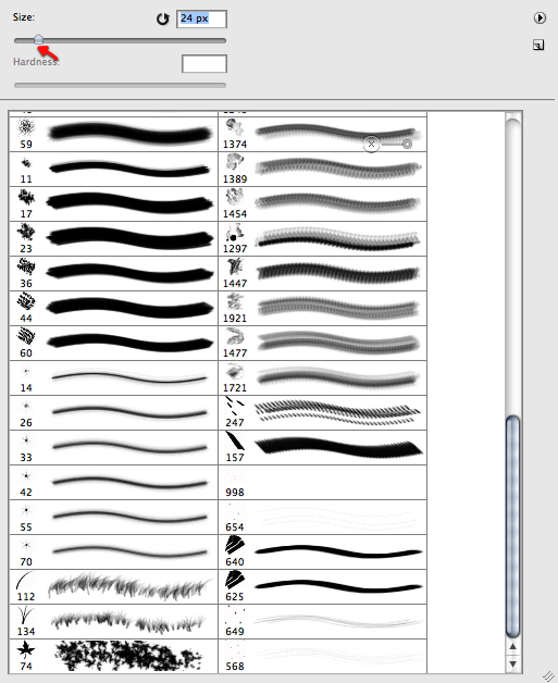
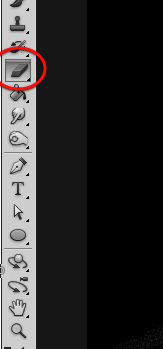
Now we will randomly erase some of our stars by using the eraser and selecting for it a brush as shown below.
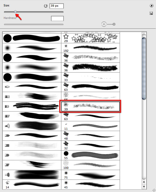
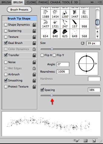
Now just adjust the settings below in the brush tip shape section.
Once we are happy and made the stars randomly distributed, let’s duplicate the layer once more and merge them. My results are shown below, at this point you can erase a bit more if you like or if you see any patterns that never look good.
In this image you can see the flow we are trying to enhance and accentuate by eliminating some of the stars.
Now we will start working on the central nucleus of stars. Every galaxy has its most accumulated stars in the center so for this let’s make a new layer.
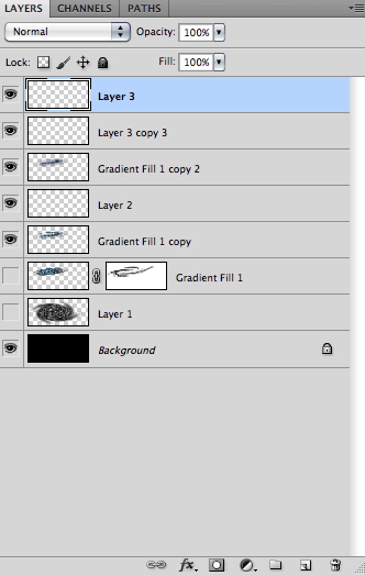
We will now increase the brush a bit to make the stars more evident, and start working on the center of the galaxy building up the nucleus. You can disable the rest of the galaxy layer so you can see more clearly what are you adding.
Once satisfied with what we have we will duplicate the layer 3 times and of course then merge them all.
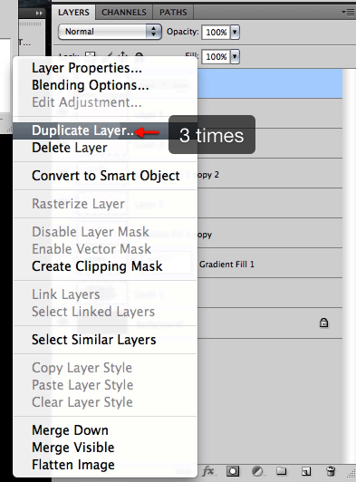
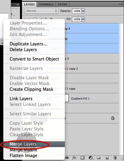
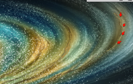
Now we can move scale and distort this layer in place plus I also erased some of it shown in red below.
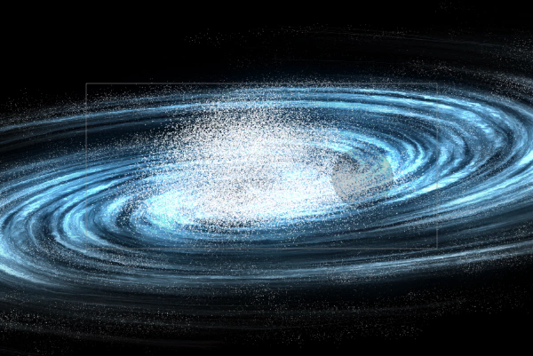
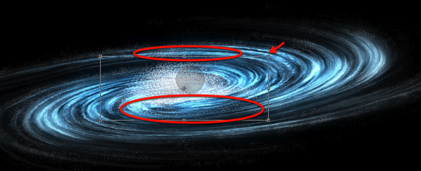
Next up we will use the gradient tool and select the gradient I have included below and set it up to circular.
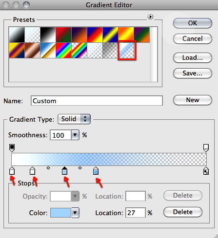
Now let’s drag this from the center of the galaxy as shown here.
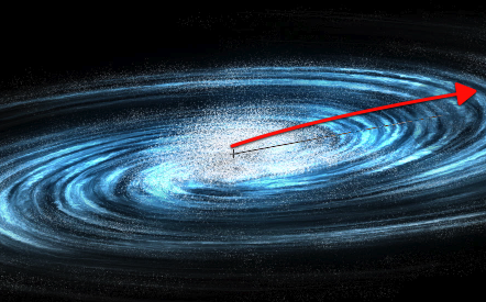
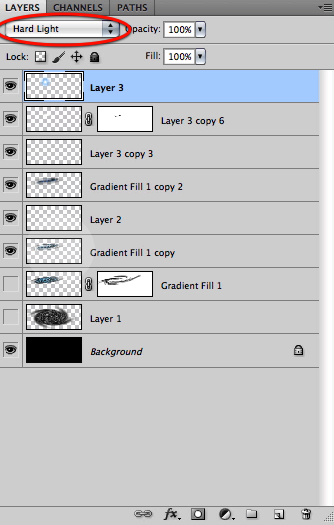
Now setup this layer mode to hard light and you can see the results below.
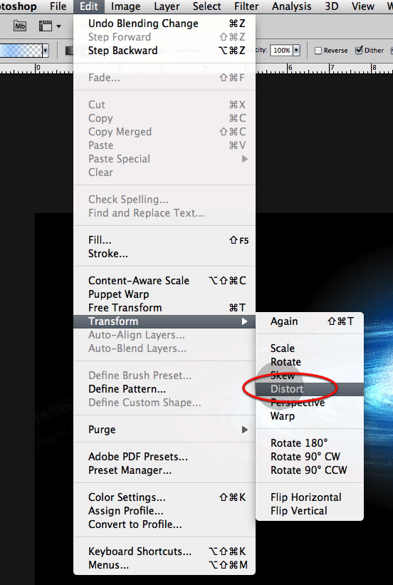
Now let’s distort this gradient a bit so it fits nicely in our galaxy center.
Now in a new layer let’s make another gradient, this time set the layer to linear light.
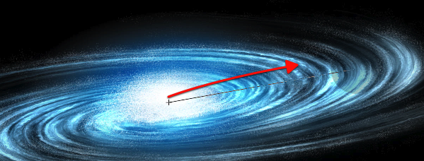
And also distort it into place.
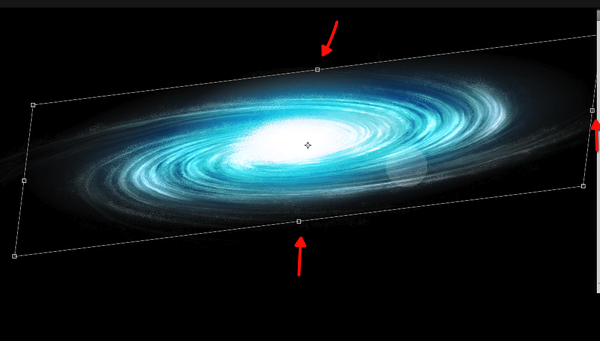
Now if needed just soft erase any hard edges that the gradient gets.
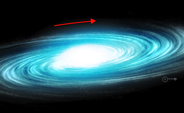
Next just reduce this layer opacity to around 64%
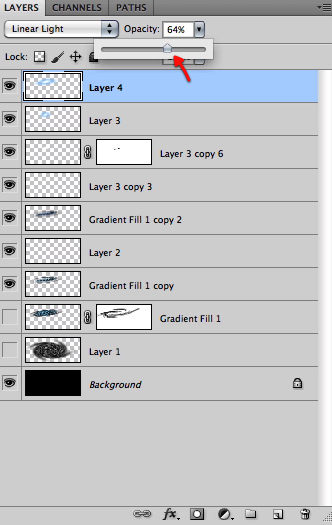
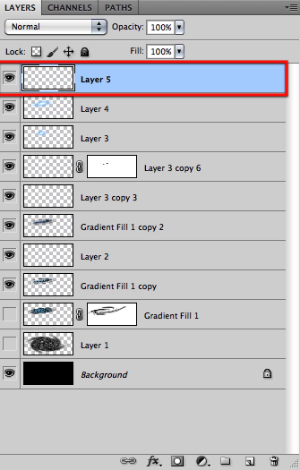
OK then we will create a new layer on top and select an almost white blue color.
Select our custom star brush again and enable shape dynamics with the pen pressure setting enabled. Then paint a bunch of new stars to add to the center of the galaxy.
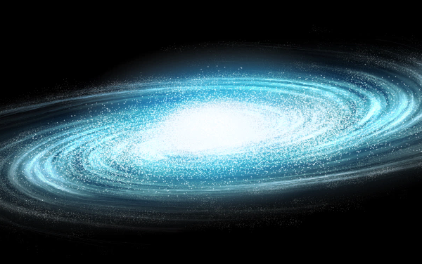
Now grab a soft brush of about 50px and create a layer mask on this latest layer.
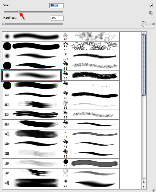
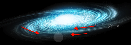
Now with black selected just mask off this layer as shown here, again following the flow of our spiral galaxy.
Great, now let’s make a duplicate of our original galaxy shape we have hidden
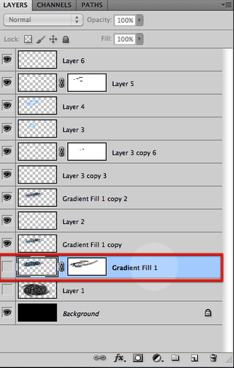
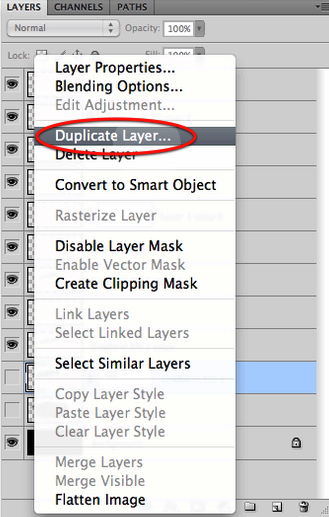
Right click on the layer mask and select "apply layer mask" then drag it all the way up below our last layer.
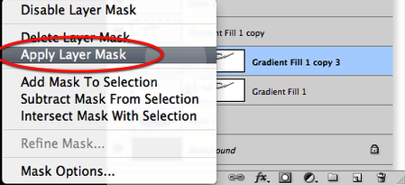
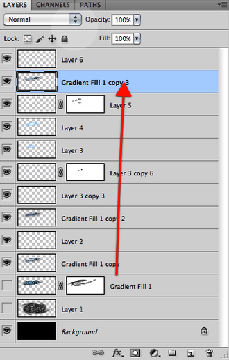
And set this layer mode to hue.
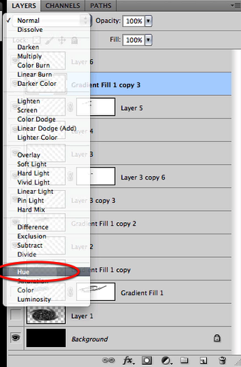
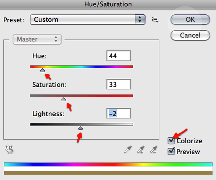
Now we will alter this layer color by setting up the hue saturation as shown below.
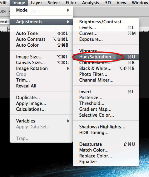
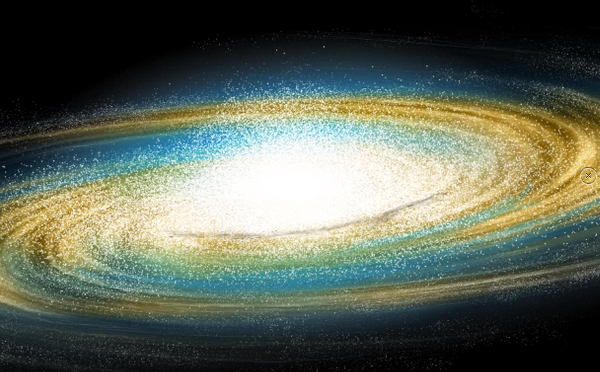
This is the result we get so far.
We will then add a layer mask here and make sure we have our soft brush still selected and at about 50px
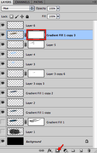
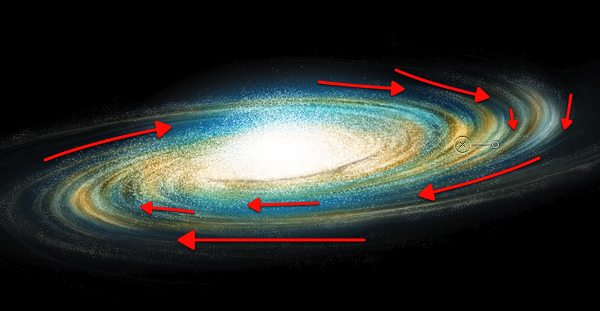
Now mask off this layer influence as shown just leaving some streams of this golden yellow hue. Adapt the brush size if you need.
Now let’s select a dark brown as shown here, and make our brush very small about 2 or 1 px.

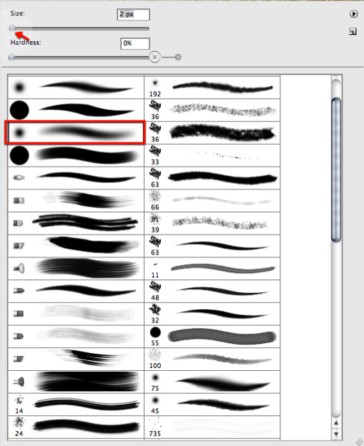
And then in a new layer let’s paint some dark matter streams as shown here.
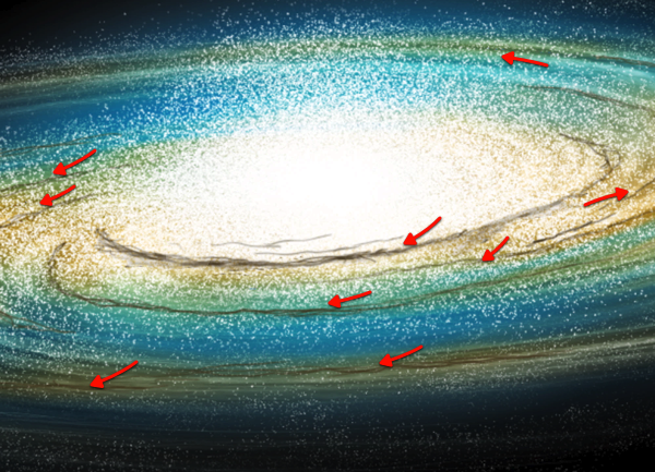
Now let’s grab the smudge tool, also with a very tiny brush as shown.

Let’s go around smudging our dark streams a bit, to eliminate the stroke look they have.
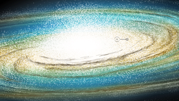
Next with our tiny brush still selected we will choose a bright yellow color as shown here and add a bit of highlights to the strokes we have been working on as shown below.
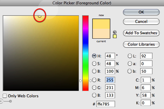
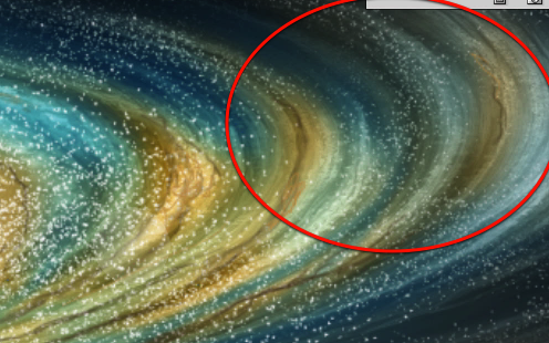
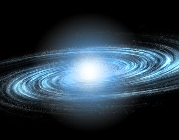
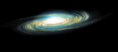
Perfect, we have reached the end of this step and these are the results we have so far.
Read More

Create a Post-Apocalyptic Matte Painting


In the movies, we often see images of ruined landscapes or apocalyptic cities. What many of us don’t know however is that much of this imagery was produced not with complicated CG software but instead, using Photoshop. In today’s tutorial we will demonstrate how to create a post-apocalyptic matte painting of an old cathedral. Let’s get started!


Tutorial Assets


Step 1

Create a new document. Use any size you want but for this scene I recommend using a 2:1 ratio, meaning that you can use resolutions like 2000×1000 and 1000×500. For this tutorial, I will be using the 1000×500 resolution. The color mode and bit depth do not matter for now.

First, let’s import the Cathedral image. You can see that it is a very large image. This is a good thing because it will downscale quite nicely. To resize and position the image, hit Command/Ctrl + T on your keyboard or go to Edit > Free transform. To scale an image while maintaining its proportions, hold the Shift key while resizing it. When you’re satisfied with the result, you’ve now got the base of the whole composition.

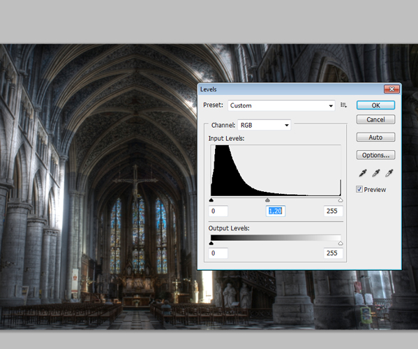
Go to Image > Adjustments > Levels. As you can see in the histogram, a lot of data is being stored in the black area which means that we’ve got an under exposured image. To get some more data out of the high and mid tones, change the value of the mid tones from 1.00 to about 1.20. Now we’re ready to go.


Step 2

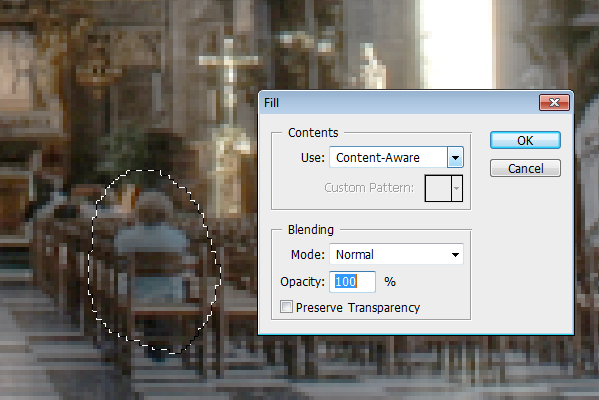
As you can see we’ve got a problem. At the moment this photograph was made, two people who probably wanted to ruin our image, took a seat in the wooden seats on the bottom of the image. Obviously, we want to remove the people. To do this, we are going to use one of Photoshop’s amazing features, the content aware fill option.

To do this, use the lasso tool or hit L on your keyboard and draw a circle around the subject. Be sure to also integrate some pieces of the environment into it so that Photoshop knows what to erase. Once selected, click with the right mouse button on the selection and under the Use: tab select Content-Aware. Unfortunately, this feature is only available in Photoshop CS5 so I would recommend people who use older versions of the software to play around with the clone stamp tool. Anyway, once the content-aware fill is applied you are probably going to have some problems. This, however, can easily be solved by using the Spot Healing Brush Tool. Ultimately you want to have a result that looks good, so some cheating is okay.


Step 3

Create a new layer called ”Fog” and set the blending mode to Soft Light. Now use a big round soft brush and paint over the dark middle area of the image covering all the stuff in the back of the scene like a part of the roof and the windows. Then reduce the opacity of the layer a little bit. This will create a natural effect, because also in real life this rule generally applies: the further away you are from an object the less contrast your eyes can detect. See the comparison image below to see the effect.


Step 4

Now we’ve got to start adding elements into the scene. Let’s start by modifying some big elements in the scene by adding some vines onto the main pillars of the cathedral.

Load the vines image and position and scale it properly, so that the vines look like they actually grow around the pillars. Due to the fact that the vine image is pretty small compared to the first image you need to duplicate and rotate it some times. A helpful thing is to duplicate the image and then rotate it 180°. Then, when you’ve finished positioning the vines it’s time to apply some color correction to make them blend properly.

A handy tip is to look at the brightest areas of the image you want to blend your element with, in this case the cathedral image. Now, the area in the front covering the pillars is quite dark so you should decrease the high tones by taking the second point on the curve and moving it down as shown in the image after opening the Curves windows by going to Image > Adjustments > Curves. Also, you need to take a look at the color tone of the cathedral ruins, which suggests a slight increase in the red channel. Also, add a slight contrast and play around with the curves in order to make the perfect blending.


Step 5

Once you’ve repeated the process and attached the vines to multiple pillars it’s time to add the other elements. Import the image of the rocks. First of all, we’ve got to isolate the rocks from the sky and from the sand. To do this, select the sky and the sand and then go to Refine Edge. This opens a window which is pretty much the key to advanced selections. Particularly the first option is really handy in Photoshop CS5, called the Edge Detection parameter. This will automatically detect the edges of the object you want to isolate and like magic, it makes a perfect selection.

You should also play around with the other parameters like Shift Edge and Smooth. When you’ve got your selection, inverse it and delete the edges like shown in the animation below. Now you can place the rocks and repeat the color correction process from the third step. The same applies to the foreground dirt pile.


Step 6

With the basic setup done, we can now add smaller details like the tombstone in the middle. To do this, extract the stone from the image just like you extracted the stones and the vines. Then place it in the middle of the image and scale it down until it matches the perspective. Now, duplicate the image and rotate it 180° and place it directly below the original one, creating a reflection. Load a big soft brush and erase the top of the stone. Also, lower the opacity to make the reflection complete. You want to apply some color correction as well to blend the stone in. For reference you can check the image below.


Step 7

Right now I’m happy with the details, although you can add more if you like. The next thing that we will do, is add the foreground vegetation. You can download the brushes and then import then into your brushes palette to use them.

Once you’ve downloaded them, you’ll find that they don’t contain any color, they are just shapes. This, however, doesn’t really matter in this case because the light comes from behind so the things on the foreground can be very dark. Pick a dark grey color to make the composition and start playing around. In Photoshop CS5, when you hold the alt key and you hold the right mouse button you can interactively scale your brushes.

Anyway, the nice thing about layers is that you can add grass on top of things, but as you can see at the rocks I’ve placed the grass underneath them. This provided much creative freedom. Also, I’ve placed some grass in front of the tombstone to make the transition from the stone to the ground a little bit smoother. This is a helpful little trick to blend things.


Step 8

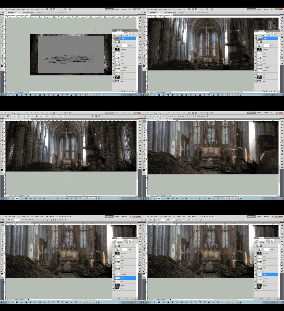
Once, you’ve finished adding some final touches to the image blending you can start working on the last details. The first detail concerns the ground cracks. For these cracks, I’ve used an image from Videocopilot’s Action Essentials 2 product. You can use other images as well as long as you’ve downloaded them from a stock photography site or you’ve made them your own. The image was originally in grayscale so I used the blending mode Overlay to delete the grey but maintain the texture. Things like cracks, holes and burn marks are always nice things to play around with so be sure to take a look at the foreground pillars to see if you can add some nice texture and damage.


Step 9

Now we’ve added all the objects into the scene and we’re ready to do some other stuff. First of all, we can add a grunge texture on top of our cathedral image to spice the image up a little bit. Just look for a grunge texture and play around with the blending mode. You can just grab the eraser and erase the parts you don’t want to be textured like the roof and the middle area of the images. Mostly the outer regions of the image need to be textured, like the pillars. You can see the difference on the image below.


Step 10

Another element you can see in the final image is the broken roof with light rays coming out of it. Let’s start by duplicating the original cathedral image in case anything goes wrong when trying to delete some parts of the roof. To actually delete the parts of the roof you can play around with different selection tools but to make nice and accurate edges you just need to do it manually.

This is probably the most labor-intensive part of the composition. The reason why is simple: you’ve got to make nice edges without any aliasing and, you must delete the right parts of the roof. For example, you can’t remove one of those big mainstays while maintaining the part of the roof it supports. I prefer working with the lasso tool and then refining the selections with the Refine Edge tool as shown in the animation above. Once you’re done you should have something like the image below.


Step 11

Obviously we can’t leave the background empty so we’ve got to download or shoot a picture of a sky. In this case I’ve used a clouded sky to give the scene a more intense effect.

A very important thing is to match the sky color with the interior color but a part of that will be done later with the final color correction. Simply place the sky image below the cathedral image and make some adjustments considering color, contrast etc..

Now, the cool thing is the light rays. To make the light rays, we need to extract the brightest parts of the clouds. To do this, duplicate the cloud layer and go to Image > Adjustments > Levels. Now Move the white slider to a lower value and make sure you can only see the bright parts of the image. Click the OK button and go to Filter > Blur > Radial Blur. Set the amount to 100 and the Blur Method to Zoom.

Also, set the quality to best and move the center of the blur to where the light comes from: the middle top of the image. Then move the layer on top of the cathedral ruins and set the transfer mode to Screen. This is how to make the light rays.

A good tip is to make some duplicates of the rays and stretch them so that you are really getting the feeling of a volumetric lightning. Also, you can adjust other things like maybe a small glow or exposure increase and some color correction. Also, you can add more details like the hanging chains to the image like I did using the techniques discussed above. A good tip by the way is to use the Liquify Tool to make the vines and chain more random looking. The image below shows what I did using the Levels and the Radial Blur.


Step 12

Now the composition is pretty much done. To spice the image up a little bit you can add one or more grunge texture layers and some more destructive elements like burning marks and cracks. To do this, just paste a grunge texture over the image and set the blending mode to what looks good (this varies with every image). Just erase the parts that you don’t want to be textures like the roof etc..


Step 13

This step considers the relighting of the scene. Obviously, all the images contain different light sources and are therefore lighted differently. The nice part of this scene is that the light source mainly comes from one place making the relighting easier. Let’s start by relighting the foreground rocks. To do this, select the appropriate layer and take the Dodge Tool (or press O on your keyboard to switch between the Dodge, Burn and Sponge Tool). Now, for the Range, select the midtones and paint over the where the light comes from, so paint the top of the rocks. The dodge tool works very well together with the Burn Tool, so I recommend using the Burn Tool and make the shadows even darker by painting the dark areas of the rocks.


Conclusion

The final thing we are going to do now is the color correction. To do this, go to Layer > New Adjustment Layer > Curves and place it on top of all the layers. First of all, add some contrast. Secondly, add some red in the midtones and remove some blue, also in the midtones. This will create a kind of ancient yellow effect.

Once you’re completely satisfied with your image it’s time for the final crucial steps. Before doing this, however, you should save the project file as it is now under a different name because we are going to merge all the layers together now. So first save your project so that you’ll keep a project file with the layers. After that, merge all the layers. Then go to Filter > Noise > Add Noise.

This is a classical trick is matte painting composing because is blends everything together really well and it gives a more natural feeling because the same amount of noise is applied to everything. Another thing you can do is apply a sharpen filter to make the final integration. Only sharpen it a bit and watch out for aliasing like effects. The final image is below. Thanks for reading and I hope you learned something new!

Read More

Create a Retro Electronic Safe Lock Interface – Psd Premium Tutorial


Photoshop can be used to create interfaces for all sorts of applications in addition to websites. In this Psd Premium tutorial, author Diego Monzon will demonstrate how to create a retro style electronic safe lock interface using both Photoshop and Illustrator. This tutorial is available exclusively to Premium Members. If you are looking to take your interface design skills to the next level then Log in or Join Now to get started!


Professional and Detailed Instructions Inside

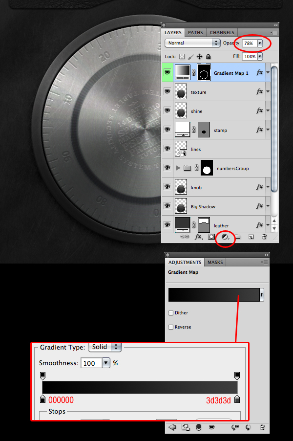
Premium members can Log in and Download! Otherwise, Join Now! Below are some sample images from this tutorial.


Psd Premium Membership

As you know, we run a premium membership system here that costs $9 a month (or $22 for 3 months!) which gives members access to the Source files for tutorials as well as periodic extra tutorials, like this one! You’ll also get access to Net Premium and Vector Premium, too. If you’re a Premium member, you can Log in and Download the Tutorial. If you’re not a member, you can of course Join Today!

Read More

What is a Clipping Mask Then?


Are you new to Photoshop? Have you been trying to teach yourself the basics of Photoshop but have found the amount of educational material available on the net a bit overwhelming? As the world’s #1 Photoshop site, we’ve published a lot of tutorials. So many, in fact, that we understand how overwhelming our site may be to those of you who may be brand new to Photoshop. This tutorial is part of a 25-part video series demonstrating everything you will need to know to start working in Photoshop.

Photoshop Basix, by Adobe Certified Expert and Instructor, Martin Perhiniak includes 25 short video tutorials, around 5 – 10 minutes in length that will teach you all the fundamentals of working with Photoshop. Today’s tutorial, Part 13: What is a Clipping Mask Then will explain clipping masks, the advantages of clipped adjustments, and how they compare to layer masks. Let’s get started!


Read More

design 3d animal character for the handle of a kitchen tool by macumba2m

design 3d handle of a small spatula to be used to scoop out creamy contents from jars (peanut butter, chocolate cream, …) spatula will be used by young kids (5 to 12 years old), therefore handle must present an animal character: a monkey… (Budget: $30-$250 USD, Jobs: 3D Modelling, Caricature & Cartoons, Concept Design, Product Design, Solidworks)